6.8 Customizing
In your future work, you will almost surely need to modify a figure in some way that is new to you and there is no way to cover every possibility here. Some options for editing graph properties are given here, such as axis labels and limits, titles, text, legends, and more. See Sections 1.19 and 6.10 for tips on learning more on your own.
6.8.1 Base R
See the help for each function for options. For example, ?barplot will show you the customization options for barplot(). See ?par for many options that work with most base R functions.
The following optional arguments can be added to almost any base R plotting function:
ylab,xlab: Change the y- and x-axis labels.xlim,ylim: Change the y- and x-axis limits.par(mfrow=c(2,2)): To display multiple plots on a 2x2 grid.lwd: Change the line width.lty: Change the line type (0 = blank, 1 = solid, 2 = dashed, 3 = dotted, …; see?parfor a full list). See the “Line Type Specification” section of?parfor more information.pch: Change the plotting symbol (0 = open square, 1 = open circle, 2 = open triangle, 3 = plus sign, …; see?pointsfor a full list).main: Change the plot title.las = 1: Rotate y-axis labels to horizontal.cex,cex.main,cex.lab,cex.axis: Change the font size of points, the title, axis labels, and axis tick labels, respectively.font.main,font.lab,font.axis: Change the font of the title, axis labels, and axis tick labels, respectively (1 = plain, 2 = bold, 3 = italic, 4 = bold italic).col,col.main,col.lab,col.axis: Change the color of points, title, axis labels, and axis tick labels, respectively. See the “Color Specification” section of?parfor more information.
The following functions can be used to add elements to an existing plot:
title("My title"): Adds a title.points(x, y): Adds a point at (x, y) ifxandyare each one number or, n points ifxandyare vectors of length n.lines(c(x1, x2), c(y1, y2)): Plots a line connecting (x1, y1) and (x2, y2).text(x, y, “My text”): Adds text to a plot at (x, y). Use theposargument to orient the text relative to (x, y).legend(): Adds a legend. See?legendfor details.box(): Add a box around a plot.
The following example illustrates a number of the options described above.
plot(mydat$stheight, mydat$stweight, col = "white",
     xlab = "Height (m)", ylab = "Weight (kg)",
     las = 1,
     main = "Weight vs. Height, by Sex",
     font.axis = 2, font.lab = 2, font.main = 4)

# Add points using a different plotting symbol and color by sex
SUB1 <- mydat$sex == "Male"
SUB2 <- mydat$sex == "Female"
points(mydat$stheight[SUB1], mydat$stweight[SUB1], pch = 2, col = "blue")
points(mydat$stheight[SUB2], mydat$stweight[SUB2], pch = 4, col = "red")

# Add regression lines for each group
# NOTE: plot, points, and lines expect x followed by y
#       but lm expects y ~ x
abline(lm(mydat$stweight[SUB1] ~ mydat$stheight[SUB1]),
       col = "blue", lwd = 2, lty = 1)
abline(lm(mydat$stweight[SUB2] ~ mydat$stheight[SUB2]),
       col = "red",  lwd = 2, lty = 2)
# Required to make the legend bold since it does not have a font argument
par(font = 2)
legend(1.3, 160, c("Male", "Female"),
       title = "Sex", col = c("blue", "red"), lwd = c(2,2), lty = c(1,2),
       bty = "n") # bty = "n" removes the default box around the legend
par(font = 1)
text(1.95, 160,
     paste("Cor =", round(cor(mydat$stheight[SUB1],
                              mydat$stweight[SUB1],
                              use = "complete.obs"), 2)),
     col = "blue", font = 2)
text(1.95, 150,
     paste("Cor =", round(cor(mydat$stheight[SUB2],
                              mydat$stweight[SUB2],
                              use = "complete.obs"), 2)),
     col = "red", font = 2)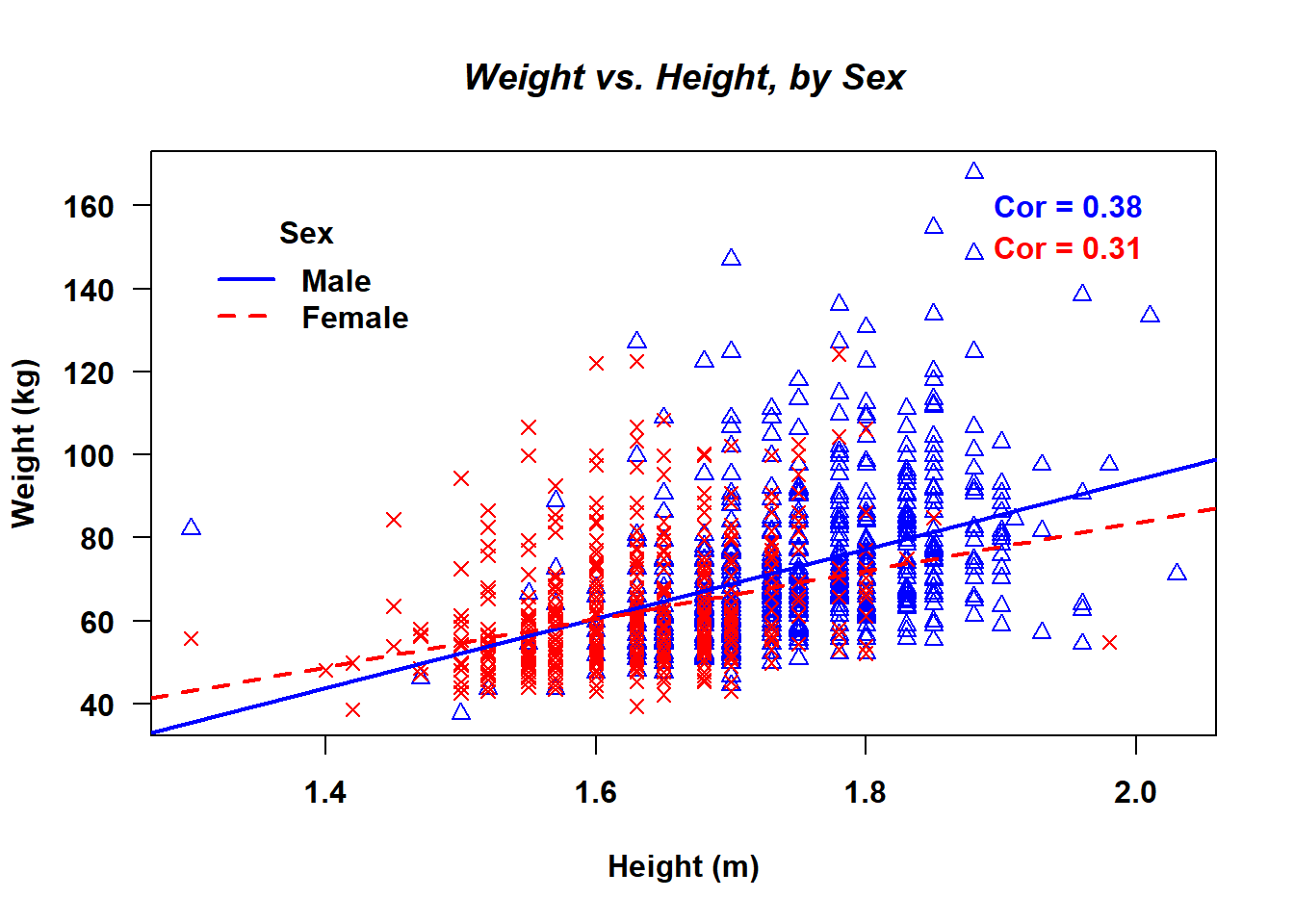
6.8.2 ggplot
To learn more about customizing ggplot figures, consult the resources listed in Section 6.10.