4.9 Try the Easy Solution First
Recall that our original question was
Do counties in the eastern United States have higher ozone levels than counties in the western United States?
What’s the simplest answer we could provide to this question? For the moment, don’t worry about whether the answer is correct, but the point is how could you provide prima facie evidence for your hypothesis or question. You may refute that evidence later with deeper analysis, but this is the first pass. Importantly, if you do not find evidence of a signal in the data using just a simple plot or analysis, then often it is unlikely that you will find something using a more sophisticated analysis.
First, we need to define what we mean by “eastern” and “western”. The simplest thing to do here is to simply divide the country into east and west using a specific longitude value. For now, we will use -100 as our cutoff. Any monitor with longitude less than -100 will be “west” and any monitor with longitude greater than or equal to -100 will be “east”.
> library(maps)
> map("state")
> abline(v = -100, lwd = 3)
> text(-120, 30, "West")
> text(-75, 30, "East")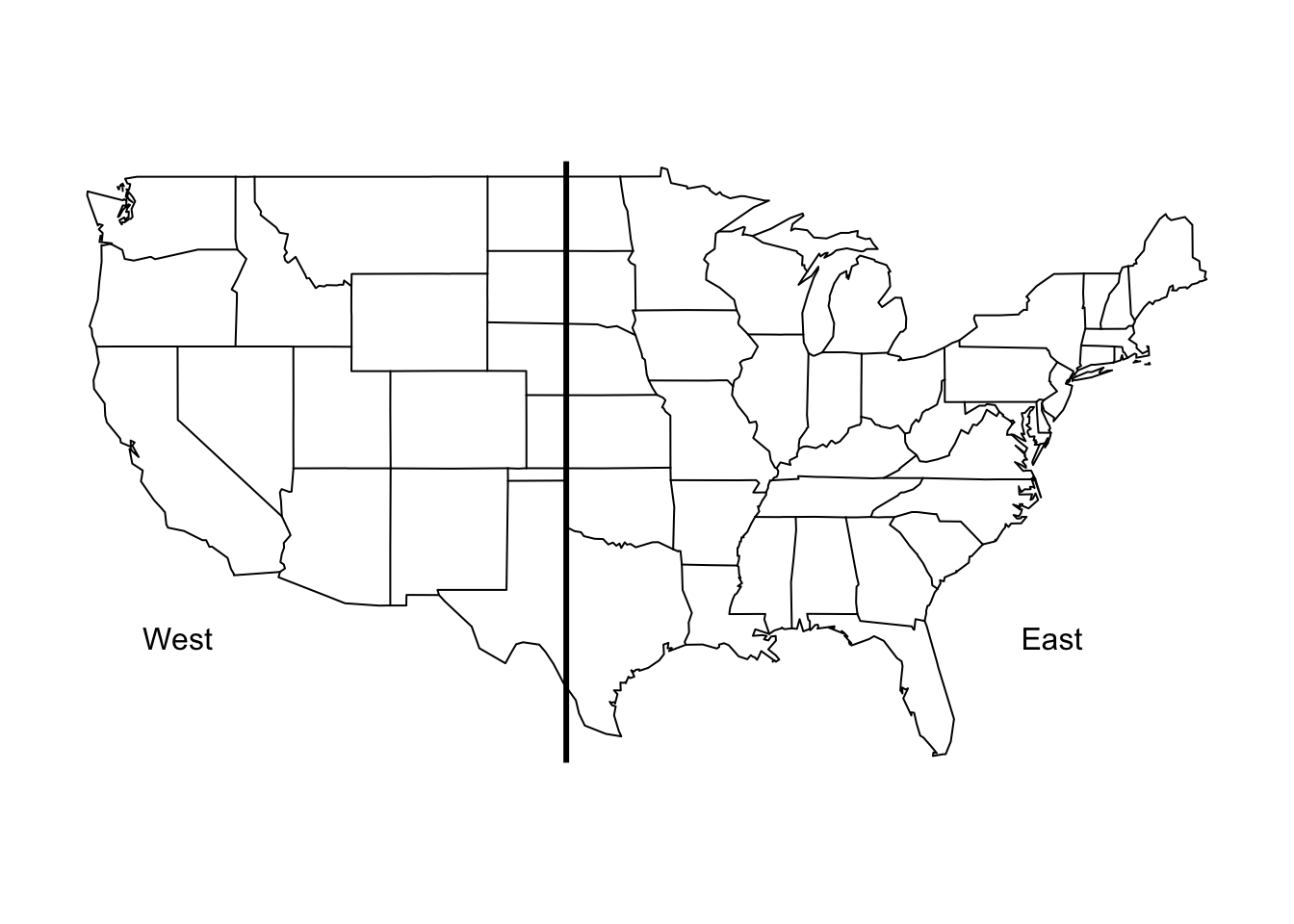
Figure 4.2: Map of East and West Regions
Here we create a new variable called region that we use to indicate whether a given measurement in the dataset was recorded in the “east” or the “west”.
> ozone$region <- factor(ifelse(ozone$Longitude < -100, "west", "east"))Now, we can make a simple summary of ozone levels in the east and west of the U.S. to see where levels tend to be higher.
> group_by(ozone, region) %>%
+         summarize(mean = mean(Sample.Measurement, na.rm = TRUE),
+                   median = median(Sample.Measurement, na.rm = TRUE))
# A tibble: 2 × 3
  region       mean median
  <fctr>      <dbl>  <dbl>
1   east 0.02995250  0.030
2   west 0.03400735  0.035
Both the mean and the median ozone level are higher in the western U.S. than in the eastern U.S., by about 0.004 ppm.
We can also make a boxplot of the ozone in the two regions to see how they compare.
> boxplot(Sample.Measurement ~ region, ozone, range = 0)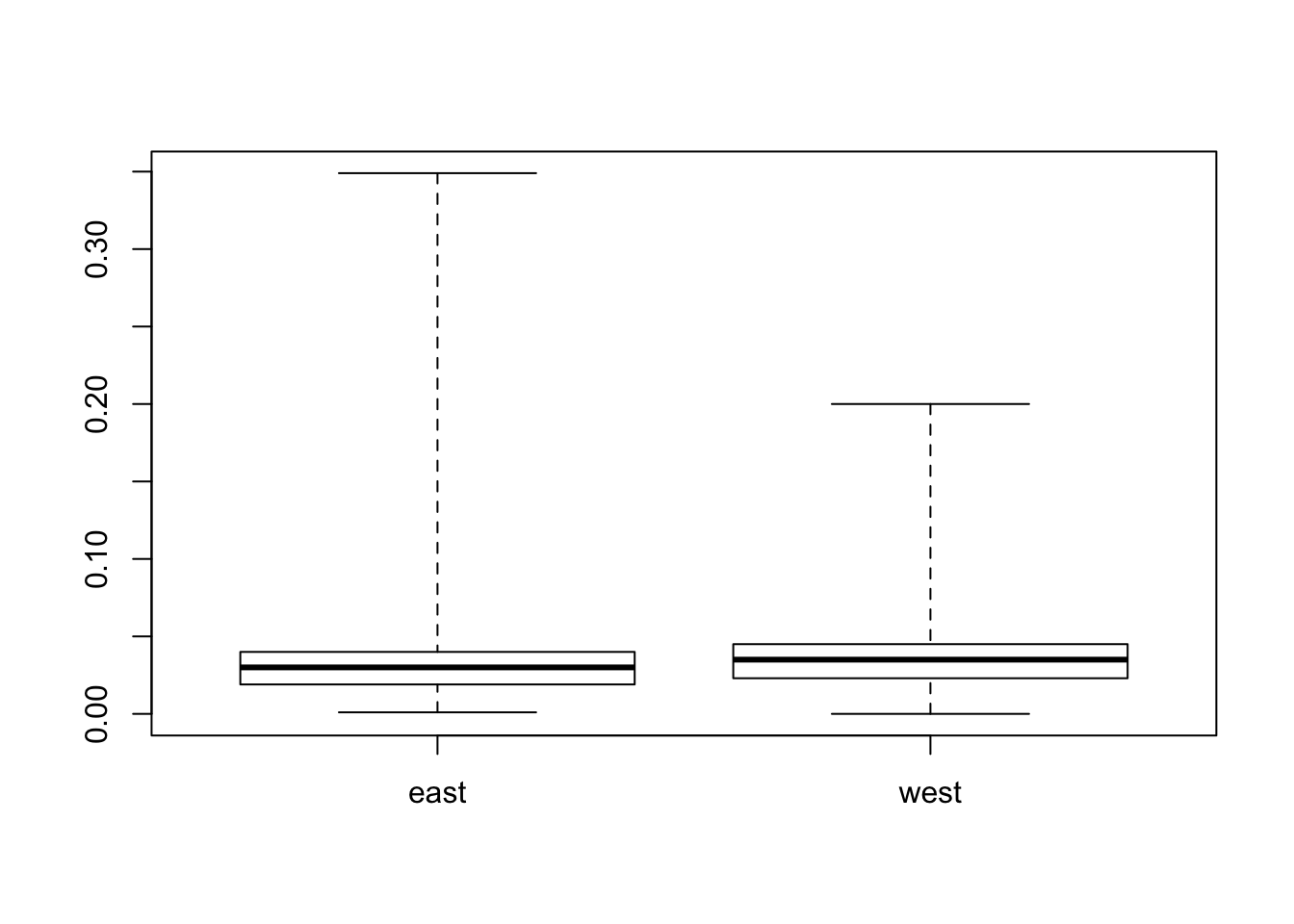
Figure 4.3: Boxplot of Ozone for East and West Regions
We can see from the boxplots that the variability of ozone in the east tends to be a lot higher than the variability in the west.
4.9.1 Challenge Your Solution
The easy solution is nice because it is, well, easy, but you should never allow those results to hold the day. You should always be thinking of ways to challenge the results, especially if those results comport with your prior expectation.
Recall that previously we noticed that three states had some unusually high values of ozone. We don’t know if these values are real or not (for now, let’s assume they are real), but it might be interesting to see if the same pattern of east/west holds up if we remove these states that have unusual activity.
> filter(ozone, State.Name != "Puerto Rico"
+        & State.Name != "Georgia"
+        & State.Name != "Hawaii") %>%
+         group_by(region) %>%
+         summarize(mean = mean(Sample.Measurement, na.rm = TRUE),
+                   median = median(Sample.Measurement, na.rm = TRUE))
# A tibble: 2 × 3
  region       mean median
  <fctr>      <dbl>  <dbl>
1   east 0.03003692  0.030
2   west 0.03406880  0.035
Indeed, it seems the pattern is the same even with those 3 states removed.