8.1 Air Pollution and Mortality in New York City
The following example shows how different types of questions and corresponding modeling approaches can lead to different conclusions. The example uses air pollution and mortality data for New York City. The data were originally used as part of the National Morbidity, Mortality, and Air Pollution Study (NMMAPS).
Below is a plot of the daily mortality from all causes for the years 2001–2005.
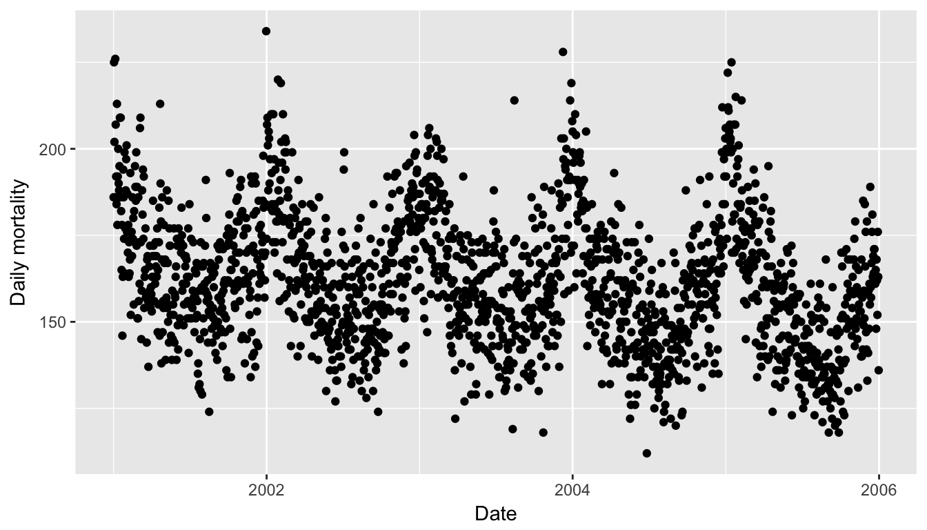
Figure 5.1: Daily Mortality in New York City, 2001–2005
And here is a plot of 24-hour average levels of particulate matter with aerodynamic diameter less than or equal to 10 microns (PM10).
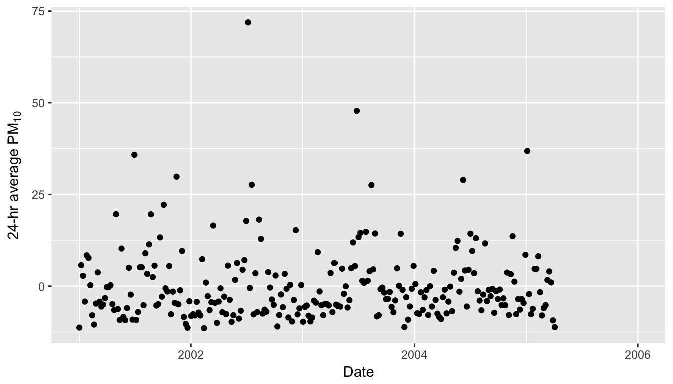
Figure 8.1: Daily PM10 in New York City, 2001–2005
Note that there are many fewer points on the plot above than there were on the plot of the mortality data. This is because PM10 is not measured everyday. Also note that there are negative values in the PM10 plot–this is because the PM10 data were mean-subtracted. In general, negative values of PM10 are not possible.