4.8 Make a Plot
Making a plot to visualize your data is a good way to further your understanding of your question and your data. Plotting can occur at different stages of a data analysis. For example, plotting may occur at the exploratory phase or later on in the presentation/communication phase.
There are two key reasons for making a plot of your data. They are creating expectations and checking deviations from expectations.
At the early stages of analysis, you may be equipped with a question/hypothesis, but you may have little sense of what is going on in the data. You may have peeked at some of it for sake of doing some sanity checks, but if your dataset is big enough, it will be difficult to simply look at all the data. So making some sort of plot, which serves as a summary, will be a useful tool for setting expectations for what the data should look like.
Once you have a good understanding of the data, a good question/hypothesis, and a set of expectations for what the data should say vis a vis your question, making a plot can be a useful tool to see how well the data match your expectations. Plots are particularly good at letting you see deviations from what you might expect. Tables typically are good at summarizing data by presenting things like means, medians, or other statistics. Plots, however, can show you those things, as well as show you things that are far from the mean or median, so you can check to see if something is supposed to be that far away. Often, what is obvious in a plot can be hidden away in a table.
Here’s a simple boxplot of the ozone data, with one boxplot for each state.
> par(las = 2, mar = c(10, 4, 2, 2), cex.axis = 0.8)
> boxplot(Sample.Measurement ~ State.Name, ozone, range = 0, ylab = "Ozone level (ppm)")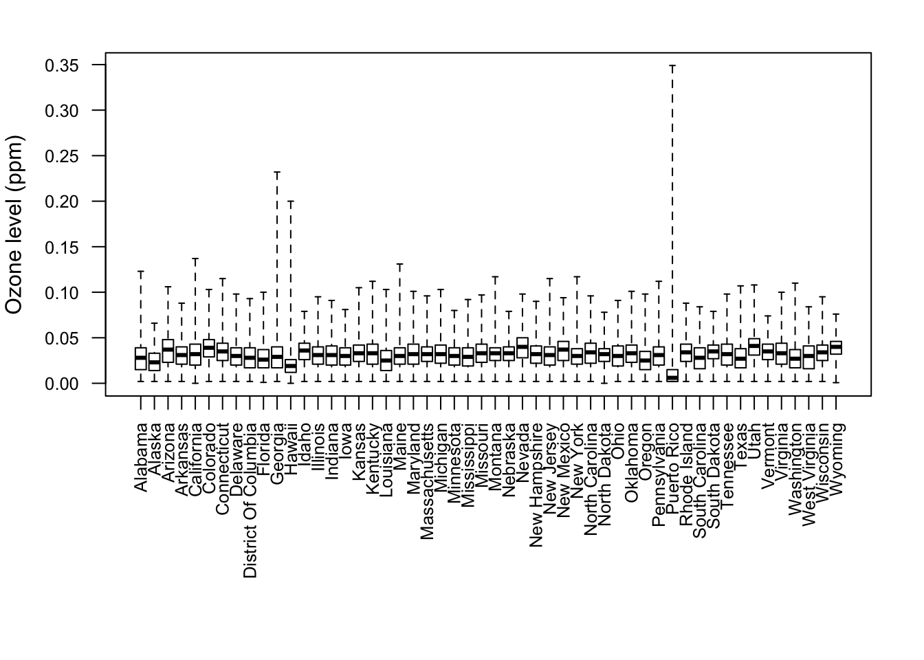
Figure 4.1: Boxplot of ozone values by state
From the plot, we can see that for most states the data are within a pretty narrow range below 0.05 ppm. However, for Puerto Rico, we see that the typical values are very low, except for some extremely high values. Similarly, Georgia and Hawaii appear to experience an occasional very high value. These might be worth exploring further, depending on your question.