5.4 Examining Linear Relationships
It’s common to look at data and try to understand linear relationships between variables of interest. The most common statistical technique to help with this task is linear regression. We can apply the principles discussed above—developing expectations, comparing our expectations to data, refining our expectations—to the application of linear regression as well.
For this example we’ll look at a simple air quality dataset containing information about tropospheric ozone levels in New York City in the year 1999 for months of May through 1999. Here are the first few rows of the dataset.
     ozone     temp month
1 25.37262 55.33333     5
2 32.83333 57.66667     5
3 28.88667 56.66667     5
4 12.06854 56.66667     5
5 11.21920 63.66667     5
6 13.19110 60.00000     5
The data contain daily average levels of ozone (in parts per billion [pbb]) and temperature (in degrees Fahrenheit). One question of interest that might motivate the collection of this dataset is “How is ambient temperature related to ambient ozone levels in New York?”
5.4.1 Expectations
After reading a little about ozone formation in the atmosphere, we know that the formation of ozone depends critically on the presence of sunlight. Sunlight is also related to temperature in the sense that on days where there is a lot of sunlight, we would expect the average temperature for that day to be higher. Cloudy days have both lower temperatures on average and less ozone. So there’s reason to believe that on days with higher temperatures we would expect there to be higher ozone levels. This is an indirect relationship—we are using temperature here as essentially a proxy for the amount of sunlight.
The simplest model that we might formulate for characterizing the relationship between temperature and ozone is a linear model. This model says that as temperature increases, the amount of ozone in the atmosphere increases linearly with it. What do we expect this to look like?
We can simulate some data to make a fake picture of what the relationship between ozone and temperature should look like under a linear model. Here’s a simple linear relationship along with the simulated data in a scatterplot.
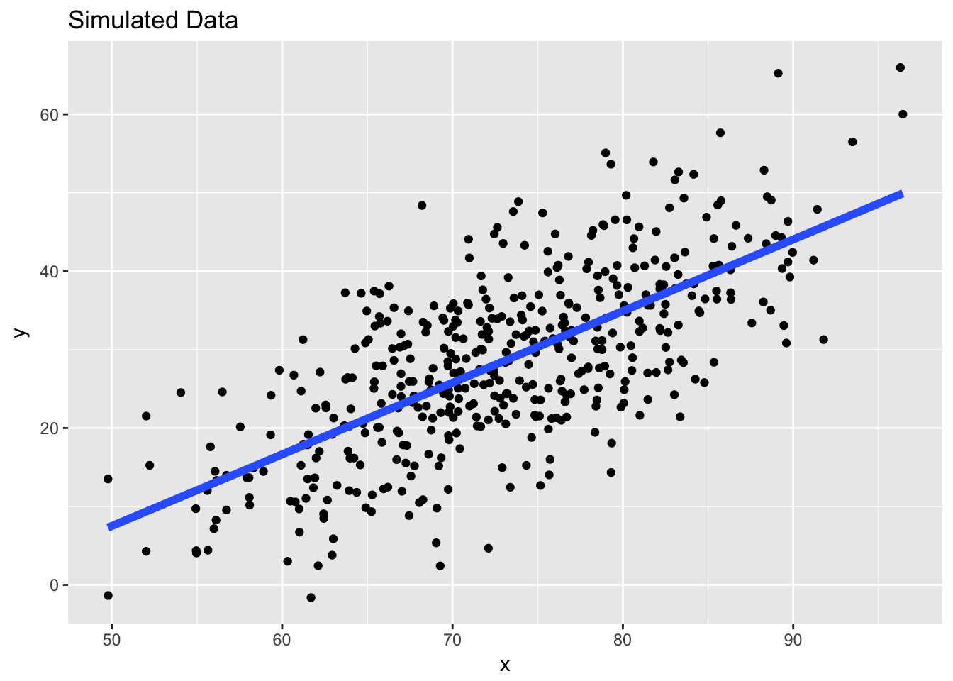
Figure 5.5: Simulated Data with a Linear Model
Note that if you choose any point on the blue line, there is roughly the same number of points above the line as there are below the line (this is also referred to as unbiased errors). Also, the points on the scatterplot appear to increase linearly as you move towards the right on the x-axis, even if there is a quite a bit of noise/scatter along the line.
If we are right about our linear model, and that is the model that characterizes the data and the relationship between ozone and temperature, then roughly speaking, this is the picture we should see when we plot the data.
5.4.2 Comparing expectations to data
Here is the picture of the actual ozone and temperature data in New York City for the year 1999. On top of the scatterplot of the data, we’ve plotted the fitted linear regression line estimated using the data.
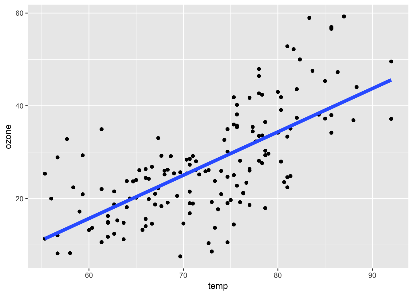
Figure 5.6: Linear Model for Ozone and Temperature
How does this picture compare to the picture that you were expecting to see?
One thing is clear: There does appear to be an increasing trend in ozone as temperature increases, as we hypothesized. However, there are a few deviations from the nice fake picture that we made above. The points don’t appear to be evenly balanced around the blue regression line.
If you draw a vertical line around a temperature of 85 degrees, you notice that most of the points are above the line. Drawing a vertical line around 70 degrees shows that most of the points are below the line. This implies that at higher temperatures, our model is biased downward (it underestimates ozone) and at moderate temperatures our model is biased upwards. This isn’t a great feature–in this situation we might prefer that our model is not biased anywhere.
Our simple linear regression model appears to capture the general increasing relationship between temperature and ozone, but it appears to be biased in certain ranges of temperature. It seems that there is room for improvement with this model if we want to better characterize the relationship between temperature and ozone in this dataset.
5.4.3 Refining expectations
From the picture above, it appears that the relationship between temperature and ozone may not be linear. Indeed, the data points suggest that maybe the relationship is flat up until about 70 degrees and then ozone levels increase rapidly with temperature after that. This suggest a nonlinear relationship between temperature and ozone.
The easiest way we can capture this revised expectation is with a smoother, in this case, a loess smoother.
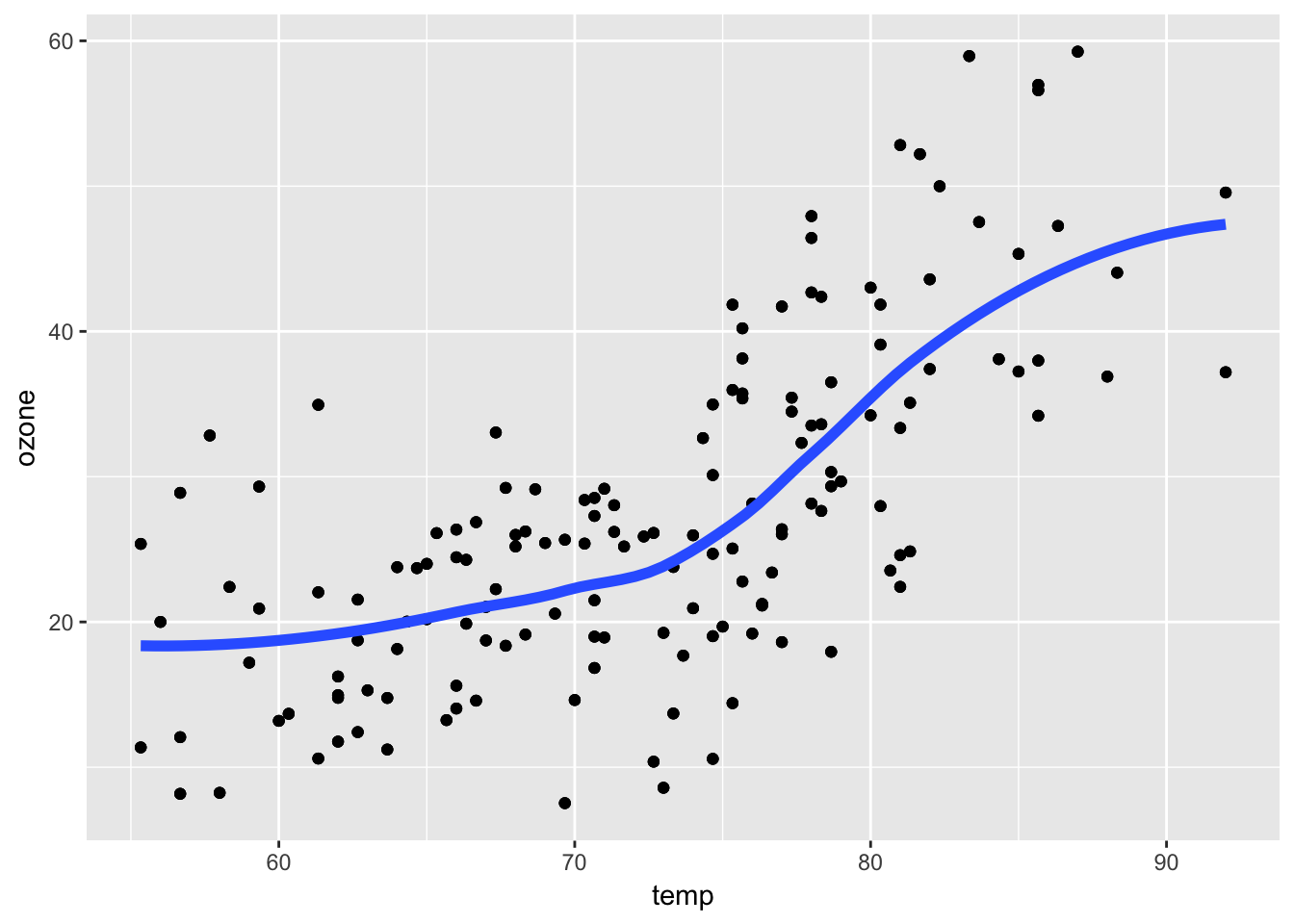
Figure 5.7: Loess Smoother for Ozone and Temperature
This plot shows a different picture–the relationship is slowly increasing up until about 75 degrees, and then sharply increases afterwards. Around 90 degrees, there’s a suggestion that the relationship levels off again.
Smoothers (like loess) are useful tools because they quickly capture trends in a dataset without making any structural assumptions about the data. Essentially, they are an automated or computerized way to sketch a curve on to some data. However, smoothers rarely tell you anything about the mechanism of the relationship and so may be limited in that sense. In order to learn more about the relationship between temperature and ozone, we may need to resort to a more detailed model than the simple linear model we had before.