5.2 Comparing Model Expectations to Reality
We may be very proud of developing our statistical model, but ultimately its usefulness will depend on how closely it mirrors the data we collect in the real world. How do we know if our expectations match with reality?
5.2.1 Drawing a fake picture
To begin with we can make some pictures, like a histogram of the data. But before we get to the data, let’s figure out what we expect to see from the data. If the population followed roughly a Normal distribution, and the data were a random sample from that population, then the distribution estimated by the histogram should look like the theoretical model provided by the Normal distribution.
In the picture below, I’ve simulated 20 data points from a Normal distribution and overlaid the theoretical Normal curve on top of the histogram.
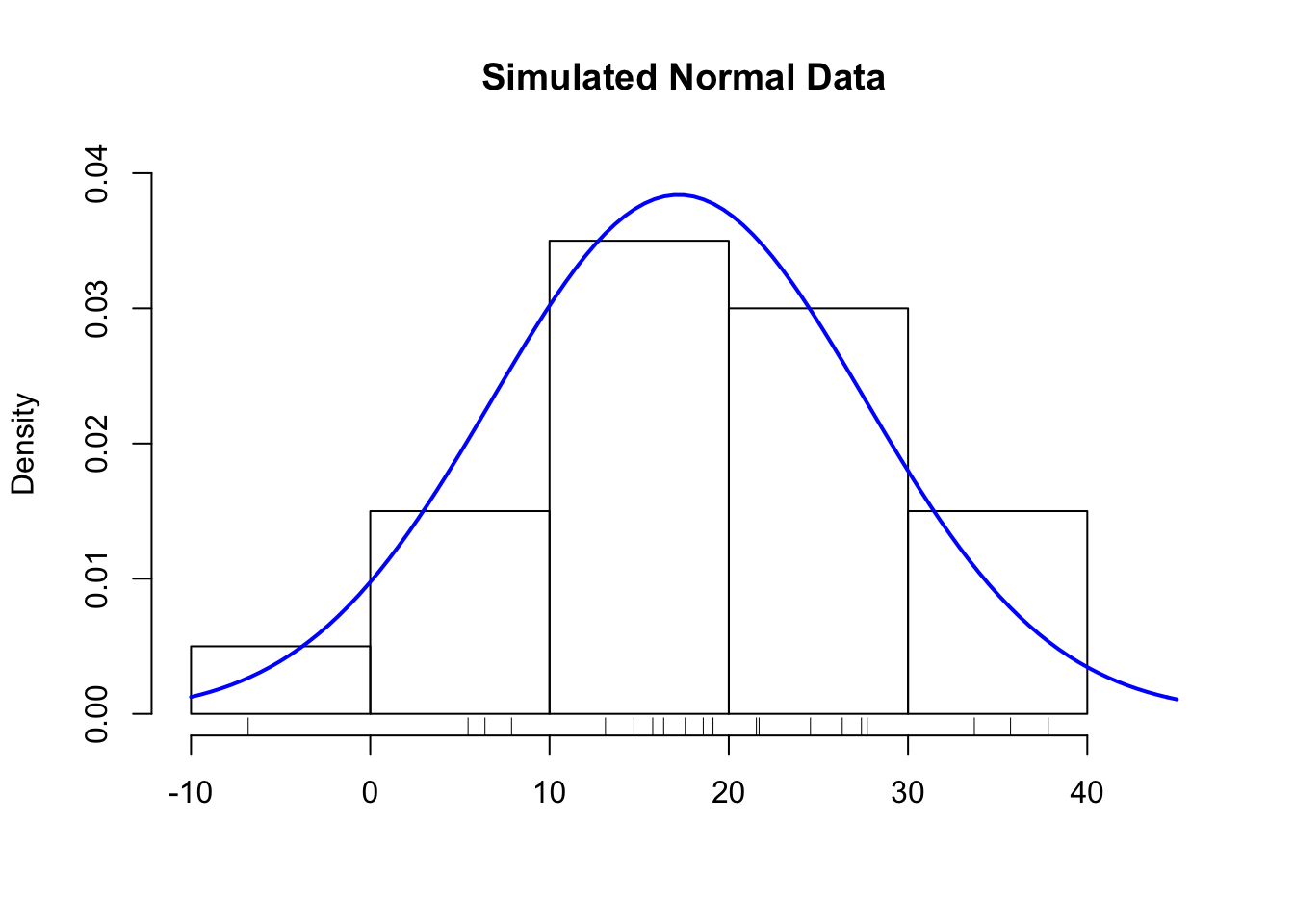
Figure 5.2: Histogram of Simulated Normal Data
Notice how closely the histogram bars and the blue curve match. This is what we want to see with the data. If we see this, then we might conclude that the Normal distribution is a good statistical model for the data.
Simulating data from a hypothesized model, if possible, is a good way to setup expectations before you look at the data. Drawing a fake picture (even by hand, if you have to) can be a very useful tool for initiating discussions about the model and what we expect from reality.
For example, before we even look at the data, we might suspect the Normal model may not provide a perfect representation of the population. In particular, the Normal distribution allows for negative values, but we don’t really expect that people will say that they’d be willing to pay negative dollars for a book.
So we have some evidence already that the Normal model may not be a perfect model, but no model is perfect. The question is does the statistical model provide a reasonable approximation that can be useful in some way?
5.2.2 The real picture
Here is a histogram of the data from the sample of 20 respondents. On top of the histogram, I’ve overlaid the Normal curve on top of the histogram of the 20 data points of the amount people say they are willing to pay for the book.
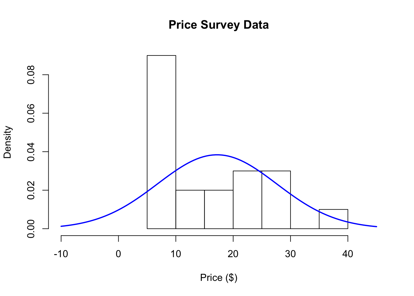
Figure 5.3: Histogram of Price Survey Data
What we would expect is that the histogram and the blue line should roughly follow each other. How do the model and reality compare?
At first glance, it looks like the histogram and the Normal distribution don’t match very well. The histogram has a large spike around $10, a feature that is not present with the blue curve. Also, the Normal distribution allows for negative values on the left-hand side of the plot, but there are no data points in that region of the plot.
So far the data suggest that the Normal model isn’t really a very good representation of the population, given the data that we sampled from the population. It seems that the 20 people surveyed have strong preference for paying a price in the neighborhood of $10, while there are a few people willing to pay more than that. These features of the data are not well characterized by a Normal distribution.