Social Network Analysis
Hello! Today, we’ll be talking about social network analysis. Network analyses are analyses of structure, which can be really important for studying things like how information flows on social media. In this tutorial, we will cover three broad topics: 1: preparing data for network analysis, 2: calculating network measures, and 3: constructing network graphs.
For this tutorial, we will be working with two new packages: igraph (which is used for network analysis preparation and analysis–the bulk of what we’ll be learning will be from here) and ggraph (a package for plotting networks using principles that are similar to ggplot2). In this tutorial, we’ll also use the academic twitter dataset that we used last week.
#install.packages("igraph")
#install.packages("ggraph")

library(tidyverse)
library(igraph) #organizes network structure (edgelist)
library(ggraph) #graphs network
library(tidygraph)
library(plyr)

twitter_data <- read_csv("data/rtweet_academictwitter_2021.csv")
What are the variables in this dataset?
##  [1] "...1"                    "user_id"                 "status_id"               "created_at"              "screen_name"             "text"
##  [7] "source"                  "display_text_width"      "reply_to_status_id"      "reply_to_user_id"        "reply_to_screen_name"    "is_quote"
## [13] "is_retweet"              "favorite_count"          "retweet_count"           "quote_count"             "reply_count"             "hashtags"
## [19] "symbols"                 "urls_url"                "urls_t.co"               "urls_expanded_url"       "media_url"               "media_t.co"
## [25] "media_expanded_url"      "media_type"              "ext_media_url"           "ext_media_t.co"          "ext_media_expanded_url"  "ext_media_type"
## [31] "mentions_user_id"        "mentions_screen_name"    "lang"                    "quoted_status_id"        "quoted_text"             "quoted_created_at"
## [37] "quoted_source"           "quoted_favorite_count"   "quoted_retweet_count"    "quoted_user_id"          "quoted_screen_name"      "quoted_name"
## [43] "quoted_followers_count"  "quoted_friends_count"    "quoted_statuses_count"   "quoted_location"         "quoted_description"      "quoted_verified"
## [49] "retweet_status_id"       "retweet_text"            "retweet_created_at"      "retweet_source"          "retweet_favorite_count"  "retweet_retweet_count"
## [55] "retweet_user_id"         "retweet_screen_name"     "retweet_name"            "retweet_followers_count" "retweet_friends_count"   "retweet_statuses_count"
## [61] "retweet_location"        "retweet_description"     "retweet_verified"        "place_url"               "place_name"              "place_full_name"
## [67] "place_type"              "country"                 "country_code"            "geo_coords"              "coords_coords"           "bbox_coords"
## [73] "status_url"              "name"                    "location"                "description"             "url"                     "protected"
## [79] "followers_count"         "friends_count"           "listed_count"            "statuses_count"          "favourites_count"        "account_created_at"
## [85] "verified"                "profile_url"             "profile_expanded_url"    "account_lang"            "profile_banner_url"      "profile_background_url"
## [91] "profile_image_url"
Data Cleaning
Since our analysis is focused on retweets, let’s subset our data by pulling out all the tweets that are retweets. For our analysis, we are also primarily interested in two pieces of information: who made the original post (retweet_screen_name) and who did the retweeting (screen_name), so we’re going to focus on these two columns.
rts <- base::subset(twitter_data, !is.na(retweet_screen_name)) %>%
  dplyr::select(screen_name, retweet_screen_name)
Now that we have our data, let’s filter out some things we may not want. Our tweet corpus has a lot of retweets (4,116,592 to be exact), so maybe we want to only look at retweet activities that happen 5 or more times. We also probably want to exclude cases where people are retweeting or quote tweeting themselves. We can do so using a piped chunk of code that combines ddply(), filter() and subset().
rt_pair_ct <- plyr::ddply(rts, .(screen_name, retweet_screen_name), nrow) %>% #counts the rows
  dplyr::filter(V1 > 4) %>%
  subset(screen_name != retweet_screen_name) #exclude cases where people are retweeting themselves

colnames(rt_pair_ct) <- c("tw_retweeter", "tw_originalposter", "count")
In the above chunk, we use ddply() to count (using nrow()) the times where screen_name is retweeting retweet_screen_name. For example, if I (@josephinelukito) retweet the NY Times (@nytimes) 10 times, the first line of this chunk will return a V1 observation of 10. Then, we filter() for all instances where V1 (the count variable) is 9 or less and subset() all the tweets where the screen_name and the retweet_screen_name are not the same (if I retweet myself 14 times, this would be removed).
Learn more about ddply() in the plyr package, check out this StackOverflow response
The last line, colnames() renames the columns of the data frame rt_pair_ct.
Finally, we have a dataset of 2562 retweet relationships. If you look at the data frame using View(), you’ll notice that there are 3 columns: tw_retweeter, tw_originalposter and count (we just renamed these variables). This generally follows network structure: at minimum, your network analysis will focus on two columns.
Network Data Wrangling
Networks are comprised of two things: nodes (also known as “vertices”, which is the plural for “vertex”) and edges (also known as “links” or “lines”). I’ll be using these terms interchangeably throughout the tutorial so you can familiarize yourself with both terms.
In our analysis, each vertex represents an account and each edge represents the relationship between them (in this case, the retweet relationship). Lines can be directed (where each edge has a direction, or arrow) or undirected. For example, we can illustrate a network with arrows pointing from the original tweeting account to the account that retweeted. Or, we can simply show it as an undirected relationship.
Because networks rely on this node-edge structure, we need a data frame that contains information about the nodes we are interested in. Luckily, we have just constructed such a data frame! In our data frame, each observation in tw_retweeter and tw_originalposter is a node, and each row is an edge (the relationship between two nodes). We also have some directionality–we know that the retweeter’s tweet is derived from the original poster. And finally, we have some useful count data to tell us how frequently an account is retweeting another account.
So now, we are ready to contruct our graph! We can do so using the igraph function graph_from_data_frame().
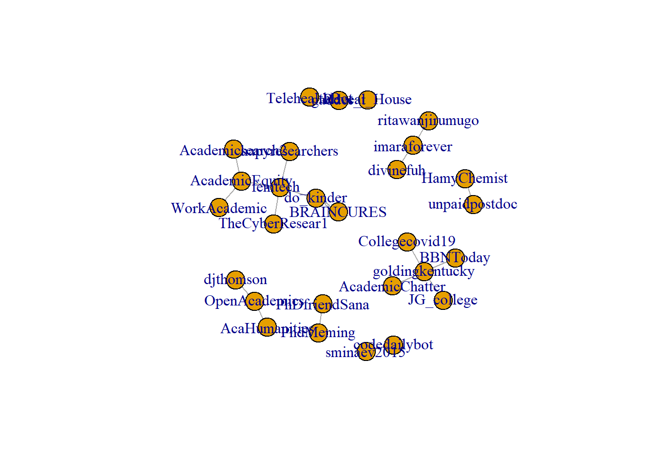
rt_graph2 <- igraph::graph_from_data_frame(rt_pair_ct, directed = FALSE)
Simple right? What does this this data structure look like?
## [1] "igraph"
## IGRAPH c8cc848 UN-- 28 21 --
## + attr: name (v/c), count (e/n)
## + edges from c8cc848 (vertex names):
##  [1] AcademicChatter--goldingkentucky AcademicEquity --Academicsearch2 AcaHumanities  --OpenAcademics   BBNToday       --goldingkentucky
##  [5] BRAINCURES     --do_kinder       codedailybot   --sminaev2015     Collegecovid19 --goldingkentucky divinefuh      --imaraforever
##  [9] djthomson      --OpenAcademics   BRAINCURES     --do_kinder       AcademicEquity --femtech_        do_kinder      --femtech_
## [13] femtech_       --hapyresearchers femtech_       --TheCyberResear1 HamyChemist    --unpaidpostdoc   JG_college     --goldingkentucky
## [17] PhDfriendSana  --PhdMeming       Reveal_House   --gaddes_t        ritawanjirumugo--imaraforever    TelehealthBot  --gaddes_t
## [21] AcademicEquity --WorkAcademic
One thing you may notice in the environment is that our new igraph object is a list. This list contains a lot of informtion–as you can see, when you print out the object rt_graph2, it will show you some example lines between nodes.
Directed Graphs
Another thing you may have noticed is that we added the argument directed = FALSE. This argument is used to remove any directionality. By defualt, though, graph_from_data_frame() will assume a directionality.
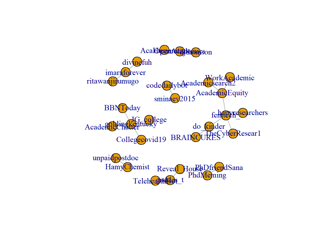
rt_graph2_directed <- igraph::graph_from_data_frame(rt_pair_ct)
rt_graph2_directed
## IGRAPH c8d5b4f DN-- 28 21 --
## + attr: name (v/c), count (e/n)
## + edges from c8d5b4f (vertex names):
##  [1] AcademicChatter->goldingkentucky AcademicEquity ->Academicsearch2 AcaHumanities  ->OpenAcademics   BBNToday       ->goldingkentucky
##  [5] BRAINCURES     ->do_kinder       codedailybot   ->sminaev2015     Collegecovid19 ->goldingkentucky divinefuh      ->imaraforever
##  [9] djthomson      ->OpenAcademics   do_kinder      ->BRAINCURES      femtech_       ->AcademicEquity  femtech_       ->do_kinder
## [13] femtech_       ->hapyresearchers femtech_       ->TheCyberResear1 HamyChemist    ->unpaidpostdoc   JG_college     ->goldingkentucky
## [17] PhDfriendSana  ->PhdMeming       Reveal_House   ->gaddes_t        ritawanjirumugo->imaraforever    TelehealthBot  ->gaddes_t
## [21] WorkAcademic   ->AcademicEquity
Note here that when we look at the igraph object rt_graph2_directed, the edges now have an arrow indicating directionality. When determining direction, the nodes in the first row (tw_retweeter) has a directional edge pointing to to the nodes in the second column (tw_originalposter)
Network Metrics
Now that we have our igraph object, we can now calculate some metrics for it. One really popular metric are measures of centrality. Three popular measures of centrality are degree centrality, closeness centrality, and betweenness centrality.
Degree Centrality
Degree centrality refers to how many links are attached to a node. It is particularly useful for identifying nodes that are particularly central or important to a network. Presumably, if a node has more edges, it is perceived as more “degree central” to a network.
Learn more about degree centrality here.
# in this chunk, we will use the degree() function from the igraph package.

degree_centrality <- igraph::degree(rt_graph2) #this produces a "named" numeric column
rt_graph2$degree <- igraph::degree(rt_graph2) #you can also save this to the igraph
igraph::degree(rt_graph2) %>% head(10)
## AcademicChatter  AcademicEquity   AcaHumanities        BBNToday      BRAINCURES    codedailybot  Collegecovid19       divinefuh       djthomson       do_kinder
##               1               3               1               1               2               1               1               1               1               3
degree() (and all the centrality functions) will produce “named” numeric. If you check out the degree_centrality object (e.g., using View(degree_centrality)), you will see that the degree() function produces a “named” vector (check out is.vector(degree_centrality)). This numeric vector has a different name for each row (for each node). Because each account’s name is referenced in the row name, you are able to save the results of degree() to the igraph object (in our case, rt_graph2.
Betweenness Centrality
Betweenness centrality is focused on nodes in “the shortest path” between two nodes (this shortest path is called a geodesic path). It is based on the principle that every pair of verticies has a “shortest path” from one vertex to another. The more often a node acts as a “bridge” between two other nodes’ geodesic (shortest) path, the higher its betweenness centrality in the network.
Learn more about betweenness centrality here.
rt_graph2$between <- betweenness(rt_graph2)
betweenness(rt_graph2) %>% head(10)
## AcademicChatter  AcademicEquity   AcaHumanities        BBNToday      BRAINCURES    codedailybot  Collegecovid19       divinefuh       djthomson       do_kinder
##               0              11               0               0               0               0               0               0               0               6
Closeness Centrality
The last centrality metric we will cover is the closeness centrality. Like the betweenness centrality, this centrality metric is based on the shortest path between nodes. It is measured based on the average geodesic path between that node and all the other nodes. A node that is “more close” to other nodes (i.e., fewer shortest paths) is therefore considered more central.
rt_graph2$tw_closeness<-closeness(rt_graph2)
closeness(rt_graph2) %>% head(10)
## AcademicChatter  AcademicEquity   AcaHumanities        BBNToday      BRAINCURES    codedailybot  Collegecovid19       divinefuh       djthomson       do_kinder
##      0.14285714      0.08333333      0.33333333      0.14285714      0.05000000      1.00000000      0.14285714      0.33333333      0.33333333      0.07142857
Although betweenness and closeness centrality are similar, they are not the same. Betweenness is focused on how dependant other nodes are to that node. Closeness is focused on how independent a node is to other nodes. Learn more here.
All three metrics can reveal how important individual nodes are to a network.
We can also use this information to make the network more focused. Below, we use the degree() centrality by deleting all nodes (verticies) that has a degree centrality of 1 or lower (i.e., nodes with a degree centrality score of 1 are removed). We will also use igraph::simplify(), a function which deletes the loops and redundant edges.
rt_graph3 <- delete.vertices(rt_graph2,which(igraph::degree(rt_graph2) < 1)) %>%
  simplify()
Neighbors
In addition to these network-level metrics, it can sometimes be useful to see what other nodes are close to a specific node. Nodes that are adjacent to one another (i.e., nodes that share one edge) are considered “neighbors”. We can identify the neighbors using the neighbors() function in igraph.
betweenness(rt_graph2) %>% sort(decreasing = TRUE) %>% head(5) #find the nodes with the highest betweenness centrality
##        femtech_  AcademicEquity       do_kinder goldingkentucky   OpenAcademics
##              17              11               6               6               1
igraph::neighbors(rt_graph2, "AcademicEquity")
## + 3/28 vertices, named, from c8cc848:
## [1] femtech_        WorkAcademic    Academicsearch2
igraph::neighbors(rt_graph2, "goldingkentucky")
## + 4/28 vertices, named, from c8cc848:
## [1] AcademicChatter BBNToday        Collegecovid19  JG_college
igraph::neighbors(rt_graph2, "OpenAcademics")
## + 2/28 vertices, named, from c8cc848:
## [1] AcaHumanities djthomson
Using the centrality metrics, we can identify verticies that are considered central to a network, and then see what other nodes it has a link to. If your graph is dirextional, you can also set a “mode” using the mode argument.
betweenness(rt_graph2_directed) %>% sort(decreasing = TRUE) %>% head(5)
##  AcademicEquity       do_kinder AcademicChatter   AcaHumanities        BBNToday
##               2               1               0               0               0
igraph::neighbors(rt_graph2_directed, "AcademicEquity", mode = "in") #Who retweeted AcademicEquity?
## + 2/28 vertices, named, from c8d5b4f:
## [1] femtech_     WorkAcademic
igraph::neighbors(rt_graph2_directed, "AcademicEquity", mode = "out") #What accounts did AcademicEquity retweet?
## + 1/28 vertex, named, from c8d5b4f:
## [1] Academicsearch2
Learn more about directionality in this PNAS article.
Plot
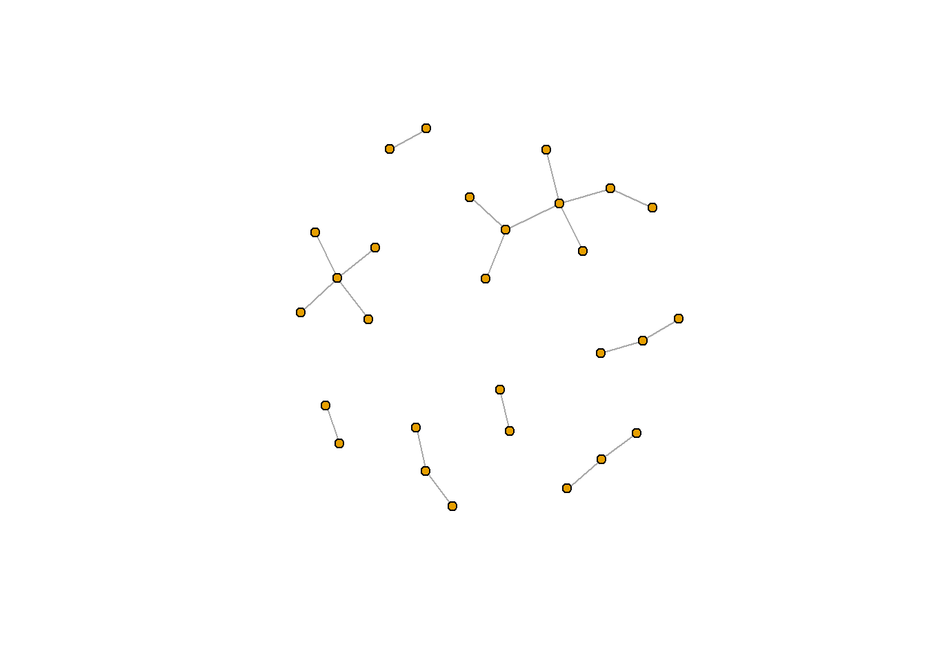
Finally, we turn to plotting networks. There are many ways to plot a network, but we’ll walk through two in this tutorial. In the first, we will plot using the plot() or plot.igraph() function in the igraph package.. Then, we will plot using ggraph().
Base R
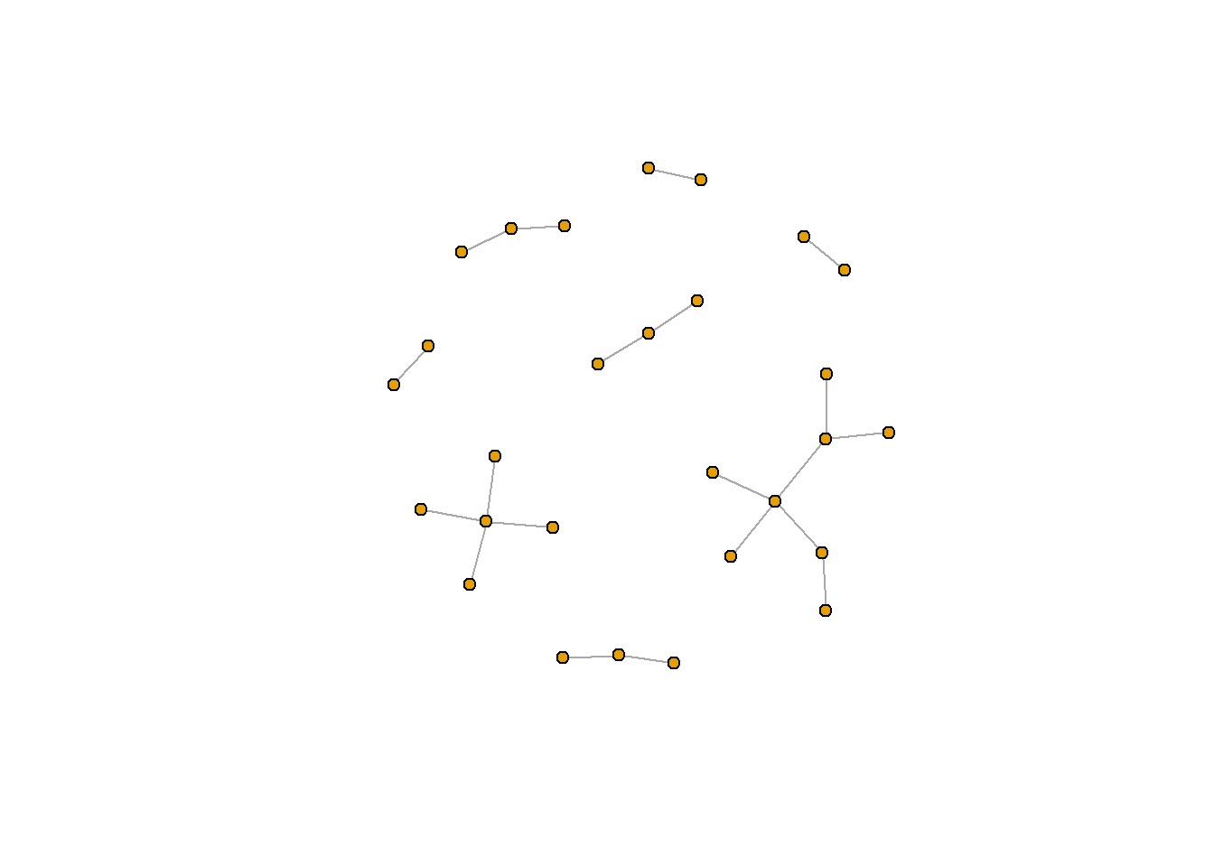
Note the difference between when we plot rt_graph2 and rt_graph3! rt_graph3 has fewer nodes, but we can see the structure a little bit better.
Let’s plot this with a few changes. first, we’ll remove the labels of the nodes using the vertex.label argument (the structure of the network is hard to see because the labels are in the way). We’ll also decrease the size of each node (the default is 20).
plot.igraph(rt_graph3,
     vertex.label=NA, vertex.size=5)
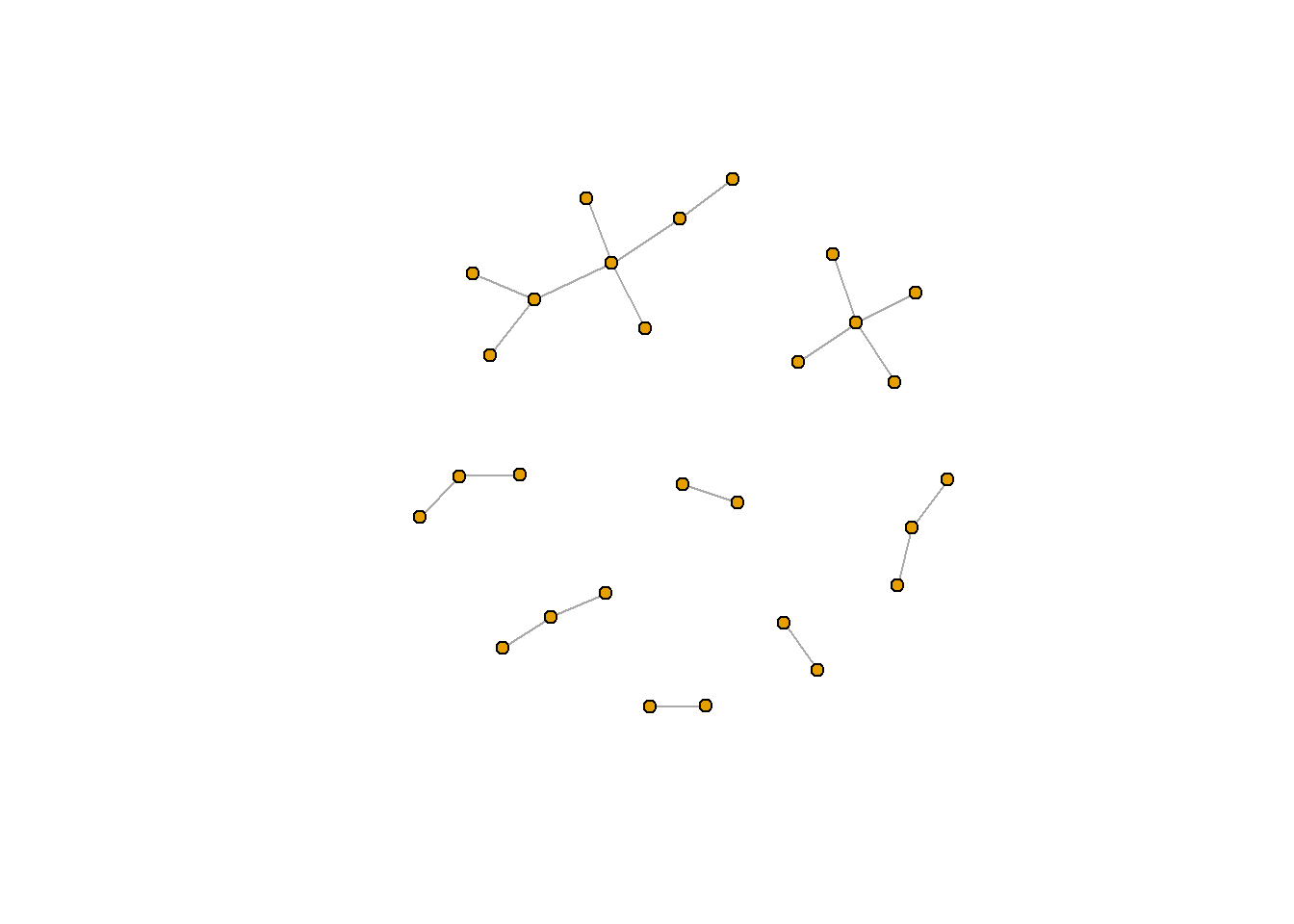
That looks a lot better!
Weights
Another thing we may want to do is weight the edges of a network. To do so, we cna add an edge attribute using the set_edge_attr() function. For example, let’s weight our network using the count of retweets (something we constructed when we processed the data). set_edge_attr() takes three arguments: the network, the name of the new attribute (variable), and how to calculate the value. In this example, we’ll use rt_pair_ct$count.
rt_graph_weight <- set_edge_attr(rt_graph2, "weight", value = (rt_pair_ct$count -3))
Next, let’s use our weighted igraph data to plot. In addition to using the igraph with the weighted data, we will need to also put the count-weight in the edge.width argument of plot.igraph().
plot.igraph(rt_graph_weight,
     vertex.label=NA, vertex.size=5,
     edge.width=E(rt_graph_weight)$weight)
In this example, the lines are pretty thick, but you can play around with the value argument in set_edge_attr() to find a size that works. For example, try dividing the value argument by 2 (it should look something like this: value = (rt_pair_ct$count -9)/2).
Format Algorithms
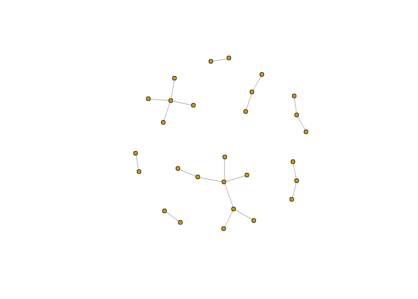
Importantly, network can be structured differently for a number of reasons. One important reason is because the “start point” of the node is randomly selected. If you want to make sure your figure is repeatable, you will need to use set.seed(), a function in R which sets a consistent start point. set.seed() is essential for reproducable results, and I often include my set.seed() function at the top of my script (before or after I load in the relevant packages).
set.seed(381)

plot.igraph(rt_graph3,
     vertex.label=NA, vertex.size=5)
Learn more about set.seed() using the help function (?set.seed).
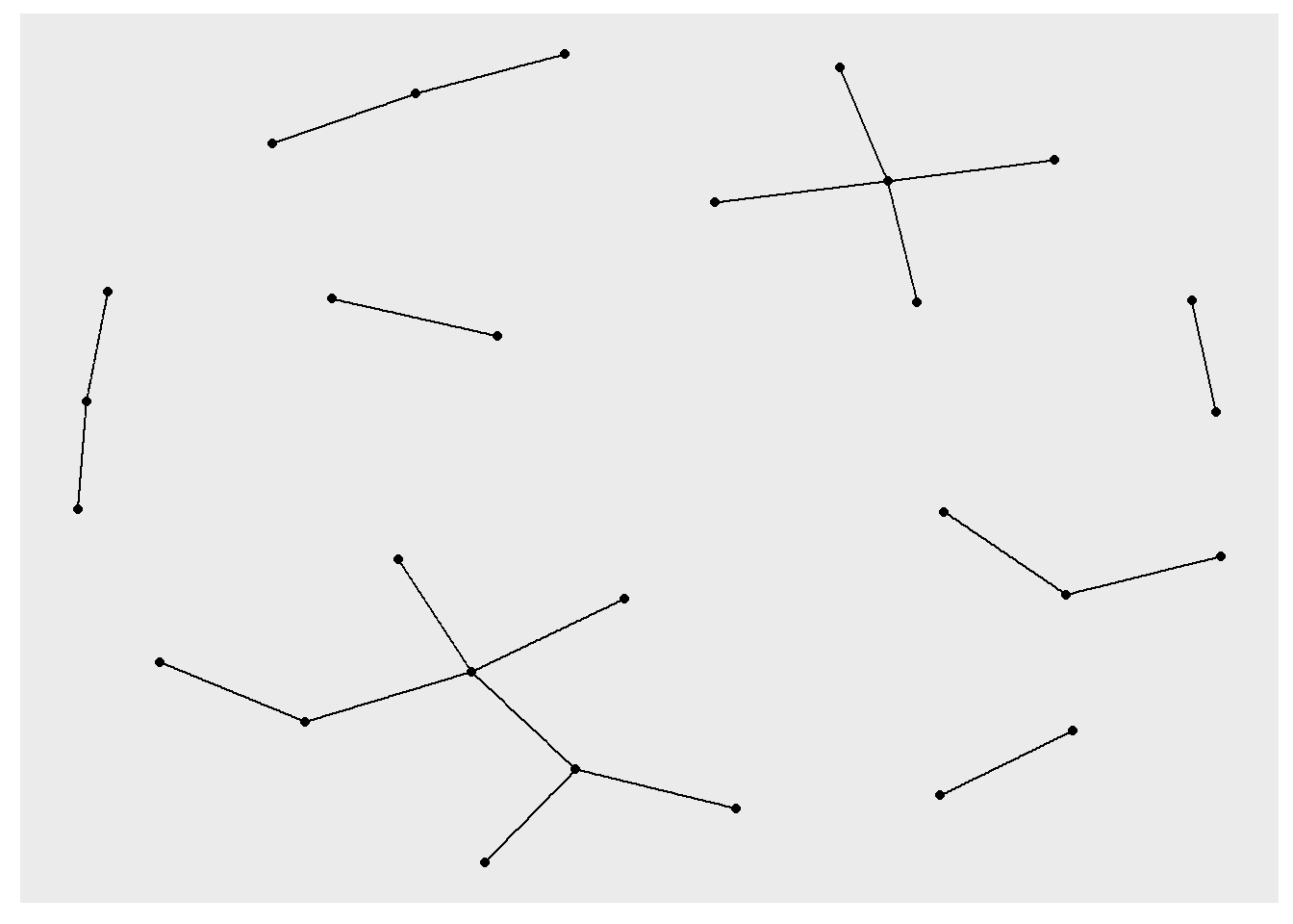
Another really important reason is the algorithm you use to lay out the nodes. There are many different formats. Several really common ones include the Frucherman-Reingold layout (fr) and the Kamada Kawai layout (kk). When attaching a layout to plot.igraph(), you need to first construct the layout using the algorithm-specific function (for example, to use the kk layout, use layout_with_kk()). You can then pass this new layout to the layout argument in plot.igraph().
To reiterate: to alter the layout, you need to first construct the layout (with a layout_with_() function) and then use that layout in the layout argument of igraph::plot.igraph().
rt_graph_kk <- layout_with_kk(rt_graph3) #Kamada Kawai
rt_graph_fr <- layout_with_fr(rt_graph3) #Frucherman-Reingold
rt_graph_dh <- layout_with_dh(rt_graph_weight) #Davidson-Harel


plot.igraph(rt_graph3, layout = rt_graph_kk,
     vertex.label=NA, vertex.size=5)
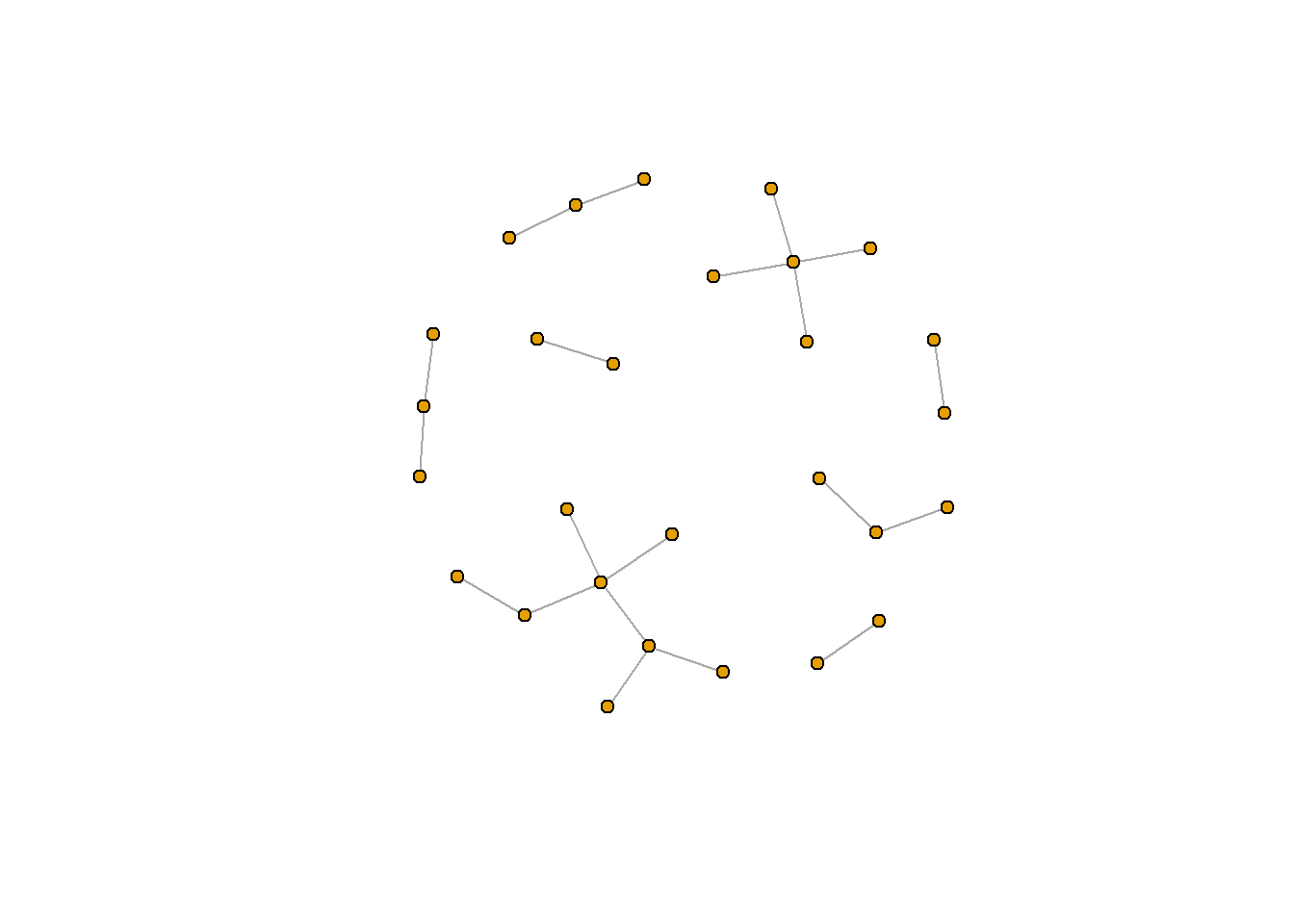
plot.igraph(rt_graph3, layout = rt_graph_fr,
     vertex.label=NA, vertex.size=5)
plot(rt_graph3, layout = rt_graph_dh, #notice that we can also use plot() as a shorthand
     vertex.label=NA, vertex.size=5)
You can see the full list of network layout algorithms in igraph here.
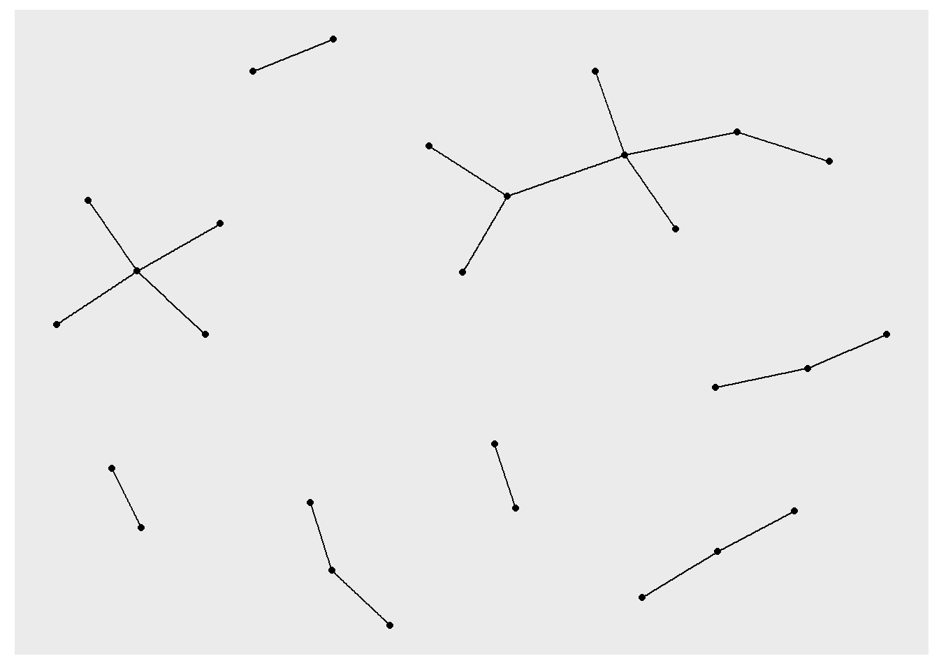
A useful function for picking the appropriate graph layout for your data is layout_nicely(), which is also in igraph. You can check ?layout_nicely() for more information. In most cases, this function will use the Fruchterman-Reingold layout (if there are less than 1000 verticies) or the DrL layout (if there are more than 1000 vericies).
rt_graph_nice <- layout_nicely(rt_graph3) #Kamada Kawai

plot(rt_graph3, layout = rt_graph_nice,
     vertex.label=NA, vertex.size=5)
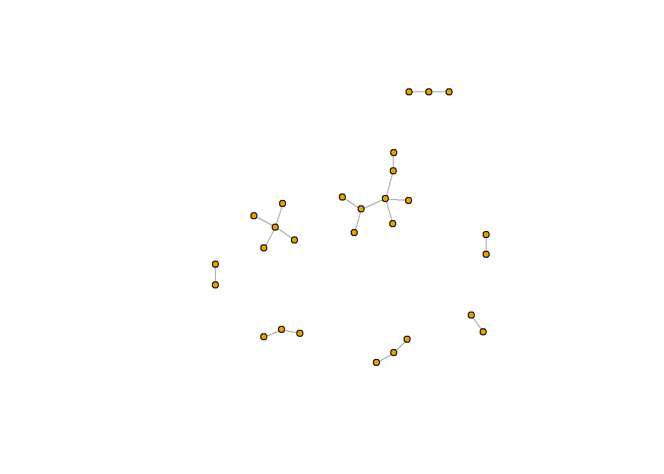
ggraph
Another option to display network is ggraph. The function ggraph() is similar to ggplot(): you create a ggraph with the datset, determine the layout, and then add geoms to your ggraph. Because networks are displayed using verticies (nodes) and links (edges), you will need at least two geoms: geom_edge_link() and geom_node_point().
Unlike plot.igraph(), you do not need to use two functions to use a specific layout algorithm. Instead, you can provide that information in the ggraph() function as an argument. This argument takes a certain set of strings (each string represents a different algorithm). For example the string "kk" represents Kamada Kawai
set.seed(381)

ggraph(rt_graph3, layout = "kk") +
  geom_edge_link() +
  geom_node_point()
## Warning: Using the `size` aesthetic in this geom was deprecated in ggplot2 3.4.0.
## i Please use `linewidth` in the `default_aes` field and elsewhere instead.
ggraph(rt_graph3, layout = "fr") +
  geom_edge_link() +
  geom_node_point()
ggraph(rt_graph3, layout = "drl") +
  geom_edge_link() +
  geom_node_point()
ggraph() does contain other potentially useful geoms. Below, for example, I use geom_edge_arc().
ggraph(rt_graph3, layout = 'fr') +
  geom_edge_arc()
Learn more about different ggraph geoms here.
Chapter 17 Social Network Analysis
Hello! Today, we’ll be talking about social network analysis. Network analyses are analyses of structure, which can be really important for studying things like how information flows on social media. In this tutorial, we will cover three broad topics: 1: preparing data for network analysis, 2: calculating network measures, and 3: constructing network graphs.
For this tutorial, we will be working with two new packages:
igraph(which is used for network analysis preparation and analysis–the bulk of what we’ll be learning will be from here) andggraph(a package for plotting networks using principles that are similar toggplot2). In this tutorial, we’ll also use the academic twitter dataset that we used last week.What are the variables in this dataset?
17.1 Data Cleaning
Since our analysis is focused on retweets, let’s subset our data by pulling out all the tweets that are retweets. For our analysis, we are also primarily interested in two pieces of information: who made the original post (
retweet_screen_name) and who did the retweeting (screen_name), so we’re going to focus on these two columns.Now that we have our data, let’s filter out some things we may not want. Our tweet corpus has a lot of retweets (4,116,592 to be exact), so maybe we want to only look at retweet activities that happen 5 or more times. We also probably want to exclude cases where people are retweeting or quote tweeting themselves. We can do so using a piped chunk of code that combines
ddply(),filter()andsubset().In the above chunk, we use
ddply()to count (usingnrow()) the times wherescreen_nameis retweetingretweet_screen_name. For example, if I (@josephinelukito) retweet the NY Times (@nytimes) 10 times, the first line of this chunk will return aV1observation of 10. Then, wefilter()for all instances whereV1(the count variable) is 9 or less andsubset()all the tweets where thescreen_nameand theretweet_screen_nameare not the same (if I retweet myself 14 times, this would be removed).Learn more about
ddply()in theplyrpackage, check out this StackOverflow responseThe last line,
colnames()renames the columns of the data framert_pair_ct.Finally, we have a dataset of 2562 retweet relationships. If you look at the data frame using
View(), you’ll notice that there are 3 columns:tw_retweeter,tw_originalposterandcount(we just renamed these variables). This generally follows network structure: at minimum, your network analysis will focus on two columns.17.2 Network Data Wrangling
Networks are comprised of two things: nodes (also known as “vertices”, which is the plural for “vertex”) and edges (also known as “links” or “lines”). I’ll be using these terms interchangeably throughout the tutorial so you can familiarize yourself with both terms.
In our analysis, each vertex represents an account and each edge represents the relationship between them (in this case, the retweet relationship). Lines can be directed (where each edge has a direction, or arrow) or undirected. For example, we can illustrate a network with arrows pointing from the original tweeting account to the account that retweeted. Or, we can simply show it as an undirected relationship.
Because networks rely on this node-edge structure, we need a data frame that contains information about the nodes we are interested in. Luckily, we have just constructed such a data frame! In our data frame, each observation in
tw_retweeterandtw_originalposteris a node, and each row is an edge (the relationship between two nodes). We also have some directionality–we know that the retweeter’s tweet is derived from the original poster. And finally, we have some useful count data to tell us how frequently an account is retweeting another account.So now, we are ready to contruct our graph! We can do so using the
igraphfunctiongraph_from_data_frame().Simple right? What does this this data structure look like?
One thing you may notice in the environment is that our new
igraphobject is a list. This list contains a lot of informtion–as you can see, when you print out the objectrt_graph2, it will show you some example lines between nodes.17.2.1 Directed Graphs
Another thing you may have noticed is that we added the argument
directed = FALSE. This argument is used to remove any directionality. By defualt, though,graph_from_data_frame()will assume a directionality.Note here that when we look at the
igraphobjectrt_graph2_directed, the edges now have an arrow indicating directionality. When determining direction, the nodes in the first row (tw_retweeter) has a directional edge pointing to to the nodes in the second column (tw_originalposter)17.3 Network Metrics
Now that we have our
igraphobject, we can now calculate some metrics for it. One really popular metric are measures of centrality. Three popular measures of centrality are degree centrality, closeness centrality, and betweenness centrality.17.3.1 Degree Centrality
Degree centrality refers to how many links are attached to a node. It is particularly useful for identifying nodes that are particularly central or important to a network. Presumably, if a node has more edges, it is perceived as more “degree central” to a network.
Learn more about degree centrality here.
degree()(and all the centrality functions) will produce “named” numeric. If you check out thedegree_centralityobject (e.g., usingView(degree_centrality)), you will see that thedegree()function produces a “named” vector (check outis.vector(degree_centrality)). This numeric vector has a different name for each row (for each node). Because each account’s name is referenced in the row name, you are able to save the results ofdegree()to the igraph object (in our case,rt_graph2.17.3.2 Betweenness Centrality
Betweenness centrality is focused on nodes in “the shortest path” between two nodes (this shortest path is called a geodesic path). It is based on the principle that every pair of verticies has a “shortest path” from one vertex to another. The more often a node acts as a “bridge” between two other nodes’ geodesic (shortest) path, the higher its betweenness centrality in the network.
Learn more about betweenness centrality here.
17.3.3 Closeness Centrality
The last centrality metric we will cover is the closeness centrality. Like the betweenness centrality, this centrality metric is based on the shortest path between nodes. It is measured based on the average geodesic path between that node and all the other nodes. A node that is “more close” to other nodes (i.e., fewer shortest paths) is therefore considered more central.
Although betweenness and closeness centrality are similar, they are not the same. Betweenness is focused on how dependant other nodes are to that node. Closeness is focused on how independent a node is to other nodes. Learn more here.
All three metrics can reveal how important individual nodes are to a network.
We can also use this information to make the network more focused. Below, we use the
degree()centrality by deleting all nodes (verticies) that has a degree centrality of 1 or lower (i.e., nodes with a degree centrality score of 1 are removed). We will also useigraph::simplify(), a function which deletes the loops and redundant edges.17.3.4 Neighbors
In addition to these network-level metrics, it can sometimes be useful to see what other nodes are close to a specific node. Nodes that are adjacent to one another (i.e., nodes that share one edge) are considered “neighbors”. We can identify the neighbors using the
neighbors()function inigraph.Using the centrality metrics, we can identify verticies that are considered central to a network, and then see what other nodes it has a link to. If your graph is dirextional, you can also set a “mode” using the
modeargument.Learn more about directionality in this PNAS article.
17.4 Plot
Finally, we turn to plotting networks. There are many ways to plot a network, but we’ll walk through two in this tutorial. In the first, we will plot using the
plot()orplot.igraph()function in theigraphpackage.. Then, we will plot usingggraph().17.4.1 Base R
Note the difference between when we plot
rt_graph2andrt_graph3!rt_graph3has fewer nodes, but we can see the structure a little bit better.Let’s plot this with a few changes. first, we’ll remove the labels of the nodes using the
vertex.labelargument (the structure of the network is hard to see because the labels are in the way). We’ll also decrease the size of each node (the default is 20).That looks a lot better!
17.4.2 Weights
Another thing we may want to do is weight the edges of a network. To do so, we cna add an edge attribute using the
set_edge_attr()function. For example, let’s weight our network using the count of retweets (something we constructed when we processed the data).set_edge_attr()takes three arguments: the network, the name of the new attribute (variable), and how to calculate the value. In this example, we’ll usert_pair_ct$count.Next, let’s use our weighted igraph data to plot. In addition to using the igraph with the weighted data, we will need to also put the count-weight in the
edge.widthargument ofplot.igraph().In this example, the lines are pretty thick, but you can play around with the
valueargument inset_edge_attr()to find a size that works. For example, try dividing thevalueargument by 2 (it should look something like this:value = (rt_pair_ct$count -9)/2).17.5 Format Algorithms
Importantly, network can be structured differently for a number of reasons. One important reason is because the “start point” of the node is randomly selected. If you want to make sure your figure is repeatable, you will need to use
set.seed(), a function in R which sets a consistent start point.set.seed()is essential for reproducable results, and I often include myset.seed()function at the top of my script (before or after I load in the relevant packages).Learn more about
set.seed()using the help function (?set.seed).Another really important reason is the algorithm you use to lay out the nodes. There are many different formats. Several really common ones include the Frucherman-Reingold layout (
fr) and the Kamada Kawai layout (kk). When attaching a layout toplot.igraph(), you need to first construct the layout using the algorithm-specific function (for example, to use thekklayout, uselayout_with_kk()). You can then pass this new layout to thelayoutargument inplot.igraph().To reiterate: to alter the layout, you need to first construct the layout (with a
layout_with_()function) and then use that layout in thelayoutargument ofigraph::plot.igraph().You can see the full list of network layout algorithms in igraph here.
A useful function for picking the appropriate graph layout for your data is
layout_nicely(), which is also inigraph. You can check?layout_nicely()for more information. In most cases, this function will use the Fruchterman-Reingold layout (if there are less than 1000 verticies) or the DrL layout (if there are more than 1000 vericies).17.5.1 ggraph
Another option to display network is
ggraph. The functionggraph()is similar toggplot(): you create aggraphwith the datset, determine the layout, and then addgeomsto yourggraph. Because networks are displayed using verticies (nodes) and links (edges), you will need at least twogeoms:geom_edge_link()andgeom_node_point().Unlike
plot.igraph(), you do not need to use two functions to use a specific layout algorithm. Instead, you can provide that information in theggraph()function as an argument. This argument takes a certain set of strings (each string represents a different algorithm). For example the string"kk"represents Kamada Kawaiggraph()does contain other potentially useful geoms. Below, for example, I usegeom_edge_arc().Learn more about different
ggraphgeoms here.17.6 Bonus: Community Detection
The last thing we’ll talk about is community detection. This is the process of identifying groups (or clusters) of nodes and edges. Like the formatting of figures, community detection relies on a range of algorithms. In this tutorial, we’ll apply two: communities derived from short random walks (
cluster_walktrap()) and communities based on propagating labels (cluster_label_prop())Learn more about
cluster_walktrap()hereLearn more about
cluster_label_prop()hereAnother function that may be useful is
cluster_optimal(), which will calculate the “optimal community structure” based on modularity. Modularity is a network metric used to detect communities based on the nodes’ distance to other nodes within their community vs nodes outside their community. One reason why we do not run it this time is because it takes a little longer to run compared to the other community detection strategies.Learn more about modularity here.
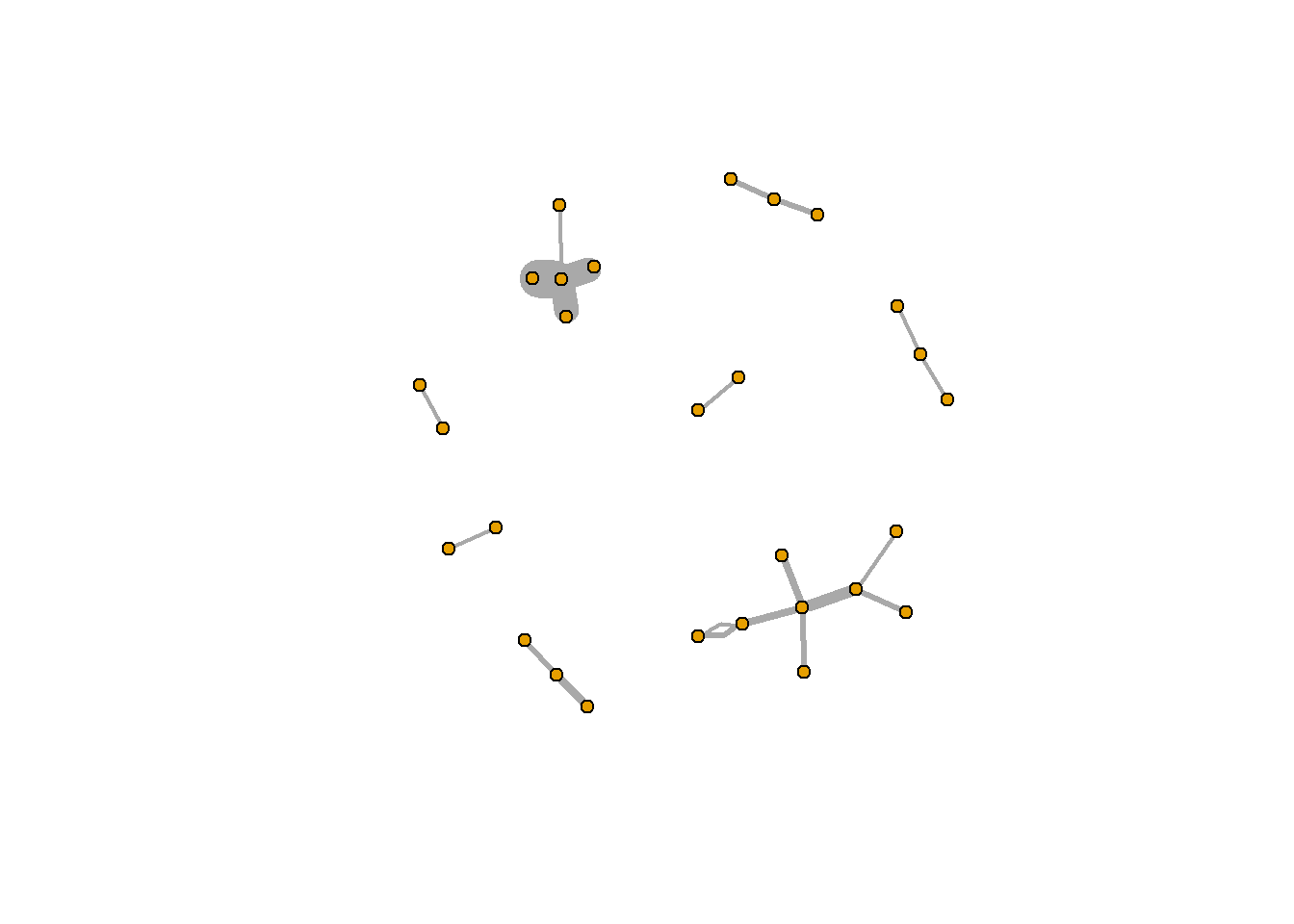
We can then immediately plot these objects using
plot.igraph(), which will display the circleWant to see which accounts belong to which groups? Pull out the right list from the
clporclwobject.What if we wanted to know a specific account’s community?
And what if we wanted to see the accounts in a specific community?
Learn how to change the colors of the communities here