4 Sense checking data, descriptive statistics, and simple plots
4.1 The study by Paal, Carpenter and Nettle (2015)
Over the next few sessions, we are going to work with the data from a study of behavioural inhibition that I was involved in (Paál, Carpenter, and Nettle 2015). Behavioural inhibition is the capacity to inhibit a response that you might otherwise make automatically. For example, let us say that you are the in the habit of checking social media every time you pick up your phone. You exhibit behavioural inhibition if you pick up your phone and don’t check social media, for example because you have decided to have a weekend free of social media. Your behavioural inhibition has failed if you find yourself checking anyway.
In the study, people’s capacity for behavioural intuition was estimated using a task called the stop signal reaction time task. In this task, participants sit at a computer and have to respond as quickly as they can (with the appropriate key) when a square or circle appears on their screen. On a minority of trials, an audible tone (the stop signal) is played just before the square or circle appears. When the tone is played, the participant has to not respond at all (to display behavioural inhibition).
In the task, participants complete over two hundred trials. When the stop signal is played, the time gap between it and the appearance of the square or circle is varied. Sometimes the participant succeeds in inhibiting the response, and sometimes they fail, because they were too far down the road to pressing a key. From this, it is possible to estimate how much time the participant needs on average in order to successfully inhibit their response. This variable is called the SSRT. It is measured in milliseconds. A person with a large SSRT is not so good at behavioural inhibition. They can only manage to stop the response if they have a lot of forewarning. A person with a small SSRT is good at behavioural inhibition. They can shut down the response even if the instruction to do so comes very late.
The next thing to do is to understand the design of the study. Go to the paper online (https://peerj.com/articles/964/) and read the Introduction. I will give away already that this is an experimental study rather than an observational one. Having read the Introduction (but no further), fill in the table below. SSRT is main the dependent or outcome variable, so I have filled that in already.
| Dependent variable (measured) | SSRT |
| Independent variable (manipulated) | |
| Covariates (measured) | |
Having understood the study a bit, we are going to do an initial exploration session with the dataset. In such a session, there are three things I would generally want to do:
sense checking the data;
calculating descriptive statistics;
doing some quick plots to help understand what is going on;
To do this, we first need to get the dataset and load into R.
4.2 Getting the data
The data are published online with the paper. In the online version (https://peerj.com/articles/964/) scroll down to Supplemental Information, which is after the Discussion but before the References, and you will see a link to the data file. Most cognitive science papers these days publish their raw data. Most often it is in a separate repository with a link from the online version of the paper. In this case, you just access it directly from the online version of the paper. In the Supplemental Information, click on the link to the data. You should see 58 rows of data, preceded by a row of column names. The precise URL of this data file is: https://dfzljdn9uc3pi.cloudfront.net/2015/964/1/data_supplement.csv.
Open a new script in RStudio. Start it with a comment so that you know what script it is:
The next thing to do is save this script (File > Save or the little disk icon). Make sure you save it somewhere you can find it again. I recommend you make a dedicated folder or set of folders for your work on this course. All of the other stuff you type today, so so in the script file so that you can save it, keep it, and modify it as needed.
Back in your R script, type and run the following line:
This loads in the contributed package tidyverse which we will always use in this course. Your scripts will therefore always need this line. You need to have previously installed the tidyverse package on your computer; look back to week 1 practical if you have not done this.
The next line you need in the script is the one that reads in the data (you can use copy and paste from your browser to get the long URL):
Run this line. You should receive some confirmation output, and then, if you go to the Environment tab of the window at top right of your screen, you should see that an object called d should have appeared, a data frame consisting of 58 observations of 13 variables. You can expand the information on d in the Environment window by clicking the small blue and white arrow. Note that it was completely arbitrary that I called this data frame d; if you want you can call it b or behavioural_inhibition_data, or whatever you want.
4.3 Step one: sense checking the data
The first thing you always want to do when you load in a data frame is check that you are getting what you expected, understand what the variables are, and do any tidying up that is needed prior to the analysis. It is worth spending some time on this step, to make sure you understand exactly what you have, and spot any oddities.
Go back to the paper and check how many participants they had. Do you have one set of observations in your data frame for every participant they say they tested?
Now let us explore what the dataset contains. You can get a list of the variable names in your data frame using the function colnames.
##  [1] "...1"
##  [2] "Experimenter"
##  [3] "Sex"
##  [4] "Age"
##  [5] "Deprivation_Rank"
##  [6] "Deprivation_Score"
##  [7] "Mood_induction_condition"
##  [8] "Initial_Mood"
##  [9] "Final_Mood"
## [10] "SSRT"
## [11] "GRT"
## [12] "Correct_responses_go_trials"
## [13] "Response_Probability"
We can see some things we are looking for, such as SSRT (the DV), Mood_induction_condition, which is presumably the IV, Age and so forth. The first column has a bit of a weird name (...1), so let’s investigate what this is.
##  [1]  1  2  3  4  5  6  7  8  9 10 11 12 13 14 15 16 17 18
## [19] 19 20 21 22 23 24 25 26 27 28 29 30 31 32 33 34 35 36
## [37] 37 38 39 40 41 42 43 44 45 46 47 48 49 50 51 52 53 54
## [55] 55 56 57 58
We can see that this first column is just the participant number. As a rule you should always have variables that are comprehensibly labelled (for your own benefit as well as the benefit of your readers). So let’s change this to a better column name.
Now run colnames(d) again, you should see the new name.
Now let’s think about the IV, the mood induction condition (neutral or negative) that the participants were assigned to. Because assignment was at random, about half the participants should have been in the neutral condition and about half in the negative one. So let’s check that this is about right. Let’s make a table of the values to see that we understand.
##
##  1  2
## 30 28
Hmm. We have about half the cases with a value of 1 and the other half with a value of 2. That makes sense, but it is bad coding by the researchers, because we don’t know which condition is represented by 1 and which by 2. How are we going to find out?
We know from the paper that the researchers measured people’s mood on a scale at the beginning of the experiment, and again at the end. This is represented in the dataset by the variables Initial_Mood and Final_Mood. So, we ought to be able to tell which are the group who had the negative mood induction because their mood will have got worse over the course of the experiment. So, first let us make a new variable which is the change in mood over the course of the experiment. We do this using the mutate function.
Let’s unpack this. Look at the right hand side first. We are modifying the data frame d (using the mutate() function) by adding a new variable, called Difference_Mood which is computed by subtracting the value of Initial_Mood from Final_Mood. We are then assigning this new improved data frame to object d, updating the d we had. Once you run this, you should see that a 14th column has indeed appeared in the data frame with the appropriate name.
I am going to show you a different way of achieving this same result, because it will be useful later. You can chain together different operations on the same object in R by using the symbol %>%. This is referred to as ‘pipe’, and informally, I think of it as ‘and then….’. So to make our new variable Difference_Mood, we could do:
Think of the right-hand side of this as something like ‘take d, ’and then’ mutate it with a new variable as defined. We will see more examples of piping later.
Ok, so we are still trying to find out which experimental condition is 1 and which is 2. What we know is that the group whose mood has got worse (negative value of Difference_Mood) is probably the negative one. This means we need summary statistics (for example the mean) of the Difference_Mood variable.
First, let me show you how to get the descriptive statistics of a variable:
## # A tibble: 1 × 2
##        M    SD
##    <dbl> <dbl>
## 1 -0.328  10.4
As you see we get a little table. The average change of mood over the course of the experiment was close to zero (mood is measured on a 100-point scale, so -0.328 is almost no change). And there was some variation between participants in this, a standard deviation of about 10. To explain the line of code we used to do this, we took d, and then we used a function summarise(), asking in particular for a summary variable M which would be the mean change in mood, and a variable SD which would be the standard deviation.
But, this is not we wanted. We wanted the descriptive statistics by experimental condition. To get this, we need an extra function, `group_by()’ in our line of code.
d %>% group_by(Mood_induction_condition) %>% summarise(M = mean(Difference_Mood), SD = sd(Difference_Mood))## # A tibble: 2 × 3
## Mood_induction_condition M SD
## <dbl> <dbl> <dbl>
## 1 1 -3.23 5.28
## 2 2 2.79 13.3Read this as ’take d, and then group it by Mood_induction_condition and then summarise it, giving us the mean and standard deviation of Difference_Mood.
Looking at the output, group 1’s mood went down slightly over the course of the experiment. Group 2’s mood went up a little bit on average, and this group also showed a lot more variability in their change in mood. So, I think it is safe to assume that group 1 were the negative mood induction group, and group 2 were the neutral mood induction group. Let’s make a better version of the Mood_induction_condition variable that actually uses the names of the conditions rather than just numbers:
d <- d %>% mutate(Condition = case_when(Mood_induction_condition == 1 ~ "Negative", Mood_induction_condition == 2 ~ "Neutral"))What this is doing is taking d and then mutating it, to make a new variable called Condition, which takes the value “Negative” when Mood_induction_condition is equal to 1, and “Neutral” when it is equal to 2.
Finally, check for yourself that this has all worked:
Make sense?
4.4 Step two: descriptive statistics
The next step that you must always do after checking you understand what is in your dataset is to calculate the descriptive statistics of the variables of interest. I am going to show you the way to do this using tidyverse, and then also a neat contributed package called table1 that will do it for you in a nice quick way.
The descriptive statistics for a continuous variable are some measure of the average or central tendency, usually the mean (though other things like the median are also possible and preferable under some circumstances), and some measure of the amount of disperson around this central tendency, usually the standard deviation (though other things like the inter-quartile range or range are also possible). For a qualitative variable, the descriptive statistics are the frequencies, i.e. how often each possible value occurred.
Looking back at your notes above, you can see that the main variables we care about, other than the experimental condition, are the DV, SSRT, and two covariates (Age and Deprivation_Score). (We said we were going to ignore GRT for our purposes, though the researchers do treat this variable in their paper. ). We could also add the mood change over the course of the experiment, Difference_Mood, which we calculated in the previous section. Difference_Mood is an important class of variable in cognitive science, a manipulation check variable. That is, the researchers aimed to make people’s mood worse (using the mood induction procedure). To interpret the results, it is important to check that they did successfully achieve this. The Difference_Mood variable tells us that they did - but not much! They managed to move the negative group’s mood about 3 points on a 100 point scale, which is not a lot. It is important to bear this in mind in interpreting the results.
To get our descriptive stats, we use the summarise() function that we met before:
d %>% summarise(M.SSRT = mean(SSRT),
                SD.SSRT = sd(SSRT),
                M.Deprivation_Score = mean(Deprivation_Score),
                SD.Deprivation_Score = sd(Deprivation_Score),
                M.Age = mean(Age),
                SD.Age = sd(Age),
                M.Difference_Mood = mean(Difference_Mood),
                SD.Difference_Mood = sd(Difference_Mood)
                )
## # A tibble: 1 × 8
## M.SSRT SD.SSRT M.Deprivation_Score SD.Deprivation_Score
## <dbl> <dbl> <dbl> <dbl>
## 1 238. 43.9 0.455 0.271
## # ℹ 4 more variables: M.Age <dbl>, SD.Age <dbl>,
## # M.Difference_Mood <dbl>, SD.Difference_Mood <dbl>We get a little table (though it is a bit ugly and you may have to scroll across to see all the values). It shows for example that the mean SSRT is about 238, with a standard deviation of around 44.
But wait! When we look at the mean and standard deviation of Age it is NA. What does this mean? NA in R means missing or uncalculable. How can the average age be uncalculable?
It is because some participants did not give their age; specifically, participant 2, look:
##  [1] 65 NA 21 60 42 20 64 31 20 20 20 60 30 44 38 47 56 53
## [19] 56 25 57 53 27 40 59 26 22 20 20 24 55 20 20 23 22 21
## [37] 34 22 23 30 31 23 25 23 28 26 23 22 61 20 23 22 22 23
## [55] 28 19 37 22
In R the average of a vector that contains an NA is also an NA, unless we tell it specifically to strip out the NA values before the calculation. We ask R to do this by specifying `na.rm = TRUE’ in the function call.
## [1] 32.77193So, go back to the code chunk where you made your descriptive statistics and insert na.rm = TRUE' when calculating the mean and standard deviation ofAge`. You should now get the values you need.
In an experimental study, you often want your descriptive statistics to be grouped be experimental condition. For example, we want to get a sense of whether the average SSRT is about the same in the negative and neutral conditions. The grouped descriptive statistics are obtained with a simple modification of the code chunk we used above, inserting a group_by() function.
d %>% group_by(Condition) %>%
  summarise(M.SSRT = mean(SSRT),
                SD.SSRT = sd(SSRT),
                M.Deprivation_Score = mean(Deprivation_Score),
                SD.Deprivation_Score = sd(Deprivation_Score),
                M.Age = mean(Age, na.rm = TRUE),
                SD.Age = sd(Age, na.rm = TRUE),
                M.Difference_Mood = mean(Difference_Mood),
                SD.Difference_Mood = sd(Difference_Mood)
                )
## # A tibble: 2 × 9
## Condition M.SSRT SD.SSRT M.Deprivation_Score
## <chr> <dbl> <dbl> <dbl>
## 1 Negative 242. 50.0 0.458
## 2 Neutral 235. 36.8 0.451
## # ℹ 5 more variables: SD.Deprivation_Score <dbl>,
## # M.Age <dbl>, SD.Age <dbl>, M.Difference_Mood <dbl>,
## # SD.Difference_Mood <dbl>The SSRT is only abit higher in the negative than the control condition. The only obvious differences are that the negative group are a bit older (this must have just been luck, since assignment was random), and have a more negative difference in mood, which is expected and we already established.
Finally for this section I am going to show you a neat package that does what we just did in a shorter step. This package is called table1. First, we install the table1 package.
## Error in install.packages : Updating loaded packagesNow, let us load it into the current session (notice, no quotation marks in this command though there were in the previous one:
The table1 package is so named because table 1 of many papers shows the descriptive statistics of the main variables, often by group. This package makes that table for you (you can even write your results section directly from R and spit out this table automatically, using something call RMarkdown that we will meet later).
So, let’s make our table 1.
| Negative (N=30) |
Neutral (N=28) |
Overall (N=58) |
|
|---|---|---|---|
| SSRT | |||
| Mean (SD) | 242 (50.0) | 235 (36.8) | 238 (43.9) |
| Median [Min, Max] | 239 [130, 392] | 234 [164, 329] | 235 [130, 392] |
| Deprivation_Score | |||
| Mean (SD) | 0.458 (0.293) | 0.451 (0.251) | 0.455 (0.271) |
| Median [Min, Max] | 0.375 [0.0108, 0.977] | 0.403 [0.0718, 0.979] | 0.380 [0.0108, 0.979] |
| Age | |||
| Mean (SD) | 34.8 (16.0) | 30.5 (13.3) | 32.8 (14.8) |
| Median [Min, Max] | 27.5 [19.0, 65.0] | 25.0 [20.0, 64.0] | 25.0 [19.0, 65.0] |
| Missing | 0 (0%) | 1 (3.6%) | 1 (1.7%) |
| Difference_Mood | |||
| Mean (SD) | -3.23 (5.28) | 2.79 (13.3) | -0.328 (10.4) |
| Median [Min, Max] | -2.50 [-15.0, 13.0] | 0 [-10.0, 64.0] | 0 [-15.0, 64.0] |
Read the code as ‘give me table 1 containing variables SSRT, Deprivation_Score, Age, and Difference_Mood, by Condition’ (note the | symbol for ‘by’). The table is really informative, giving us not just the mean and standard deviation, but the median, the miniumum, the maximum, and the number of missing values if applicable. You are also told the number of cases in each group and overall.
4.5 Step three: Making some quick plots
There is one final step in an initial session with a dataset: to make some basic plots so you can see what the data look like. These do not have to be the final pretty, publishable plots that we will make in a later week. It is just some quick plots so you can understand what is in your data.
The first useful function is hist(), which returns a histogram of a continuous variable so you can see what the distribution is like. Let’s try:
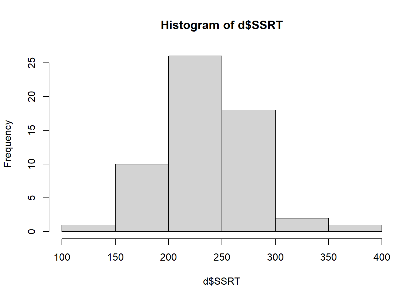 The bars show the number of cases in each of the bins shown on the horizontal axis. From this we can see that most of the SSRT values are around 200 to 300 msec, with a smaller number of more extreme values in either direction. Importantly, the distribution is roughly symmetrical: there are about as many values 100 msec above the mean as there are 100 msec below the mean. This is good to know as if the shape were very different (for example most people had values below 100 msec and a few had values about 1000 msec), this could affect how we will analyse the data.
By the way, if you want finer bins on the horizontal axis you can set this.
 You can also specify all kinds of other features like axis names and colours, but as we are just eyeballing the data, this does not matter too much.
Now try making histograms for Age andDeprivation_Score`.
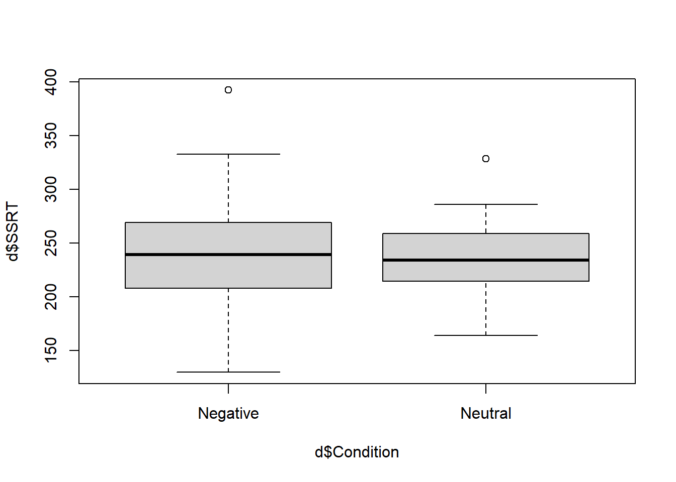
The second type of quick plot that it is worth doing is called a boxplot. This is useful for understanding how the distribution of a continuous variable (like SSRT in the present case) changes across levels of a qualitative variable (like Condition). Let’s make one:
 In this expression, note the symbol
 ~. This is an important one in R. It is called tilde in English and we can usually paraphrase what it does as ‘by’, as in ‘make a boxplot of SSRT by Condition’.
What are we looking at here? The thick horizontal lines represent the median SSRTs in the two conditions. You can just about see (as we already know) that the median is very slightly higher in the Negative than the Neutral condition. The filled boxes are the areas containing half of the data points in each condition (i.e. the region from the datapoint at the 25th percentile to the one at the 75 percentile, known as the inter-quartile range). The whiskers that point out from the boxes aim to capture the variability of the remaining data in both directions. The rule establishing the length of the whiskers is a bit complex, but basically they go to the largest (smallest) data point that is within 1.5 times the height of the box in either direction. Any remaining values outside the whiskers are shown as isolated points or outliers (there is one positive outlier in both conditions here).
So what we get from this boxplot is that the distribution of SSRTs is not very different in the two conditions: the central tendency is very slightly higher in the Negative condition, and there is also more dispersion in the Negative condition, as indicated by the wider box and wider whiskers.
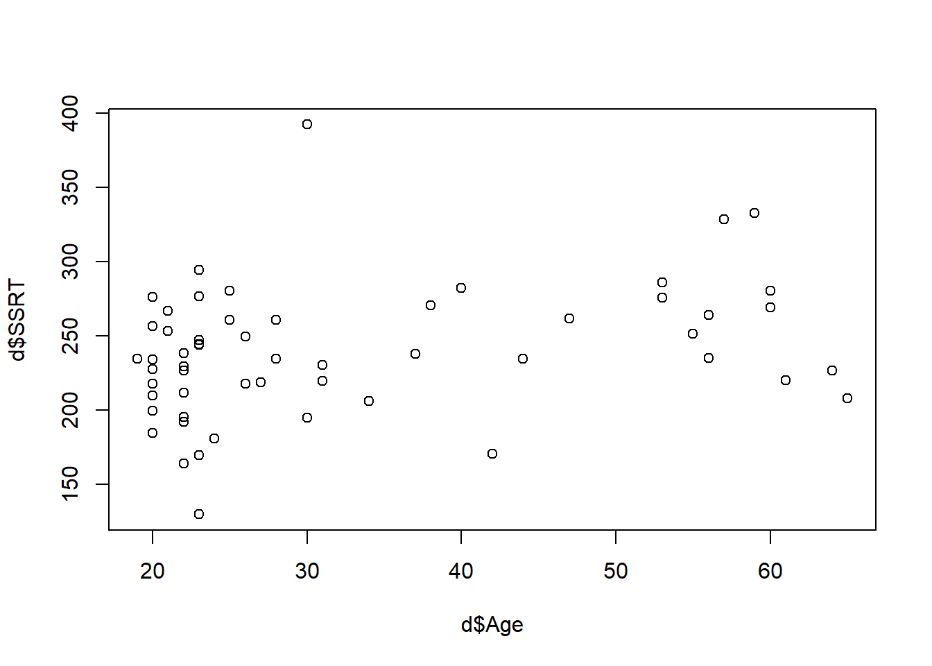
The final kind of quick plot we might want to make is the scatterplot, which we make with the function plot(). A scatterplot is useful when you want to quickly understand if there is any obvious relationship between two quantitative variables. Here, let’s do it for Age and SSRT.
 Note the
 ~ meaning ‘by’ again. What do we see? It looks like some of the higher SSRTs are in the older participants. Or maybe to be more precise, there aren’t any older participants with very low SSRTs. Might this indicate that SSRT gets greater with age (in other words, people get worse at behavioural inhbition as they get older?).
4.6 Summary
In this session, we have learned to:
Load in a dataset from a published paper;
Sense check the data, including counting cases, renaming columns, making a new variable, recoding the values of a variable;
Obtain descriptive statistics, both overall and by group;
Do some quick plots of the data, such as histograms, boxplots and scatterplots.