9 Making publication-quality plots
In this session, we are going to learn to make graphs and figures that are good enough to submit to a scientific journal or include in a thesis. We do this using a contributed package called ggplot. This package, created by Hadley Wickham, implements an idea called The Grammar of Graphics, in which graphical representations are built up progressively out of smaller elements, like words being chained together to make up sentences. ggplot is part of the mega-package called tidyverse, so as long as you run the following code at the beginning of your session or script, you will have access to ggplot and all its functions.
9.1 A new dataset: Fitouchi et al. (2022)
9.1.1 Background to the study
We are going to work with a new data set for the next couple of sessions. The dataset comes from work by Leo Fitouchi, of the ENS-PSL, and now the Institute for Advanced Studies in Toulouse, on why people moralize apparently harmless activities (Fitouchi et al. 2022). For example, people often think it is morally wrong to be lazy, drink alcohol, eat a lot for pleasure, or have a lot of sex, even if nobody seems to be harmed by this activity. As a rule, people want other people to be good cooperators. Moral disapproval is usually directed towards instances of being a bad cooperator (cheating, stealing, betraying and so on). Fitouchi’s hypothesis is that people think that activities like lazing, drinking alcohol, eating gluttonously, or taking a lot of sexual pleasure, make the individuals who do them become less good cooperators, because they lose their self-control. Thus, these behaviours are morally disapproved, because although they don’t directly cause harm to anyone else, they have a thought to have a negative effect on cooperative character. (This does not mean this perception is correct, by the way; there is no evidence that eating a lot makes you a bad cooperator. Fitouchi’s hypothesis just requires that the perception is widespread.)
The study we will be looking at is study 1 of the preprint. In this study, around 400 participants read a vignette about a character called Max, who had either recently increased his laziness and gluttony (the indulgence condition) or decreased it (the restraint condition). Thus, this is an experimental study with one independent variable (condition) manipulated between subjects. The key dependent variable is a rating of the likely change in Max’s cooperativeness, named coop_score in the data. This is made up of averaging together four individual questions about the effects of the lifestyle change on Max’s propensity to cooperate into one score. There are other dependent variables and moderators too but we are not going to worry about those here. There is also a key covariate: puritanism_score. This is a scale measuring the participant’s puritan attitudes. You would expect people high in puritanism score to feel that indulgence would be particular corrosive to Max’s cooperative character.
You can find the pre-registration of the study (study 1 remember) in Fitouchi’s immaculately organized Open Science Framework repository for this project (https://osf.io/52thu/). Reading this and/or the preprint will help you follow along.
9.1.2 Getting the data
The raw data and R scripts are all available in the repository at https://osf.io/52thu/. In the repository, the data are provided in a very raw form, so there is a lot of preliminary processing in Fitouchi’s script (merging of two datafiles because the data were collected in two waves, deleting redundant rows, calculating scores and so on). If you want to make the version of the data we are going to work with from scratch (the data frame called df7 in Fitouchi’s script), you need to download the two datafiles for study 1 from the repository, and run Fitouchi’s script up to line 153. This in turn requires you to use the contributed package psych.
It would be good for you to work through this, but in case you want to skip this step and move straight onto today’s exercises, I have made a version of the data with all the preliminary processing already done. That version is downloadable at: https://www.danielnettle.eu/fitouchi_study1_processed_data/.
Go to the link, and download the .csv file into a suitable directory on your computer. Then, set R’s working directory to this location (Session > Set Working Directory > Choose Directory remember).
Then you need to run the following lines (you need tidyverse activated in this session as in all others).
## Rows: 379 Columns: 24
## ── Column specification ──────────────────────────────────
## Delimiter: ","
## chr  (1): Condition
## dbl (23): character_1, character_2, character_3, chara...
##
## ℹ Use `spec()` to retrieve the full column specification for this data.
## ℹ Specify the column types or set `show_col_types = FALSE` to quiet this message.
I only called the dataframe df7 because that is what Fitouchi called it in his script.
Now we have the data, look at the column names:
##  [1] "character_1"       "character_2"
##  [3] "character_3"       "character_4"
##  [5] "character_5"       "coop_1"
##  [7] "coop_2"            "coop_3"
##  [9] "coop_4"            "selfcontrol_1"
## [11] "selfcontrol_2"     "selfcontrol_3"
## [13] "selfcontrol_4"     "selfcontrol_5"
## [15] "selfcontrol_6"     "puritanism_1"
## [17] "puritanism_2"      "puritanism_3"
## [19] "puritanism_4"      "Condition"
## [21] "character_score"   "coop_score"
## [23] "selfcontrol_score" "puritanism_score"
The independent variable is Condition, the dependent variable we are going to look at is character_score, and the covariate we are interested in is puritanism_score.
9.2 A first plot: two experimental groups
9.2.1 Making the plot
When you plot with the ggplot() function, you start by defining a canvas whose key dimensions and attributes map onto variables in the dataset. That mapping is called the aesthetic of the plot, controlled by the function aes().Then you add layers progressively to that canvas, notably geometric objects that represent the data (geoms), thematic objects that modify the appearance, and other elements like text annotations. Your plot is itself an R object, which you can print to various output devices, notably the screen, or a picture writer (.jpeg or .png) or a PDF writer.
So, let us say that we want our figure 1 to be a graph of how the dependent variable coop_score is distributed according to the independent variable Condition. This means that the mapping between our canvas and the data frame is as follows:
| Data frame | Figure canvas |
|---|---|
| Condition | Horizontal (x) axis |
| coop_score | Vertical (y) axis |
Let’s set this up:
This says, ’take df7 and then make a ggplot, with the aesthetic such that Condition corresponds to the x-axis and coop_score to the y-axis; then assign this to the object figure1.
Now, let’s have a look at this figure we have made on the screen.
Well it’s not very exciting yet is it? But we have the blank canvas on which we want to work. Let’s start to add some geoms. The most obvious one is the raw data points, which is called geom_point(). We add that as follows (note that the plus has to come at the end of the second line, not the beginning of the third):
figure1 <- df7 %>%
  ggplot(aes(x=Condition, y=coop_score)) +
  geom_point()

# Now print it to the screen
figure1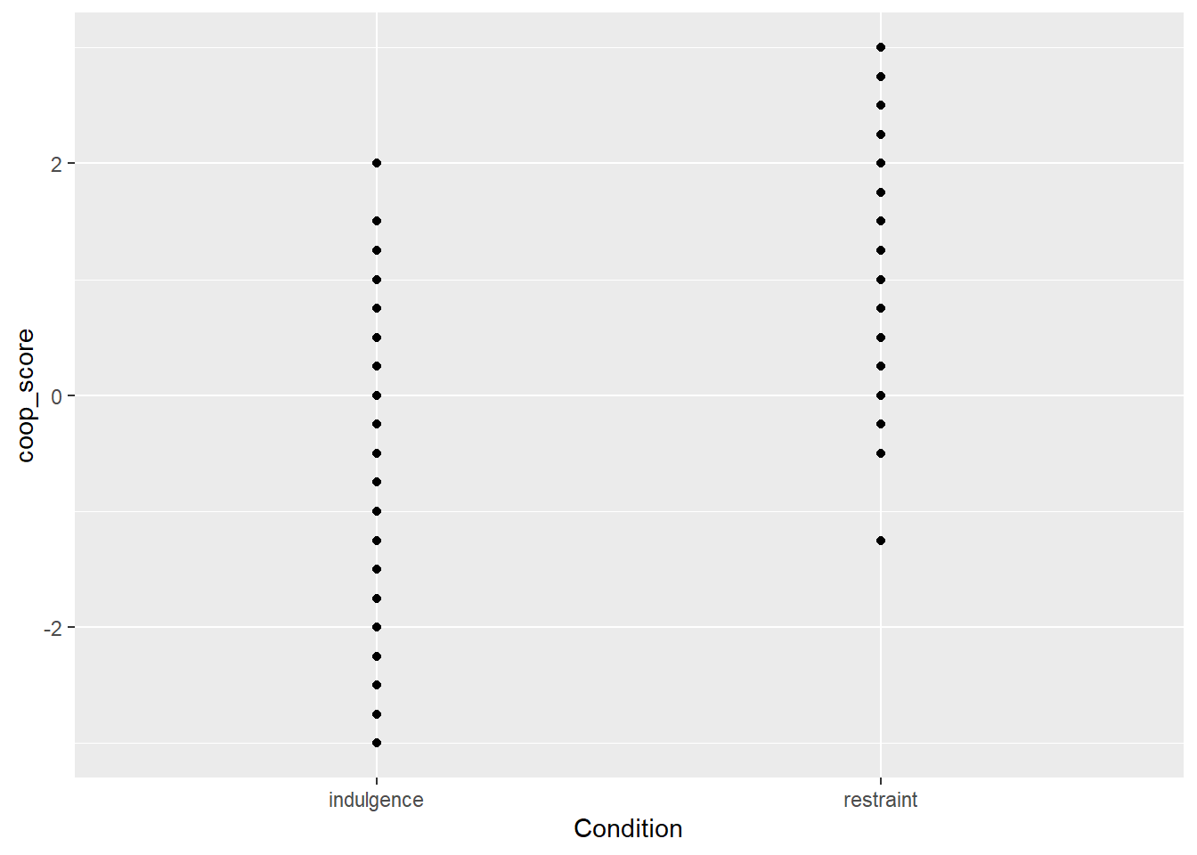
Something is not great here. The problem is that coop_score can only take a limited number of values, and all the data points with the same value are printed on top of one another and you can’t really see the data. You can improve this by adding a specification to geom_point() to jitter the points a bit (randomly perturb them slightly to the left or right. Here is how you do this (the width and height arguments just specify how far you want the jittering to go in each dimension; here I don’t want to jitter at all vertically, I want to see where the scores really are on the y-axis, and I want to jitter a bit horizontally so the points are not on top of one another:
figure1 <- df7 %>%
  ggplot(aes(x=Condition, y=coop_score)) +
  geom_point(position=position_jitter(width=0.2, height=0))

# Now print it to the screen
figure1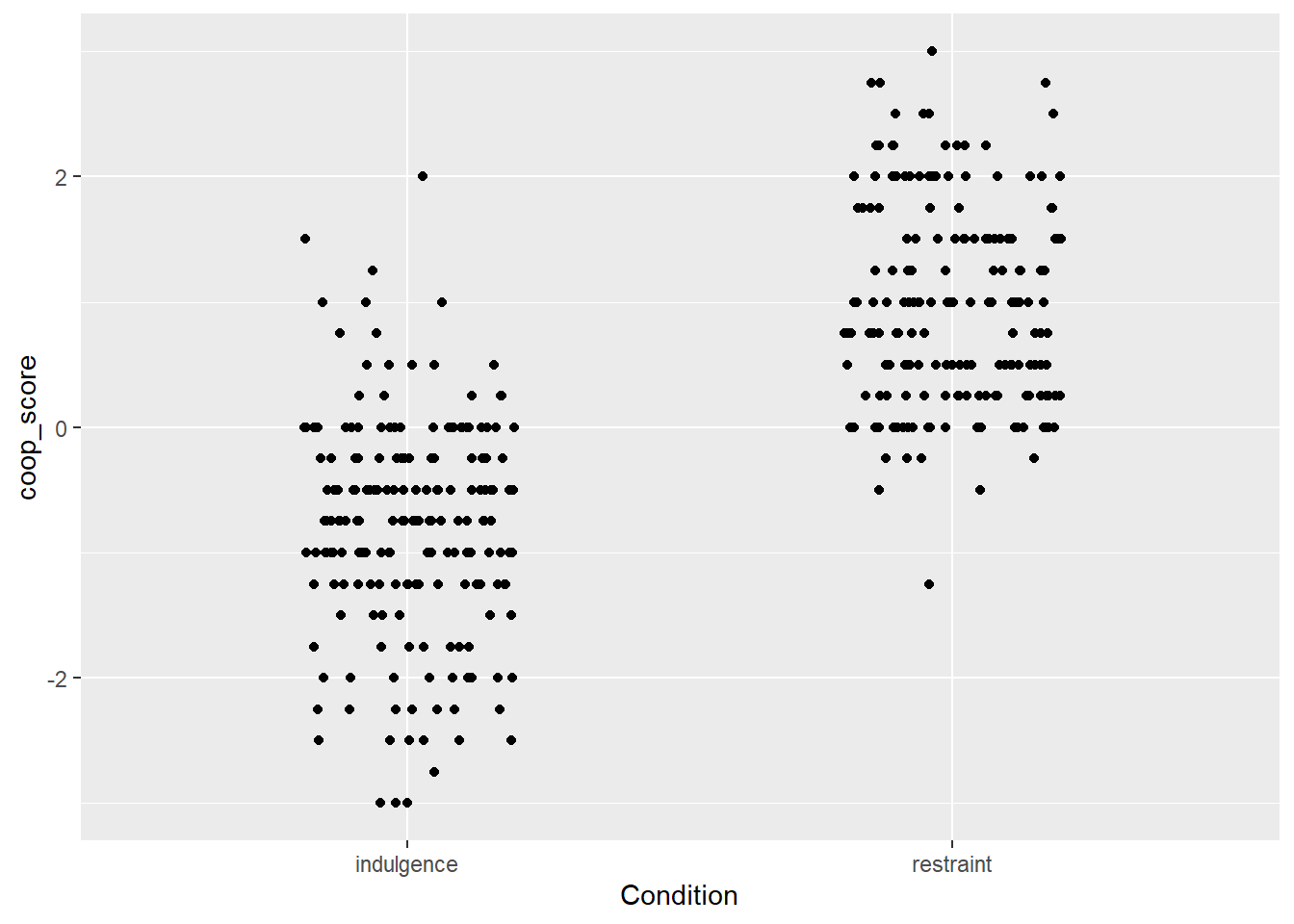
Ok, so now we really see the raw data, in the form of two clouds, and it looks like the coop_score values tend to be a lot higher in the restraint than the indulgence condition. What I would want to do next is to represent the central tendency of the variable in each condition in a visually clear way. We can do this with a geom_boxplot():
figure1 <- df7 %>%
  ggplot(aes(x=Condition, y=coop_score)) +
  geom_point(position=position_jitter(width=0.2, height=0)) +
  geom_boxplot()

# Now print it to the screen
figure1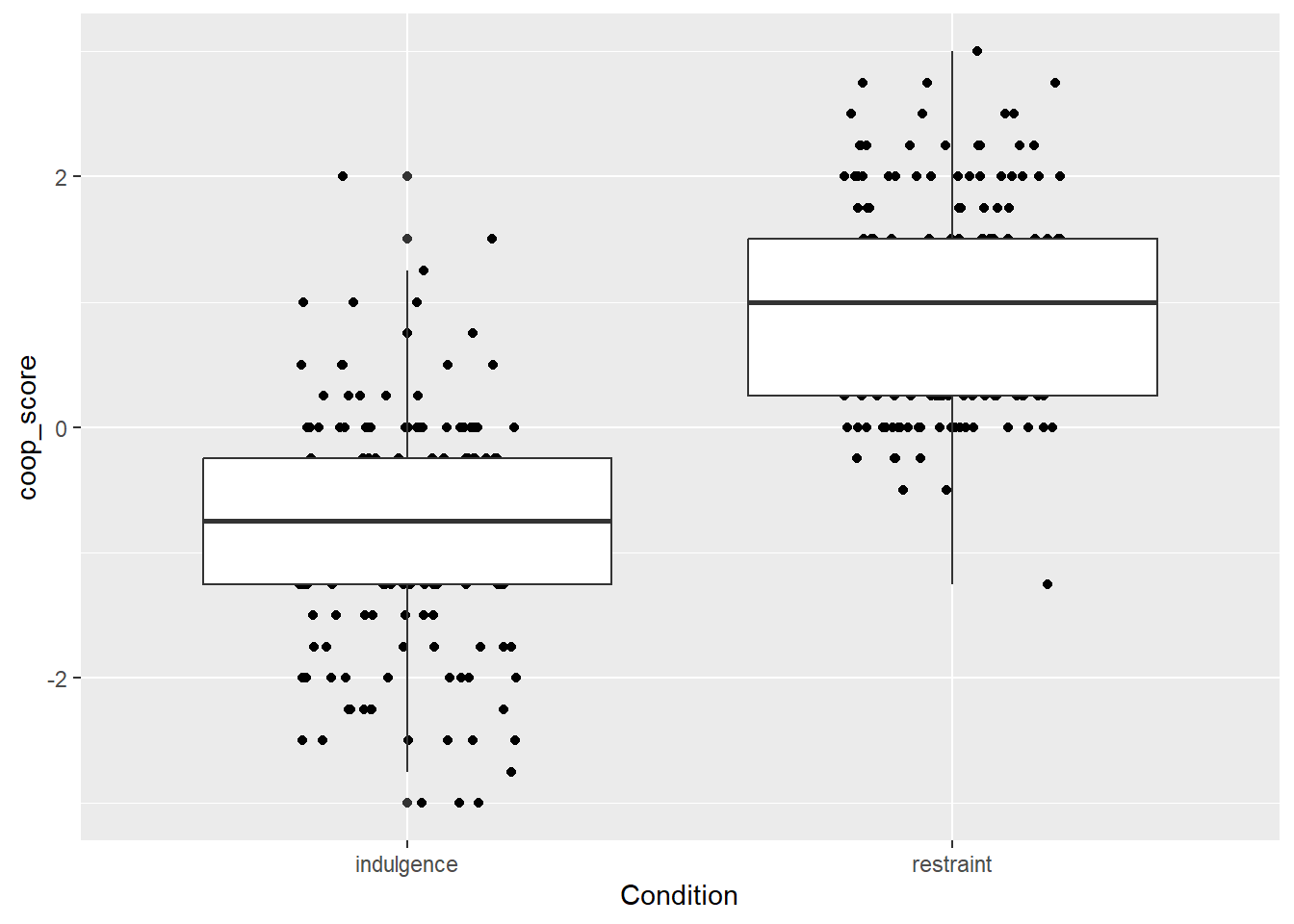
The wide boxplots do not look good. We can control their width with a width argument to geom_boxplot().
figure1 <- df7 %>% ggplot(aes(x=Condition, y=coop_score)) +
  geom_point(position=position_jitter(width=0.2, height=0)) +
  geom_boxplot(width=0.2)
# Now print it to the screen
figure1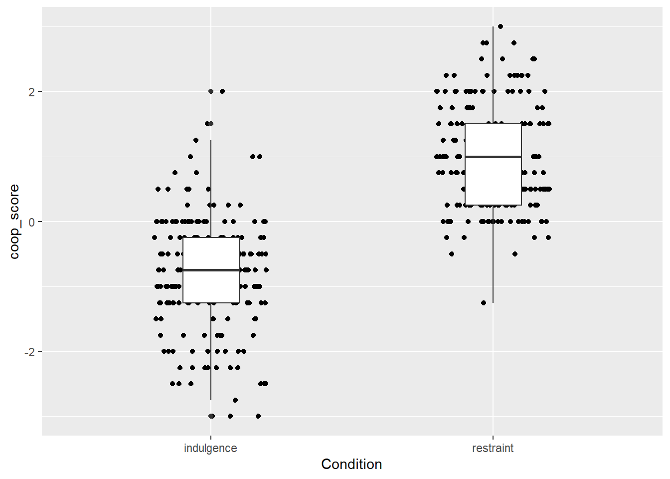
Ok, this is not too bad. You can see the data points, and you can see that the central tendency is different in the two groups. You can verify that this is the right conclusion if you like by fitting a General Linear Model and seeing that coop_score does indeed vary significantly by Condition.
##
## Call:
## lm(formula = coop_score ~ Condition, data = df7)
##
## Residuals:
##      Min       1Q   Median       3Q      Max
## -2.21995 -0.46995  0.03005  0.55612  2.80612
##
## Coefficients:
##                    Estimate Std. Error t value Pr(>|t|)
## (Intercept)        -0.80612    0.06008  -13.42   <2e-16
## Conditionrestraint  1.77607    0.08646   20.54   <2e-16
##
## (Intercept)        ***
## Conditionrestraint ***
## ---
## Signif. codes:
## 0 '***' 0.001 '**' 0.01 '*' 0.05 '.' 0.1 ' ' 1
##
## Residual standard error: 0.8411 on 377 degrees of freedom
## Multiple R-squared:  0.5281, Adjusted R-squared:  0.5269
## F-statistic:   422 on 1 and 377 DF,  p-value: < 2.2e-16
The plot is still ugly, though. The next section shows how to make your ggplots pretty.
9.2.2 Making it prettier
The default ggplot options are remarkably ugly (that grey background - ugh!). This is odd because the package has much prettier visual looks available. You can apply these with a theme() layer. My current favourite is theme_classic() but theme_bw() is also ok.
figure1 <- df7 %>% ggplot(aes(x=Condition, y=coop_score)) +
  geom_point(position=position_jitter(width=0.2, height=0)) +
  geom_boxplot(width=0.2) +
  theme_classic()
# Now print it to the screen
figure1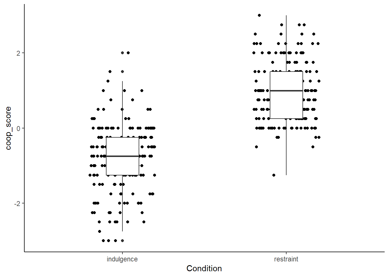
Better. But the boxplots don’t really stand out through the points, so lets make the points grey instead of black.
figure1 <- df7 %>% ggplot(aes(x=Condition, y=coop_score)) +
  geom_point(position=position_jitter(width=0.2, height=0), colour="darkgrey") +
  geom_boxplot(width=0.2) +
  theme_classic()
# Now print it to the screen
figure1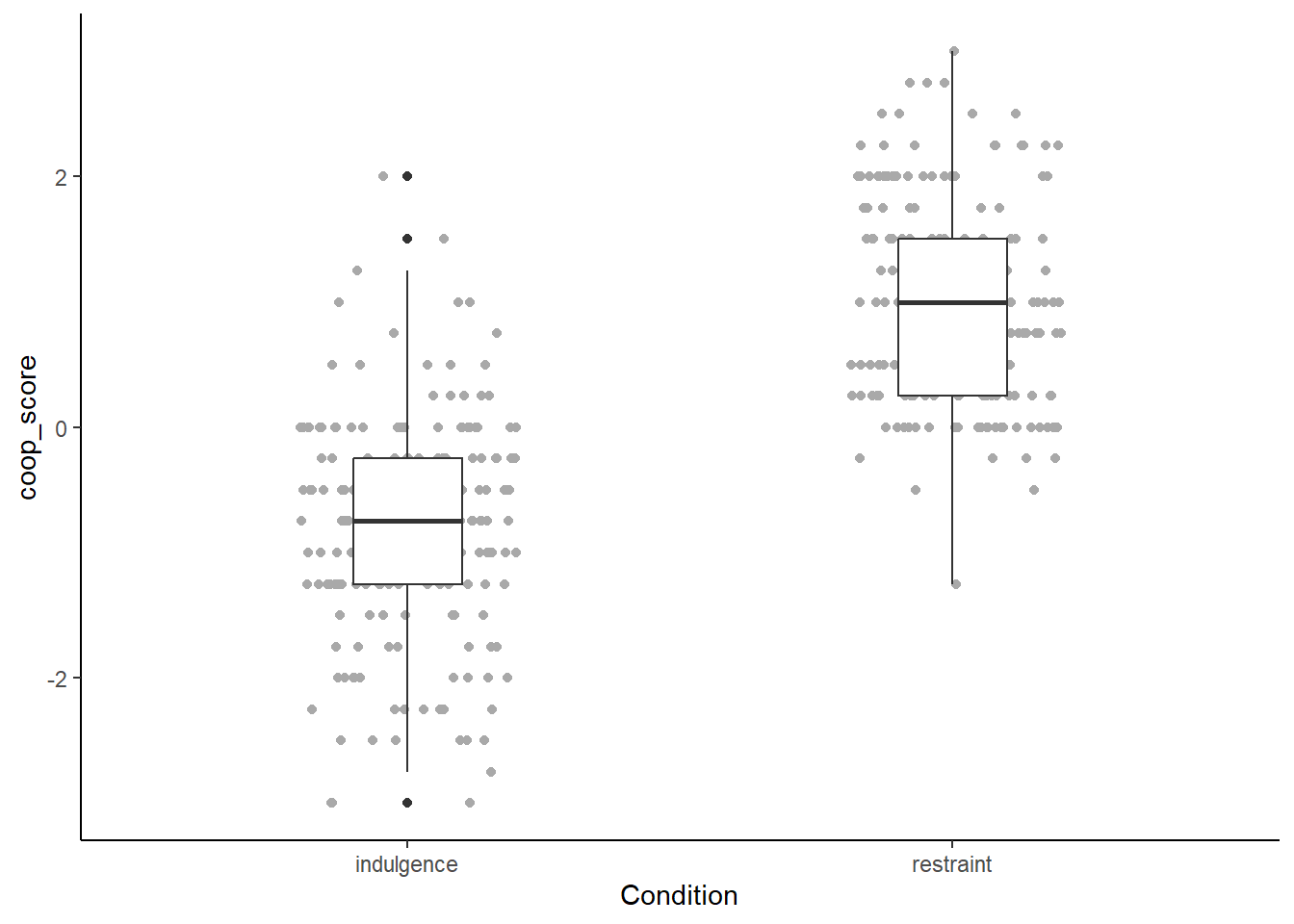
Better, but we could experiment with giving the boxplots some colour too:
figure1 <- df7 %>% ggplot(aes(x=Condition, y=coop_score)) +
  geom_point(position=position_jitter(width=0.2, height=0), colour="darkgrey") +
  geom_boxplot(width=0.2, colour=c("darkred", "darkgreen")) +
  theme_classic()
# Now print it to the screen
figure1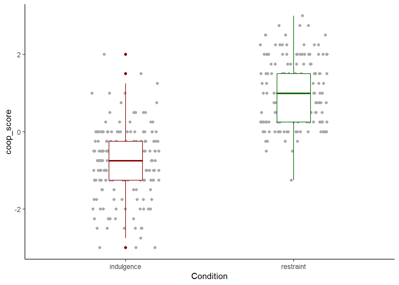
Now we are really getting somewhere. The axis label names are the variable names. For Condition this is ok. coop_score is not a good label though, we want a more descriptive phrase. We add this with ylab().
figure1 <- df7 %>% ggplot(aes(x=Condition, y=coop_score)) +
  geom_point(position=position_jitter(width=0.2, height=0), colour="darkgrey") +
  geom_boxplot(width=0.2, colour=c("darkred", "darkgreen")) +
  theme_classic() +
  ylab("Change in cooperativeness")
# Now print it to the screen
figure1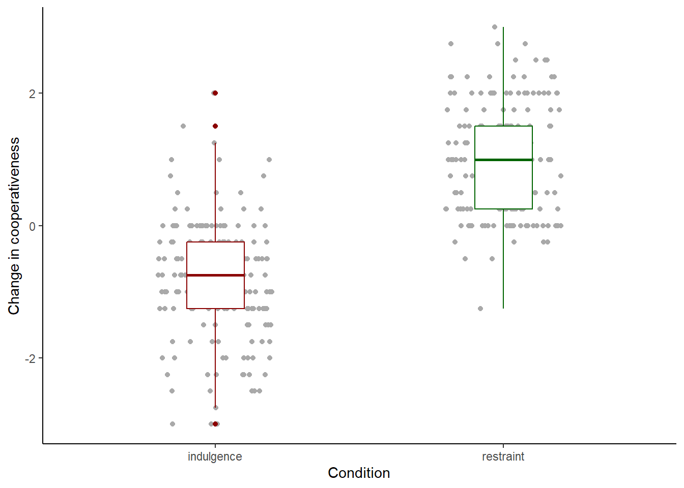
It is important to be fussy about your figures. These are the main way that most people will understand what you have found. If you make plots that are uninformative, or messy or hasty, it has a really negative effect on the reception of your work. Here, the things I would still fuss about are the following. The labels ‘indulgence’ and ‘restraint’ do not have capital letters, whereas ‘Condition’ does. This comes from the way the data are encoded, but we can provide a manual fix with:
figure1 <- df7 %>% ggplot(aes(x=Condition, y=coop_score)) +
   geom_point(position=position_jitter(width=0.2, height=0),
              colour="darkgrey") +
   geom_boxplot(width=0.2, colour=c("darkred", "darkgreen")) +
   theme_classic() +
  ylab("Change in cooperativeness") +
  scale_x_discrete(labels=c("Indulgence", "Restraint"))

 # Now print it to the screen
figure1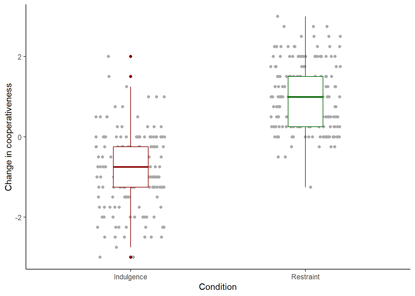
One more tiny thing. You will see that a few of the points appear in the colours of the boxplots, not the grey of the rest of the points. Why is this? You might recall from session 4 that when a boxplot is created, points that lie beyond the whiskers (outliers) are shown as individual points. So here, outlier points are shown twice, once in grey when geom_point() plots all the points, and then again in the colours of the boxplot when the boxplots are added. Plotting the outliers with the boxplots is redundant in this case as all the points are already shown anyway. So, we suppress the boxplot outliers by the cheap trick of setting their shape attribute to NA:
figure1 <- df7 %>% ggplot(aes(x=Condition, y=coop_score)) +
   geom_point(position=position_jitter(width=0.2, height=0),
              colour="darkgrey") +
   geom_boxplot(width=0.2, colour=c("darkred", "darkgreen"),
                outlier.shape = NA) +
   theme_classic() +
  ylab("Change in cooperativeness") +
  scale_x_discrete(labels=c("Indulgence", "Restraint"))

 # Now print it to the screen
figure1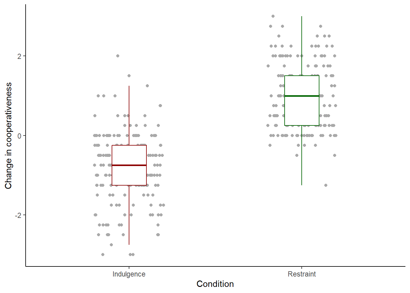
Now we have a figure I would find acceptable. This is not the only way of presenting this information. Fitouchi does it a different way in the paper. If it were mine, instead of the individual points, I might use something called a geom_violin() which summarises the distribution of the data using a shape rather than plotting every point. But this is not bad, so let us go with it for now.
There are many, many other things you can control in ggplot(), from the scales to the layers to legends and more. All of these are done by either adding extra features to the basic call, as we did with the theme() and ylab() statments, or including extra arguments to existing features, like we did when we specified width and colour. And, there are other geoms too, like bars and histograms and fit lines. The options are so numerous that I won’t go through them all here. You will get used to them as you make more graphs. There is a useful cheat sheet at: https://rstudio.github.io/cheatsheets/html/data-visualization.html
9.2.3 Outputting your figure
So far, we have printed figure1 to the screen. This is just a draft. The version you will want to include in your paper will need to be a PDF or image file (such as .png format). You make these by calling an output device and printing figure1 to it, then turning it off to complete the file. Here is how to make a .png version at a resolution of 600dpi, 8cm wide and 10cm high.
## png
##   2
You should now find a file called ‘figure1.png’ in your working directory. As you can see it looks a lot better than the draft on the screen.
For a PDF, it is as follow. Curious fact, the PDF device only works in inches, not cm, so we will make it 3in wide and 4in high (a inch is about 2.5 cms). Note that there is no resolution parameter for pdf(), since PDF graphics are vector based, and hence infinitely magnifiable without loss of resolution.
## png
##   2
9.3 A plot with a continuous x-axis
In our first example, the x-axis was categorical (the two conditions) and the y-axis was continuous. What if we want both axes to represent continuous variables, as in a scatter plot?
Let’s make figure 2, mapping the covariate puritanism_score to the x-axis and coop_score to the y-axis. I have done a few things like set the axis labels and the theme already.
figure2 <- df7 %>%
  ggplot(aes(x=puritanism_score, y=coop_score)) +
  geom_point() +
  theme_classic() +
  xlab("Puritanism score") +
  ylab("Change in cooperativeness")

figure2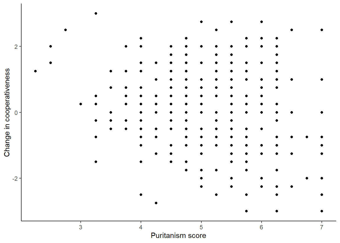
That looks ok. But maybe we want to add a fit line (called a smoother) to show the relationship between the two variables. There are various options for this, including non-linear ones, but we will go for a straight line generated by a General Linear Model.
figure2 <- df7 %>%
  ggplot(aes(x=puritanism_score, y=coop_score)) +
  geom_point() +
  geom_smooth(method="lm") +
  theme_classic() +
  xlab("Puritanism score") +
  ylab("Change in cooperativeness")

figure2
## `geom_smooth()` using formula = 'y ~ x'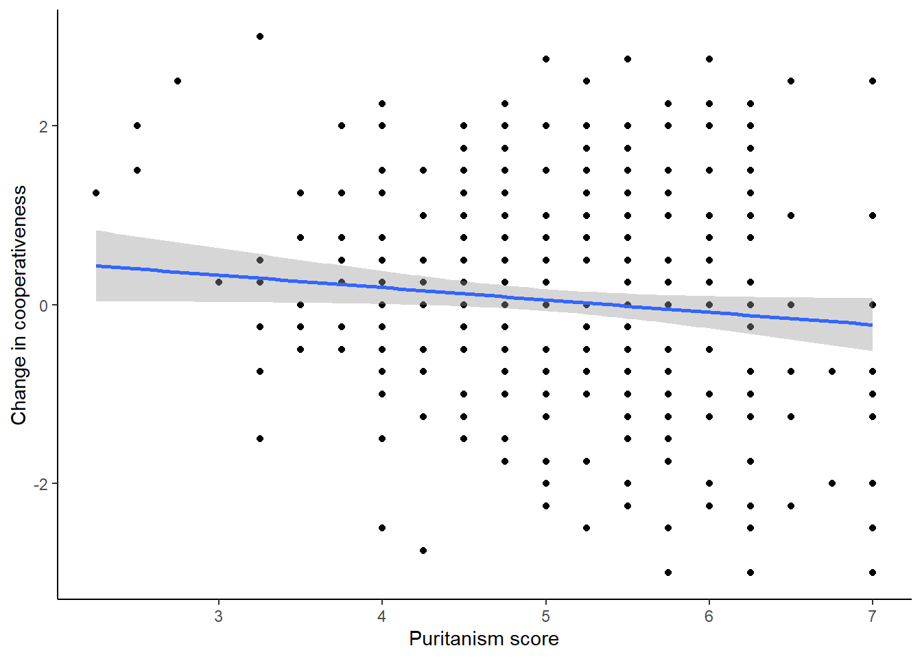
The line is pretty flat; there is not a strong relationship between the variables.
9.3.1 Mapping a variable to the colour of the points
However, we have forgotten so far to show that the study had two conditions. Half of the participants were rating coop_score in the indulgence condition, and half in the restraint condition. We know from figure 1 that the scores were pretty different in the two conditions, and so maybe we should indicate on the graph which condition each point comes from. To make the point colour reflect the condition, we need to expand the aesthetic. Now as well as mapping axes to variables (x to puritanism_score, y to coop_change) we want to make the colour of the points to the variable Condition. Let’s do that:
figure2 <- df7 %>%
  ggplot(aes(x=puritanism_score, y=coop_score, colour=Condition)) +
  geom_point() +
  geom_smooth(method="lm") +
  theme_classic() +
  xlab("Puritanism score") +
  ylab("Change in cooperativeness")

figure2
## `geom_smooth()` using formula = 'y ~ x'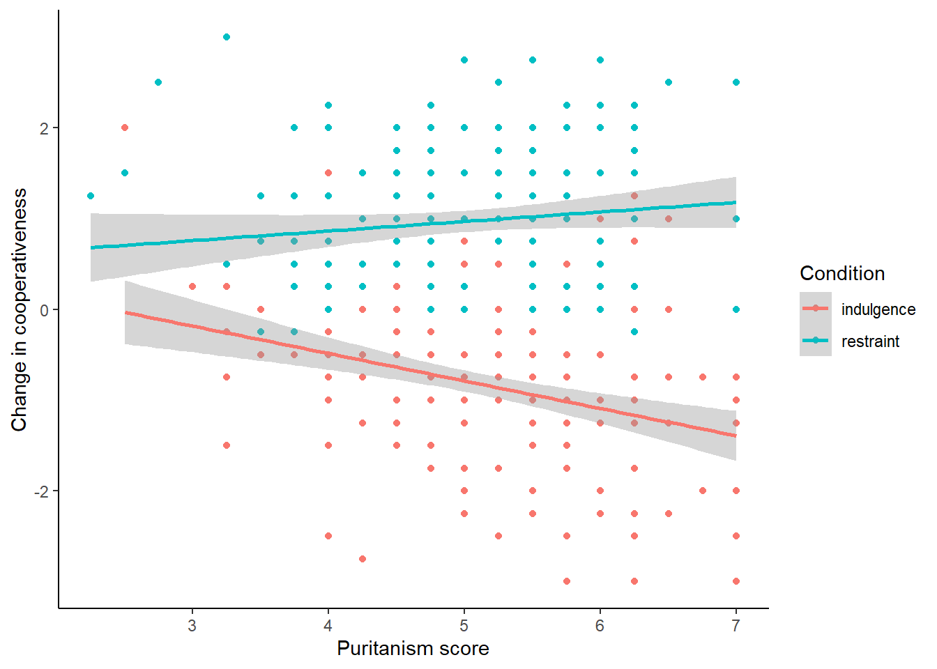
This is good in a way. However, not only do we now have the points coloured according to condition, we have fit lines coloured and fitted by condition too. The lines seem to have different slopes, which is pretty interesting and we will return to it in the next session. But it might not reflect what we wanted. We might have wanted the overall fit line (i.e. just one line) whilst having colour coding by Condition for the points only. To achieve this, it is important to appreciate that there is an overall aesthetic in the first line of the plot (the one with the ggplot() call), and this is inherited by all the geoms. But individual geoms can have their own geom-specific aesthetics too. So we can apply the colour mapping just in the geom_point() , not overall.
figure2 <- df7 %>%
  ggplot(aes(x=puritanism_score, y=coop_score)) +
  geom_point(aes(colour=Condition)) +
  geom_smooth(method="lm") +
  theme_classic() +
  xlab("Puritanism score") +
  ylab("Change in cooperativeness")

figure2
## `geom_smooth()` using formula = 'y ~ x'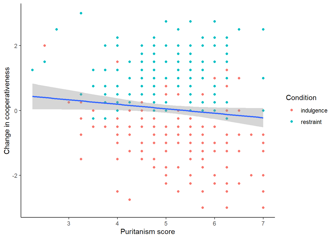
Of course, it could be the case that for some reason you want to show (a) the points labelled by condition; (b) the overall fit line; and (c) the condition-specific fit lines. I would find that rather a busy plot but there could be a reason for it. Here is how we would do that. The key is to add geom_smooth() twice, once with an aesthetic colouring it by condition and once not. I will make the overall one black, and the condition-specific ones dotted, to make them look as different as possible.
figure2 <- df7 %>%
  ggplot(aes(x=puritanism_score, y=coop_score)) +
  geom_point(aes(colour=Condition)) +
  geom_smooth(aes(colour=Condition), method="lm", linetype="dotted") +
  geom_smooth(method="lm", , colour="black") +
  theme_classic() +
  xlab("Puritanism score") +
  ylab("Change in cooperativeness")

figure2
## `geom_smooth()` using formula = 'y ~ x'
## `geom_smooth()` using formula = 'y ~ x'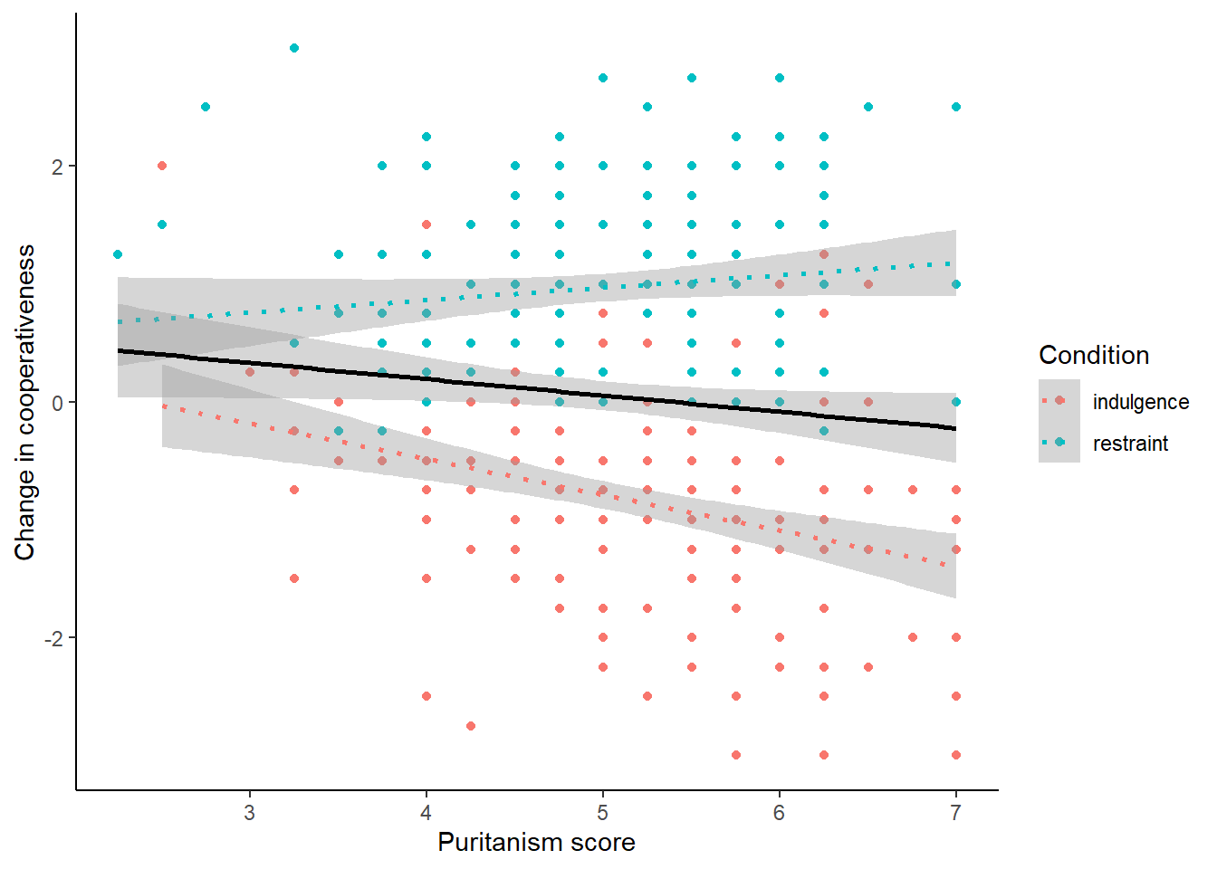
Final change for this section: you may not like R’s default choice of colours when a discrete variable is mapped to colour. You can set the colour scheme for yourself with scale_colour_manual():
figure2 <- df7 %>%
  ggplot(aes(x=puritanism_score, y=coop_score)) +
  geom_point(aes(colour=Condition)) +
  geom_smooth(aes(colour=Condition), method="lm", linetype="dotted") +
  geom_smooth(method="lm", , colour="black") +
  theme_classic() +
  xlab("Puritanism score") +
  ylab("Change in cooperativeness") +
  scale_colour_manual(values=c("darkred", "darkgreen"))

figure2
## `geom_smooth()` using formula = 'y ~ x'
## `geom_smooth()` using formula = 'y ~ x'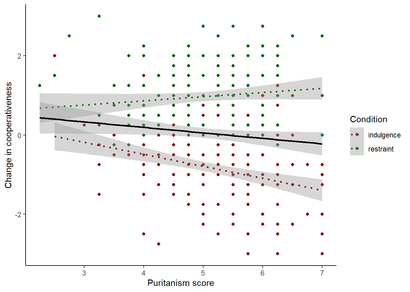
9.3.2 Facetting
This section presents you with an alternative to plotting the two conditions in different colours. This is facetting, a brilliant feature of plotting with ggplot() that makes it possible to make smart looking multi-panel figures, or make it possible to see what is going on in different subsets of your data, with just one line of code. Basically, we make the simple plot we want to see for each condition, and then we add facet_wrap(~Condition). So:
figure2 <- df7 %>%
  ggplot(aes(x=puritanism_score, y=coop_score)) +
  geom_point() +
  geom_smooth(method="lm", , colour="black") +
  theme_classic() +
  xlab("Puritanism score") +
  ylab("Change in cooperativeness") +
  facet_wrap(~Condition)

figure2
## `geom_smooth()` using formula = 'y ~ x'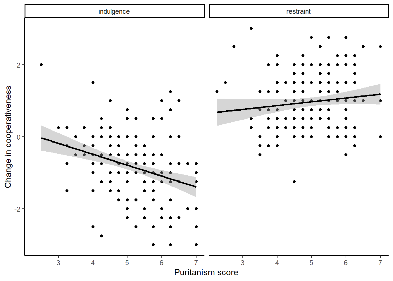
You can have a figure with more than two facets (when the facetting variable has more than two levels), or even a grid of facets formed by the combinations of two discrete variables, using facet_grid(variableA ~ variableB). You should play around with facetting as it is very useful.
Now, you should output figure 2 to .png and .pdf files, as we did for figure 1. Think about the best dimensions (for example the facetted version obviously needs to be at least twice as wide as high).
9.4 Summary
In this session, we have covered the basics of plotting with ggplot(). This includes:
Defining an aesthetic to map variables in your data to dimensions of a plot;
Adding geometric objects such as points, fit lines and boxplots;
Customising the appearance of the figure;
Outputting your final figure to an image or PDF file.