Chapter 7 Summarizing and Displaing Measurement Data
Descriptive statistics is the branch of statistics that involves ‘describing a situation’. Most of the methods used in descriptive statistics are relatively simple, such as finding averages or constructing a graph.
A distribution consists of the values that a random variable takes on and how often it takes those values. We will use three techniques to describe a distribution: a table, graph, or mathematical function.
7.1 Class Data
Part of the data table is presented. Each row represents a student, and each column is a variable (one of the questions you were asked).
##   Class    Sex  Color Texts Chocolate Height Temperature
## 1  9:30   Male  Green    10         3     70          86
## 2  9:30 Female Purple     2         3     67          76
## 3  9:30 Female  Green     2        10     67          90
## 4  9:30 Female   Blue     4         7     66          85
## 5  9:30   Male Purple    30         6     67          90
## 6  9:30 Female    Red     4         7     67          83
7.2 Stemplot
A common way to display a quantitative data set is with a stem-and-leaf plot, also known as a stemplot. Each data value is divided into two pieces. The leaf consists of the final significant digit, and the stem the remaining digits.
If we were going to do a stemplot of ages and we had a 42 year-old man, the stem would be the ‘4’ and the leaf the ‘2’. If we had a 9 year-old girl, the stem would be ‘0’ and the leaf the ‘9’.
Here is a stemplot for the number of text messages you sent.
## 1 | 2: represents 12
##  leaf unit: 1
##             n: 71
##     0 | 00000011112222223344444555556667788889999
##     1 | 0000122236777
##     2 | 00000333788
##     3 | 0234
##     4 |
##     5 |
##     6 |
##     7 |
##     8 | 7
##     9 |
##    10 | 0
## ________________________________________________________
## 1 | 2: represents 12, leaf unit: 1
## Texts[Sex == "Male"] Texts[Sex == "Female"]
## ________________________________________________________
## 98765554332221100000| 0 |011222444455667888999
## 21000| 1 |02236777
## 7300| 2 |0003388
## 0| 3 |234
## | 4 |
## | 5 |
## | 6 |
## | 7 |
## 7| 8 |
## | 9 |
## 0| 10 |
## ________________________________________________________
## n: 32 39
## ________________________________________________________7.3 Histogram
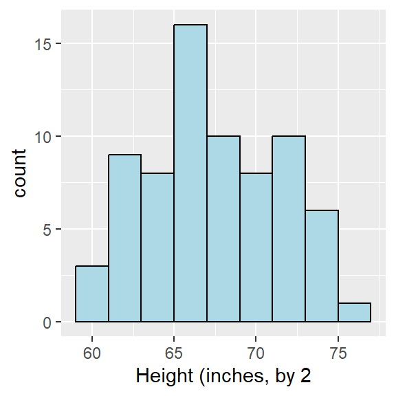
Stemplots aren’t very feasible for very large data sets (or even this one, to be honest). A histogram is a much better choice for most data sets involving measurement data at the interval/ratio levels of measurement.
We need to either choose how many bars to have (often called bins) or choose how wide to make each bar (binwidth). If you are drawing the histogram by hand, you can just make convenient choices; we usally want 5 to 10 bars per graph. If you are using software, you can generally instruct the software on the choices you want, or see if the default choices are OK.
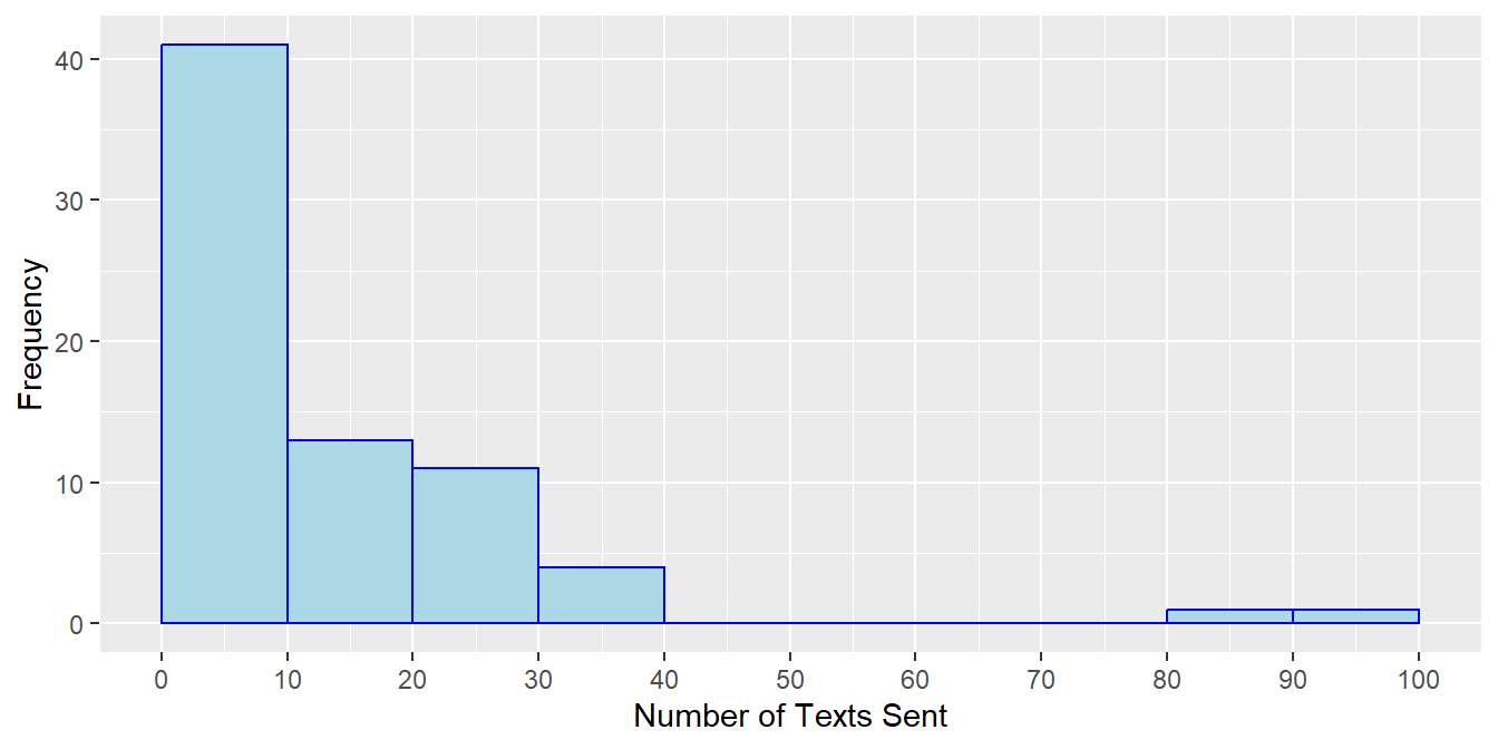
Since the stemplot “naturally” groups together our text messaging data in groups of 10 (i.e. 0-9 texts, 10-19 texts, etc.), I’ll construct a frequency table and histogram with that choice.
| Number of Texts | Frequency |
|---|---|
| 0-9 | 41 |
| 10-19 | 13 |
| 20-29 | 11 |
| 30-39 | 4 |
| 40-49 | 0 |
| 50-59 | 0 |
| 60-69 | 0 |
| 70-79 | 0 |
| 80-89 | 1 |
| 90-99 | 0 |
| 100-109 | 1 |
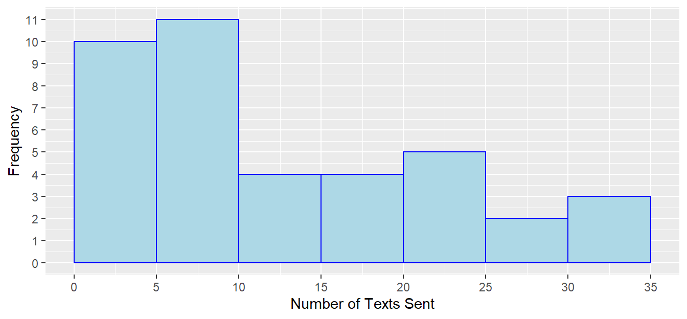
Let’s look at just the female students with a binwidth of 5.
| Number of Texts | Frequency |
|---|---|
| 0-4 | 10 |
| 5-9 | 11 |
| 10-14 | 4 |
| 15-19 | 4 |
| 20-24 | 5 |
| 25-29 | 2 |
| 30-34 | 3 |
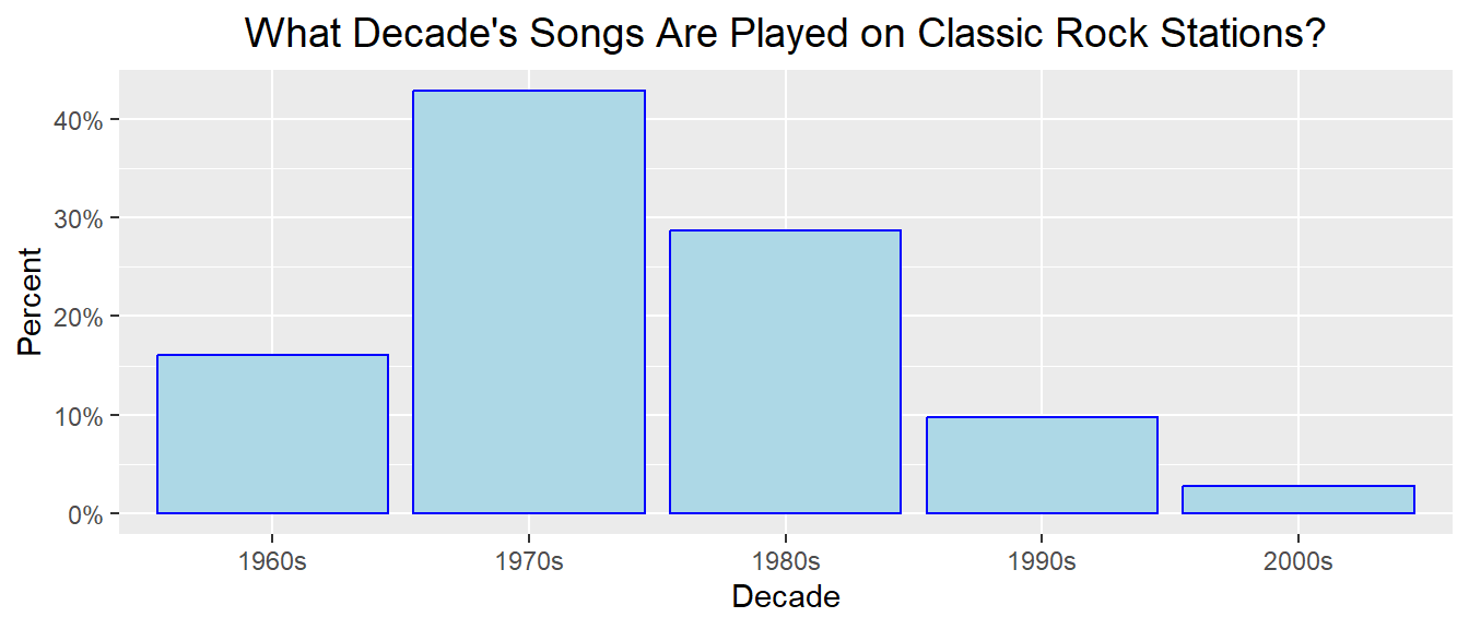
Here’s a much larger data set, representing what decade that songs played on classic rock radio stations in June, 2014 were from. Notice this time I graphed the relative frequency percentage on the \(y\)-axis.
| Decade | Number of Songs | Percentage |
|---|---|---|
| 1960s | 264 | 16.0% |
| 1970s | 707 | 42.9% |
| 1980s | 472 | 28.6% |
| 1990s | 161 | 9.8% |
| 2000s | 45 | 2.7% |
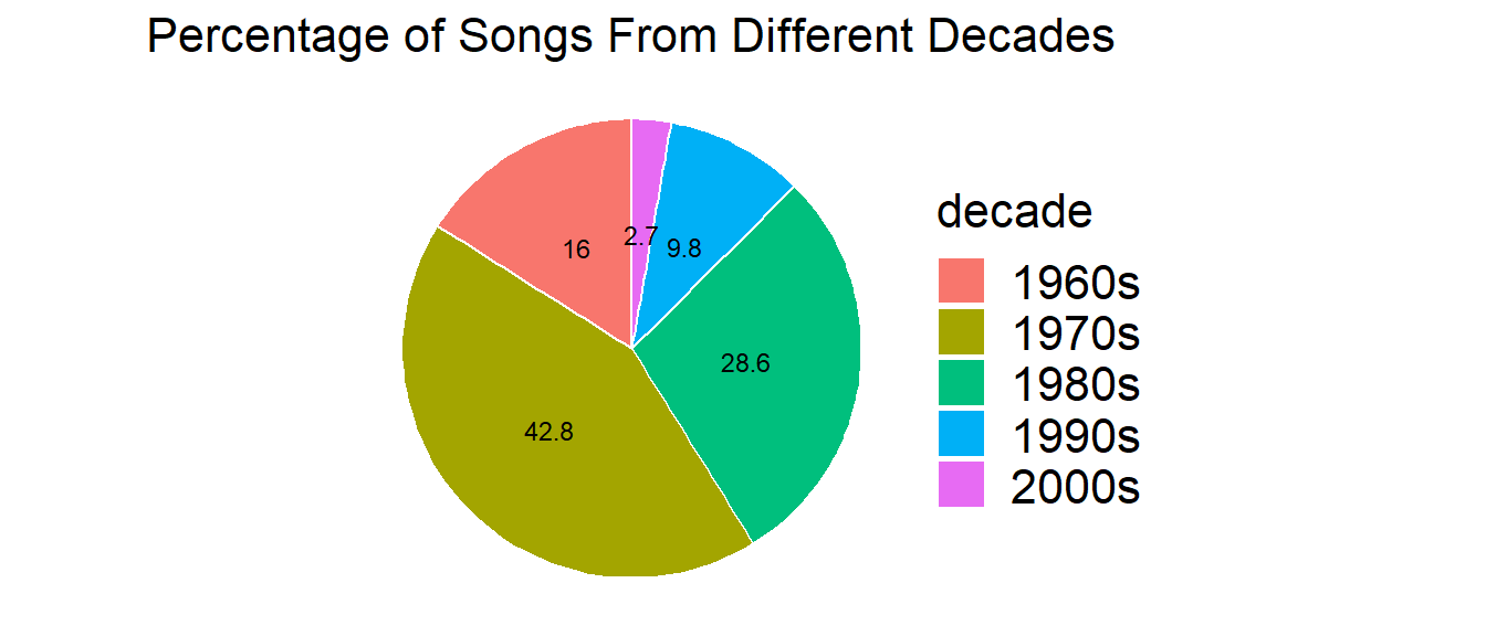
Most statisticians, particularly ones that are experts in graphics, hate pie charts. The human eye is much better at judging differences in percentages in a bar chart/histogram format than a pie chart. Nevertheless, they are still very commonly used and you will see them. I won’t ask you to make them, but here’s one for the classic rock data.
7.4 Measures of Central Tendency
We often are interested in the central value, or ‘average’, of a distribution. Common statistics used to measure the center of a distribution include:
- mean
- median
- mode
7.5 Sample Mean
The mean (or arithmetic mean) of a dataset is just the average, computed as you would expect (i.e. add up the values and divide by sample size).
The mean of a sample is referred to as a statistic (a characteristic of a sample) and is computed as \[\bar{x}=\frac{\sum x}{n}\]
7.6 Population Mean
The mean of a population is referred to as a parameter (a characteristic of a population) and is computed as \[\mu=\frac{\sum x}{N}\]
Notice we are using Greek letters for population parameters. This is the usual convention (although exceptions do exist). We usually can’t calculate a parameter because we usually don’t have data on the entire population.
7.7 Median and Mode
The median is the middle value in an ordered data set. The median is often used if outliers (i.e. unusually small or large values) exist in the dataset. Outliers will affect the mean more than the median. We say the median is more resistant, or robust, to the effect of outliers.
The median is computed by taking the \(\frac{n+1}{2}\)th ordered data value, averaging the two middle values if \(\frac{n+1}{2}\) is not an integer.
The mode is the most frequent value in the data set. A data set may have mulitple modes, and the mode may not necessarily be found in the center of the distribution.
7.8 Computing Mean, Median, Mode
Here, instead of using data I collected from the class, the data below are hypothetical exam scores that a class with \(n=35\) students might have earned.
Mean: \(\bar{x}=\frac{2603}{35}=74.4\)
Median: \(M=77\) (the \(\frac{35+1}{2}=18\)th ordered value)
Mode: 71 and 87 (both occur three times)
## 1 | 2: represents 12
##  leaf unit: 1
##             n: 35
##     2 | 9
##     3 |
##     4 | 579
##     5 | 3
##     6 | 233578
##     7 | 11124578
##     8 | 011236677789
##     9 | 367
##    10 | 0
7.9 Measures of Variability
In addition to central tendency, we are also interested in the amount of spread, or variability, in the data. Are the data clustered close to the mean or is there a wide range?
Statistics for measuring variability include:
- Range
- Five-Number Summary and IQR
- Variance and Standard Deviation
7.10 Range and Five-Number Summary
The five-number summary is a set of five statistics that gives information about the center, spread, and shape of a distribution. It consists of the following values:
Minimum (\(Min\))
First Quartile (\(Q_1\))
Median (\(M\))
Third Quartile (\(Q_3\))
Maximum (\(Max\))
We will use the simplest way to compute the quartiles. Some statistical software packages will compute the quartiles with a more complex method and get slightly different answers; we won’t worry about those details in this class.
7.11 Five-Number Summary
We already know how to compute the median, and the minimum and maximum are just the smallest and largest values in the data set.
The first quartile, \(Q_1\), is the 25th percentile of the data set. We will compute it by taking the median of the lower half of the data set. For example, the exam scores data set has \(n=35\) data values. The median, \(M=77\), was the 18th data value. So \(Q_1\) will be the median of the 17 values below 77.
Similarly, the third quartile, \(Q_3\), is the 75th percentile of the data set. It is the median of the data values greater than the median.
7.12 Range and Five-Number Summary
The five-number summary of the exam scores data set.
1.\(Min=29\) (the 1st or minimum value)
\(Q_1=65\) (the 9th value)
\(M=77\) (the 18th or middle value)
\(Q_3=87\) (the 27th value)
\(Max=100\) (the 35th or largest value)
The range is a simple measure of variability that is \(Range=Max-Min\). The interquartile range is \(IQR=Q_3-Q_1\), which measures the variability of the middle 50% of the distribution. Here, the range=71 and \(IQR=22\).
7.13 Tukey’s Rule for Outliers
The famous statistician John Tukey has a simple rule for determining if a point in a data set is small/large enough to be an outlier.
First, compute the Step, where \(Step=1.5*IQR\). In the exam scores example, Step=33.
Next, subtract the step from the first quartile. \(Q_1-Step=65-33=32\). Any exam scores below 32 are outliers. In our problem, the score of 29 is an outlier on the low end.
Finally, add the step to the third quartile. \(Q_3+Step=87+33=120\). Any exam scores above 120 are outliers. In our problem, no points qualify as outliers on the high end. These values 32 and 120 are sometimes called fences; outliers are ‘outside’ the fences.
7.14 Tukey’s Boxplot
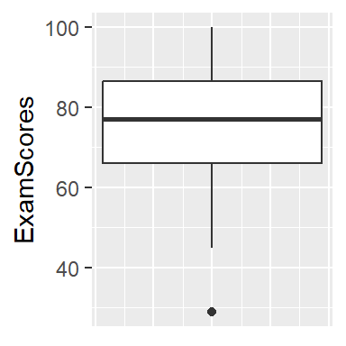
The boxplot is a graph that displays information from the five-number summary, along with outliers. The vertical, or y-axis, has the range of data values. Horizontal lines are drawn at the first quartile, median, and third quartile, and are connected with vertical lines to form a ‘box’. Sometimes the boxplot is oriented such that the x-axis is used to display the range of values rather than the y-axis.
‘Whiskers’ are vertical lines that are drawn from the quartiles to the smallest/largest values that are NOT outliers.
Points that are outliers are displayed with a symbol such as an asterisk or circle to clearly identify their outlier status.
The student who got a very low score of 29, is indicated as an outlier.
7.15 Variance and Standard Deviation
A weakness of the range is that it only uses the two most extreme values in the data set. The IQR is better, but it would be preferable to have a statistic that uses all values in the data set in an effort to measure the `average deviation’ or distance from the mean.
The deviation is defined as \(x-\bar{x}\). For example, if Dr. X is 42 and the average college professor is 48, the deviation is 42-48=-6, or Dr. X is six years younger than average.
Unfortunately, the sum of deviations, \(\sum (x-\bar{x})\) will equal zero for all data sets. Therefore, we cannot just compute the `average deviation’.
Occasionally we take the absolute value of the deviations, but the standard method for computing variability is based on squared deviations.
If we have a sample of data (i.e. a portion of a larger population), the variance is computed as: \[s^2=\frac{\sum (x-\bar{x})^2}{n-1}\]
Less commonly, if our data represents an entire population, the variance is: \[\sigma^2=\frac{\sum (x-\mu)^2}{N}\]
The standard deviation (either \(s\) or \(\sigma\)) is the square root of variance.
An example of computing the variance for a sample of \(n=5\) ages, where \(\bar{x}=44.2\) years.
| \(x\) | \(x-\bar{x}\) | \((x-\bar{x})^2\) |
|---|---|---|
| 29 | -15.2 | 231.04 |
| 35 | -9.2 | 84.64 |
| 42 | -2.2 | 4.84 |
| 50 | 5.8 | 33.64 |
| 65 | 20.8 | 432.64 |
| \(\sum\): 221 | 0 | 786.80 |
So the variance is \[s^2=\frac{786.8}{5-1}=196.7\] where the unit is years squared.
It is usually more convenient to take the square root. The standard deviation is \(s=\sqrt{196.7}=14.02\) years.
Obviously we want to use technology for large data sets.
7.16 Symmetric Distribution
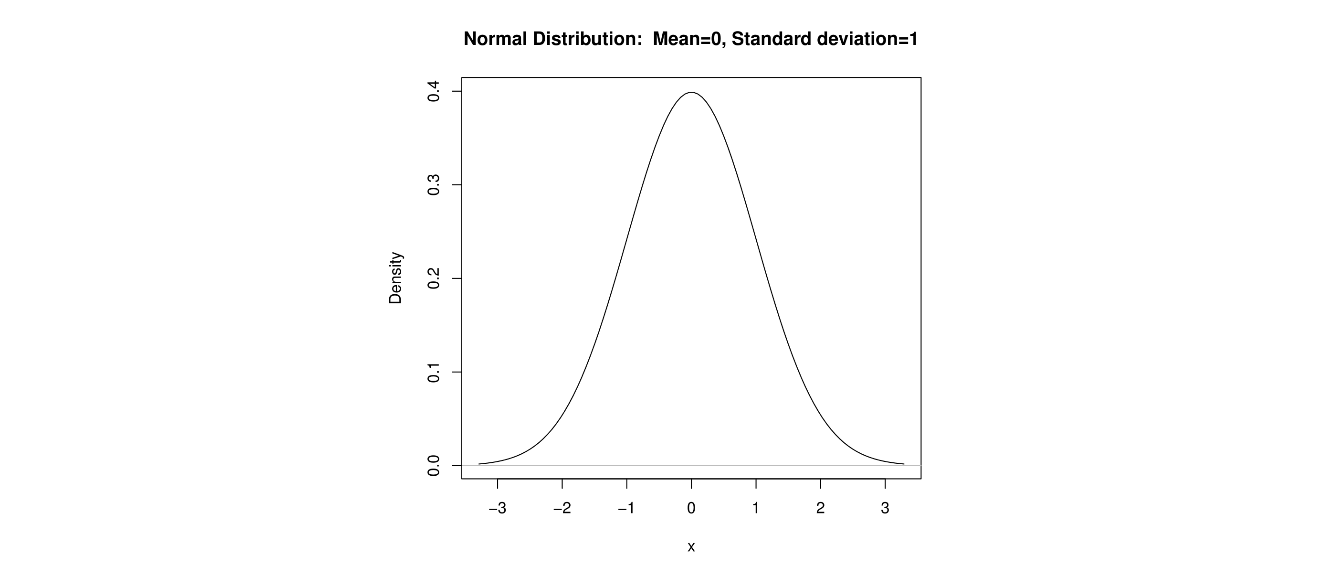
In addition to the center and variability of a distribution, we are interested in shape. A distribution that has the property that the part of the distribution below the median matches the part above the median is said to be symmetric.
The mean will equal the median when the distribution is symmeteric. The well-known distribution is symmetric. We’ll see it again in Chapter 8.
7.17 Right-Skewed Distribution
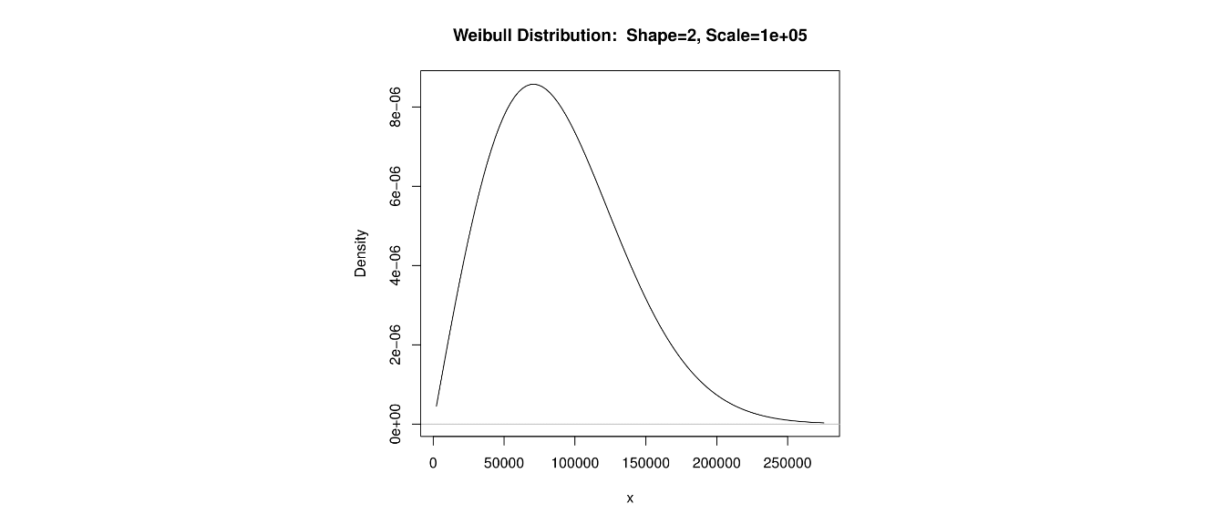
A distibution that is not symmetric, but has the property that the mean is greater than the median and has a ‘tail’ of low probability to the right is said to be right-skewed, or positively skewed.
The income of a sample of Americans would probably be right-skewed, as a small percentage of people make very large salaries.
7.18 Left-Skewed Distribution
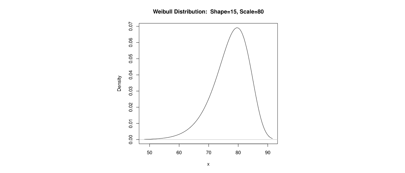
A distibution that is not symmetric, but has the property that the mean is less than the median and has a ‘tail’ of low probability to the left is said to be left-skewed, or negatively skewed.
The ages of patients suffering from Alzheimer’s disease would be left-skewed, as a small percentage of younger people have an early onset of the disorder.
7.19 Comparing Distributions
We often use both graphs and summary statistics to aid us in describing distributions and in comparing distributions of different groups.
The four main characteristics of a distribution that we care about are:
Center/Central Tendency (i.e. mean,median,mode)
Spread/Variability (range, IQR, variance, standard deviation)
Shape (symmetric/skewed,unimodal/bimodal)
Outliers/Influential Points
Let’s consider again the data on the number of text messages my students sent. The Fall 2018 data is avaialble at .
7.20 Comparing Groups
Maybe there is a significant difference between female and male students?
##      Sex min  Q1 median    Q3 max     mean        sd  n missing
## 1 Female   0 4.5    9.0 18.50  34 12.28205  9.700648 39       0
## 2   Male   0 2.0    5.5 11.25 100 13.21875 22.614204 32       0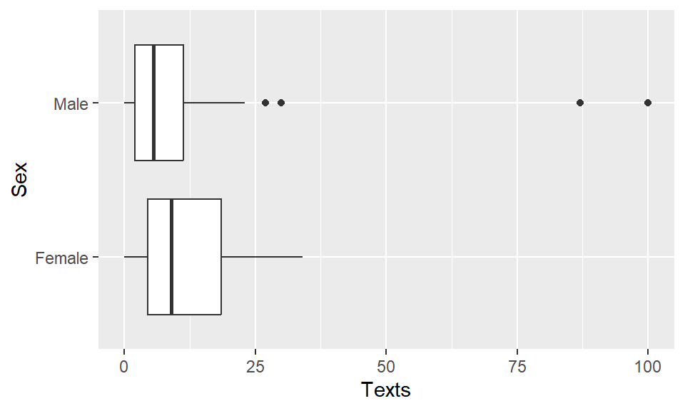
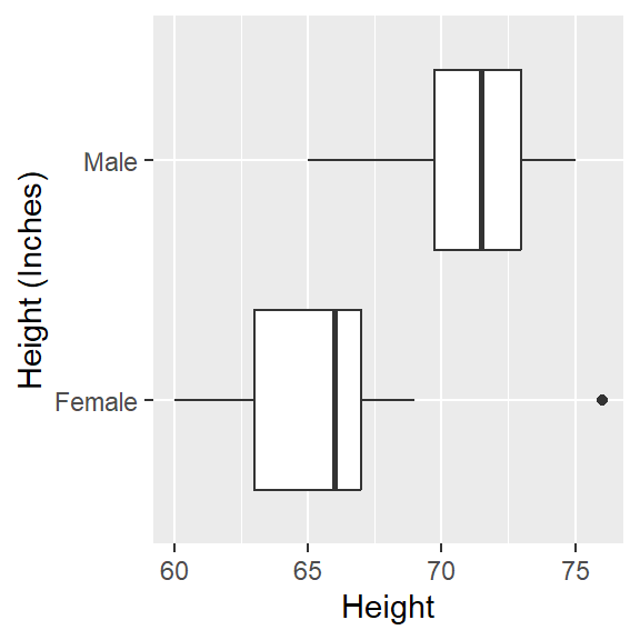
What about height of students?
##  min Q1 median Q3 max     mean       sd  n missing
##   60 65     67 71  76 67.90141 3.996981 71       0
## Sex min Q1 median Q3 max mean sd n missing
## 1 Female 60 63.00 66.0 67 76 65.28205 2.955358 39 0
## 2 Male 65 69.75 71.5 73 75 71.09375 2.493338 32 0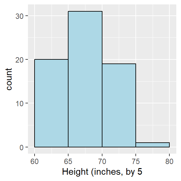
7.21 Effect of Linear Transformations
Consider the following set of exam scores.
What will happen to measures of central tendency or location (i.e. the minimum/maximum and the quartiles) if I add the same constant, say \(c=5\), to all 10 exam scores?
What will happen to measures of spread if I add the same constant, say \(c=5\), to all 10 exam scores?
## [1] 79## [1] 84## [1] 19.13693## [1] 19.13693- If I converted everyone’s height from inches to centimeters by multiplying by \(a=2.54\), what would the mean height be in cm? How about standard deviation?
##      Inches Centimeters
## [1,]     72      182.88
## [2,]     63      160.02
## [3,]     65      165.10
## [4,]     68      172.72
## [5,] 70 177.80## [1] 67.6## [1] 171.704## [1] 171.704## [1] 3.646917## [1] 9.263168## [1] 9.2631687.22 More on Comparing Distributions
Unit #6 of Against All Odds has a decent video for this:
https://www.learner.org/courses/againstallodds/unitpages/unit06.html
In the video, we see that the average rainfall per month in Portland, Oregon and in Montreal, Quebec is about the same, but the variability is much different. Portland has the reputation of being a “rainy” city, due to heavy rainfall in the winter months, although it gets very little rain in the summer. Montreal has a more constant rainfall.
Also, there was a comparison of sales per 4 weeks between two different locations of a chain restaurant: one located in a shopping mall and the other very near a beach.
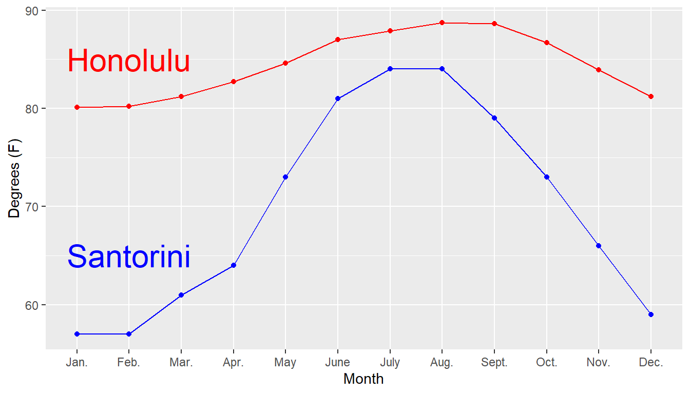
Let’s compare two popular tourist locations, in terms of temperature rather than rainfall. Santorini, Greece has the reputation of being warm in the summer (but cool in the winter, when there is little tourism), while Honolulu is noted for consistently warm temperatures throughout the year.
https://en.wikipedia.org/wiki/Santorini
https://en.wikipedia.org/wiki/Honolulu
Average High Temperatures (degrees Fahrenheit)
| Month | Santorini | Honolulu |
|---|---|---|
| January | 57 | 80.1 |
| February | 57 | 80.2 |
| March | 61 | 81.2 |
| April | 64 | 82.7 |
| May | 73 | 84.6 |
| June | 81 | 87.0 |
| July | 84 | 87.9 |
| August | 84 | 88.7 |
| September | 79 | 88.6 |
| October | 73 | 86.7 |
| November | 66 | 83.9 |
| December | 59 | 81.2 |
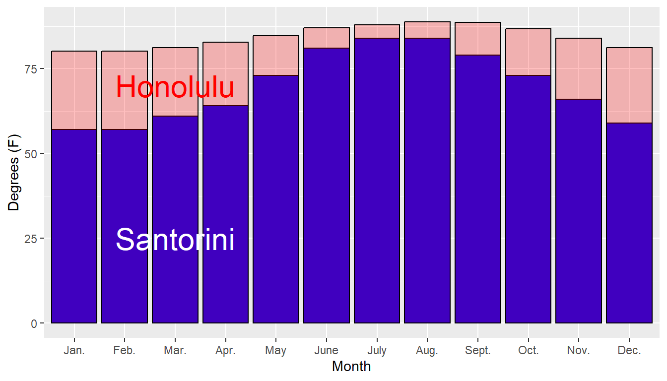
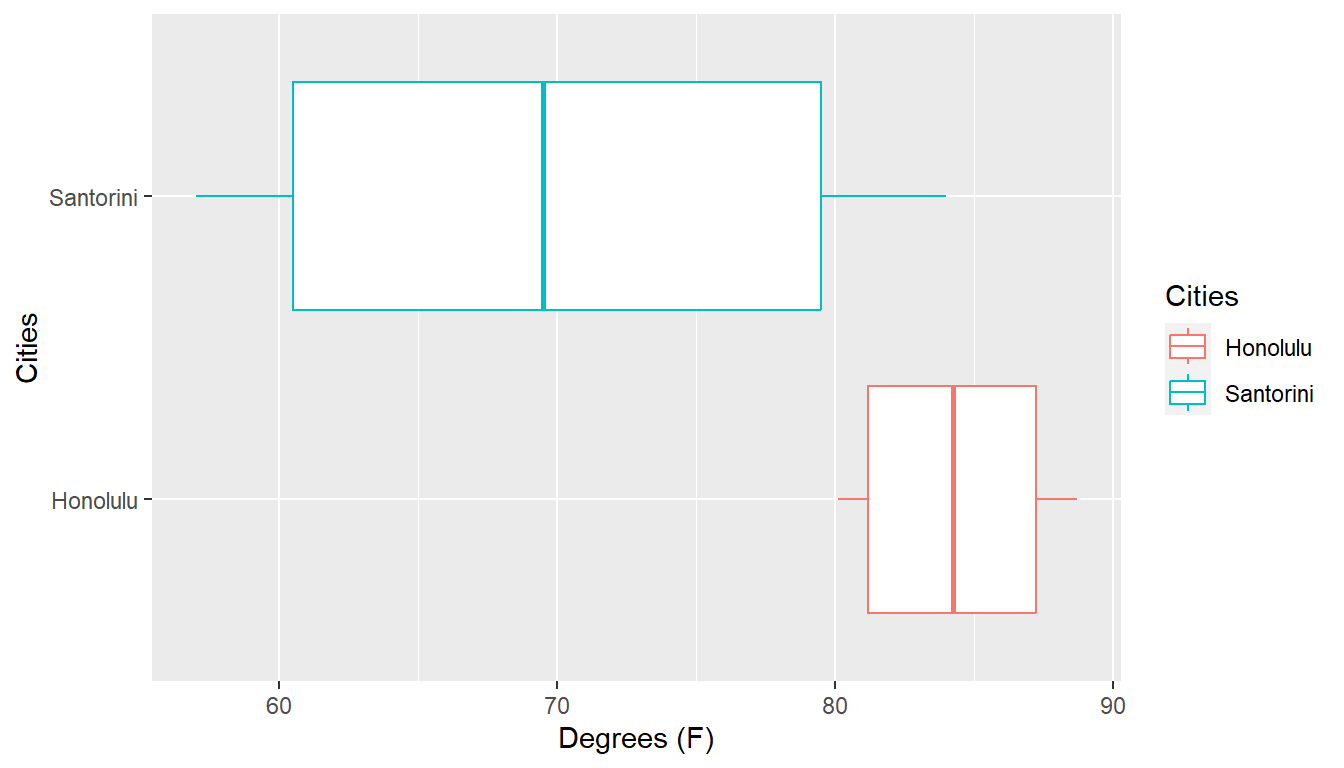
Here’s a time series plot of the data. Other graphical approaches could include bar charts or boxplots. Be careful with the scales of the axes!
##      Cities  min   Q1 median    Q3  max     mean        sd  n missing
## 1  Honolulu 80.1 81.2  84.25 87.45 88.7 84.40000  3.305918 12       0
## 2 Santorini 57.0 60.0  69.50 80.00 84.0 69.83333 10.460604 12       0
A meaningful stemplot for Honolulu would probably use the tenths place, rather than the ones place, as the leaf. 80.1 would appear as \(80 | 1\) rather than \(8 | 0\). The \(80\) row would be for all temperatures from 80.0 to 80.9 degrees Fahrenheit.
In the video, the sales figures were truncated to the nearest thousands: for example, a sales figure of $129,923 was reported on the stemplot as \(12 | 9\) rather than \(12992|3\). the \(12\) row would be for all sales figures from $120,000 to $129,999.
7.23 Add/Subtract a constant
Let’s take a small sample of size \(n=5\) that are the ages of people.
\[36 \: \: 34 \: \: 31 \: \: 30 \: \: 22\]
Suppose I have computed the sample mean and standard devitation and got \[\bar{X} = \frac{\sum X}{n} = \frac{153}{5} = 30.6\]
So the standard deviation is:
| \(X\) | \((X-\bar{X})\) | \((X-\bar{X})^2\) |
|---|---|---|
| 36 | 5.4 | 29.16 |
| 34 | 3.4 | 11.56 |
| 31 | 0.4 | 0.16 |
| 30 | -0.6 | 0.36 |
| 22 | -8.6 | 73.96 |
Thus \[s^2 = \frac{\sum(X-\bar{X})^2}{n-1} = \frac{115.2}{4}=28.8\] \[s = \sqrt{s^2}= \sqrt{28.8} = 5.37\]
Now let’s look at these people 5 years from today. Assuming everyone survives, they will all be 5 years older. Mathematically, if \(X\) is your age today, we will let \(Y=X+5\). What do you think \(\bar{y}\) will be? How about \(s_Y\)?
We could look at their age ten years ago and subtract a constant, let \(Y=X-10\). What happens to the mean and standard deviation if we do this?
7.24 Multiply/Divide by a constant
Let \(X\) represent the amount of money a person has in their wallet right now, measured in U.S. dollars. The exhange rate to Mexican pesos is that $1 US is approximatley $20 Mexican pesos (Mexico also uses the dollar sign for their currency). Go to www.xe.com for more precise and up-to-date conversions.
Amount for \(n=5\) people, in U.S. dollars
\[ 20 \: \: 42 \: \: 8 \: \: 65 \: \: 15\]
For this small sample \(\bar{X}=30\) and \(s_X=23.3345\).
Let \(Y=20X\) be the amount of Mexican pesos you get. For example, the first person with a $20 bill gets \(Y=20 \times 5=100\) pesos.
What do you think \(\bar{Y}\) will be? What about \(s_Y\)?
It was probably not to hard to guess (and be correct in your guess) that \(\bar{Y}=20\bar{X}=20 \times 30 = 600\). Let’s see what \(s_Y\) will be.
| \(X\) | \(Y\) | \((Y-\bar{Y})\) | \((Y-\bar{Y})^2\) |
|---|---|---|---|
| 20 | 400 | -200 | 40000 |
| 42 | 840 | 240 | 57600 |
| 8 | 160 | -440 | 193600 |
| 65 | 1300 | 700 | 490000 |
| 15 | 300 | -300 | 90000 |
Thus \[s^2_Y = \frac{\sum(Y-\bar{Y})^2}{n-1} = \frac{871200}{4}=217800\] \[s_Y = \sqrt{s^2_Y}= \sqrt{217800} = 466.69\]
Notice that \(20 s_X = 20 \times 23.3345 = 466.69\)$ Both the mean and standard deviation of our money was multiplied by 20.
7.25 Linear Transformation
Let’s get crazy and do both add a constant and multiply a constant at the same time. For example, we can convert degrees Celsius to degress Fahrenheit with the formula \[F = 1.8 C + 32\]
Here’s the predicted low temperature in 6 world cities on September 16, in degrees Celsius.
| City | Temperature |
|---|---|
| Toronto, Canada | 15 |
| Seoul, South Korea | 18 |
| Rome, Italy | 16 |
| Lagos, Nigeria | 25 |
| Barrow, Alaska | -1 |
| Melbourne, Australia | 5 |
The mean and standard deviation of this sample of size \(n=6\) is \(\bar{C}=13\) and \(s_C=9.4\) degrees Celsius.
If you are American, you want this in degrees Fahrenheit, so let’s convert.
| City | Temperature |
|---|---|
| Toronto, Canada | 1.8(15)+32=59 |
| Seoul, South Korea | 1.8(18)+32=64.4 |
| Rome, Italy | 1.8(16)+32=60.8 |
| Lagos, Nigeria | 1.8(25)+32=77 |
| Barrow, Alaska | 1.8(-1)+32=30.2 |
| Melbourne, Australia | 1.8(5)+32=41 |
What will the mean be in degrees Fahrenheit? The mean is changed both by the multiplication of a constant (there are 1.8 Celsius degrees per Fahrenheit degree) and the addition of a constant (we add 32 to account for the fact that water freezes at 0 C and 32 F). So the mean in terms of degrees F will be: \[\bar{F} = 1.8 \bar{C} + 32 = 1.8(13)+32=55.4\]
However, the standard deviation is ONLY affected by multiplication/division of a constant and NOT by addition/subtraction. So \[s_F = 1.8 s_C = 1.8(9.4) = 16.92\]
In general, when we do the linear transformation \[Y = cX + d\] then the mean will be \[\bar{Y}=c\bar{X}+d\] and the standard deviation will be \[s_Y = c s_X\]
For Celsius (\(X\)) to Fahrenheit (\(Y\)), the constants \(c\) and \(d\) were \(c=1.8\) and \(d=32\)