STA 125 Notes (Statistical Reasoning)
2023-07-13
Chapter 1 The Benefits and Risks of Using Statistics

These notes are meant to supplement, not replace your textbook. I will occasionally cover topics not in your textbook, and I will stress those topics I feel are most important.
“Statistical Reasoning” is a new course at Murray State, where the major goal of the course is to become a “consumer” of statistics rather than a “producer” of statistics. Thus, our emphasis will be on the correct interpretation of statistical results that you might run across in the media, particularly as applied to public policy and science. The amount of mathematical computation will be less than in a course such as STA 135, although it will not be entirely absent.
A basic scientific calculator will be sufficient for this course; any homework assignments I make or exams I give will be based on the assumption that you have such a basic calculator. If you already own a graphing calculator with statistical features such as the TI-83 or TI-84 (and its various versions), that is OK but is not required and you do not need to buy such a calculator (which is more expensive) if you don’t already have one.
1.1 Introductory Activity
If you have a device connect to the internet, go to the following link (link also available on the STA 125 Canvas page): https://news.gallup.com/poll/262166/americans-converse-family-matters-politics.aspx
This article “Americans Converse More About Family Matters Than Politics” discusses the results of a 2019 poll conducted on people’s behaviors involving their conversations with family and friends.
As it is the first day of class, we haven’t studied any statistical concepts or calculations yet, but let’s see what we can see from this article in the media that is meant for a general audience.
Concepts that I hope are mentioned (and will interject into the class discussion if a student doesn’t mention them), include:
How was the data collected? Well, if you click on the Survey Methods link at the bottom of the article, it was a random sample.
<talk about why phone sampling was used and why it was weighted 70% to cellphones and 30% to landlines>
A sample is a portion or subset of a larger population, where the population is the collection of all people/objects/things we would want to make a conclusions about. Here, since it is impossible to survey all Americans, we use a smaller portion (in this case, about 1000) Americans to base any conclusions or inferences that we draw.
Numerical characteristics of samples are called statistics and we generally use Latin letters to represent them. For example, the article says that only 24% of Americans had discussed politics with family/friends in the last week. This is based on a sample and we say \[\hat{p}=0.24\]
If we knew the proportion for an entire population, we often (but not always) will use a Greek letter. From the article https://thriftytraveler.com/us-citizens-passport/, 42% of Americans have a passport. Since the total number of passport holders and the total American population are (more or less) known, it is a population parameter rather than a sample statistics, we say \[\pi=0.42\] or often \[p=0.42\] (often don’t use the Greek letter here since \(\pi\) has a special meaning as a mathematical constant).
Another common instance of sample statistics and population parameters are with the mean (average). If I ask a sample of \(n=100\) college students how many texts they sent yesterday, the sample mean could be \[\bar{x}=17.2\] If I compute a mean (or average) for an entire populations, we would use the Greek letter \(\mu\). For instance, the mean salary of a major league baseball players (a small, known population) is \[\mu=4.3\] or $4.3 million dollars! Source:
https://www.statista.com/statistics/236213/mean-salaray-of-players-in-majpr-league-baseball/
(yes, the link has typos in it!)
Going back to the family matters vs politics article, I’d bring up the bar chart if not mentioned by a student. This chart has the bars going horizontally rather than vertically, this is just an aesthetic choice (similar to if we chose to use a different color for the bars or a different font for the article).
Do the percentages in the various bars add up to 100%? Why or why not?
They don’t because the people who respond to the survey were allowed to answer the question in an open-ended fashion with as many choices as they like. For example, John might talk about both family matters AND politics at the dinner table with his family.
What are some other statistical graphs, for explaining data, that you have seen?
Are there any differences based on the demographics (i.e. statistical data related to belonging to particular groups within a population) of the sample?
Yes, the author of this article chose to mention that young adults (18 to 34) were much less likely to discuss politics than middle-aged or older adults.
The article also mentions some differences based on education level (college graduate vs. non-graduate) and gender (female vs male).
Some of these differences are statistically significant. At this stage of the course, we will define being statistically significant as when the difference observed between groups is larger than would be expected to occur by chance if there was no difference in the groups.
++ Later this semester, we will look a bit deeper into the mathematics involved in determining when something is significant. The sample size and desired level of confidence are both important factors in this determination.
Women are significantly more likely than men to say they talk about family and personal matters, by 53% to 38%. Notice there is a 15% difference between the genders on this aspect, and this is deemed large enough to have not happened by chance.
Men are slightly more likely than women to talk about politics or their job, but the differences are not statistically meaningful. Notice in the table that the difference in talking about politics was 28% male and 20% female, and for the job it was 21% to 13%. However, with our sample size and the 95% level of confidence, this difference is not large enough to be deemed significant.
This concept of statistical significance is vital in planned experiments. For example, if we are testing a new drug that is supposed to cure a disease versus a placebo, the drug will not be approved unless it is significantly better (in the statistical sense) than the placebo.
Statistical significance can be assessed with either confidence intervals/margin-or-error or a hypothesis test/p-values. We’ll discuss both later this semester. Traditionally, \(p\)-values were emphasized, but the American Statistical Association and several important academic journals like the New England Journal of Medicine have recommended more emphasis be placed on confidence intervals and margins-of-error.
1.2 Chapter One “The Benefits and Risks of Using Statistics”
A textbook definition of statistics (as opposed to the sample statistic) is that it’s the field of study that is a collection of procedures and principles for gathering and analyzing information, and using that information for making better decisions and conclusions in the face of uncertainty.
What the heck does that mean? Let’s take an example of some questions we might try to answer using statistics.
Questions: Will I need an umbrella or rain jacket when I come to class next Monday? Will I need a jacket or coat when I come to class on Monday September 28th?
<we’ll brainstorm on how we might make these decisions>
Maybe this seemed a bit trivial to you–you can just have an umbrella or a jacket in your backpack or car, use them if needed and not if it’s not raining or too cold. Let’s look at a bigger decision that we might wish to make using statistics (based on Case Study 1.2 in the textbook).
1.3 The Physicians’ Aspirin Study
More details of the study are found here: http://phs.bwh.harvard.edu/phs1.htm In the 1980s, a study was designed to see if taking aspirin would be beneficial in reducing the chance of suffering a heart attack. A sample of approximately 22000 middle-aged male physicians was collected. Half were randomly assigned to take aspirin, and the other half a placebo, or inert substance that did not contain aspirin. Both the participants in the study and the doctors & nurses that they interacted with were unaware of whether they were in the treatment group (aspirin) or the control group (placebo).
1.4 The Physicians’ Aspirin Study (continued)
After the data was collected and analyzed statistically, it was shown that the physicians in the treatment group were significantly less likely to have suffered a heart attack during the time period of the study than those in the control group. (consider Table 1.1 from the textbook)
| Condition | Heart Attack | No Heart Attack | Attacks per 1000 |
|---|---|---|---|
| Aspirin | 104 | 10,933 | 9.42 |
| Placebo | 189 | 10,845 | 17.13 |
The rate of heart attacks in the aspirin group was \[\frac{9.42}{17.13}=0.55\] only 55% what was observed in the placebo group.
This study was the basis of the common recommendation of taking a low-dose aspirin tablet to reduce one’s chance of having a heart attack. You may have seen the commercials that some aspirin companies have on TV that advertise this fact and encourage viewers to see their doctor to see if they should go on an ‘aspirin regimen’.
1.5 Questions about the Aspirin Study
Do you think the sample used in this study was collected in an appropriate fashion? Would this result in a representative sample? Why or why not?
If you were going to redo this study, would you change anything about how the sample was collected?
Do you have any other concerns about how the study was conducted?
Is this an observational study or a randomized experiment?
We’ll talk more about this study and similar studies in Chapters 4 and 5.
1.6 Current Population Survey, Incomes by Education
Current Population Survey. The Current Population Survey (CPS) is a monthly survey of thousands of U.S. households conducted by the United States Census Bureau for the Bureau of Labor Statistics (BLS). The BLS uses the data to publish reports early each month called the Employment Situation.
https://en.wikipedia.org/wiki/Current_Population_Survey
I will pull up the EXCEL spreadsheet for Both Sexes: 25 Years and Over: Total Work Experience: All Races and we will see data on incomes for people 25+ based on their level of educational attainment.
https://www.census.gov/data/tables/time-series/demo/income-poverty/cps-pinc/pinc-03.html
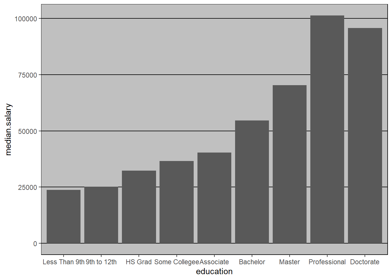
Here, I’ll just report the median salaries by level of educational attainment (2017 data):
| Level of Education | Median Salary |
|---|---|
| Total | $57,974 |
| Less Than 9th Grade | $23,760 |
| 9th to 12th Grade | $25,202 |
| High School Graduate (including G.E.D.) | $32,346 |
| Some college, no degree | $36,542 |
| Associate’s Degree | $40,355 |
| Bachelor’s Degree | $54,603 |
| Master’s Degree | $70,333 |
| Professional Degree | $101,248 |
| Doctorate Degree | $95,702 |
Is this an observational study or a randomized experiment?
Do you think the mean or median is better for incomes?
Would you like to see this information provided in a graph?
What is a “standard error”?
What pattern do you see in this data? Do you think this pattern would be statistically significant? Are these differences practically significant?
Here is a graph (visualization) of the data: