Chapter 9 Chapter 9: Graphs, Good and (mostly) Bad
9.1 Characteristics of a Good Graph
The data should stand out from the background. while there is nothing wrong with creative graphics, the numerical information being described should not be lost.
The graph should be clearly labeled, including:
having an overall title
all axes, bars, etc. are described
scale is given for all axes used (horizontal and vertical), including the starting point
The source of the data should be included in the graph or in the body of the article that accompanies the graph.
There should be no chartjunk. This is a term coined by Edward Tufte to refer to any visual elements in charts and graphs that are not necessary to comprehend the information represented on the graph, or that distract the viewer from this information.
9.2 Graphs for Categorical Data
choices include:
pie charts
bar charts
stacked bar charts
pictographs
With a pie chart, be careful that the categories are all mutually exclusive, as it is not appropriate if they are not. For example, a survey asked households what kinds of pets they own; many households own more than one type of pet (for instance, your family might have dogs, cats, and freshwater fish). A bar chart is a much better option in that case. I use a stacked bar chart later to improve (IMHO) a poor graph.
Even when pie charts are appropriate, the human eye is still not good at judging relative sizes when given as “pie pieces” rather than the height of bars. Visual tricks such as “3D” pie charts, “exploding” pie charts, or “donut charts” (a pie chart with a hole in the middle) should be avoided. The following link has a lot of bad pie charts.
http://iase-web.org/islp/apps/gov_stats_graphing/GoodBad/GoodBadGraphs.pdf
Pictographs are attempts to make a graph more visually appealing with some sort of picture. A common flaw is when the intended comparison is amplified by the “area” of the picture. Below, Burger King sales are about 3 times more than Starbucks sales. But since both logos are circular and the area of a circle is \(A=\pi r^2\), the Burger King logo is about 9 times the size of the Starbucks logo, exaggerating the difference between the two companies.
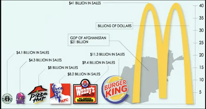
SOURCE: https://www.businessinsider.com/the-27-worst-charts-of-all-time-2013-6
9.3 Graphs for Measurement Data
Choices include:
stemplot
histograms
boxplots
scatterplots
The first three choices are appropriate for univariate data. Histograms are good for displaying the shape of a distribution, although the choice of binwidth can distort the shape. Stemplots and especially boxplots are great for comparisons between different groups. Boxplots are good for showing the five-number summary and outliers.
We’ll look at scatterplots in chapters 10 & 11, as we look at bivariate data and the relationship between two measurement level variables (such as the relationship between a car’s weight and gas mileage or a student’s ACT score and college GPA).
9.4 Time Series Graphs
When we want to see how the value of a variable changes over time, a type of line graph called a time series plot can be used, where typically time is plotted on the \(x\)-axis and the other variable of interest on the \(y\)-axis.
Here’s a graph of the level of Kentucky Lake over the past several years.

In a time series plot, we look for:
Overall trend: For example, if we were looking at the population of the United States over the past 200 years, there is an upward trend.
Seasonal trend: There is a seasonal trend of the water level of Kentucky Lake. The TVA manages the reservoir for flood control and recreational purposes, with a “winter pool” of 355 feet and a “summer pool” of 359 feet. It is very common to see seasonal trends in sales (ice cream in the summer, toys just before Christmas, etc.)
Cycles: Economic systems tend to follow irregular cycles, that are often governed by social and/or political factors (such as which party controls the government).
Random fluctuations: In the Kentucky Lake example, there are “spikes” in the time series data that tend to accompany periods of heavy rainfall. In economic data, you might see fluctuations due to historical events, such as a war, a terroristic attack, or a natural disaster such as a hurricane or earthquake.
As with any other graph, be careful to check the axes, particularly the starting point. The graph will usually but not always start at zero.
In the Kentucky Lake graph, the \(y\)-axisstarts at 352 feet rather than 0, as the level of the reservoir would never be expected to go below that level, even in a drought year. The axis goes up to 368 feet. On May 4, 2011, heavy rainfall and flooding led to a record level of 372.5 feet (the top of the dam is 375 feet).
SOURCE: http://gokentuckylake.com/Level/ (Retrived September 8, 2020) https://www.kentuckylake.com/levels/lake-levels-faqs.php
9.5 The “Best” Graph Ever (you may not agree)
Edward Tufte has said that this graph, created in the 19th century by the French engineer Charles Minard (called a flow map) is the best statistical graph ever. I’m not sure that I agree, but it does communicate the incredible loss of life suffered by the French army during Napoleon’s failed invasion of Russia in 1812-13, along with elements of the geographical location as the army advanced towards Moscow and then retreated, and the bitterly cold temperatures. The temperature here is on the now rarely used Reaumur scale, similar to Celsius in setting zero degrees at the freezing point for water, but setting the boiling point of water as 80 degrees rather than 100 degrees. (I never heard of that scale until I researched Minard’s graph)

SOURCE: https://commons.wikimedia.org/wiki/File:Minard_Update.png
9.6 The “Worst” Graphs Ever
Tufte thought this graph was the worst ever; it’s one of the 27 given in this article at Business Insider. It is truly awful, a textbook example of chartjunk!

SOURCE: https://www.businessinsider.com/the-27-worst-charts-of-all-time-2013-6
Here’s me making a graph with the statistical program R to display the same information, with a much better data-to-ink ratio. The data-ink ratio is the proportion of ink that is used to present actual data compared to the total amount of ink (or pixels) used in the entire display.