2.3 PCA Analysis
#PCA w Inference battery
pca.prep.inf <- epPCA.inference.battery(sausage.processed,
                                        center = TRUE,
                                        scale = FALSE,
                                        DESIGN = wk0$Product)
## [1] "It is estimated that your iterations will take 0.03 minutes."
## [1] "R is not in interactive() mode. Resample-based tests will be conducted. Please take note of the progress bar."
## ================================================================================Note:
Here we face a dilemma that is whether we should scale our data points during analysis? Let’s take look at both scale and not-scale. After consideration, we decided to not scale because panelist ratings are already on a Likert-scale (thus, uniform).
2.3.1 Scree Plot
Combine results from Eigenvalues Permutation test above to scree plot by adding p.ev argument (estimated p-values).
inf.scree <- PlotScree(ev = pca.prep.inf$Fixed.Data$ExPosition.Data$eigs,
                      p.ev = pca.prep.inf$Inference.Data$components$p.vals,
                      plotKaiser = TRUE)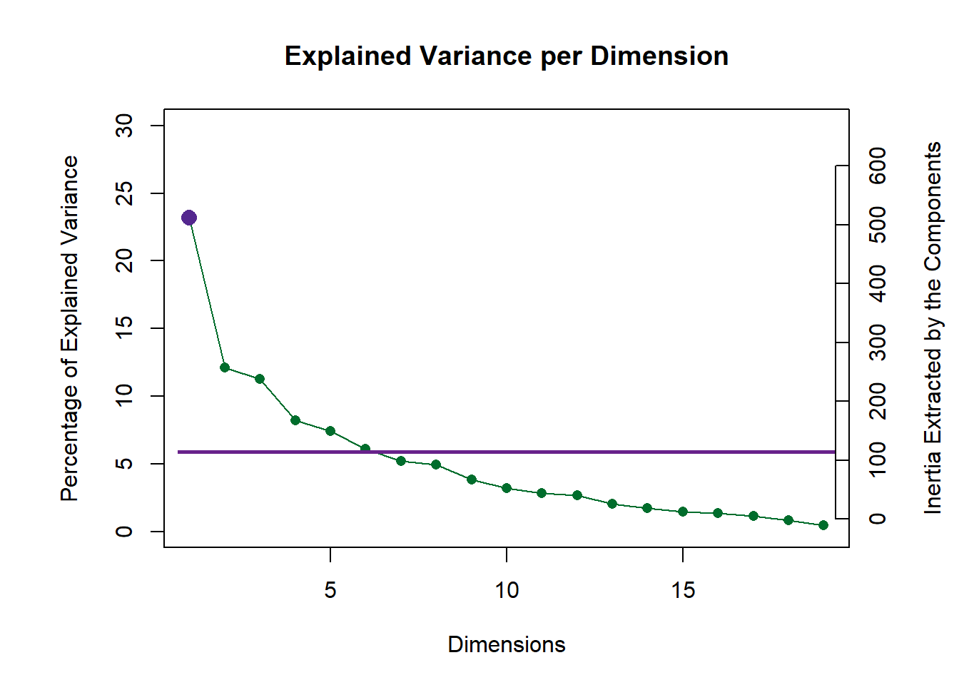
2.3.2 Testing the eigenvalues
zeDim = 1
pH1 <- prettyHist(
  distribution = pca.prep.inf$Inference.Data$components$eigs.perm[,zeDim],
  observed = pca.prep.inf$Fixed.Data$ExPosition.Data$eigs[zeDim],
  xlim = c(200, 550), # needs to be set by hand
  breaks = 20,
  border = "white",
  main = paste0("Permutation Test for Eigenvalue ",zeDim),
  xlab = paste0("Eigenvalue ",zeDim),
  ylab = "",
  counts = FALSE,
  cutoffs = c( 0.975)
  )
#eigen plot 2----
zeDim = 2
pH2 <- pH1 <- prettyHist(
  distribution = pca.prep.inf$Inference.Data$components$eigs.perm[,zeDim],
  observed = pca.prep.inf$Fixed.Data$ExPosition.Data$eigs[zeDim],
  xlim = c(200, 350), # needs to be set by hand
  breaks = 20,
  border = "white",
  main = paste0("Permutation Test for Eigenvalue ",zeDim),
  xlab = paste0("Eigenvalue ",zeDim),
  ylab = "",
  counts = FALSE,
  cutoffs = c(0.975))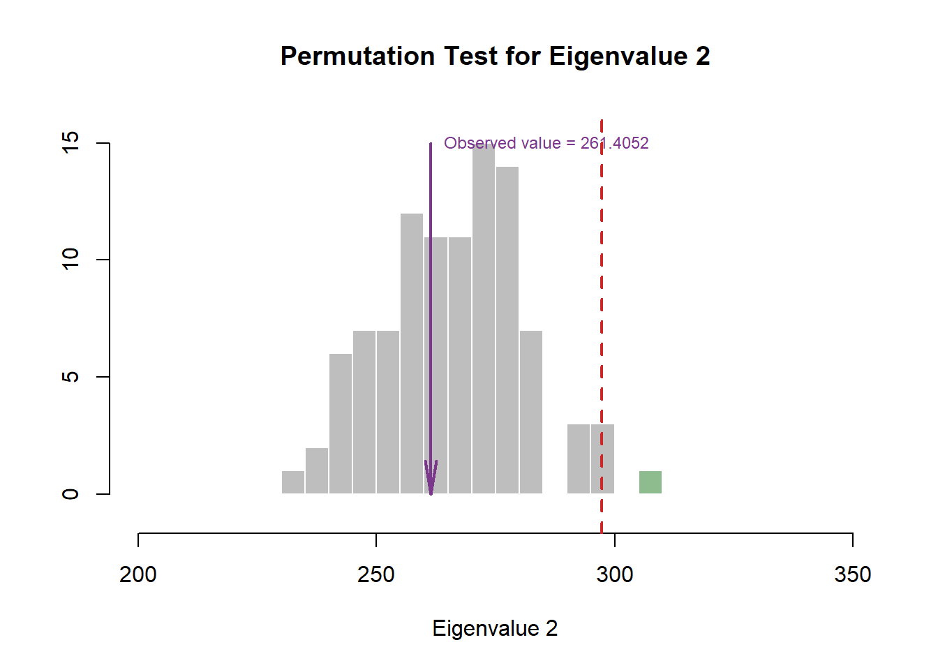
2.3.3 Rows Factor Scores
We will map all observations onto the newly-formed Principal Components. Keep in mind that we interpret Factor Scores (aka Row Factor Map) by distances between data points. It is important that we show insights from multiple perspectives. Thus, we will perform 3 Factor Scores with 3 different groupings (colored accordingly). We will be stacking different maps as layers on top of teach others.
First, we will need to control for the different color schemes:
Color Schemes:
#Colors by products:
prod.color <- dplyr::recode(wk0$Product,
                     'SALCHICHA DE PAVO CHIMEX' = 'green3',
                     'Salchicha de pavo FUD' = 'blue',
                     'Salchicha de Pavo Nutrideli' = 'brown',
                     'Salchicha pavo CHERO' = 'firebrick1',
                     'SALCHICHA VIENA CHIMEX' = 'grey50',
                     'Salchicha viena FUD' = 'orange',
                     'Salchicha Viena Nutrideli' = 'darkorchid',
                     'Salchicha VIENA VIVA' = 'deeppink'
                     )

#Colors by products mean:
prod.color.mean <- dplyr::recode(wk6$Product,
                         'SALCHICHA DE PAVO CHIMEX' = 'green3',
                         'Salchicha de pavo FUD' = 'blue',
                         'Salchicha de Pavo Nutrideli' = 'brown',
                         'Salchicha pavo CHERO' = 'firebrick1',
                         'SALCHICHA VIENA CHIMEX' = 'grey50',
                         'Salchicha viena FUD' = 'orange',
                         'Salchicha Viena Nutrideli' = 'darkorchid',
                         'Salchicha VIENA VIVA' = 'deeppink')

#Color by Panelists:
prod.color.panelist <- dplyr::recode_factor(wk0$Panelist,
                                     'XEL' = 'green3',
                                     'LALO' = 'blue',
                                     'JUAN' = 'brown',
                                     'MARTHA' = 'firebrick1',
                                     'NERI' = 'grey50',
                                     'DIANA' = 'orange',
                                     'DULCE' = 'darkorchid',
                                     'RAUL' = 'deeppink',
                                     'MINE' = 'ivory')

#colors by sausage type
prod.color.type <- dplyr::recode(wk0$Product,
                       'SALCHICHA DE PAVO CHIMEX' = 'green3',
                       'Salchicha de pavo FUD' = 'green3',
                       'Salchicha de Pavo Nutrideli' = 'green3',
                       'Salchicha pavo CHERO' = 'green3',
                       'SALCHICHA VIENA CHIMEX' = 'orange',
                       'Salchicha viena FUD' = 'orange',
                       'Salchicha Viena Nutrideli' = 'orange',
                       'Salchicha VIENA VIVA' = 'orange'
                       )
Factor Scores Group Means: By Products:
#Control our data and process to get group means by products
#Extract means data from InPosition Results
mean.by.product <- as.data.frame(pca.prep.inf$Fixed.Data$ExPosition.Data$fi)

#Function to find means
group.mean <- aggregate(mean.by.product,
                        by = list(wk0$Product), # must be a list
                        mean)

#Cleanup our dataframe
sausage.processed.mean <- group.mean[,-1]
rownames(sausage.processed.mean) <- group.mean[, 1]

#Display dataframe
b <- kable(sausage.processed.mean)
scroll_box(b, width = "910px", height = "200px")| V1 | V2 | V3 | V4 | V5 | V6 | V7 | V8 | V9 | V10 | V11 | V12 | V13 | V14 | V15 | V16 | V17 | V18 | V19 | |
|---|---|---|---|---|---|---|---|---|---|---|---|---|---|---|---|---|---|---|---|
| SALCHICHA DE PAVO CHIMEX | 1.2394043 | -2.0524070 | 1.099511 | 0.7269461 | -0.5311395 | -0.8079869 | -0.7512369 | 0.0748295 | -0.3750248 | -0.3580580 | -0.1854410 | -0.2035473 | -0.4054694 | -0.0938875 | -0.3791593 | 0.0541523 | -0.1046818 | -0.1377169 | -0.1680564 |
| Salchicha de pavo FUD | 1.9330086 | 0.7268798 | -1.226526 | 1.2966562 | -1.2154268 | -0.5166001 | 1.0448834 | 0.7350809 | 0.4061592 | 1.3016719 | -0.2591097 | -0.4066840 | 0.3551026 | 0.3029441 | 0.2121841 | 0.0980847 | -0.0531235 | -0.2212013 | 0.0580410 |
| Salchicha de Pavo Nutrideli | 1.4384999 | -0.1030156 | -1.221672 | -1.3433176 | -0.1463937 | -0.3579041 | 0.0976360 | -0.2522029 | 0.0128424 | -0.5199416 | -0.2075354 | 0.3637541 | -0.2407137 | -0.2069871 | 0.4635503 | -0.1557881 | -0.0519003 | 0.3513210 | -0.1650250 |
| Salchicha pavo CHERO | 0.5633270 | 3.8600032 | 1.779502 | 0.4870372 | 0.4091708 | 0.6150715 | -0.1294381 | -0.4149953 | -0.1663097 | 0.0500330 | 0.1442274 | 0.0847115 | 0.0157336 | -0.1058860 | -0.3375169 | -0.1497788 | -0.1365166 | 0.1148656 | 0.1012160 |
| SALCHICHA VIENA CHIMEX | 2.2645779 | -2.0239543 | 1.888453 | 0.4403874 | 0.2246586 | 0.7760842 | 0.2781477 | -0.5367027 | -0.0860096 | -0.2838238 | 0.3382057 | -0.1106046 | 0.1944087 | 0.0979439 | 0.2393629 | 0.0256800 | 0.2204307 | 0.2649730 | 0.0266150 |
| Salchicha viena FUD | -5.2520979 | 0.2748239 | 1.210188 | -0.1807597 | -0.1786208 | -0.6860543 | -0.0904392 | -0.6118553 | -0.2868873 | 0.4672659 | -0.0030648 | 0.0265137 | -0.1083255 | -0.0642438 | 0.2275572 | -0.0664002 | 0.1788398 | 0.0296793 | 0.0217461 |
| Salchicha Viena Nutrideli | -3.1743940 | -1.4028712 | -1.277285 | -0.9495755 | 0.2488221 | 0.6313564 | 0.6182676 | 0.6569672 | 0.6927863 | 0.0100017 | 0.0489783 | 0.3506571 | 0.3219506 | -0.0249282 | -0.3729888 | -0.1430382 | -0.1633301 | -0.2069655 | -0.0227696 |
| Salchicha VIENA VIVA | 0.9876742 | 0.7205412 | -2.252171 | -0.4773741 | 1.1889293 | 0.3460334 | -1.0678206 | 0.3488785 | -0.1975565 | -0.6671490 | 0.1237395 | -0.1048005 | -0.1326869 | 0.0950446 | -0.0529895 | 0.3370883 | 0.1102817 | -0.1949552 | 0.1482329 |
#Create factor map for group means by products
fi.mean.plot <- createFactorMap(sausage.processed.mean,
                                alpha.points = 0.8,
                                col.points = prod.color.mean,
                                col.labels = prod.color.mean,
                                pch = 17,
                                cex = 3,
                                text.cex = 3)
By Panelists
mean.by.panelist <- as.data.frame(pca.prep.inf$Fixed.Data$ExPosition.Data$fi)

#Function to find means
group.mean.panelist <- aggregate(mean.by.panelist,
                        by = list(wk0$Panelist), # must be a list
                        mean)

#Cleanup our dataframe
t.group.mean.panelist <- group.mean.panelist[, -1]
rownames(t.group.mean.panelist) <- group.mean.panelist[, 1]

#Display dataframe
c <- kable(t.group.mean.panelist)
scroll_box(c, width = "910px", height = "200px")| V1 | V2 | V3 | V4 | V5 | V6 | V7 | V8 | V9 | V10 | V11 | V12 | V13 | V14 | V15 | V16 | V17 | V18 | V19 | |
|---|---|---|---|---|---|---|---|---|---|---|---|---|---|---|---|---|---|---|---|
| DIANA | 1.7850755 | 0.1970943 | 0.9404685 | -1.9187851 | 0.6602523 | -1.5753708 | 0.0907514 | -0.7553454 | 0.7756005 | 0.4662678 | -0.3201513 | 0.3404141 | 0.1064044 | 0.2473606 | -0.3213027 | -0.1294248 | -0.1167575 | -0.1253762 | 0.1219437 |
| DULCE | -0.0167322 | 0.3464073 | -0.4826686 | -0.2520327 | 0.3709075 | 0.6003449 | -0.9372099 | -0.3615094 | -0.2393502 | 0.0352181 | 0.4540946 | -0.7422984 | -0.3005186 | 0.0362544 | 0.0404885 | -0.2513550 | 0.0706413 | -0.3501098 | 0.0382129 |
| JUAN | -1.1265089 | -0.0882003 | 0.7757999 | -0.8108529 | -0.7804541 | 0.8001554 | 0.0402400 | 0.8865713 | -0.6313373 | -0.8014247 | -0.5078233 | -0.3167829 | 0.0940007 | 0.3121076 | -0.1880986 | -0.0130495 | -0.0286158 | 0.0189474 | -0.0048153 |
| LALO | 0.0866386 | -0.3116102 | -0.1314004 | 0.5785014 | -0.5800335 | 0.6314740 | 0.3039228 | -0.6368290 | 0.0531224 | 0.1988900 | 0.0108409 | -0.2674967 | 0.4102177 | 0.0856262 | -0.3786094 | 0.3095158 | -0.1439054 | 0.1664978 | 0.0409470 |
| MARTHA | -0.3503689 | -0.7471217 | 0.7906657 | 0.9673564 | 1.3215498 | 0.1926965 | -0.8188271 | 0.7757472 | 0.0489221 | 0.3948487 | -0.4434475 | 0.8420194 | 0.1189427 | 0.2376141 | 0.3669611 | 0.0924394 | 0.0785056 | -0.0925500 | -0.0664284 |
| MINE | 2.2334506 | -0.9038765 | 1.6498440 | -0.2716412 | -1.8984028 | 0.9555717 | -0.4360030 | 1.1400958 | -0.1987774 | -0.2513268 | 0.1832707 | 0.4061695 | 0.8043519 | -0.4899367 | 0.0230596 | 0.1223055 | -0.1639724 | -0.0686819 | -0.1417785 |
| NERI | -0.2586072 | 0.0530440 | 0.1285145 | 0.1024858 | 0.8434491 | -0.6528730 | 1.2588603 | 0.2667983 | 0.0729350 | -0.0629078 | 0.3962235 | -0.3736495 | -0.5244184 | -0.5651530 | 0.1930417 | 0.4857600 | 0.4401169 | 0.1893124 | 0.0569193 |
| RAUL | -0.6304393 | 1.3608085 | -2.0754886 | 0.4822039 | -0.5019052 | -1.2014519 | 0.6957031 | 0.1406834 | -0.9720838 | -0.7195441 | -0.0428123 | 0.3870323 | 0.1549228 | 0.3358149 | -0.0828268 | -0.7099419 | -0.0092452 | 0.1319482 | -0.1357611 |
| XEL | -0.6250250 | -0.1422912 | -0.9864797 | 0.9721830 | -0.8448979 | 0.6463420 | -0.2909837 | -0.5976601 | 0.6447948 | 0.3028356 | 0.3101678 | 0.0356084 | -0.3107025 | -0.3829314 | 0.3174799 | -0.0089252 | -0.2351387 | 0.1224414 | -0.0323933 |
#Color by Panelists means:
prod.color.panelist.mean <- dplyr::recode_factor(group.mean.panelist[, 1],
                                     'XEL' = 'green3',
                                     'LALO' = 'blue',
                                     'JUAN' = 'brown',
                                     'MARTHA' = 'firebrick1',
                                     'NERI' = 'grey50',
                                     'DIANA' = 'orange',
                                     'DULCE' = 'darkorchid',
                                     'RAUL' = 'deeppink',
                                     'MINE' = 'ivory')

#Create factor map for group means by products
fi.mean.plot.panelist <- createFactorMap(t.group.mean.panelist,
                                alpha.points = 0.8,
                                col.points = prod.color.panelist.mean,
                                col.labels = prod.color.panelist.mean,
                                pch = 17,
                                cex = 3,
                                text.cex = 3)
By Sausage Type (or Session):
We learned that session determine what type of sausage is tested. Session 1 tests all Pavo sausages and Session 2 tests all Viena sausages.
mean.by.type <- as.data.frame(pca.prep.inf$Fixed.Data$ExPosition.Data$fi)

#Function to find means
group.mean.type <- aggregate(mean.by.type,
                        by = list(wk0$Session), # must be a list
                        mean)

#Cleanup our dataframe
t.group.mean.type <- group.mean.type[, -1]
assign.type <- ifelse(group.mean.type[1] == 1, "Pavo", "Viena") #assign sausage type
rownames(t.group.mean.type) <- assign.type

#Display dataframe
d <- kable(t.group.mean.type)
scroll_box(d, width = "910px", height = "200px")| V1 | V2 | V3 | V4 | V5 | V6 | V7 | V8 | V9 | V10 | V11 | V12 | V13 | V14 | V15 | V16 | V17 | V18 | V19 | |
|---|---|---|---|---|---|---|---|---|---|---|---|---|---|---|---|---|---|---|---|
| Pavo | 1.29356 | 0.6078651 | 0.1077038 | 0.2918305 | -0.3709473 | -0.2668549 | 0.0654611 | 0.0356781 | -0.0305832 | 0.1184263 | -0.1269647 | -0.0404414 | -0.0688367 | -0.0259541 | -0.0102354 | -0.0383325 | -0.0865555 | 0.0268171 | -0.0434561 |
| Viena | -1.29356 | -0.6078651 | -0.1077038 | -0.2918305 | 0.3709473 | 0.2668549 | -0.0654611 | -0.0356781 | 0.0305832 | -0.1184263 | 0.1269647 | 0.0404414 | 0.0688367 | 0.0259541 | 0.0102354 | 0.0383325 | 0.0865555 | -0.0268171 | 0.0434561 |
#Color by sausage type means
prod.color.type.mean <- dplyr::recode(group.mean.type$Group.1,
                       '1' = 'green3',
                       '2' = 'orange',
                       )

#Create factor map for group means by products
fi.mean.plot.type <- createFactorMap(t.group.mean.type,
                                alpha.points = 0.8,
                                col.points = prod.color.type.mean,
                                col.labels = prod.color.type.mean,
                                pch = 17,
                                cex = 3,
                                text.cex = 3)
Factor Scores Map 1: by Panelist
t1.aMap <- createFactorMap(pca.prep.inf$Fixed.Data$ExPosition.Data$fi,
                          axis1 = 1,
                          axis2 = 2,
                          title = "Observations Factor Scores (Colored by Panelists)",
                          col.points = prod.color.panelist,
                          col.labels = prod.color.panelist,
                          cex = 2.5,
                          text.cex = 3,
                          display.labels = FALSE)

t2.aMap <- createFactorMap(pca.prep.inf$Fixed.Data$ExPosition.Data$fi,
                          axis1 = 1,
                          axis2 = 2,
                          title = "Observations Factor Scores (Colored by Panelists) with TI and Means",
                          col.points = prod.color.panelist,
                          col.labels = prod.color.panelist,
                          cex = 2.5,
                          text.cex = 3,
                          display.labels = FALSE)

t3.aMap <- createFactorMap(pca.prep.inf$Fixed.Data$ExPosition.Data$fi,
                          axis1 = 1,
                          axis2 = 2,
                          title = "Observations Factor Scores (Colored by Panelists) with BI and Means",
                          col.points = prod.color.panelist,
                          col.labels = prod.color.panelist,
                          cex = 2.5,
                          text.cex = 3,
                          display.labels = FALSE)

row.label <- createxyLabels.gen(1,2,
                                lambda = round(pca.prep.inf$Fixed.Data$ExPosition.Data$eigs),
                                tau = round(pca.prep.inf$Fixed.Data$ExPosition.Data$t),
                                axisName = "Component")

#draw  out Row factor score map 3
row.fscore1 <- t1.aMap$zeMap + row.label
row.fscore1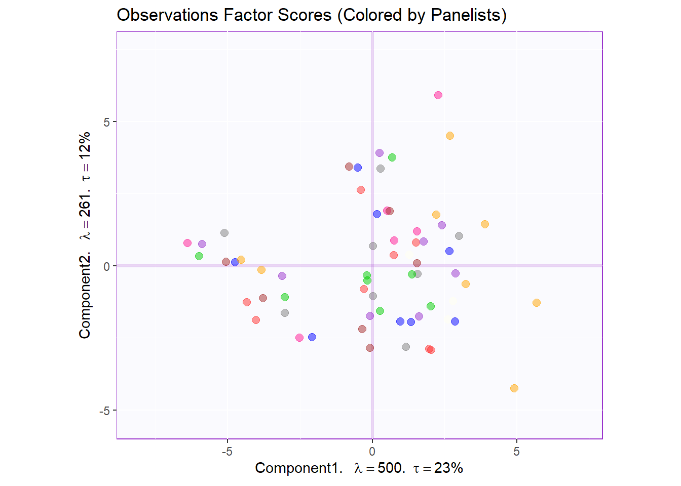
Factor Scores Map 1 with TI and means: by Panelist
Tolerance Interval:
#Make TI map:
TIplot.panelist <- MakeToleranceIntervals(pca.prep.inf$Fixed.Data$ExPosition.Data$fi,
                                 design = as.factor(wk0$Panelist),
                                 # line below is needed
                                 names.of.factors =  c("Dim1","Dim2"), # needed
                                 col = prod.color.panelist.mean,
                                 line.size = .50,
                                 line.type = 3,
                                 alpha.ellipse = .2,
                                 alpha.line    = .4,
                                 p.level       = .95)


row.full.1TI <- t2.aMap$zeMap_background + t2.aMap$zeMap_dots + fi.mean.plot.panelist$zeMap_dots + fi.mean.plot.panelist$zeMap_text + TIplot.panelist + row.label
row.full.1TI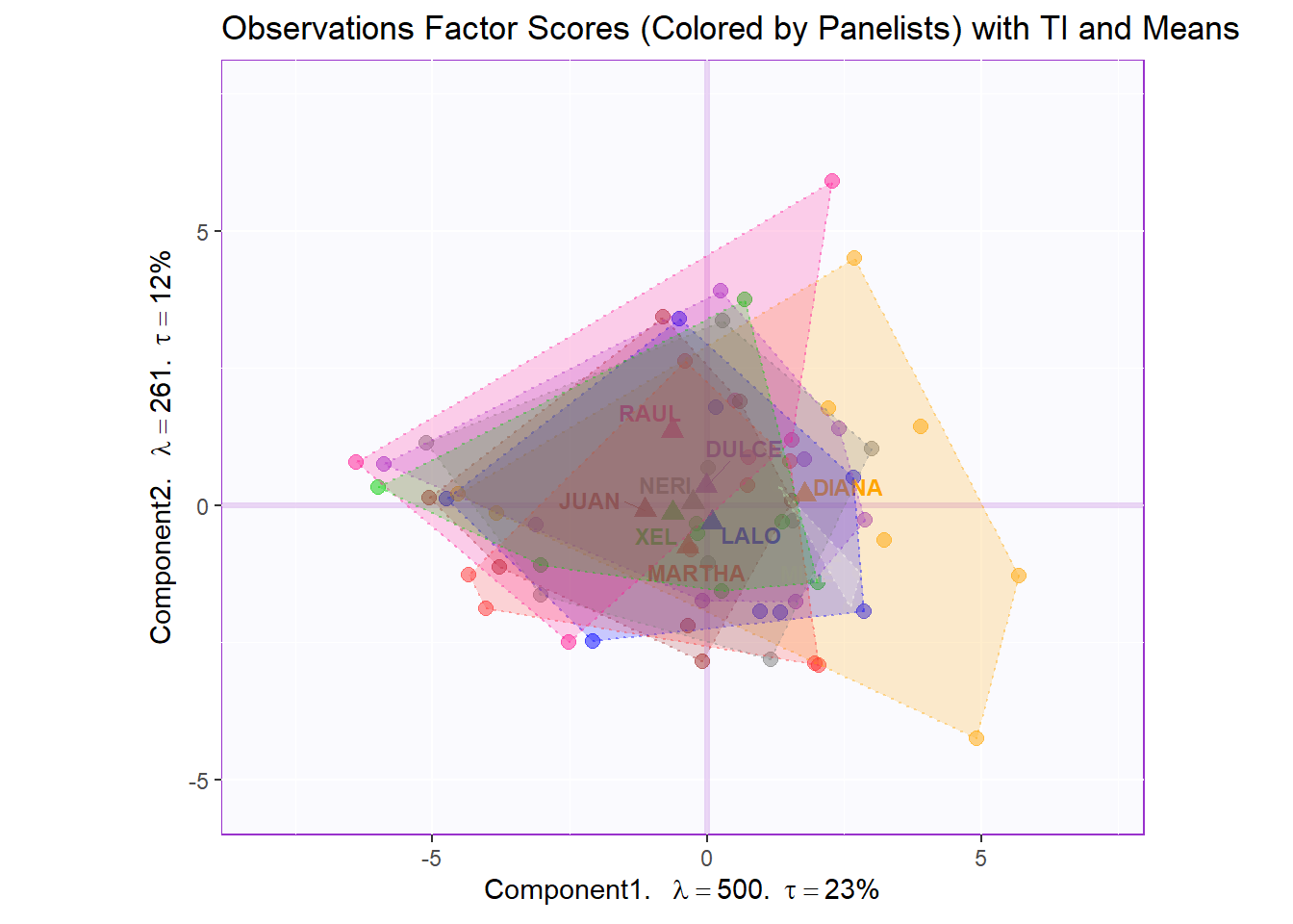
Bootstrap Interval:
fi.boot.panelist <- Boot4Mean(pca.prep.inf$Fixed.Data$ExPosition.Data$fi,
                     design = wk0$Panelist,
                     niter = 1000)

bootCI4mean.panelist <- MakeCIEllipses(fi.boot.panelist$BootCube[,c(1:2),], # get the first two components
                              col = prod.color.panelist.mean)

row.full.1BI <- t3.aMap$zeMap_background + t3.aMap$zeMap_dots + bootCI4mean.panelist + fi.mean.plot.panelist$zeMap_dots + fi.mean.plot.panelist$zeMap_text + row.label
row.full.1BI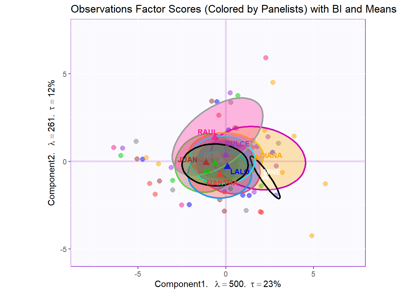
Factor Scores Map 2: by Products
t1.bMap <- createFactorMap(pca.prep.inf$Fixed.Data$ExPosition.Data$fi,
                          axis1 = 1,
                          axis2 = 2,
                          title = "Observations Factor Scores (Colored by Products)",
                          col.points = prod.color,
                          col.labels = prod.color,
                          cex = 2.5,
                          text.cex = 3,
                          display.labels = FALSE)

t2.bMap <- createFactorMap(pca.prep.inf$Fixed.Data$ExPosition.Data$fi,
                          axis1 = 1,
                          axis2 = 2,
                          title = "Observations Factor Scores (Colored by Products) with TI and Means",
                          col.points = prod.color,
                          col.labels = prod.color,
                          cex = 2.5,
                          text.cex = 3,
                          display.labels = FALSE)

t3.bMap <- createFactorMap(pca.prep.inf$Fixed.Data$ExPosition.Data$fi,
                          axis1 = 1,
                          axis2 = 2,
                          title = "Observations Factor Scores (Colored by Products) with BI and Means",
                          col.points = prod.color,
                          col.labels = prod.color,
                          cex = 2.5,
                          text.cex = 3,
                          display.labels = FALSE)

row.label <- createxyLabels.gen(1,2,
                                lambda = round(pca.prep.inf$Fixed.Data$ExPosition.Data$eigs),
                                tau = round(pca.prep.inf$Fixed.Data$ExPosition.Data$t),
                                axisName = "Component")

#draw  out Row factor score map 3
row.fscore2 <- t1.bMap$zeMap + row.label
row.fscore2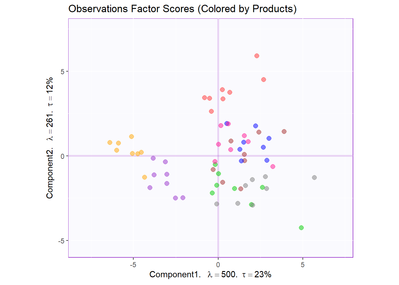
Factor Scores Map 2 with TI and means: by Panelist
Tolerance Interval
#Make TI map:
TIplot.product <- MakeToleranceIntervals(pca.prep.inf$Fixed.Data$ExPosition.Data$fi,
                                 design = as.factor(wk0$Product),
                                 # line below is needed
                                 names.of.factors =  c("Dim1","Dim2"), # needed
                                 col = prod.color.mean,
                                 line.size = .50,
                                 line.type = 3,
                                 alpha.ellipse = .2,
                                 alpha.line    = .4,
                                 p.level       = .95)


row.full.2TI <- t2.bMap$zeMap_background + t2.bMap$zeMap_dots + fi.mean.plot$zeMap_dots + fi.mean.plot$zeMap_text + TIplot.product + row.label
row.full.2TI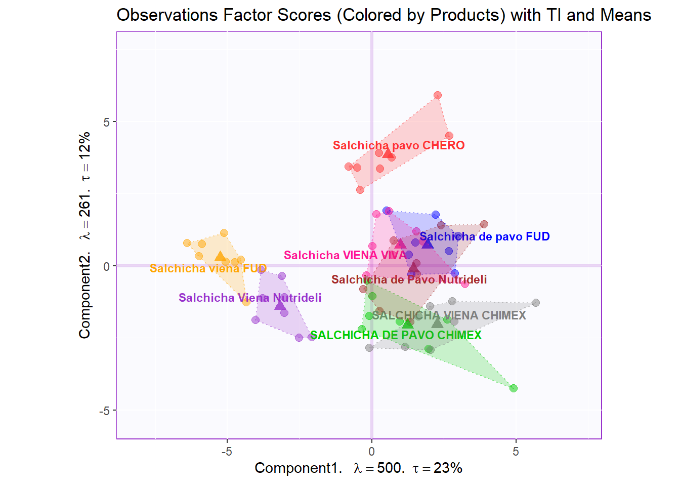
Boostrap Interval
fi.boot.product <- Boot4Mean(pca.prep.inf$Fixed.Data$ExPosition.Data$fi,
                     design = wk0$Product,
                     niter = 1000)

bootCI4mean.product <- MakeCIEllipses(fi.boot.product$BootCube[,c(1:2),], # get the first two components
                              col = prod.color.mean)

row.full.2BI <- t3.bMap$zeMap_background + t3.bMap$zeMap_dots + bootCI4mean.product + fi.mean.plot$zeMap_dots + fi.mean.plot$zeMap_text + row.label
row.full.2BI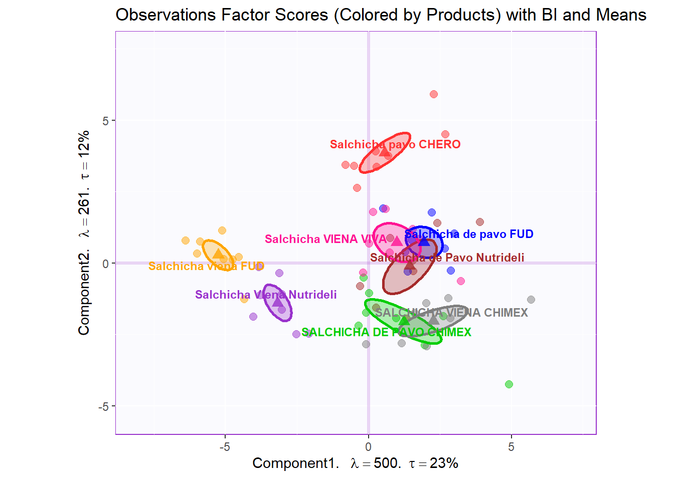
Factor Scores Map 3: by Sausage Type Note: There is not a lot of interesting insights from row factor map 1 and 2. We noticed that there 2 types sausages (not already pointed out in the dataset) that are Pavo (Turkey) and Viena (Mixed). Let’s assume that sausage type is a valid differentiating attribute ans recolor our observation where Pavo sausages are in green and Viena sausages are in orange.
t1.cMap <- createFactorMap(pca.prep.inf$Fixed.Data$ExPosition.Data$fi,
                          axis1 = 1,
                          axis2 = 2,
                          title = "Observations Factor Scores (Colored by Type - Pavo vs Viena)",
                          col.points = prod.color.type,
                          col.labels = prod.color.type,
                          cex = 2.5,
                          text.cex = 3,
                          display.labels = FALSE)

t2.cMap <- createFactorMap(pca.prep.inf$Fixed.Data$ExPosition.Data$fi,
                          axis1 = 1,
                          axis2 = 2,
                          title = "Observations Factor Scores (Colored by Type) with TI and Means",
                          col.points = prod.color.type,
                          col.labels = prod.color.type,
                          cex = 2.5,
                          text.cex = 3,
                          display.labels = FALSE)

t3.cMap <- createFactorMap(pca.prep.inf$Fixed.Data$ExPosition.Data$fi,
                          axis1 = 1,
                          axis2 = 2,
                          title = "Observations Factor Scores (Colored by Type) with BI and Means",
                          col.points = prod.color.type,
                          col.labels = prod.color.type,
                          cex = 2.5,
                          text.cex = 3,
                          display.labels = FALSE)

row.label <- createxyLabels.gen(1,2,
                                lambda = round(pca.prep.inf$Fixed.Data$ExPosition.Data$eigs),
                                tau = round(pca.prep.inf$Fixed.Data$ExPosition.Data$t),
                                axisName = "Component")

#draw  out Row factor score map 3
row.fscore3 <- t1.cMap$zeMap + row.label
row.fscore3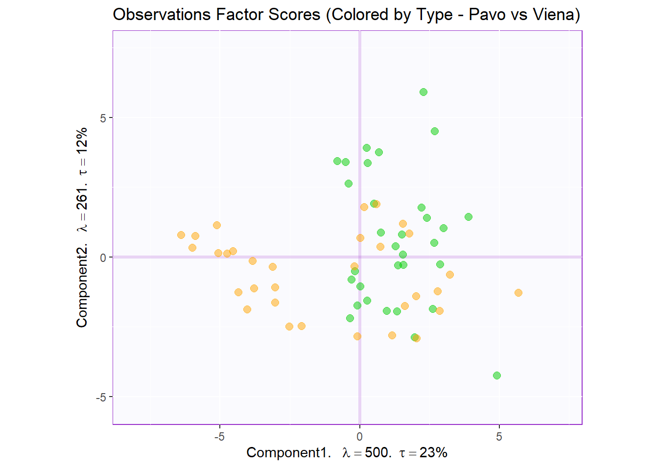
Factor Scores Map 3 with TI/BI and means: by Sausage Type
Tolerance Interval:
#Make TI map:
TIplot.type <- MakeToleranceIntervals(pca.prep.inf$Fixed.Data$ExPosition.Data$fi,
                                 design = as.factor(wk0$Session),
                                 # line below is needed
                                 names.of.factors =  c("Dim1","Dim2"), # needed
                                 col = prod.color.type.mean,
                                 line.size = .50,
                                 line.type = 3,
                                 alpha.ellipse = .2,
                                 alpha.line    = .4,
                                 p.level       = .95)


row.full.3TI <- t2.cMap$zeMap_background + t2.cMap$zeMap_dots + fi.mean.plot.type$zeMap_dots + fi.mean.plot.type$zeMap_text + TIplot.type + row.label
row.full.3TI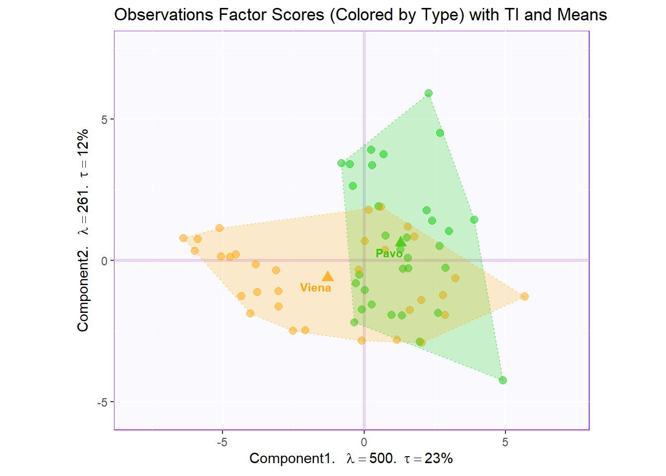
Boostrap Interval:
fi.boot.type <- Boot4Mean(pca.prep.inf$Fixed.Data$ExPosition.Data$fi,
                     design = wk0$Session,
                     niter = 1000)

bootCI4mean.type <- MakeCIEllipses(fi.boot.type$BootCube[,c(1:2),], # get the first two components
                              col = prod.color.type.mean)

row.full.3BI <- t3.cMap$zeMap_background + t3.cMap$zeMap_dots + bootCI4mean.type + fi.mean.plot.type$zeMap_dots + fi.mean.plot.type$zeMap_text + row.label
row.full.3BI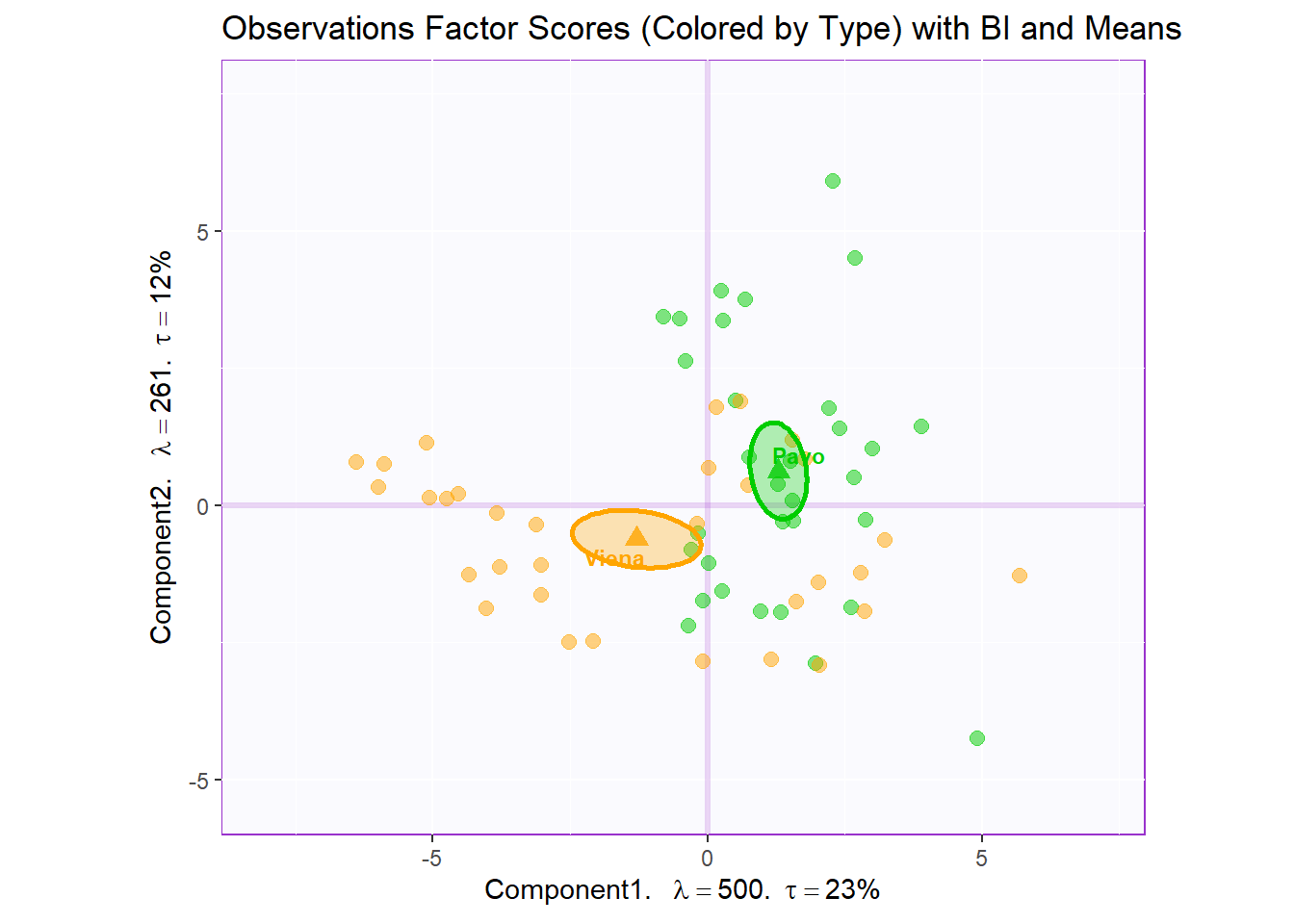
2.3.3.1 Combine Factor Scores for Comparison:
All row factor scores
#We then use the next line of code to put two figures side to side:
require(ggplot2)
library(gridExtra)
require(ggplotify)

final.output.barplots <- grid.arrange(
    as.grob(row.fscore1),
    as.gron(row.full.1TI),
    as.grob(row.full.1BI),
    as.grob(row.fscore2),
    as.grob(row.full.2TI),
    as.grob(row.full.2BI),
    as.grob(row.fscore3),
    as.grob(row.full.3TI),
    as.grob(row.full.3BI),
    ncol = 3,nrow = 3,
    top = "Observation Factor Scores in 3 Perspectives"
  )
2.3.4 Columns Factor Scores
Notes:
The angle between the vectors is an approximation of the correlation between the variables. A small angle indicates the variables are positively correlated, an angle of 90 degrees indicates the variables are not correlated, and an angle close to 180 degrees indicates the variables are negatively correlated.
Variables Factor Scores
#Color for variables:
#Assign different colors to each variables:
var <- colnames(sausage.processed)
var.color <- prettyGraphsColorSelection(n.colors = ncol(sausage.processed))
#too many var to assign color manually so we use prettyGraphsColorSelection() to automatically assign colors

#Column Factor Scores----
my.fj.plot <- createFactorMap(pca.prep.inf$Fixed.Data$ExPosition.Data$fj, # data
                              title = "Variables Factor Scores", # title of the plot
                              axis1 = 1, axis2 = 2, # which component for x and y axes
                              pch = 19, # the shape of the dots (google `pch`)
                              cex = 3, # the size of the dots
                              text.cex = 3, # the size of the text
                              col.points = var.color, # color of the dots
                              col.labels = var.color, # color for labels of dots
)

fj.plot <- my.fj.plot$zeMap + row.label # you need this line to be able to save them in the end
fj.plot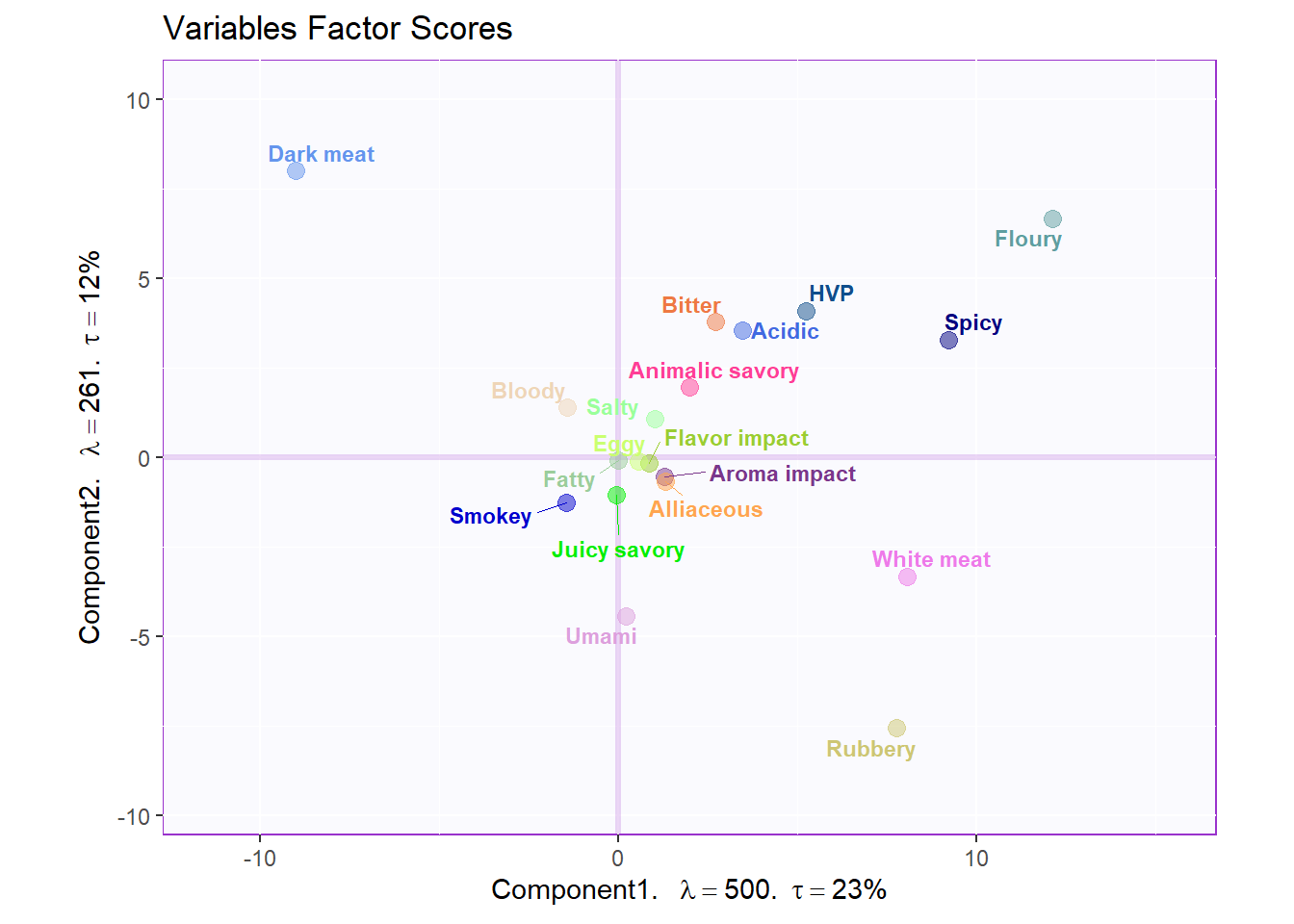
Loadings Circle
#Loadings circle----
  cor.loading <- cor(sausage.processed, pca.prep.inf$Fixed.Data$ExPosition.Data$fi)
rownames(cor.loading) <- rownames(cor.loading)

loading.plot <- createFactorMap(cor.loading,
                                constraints = list(minx = -1, miny = -1,
                                                   maxx = 1, maxy = 1),
                                col.points = var.color,
                                col.labels = var.color,
                                title = "Loadings Circle")

LoadingMapWithCircles <- loading.plot$zeMap +
                          addArrows(cor.loading, color = var.color) +
                          addCircleOfCor() + xlab("Component 1") + ylab("Component 2")
LoadingMapWithCircles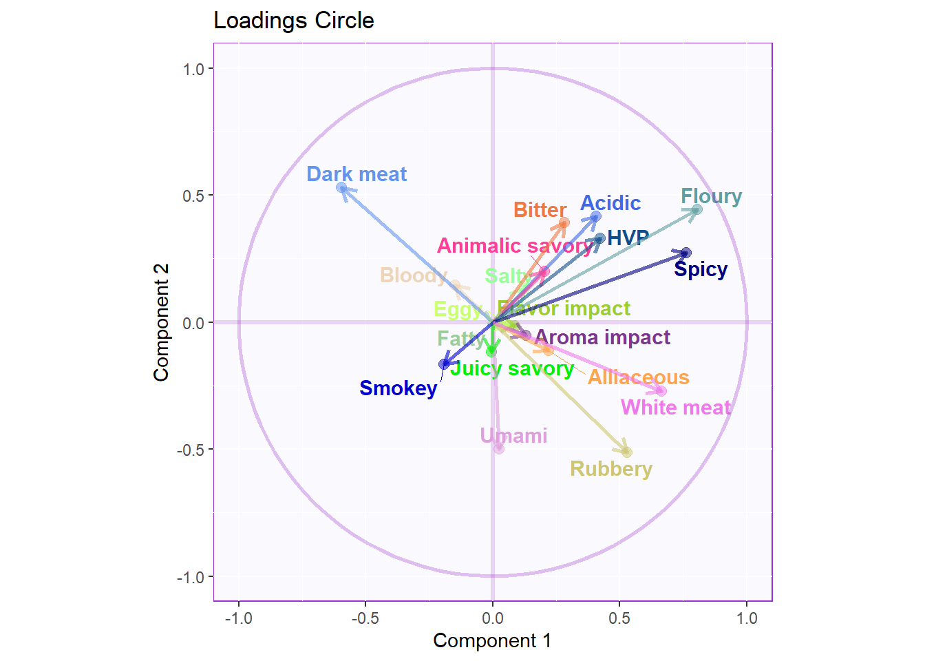
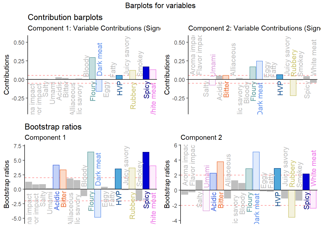
2.3.5 Contributions and Bootstrap Ratio of Columns
Notes:
This is not the same as the contribution bars
Contribution Barplot:
signed.ctrJ <- pca.prep.inf$Fixed.Data$ExPosition.Data$cj * sign(pca.prep.inf$Fixed.Data$ExPosition.Data$fj)

# plot contributions for component 1
ctrJ.1 <- PrettyBarPlot2(signed.ctrJ[,1],
                         threshold = 1 / NROW(signed.ctrJ),
                         font.size = 4,
                         color4bar = var.color,
                         ylab = 'Contributions',
                         ylim = c(1.2*min(signed.ctrJ), 1.2*max(signed.ctrJ))
) + ggtitle("Contribution barplots", subtitle = 'Component 1: Variable Contributions (Signed)')

# plot contributions for component 2
ctrJ.2 <- PrettyBarPlot2(signed.ctrJ[,2],
                         threshold = 1 / NROW(signed.ctrJ),
                         font.size = 4,
                         color4bar = var.color,
                         ylab = 'Contributions',
                         ylim = c(1.2*min(signed.ctrJ), 1.2*max(signed.ctrJ))
) + ggtitle("",subtitle = 'Component 2: Variable Contributions (Signed)')
Bootstrap Ratio Barplot:
BR <- pca.prep.inf$Inference.Data$fj.boots$tests$boot.ratios
laDim = 1

# Plot the bootstrap ratios for Dimension 1
ba001.BR1 <- PrettyBarPlot2(BR[,laDim],
                            threshold = 2,
                            font.size = 4,
                            color4bar = var.color,
                            ylab = 'Bootstrap ratios'
                            #ylim = c(1.2*min(BR[,laDim]), 1.2*max(BR[,laDim]))
) + ggtitle("Bootstrap ratios", subtitle = paste0('Component ', laDim))

# Plot the bootstrap ratios for Dimension 2
laDim = 2
ba002.BR2 <- PrettyBarPlot2(BR[,laDim],
                            threshold = 2,
                            font.size = 4,
                            color4bar = var.color,
                            ylab = 'Bootstrap ratios'
                            #ylim = c(1.2*min(BR[,laDim]), 1.2*max(BR[,laDim]))
) + ggtitle("",subtitle = paste0('Component ', laDim))

#We then use the next line of code to put two figures side to side:

final.output.barplots <- grid.arrange(
    ctrJ.1,
    ctrJ.2,
    ba001.BR1,
    ba002.BR2,
    ncol = 2,nrow = 2,
    top = "Barplots for variables"
  )