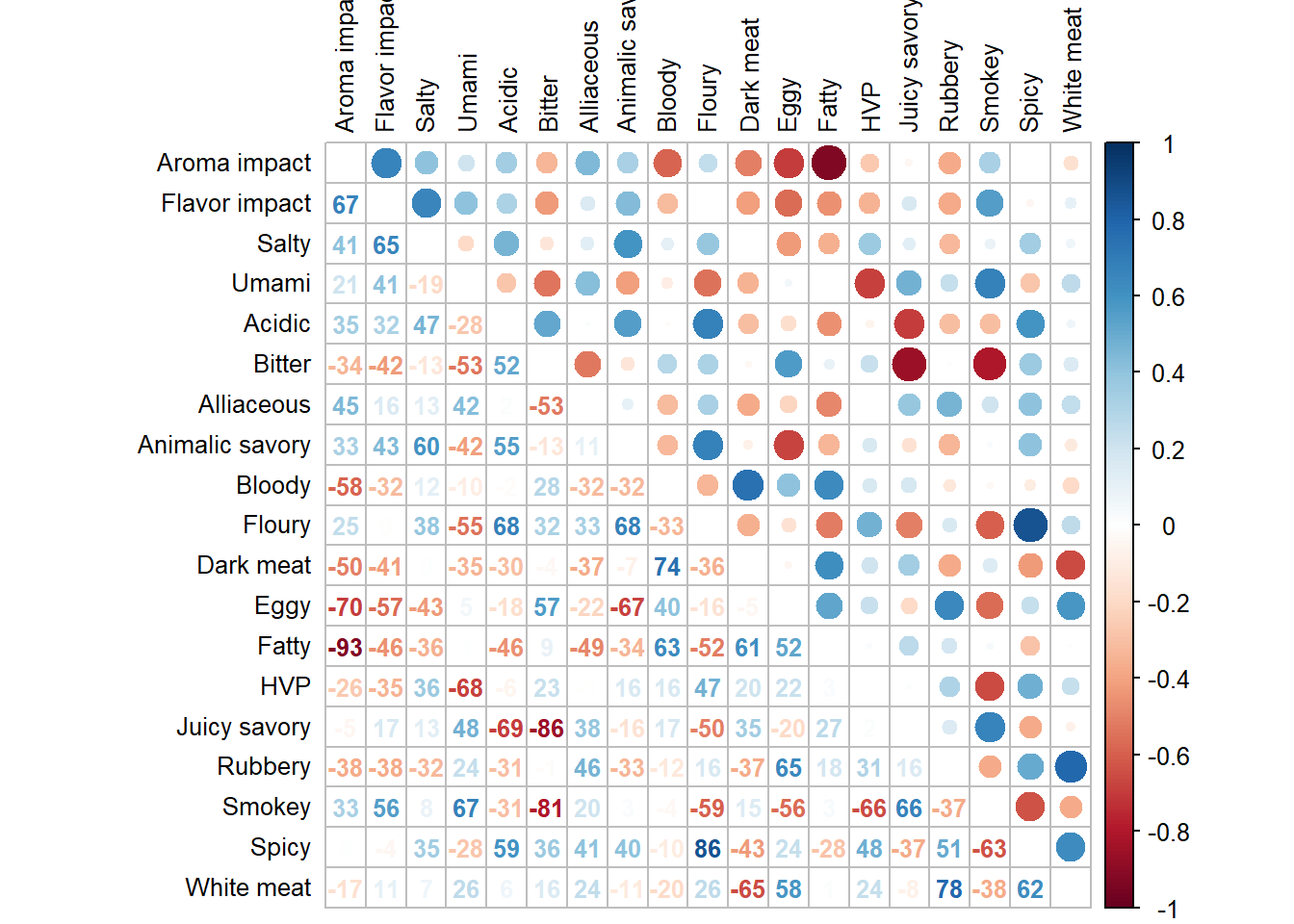
3.2 Heat Map
Comparing to the Correlation plot from PCA, we noticed that our Heat Map this time has a more pronounced correlation value. I speculate that this because using Group Means as data reduces the amount of variances. We see both positive and negative correlations among variables.
#heat map of means
#correlation plot 3: mixed circle visualization (top) and numbers (bottom)

corrplot3 <- corrplot.mixed(cor(sausage.processed.mean.prod), upper = 'circle',
                            lower = "number",
                            tl.pos = "lt",
                            tl.col = "black",
                            tl.cex = 0.8,
                            addCoefasPercent = TRUE,
                            number.cex=0.8)