8.3 CA Analysis
CA and its inference analysis (boot, CI, TI, eigenvalue tests, scree) can be done by InPosition. Also, note that there are 2 ways to perform CA: symmetric and asymmetric (find definition above). We should perform both for either rows or columns or both. In the case of this sensory profile dataset where there is subjectivity to be balanced in both rows and columns, it is recommended that we do both tests (symmetry and asymmetry) for both rows and columns.
8.3.1 Run CA
We will perform CA in 2 ways: Symmetric and Asymmetric using epCA. Note that the results include multiple components like
“ExPosition.Data” - All ExPosition classes output (data, factor scores, contributions, etc…)
“Plotting.Data” - All ExPosition & prettyGraphs plotting data (constraints, colors, etc…)
For Inference Analysis we can use epCA.inference.battery() to obtain multiple result components.
In order to do epCA for rows instead of columns, we can simply transpose the data set as “t(data)”
SYMMETRIC CA
#Preliminary CA
resCA.sym           <- epCA(wk1, symmetric = TRUE, graphs = FALSE)

#Inference Battery for Columns (J)
resCAinf.sym.col    <- epCA.inference.battery(wk1, symmetric = TRUE, graphs = FALSE)

#Inference Battery for Rows (I)
resCAinf.sym.row    <- epCA.inference.battery(t(wk1), symmetric = TRUE, graphs = FALSE)
ASYMMETRIC CA
#Preliminary CA
resCA.asym           <- epCA(wk1, symmetric = FALSE, graphs = FALSE)
resCA.asym2           <- epCA(t(wk1), symmetric = FALSE, graphs = FALSE)

#Inference Battery for Columns (J)
resCAinf.asym.col    <- epCA.inference.battery(wk1, symmetric = FALSE, graphs = FALSE)

#Inference Battery for Rows (I)
resCAinf.asym.row    <- epCA.inference.battery(t(wk1), symmetric = FALSE, graphs = FALSE)
8.3.2 Scree Plot
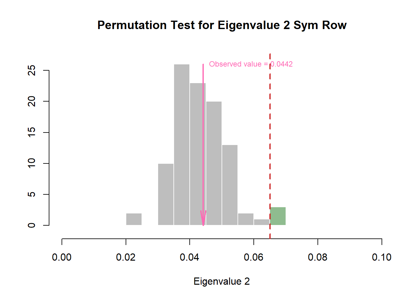
Even with included permutation test, our scree plot does not show any significant component
#Symmetry
scree1   <- PlotScree(ev = resCA.sym$ExPosition.Data$eigs,
                     p.ev = resCAinf.sym.col$Inference.Data$components$p.vals,
                     title = "Explained Variance per Dimension + Permutation Test",
                     plotKaiser = TRUE,
                     color4Kaiser = "hotpink")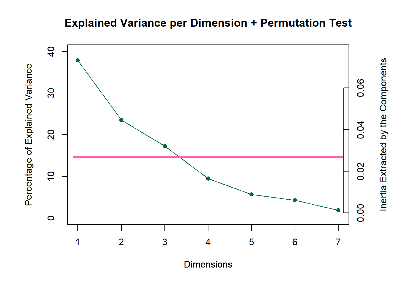
scree1
scree1   <- recordPlot()

#Asymmetry

#scree2   <- PlotScree(ev = resCA.asym$ExPosition.Data$eigs,
#                     p.ev = resCAinf.asym.col$Inference.Data$components$p.vals,
#                     title = "Explained Variance per Dimension + Permutation Test (No Significant Component)")
#scree2
#scree2   <- recordPlot()
We see that there is no significant component for this dataset.
8.3.3 Permutation Test
Wanted to take a look into the eigenvalues to make sure that no component is actually significant.
Columns:
zeDim = 1
pH1 <- prettyHist(
  distribution = resCAinf.sym.col$Inference.Data$components$eigs.perm[,zeDim],
  observed = resCAinf.sym.col$Fixed.Data$ExPosition.Data$eigs[zeDim],
  xlim = c(0, 0.1), # needs to be set by hand
  breaks = 10,
  border = "white",
  main = paste0("Permutation Test for Eigenvalue ",zeDim, " Sym Col"),
  xlab = paste0("Eigenvalue ",zeDim),
  ylab = "",
  counts = FALSE,
  cutoffs = c( 0.975),
  observed.col = "hotpink"
  )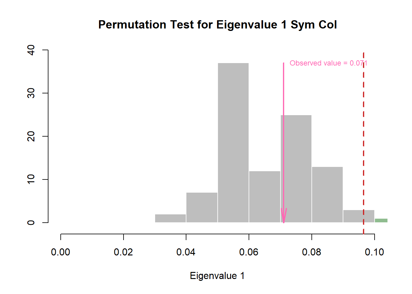
pH1 <- recordPlot()

zeDim = 2
pH2 <- prettyHist(
  distribution = resCAinf.sym.col$Inference.Data$components$eigs.perm[,zeDim],
  observed = resCAinf.sym.col$Fixed.Data$ExPosition.Data$eigs[zeDim],
  xlim = c(0, 0.1), # needs to be set by hand
  breaks = 10,
  border = "white",
  main = paste0("Permutation Test for Eigenvalue ",zeDim, " Sym Col"),
  xlab = paste0("Eigenvalue ",zeDim),
  ylab = "",
  counts = FALSE,
  cutoffs = c( 0.975),
  observed.col = "hotpink"
  )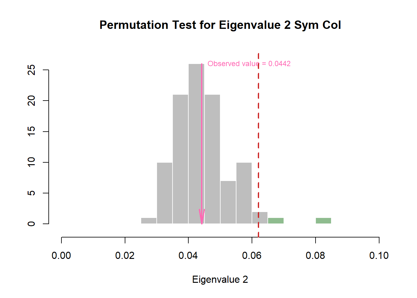
pH2 <- recordPlot()

#Rows:
zeDim = 1
pH3 <- prettyHist(
  distribution = resCAinf.sym.row$Inference.Data$components$eigs.perm[,zeDim],
  observed = resCAinf.sym.row$Fixed.Data$ExPosition.Data$eigs[zeDim],
  xlim = c(0, 0.1), # needs to be set by hand
  breaks = 10,
  border = "white",
  main = paste0("Permutation Test for Eigenvalue ",zeDim, " Sym Row"),
  xlab = paste0("Eigenvalue ",zeDim),
  ylab = "",
  counts = FALSE,
  cutoffs = c( 0.975),
  observed.col = "hotpink"
  )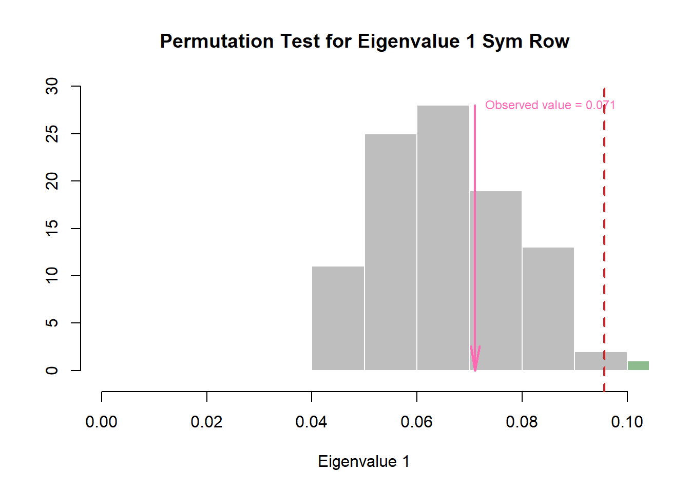
pH3 <- recordPlot()

zeDim = 2
pH4 <- prettyHist(
  distribution = resCAinf.asym.row$Inference.Data$components$eigs.perm[,zeDim],
  observed = resCAinf.asym.row$Fixed.Data$ExPosition.Data$eigs[zeDim],
  xlim = c(0, 0.1), # needs to be set by hand
  breaks = 10,
  border = "white",
  main = paste0("Permutation Test for Eigenvalue ",zeDim, " Sym Row"),
  xlab = paste0("Eigenvalue ",zeDim),
  ylab = "",
  counts = FALSE,
  cutoffs = c( 0.975),
  observed.col = "hotpink"
  )
8.3.4 Factor Scores
Set-Up:
Here we will list all of the components required to plot the Factor Scores and reassign to variables for easy handling.
#Factor scores needed
Fj.a <- resCA.asym$ExPosition.Data$fj
Fi   <- resCA.sym$ExPosition.Data$fi
Fj   <- resCA.sym$ExPosition.Data$fj

# Asym map opposite row -col
t.Fj.a <- resCA.asym2$ExPosition.Data$fj
t.Fi   <- resCA.asym2$ExPosition.Data$fi
t.Fj   <- resCA.asym2$ExPosition.Data$fj

# constraints -----
# first get the constraints correct
constraints.sym  <- minmaxHelper(mat1 = Fi, mat2  = Fj)
constraints.asym <- minmaxHelper(mat1 = Fi, mat2  = Fj.a)
constraints.asym2 <- minmaxHelper(mat1 = t.Fi, mat2  = t.Fj.a)

# Get some colors ----
col.var <- prettyGraphsColorSelection(n.colors = nrow(Fi))

# baseMaps ----
colnames(Fi)   <- paste("Dimension ", 1:ncol(Fi))
colnames(Fj)   <- paste("Dimension ", 1:ncol(Fj))
colnames(Fj.a) <- paste("Dimension ", 1:ncol(Fj.a))
8.3.4.1 Asymmetric Factor Scores
Notes:
First, we will make an Asymmetric plot with Simplex (kind of like a Tolerance Interval for all variable - technically, it is flattening all dimentsion) so that we can compare col-to-row.
Interpretations:
We can interpret asymmetric plot by assessing the proximity (distance between) each data points (can be done for both rows and columns).
Some noticeable points of observation:
• We see that most observation cluster around center of gravity.
• Some observation also stay very near to components and can be broken into 3 main groups.
• Some of these observation groups are relatively close to some respective characteristics.
• For observations, we see small eigen values (this is because CA uses chi-square probability)
Asymmetric map with that makes Simplex polygon from column:
# Your asymmetric factor scores
asymMap  <- createFactorMapIJ(Fi,
                              Fj.a,
                              constraints  =  constraints.asym,
                              col.labels.j = "darkgreen",
                              col.points.j = "darkgreen",
                              col.points.i = "hotpink")

# set drawing order, goal is to flatten the simplex:
polygonorder <- c(5,8,13,4,2,6)

# Make the simplex visible
zePoly.J <-  PTCA4CATA::ggdrawPolygon(Fj.a,
                                      order2draw = polygonorder, # this parameter determines which point to draw first
                                      color = 'darkgreen',
                                      size = .2,
                                      fill =  'darkgreen',
                                      alpha = .05)

# Labels
labels4CA <- createxyLabels(resCA = resCA.asym)

# Combine all elements you want to include in this plot
asymMap.simplex  <-  asymMap$baseMap + zePoly.J +
                          asymMap$I_points +
                          asymMap$J_labels +
                          asymMap$J_points +
                          labels4CA +
                          ggtitle('Asymmetric Map with Simplex (From Emotions')

asymMap.simplex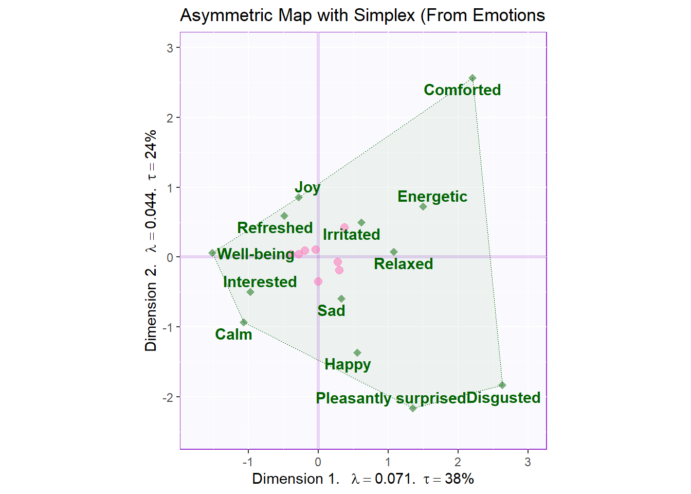
Asymmetric map with that makes Simplex polygon from rows:
We prefer to draw asymmetric map from either rows or columns that have less levels. Here the rows have less levels
# Your asymmetric factor scores
asymMap2  <- createFactorMapIJ(t.Fi,
                              t.Fj.a,
                              constraints  =  constraints.asym2,
                              col.labels.j = "hotpink",
                              col.points.j = "hotpink",
                              col.points.i = "darkgreen")

# set drawing order, goal is to flatten the simplex:
polygonorder2 <- c(1,7,6,3,2)

# Make the simplex visible
zePoly.J <-  PTCA4CATA::ggdrawPolygon(t.Fj.a,
                                      order2draw = polygonorder2, # this parameter determines which point to draw first
                                      color = 'hotpink',
                                      size = .2,
                                      fill =  'hotpink',
                                      alpha = .05)

# Labels
labels4CA <- createxyLabels(resCA = resCA.asym)

# Combine all elements you want to include in this plot
asymMap.simplex2  <-  asymMap2$baseMap + zePoly.J +
                          asymMap2$I_points +
                          asymMap2$J_labels +
                          asymMap2$J_points +
                          labels4CA +
                          ggtitle('Asymmetric Map with Simplex (From Products)')

asymMap.simplex2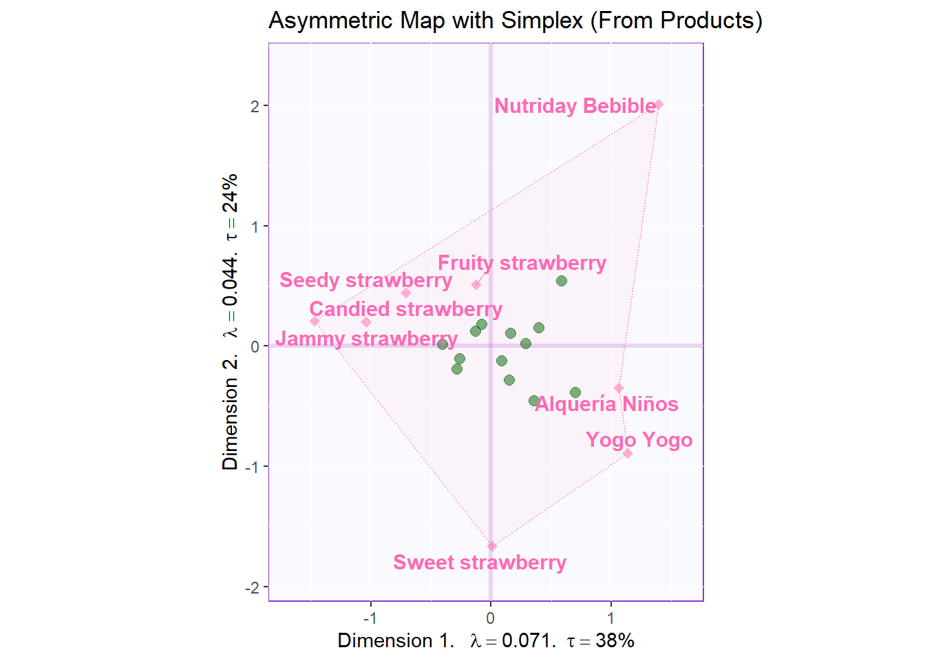
Let’s also check Dimension 3 and 4:
# Your asymmetric factor scores
asymMap3  <- createFactorMapIJ(t.Fi,
                              t.Fj.a,
                              col.labels.j = "hotpink",
                              col.points.j = "hotpink",
                              col.points.i = "darkgreen",
                              axis1 = 3,
                              axis2 = 4
                              )

# set drawing order, goal is to flatten the simplex:
polygonorder3 <- c(5,7,4,3)

# Make the simplex visible
zePoly.J.extra <-  PTCA4CATA::ggdrawPolygon(t.Fj.a[,3:4],
                                      order2draw = polygonorder3, # this parameter determines which point to draw first
                                      color = 'hotpink',
                                      size = .2,
                                      fill =  'hotpink',
                                      alpha = .05)

# Labels
labels4CA <- createxyLabels(resCA = resCA.asym, x_axis = 3, y_axis = 4)

# Combine all elements you want to include in this plot
asymMap.simplex3  <-  asymMap3$baseMap + zePoly.J.extra +
                          asymMap3$I_points +
                          asymMap3$J_labels +
                          asymMap3$J_points +
                          labels4CA +
                          ggtitle('Asymmetric Map with Simplex (From Products) - D3 & D4')

asymMap.simplex3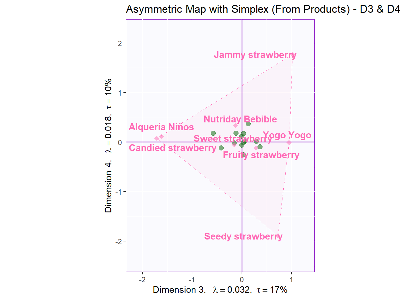
Asym for D1 and D3:
# Your asymmetric factor scores
asymMap4  <- createFactorMapIJ(t.Fi,
                              t.Fj.a,
                              col.labels.j = "hotpink",
                              col.points.j = "hotpink",
                              col.points.i = "darkgreen",
                              axis1 = 1,
                              axis2 = 3
                              )

# set drawing order, goal is to flatten the simplex:
polygonorder4 <- c(3,5,7,2,1)

# Make the simplex visible
zePoly.J.extra <-  PTCA4CATA::ggdrawPolygon(t.Fj.a[,c(1,3)],
                                      order2draw = polygonorder4, # this parameter determines which point to draw first
                                      color = 'hotpink',
                                      size = .2,
                                      fill =  'hotpink',
                                      alpha = .05)

# Labels
labels4CA <- createxyLabels(resCA = resCA.asym, x_axis = 1, y_axis = 3)

# Combine all elements you want to include in this plot
asymMap.simplex4  <-  asymMap4$baseMap + zePoly.J.extra +
                          asymMap4$I_points +
                          asymMap4$J_labels +
                          asymMap4$J_points +
                          labels4CA +
                          ggtitle('Asymmetric Map with Simplex (From Products) - D1 & D3')

asymMap.simplex4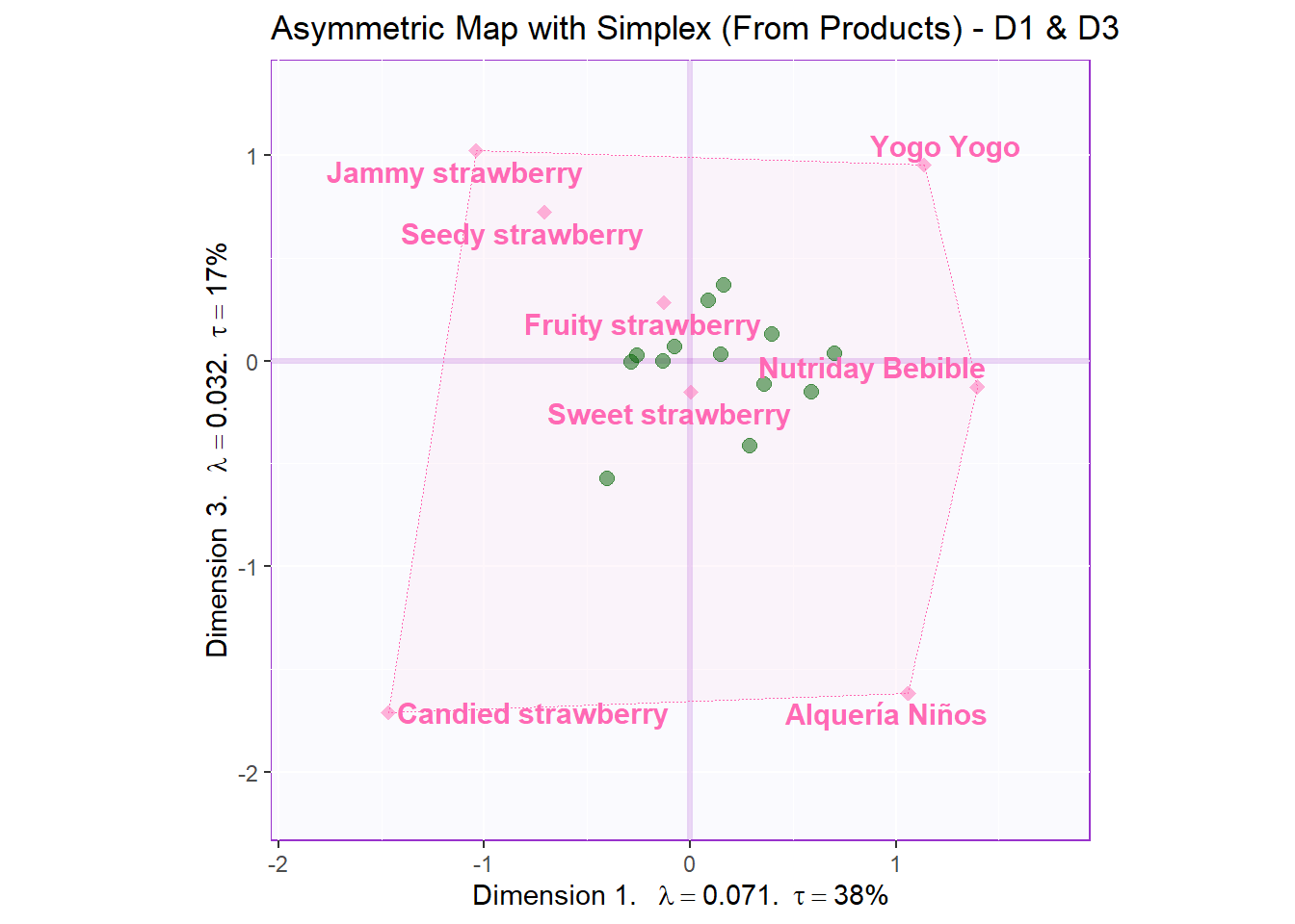
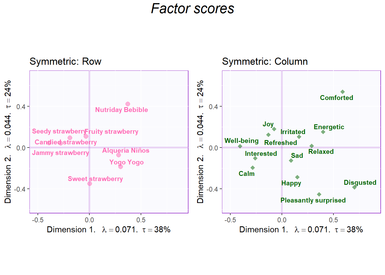
8.3.4.2 Symmetric Factor Scores
Notes:
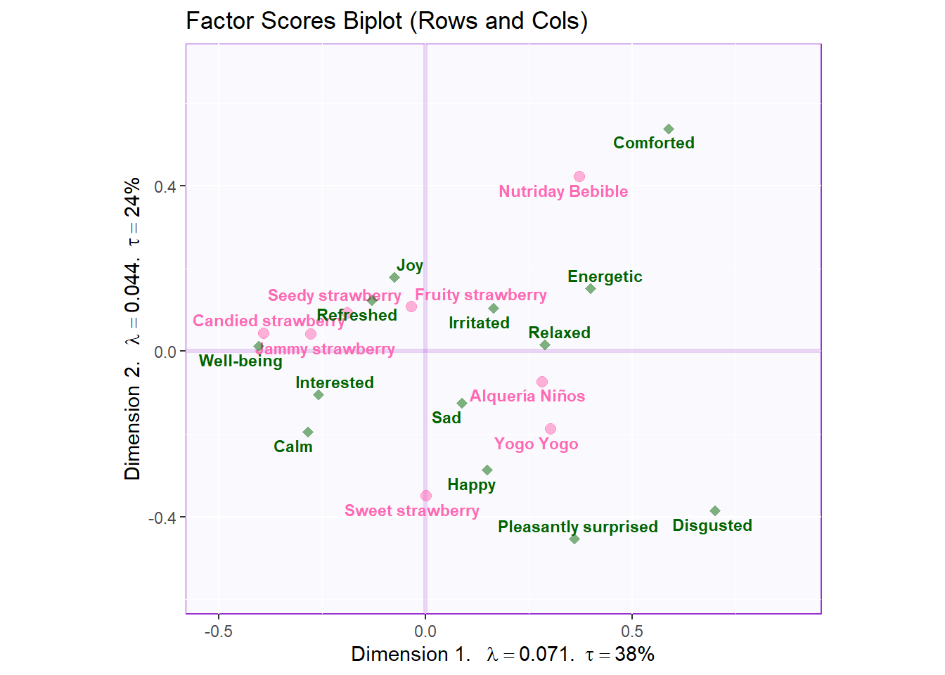
Since we have a relatively large number of rows and cols, it is a good idea to plot rows and cols separately. On the other hand, if we have a small number of rows and cols, we can do a biplot where 2 maps are on top of each other. Reason: since it is a symmetric map, we can put them on a same plane without issues.
# create symmetric Map:
symMap <- createFactorMapIJ(Fi,
Fj,
col.labels.j = "darkgreen",
col.points.j = "darkgreen",
col.points.i = "hotpink",
col.labels.i = "hotpink",
text.cex.i = 3,
text.cex.j = 3)
labels4CA <- createxyLabels(resCA = resCA.asym)
# plot the row factor scores
symMap.row <- symMap$baseMap +
symMap$I_labels + symMap$I_points +
ggtitle('Symmetric: Row') +
labels4CA
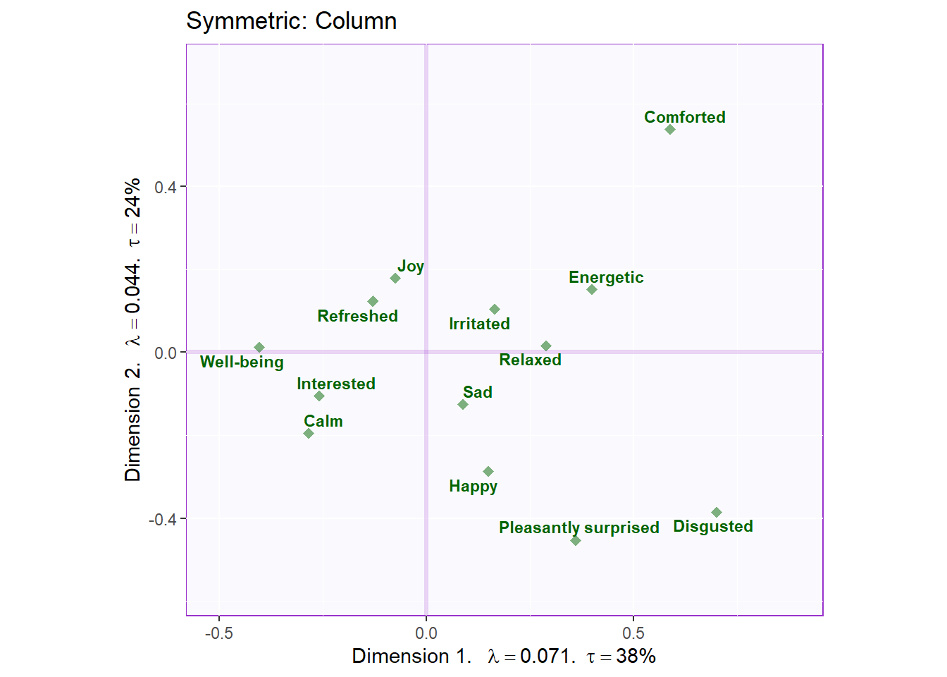
# plot the columns factor scores with confidence intervals
symMap.col <- symMap$baseMap +
symMap$J_labels + symMap$J_points +
ggtitle('Symmetric: Column') +
labels4CA
sidebyside <- grid.arrange(
symMap.row, symMap.col,
ncol = 2,nrow = 1,
top = textGrob("Factor scores", gp = gpar(fontsize = 18, font = 3))
)
biplot     <- symMap$baseMap  +
              symMap$I_labels + symMap$I_points +
              symMap$J_labels + symMap$J_points +
              ggtitle('Factor Scores Biplot (Rows and Cols)') +
              labels4CA

sidebyside
## TableGrob (2 x 2) "arrange": 3 grobs
## z cells name grob
## 1 1 (2-2,1-1) arrange gtable[layout]
## 2 2 (2-2,2-2) arrange gtable[layout]
## 3 3 (1-1,1-2) arrange text[GRID.text.12558]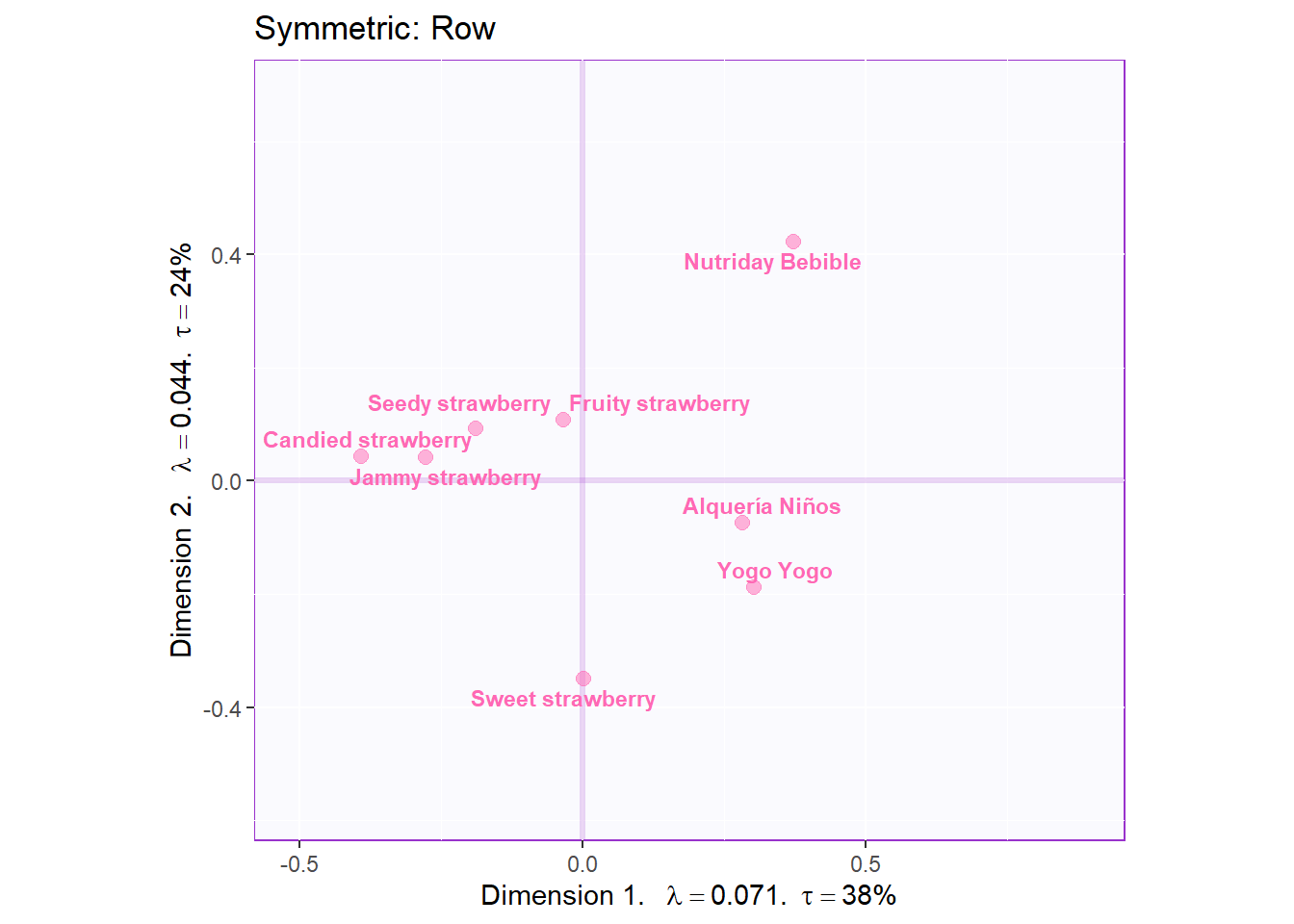
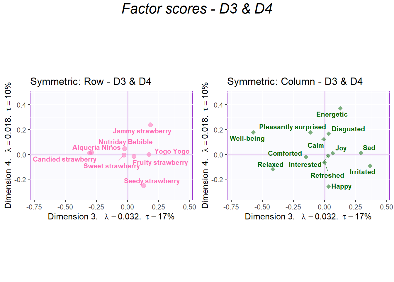
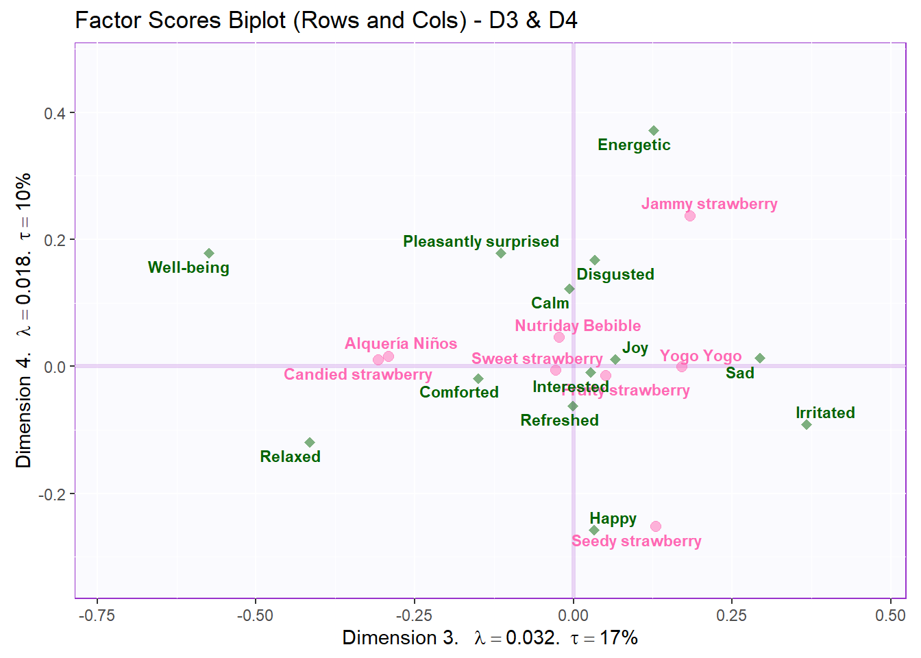
Let’s also check Dimension 3 and 4:
# create symmetric Map:
symMap <- createFactorMapIJ(Fi,
Fj,
col.labels.j = "darkgreen",
col.points.j = "darkgreen",
col.points.i = "hotpink",
col.labels.i = "hotpink",
text.cex.i = 3,
text.cex.j = 3,
axis1 = 3,
axis2 = 4)
labels4CA <- createxyLabels(resCA = resCA.asym, x_axis = 3, y_axis = 4)
# plot the row factor scores
symMap.row2 <- symMap$baseMap +
symMap$I_labels + symMap$I_points +
ggtitle('Symmetric: Row - D3 & D4') +
labels4CA
# plot the columns factor scores with confidence intervals
symMap.col2 <- symMap$baseMap +
symMap$J_labels + symMap$J_points +
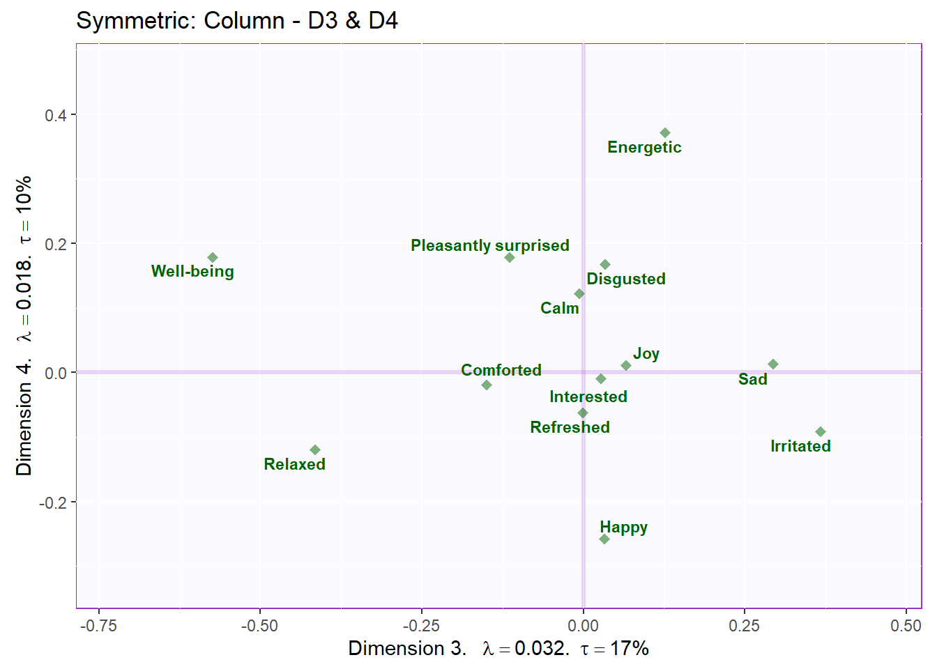
ggtitle('Symmetric: Column - D3 & D4') +
labels4CA
sidebyside2 <- grid.arrange(
symMap.row2, symMap.col2,
ncol = 2,nrow = 1,
top = textGrob("Factor scores - D3 & D4", gp = gpar(fontsize = 18, font = 3))
)
biplot2     <- symMap$baseMap  +
              symMap$I_labels + symMap$I_points +
              symMap$J_labels + symMap$J_points +
              ggtitle('Factor Scores Biplot (Rows and Cols) - D3 & D4') +
              labels4CA

sidebyside2
## TableGrob (2 x 2) "arrange": 3 grobs
## z cells name grob
## 1 1 (2-2,1-1) arrange gtable[layout]
## 2 2 (2-2,2-2) arrange gtable[layout]
## 3 3 (1-1,1-2) arrange text[GRID.text.13030]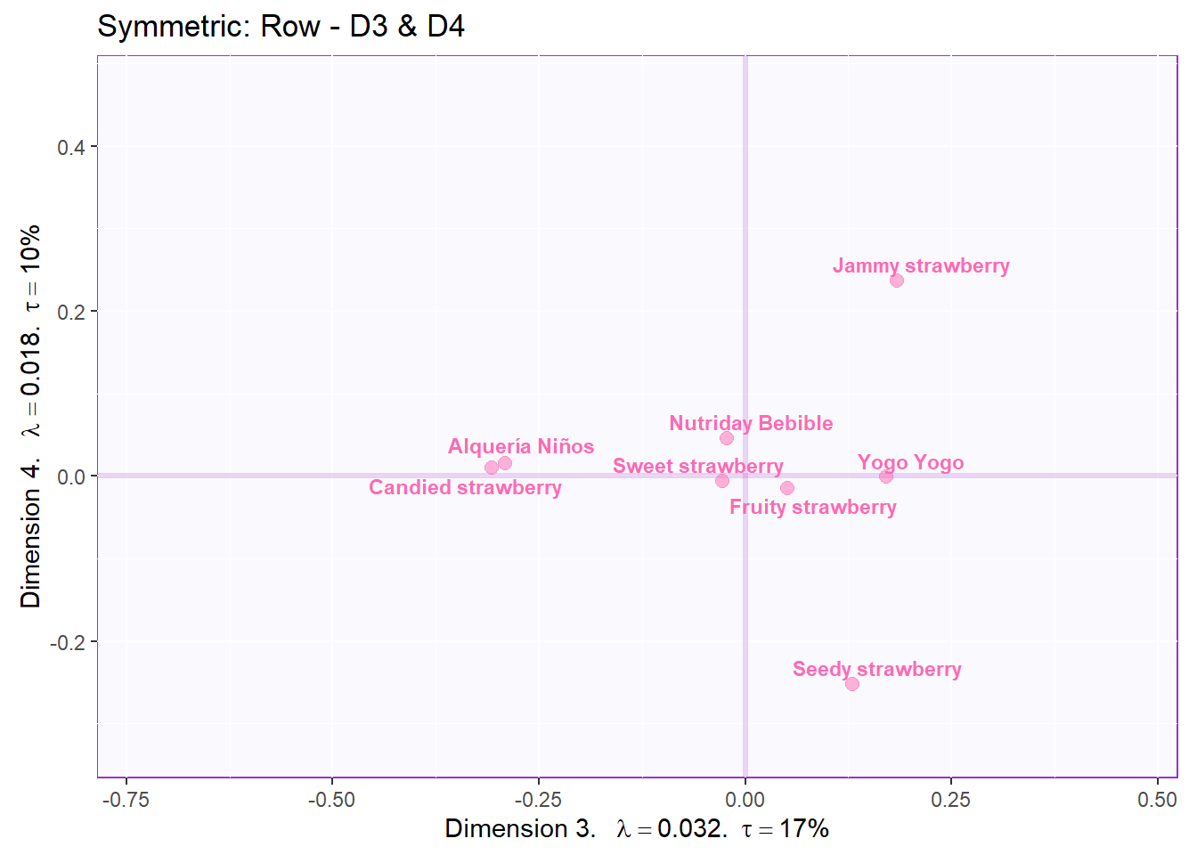
Recolor to tell a story about products similarities (D1,2 - rows):
#color for product groups based on proximity
prod.color <- dplyr::recode(wk0$Products,
                            "Nutriday Bebible" = "firebrick1",
                            "Alquería Niños" = 'firebrick1',
                            "Yogo Yogo" = 'firebrick1',
                            "Seedy strawberry" = "thistle2",
                            "Jammy strawberry" = "turquoise3",
                            "Sweet strawberry" = "thistle2",
                            "Candied strawberry" = "turquoise3",
                            "Fruity strawberry"= "thistle2"
                            )


# create symmetric Map:
symMap <- createFactorMapIJ(Fi,
                            Fj,
                            col.points.i = prod.color,
                            col.labels.i = prod.color,
                            text.cex.i = 3,
                            text.cex.j = 3)

labels4CA <- createxyLabels(resCA = resCA.asym)

# plot the row factor scores
symMap.row3 <- symMap$baseMap  +
              symMap$I_labels + symMap$I_points +
              ggtitle('Symmetric: Row - Products Groups on Component 1') +
              labels4CA

symMap.row3 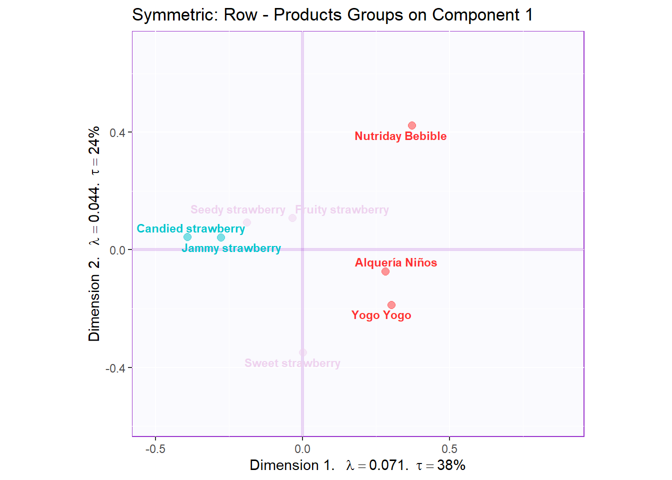
Recolor to tell a story about positive vs negative emotions (D3,4 - columns):
#Recolor positive vs negative emotions:
emo.color <- dplyr::recode(colnames(wk0[,-1]),
                           "Happy" = "turquoise3",
                           "Pleasantly surprised" = "turquoise3",
                           "Refreshed" = "turquoise3",
                           "Calm" = "turquoise3",
                           "Comforted" = "turquoise3",
                           "Disgusted" = 'firebrick1',
                           "Energetic" = "turquoise3",
                           "Joy" = "turquoise3",
                           "Interested" = "turquoise3",
                           "Irritated" = 'firebrick1',
                           "Relaxed" = "turquoise3",
                           "Sad" = 'firebrick1',
                           "Well-being" = "turquoise3")

# create symmetric Map:
symMap <- createFactorMapIJ(Fi,
                            Fj,
                            col.labels.j = emo.color,
                            col.points.j = emo.color,
                            text.cex.i = 3,
                            text.cex.j = 3,
                            axis1 = 3,
                            axis2 = 4)

labels4CA <- createxyLabels(resCA = resCA.asym, x_axis = 3, y_axis = 4)

# plot the columns factor scores with confidence intervals
symMap.col3 <- symMap$baseMap +
              symMap$J_labels + symMap$J_points +
              ggtitle('Symmetric: Column - D3 & D4 - Positive VS Negative Emotion') +
              labels4CA

symMap.col3 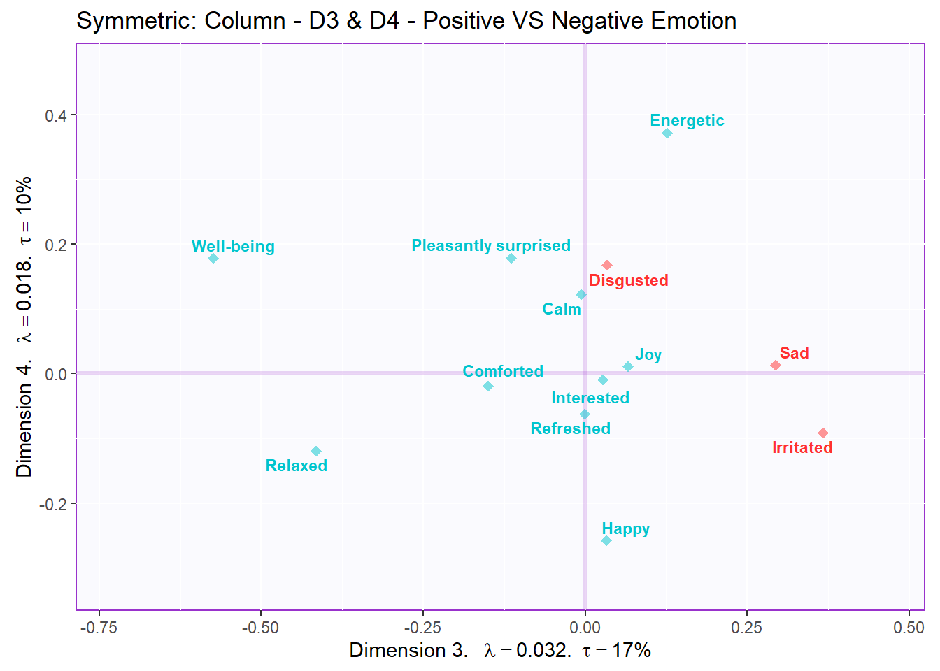
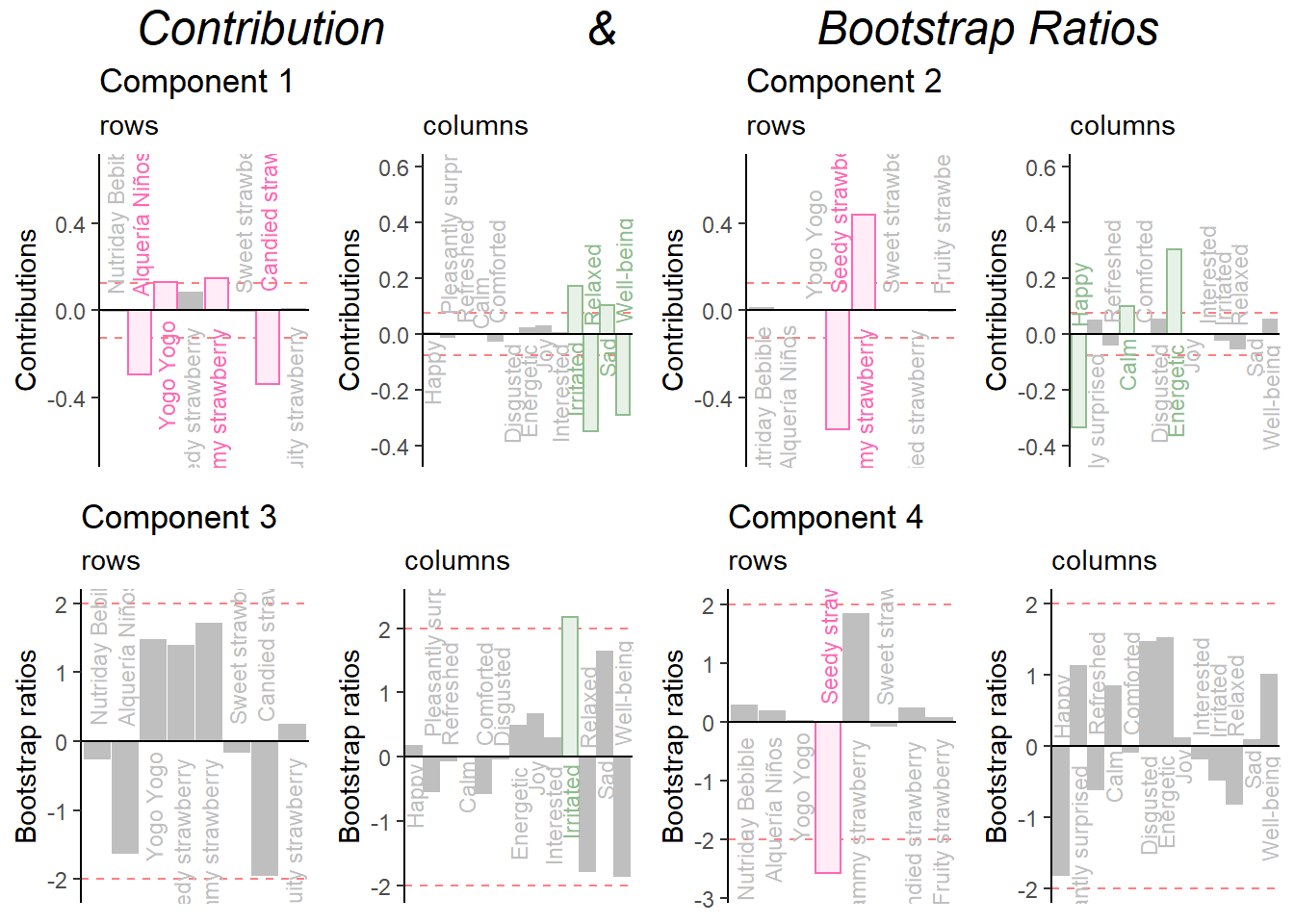
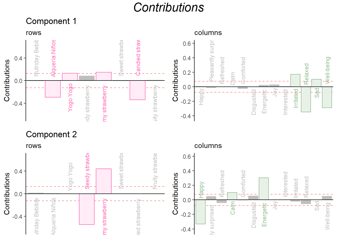
8.3.4.3 Contributions and bootstrap ratios barplots
Contribution barplots:
Make the barplots:
signed.ctrI <- resCA.sym$ExPosition.Data$ci * sign(resCA.sym$ExPosition.Data$fi)
signed.ctrJ <- resCA.sym$ExPosition.Data$cj * sign(resCA.sym$ExPosition.Data$fj)

#matching color scheme:
sweet.col <- rep("darkseagreen",13)
sweet.row <- rep("hotpink",8)

# plot contributions of rows for component 1
ctrI.1 <- PrettyBarPlot2(signed.ctrI[,1],
                         threshold = 1 / NROW(signed.ctrI),
                         font.size = 3,
                         color4bar = sweet.row,
                         ylab = 'Contributions',
                         ylim = c(1.2*min(signed.ctrI), 1.2*max(signed.ctrI))
) + ggtitle("Component 1", subtitle = 'rows')

# plot contributions of columns for component 1
ctrJ.1 <- PrettyBarPlot2(signed.ctrJ[,1],
                         threshold = 1 / NROW(signed.ctrJ),
                         font.size = 3,
                         color4bar = sweet.col,
                         ylab = 'Contributions',
                         ylim = c(1.2*min(signed.ctrJ), 1.2*max(signed.ctrJ))
) + ggtitle("", subtitle = 'columns')

# plot contributions of rows for component 2
ctrI.2 <- PrettyBarPlot2(signed.ctrI[,2],
                         threshold = 1 / NROW(signed.ctrI),
                         font.size = 3,
                         color4bar = sweet.row,
                         ylab = 'Contributions',
                         ylim = c(1.2*min(signed.ctrI), 1.2*max(signed.ctrI))
) + ggtitle("Component 2", subtitle = 'rows')

# plot contributions of columns for component 2
ctrJ.2 <- PrettyBarPlot2(signed.ctrJ[,2],
                         threshold = 1 / NROW(signed.ctrJ),
                         font.size = 3,
                         color4bar = sweet.col,
                         ylab = 'Contributions',
                         ylim = c(1.2*min(signed.ctrJ), 1.2*max(signed.ctrJ))
) + ggtitle("", subtitle = 'columns')
Combine them:
grid.arrange(
    as.grob(ctrI.1),as.grob(ctrJ.1),as.grob(ctrI.2),as.grob(ctrJ.2),
    ncol = 2,nrow = 2,
    top = textGrob("Contributions", gp = gpar(fontsize = 18, font = 3))
  )
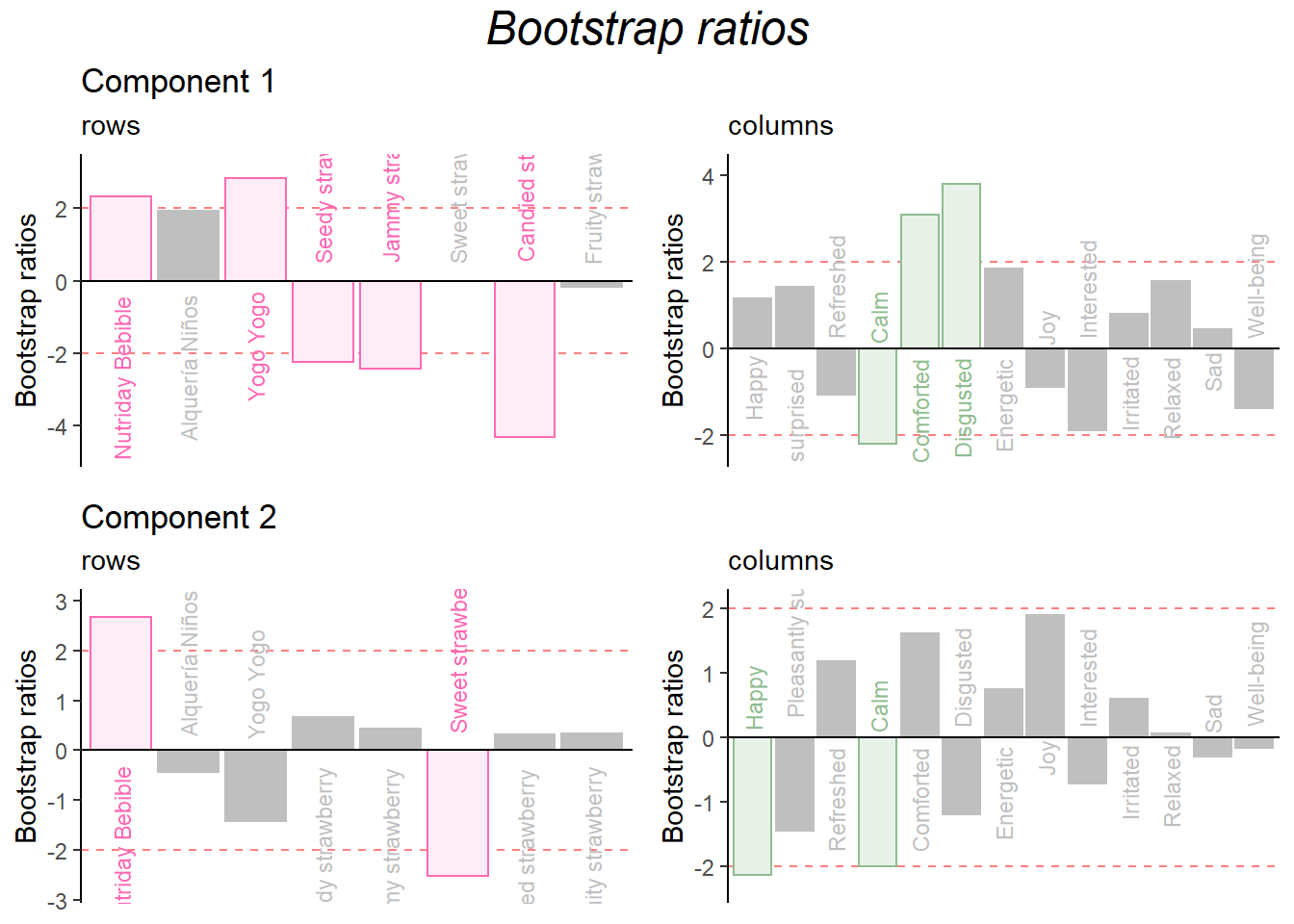
Bootstrap Ratio
BR.I <- resCAinf.sym.row$Inference.Data$fj.boots$tests$boot.ratios
BR.J <- resCAinf.sym.col$Inference.Data$fj.boots$tests$boot.ratios

sweet.row1 <- rep("hotpink",13)

laDim = 1

# Plot the bootstrap ratios for Dimension 1
ba001.BR1.I <- PrettyBarPlot2(BR.I[,laDim],
                        threshold = 2,
                        font.size = 3,
                   color4bar = sweet.row,
                  ylab = 'Bootstrap ratios'
                  #ylim = c(1.2*min(BR[,laDim]), 1.2*max(BR[,laDim]))
) + ggtitle(paste0('Component ', laDim), subtitle = 'rows')

ba002.BR1.J <- PrettyBarPlot2(BR.J[,laDim],
                        threshold = 2,
                        font.size = 3,
                   color4bar = sweet.col,
                  ylab = 'Bootstrap ratios'
                  #ylim = c(1.2*min(BR[,laDim]), 1.2*max(BR[,laDim]))
) + ggtitle("", subtitle = 'columns')

# Plot the bootstrap ratios for Dimension 2
laDim = 2
ba003.BR2.I <- PrettyBarPlot2(BR.I[,laDim],
                        threshold = 2,
                        font.size = 3,
                   color4bar = sweet.row,
                  ylab = 'Bootstrap ratios'
                  #ylim = c(1.2*min(BR[,laDim]), 1.2*max(BR[,laDim]))
) + ggtitle(paste0('Component ', laDim), subtitle = 'rows')

ba004.BR2.J <- PrettyBarPlot2(BR.J[,laDim],
                        threshold = 2,
                        font.size = 3,
                   color4bar = sweet.col,
                  ylab = 'Bootstrap ratios'
                  #ylim = c(1.2*min(BR[,laDim]), 1.2*max(BR[,laDim]))
) + ggtitle("", subtitle = 'columns')
Combine them:
grid.arrange(
    as.grob(ba001.BR1.I),as.grob(ba002.BR1.J),as.grob(ba003.BR2.I),as.grob(ba004.BR2.J),
    ncol = 2,nrow = 2,
    top = textGrob("Bootstrap ratios", gp = gpar(fontsize = 18, font = 3))
  )
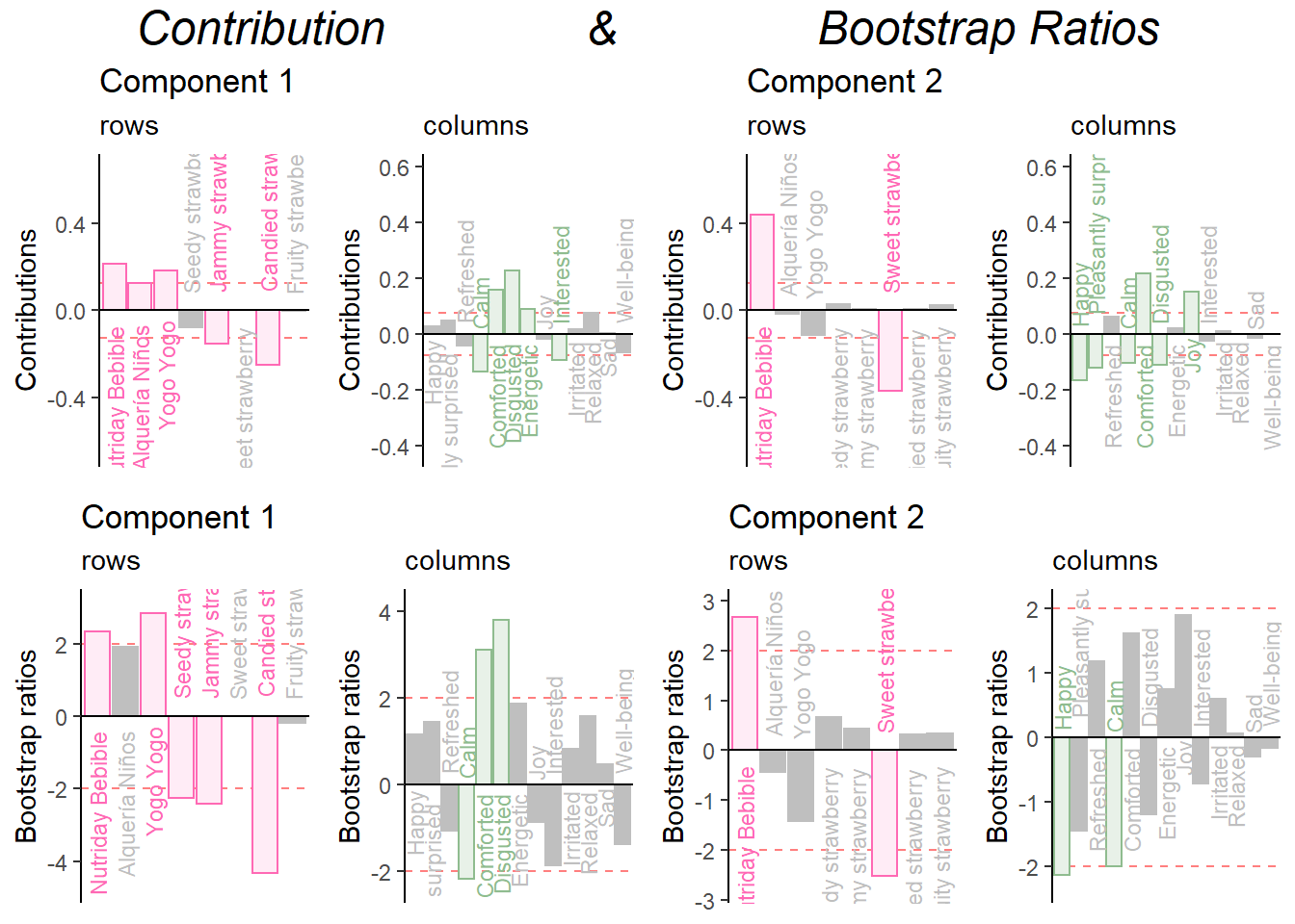
Combine them all:
grid.arrange(
     as.grob(ctrI.1),as.grob(ctrJ.1),as.grob(ctrI.2),as.grob(ctrJ.2),as.grob(ba001.BR1.I),as.grob(ba002.BR1.J),as.grob(ba003.BR2.I),as.grob(ba004.BR2.J),
    ncol = 4,nrow = 2,
    top = textGrob("Contribution                &                Bootstrap Ratios", gp = gpar(fontsize = 18, font = 3))
  )
Repeat for Dimension 3 and 4:
Make the barplots:
signed.ctrI <- resCA.sym$ExPosition.Data$ci * sign(resCA.sym$ExPosition.Data$fi)
signed.ctrJ <- resCA.sym$ExPosition.Data$cj * sign(resCA.sym$ExPosition.Data$fj)

#matching color scheme:
sweet.col <- rep("darkseagreen",13)
sweet.row <- rep("hotpink",8)

# plot contributions of rows for component 1
ctrI.1 <- PrettyBarPlot2(signed.ctrI[,3],
                         threshold = 1 / NROW(signed.ctrI),
                         font.size = 3,
                         color4bar = sweet.row,
                         ylab = 'Contributions',
                         ylim = c(1.2*min(signed.ctrI), 1.2*max(signed.ctrI))
) + ggtitle("Component 1", subtitle = 'rows')

# plot contributions of columns for component 1
ctrJ.1 <- PrettyBarPlot2(signed.ctrJ[,3],
                         threshold = 1 / NROW(signed.ctrJ),
                         font.size = 3,
                         color4bar = sweet.col,
                         ylab = 'Contributions',
                         ylim = c(1.2*min(signed.ctrJ), 1.2*max(signed.ctrJ))
) + ggtitle("", subtitle = 'columns')

# plot contributions of rows for component 2
ctrI.2 <- PrettyBarPlot2(signed.ctrI[,4],
                         threshold = 1 / NROW(signed.ctrI),
                         font.size = 3,
                         color4bar = sweet.row,
                         ylab = 'Contributions',
                         ylim = c(1.2*min(signed.ctrI), 1.2*max(signed.ctrI))
) + ggtitle("Component 2", subtitle = 'rows')

# plot contributions of columns for component 2
ctrJ.2 <- PrettyBarPlot2(signed.ctrJ[,4],
                         threshold = 1 / NROW(signed.ctrJ),
                         font.size = 3,
                         color4bar = sweet.col,
                         ylab = 'Contributions',
                         ylim = c(1.2*min(signed.ctrJ), 1.2*max(signed.ctrJ))
) + ggtitle("", subtitle = 'columns')
Combine them:
grid.arrange(
    as.grob(ctrI.1),as.grob(ctrJ.1),as.grob(ctrI.2),as.grob(ctrJ.2),
    ncol = 2,nrow = 2,
    top = textGrob("Contributions", gp = gpar(fontsize = 18, font = 3))
  )
Bootstrap Ratio
BR.I <- resCAinf.sym.row$Inference.Data$fj.boots$tests$boot.ratios
BR.J <- resCAinf.sym.col$Inference.Data$fj.boots$tests$boot.ratios

sweet.row1 <- rep("hotpink",13)

laDim = 3

# Plot the bootstrap ratios for Dimension 1
ba001.BR1.I <- PrettyBarPlot2(BR.I[,laDim],
                        threshold = 2,
                        font.size = 3,
                   color4bar = sweet.row,
                  ylab = 'Bootstrap ratios'
                  #ylim = c(1.2*min(BR[,laDim]), 1.2*max(BR[,laDim]))
) + ggtitle(paste0('Component ', laDim), subtitle = 'rows')

ba002.BR1.J <- PrettyBarPlot2(BR.J[,laDim],
                        threshold = 2,
                        font.size = 3,
                   color4bar = sweet.col,
                  ylab = 'Bootstrap ratios'
                  #ylim = c(1.2*min(BR[,laDim]), 1.2*max(BR[,laDim]))
) + ggtitle("", subtitle = 'columns')

# Plot the bootstrap ratios for Dimension 2
laDim = 4
ba003.BR2.I <- PrettyBarPlot2(BR.I[,laDim],
                        threshold = 2,
                        font.size = 3,
                   color4bar = sweet.row,
                  ylab = 'Bootstrap ratios'
                  #ylim = c(1.2*min(BR[,laDim]), 1.2*max(BR[,laDim]))
) + ggtitle(paste0('Component ', laDim), subtitle = 'rows')

ba004.BR2.J <- PrettyBarPlot2(BR.J[,laDim],
                        threshold = 2,
                        font.size = 3,
                   color4bar = sweet.col,
                  ylab = 'Bootstrap ratios'
                  #ylim = c(1.2*min(BR[,laDim]), 1.2*max(BR[,laDim]))
) + ggtitle("", subtitle = 'columns')
Combine them:
grid.arrange(
    as.grob(ba001.BR1.I),as.grob(ba002.BR1.J),as.grob(ba003.BR2.I),as.grob(ba004.BR2.J),
    ncol = 2,nrow = 2,
    top = textGrob("Bootstrap ratios", gp = gpar(fontsize = 18, font = 3))
  )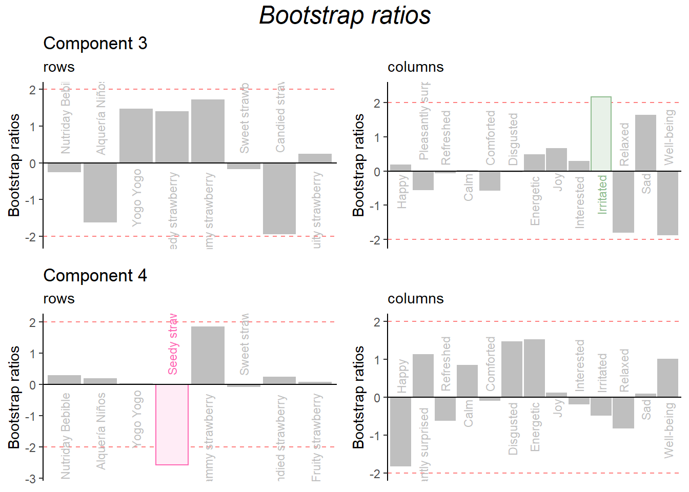
Combine them all:
grid.arrange(
     as.grob(ctrI.1),as.grob(ctrJ.1),as.grob(ctrI.2),as.grob(ctrJ.2),as.grob(ba001.BR1.I),as.grob(ba002.BR1.J),as.grob(ba003.BR2.I),as.grob(ba004.BR2.J),
    ncol = 4,nrow = 2,
    top = textGrob("Contribution                &                Bootstrap Ratios", gp = gpar(fontsize = 18, font = 3))
  )