9.4 DiSTATIS Analysis
The first step of DISTATIS is to compute the distance of data set. Here we will use the function DistanceFromSort(sort). Then we will sue the distance matrix to feed into DISTATIS analysis using the function distantis().
# Get the brick of distance
DistanceCube <- DistanceFromSort(sort)
resDistatis <- distatis(DistanceCube)
9.4.1 Scree Plot
Using the results from distatis(), we can plot the scree plot to demonstrate explained variance per dimension. The scree plot we have here is of the RV or between-judges. The plot suggests that we can assess up to 3 dimensions. Here, we will only look at the first too.
scree <- PlotScree(ev = resDistatis$res4Cmat$eigValues,
title = "RV-map: Explained Variance per Dimension",
plotKaiser = TRUE)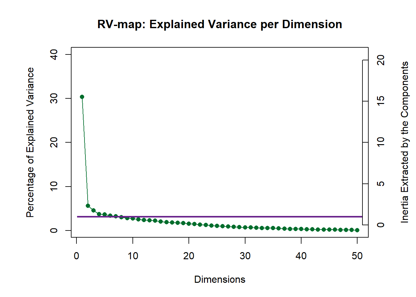
9.4.2 Weights of each judge
The result from distatis() also computed the weights of each judges. Here, we plot all of them in a barplot to see which judges differ the most from others. This will come to be useful later where w need to choose judges of interest to simplify our Compromise Partial Map.
#Weight Results time 100
W <- (resDistatis$res4Cmat$alpha)*100

#Barplot
plot1 <- PrettyBarPlot2(
  bootratio = W, #change index to access other latents
  threshold = 0,
  ylim = NULL,
  #color4bar = var.color1,
  #color4ns = "gray75",
  plotnames = TRUE,
  main = 'Weight of each Judge (Multiplied by 100)',
  ylab = "Weights")

plot1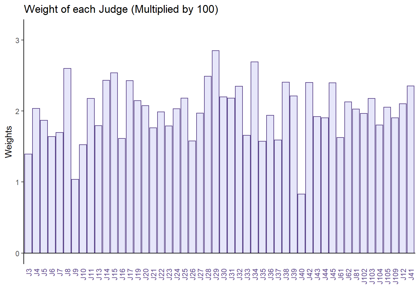
9.4.3 Factor Scores
9.4.3.0.1 Judges
First, we will plot our judges factor scores without groupings.
# No need to find group means and CI

#Color
judge.color <- prettyGraphsColorSelection(n.colors = ncol(sort))
row.names(judge.color) <- colnames(sort)

# Get the factors from the Cmat analysis
G <- resDistatis$res4Cmat$G

# Create the layers of the map
gg.rv.graph.out <- createFactorMap(X = resDistatis$res4Cmat$G,
axis1 = 1, axis2 = 2,
title = "Judges: RVMap",
col.points = judge.color,
col.labels = judge.color)

# create the labels for the dimensions of the RV map
labels4RV <- createxyLabels.gen(
lambda = resDistatis$res4Cmat$eigValues ,
tau = resDistatis$res4Cmat$tau,
axisName = "Dimension ")

# # Create the map from the layers
# Here with lables and dots
judge <- gg.rv.graph.out$zeMap + labels4RV
judge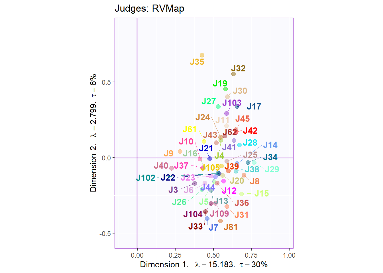
9.4.3.0.2 Cluster Analysis
Clustering the judges as it is right now (no grouping info) shows that we have a hard time to explain the difference between judges. The cluster analysis we use here is hierarchical clustering where we can build a decision tree or dendogram. The less branches and purer each branch is, the better the model perform. Here, we can see that this tree is quite large and has many sub-branch that includes several different outcome per branch. Thus, we will try to do this clustering again using other approaches (K-Means).
# a hierarchical cluster analysis on the factor scores of the RV matrix.

D <- dist(resDistatis$res4Cmat$G, method = "euclidean")
fit <- hclust(D, method = "ward.D2")
judge.tree <- fviz_dend(fit, k = 1,
k_colors = 'burlywood4',
label_cols = judge.color,
cex = .7, xlab = 'Participants',
main = 'Cluster Analysis: Participants')

judge.tree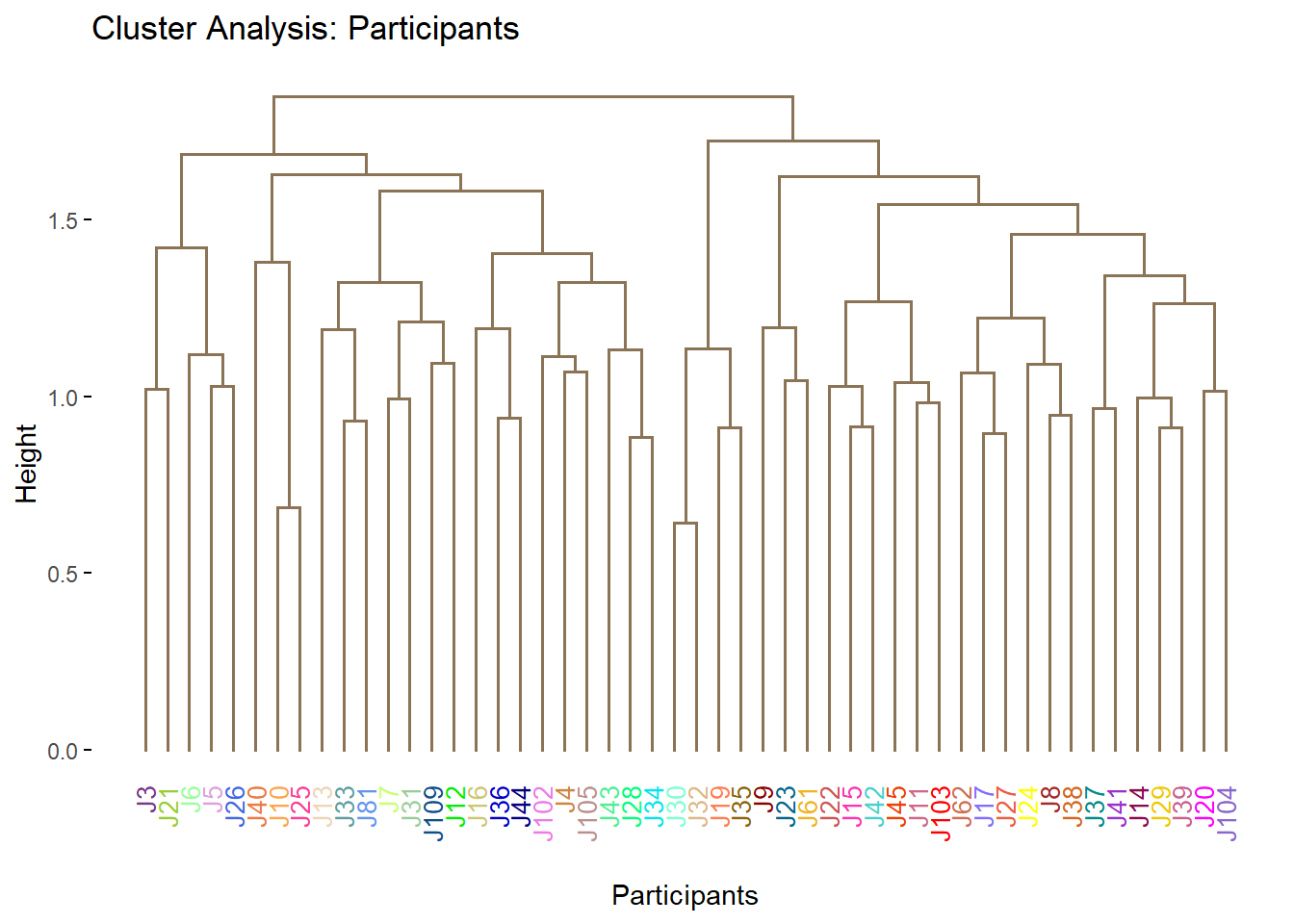
9.4.3.0.3 K-Means
As desscribed above, the experiment design says that we have 2 types of judges (from France or South Africa). Although we do not have the info of each judge, we can perform K-Mean clustering with 2 centers to see how our model perform with such grouping. Herem we can see that when the number f cluster = 2, Dimension 2 does a great job at seperating the 2 groups of judges. Note, we do not know which cluster match exactly to which actual origin of judges.
# First plain k-means
set.seed(42)
judge.kMeans <- kmeans(x = G , centers = 2)

# Now to get a map by cluster:
col4Clusters <- createColorVectorsByDesign(makeNominalData(as.data.frame(judge.kMeans$cluster) ))

judge.km.map <- PTCA4CATA::createFactorMap(G,
title = "RV map. k-means 4 groups",
col.points = col4Clusters$oc,
col.labels = col4Clusters$oc,
constraints = gg.rv.graph.out$constraints,
alpha.points = .4)

judge.km.map1 <- judge.km.map$zeMap_background +
judge.km.map$zeMap_dots + judge.km.map$zeMap_text + labels4RV

judge.km.map1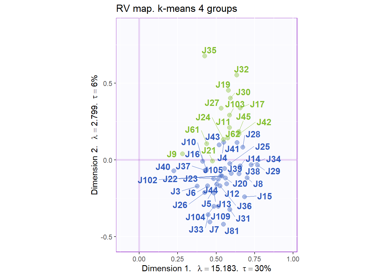
9.4.3.0.4 Suggestion: Elbow Plot for K-Means
A major huddle when using K-means algorithm is how to choose the appropriate number of cluster. This question is especially difficult to answer when we don’t already know research design. Here, I provided a sample code chunk to determine the number of clusters needed using a Scree-plot equivalence called Elbow Plot. In this plot, we see a drop off of Total Within Sum of Square - TWSS (essentially this still Sum of Variance or Inertia, ML world call this loss). Similar to Scree plot, we will pick the number of cluster where TWSS stops having dramatic decrease.
# function for first-order differencing and scaling
#     (parameter is a vector)
d1Calc        <- function(v) {
      n       <- length(v)
      d1      <- v[1:(n-1)] - v[2:n]         # first order differences
      d1scale <- d1/max(d1)                  # relative scale
      return (list(d1      = d1,
                   d1scale = d1scale) )
      }

(kmTd       <- d1Calc(judge.kMeans$tot.withinss) )                # d1 and d1scale

plot(1:length(kmTd$d1),
     kmTd$d1,
     type="b",
     main="Total Within-Group SS by Number of Clusters (1st order diff)",
     xlab="Number of Clusters",
     ylab="Total With-Group SS")

# decision? [6] deliverable (5)
nClust  <- 6
9.4.3.1 Compromise
# A scree plot for the Compromise.
scree2 <- PlotScree(
ev = resDistatis$res4Cmat$eigValues,
title = "Compromise: Explained Variance per Dimension",
plotKaiser = TRUE)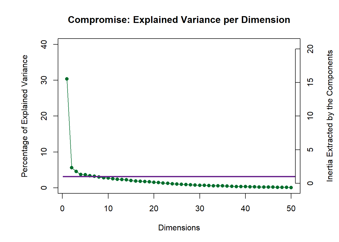
9.4.3.2 Compromise: Products
Here can plot the Products and their confindence interval. Note that we have 2 groups of products (France and South Africa). In our map, data points that start with F are from France and are in blue, those that start with SA and are in green are from South Africa. We can see that the products are largely different from each other. We can see some overlapping between some South African wines such as SBEA and SREY. There is little to none onerlapping between French wines. We also note that dimension 1 did a good job at separating the 2 groups.
# 4.1 Get the bootstrap factor scores (with default 1000 iterations)
BootF <- BootFactorScores(resDistatis$res4Splus$PartialF)
## [1] Bootstrap On Factor Scores. Iterations #:
## [2] 1000# 5.2 a compromise plot
# General title for the compromise factor plots:
genTitle4Compromise = 'Compromise: Products with Ellipsoid'
# To get graphs with axes 1 and 2:
h_axis = 1
v_axis = 2
# To get graphs with say 2 and 3
# change the values of v_axis and h_axis
F_f <- resDistatis$res4Splus$F
t <- F_f[ order(row.names(F_f)), ]
# Create color for the Products from prettyGraph
color4Products <- dplyr::recode(rownames(F_f),
"FBAU" = 'midnightblue',
"FCAR" = 'midnightblue',
"FCLL" = 'midnightblue',
"FCLP" = 'midnightblue',
"FHUE" = 'midnightblue',
"FROC" = 'midnightblue',
"FROU" = 'midnightblue',
"SBEA" = 'springgreen4',
"SFED" = 'springgreen4',
"SKLE" = 'springgreen4',
"SRAA" = 'springgreen4',
"SRAD" = 'springgreen4',
"SREY" = 'springgreen4',
"SRUD" = 'springgreen4',)
gg.compromise.graph.out <- createFactorMap(resDistatis$res4Splus$F,
axis1 = h_axis,
axis2 = v_axis,
title = genTitle4Compromise,
col.points = color4Products ,
col.labels = color4Products)
# NB for the lines below You need DISTATIS version > 1.0.0
# to get the eigen values and tau for the compromise
label4S <- createxyLabels.gen(
x_axis = h_axis, y_axis = v_axis,
lambda = resDistatis$res4Cmat$eigValues ,
tau = resDistatis$res4Cmat$tau,
axisName = "Dimension ")
b2.gg.Smap <- gg.compromise.graph.out$zeMap + label4S
#
# 5.4 a bootstrap confidence interval plot
# 5.3 create the ellipses
gg.boot.graph.out.elli <- MakeCIEllipses(
data = BootF[,c(h_axis,v_axis),],
names.of.factors =
c(paste0('Factor ',h_axis),
paste0('Factor ',v_axis)),
col = color4Products,
)
# Add ellipses to compromise graph
b3.gg.map.elli <- gg.compromise.graph.out$zeMap + gg.boot.graph.out.elli + label4S
b3.gg.map.elli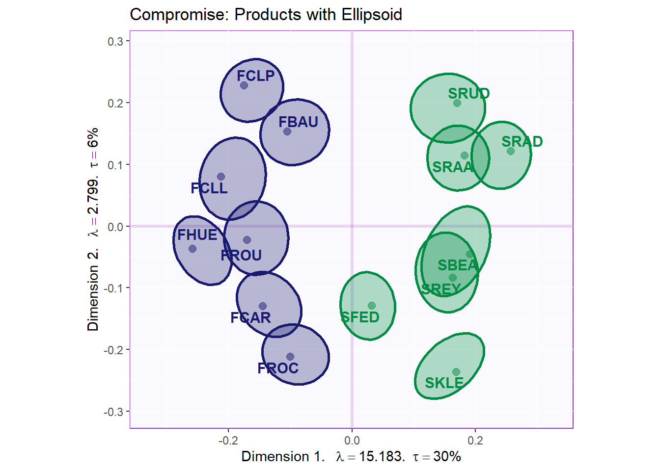
9.4.3.2.1 Cluster Analysis: Products
The clustering we have here is much better. We see that pur tree is small, has relatively little number of branches and each branch outcome are pure.
nFac4Prod = 2
D4Prod <- dist(resDistatis$res4Splus$F[,1:nFac4Prod], method = "euclidean")
fit4Prod <- hclust(D4Prod, method = "ward.D2")
b3.tree4Product <- fviz_dend(fit4Prod, k = 1,
k_colors = 'burlywood4',
label_cols = color4Products[fit4Prod$order],
cex = .7, xlab = 'Products',
main = 'Cluster Analysis: Products')

b3.tree4Product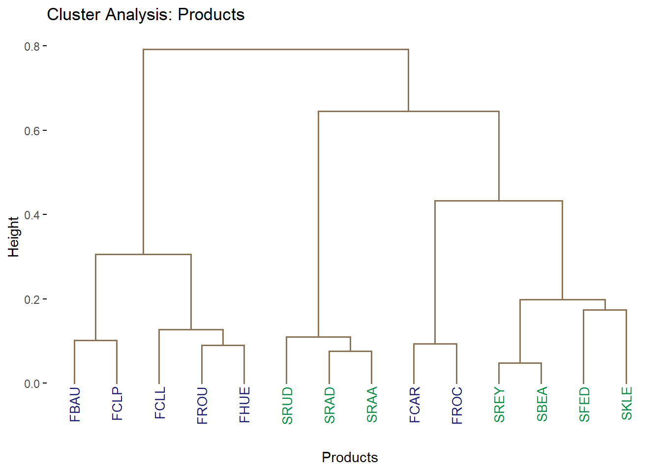
9.4.3.3 Partial factor scores: colored by products
As there are too many judges, we only plot the top 3 and bottom 3 judges in term of their Weights. Top 3: ‘J40’, ‘J9’,‘J3’. Bottom 3: ‘J29’, ‘J34’, ‘J8’. The major benefit of this plot is to assess the effects and potential biases in Judges’ ratings. We can interpret the connecting lines as followed: the more parallel the more the varaibles are similar to each others. The shorter lines radiating from each product present each different judges’ ratings. For this, we can use lengths to see how different the Judges’ Ratings were on a specific wine.
# get the partial map
F_j <- resDistatis$res4Splus$PartialF
alpha_j <- resDistatis$res4Cmat$alpha

#Select top 3 and bottom 3 judges in term of weights
slice_min(as.data.frame(W), order_by = W, n=3) #min 3
## W
## J40 0.829388
## J9 1.039161
## J3 1.392469## W
## J29 2.848324
## J34 2.690643
## J8 2.599219judge.noteworthy <- c('J40', 'J9','J3', 'J29', 'J34', 'J8')
map4PFS <- createPartialFactorScoresMap(
factorScores = resDistatis$res4Splus$F,
partialFactorScores = F_j[,,judge.noteworthy],
axis1 = 1, axis2 = 2,
#colors4Items = as.vector(color),
#names4Partial = dimnames(F_j)[[3]], #
font.labels = 'bold')
gg.compromise.graph.out <- createFactorMap(resDistatis$res4Splus$F,
axis1 = h_axis,
axis2 = v_axis,
title = "Partial: Products & Judges (Colored by Products)",
col.points = color4Products ,
col.labels = color4Products)
d1.partialFS.map.byProducts <- gg.compromise.graph.out$zeMap +
map4PFS$mapColByItems + label4S
d1.partialFS.map.byProducts 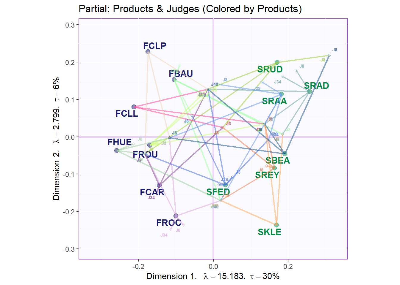
d1.partialFS.map.byProducts <- recordPlot()

gg.compromise.graph.out <- createFactorMap(resDistatis$res4Splus$F,
axis1 = h_axis,
axis2 = v_axis,
title = "Partial: Products & Judges (Colored by Blocks)",
col.points = color4Products ,
col.labels = color4Products)

d2.partialFS.map.byCategories <- gg.compromise.graph.out$zeMap +
map4PFS$mapColByBlocks + label4S
d2.partialFS.map.byCategories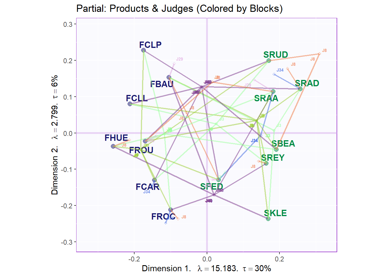
9.4.3.4 Print the graph vocabulary (with the products dots)
We can also project vocabs used as supplementary data onto our compromise map. Generally, we cannot see any clear relations between these descriptions with each products.
# 5.5. Vocabulary
F4Voc <- DistatisR::projectVoc(vocab, resDistatis$res4Splus$F)
F4Voc2 <- DistatisR::projectVoc(vocab, resDistatis$res4Splus$ProjectionMatrix)

# 5.5.2 CA-like Barycentric (same Inertia as products)
gg.voc.bary <- createFactorMap(F4Voc2$Fvoca.bary,
title = 'Vocabulary',
col.points = 'red4',
col.labels = 'red4',
display.points = FALSE,
)
#
e1.gg.voc.bary.gr <- gg.voc.bary$zeMap + label4S

gg.compromise.graph.out <- createFactorMap(resDistatis$res4Splus$F,
axis1 = h_axis,
axis2 = v_axis,
title = "Vocabulary Projection",
col.points = color4Products ,
col.labels = color4Products)

#print(e1.gg.voc.bary.gr)
b5.gg.voc.bary.dots.gr <- gg.compromise.graph.out$zeMap_background +
gg.compromise.graph.out$zeMap_dots +
gg.voc.bary$zeMap_text + label4S

b5.gg.voc.bary.dots.gr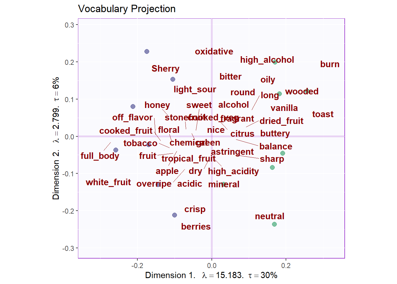
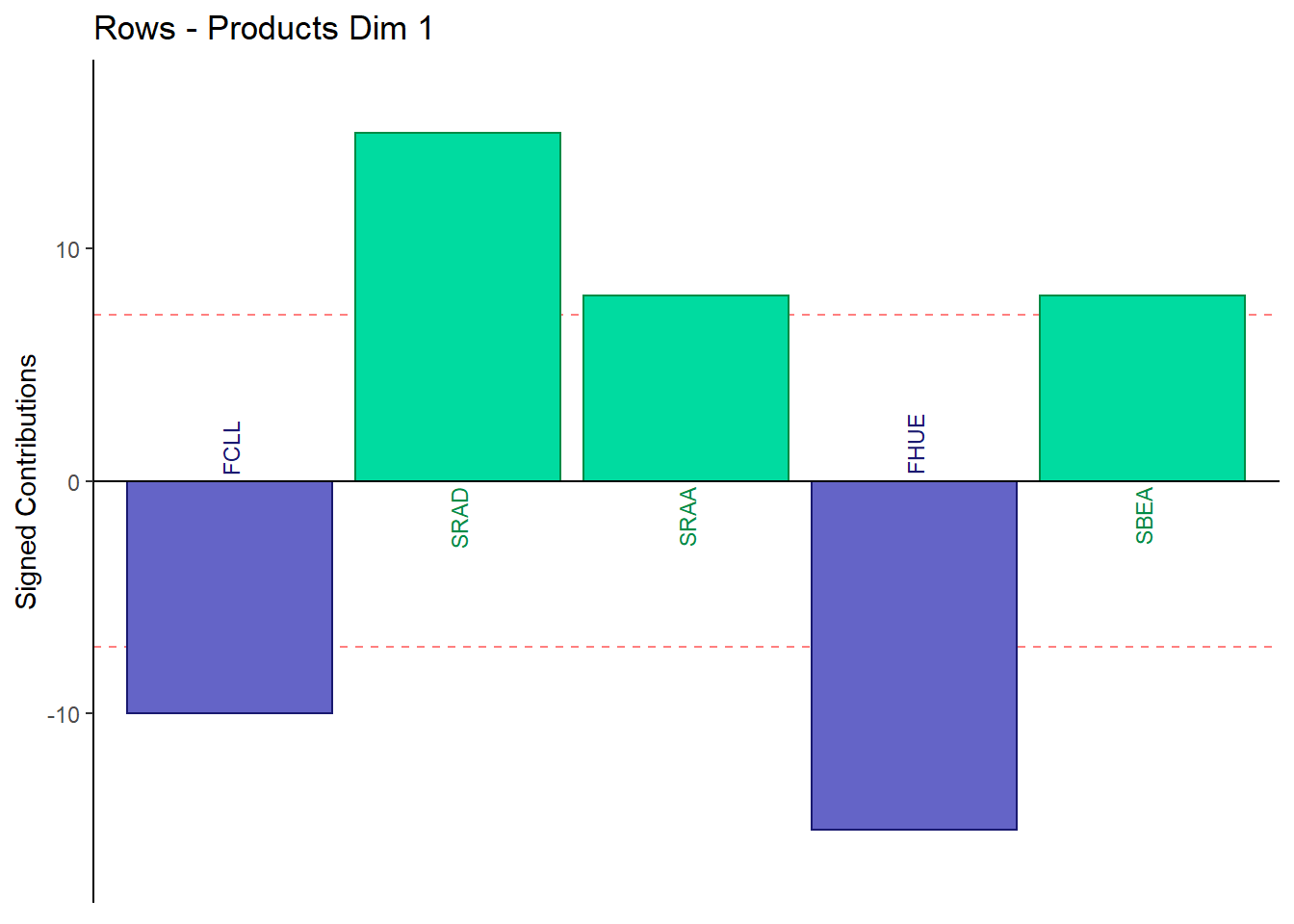
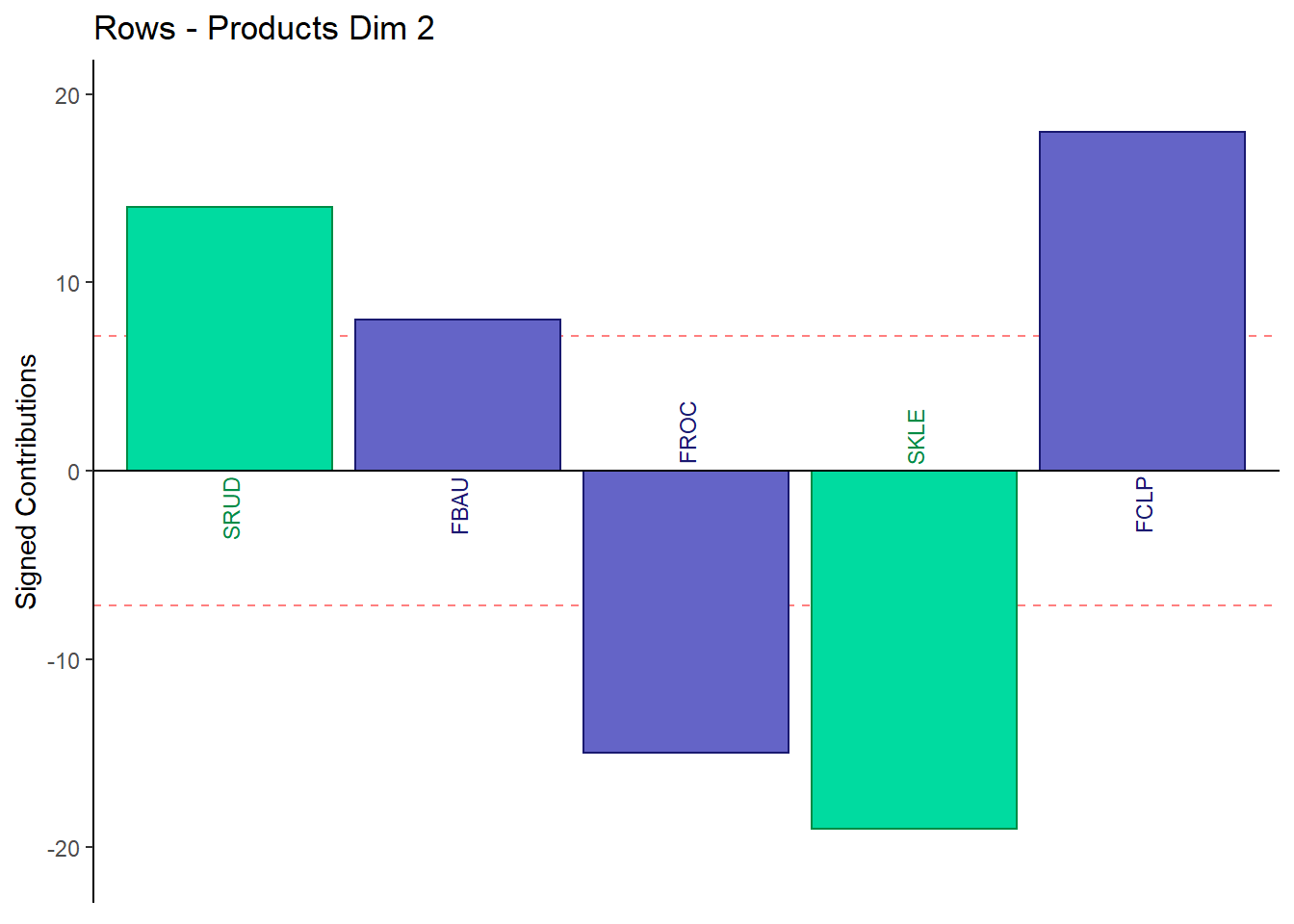
9.4.3.5 Contributions for Rows: Products
Fj <- resDistatis$res4Splus$F
F2 <- Fj**2
SF2 <- apply(F2, 2, sum)
ctrj <- t(t(F2)/SF2)
signed.ctrj <- ctrj * sign(Fj)
rownames(signed.ctrj) <- rownames(sort)

for (k in 1:2) {
c001.plotCtrj.1 <- PrettyBarPlot2(
                       bootratio = round(100*signed.ctrj[,k]),
                       signifOnly = TRUE,
                       threshold = 100 / nrow(signed.ctrj),
                       ylim = NULL,
                       color4bar = color4Products,
                       color4ns = "gray75",
                       plotnames = TRUE,
                       main = paste('Rows - Products Dim', k),
                       ylab = "Signed Contributions")
print(c001.plotCtrj.1)
}
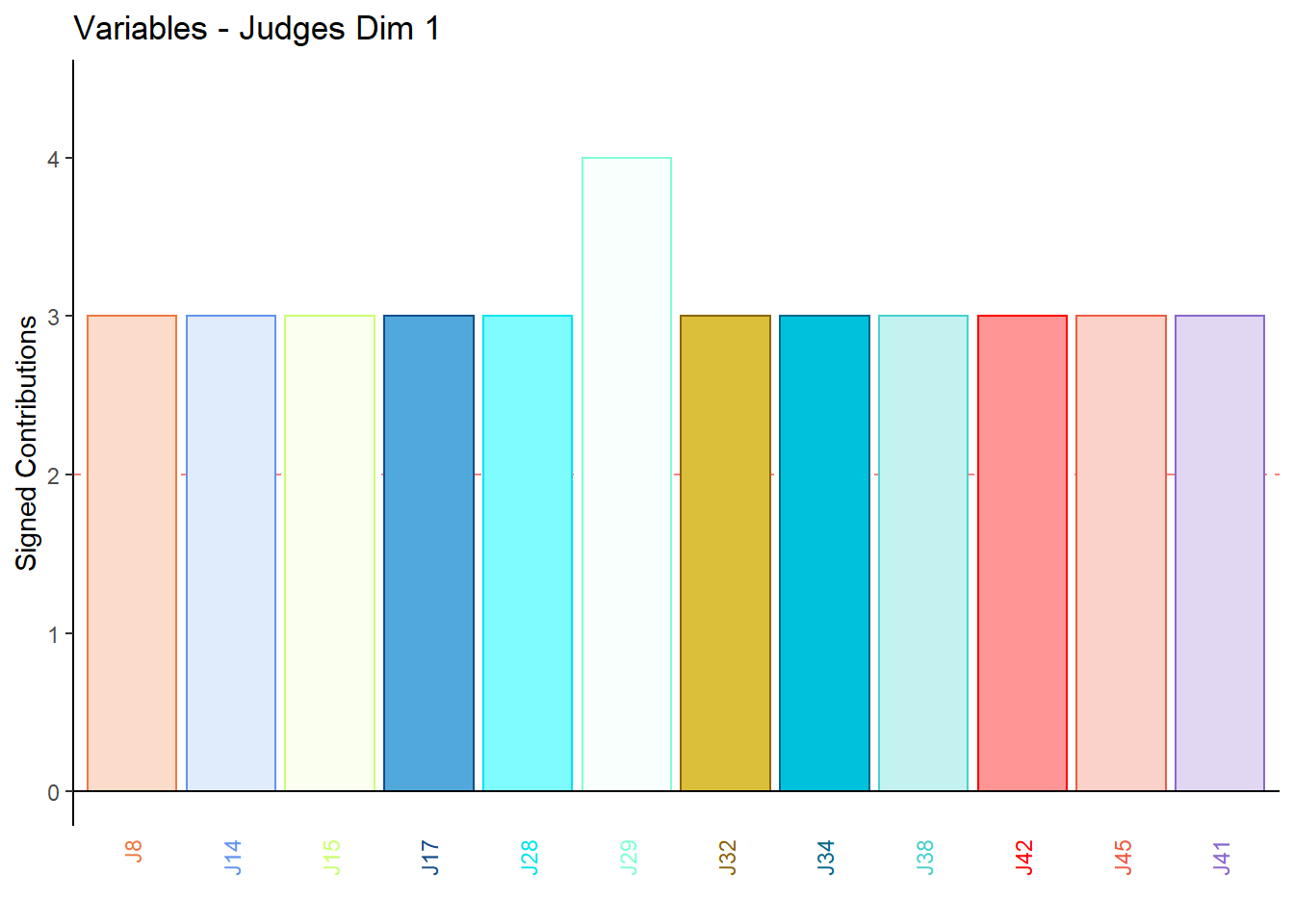
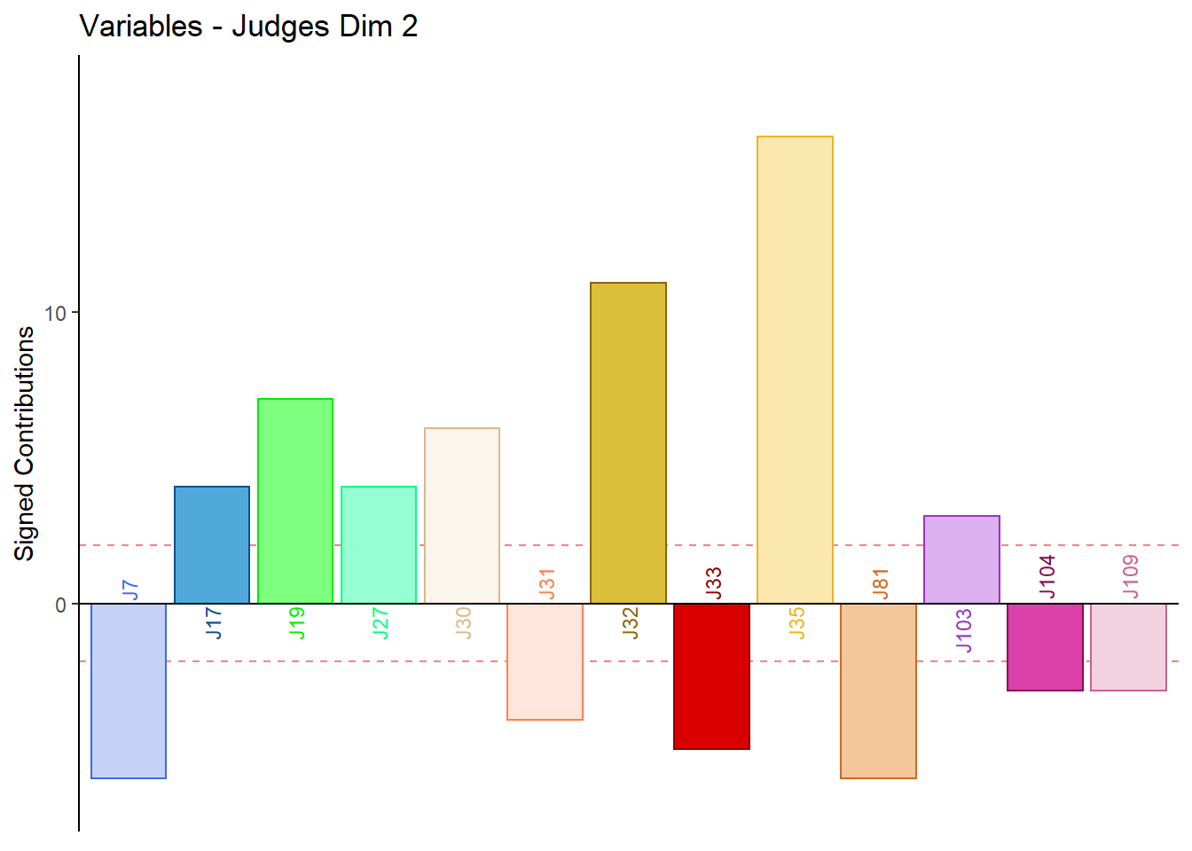
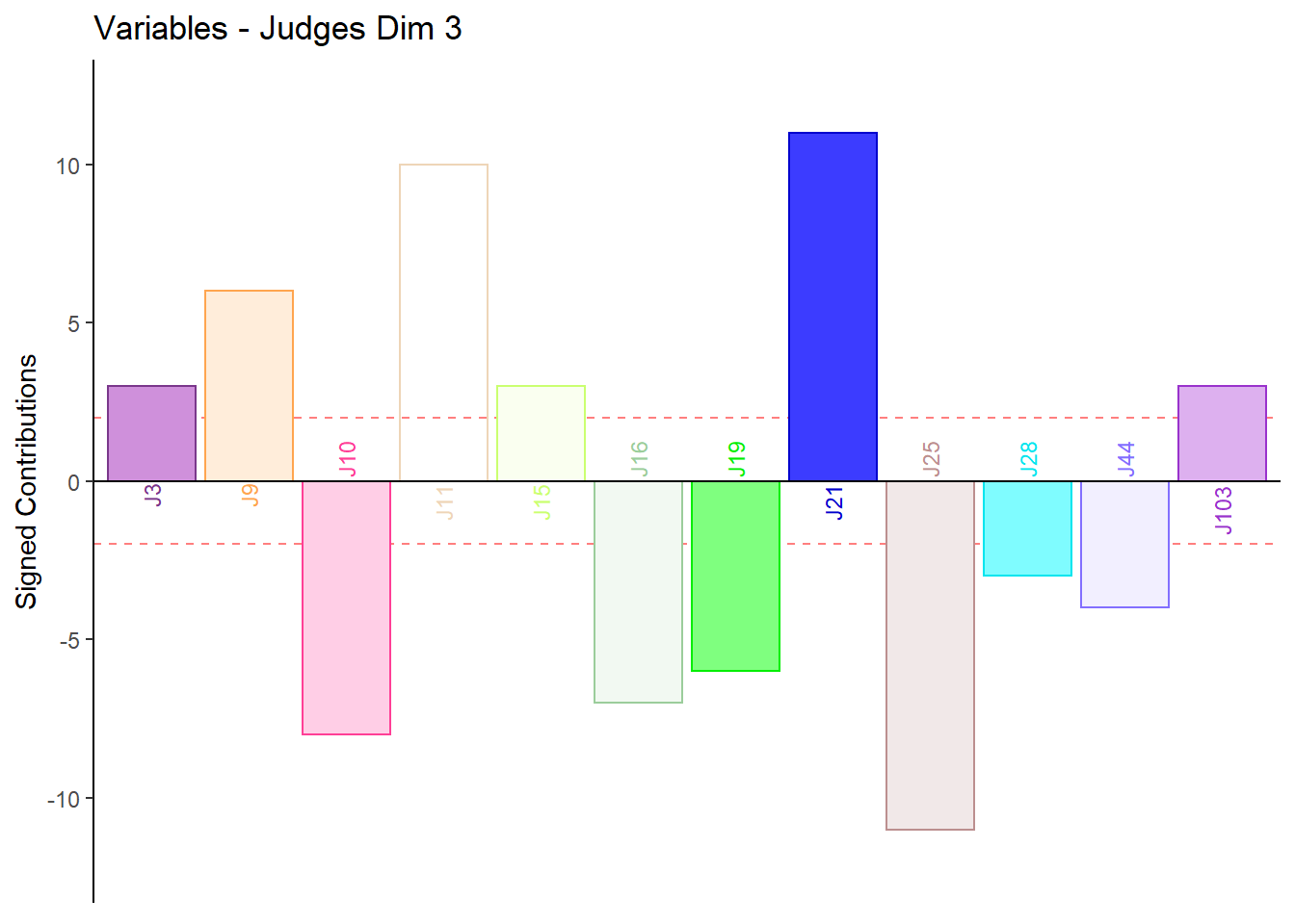
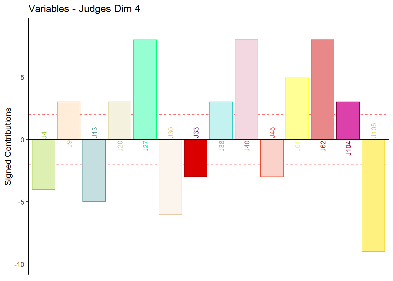
9.4.3.6 Contributions for Columns: Judges
Fj <- resDistatis$res4Cmat$G
RvFS <- Fj**2
RvSF2 <- apply(RvFS, 2, sum)
ctrj <- t(t(RvFS)/RvSF2)
signed.ctrj <- ctrj * sign(Fj)

#Gender
for (k in 1:4) {
c001.plotCtrj.1 <- PrettyBarPlot2(
                       bootratio = round(100*signed.ctrj[,k]),
                       signifOnly = TRUE,
                       threshold = 100 / nrow(signed.ctrj),
                       ylim = NULL,
                       color4bar = judge.color,
                       color4ns = "gray75",
                       plotnames = TRUE,
                       main = paste('Variables - Judges Dim', k),
                       ylab = "Signed Contributions")
print(c001.plotCtrj.1)
#c001.plotCtrj.1 <- recordPlot()
}