3.3 BADA Analysis
#BDA
resBADA <- tepBADA(sausage.processed,
                   DESIGN = wk0$Product,
                   scale = FALSE,
                   graphs = FALSE)

# Inferences -----
nIter <- 1000
resBADA.inf <- tepBADA.inference.battery(
  sausage.processed,
  DESIGN = wk0$Product,
  graphs = FALSE,
  test.iters = nIter
)
## [1] "It is estimated that your iterations will take 0.5 minutes."
## [1] "R is not in interactive() mode. Resample-based tests will be conducted. Please take note of the progress bar."
## ================================================================================3.3.1 Scree Plot
Compare to the Scree Plot yielded from PCA, this time it looks like this is quite a bit of over-estimation in Components Significance. We will also double check this effect by performing eigen value tests on Component 1 and 2. From these test, we can see that there is indeed an effect of over-estimation in Components Significance when using BADA.
# Scree
inf.scree <- PlotScree(ev = resBADA.inf$Fixed.Data$TExPosition.Data$eigs,
                       p.ev = resBADA.inf$Inference.Data$components$p.vals,
                       plotKaiser = TRUE,
                       title = "BADA: Explained Variance per Dimension")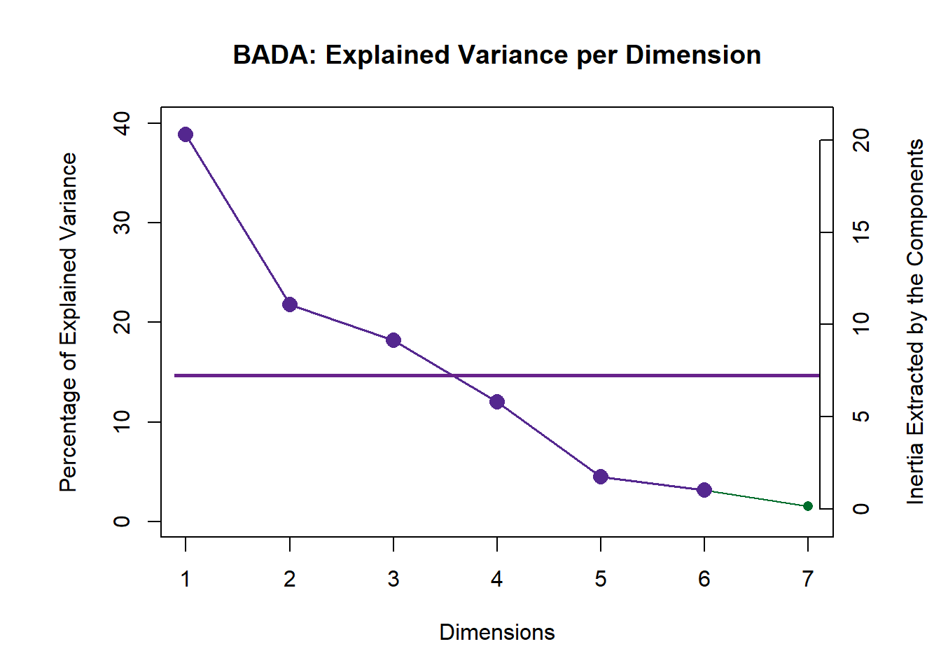
3.3.1.1 Eigen Tests
In this step, we use Permutation (random resampling) as the Cross-Validation methods of choice to verify the effect of Explained Varaince (Inertia) of each component presented in the scree plot above. In this section, we will highlight how it is done under the hood. However, we will prefer to include this Permutation test within the Scree Plot going forward.
#eigen plot 1
zeDim = 1
pH1 <- prettyHist(
  distribution = resBADA.inf$Inference.Data$components$eigs.perm[,zeDim],
  observed = resBADA.inf$Fixed.Data$TExPosition.Data$eigs[zeDim],
  xlim = c(0, 20), # needs to be set by hand
  breaks = 20,
  border = "white",
  main = paste0("Permutation Test for Eigenvalue ",zeDim),
  xlab = paste0("Eigenvalue ",zeDim),
  ylab = "",
  counts = FALSE,
  cutoffs = c( 0.975)
)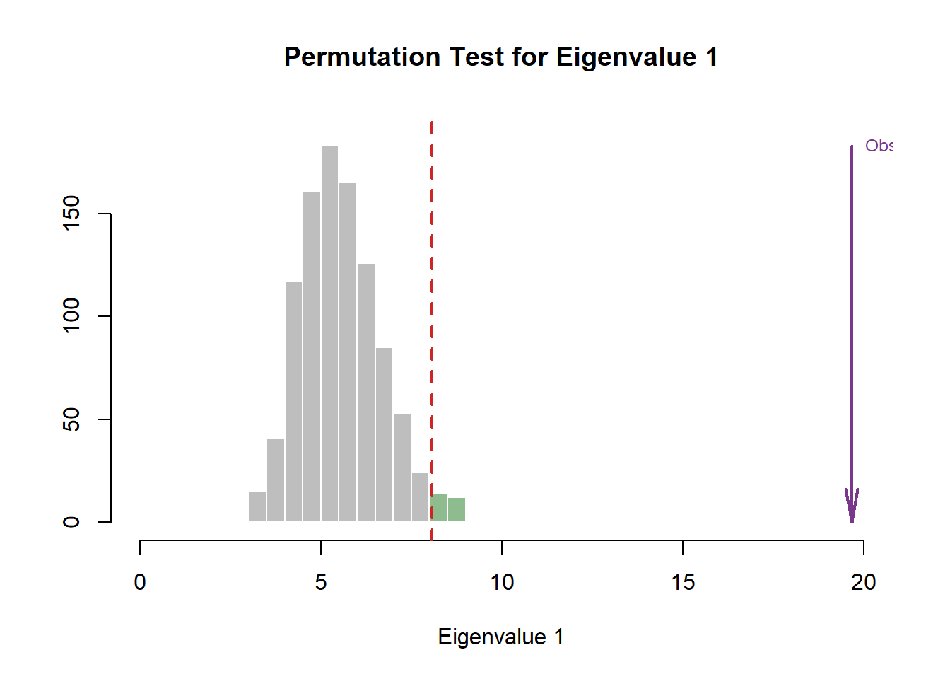
eigs1 <- recordPlot()
eigs1


#eigen plot 2
zeDim = 2
pH2 <- pH1 <- prettyHist(
  distribution = resBADA.inf$Inference.Data$components$eigs.perm[,zeDim],
  observed = resBADA.inf$Fixed.Data$TExPosition.Data$eigs[zeDim],
  xlim = c(0, 13), # needs to be set by hand
  breaks = 20,
  border = "white",
  main = paste0("Permutation Test for Eigenvalue ",zeDim),
  xlab = paste0("Eigenvalue ",zeDim),
  ylab = "",
  counts = FALSE,
  cutoffs = c(0.975))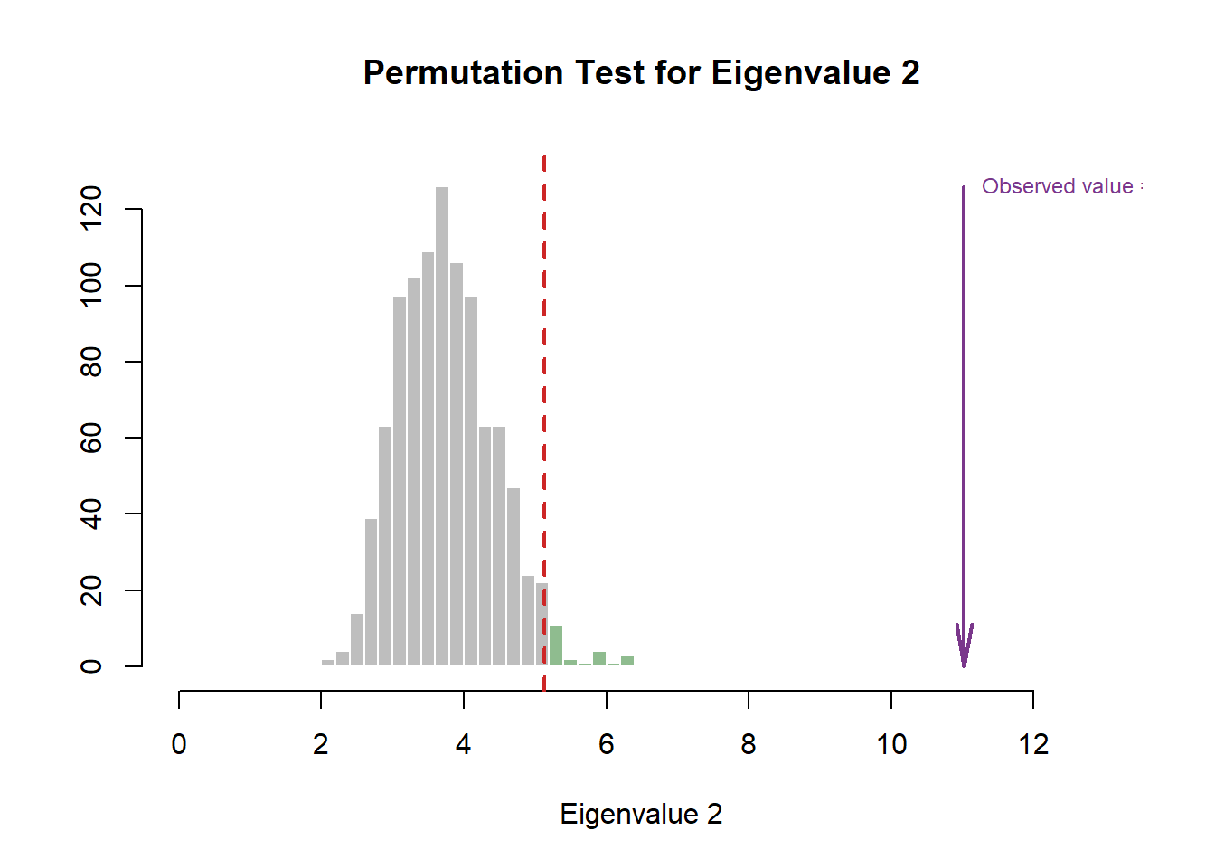
3.3.2 Row Factor Scores
3.3.2.1 All Observations and Their Maps
# Main Map for Observations ----
Imap <- PTCA4CATA::createFactorMap(
  resBADA$TExPosition.Data$fii,
  col.points = prod.color.type,
  col.labels = prod.color.type,
  alpha.points = .5
)

# Labels -------
label4Map <- createxyLabels.gen(1,2,
                                lambda = resBADA$TExPosition.Data$eigs,
                                tau = resBADA$TExPosition.Data$t)
3.3.2.2 Group Means and Their Maps
#Factor map with Product as grouping
sausageMeans2 <- PTCA4CATA::getMeans(
  resBADA$TExPosition.Data$fii,
  wk0$Product)

#Color
prod.color.type.mean <- dplyr::recode(wk6$Product,
                          'SALCHICHA DE PAVO CHIMEX' = 'green3',
                          'Salchicha de pavo FUD' = 'green3',
                          'Salchicha de Pavo Nutrideli' = 'green3',
                          'Salchicha pavo CHERO' = 'green3',
                          'SALCHICHA VIENA CHIMEX' = 'orange',
                          'Salchicha viena FUD' = 'orange',
                          'Salchicha Viena Nutrideli' = 'orange',
                          'Salchicha VIENA VIVA' = 'orange')


#Map by Grouping under Sausage Types
MapGroup2 <- PTCA4CATA::createFactorMap(sausageMeans2,
                                       # use the constraint from the main map
                                       constraints = Imap$constraints,
                                       col.points = prod.color.type.mean,
                                       cex = 7,  # size of the dot (bigger)
                                       col.labels = prod.color.type.mean,
                                       text.cex = 4,
                                       pch = 17)
3.3.2.3 Make Tolerance Intervals
Notes on Row Factor Scores Map with TI:
1. The Triangle data points are the Group Means (Barycenters) by Products.
2. The Tolerance Intervals are made by polygon of all observations per according Product Groups. As expected, we see that the Group Means data points stays in the relative “Center” of the polygon hull.
3. The coloring option here depicts Product Groups as their sausage type. We chose this coloring scheme because we found that this grouping makes the most sense from PCA.
#Make TI Layer Map:
TIplot.type2 <- MakeToleranceIntervals(resBADA$TExPosition.Data$fii,
                                      design = as.factor(wk0$Product),
                                      # line below is needed
                                      names.of.factors =  c("Dim1","Dim2"), # needed
                                      col = prod.color.type.mean,
                                      line.size = .50,
                                      line.type = 3,
                                      alpha.ellipse = .2,
                                      alpha.line    = .4,
                                      p.level       = .95)

#Compile Maps:
row.full.4TI <- Imap$zeMap_background +
  TIplot.type2 + label4Map+
  MapGroup2$zeMap_dots + MapGroup2$zeMap_text +
  ggtitle('BADA: Group Centers with Hulls and Observations')
row.full.4TI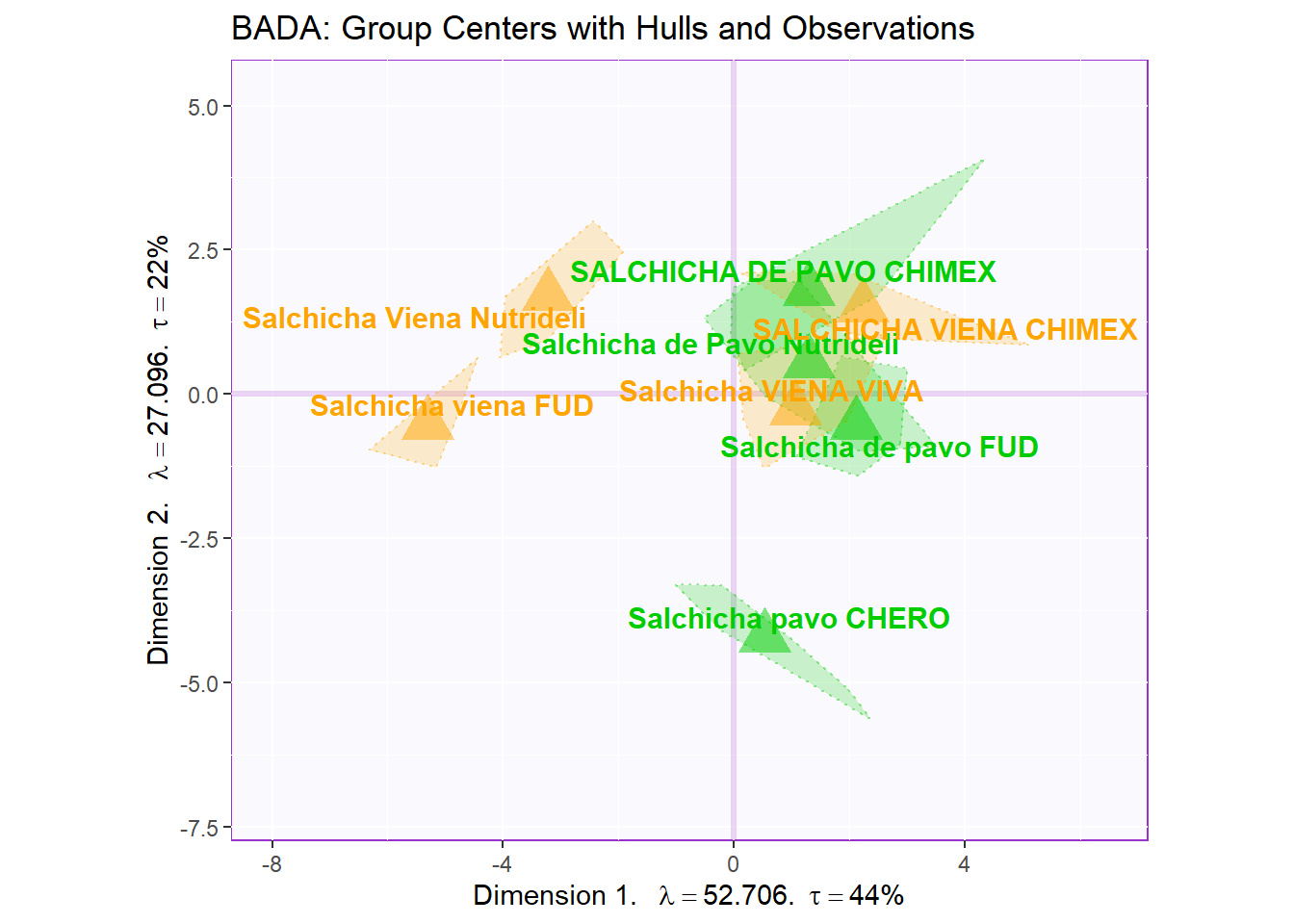
3.3.2.4 Make Bootstrap Interval
Notes on Row Factor Scores Map with BI:
1. The Triangle data points are the Group Means (Barycenters) by Products.
2. The Bootstrap Intervals are made by Esclipse of all observations per according Product Groups. As expected, we see that the Group Means data points stays in the relative “Center” of the polygon hull.
3. The coloring option here follow the coloring scheme for variables used in PCA - for consistency.
4. Bootstrap is a resampling method that replaces observation through iterations of resampling. The goal is to “stretch” the data set bounds and help statistically verify the validity of our findings.
#Make BI Layer Map:
bootCI4mean.type2 <- MakeCIEllipses(resBADA.inf$Inference.Data$boot.data$fi.boot.data$boots,
                                   col = prod.color.type.mean)

#Map by Grouping under Sausage Types
MapGroup3 <- PTCA4CATA::createFactorMap(resBADA.inf$Fixed.Data$TExPosition.Data$fi,
                                       # use the constraint from the main map
                                       constraints = Imap$constraints,
                                       col.points = prod.color.type.mean,
                                       cex = 7,  # size of the dot (bigger)
                                       col.labels = prod.color.type.mean,
                                       text.cex = 4,
                                       pch = 17)

#Compile Maps:
row.full.5BI <- Imap$zeMap_background +
  bootCI4mean.type2 +
  MapGroup3$zeMap_dots +
  MapGroup3$zeMap_text + label4Map +
  ggtitle('BADA: Group Centers with BI and Observations')
row.full.5BI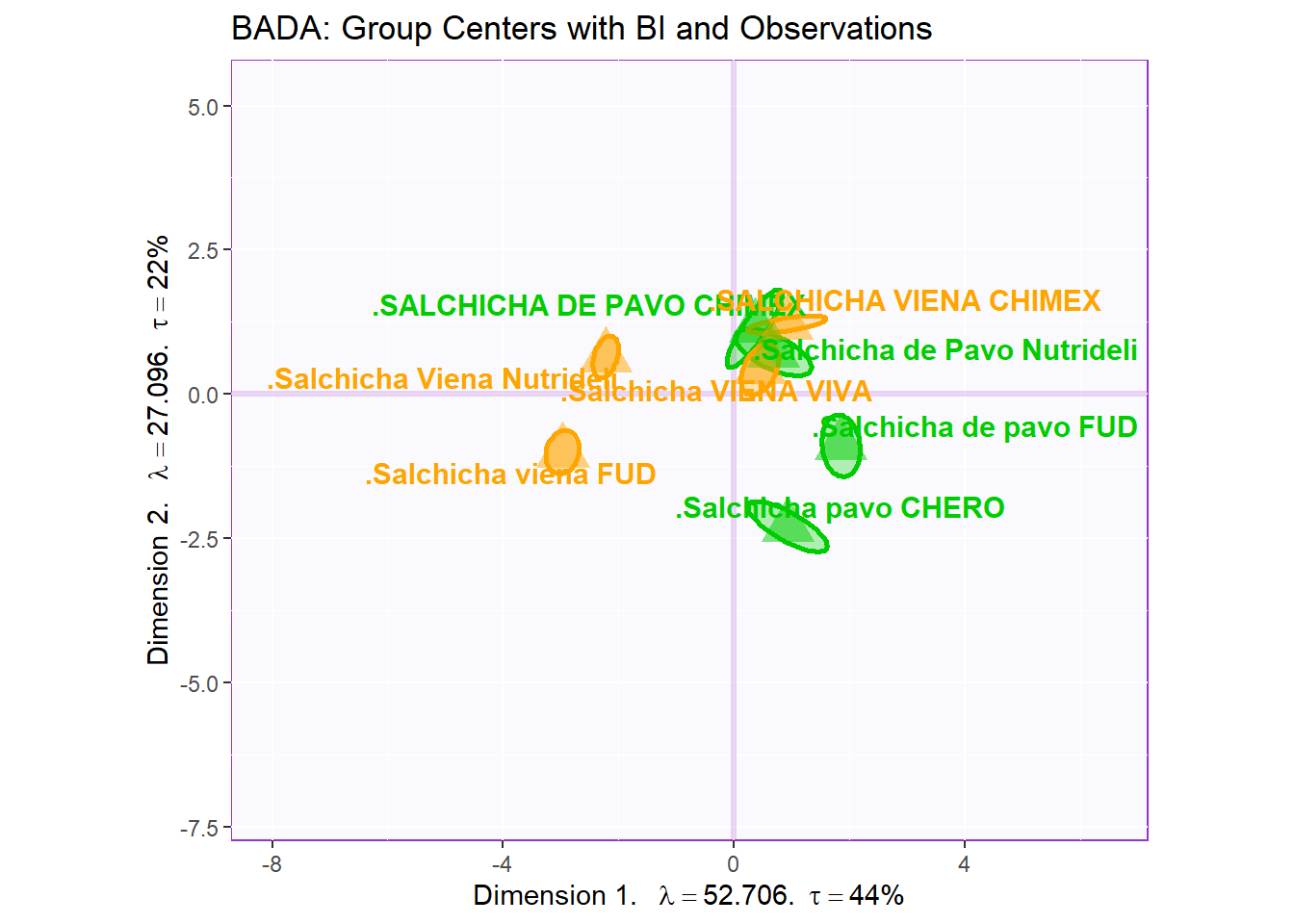
3.3.3 Column Factor Scores
3.3.3.1 Loadings:
# variables fs----------
var <- colnames(sausage.processed)
var.color <- prettyGraphsColorSelection(n.colors = ncol(sausage.processed))
#too many var to assign color manually so we use prettyGraphsColorSelection() to automatically assign colors

#Column Factor Scores----
Fj <- resBADA$TExPosition.Data$fj
baseMap.j <- PTCA4CATA::createFactorMap(Fj,
                                        col.points   = var.color,
                                        alpha.points =  .3,
                                        col.labels   = var.color)
# arrows
zeArrows <- addArrows(Fj, color = var.color)

# A graph for the J-set
b001.aggMap.j <- baseMap.j$zeMap_background + # background
  baseMap.j$zeMap_dots +  # dots
  baseMap.j$zeMap_text +  # names
  label4Map # lables for the axes
b002.aggMap.j <- b001.aggMap.j + zeArrows
b003.aggMap.j <- baseMap.j$zeMap_background + # background
  baseMap.j$zeMap_text +  # names
  zeArrows + label4Map

b003.aggMap.j 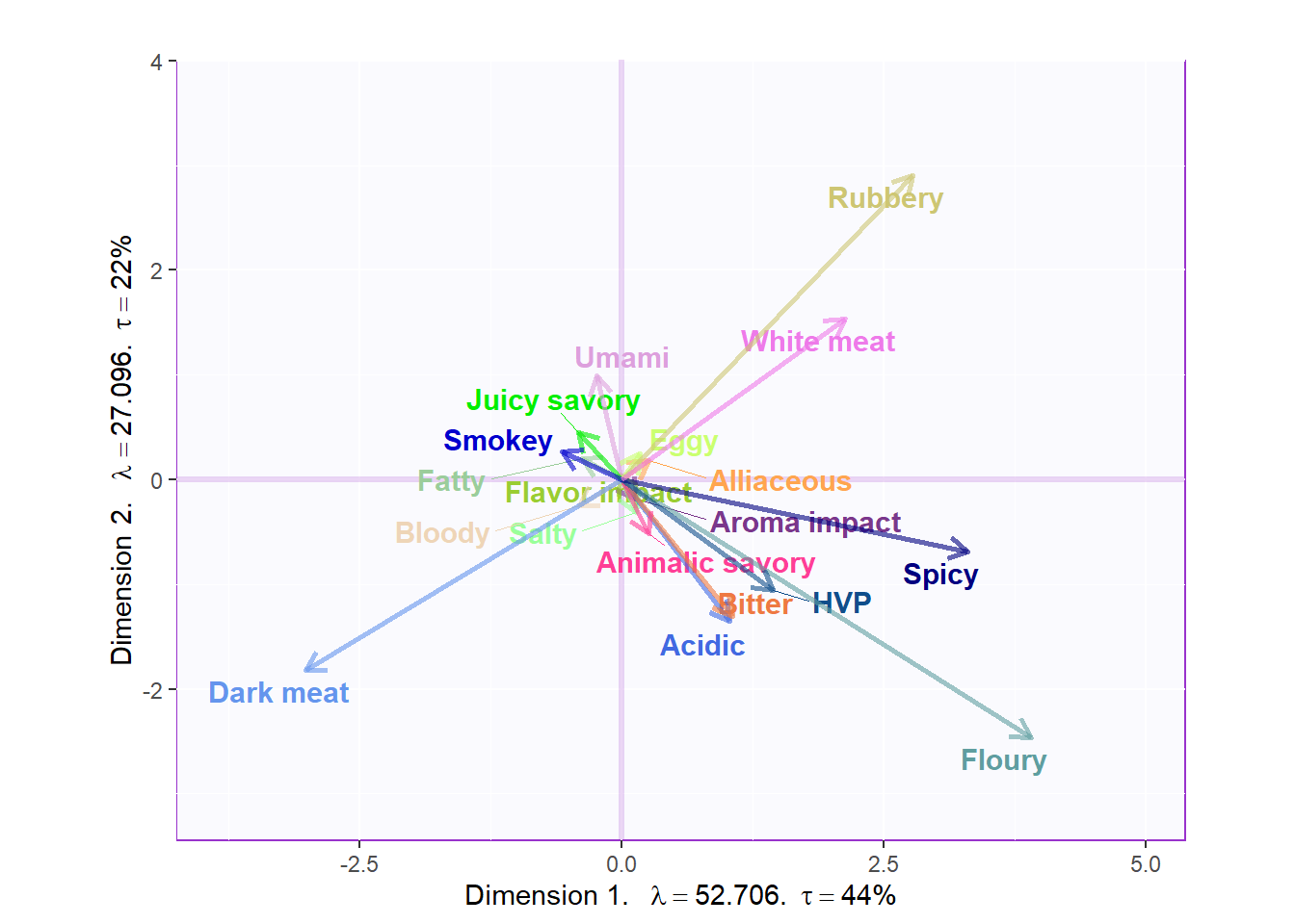
3.3.3.2 Loadings Circle:
Notes on Column Factor Scores Map:
1. We see that the overall relationships between variables are exactly similar to PCA but flipped.
2. Their relationships with each component 1 and 2 also don’t differ from PCA, in term of Cosine.
3. Note that the way to interpret this plot is similar to when we interpret PCA in which we will assess the Cosine between arrows to see how similar they are to each other: small angle present they are more similar wile large (180) presents opposite relationship.
cor.loading <- cor(sausage.processed.mean.prod, resBADA.inf$Fixed.Data$TExPosition.Data$fi)
rownames(cor.loading) <- rownames(cor.loading)

loading.plot <- createFactorMap(cor.loading,
                                constraints = list(minx = -1, miny = -1,
                                                   maxx = 1, maxy = 1),
                                col.points = var.color,
                                col.labels = var.color,
                                title = "Loadings Circle")

LoadingMapWithCircles <- loading.plot$zeMap +
  addArrows(cor.loading, color = var.color) +
  addCircleOfCor() + xlab("Component 1") + ylab("Component 2")
LoadingMapWithCircles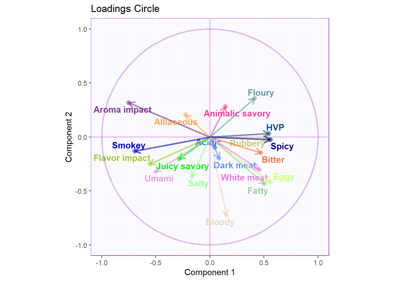
3.3.4 CONTRIBUTIONS AND BOOTSTRAP RATIOS
3.3.4.1 Contributions:
#Contributions
ctrj <- resBADA$TExPosition.Data$cj
signed.ctrj <- ctrj * sign(Fj)

# Contrib 1
c001.plotCtrj.1 <- PrettyBarPlot2(
  bootratio = round(100*signed.ctrj[,1]),
  threshold = 100 / nrow(signed.ctrj),
  ylim = NULL,
  color4bar = gplots::col2hex(var.color),
  color4ns = "gray75",
  plotnames = TRUE,
  main = 'Important Contributions Variables. Dim 1.',
  ylab = "Signed Contributions",
  font.size = 5)

print(c001.plotCtrj.1)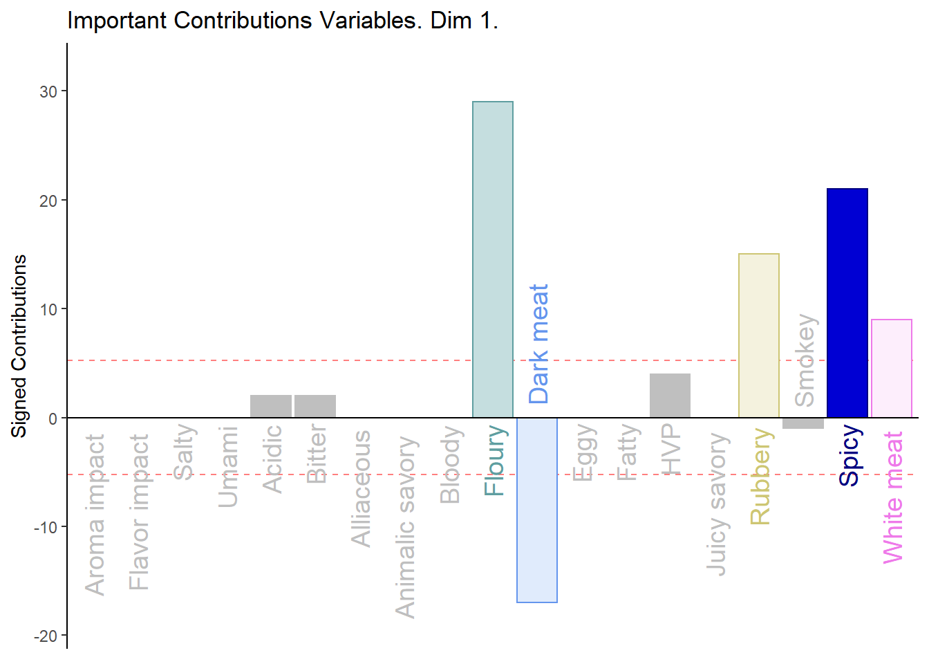
# Contrib 2
c002.plotCtrj.2 <- PrettyBarPlot2(
  bootratio = round(100*signed.ctrj[,2]),
  threshold = 100 / nrow(signed.ctrj),
  ylim = NULL,
  color4bar = gplots::col2hex(var.color),
  color4ns = "gray75",
  plotnames = TRUE,
  main = 'Important Contributions Variables. Dim 2.',
  ylab = "Signed Contributions",
  font.size = 5)

print(c002.plotCtrj.2)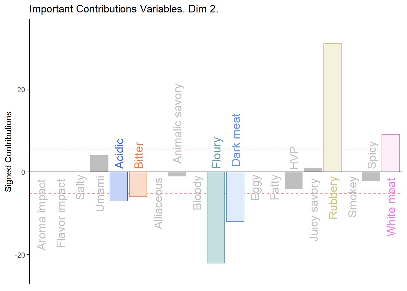
3.3.4.2 BOOTSTRAP RATIOS:
#  Bootstrap ratios
BRj <- resBADA.inf$Inference.Data$boot.data$fj.boot.data$tests$boot.ratios

# BR1
d001.plotBRj.1 <- PrettyBarPlot2(
  bootratio = BRj[,1],
  threshold = 2,
  ylim = NULL,
  color4bar = gplots::col2hex(var.color),
  color4ns = "gray75",
  plotnames = TRUE,
  main = 'Bootstrap Ratios Variables. Dim 1.',
  ylab = "Bootstrap Ratios",
  font.size = 5)

print(d001.plotBRj.1)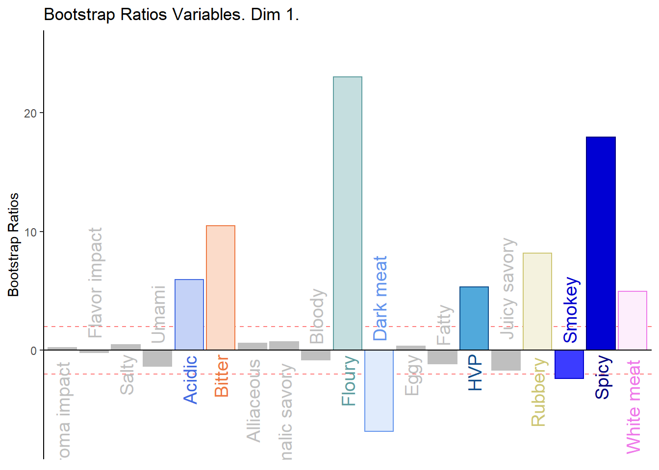
#BR. 2
d003.plotBRj.2 <- PrettyBarPlot2(
  bootratio = BRj[,2],
  threshold = 2,
  ylim = NULL,
  color4bar = gplots::col2hex(var.color),
  color4ns = "gray75",
  plotnames = TRUE,
  main = 'Bootstrap Ratios Variables. Dim 2.',
  ylab = "Bootstrap Ratios",
  font.size = 5)

print(d003.plotBRj.2)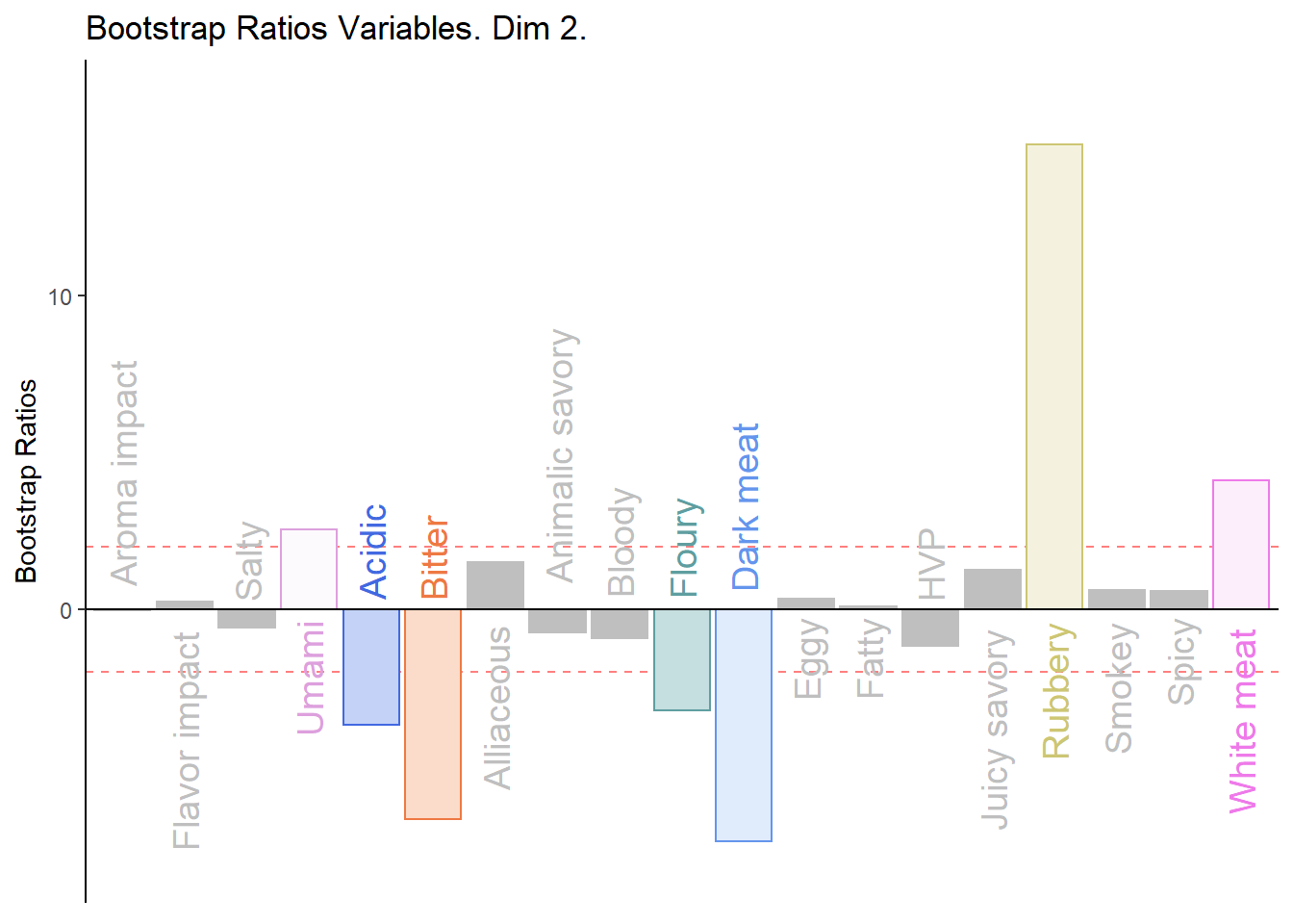
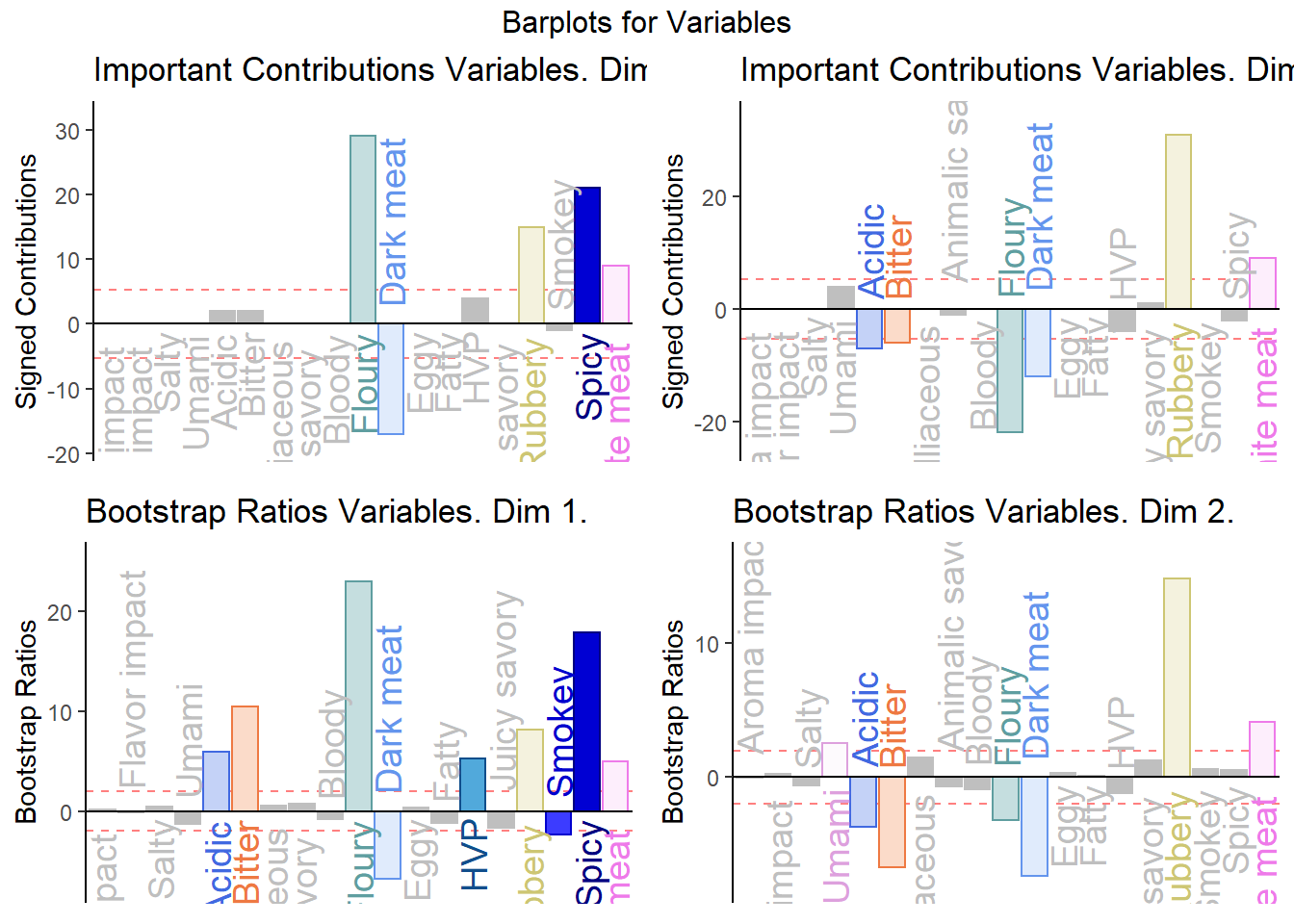
3.3.4.3 Combine All Barplots:
Notes on Barplots:
1. We see that the overall relationships between variables, compared to average contribustion are exactly similar to PCA.
2. We do notice a few variables show a more pronounce contribution (either positive or negativce) compared to PCA.
#We then use the next line of code to put two figures side to side:

final.output.barplots <- grid.arrange(
    c001.plotCtrj.1,
    c002.plotCtrj.2,
    d001.plotBRj.1,
    d003.plotBRj.2,
    ncol = 2,nrow = 2,
    top = "Barplots for Variables"
  )
3.3.5 Prediction & Confusion Matrix:
The most outstanding implication of Barycentric analysis is that we can use it to predict new observation. This aspect of BADA functions relatively similar to Supervised clustering algorithm and thus, we should use cross-validation techniques such as simple data splitting (test vs train) and confusion matrix to analyze model performance and reduce over-fitting.
3.3.5.1 Fixed Data Confusion Matrix:
#Fixed CM
fixed_cm <- as.data.frame(resBADA.inf$Inference.Data$loo.data$fixed.confuse)
a <- kable(fixed_cm)
scroll_box(a, width = "910px", height = "400px")| .Salchicha de Pavo Nutrideli | .Salchicha de pavo FUD | .Salchicha pavo CHERO | .SALCHICHA DE PAVO CHIMEX | .Salchicha Viena Nutrideli | .Salchicha viena FUD | .Salchicha VIENA VIVA | .SALCHICHA VIENA CHIMEX | |
|---|---|---|---|---|---|---|---|---|
| .Salchicha de Pavo Nutrideli | 6 | 0 | 0 | 0 | 0 | 0 | 1 | 0 |
| .Salchicha de pavo FUD | 0 | 8 | 0 | 0 | 0 | 0 | 0 | 0 |
| .Salchicha pavo CHERO | 0 | 0 | 8 | 0 | 0 | 0 | 0 | 0 |
| .SALCHICHA DE PAVO CHIMEX | 0 | 0 | 0 | 7 | 0 | 0 | 0 | 0 |
| .Salchicha Viena Nutrideli | 0 | 0 | 0 | 0 | 8 | 0 | 0 | 0 |
| .Salchicha viena FUD | 0 | 0 | 0 | 0 | 0 | 8 | 0 | 0 |
| .Salchicha VIENA VIVA | 2 | 0 | 0 | 0 | 0 | 0 | 7 | 0 |
| .SALCHICHA VIENA CHIMEX | 0 | 0 | 0 | 1 | 0 | 0 | 0 | 8 |
3.3.5.2 Fixed Data Confusion Matrix Accuracy:
## [1] 0.93753.3.5.3 Random Confusion Matrix:
#Random CM
random_cm <- as.data.frame(resBADA.inf$Inference.Data$loo.data$loo.confuse)
a <- kable(random_cm)
scroll_box(a, width = "910px", height = "500px")| .Salchicha de Pavo Nutrideli.actual | .Salchicha de pavo FUD.actual | .Salchicha pavo CHERO.actual | .SALCHICHA DE PAVO CHIMEX.actual | .Salchicha Viena Nutrideli.actual | .Salchicha viena FUD.actual | .Salchicha VIENA VIVA.actual | .SALCHICHA VIENA CHIMEX.actual | |
|---|---|---|---|---|---|---|---|---|
| .Salchicha de Pavo Nutrideli.predicted | 3 | 1 | 0 | 1 | 0 | 0 | 3 | 0 |
| .Salchicha de pavo FUD.predicted | 0 | 7 | 2 | 0 | 0 | 0 | 0 | 0 |
| .Salchicha pavo CHERO.predicted | 0 | 0 | 6 | 0 | 0 | 0 | 0 | 0 |
| .SALCHICHA DE PAVO CHIMEX.predicted | 2 | 0 | 0 | 3 | 0 | 0 | 0 | 2 |
| .Salchicha Viena Nutrideli.predicted | 0 | 0 | 0 | 0 | 8 | 0 | 0 | 0 |
| .Salchicha viena FUD.predicted | 0 | 0 | 0 | 0 | 0 | 8 | 0 | 0 |
| .Salchicha VIENA VIVA.predicted | 3 | 0 | 0 | 0 | 0 | 0 | 5 | 0 |
| .SALCHICHA VIENA CHIMEX.predicted | 0 | 0 | 0 | 4 | 0 | 0 | 0 | 6 |