4.5 MCA Analysis
MCA:
MCA Inference:
resMCA.inf <- InPosition::epMCA.inference.battery(
                    DATA = bin_data,
                    DESIGN = wk0$Product,
                    graphs =  FALSE # TRUE first pass only
)
## [1] "It is estimated that your iterations will take 0 minutes."
## [1] "R is not in interactive() mode. Resample-based tests will be conducted. Please take note of the progress bar."
## ================================================================================MCA Contribution:
4.5.1 Scree:
PlotScree(ev = resMCA$ExPosition.Data$eigs,
        p.ev = resMCA.inf$Inference.Data$components$p.vals,
        plotKaiser = TRUE)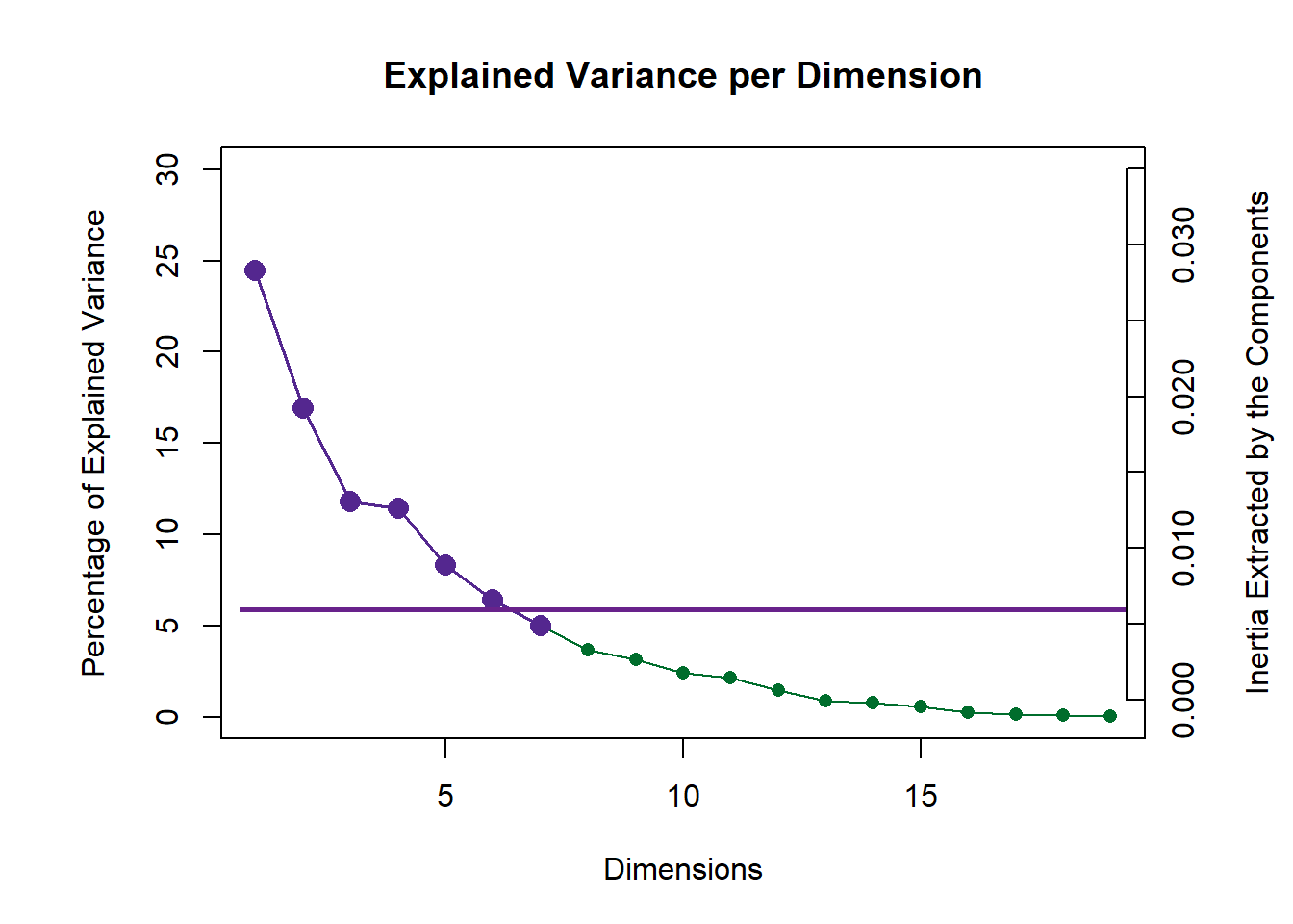
Color Schemes:
#Colors by products:
prod.color <- dplyr::recode(wk0$Product,
                     'SALCHICHA DE PAVO CHIMEX' = 'green3',
                     'Salchicha de pavo FUD' = 'blue',
                     'Salchicha de Pavo Nutrideli' = 'brown',
                     'Salchicha pavo CHERO' = 'firebrick1',
                     'SALCHICHA VIENA CHIMEX' = 'grey50',
                     'Salchicha viena FUD' = 'orange',
                     'Salchicha Viena Nutrideli' = 'darkorchid',
                     'Salchicha VIENA VIVA' = 'deeppink'
                     )

#Colors by products mean:
prod.color.mean <- dplyr::recode(wk6$Product,
                         'SALCHICHA DE PAVO CHIMEX' = 'green3',
                         'Salchicha de pavo FUD' = 'blue',
                         'Salchicha de Pavo Nutrideli' = 'brown',
                         'Salchicha pavo CHERO' = 'firebrick1',
                         'SALCHICHA VIENA CHIMEX' = 'grey50',
                         'Salchicha viena FUD' = 'orange',
                         'Salchicha Viena Nutrideli' = 'darkorchid',
                         'Salchicha VIENA VIVA' = 'deeppink')

#Color by Panelists:
prod.color.panelist <- dplyr::recode_factor(wk0$Panelist,
                                     'XEL' = 'green3',
                                     'LALO' = 'blue',
                                     'JUAN' = 'brown',
                                     'MARTHA' = 'firebrick1',
                                     'NERI' = 'grey50',
                                     'DIANA' = 'orange',
                                     'DULCE' = 'darkorchid',
                                     'RAUL' = 'deeppink',
                                     'MINE' = 'ivory')

#colors by sausage type
prod.color.type <- dplyr::recode(wk0$Product,
                       'SALCHICHA DE PAVO CHIMEX' = 'green3',
                       'Salchicha de pavo FUD' = 'green3',
                       'Salchicha de Pavo Nutrideli' = 'green3',
                       'Salchicha pavo CHERO' = 'green3',
                       'SALCHICHA VIENA CHIMEX' = 'orange',
                       'Salchicha viena FUD' = 'orange',
                       'Salchicha Viena Nutrideli' = 'orange',
                       'Salchicha VIENA VIVA' = 'orange'
                       )
4.5.2 Factor Scores Group Means:
By Products:
#Control our data and process to get group means by products
#Extract means data from InPosition Results
mean.by.product <- as.data.frame(resMCA.inf$Fixed.Data$ExPosition.Data$fi)

#Function to find means
group.mean <- aggregate(mean.by.product,
                        by = list(wk0$Product), # must be a list
                        mean)

#Cleanup our dataframe
sausage.processed.mean <- group.mean[,-1]
rownames(sausage.processed.mean) <- group.mean[, 1]

#Display dataframe
b <- kable(sausage.processed.mean)
scroll_box(b, width = "910px", height = "200px")| V1 | V2 | V3 | V4 | V5 | V6 | V7 | V8 | V9 | V10 | V11 | V12 | V13 | V14 | V15 | V16 | V17 | V18 | V19 | |
|---|---|---|---|---|---|---|---|---|---|---|---|---|---|---|---|---|---|---|---|
| SALCHICHA DE PAVO CHIMEX | 0.0320188 | -0.0595452 | -0.0796830 | -0.0378040 | -0.0787470 | -0.0088642 | -0.0223997 | 0.0295063 | -0.0094923 | -0.0245342 | 0.0055457 | 0.0183122 | 0.0062046 | -0.0114264 | -0.0094453 | -0.0074331 | 0.0038241 | 0.0003442 | -0.0010928 |
| Salchicha de pavo FUD | 0.0130501 | -0.0914266 | 0.0178244 | -0.0616117 | 0.0000035 | -0.0052132 | 0.0505619 | -0.0343788 | 0.0037989 | -0.0111159 | 0.0012089 | -0.0012324 | -0.0011769 | -0.0018530 | 0.0025909 | 0.0012169 | -0.0060575 | -0.0032858 | -0.0012277 |
| Salchicha de Pavo Nutrideli | 0.0631507 | -0.0497371 | 0.0491209 | -0.0209105 | 0.0088007 | -0.0003897 | 0.0375326 | -0.0082228 | 0.0138700 | -0.0139100 | 0.0266316 | -0.0315559 | 0.0119854 | 0.0104955 | -0.0077522 | 0.0003976 | -0.0054733 | 0.0053512 | 0.0015772 |
| Salchicha pavo CHERO | 0.0365938 | -0.0186758 | 0.0731687 | 0.0216036 | 0.0667858 | 0.0594356 | 0.0191775 | 0.0792717 | 0.0122118 | 0.0406101 | -0.0340769 | 0.0277614 | -0.0078376 | 0.0134697 | 0.0044073 | 0.0075346 | -0.0022507 | -0.0005569 | -0.0024673 |
| SALCHICHA VIENA CHIMEX | -0.0064706 | -0.1070972 | 0.0372783 | 0.0130979 | -0.0890176 | -0.0285220 | -0.0446215 | 0.0112001 | -0.0173541 | -0.0272675 | -0.0175831 | -0.0045896 | -0.0237796 | -0.0080954 | 0.0082941 | 0.0009729 | 0.0045617 | -0.0009807 | 0.0016780 |
| Salchicha viena FUD | -0.0906500 | 0.2116342 | -0.0307304 | 0.0996832 | 0.0190729 | -0.0597138 | -0.0064507 | 0.0160269 | 0.0259189 | -0.0111254 | -0.0029635 | 0.0129392 | -0.0014788 | 0.0105011 | -0.0072793 | 0.0029784 | 0.0022662 | -0.0036724 | -0.0021233 |
| Salchicha Viena Nutrideli | -0.0713148 | 0.1384126 | -0.0504849 | -0.0069191 | 0.0401826 | -0.0386781 | -0.0211051 | -0.0547320 | -0.0141375 | 0.0115954 | 0.0011355 | -0.0107556 | -0.0052182 | -0.0043947 | 0.0137528 | -0.0064617 | -0.0032853 | 0.0077967 | 0.0022535 |
| Salchicha VIENA VIVA | 0.0236220 | -0.0235650 | -0.0164940 | -0.0071393 | 0.0329190 | 0.0819454 | -0.0126949 | -0.0386714 | -0.0148157 | 0.0357475 | 0.0201017 | -0.0108793 | 0.0213011 | -0.0086969 | -0.0045683 | 0.0007944 | 0.0064148 | -0.0049963 | 0.0014023 |
#Create factor map for group means by products
fi.mean.plot <- createFactorMap(sausage.processed.mean,
                                alpha.points = 0.8,
                                col.points = prod.color.mean,
                                col.labels = prod.color.mean,
                                pch = 17,
                                cex = 3,
                                text.cex = 3)
By Panelists
mean.by.panelist <- as.data.frame(resMCA.inf$Fixed.Data$ExPosition.Data$fi)

#Function to find means
group.mean.panelist <- aggregate(mean.by.panelist,
                        by = list(wk0$Panelist), # must be a list
                        mean)

#Cleanup our dataframe
t.group.mean.panelist <- group.mean.panelist[, -1]
rownames(t.group.mean.panelist) <- group.mean.panelist[, 1]

#Display dataframe
c <- kable(t.group.mean.panelist)
scroll_box(c, width = "910px", height = "200px")| V1 | V2 | V3 | V4 | V5 | V6 | V7 | V8 | V9 | V10 | V11 | V12 | V13 | V14 | V15 | V16 | V17 | V18 | V19 | |
|---|---|---|---|---|---|---|---|---|---|---|---|---|---|---|---|---|---|---|---|
| DIANA | 0.2739860 | 0.0295182 | -0.0036128 | 0.0268754 | -0.0328965 | -0.0502237 | -0.0238883 | 0.0024381 | -0.0023255 | 0.0197075 | 0.0014420 | 0.0019730 | 0.0090054 | 0.0113471 | -0.0012139 | 0.0086142 | 0.0018961 | 0.0033698 | 0.0021260 |
| DULCE | -0.0002732 | 0.0576609 | 0.0235642 | 0.0042715 | -0.0324238 | 0.0406761 | 0.0014534 | 0.0078409 | -0.0083207 | 0.0015222 | 0.0119211 | -0.0255481 | 0.0032049 | -0.0072138 | 0.0020577 | 0.0087379 | -0.0007013 | 0.0043347 | -0.0064372 |
| JUAN | -0.0305866 | -0.0337445 | -0.0970876 | -0.0063196 | 0.0570775 | 0.0026558 | -0.0286560 | 0.0449403 | 0.0200894 | 0.0049288 | -0.0267389 | -0.0029954 | -0.0043721 | -0.0138750 | -0.0144487 | -0.0109824 | -0.0070770 | 0.0004432 | 0.0004308 |
| LALO | -0.1098348 | -0.0324159 | 0.0200070 | -0.0368379 | -0.0401936 | -0.0172401 | -0.0144175 | -0.0152642 | 0.0057875 | 0.0091109 | -0.0363013 | 0.0165435 | 0.0085835 | 0.0043824 | -0.0175084 | 0.0013051 | -0.0065830 | -0.0013495 | 0.0014725 |
| MARTHA | -0.0413675 | -0.0262480 | -0.0621087 | 0.0788707 | -0.0361470 | 0.0154438 | 0.0352873 | -0.0141974 | 0.0178778 | 0.0093768 | 0.0296691 | 0.0043567 | -0.0283939 | -0.0158129 | 0.0019621 | 0.0015849 | 0.0037092 | -0.0004257 | -0.0018466 |
| MINE | -0.0641833 | -0.1506977 | -0.1709689 | -0.0973975 | -0.0095856 | -0.0143023 | -0.0703637 | 0.0319946 | 0.0116973 | -0.0225900 | 0.0140404 | -0.0403402 | -0.0170373 | 0.0226230 | 0.0261053 | 0.0108442 | 0.0021802 | -0.0078374 | 0.0055184 |
| NERI | 0.0048300 | -0.0387229 | 0.0418637 | 0.0697212 | 0.0516134 | 0.0115408 | 0.0074615 | -0.0333940 | -0.0568478 | -0.0342552 | -0.0180509 | 0.0246642 | 0.0110330 | 0.0183815 | 0.0036048 | -0.0037574 | 0.0019304 | 0.0005014 | 0.0011652 |
| RAUL | 0.0581831 | 0.0922940 | 0.0280533 | -0.0342342 | 0.0492171 | -0.0216348 | 0.0984443 | 0.0080991 | 0.0023800 | 0.0168751 | -0.0083502 | -0.0188236 | 0.0118182 | -0.0072404 | 0.0078842 | -0.0051237 | 0.0077291 | -0.0040590 | 0.0013692 |
| XEL | -0.1201458 | 0.0270254 | 0.1083117 | -0.0751716 | 0.0067866 | 0.0190687 | -0.0282691 | -0.0048185 | 0.0200789 | -0.0139601 | 0.0357140 | 0.0098769 | -0.0020819 | -0.0019970 | 0.0080376 | -0.0070989 | -0.0006734 | -0.0008353 | 0.0000469 |
#Color by Panelists means:
prod.color.panelist.mean <- dplyr::recode_factor(group.mean.panelist[, 1],
                                     'XEL' = 'green3',
                                     'LALO' = 'blue',
                                     'JUAN' = 'brown',
                                     'MARTHA' = 'firebrick1',
                                     'NERI' = 'grey50',
                                     'DIANA' = 'orange',
                                     'DULCE' = 'darkorchid',
                                     'RAUL' = 'deeppink',
                                     'MINE' = 'ivory')

#Create factor map for group means by products
fi.mean.plot.panelist <- createFactorMap(t.group.mean.panelist,
                                alpha.points = 0.8,
                                col.points = prod.color.panelist.mean,
                                col.labels = prod.color.panelist.mean,
                                pch = 17,
                                cex = 3,
                                text.cex = 3)
By Sausage Type (or Session):
We learned that session determine what type of sausage is tested. Session 1 tests all Pavo sausages and Session 2 tests all Viena sausages.
mean.by.type <- as.data.frame(resMCA.inf$Fixed.Data$ExPosition.Data$fi)

#Function to find means
group.mean.type <- aggregate(mean.by.type,
                        by = list(wk0$Session), # must be a list
                        mean)

#Cleanup our dataframe
t.group.mean.type <- group.mean.type[, -1]
assign.type <- ifelse(group.mean.type[1] == 1, "Pavo", "Viena") #assign sausage type
rownames(t.group.mean.type) <- assign.type

#Display dataframe
d <- kable(t.group.mean.type)
scroll_box(d, width = "910px", height = "200px")| V1 | V2 | V3 | V4 | V5 | V6 | V7 | V8 | V9 | V10 | V11 | V12 | V13 | V14 | V15 | V16 | V17 | V18 | V19 | |
|---|---|---|---|---|---|---|---|---|---|---|---|---|---|---|---|---|---|---|---|
| Pavo | 0.0362033 | -0.0548462 | 0.0151078 | -0.0246807 | -0.0007893 | 0.0112421 | 0.0212181 | 0.0165441 | 0.0050971 | -0.0022375 | -0.0001727 | 0.0033213 | 0.0022939 | 0.0026715 | -0.0025498 | 0.000429 | -0.0024893 | 0.0004632 | -0.0008027 |
| Viena | -0.0362033 | 0.0548462 | -0.0151078 | 0.0246807 | 0.0007893 | -0.0112421 | -0.0212181 | -0.0165441 | -0.0050971 | 0.0022375 | 0.0001727 | -0.0033213 | -0.0022939 | -0.0026715 | 0.0025498 | -0.000429 | 0.0024893 | -0.0004632 | 0.0008027 |
#Color by sausage type means
prod.color.type.mean <- dplyr::recode(group.mean.type$Group.1,
                       '1' = 'green3',
                       '2' = 'orange',
                       )

#Create factor map for group means by products
fi.mean.plot.type <- createFactorMap(t.group.mean.type,
                                alpha.points = 0.8,
                                col.points = prod.color.type.mean,
                                col.labels = prod.color.type.mean,
                                pch = 17,
                                cex = 3,
                                text.cex = 3)
Factor Scores Map 1: by Panelist
t1.aMap <- createFactorMap(resMCA.inf$Fixed.Data$ExPosition.Data$fi,
                          axis1 = 1,
                          axis2 = 2,
                          title = "Observations Factor Scores (Colored by Panelists)",
                          col.points = prod.color.panelist,
                          col.labels = prod.color.panelist,
                          cex = 2.5,
                          text.cex = 3,
                          display.labels = FALSE)

t2.aMap <- createFactorMap(resMCA.inf$Fixed.Data$ExPosition.Data$fi,
                          axis1 = 1,
                          axis2 = 2,
                          title = "Observations Factor Scores (Colored by Panelists) with TI and Means",
                          col.points = prod.color.panelist,
                          col.labels = prod.color.panelist,
                          cex = 2.5,
                          text.cex = 3,
                          display.labels = FALSE)

t3.aMap <- createFactorMap(resMCA.inf$Fixed.Data$ExPosition.Data$fi,
                          axis1 = 1,
                          axis2 = 2,
                          title = "Observations Factor Scores (Colored by Panelists) with BI and Means",
                          col.points = prod.color.panelist,
                          col.labels = prod.color.panelist,
                          cex = 2.5,
                          text.cex = 3,
                          display.labels = FALSE)

row.label <- createxyLabels.gen(1,2,
                                lambda = round(resMCA.inf$Fixed.Data$ExPosition.Data$eigs),
                                tau = round(resMCA.inf$Fixed.Data$ExPosition.Data$t),
                                axisName = "Component")

#draw  out Row factor score map 3
row.fscore1 <- t1.aMap$zeMap + row.label
row.fscore1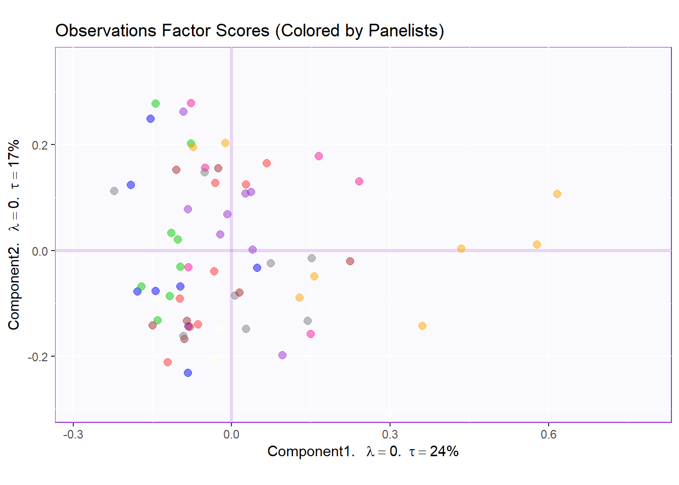
Factor Scores Map 1 with TI and means: by Panelist
Tolerance Interval:
#Make TI map:
TIplot.panelist <- MakeToleranceIntervals(resMCA.inf$Fixed.Data$ExPosition.Data$fi,
                                 design = as.factor(wk0$Panelist),
                                 # line below is needed
                                 names.of.factors =  c("Dim1","Dim2"), # needed
                                 col = prod.color.panelist.mean,
                                 line.size = .50,
                                 line.type = 3,
                                 alpha.ellipse = .2,
                                 alpha.line    = .4,
                                 p.level       = .95)


row.full.1TI <- t2.aMap$zeMap_background + t2.aMap$zeMap_dots + fi.mean.plot.panelist$zeMap_dots + fi.mean.plot.panelist$zeMap_text + TIplot.panelist + row.label
row.full.1TI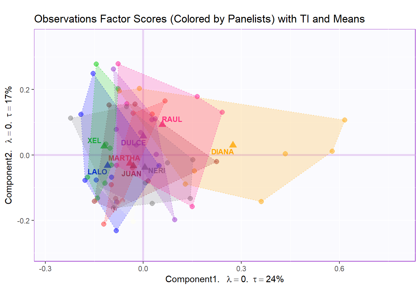
Bootstrap Interval:
fi.boot.panelist <- Boot4Mean(resMCA.inf$Fixed.Data$ExPosition.Data$fi,
                     design = wk0$Panelist,
                     niter = 1000)

bootCI4mean.panelist <- MakeCIEllipses(fi.boot.panelist$BootCube[,c(1:2),], # get the first two components
                              col = prod.color.panelist.mean)

row.full.1BI <- t3.aMap$zeMap_background + t3.aMap$zeMap_dots + bootCI4mean.panelist + fi.mean.plot.panelist$zeMap_dots + fi.mean.plot.panelist$zeMap_text + row.label
row.full.1BI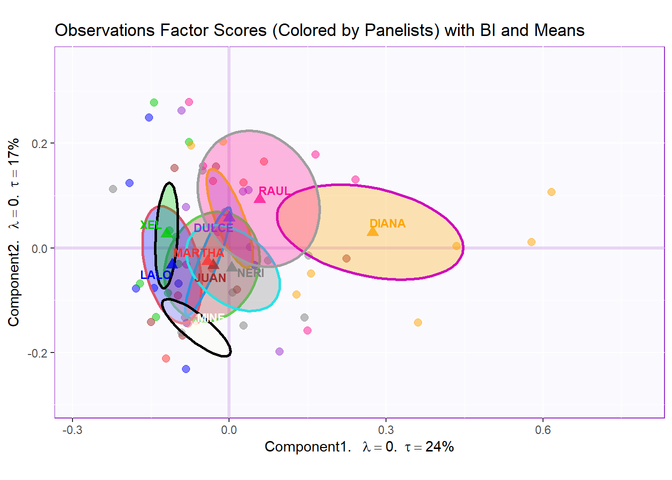
Factor Scores Map 2: by Products
t1.bMap <- createFactorMap(resMCA.inf$Fixed.Data$ExPosition.Data$fi,
                          axis1 = 1,
                          axis2 = 2,
                          title = "Observations Factor Scores (Colored by Products)",
                          col.points = prod.color,
                          col.labels = prod.color,
                          cex = 2.5,
                          text.cex = 3,
                          display.labels = FALSE)

t2.bMap <- createFactorMap(resMCA.inf$Fixed.Data$ExPosition.Data$fi,
                          axis1 = 1,
                          axis2 = 2,
                          title = "Observations Factor Scores (Colored by Products) with TI and Means",
                          col.points = prod.color,
                          col.labels = prod.color,
                          cex = 2.5,
                          text.cex = 3,
                          display.labels = FALSE)

t3.bMap <- createFactorMap(resMCA.inf$Fixed.Data$ExPosition.Data$fi,
                          axis1 = 1,
                          axis2 = 2,
                          title = "Observations Factor Scores (Colored by Products) with BI and Means",
                          col.points = prod.color,
                          col.labels = prod.color,
                          cex = 2.5,
                          text.cex = 3,
                          display.labels = FALSE)

row.label <- createxyLabels.gen(1,2,
                                lambda = round(resMCA.inf$Fixed.Data$ExPosition.Data$eigs),
                                tau = round(resMCA.inf$Fixed.Data$ExPosition.Data$t),
                                axisName = "Component")

#draw  out Row factor score map 3
row.fscore2 <- t1.bMap$zeMap + row.label
row.fscore2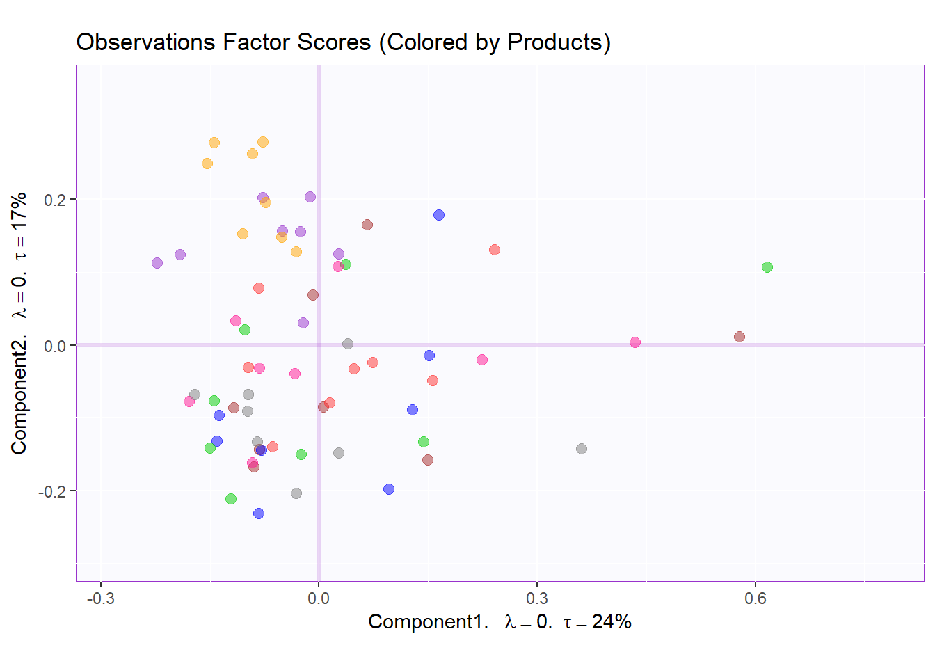
Factor Scores Map 2 with TI and means: by Panelist
Tolerance Interval
#Make TI map:
TIplot.product <- MakeToleranceIntervals(resMCA.inf$Fixed.Data$ExPosition.Data$fi,
                                 design = as.factor(wk0$Product),
                                 # line below is needed
                                 names.of.factors =  c("Dim1","Dim2"), # needed
                                 col = prod.color.mean,
                                 line.size = .50,
                                 line.type = 3,
                                 alpha.ellipse = .2,
                                 alpha.line    = .4,
                                 p.level       = .95)


row.full.2TI <- t2.bMap$zeMap_background + t2.bMap$zeMap_dots + fi.mean.plot$zeMap_dots + fi.mean.plot$zeMap_text + TIplot.product + row.label
row.full.2TI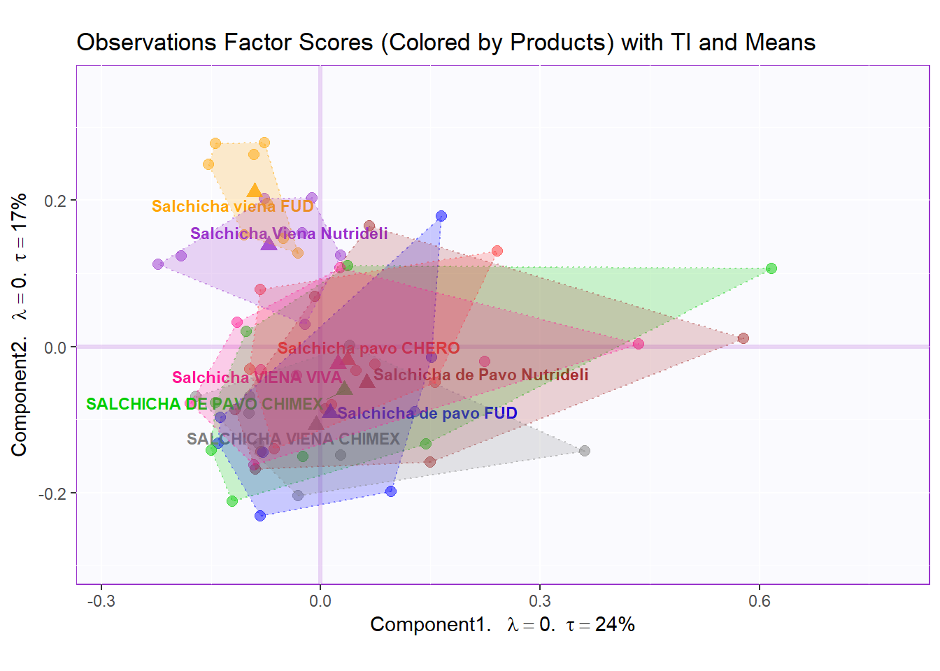
Boostrap Interval
fi.boot.product <- Boot4Mean(resMCA.inf$Fixed.Data$ExPosition.Data$fi,
                     design = wk0$Product,
                     niter = 1000)

bootCI4mean.product <- MakeCIEllipses(fi.boot.product$BootCube[,c(1:2),], # get the first two components
                              col = prod.color.mean)

row.full.2BI <- t3.bMap$zeMap_background + t3.bMap$zeMap_dots + bootCI4mean.product + fi.mean.plot$zeMap_dots + fi.mean.plot$zeMap_text + row.label
row.full.2BI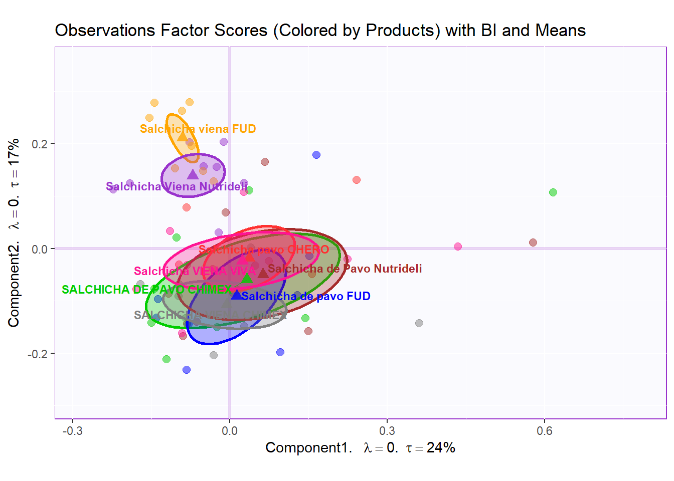
Factor Scores Map 3: by Sausage Type Note: There is not a lot of interesting insights from row factor map 1 and 2. We noticed that there 2 types sausages (not already pointed out in the dataset) that are Pavo (Turkey) and Viena (Mixed). Let’s assume that sausage type is a valid differentiating attribute and recolor our observation where Pavo sausages are in green and Viena sausages are in orange.
t1.cMap <- createFactorMap(resMCA.inf$Fixed.Data$ExPosition.Data$fi,
                          axis1 = 1,
                          axis2 = 2,
                          title = "Observations Factor Scores (Colored by Type - Pavo vs Viena)",
                          col.points = prod.color.type,
                          col.labels = prod.color.type,
                          cex = 2.5,
                          text.cex = 3,
                          display.labels = FALSE)

t2.cMap <- createFactorMap(resMCA.inf$Fixed.Data$ExPosition.Data$fi,
                          axis1 = 1,
                          axis2 = 2,
                          title = "Observations Factor Scores (Colored by Type) with TI and Means",
                          col.points = prod.color.type,
                          col.labels = prod.color.type,
                          cex = 2.5,
                          text.cex = 3,
                          display.labels = FALSE)

t3.cMap <- createFactorMap(resMCA.inf$Fixed.Data$ExPosition.Data$fi,
                          axis1 = 1,
                          axis2 = 2,
                          title = "Observations Factor Scores (Colored by Type) with BI and Means",
                          col.points = prod.color.type,
                          col.labels = prod.color.type,
                          cex = 2.5,
                          text.cex = 3,
                          display.labels = FALSE)

row.label <- createxyLabels.gen(1,2,
                                lambda = round(resMCA.inf$Fixed.Data$ExPosition.Data$eigs),
                                tau = round(resMCA.inf$Fixed.Data$ExPosition.Data$t),
                                axisName = "Component")

#draw  out Row factor score map 3
row.fscore3 <- t1.cMap$zeMap + row.label
row.fscore3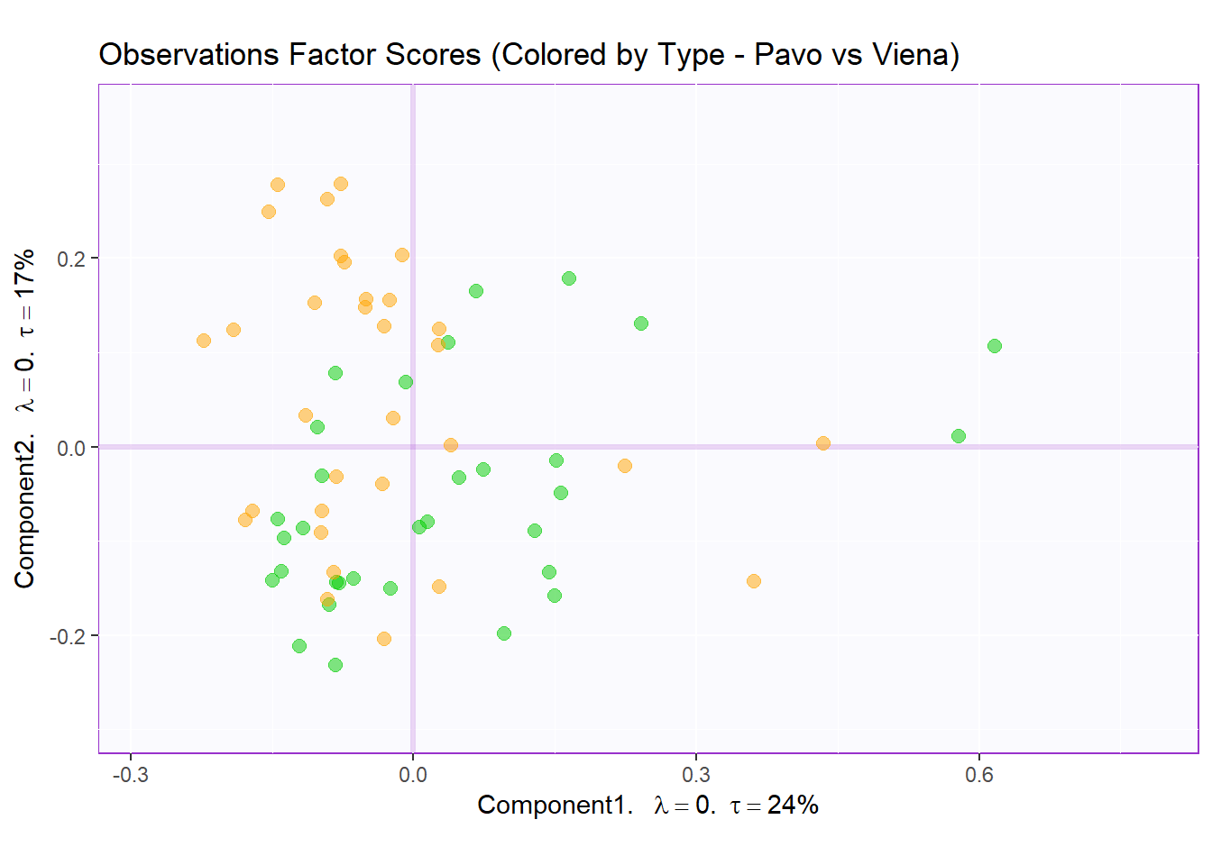
Factor Scores Map 3 with TI/BI and means: by Sausage Type
Tolerance Interval:
#Make TI map:
TIplot.type <- MakeToleranceIntervals(resMCA.inf$Fixed.Data$ExPosition.Data$fi,
                                 design = as.factor(wk0$Session),
                                 # line below is needed
                                 names.of.factors =  c("Dim1","Dim2"), # needed
                                 col = prod.color.type.mean,
                                 line.size = .50,
                                 line.type = 3,
                                 alpha.ellipse = .2,
                                 alpha.line    = .4,
                                 p.level       = .95)


row.full.3TI <- t2.cMap$zeMap_background + t2.cMap$zeMap_dots + fi.mean.plot.type$zeMap_dots + fi.mean.plot.type$zeMap_text + TIplot.type + row.label
row.full.3TI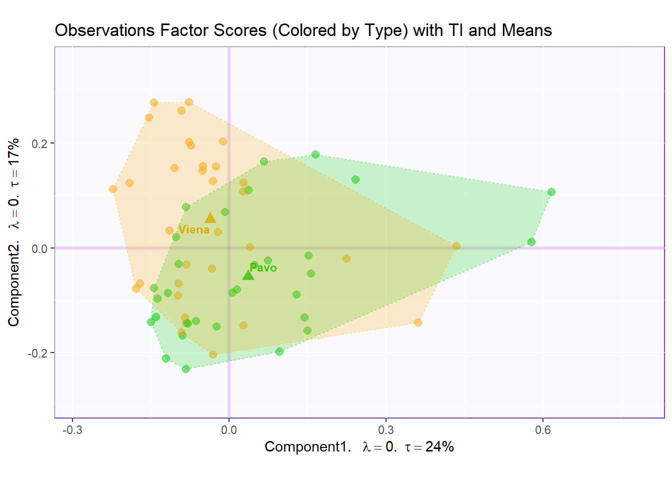
Boostrap Interval:
fi.boot.type <- Boot4Mean(resMCA.inf$Fixed.Data$ExPosition.Data$fi,
                     design = wk0$Session,
                     niter = 1000)

bootCI4mean.type <- MakeCIEllipses(fi.boot.type$BootCube[,c(1:2),], # get the first two components
                              col = prod.color.type.mean)

row.full.3BI <- t3.cMap$zeMap_background + t3.cMap$zeMap_dots + bootCI4mean.type + fi.mean.plot.type$zeMap_dots + fi.mean.plot.type$zeMap_text + row.label
row.full.3BI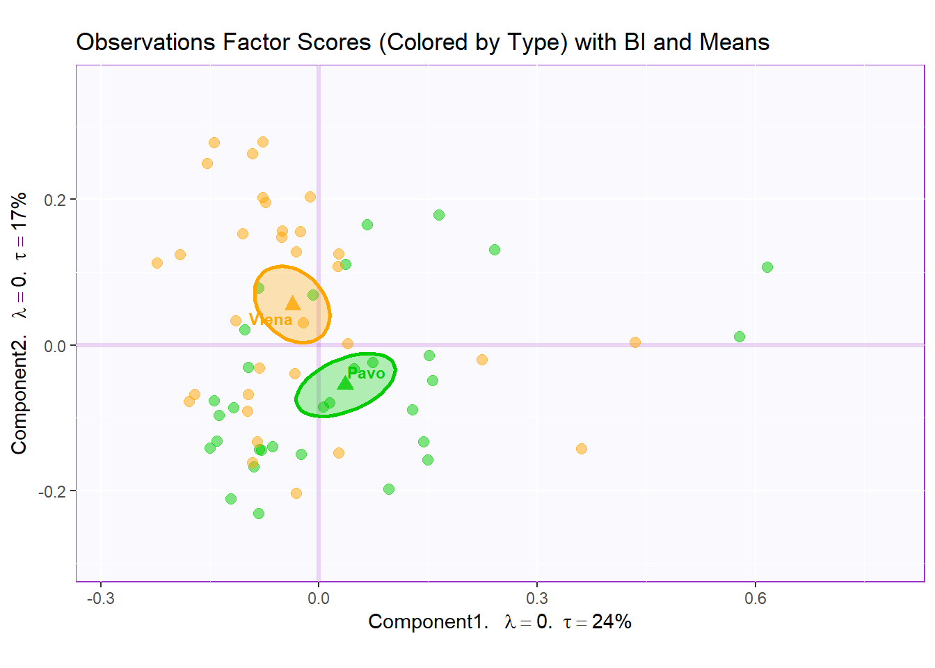
4.5.2.1 Combine Factor Scores for Comparison:
All row factor scores
#We then use the next line of code to put two figures side to side:
require(ggplot2)
library(gridExtra)
require(ggplotify)

final.output.barplots <- grid.arrange(
    as.grob(row.fscore1),
    as.gron(row.full.1TI),
    as.grob(row.full.1BI),
    as.grob(row.fscore2),
    as.grob(row.full.2TI),
    as.grob(row.full.2BI),
    as.grob(row.fscore3),
    as.grob(row.full.3TI),
    as.grob(row.full.3BI),
    ncol = 3,nrow = 3,
    top = "Observation Factor Scores in 3 Perspectives"
  )
4.5.3 Variables Factor Scores:
#Color for variables:
#Assign different colors to each variables:
var <- colnames(sausage.processed)
var.color <- prettyGraphsColorSelection(n.colors = ncol(sausage.processed))
col4Levels <- coloringLevels(
              rownames(resMCA$ExPosition.Data$fj), var.color)

#too many var to assign color manually so we use prettyGraphsColorSelection() to automatically assign colors

#Column Factor Scores----
my.fj.plot <- createFactorMap(resMCA$ExPosition.Data$fj, # data
                              title = "MCA Variables Factor Scores", # title of the plot
                              axis1 = 1, axis2 = 2, # which component for x and y axes
                              pch = 19, # the shape of the dots (google `pch`)
                              cex = 3, # the size of the dots
                              text.cex = 3, # the size of the text
                              col.points = col4Levels$color4Levels, # color of the dots
                              col.labels = col4Levels$color4Levels, # color for labels of dots
)

fj.plot <- my.fj.plot$zeMap + row.label # you need this line to be able to save them in the end
fj.plot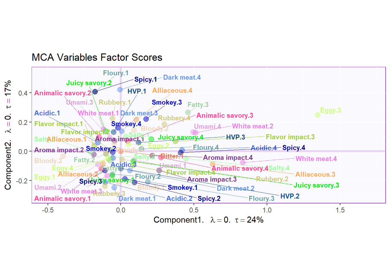
4.5.4 Contributions:
signed.ctr.lv <- resMCA$ExPosition.Data$cj * sign(resMCA$ExPosition.Data$fj)
 # Contribution # 1 & 2
 #___________________________________________________________
 #
 h.b004.ctr.lv.1 <- PrettyBarPlot2(signed.ctr.lv[,1],
                                 threshold = 1 / NROW(signed.ctr.lv),
                                 font.size = 5,
                                 color4bar = gplots::col2hex(col4Levels$color4Levels), # we need hex code
                                 main = 'MCA: Variable Level Contributions (Signed)',
                                 ylab = 'Contributions',
                                 ylim = c(1.2*min(signed.ctr.lv), 1.2*max(signed.ctr.lv))
 )
 print(h.b004.ctr.lv.1)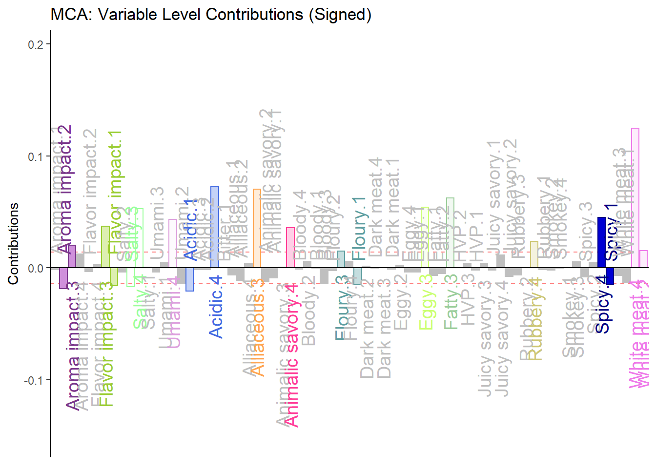
 #
 h.b005.ctr.lv.2 <- PrettyBarPlot2(signed.ctr.lv[,2],
                                 threshold = 1 / NROW(signed.ctr.lv),
                                 font.size = 5,
                                 color4bar = gplots::col2hex(col4Levels$color4Levels), # we need hex code
                                 main = 'MCA: Variable Level Contributions (Signed)',
                                 ylab = 'Contributions',
                                 ylim = c(1.2*min(signed.ctr.lv), 1.2*max(signed.ctr.lv))
 )
 print(h.b005.ctr.lv.2)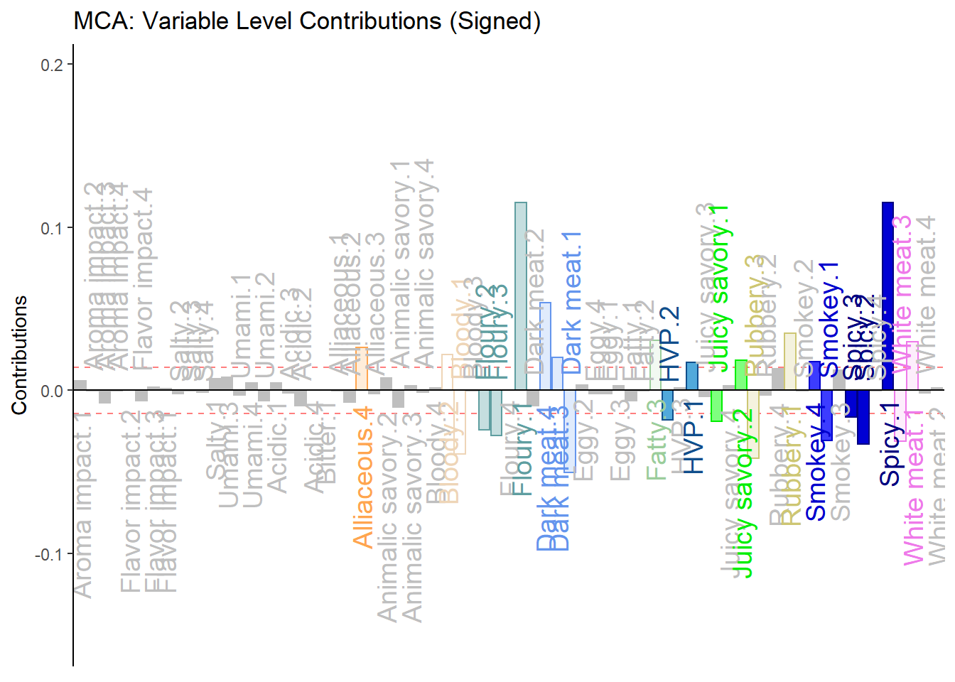
#___________________________________________________________
# Contribution Plots for variables ----
# get the Contributions and make a plot.
#___________________________________________________________
# Here we add up the (un-signed) contributions for the levels of each variables to
# compute the contributions of variables
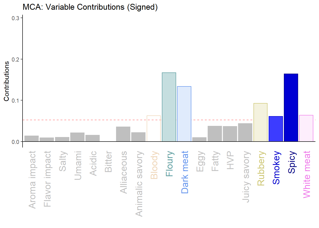
varCtr <- data4PCCAR::ctr4Variables(resMCA$ExPosition.Data$cj)
# Contribution # 1 & 2
#___________________________________________________________
#
varCtr1 <- varCtr[,1]
names(varCtr1) <- rownames(varCtr)
h.b006.ctr.var.1 <- PrettyBarPlot2(varCtr1,
threshold = 1 / NROW(varCtr),
font.size = 5,
color4bar = gplots::col2hex(col4Levels$color4Variables), # we need hex code
main = 'MCA: Variable Contributions',
ylab = 'Contributions',
ylim = c(0, 1.2*max(varCtr))
)
print(h.b006.ctr.var.1)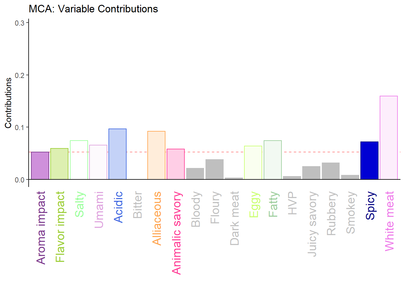
 #
 varCtr2 <- varCtr[,2]
 names(varCtr2) <- rownames(varCtr)
 h.b007.ctr.var.2 <- PrettyBarPlot2(varCtr2,
                                    threshold = 1 / NROW(varCtr),
                                    font.size = 5,
                                    color4bar = gplots::col2hex(col4Levels$color4Variables), # we need hex code
                                    main = 'MCA: Variable Contributions (Signed)',
                                    ylab = 'Contributions',
                                    ylim = c(0, 1.2*max(varCtr))
 )
 print(h.b007.ctr.var.2)