7.3 MFA Analysis
We can run the mpMFA() function to do MFA analysis. Note that it takes both the concatenated “grand.tab” data table ans the design matrix of the Panelists.
## [1] "Preprocessed the Rows of the data matrix using:  None"
## [1] "Preprocessed the Columns of the data matrix using:  Center_1Norm"
## [1] "Preprocessed the Tables of the data matrix using:  MFA_Normalization"
## [1] "Preprocessing Completed"
## [1] "Optimizing using:  None"
## [1] "Processing Complete"
7.3.1 Heatmaps: Rv matrix and Processed Data (Corrplot)
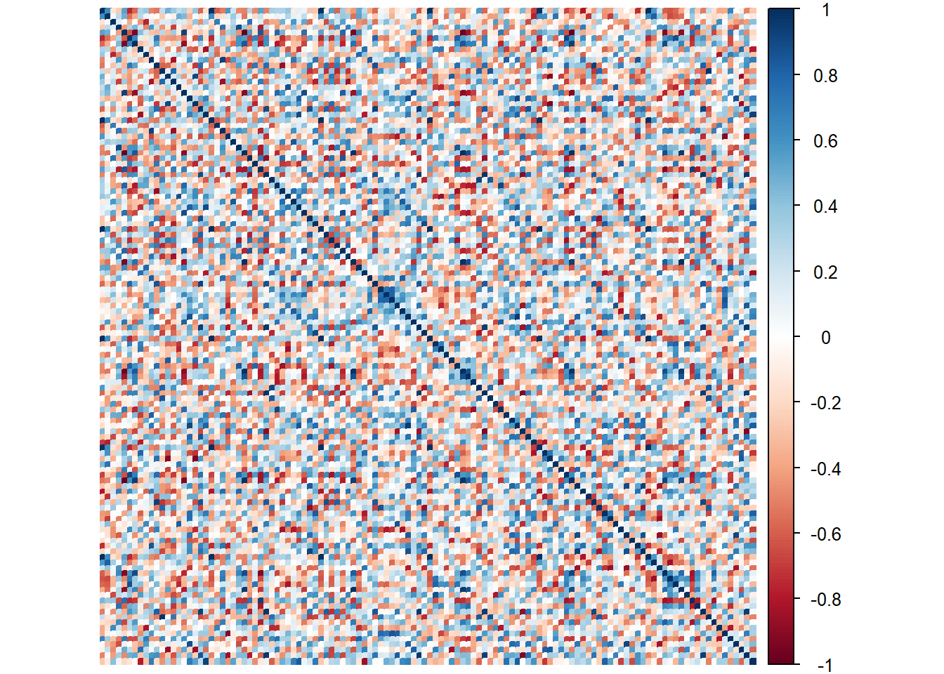
7.3.1.1 RV Matrix Heatmap:
Here we see the correlations between the Panelists. The general consensus is that most Panelist rate similar (relatively). We noted that DIANA and DULCE were the ones that stand out the most! we actually saw this before using PLSC!
Rv <- resMFA$mexPosition.Data$InnerProduct$RVMatrix
colnames(Rv) <- tables[-c(3,8,9),]$Panelist
rownames(Rv) <- tables[-c(3,8,9),]$Panelist

# Compute the correlation matrix
heat1 <- cor(Rv)

# Plot it with corrplot
corrplot(heat1, method = "color",
         #title = ,
tl.col = "black") 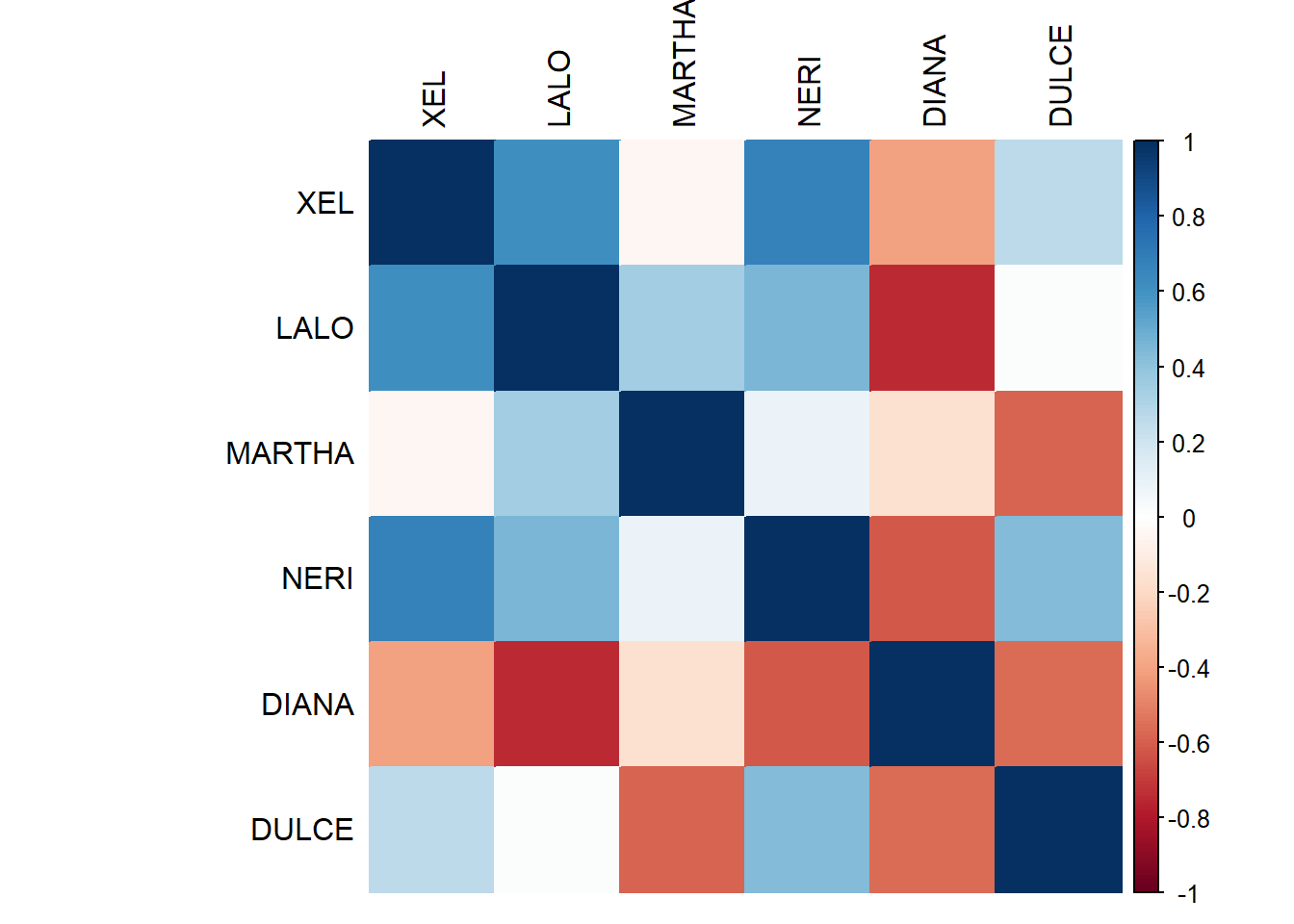
Rv <- resMFA$mexPosition.Data$InnerProduct$RVMatrix
colnames(Rv) <- tables[-c(3,8,9),]$Panelist
rownames(Rv) <- tables[-c(3,8,9),]$Panelist

# Plot it with heatmap
heat2a <- heatmap(Rv**2,
                 Rowv = NA,
Colv = NA) 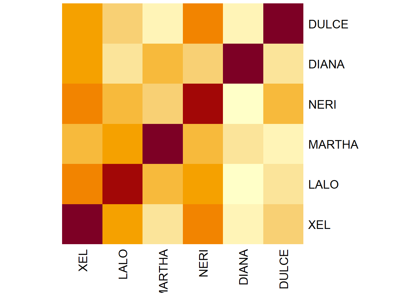
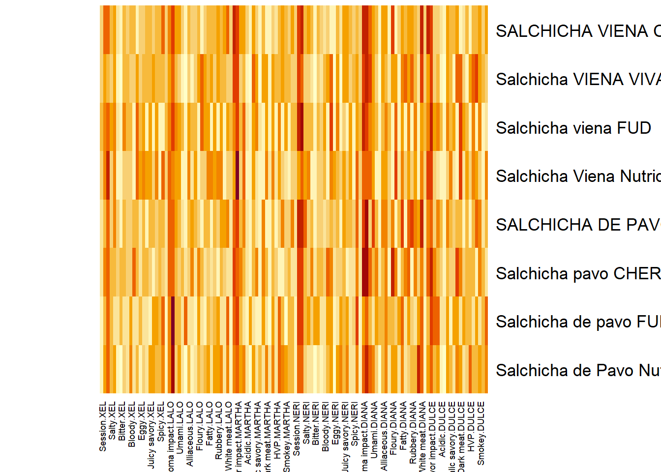
7.3.1.2 Processed Data CorrPlot (Concatenated Data):
The correlation plot of the entire concated data. I am not sure if this is the most insightful plot so let’s move on.
# Compute the correlation matrix
heat2 <- cor(grand.tab)

# Plot it with corrplot
corrplot(heat2, method = "color",
         #title = ,
         tl.col = "black",
         tl.pos='n',
) 
7.3.1.3 Processed Data Heatmap (Concatenated Data):
Perhaps this is the better way to show the relationships in grand.tab. Note that we see dark bands of color repeating per 20 cols. I suspect this is the Session (our best grouping scheme for observations from previous analysis).
7.3.2 Scree Plot: Rv matrix and Compromise
Here, similar to DISTATIS, we plot 2 scree plots. One for Rv Matrix (Panelists) and one for our compromise (all tables). We decided to asess Dim 1 and 2.
scree1 <- PlotScree(ev = resMFA$mexPosition.Data$Table$eigs,
title = "Rv Matrix: Explained Variance per Dimension",
plotKaiser = TRUE)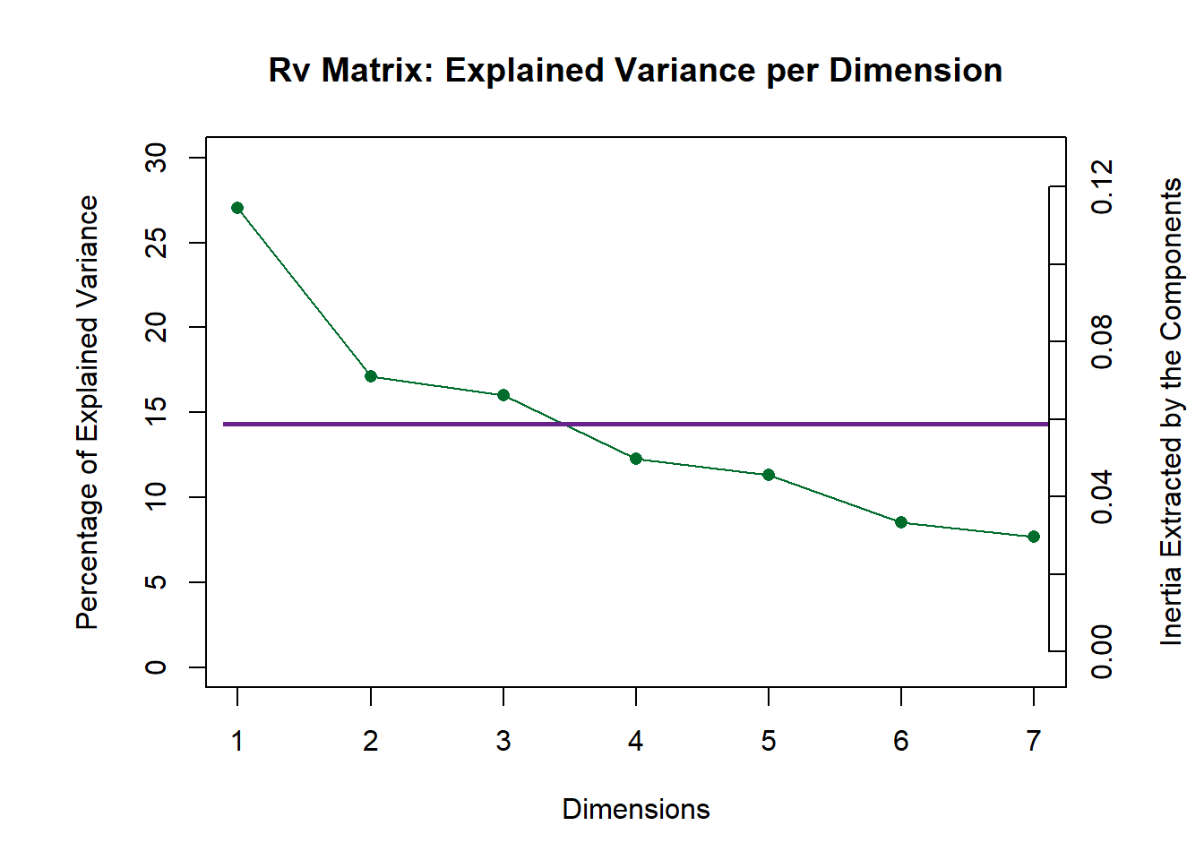
scree2 <- PlotScree(ev = resMFA$mexPosition.Data$Compromise$compromise.eigs,
title = "Compromise: Explained Variance per Dimension",
plotKaiser = TRUE)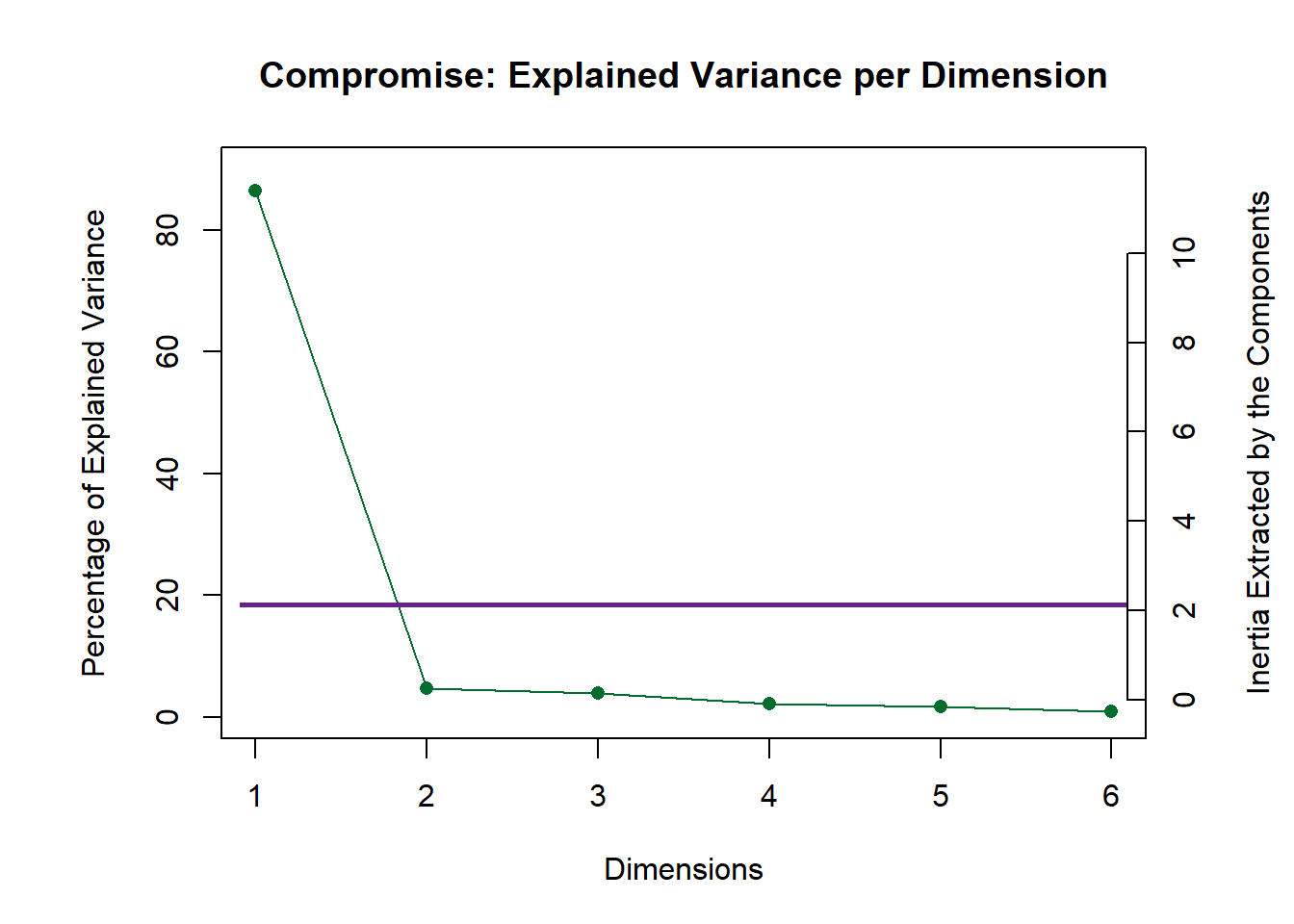
7.3.3 Weights (alpha)
Find the Weights by taking the inverse of the first eigen values of each group of variables (cols in each “cell data tables”). Weight is similar for all attributes rated by the same Panelist. Here we attempt to display the weights of each Panelist by finding the singular values then times 100 to magnify the effects.
Eig.tab <- resMFA$mexPosition.Data$Compromise$compromise.eigs
Alpha <- 1/sqrt(Eig.tab)*100
names(Alpha) <- tables[-c(3,8,9),]$Panelist

#Barplot
plot1 <- PrettyBarPlot2(
  bootratio = Alpha, #change index to access other latents
  threshold = 0,
  ylim = NULL,
  color4bar = resMFA$Plotting.Data$table.col,
  #color4ns = "gray75",
  plotnames = TRUE,
  main = 'Weight of each Panelist (Multiplied by 100)',
  ylab = "Weights",
  )

plot1 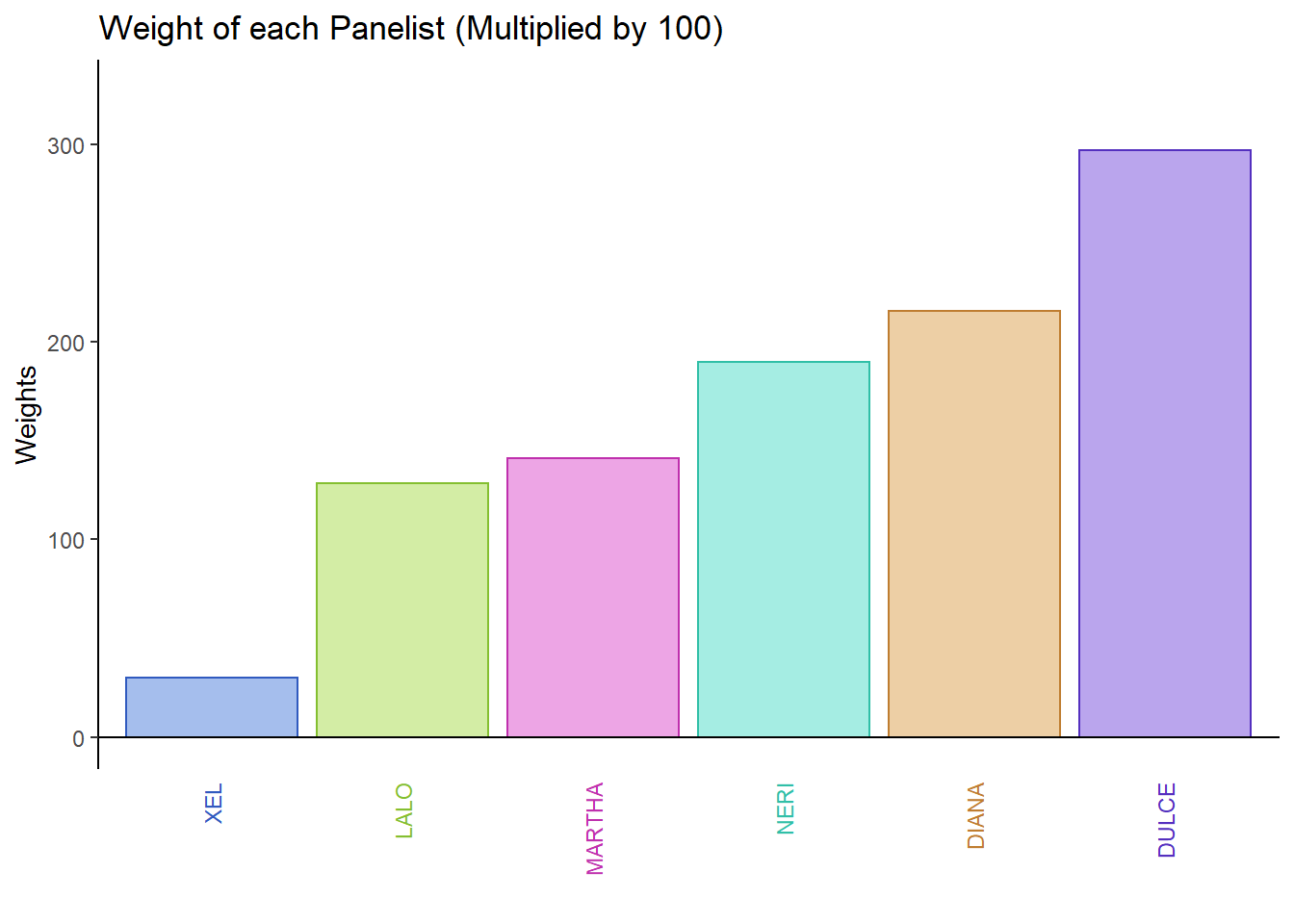
7.3.4 Factor Scores
7.3.4.1 Rv Map for Judges:
Here, we can see that the judges are relatively similar on both dimensions.
# set names of Panelists
rv.matrix <- resMFA$mexPosition.Data$InnerProduct$ci
rownames(rv.matrix) <- rownames(resMFA$Plotting.Data$table.col)

# Create the main layer of the map
gg.rv.graph.out <- createFactorMap(X = rv.matrix,
axis1 = 1, axis2 = 2,
title = "Judges: RVMap",
col.points = resMFA$Plotting.Data$table.col,
col.labels = resMFA$Plotting.Data$table.col)

#label
row.label <- createxyLabels.gen(1,2,
                                lambda = resMFA$mexPosition.Data$Table$eigs,
                                tau = round(resMFA$mexPosition.Data$Table$t),
                                axisName = "Component")

# draw out
rv.map <- gg.rv.graph.out$zeMap + row.label
rv.map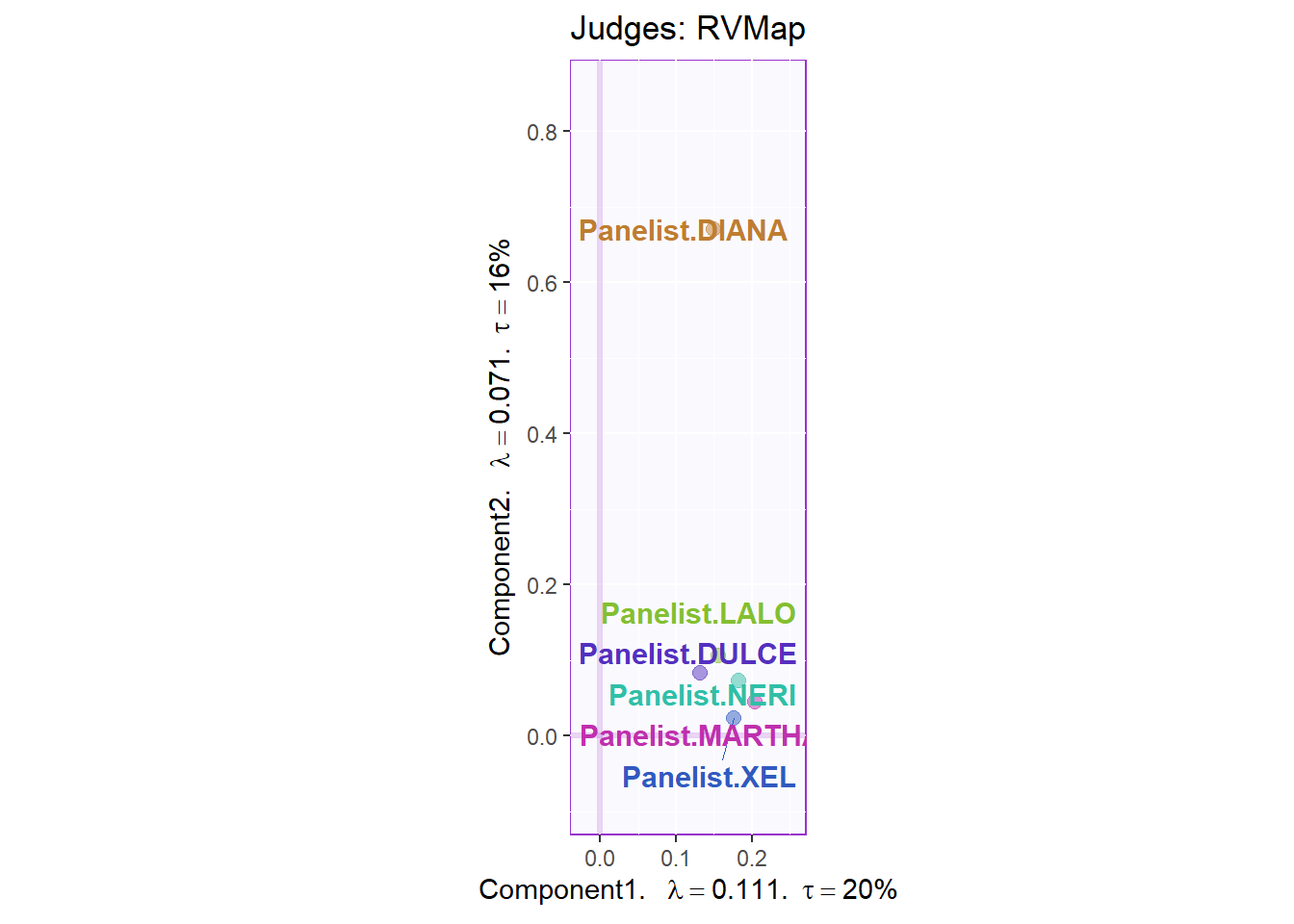
7.3.4.2 Rows Global Factor Scores:
Again, when using Sausage Type as our grouping scheme for observations, we see a cleat distinction between sausages of the Pavo (green) and Viena (orange) variants. We can see that Dimension 1 did a great job in separating these 2 groups. We also plotted the Confidence Interval using Boostrap resampling. This also confirmed our finding from past analysis.
#info
row.global <- resMFA$mexPosition.Data$Table$fi

#colors by sausage type
prod.color.type <- dplyr::recode(rownames(row.global),
                       'SALCHICHA DE PAVO CHIMEX' = 'green3',
                       'Salchicha de pavo FUD' = 'green3',
                       'Salchicha de Pavo Nutrideli' = 'green3',
                       'Salchicha pavo CHERO' = 'green3',
                       'SALCHICHA VIENA CHIMEX' = 'orange',
                       'Salchicha viena FUD' = 'orange',
                       'Salchicha Viena Nutrideli' = 'orange',
                       'Salchicha VIENA VIVA' = 'orange'
                       )

#map
t1.aMap <- createFactorMap(resMFA$mexPosition.Data$Table$fi,
                          axis1 = 1,
                          axis2 = 2,
                          title = "Rows Global Factor Scores (Colored by Types)",
                          col.points = prod.color.type,
                          col.labels = prod.color.type,
                          cex = 2.5,
                          text.cex = 3,
                          display.labels = TRUE,
                          alpha.labels = 0.4
                          )


#label
row.label <- createxyLabels.gen(1,2,
                                lambda = resMFA$mexPosition.Data$Table$eigs,
                                tau = round(resMFA$mexPosition.Data$Table$t),
                                axisName = "Component")

# bootstrap CI
BootF <- Boot4Mean(resMFA$mexPosition.Data$Table$fi,
                     design = c(1,1,1,1,2,2,2,2),
                     niter = 1000)

elli <- MakeCIEllipses(
        data = BootF$BootCube[,c(1:2),], # get the first two components,
        col = c("green3","orange")
)

#Group Means
means <- getMeans(resMFA$mexPosition.Data$Table$fi, factor = c(1,1,1,1,2,2,2,2))
rownames(means) <- c("Pavo", "Vienna")

#Color Means
prod.color.type.mean <- dplyr::recode(rownames(means),
                       'Pavo' = 'green3',
                       'Vienna' = 'orange',
                       )

#Create factor map for group means by products
fi.mean.plot.type <- createFactorMap(means,
                                alpha.points = 0.8,
                                col.points = prod.color.type.mean,
                                col.labels = prod.color.type.mean,
                                pch = 17,
                                cex = 4,
                                text.cex = 4)

#draw out
row1 <- t1.aMap$zeMap + fi.mean.plot.type$zeMap_dots + fi.mean.plot.type$zeMap_text + elli + row.label
row1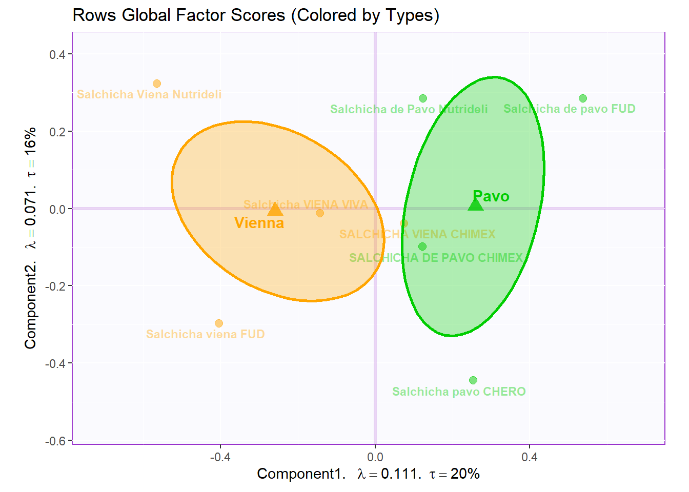
7.3.4.3 Rows Partial Factor Scores:
Now, we tack on the ratings made by the Panelists and compare them to the Means of our 8 products. We can see the deviation between Panelists and the gorup means by assessing the spread of data points. We can say that there is relatively little deviation from panelists in the majority of cases.
#set names
global <- resMFA$mexPosition.Data$Table$fi
colnames(global) <- c('Dimension 1', 'Dimension 2', 'Dimension 3',
                                       'Dimension 4', 'Dimesion 5', 'Dimension 6',
                                       'Dimension 7')

# set simialr rownames for both global and partial factor scores
partial.data <- resMFA$mexPosition.Data$Table$partial.fi.array
dimnames(partial.data) <- list(NULL, c('Dimension 1', 'Dimension 2', 'Dimension 3',
                                       'Dimension 4', 'Dimesion 5', 'Dimension 6',
                                       'Dimension 7'), c("XEL", "LALO", "MARTHA", "NERI", "DIANA", "DULCE"))

#set constraints:
constraint4PFS <- minmaxHelper4Partial(resMFA$mexPosition.Data$Table$fi, partial.data)

t2.aMap <- createFactorMap(global,
                          axis1 = 1,
                          axis2 = 2,
                          title = "Rows Partial Factor Scores (Colored by Types)",
                          col.points = prod.color.type,
                          col.labels = prod.color.type,
                          cex = 5,
                          text.cex = 3,
                          display.labels = FALSE,
                          constraints = constraint4PFS,
                          alpha.points = 0.5
                          )

row.partial <- createPartialFactorScoresMap(
            factorScores = global,
            partialFactorScores = partial.data,
            axis1 = 1, axis2 = 2,
            colors4Blocks =  as.vector(resMFA$Plotting.Data$table.col),
            #names4Partial = dimnames(partial.data)[[3]],
            font.labels = 'bold',
            #alpha.lines = 0.5,
            #alpha.labels = 0.5,
            #alpha.points = 0.5
            )

row.partial.map <- t2.aMap$zeMap_background + t2.aMap$zeMap_dots + t2.aMap$zeMap_text + row.label + row.partial$mapColByBlocks

row.partial.map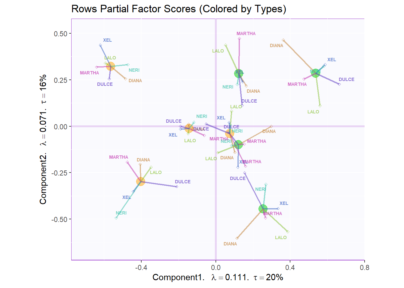
7.3.4.4 Variables Factor Scores:
Next, we plotted the loadings or the factor scores of our variables. Note that we colored them per Panelists and not Attribute. There is quite a lot of data points that hinder our ability to find new meaningful insights.
#Color for variables:
#Assign different colors to each variables:
var <- colnames(grand.tab)
var.color <- prettyGraphsColorSelection(n.colors = 121)
#too many var to assign color manually so we use prettyGraphsColorSelection() to automatically assign colors

#Column Factor Scores----
my.fj.plot <- createFactorMap(resMFA$mexPosition.Data$Table$Q, # data
                              title = "Loadings: Variables Factor Scores (Colored by Panelists", # title of the plot
                              axis1 = 1, axis2 = 2, # which component for x and y axes
                              pch = 19, # the shape of the dots (google `pch`)
                              cex = 3, # the size of the dots
                              text.cex = 3, # the size of the text
                              #col.points = var.color, # color of the dots
                              #col.labels = var.color, # color for labels of dots
                              col.points = resMFA$Plotting.Data$fj.col,
                              col.labels = resMFA$Plotting.Data$fj.col
)

fj.plot <- my.fj.plot$zeMap_background + my.fj.plot$zeMap_dots + row.label # you need this line to be able to save them in the end
fj.plot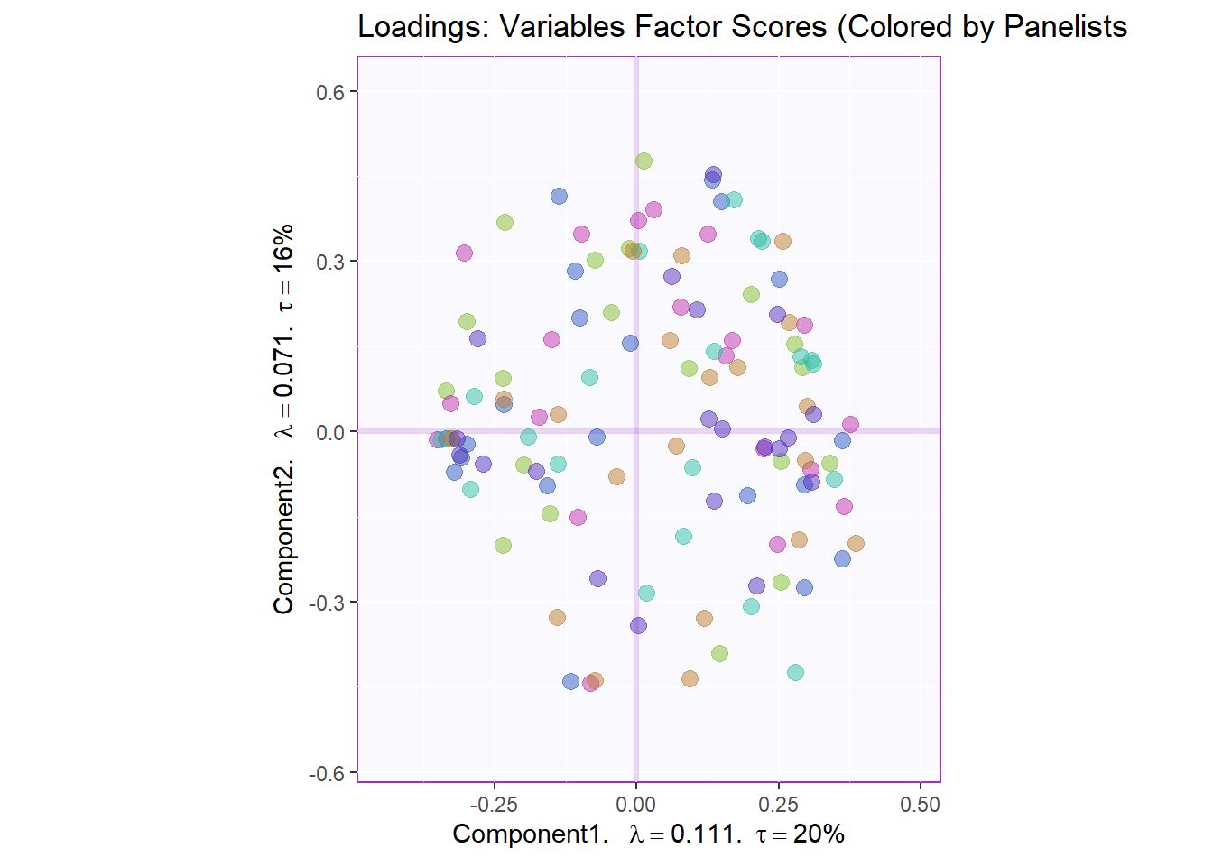
7.3.4.5 Loadings Circle:
We also tried to plot the variable factor scores on a loading circle but again it is a little hard to extract info. We can refer to this later to check out the relationships between specific pairs. We can interpret the plot using the same intuitution from PCA’s loadings.
#Loadings circle----
cor.loading <- cor(grand.tab, resMFA$mexPosition.Data$Table$fi)

loading.plot <- createFactorMap(cor.loading,
                                constraints = list(minx = -1, miny = -1,
                                                   maxx = 1, maxy = 1),
                                col.points = resMFA$Plotting.Data$fj.col,
                                col.labels = resMFA$Plotting.Data$fj.col,
                                title = "Loadings Circle")

LoadingMapWithCircles <- loading.plot$zeMap_background +
                          addArrows(cor.loading, color = var.color) +
                          addCircleOfCor() + xlab("Component 1") + ylab("Component 2") + row.label
LoadingMapWithCircles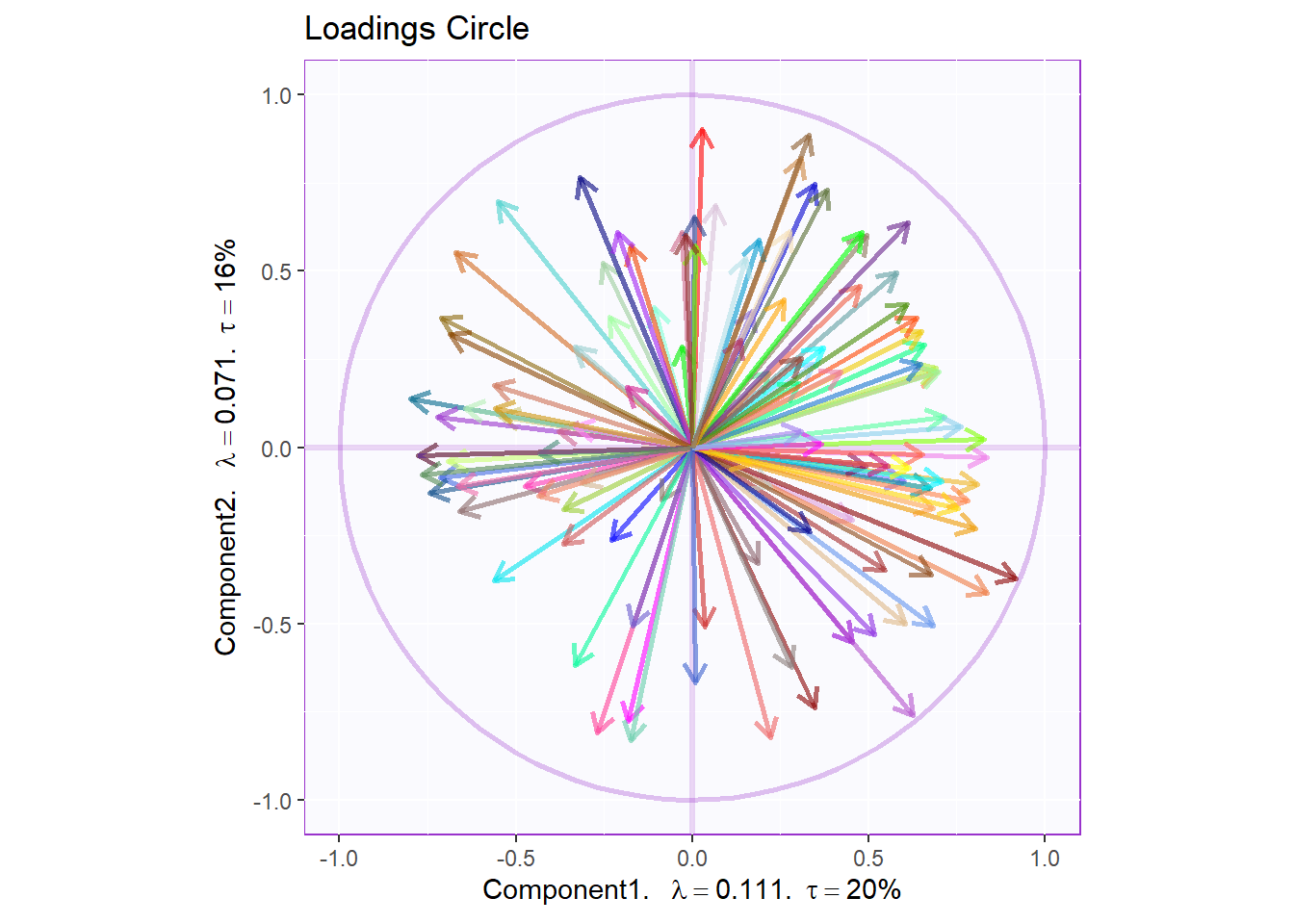
7.3.5 Contributions
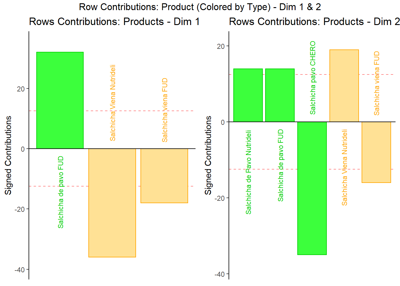
7.3.5.1 Rows Contribution Barplot:
We see that in Dim 1, Pavo Fud and Viena Nutrideli contributed the most to the inertia (variance total) in dimension 1. If we refer back to our rows partial factor score plot, we can see these 2 products sit at the 2 extremes of the Dimension. We can use see the same phenomenon in Dimension 2 with Salchicha pavo CHERO and Salchicha Viena Nutrideli driving the effect.
Fi <- resMFA$mexPosition.Data$Table$fi
F2 <- Fi**2
SF2 <- apply(F2, 2, sum)
ctri <- t(t(F2)/SF2)
signed.ctri <- ctri * sign(Fi)
rownames(signed.ctri) <- rownames(Fi)

#Dim1
k = 1
c001.plotCtri.1 <- PrettyBarPlot2(
                       bootratio = round(100*signed.ctri[,k]),
                       signifOnly = TRUE,
                       threshold = 100 / nrow(signed.ctri),
                       ylim = NULL,
                       color4bar = prod.color.type,
                       color4ns = "gray75",
                       plotnames = TRUE,
                       main = paste('Rows Contributions: Products - Dim', k),
                       ylab = "Signed Contributions")

#Dim2
k = 2
c001.plotCtri.2 <- PrettyBarPlot2(
                       bootratio = round(100*signed.ctri[,k]),
                       signifOnly = TRUE,
                       threshold = 100 / nrow(signed.ctri),
                       ylim = NULL,
                       color4bar = prod.color.type,
                       color4ns = "gray75",
                       plotnames = TRUE,
                       main = paste('Rows Contributions: Products - Dim', k),
                       ylab = "Signed Contributions")

#c001.plotCtri.1
#c001.plotCtri.1 <- recordPlot()

#c001.plotCtri.2
#c001.plotCtri.2 <- recordPlot()
row.boots <- grid.arrange(
c001.plotCtri.1,
c001.plotCtri.2,
ncol = 2,nrow = 1,
top = "Row Contributions: Product (Colored by Type) - Dim 1 & 2"
)
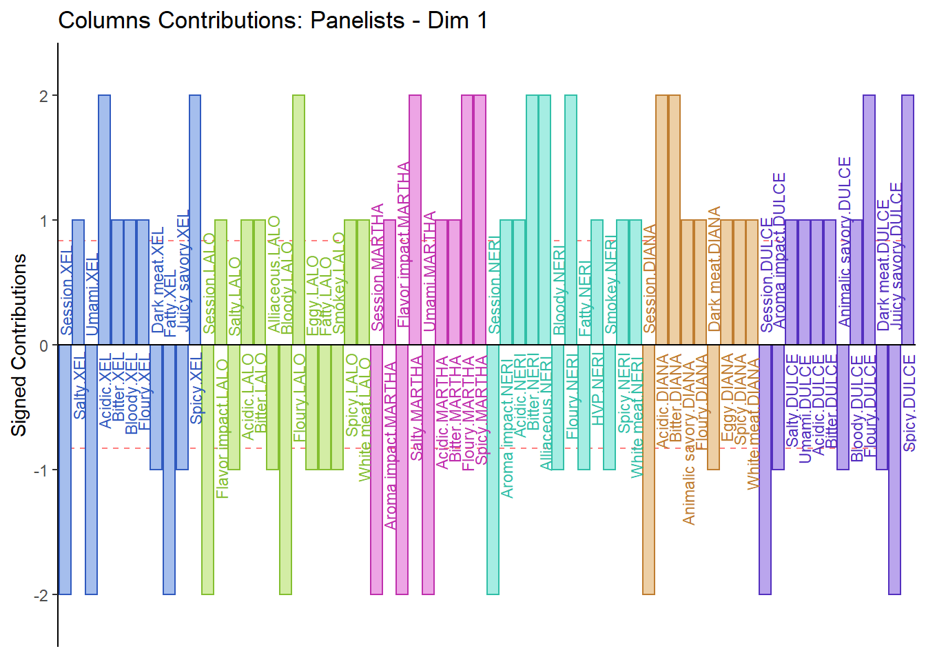
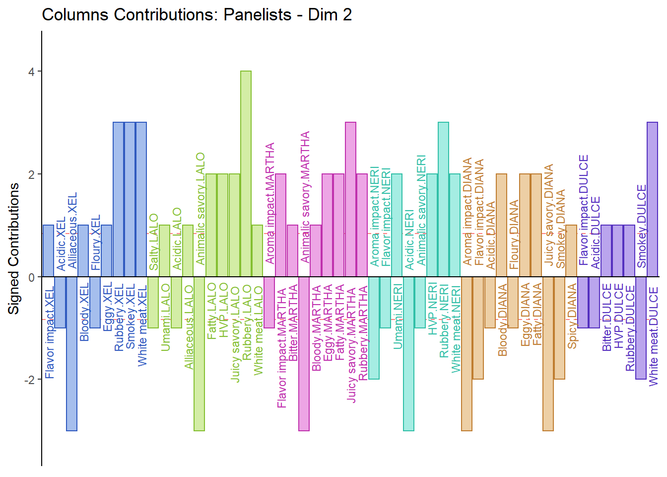
7.3.5.2 Columns Contribution Barplot:
From the Columns Contribution Barplot, we can see that most ratings are similar between Panelists. We do note some exceptions as can interpret them as followed:
1. Martha sensitive to Floury & Spicy
2. Diana sensitive to Acidic
3. Lalo sensitive to Rubbery
4. Dulce sensitive to White Meat
Fj <- resMFA$mexPosition.Data$Table$Q
F2 <- Fj**2
SF2 <- apply(F2, 2, sum)
ctrj <- t(t(F2)/SF2)
signed.ctrj <- ctrj * sign(Fj)
rownames(signed.ctrj) <- rownames(Fj)

#Dim1
k = 1
c001.plotCtrj.1 <- PrettyBarPlot2(
                       bootratio = round(100*signed.ctrj[,k]),
                       signifOnly = TRUE,
                       threshold = 100 / nrow(signed.ctrj),
                       ylim = NULL,
                       color4bar = resMFA$Plotting.Data$fj.col,
                       color4ns = "gray75",
                       plotnames = TRUE,
                       main = paste('Columns Contributions: Panelists - Dim', k),
                       ylab = "Signed Contributions")

#Dim2
k = 2
c001.plotCtrj.2 <- PrettyBarPlot2(
                       bootratio = round(100*signed.ctrj[,k]),
                       signifOnly = TRUE,
                       threshold = 100 / nrow(signed.ctrj),
                       ylim = NULL,
                       color4bar = resMFA$Plotting.Data$fj.col,
                       color4ns = "gray75",
                       plotnames = TRUE,
                       main = paste('Columns Contributions: Panelists - Dim', k),
                       ylab = "Signed Contributions")
c001.plotCtrj.1