Chapter 4 Feb 8–14: RMarkdown Files, Visualize and Summarize Data in R
This chapter has now been updated for spring 2021 and is ready to be used during the week of February 8–14 2021.
This week, our goals are to…
Create and export RMarkdown files.
Summarize and describe data in R.
Visualize data in R.
Announcements and reminders:
If you have data of your own that you are interested in analyzing, you can often use your own data instead of the provided data for the weekly assignments. Please discuss this with the instructors as desired. As long as you are adequately practicing the new skills each week, it doesn’t matter which data you use.
Sometimes in this online textbook, the code provided is for illustrative purposes only and may not run for you when you copy and paste it into RStudio on your own computer. Nevertheless, I recommend that you still paste all code into RStudio into your own computer as you read, so that you have it available for future use, including when you do the assignment at the end of the chapter.
Please share any feedback you have about course materials and/or any errors you notice in the book. Your feedback is very important to maintain and improve the course.
4.1 RMarkdown introduction
In this section, we will learn about a type of file called an RMarkdown (or RMD) file that you can create in RStudio. RMarkdown files are similar in some ways to an R script file but have added capabilities, which you will learn about below.
Please start by watching the following video, which demonstrates the content in the rest of this section:
The video above can be viewed externally at https://youtu.be/-JXOy1imf78 or https://tinyurl.com/RMarkdownIntro. Please keep in mind that you can pause the video (using spacebar or your mouse) or rewind/fast-forward the video (using arrow keys, mouse, or tapping on the screen) as needed as you follow along. You can also click here to download a sample R Markdown file that is very similar to the one in the video, in case that allows you to follow along faster.
Note that this video demonstrates the same procedure that is written later in this chapter. You don’t need to read that section of this chapter if you follow along with this video.
RMarkdown allows you to easily create a file that contains plain text, formatted text, R code, and R output all in one place. It has all of the functionality of an R script file plus many additional capabilities. This textbook that you are reading right now was created using RMarkdown.
Note that the terms RMD, RMarkdown, and R Markdown all refer to the same type of file.
4.1.1 Selected RMarkdown resources
While everything that you need to know for now is included within this chapter, the following resources will allow you to learn more about RMarkdown if you wish. I still refer to many of these resources on a regular basis, even though I have been using it for a while!
Selected RMarkdown resources (not required for you to look):
- Sample RMarkdown File #1 – This is the RMD file used in the video above. You can download this file, open it in RStudio on your computer, and modify its contents to create your own RMarkdown file. Be sure to try “Knitting” this file using the “Knit” menu.
- Sample RMarkdown File #2 – This sample file should knit (export) successfully right away when you open it in RStudio. It uses built-in data in R and does not require you to first load a particular Excel file. You can download this file, open it in RStudio on your computer, and modify its contents to create your own RMarkdown file. Be sure to try “Knitting” this file using the “Knit” menu.
- R Markdown Cheat Sheet #1
- R Markdown Cheat Sheet #2
4.1.2 Getting started in RMarkdown
Now we will go through the steps of using RMarkdown for the first time. You can also repeat these steps in the future as needed, when you make different types of RMarkdown files in your own work or for course assignments. If you watched and followed along with everything in the RMarkdown video above, it is likely NOT necessary for you to read this section carefully. The content in the video and the text in this section are meant to be as close to the same as possible. You can simply treat the text in this section as a reference to look at later.
This section gives a step-by-step look at the creation of an RMarkdown file. Sample RMarkdown File #1 is the finished version of the file that the steps below help you create. You are welcome to simply download and inspect this finished version of the file if that would be more productive for you than recreating it yourself below.
The narrative description of the creation of an RMarkdown file begins here.
First, we need to make and save a new RMarkdown file. Here are two ways to do this in RStudio:
- Click on File -> New File -> R Markdown
- Click on the dropdown menu next to the new file button in the toolbar (which has a plus symbol on it) -> R Markdown
When you open a new RMD (RMarkdown) file—especially the first time you do this—RStudio might prompt you to install some new packages. You should click Yes and install these packages. Once this is done, a new window should appear labeled New R Markdown. Write whatever you would like into the Title and Author fields and then select HTML as the default output format.
A new RMD file should then appear as a new tab for you in RStudio. You should save this file in your working directory (the folder you are using for your R work). Be sure to save frequently as you continue the procedure below.
In your new file, you should see the following items:
- A header section at the top. This will include the title and author information that you wrote. You can modify these any time you would like. You should only change the items that are within quotation marks.
- An R code chunk that says
{r setup, include=FALSE}andknitr::opts_chunk$set(echo = TRUE). You should leave those lines as they are. Do not change them at all! - Next, you should see a line that says
## RMarkdown. You can delete this text as well as everything in the rest of the document.
Now that you have deleted the text ## RMarkdown and everything below it, we can start making our own new document. Please follow the instructions below.
Just like the data analysis we have done before, we have to begin by setting our working directory and loading any datasets that we plan to use. Make a few new lines at the bottom of your document and then insert an R code chunk. You can do this by clicking on Insert -> R with your mouse (do not use the insert key on your keyboard; that is unrelated). Once you do that, a new field spanning three lines should appear in your RMD document.
Put the following lines of code into this code chunk (code chunks can contain multiple lines of code):
setwd("C:/My Data Folder/Project1")
if (!require(readxl)) install.packages('readxl')
library(readxl)
d<- read_excel("sampledatafoodsales.xlsx", sheet = "FoodSales")
In the code above, make the appropriate modifications such that you can successfully load the file sampledatafoodsales.xlsx into R on your own computer. You will likely need to modify the setwd(...) command, for example, so that it matches the working directory (folder) that you wish to use. You can click here to download the sampledatafoodsales.xlsx Excel file that we will be using for this part of the chapter, if you do not already have it on your computer.56 You will download a ZIP file which contains the Excel file you need. Move that Excel file into your desired working directory on your computer. Open the Excel file in Excel and remove any spaces from the variable names (column names in row 1 in Excel) before you proceed. For example, change Unit Price to UnitPrice.
Now you are ready to run the code in the code chunk you made above. Like in an R script file, you can run a single line of code at a time. To do this, move your cursor/mouse to the line that you want to run—which in this case should be the setwd(...) command—and click on Run -> Run Selected Line(s). Note that you DO NOT have to highlight the command you want to run; it is good enough to just have your cursor anywhere on the line. Just like with basic R script files, you will see that when you run a single line of code in an RMD file, it will send that code to the console for you automatically. Furthermore, any results—if there are any to show—will also be displayed within the RMD file itself, below your code chunk.
Another option you have is to run the entire code chunk at once. Here are two ways to do this:
- Move your cursor/mouse to any line within the code chunk. Click
Run->Run Current Chunk. - Click on the little green triangular play button that is next to the chunk itself. It doesn’t matter where your cursor/mouse is when you do this.
Now that you have run the entire code chunk, you can see that all items from that code chunk were sent to the console and were run one at a time. If the computer has any output to show you in response to any of these lines of code, it will display them to you both in the console and beneath your code chunk in the RMD file.
Above, you set the working directory and loaded your data into R, all within a single code chunk in your RMD file. The great thing about RMD files is that you can put plan text, formatted text, and code all in one place.
Make some new empty lines in your RMD file and type # Introduction into the lowest line. It is important that there is a space between the # symbol and the Introduction text. When you type # Introduction, you are telling the computer that you are making a new section. When this document is exported into a final document, the computer will create a nice-looking Introduction heading for you. You will see this at the end of this section.
Let’s continue. Add a few more empty lines. In the lowest empty line, type some text. You can type anything you want here. This is just like typing text into Microsoft Word or into an e-mail. You can type anything you want outside of R code chunks. This textbook that you’re reading right now is also made using RMD files. The text you are reading right now in this sentence is text that I wrote into an RMD file, not within an R code chunk.
This is how the start of the subsection you are reading now looks in my RMD file:
### Getting Started in RMarkdown

Now we will go through the steps of using RMarkdown for the first time.
Here’s what the text above does when I put it into my RMD file:
###tells the computer that I am starting a section within a section within a section.- There is a space after the
###, which is important. - The text
Getting Started in RMarkdowntells the computer what I want to call this new subsection. - There is a blank line, which you should also include.
- After the blank line, I start writing whatever it is I want you to read, which in this case was the sentence “Now we will go through the steps of using RMarkdown for the first time.”
- Then I write more (not shown).
Note that at first, you will just write # one time, not three times like I did. You will just write # Introduction. Then if you want to make a subsection within your Introduction section, you can write ## later. We will practice this below.
The introduction section in this example will not include any data analysis. You can write whatever you want in that section. Once you have done that, made a new section called Data analysis. You will do this by making a few new empty lines at the bottom of your RMD file and then writing # Data analysis. Again, make sure that there is a space between # and the word Data. Then create a few more new empty lines below. You have now added another section to your file. This is how we keep our work organized. The skills we are developing together are not only focused on analyzing our data but also on responsible interpretation and reasonable presentation of our work. Keeping your work organized in an RMD file is an important part of achieving these goals.
Make some more new empty lines now. And then type ## Tables and descriptive statistics. We are making a subsection called Tables and descriptive statistics within the section called Data analysis. If you wanted to make a third-level subsection within Tables and descriptive statistics, then you would write ### Name of subsection into its own new line below. Now that you have made the new Tables and descriptive statistics subsection, create some new empty lines. Then, into the lowest empty line, type The following table shows the distribution of products across cities:.
Now we are ready to add some R code into our RMD file, to help us do some data analysis. Add a few new empty lines and then make a new code chunk in the lowest line. Like you did before, you will click on Insert -> R to do this.
Put the following code within the newly created code chunk:
table(d$Product,d$City)The code above creates a two-way table. Run this code chunk from within the RMD file. You will see that the command table(d$Product,d$City) has been sent to your console. Furthermore, your two-way table should also be displayed for you within the RMD file, directly underneath the RMD file. You can choose to leave this open to look at later, make it small by clicking the button with the up arrows, or click on the X to remove this output. For now, it doesn’t matter which one of these you choose. You can leave the output there or close it.
Make some new empty lines beneath the code chunk that you just ran. In one or more of these empty lines—beneath the table—you can type more text if you want. When you are eventually done writing and ready to export your final work, this text will appear beneath the two-way table, for your reader to see.
Next, let’s add a summary of a selected variable to our RMD file. Make some new empty lines and write Next, we will look at some descriptive statistics for the Unit Prices of various sales:. Then, make some more new empty lines and make a new code chunk. Put summary(d$UnitPrice) into this code chunk. Like you did with the table just earlier, you can run this command in the code chunk, see the output, and add new lines and sentences below the code chunk.
At this point, you are working within the subsection called Tables and descriptive statistics within the section Data analysis. Let’s add a second subsection within the Data analysis section. We will call it Charts. To accomplish this, you will make a few new empty lines and type ## Charts in its own new line. After that, make a few new empty lines and type any text that you would like.
Now you are working within your new subsection called Charts, go ahead and again make new empty lines and insert a new code chunk. Place the following line of code within the chunk:
par(mar=c(1,1,1,1))
plot(d$Quantity,d$UnitPrice)
Note that you can put more than one line of code into a single code chunk. You can put as many lines of code as you want into a single code chunk.
Here is what the lines of code above do:
par(mar=c(1,1,1,1))– These reset the plotting dimensions within R. Typically, you do not need to include this line of code. Sometimes when you get a plotting error, you can include this line. You can try running this chunk with and without this line and see what happens.plot(d$Quantity,d$UnitPrice)– This command uses theplot(...)function, which tells the computer to make a scatterplot for you. You then need to tell the computer which data to put on the two axes of the scatterplot. In this case, we decided to put the variableQuantityon the horizontal axis (x-axis) and the variableUnitPriceon the vertical axis (y-axis). Both variables are inside of the datasetd, so we writed$before each variable’s name.
Again, you can add new empty lines below the code chunk and write whatever you would like, such as interpretation of the scatterplot or an explanation of the chart that will follow. Then, make more new empty lines and insert another R code chunk. Put the following lines of code into this new chunk:
boxplot(d$UnitPrice)

boxplot(Quantity ~ City, data = d)
Remember, it is fine and often very useful to put multiple lines of R code within a single code chunk in an RMD file, as we have done above.
Above, we made some box plots. Box plots are very useful in helping us visualize the distribution of a group of data.
Here is an explanation of the command boxplot(d$UnitPrice):
boxplot(...)– This tells the computer that we want to make a boxplot.d$UnitPrice– This tells the computer that we want to make a box plot to help us visualize the distribution of the variableUnitPrice, which is within the datasetd.
Here is an explanation of the command boxplot(Quantity ~ City, data = d):
boxplot(...)– This tells the computer that we want to make a boxplot.Quantity ~ City– This tells the computer that we want a separate boxplot for the variableQuantitygrouped by the variableCity. This means that the computer will create a separate box plot of the distribution of the variableQuantityfor each group of observations as they are grouped by the variableCity.data = d– This tells the computer where to look for the variablesQuantityandCity. They are within the dataset calledd, which is what we are telling the computer here.
For the purposes of this practice example, we are now done with adding any R code to our RMD file. Of course, you can choose to write more on your own, modify the dataset that is being loaded, and completely customize all of your analysis and the text that you write outside of code chunks.
We will finish making our RMD file by making a Conclusion section, just to complete the illustration of how we can use an RMD file to conduct the entire quantitative project work process—including writing plain text (as we might in Microsoft Word), using code for data analysis, presenting results, and writing interpretations or conclusions—all in a single place.
To complete this final step, make some new empty lines and then write # Conclusion in its own new line at the bottom of your file. Then, make some more empty new lines. In the lowest of these lines, you can write any text that you wish for your reader to see.
We have now completed all of the content that will go into our RMD file. Now it is time to export/knit our RMD file into a finished document. You can choose to export/knit your RMD file as an HTML file, Microsoft Word file, or a PDF file. You can make changes to your RMD file any time you want and then knit it again.
The word knit means the same as the word export.
Let’s try to knit the RMD file that we just created. Locate the Knit button at the top of your RStudio window. Next to that button, there is a small drop-down arrow. Click on that arrow. You will see options to knit to HTML, Word, and PDF.
Start by clicking HTML. Your console window should switch to the R Markdown tab at this point. It will process the entire RMD file. Once that process is complete, a new HTML file should be added to your working directory. You can open this HTML file in your web browser on your computer. The HTML file might also open automatically in a new window within RStudio itself.
Next, try knitting a Word file. Once the process is complete, a new Word document should be added to your working directory. The file might also open automatically within Microsoft Word on your computer.
Finally, you can try knitting a PDF file. This does not always work right away on all computers. If knitting a PDF does not work initially, try running the following code to install the tinytex package:
if (!require(tinytex)) install.packages('tinytex')After running the code above, try knitting to PDF again. If that doesn’t work, you can contact a course instructor if you wish to make it work. Note that it is not essential for you to be able to knit to PDF at this stage in the course. Knitting to HTML and/or Word should be sufficient.
The knitted file(s) that you create can be emailed as an attachment or uploaded to a website, just like many other files on your computer. Keep in mind that you now have your original RMD file as well as the knitted output. Your RMD file is important to save because that is what generated the knitted output. If you want to make changes to the output, you have to make those changes within the RMD file.
You are now equipped to make and export a basic RMD file that can help you organize your work in this course and any future quantitative projects you might do using R and RStudio.
4.1.3 Optional – additional skills in RMarkdown
In this section, a few optional skills in RMarkdown are demonstrated that you are not required to know.
4.1.3.1 Write nice equations
You can write nice-looking equations into an RMarkdown document. The most basic way to do this is demonstrated here. You can then look up how to do more complicated equations in the provided resources.
For the purposes of this course, you do not need to know or use any of this notation. You can simply write your equations in plain text, like this: yhat = b1(x)+b0. That is good enough for the work we do in this course.
Let’s say you want to write the equation \(\hat{y} = b_1 x + b_0\).
Here is how I wrote the line above into my RMarkdown file:
Let's say you want to write the equation $\hat{y} = b_1 x + b_0$.As you can see, to write an equation into your RMarkdown file, you put the equation in between two dollar symbols:
$equation goes here$You put the dollar symbols and the equation into the main text portion of your R Markdown document. You do NOT put the dollar symbols and the equation into an R code chunk.
Within those dollar signs, you write the equation using what is called LaTeX syntax.
Here are some examples of LaTeX you can write and the output you will get:
| Description | RMarkdown | Result |
|---|---|---|
| fraction | $\frac{1}{2}$ |
\(\frac{1}{2}\) |
| plain text | $\text{Sum of Squares Regression}$ |
\(\text{Sum of Squares Regression}\) |
| hat | $\hat{y}$ |
\(\hat{y}\) |
| subscript | $b_1$ |
\(b_1\) |
| combination | $\frac{\hat{\text{My Numerator}_x}}{\text{My Denominator}_1}$ |
\(\frac{\hat{\text{My Numerator}_x}}{\text{My Denominator}_1}\) |
If you want to read more about how to write equations in RMarkdown—such as ones that are different or more complicated than the examples above—you can have a look at the resources below. Again, remember that you are not required to know any of this for our course.
RMarkdown equations guidance (optional):
- LaTeX math and equations. https://www.latex-tutorial.com/tutorials/amsmath/.
- Section 2.5.3 “Math expressions” in R Markdown: The Definitive Guide. Xie, Y et al. https://bookdown.org/yihui/rmarkdown/markdown-syntax.html#math-expressions.
4.1.3.2 Visual RMarkdown
In January 2021, a new version of RStudio came out which includes a new feature called Visual RMarkdown. Visual RMarkdown may be useful to you as you study statistics in this textbook and do other projects. Of course, note that this is a new feature and therefore may also cause challenges that we do not yet know about.
The following video provides a brief overview of Visual RMarkdown and demonstrates some of its basic features:
The video above can be viewed externally at https://youtu.be/k8lY2X8T8lE.
4.2 Data distributions
For continuous numeric variables, it is useful for us to be able to rapidly understand how our data is distributed. It is also important to be familiar with some basic details about how normal distributions work.
4.2.1 Histograms and normal distributions
This section discusses how histograms can be used to see how our data is distributed and covers some basic information about normal distributions. Histograms simply count the number of values that are in your data within selected intervals. Keep reading to see some examples of histograms.
Imagine that we measured the heights of hundreds or thousands of people. It is likely that our histogram of all the measured heights would look like this:57
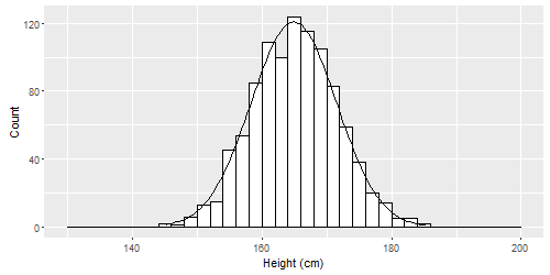
This shape is called a normal distribution. Normal distributions can be spread out wide or very compact, but they all are tallest in the middle and shortest at the ends (the tails). They can all be characterized by a mean and standard deviation. Some examples are below.
Below is a normal distribution with 10000 observations (10000 measurements of something), mean = 50, and standard deviation = 5. You could pretend this is data on the number of questions that 10000 people got correct on a test. The average score was 50, the average deviation from that score was 5. The minimum score appears to be about 30 and the highest around 70 or 80.
The following histogram shows the data distribution described above:
hist(rnorm(10000, mean = 50, sd = 5), breaks=20, main ="", xlab = "Test Score",xlim = c(20,80))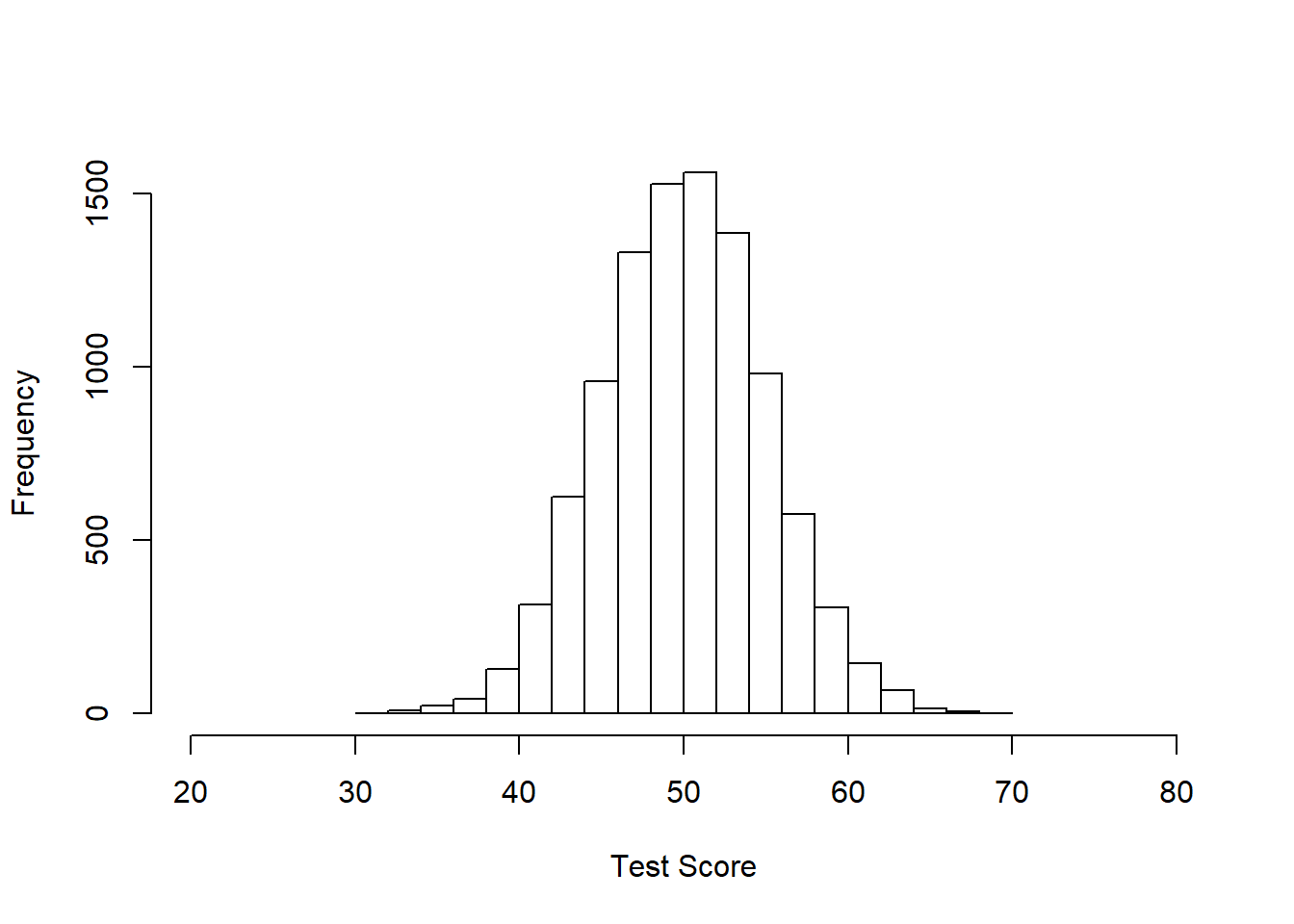
Below is another normal distribution with 10000 samples, mean = 50, standard deviation = 1. You can see that this distribution is much more compact than the previous one, which I have emphasized by keeping the x-axis range the same as above:
hist(rnorm(10000, mean = 50, sd = 1), breaks=20, main ="", xlim = c(20,80), xlab = "Walking Stick Lengths (in)")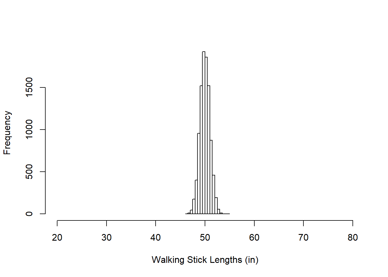
And finally here is another normal distribution with 10000 samples, mean = 50, and standard deviation = 50. The next two histograms both show the same distributions, but with different x-axis ranges and buckets:
par(mfrow=c(1,2))
p1<- hist(rnorm(10000, mean = 50, sd = 50), breaks=20, main ="", xlim = c(20,80))
p2 <- hist(rnorm(10000, mean = 50, sd = 50), breaks=20, main ="", xlim = c(-200,300))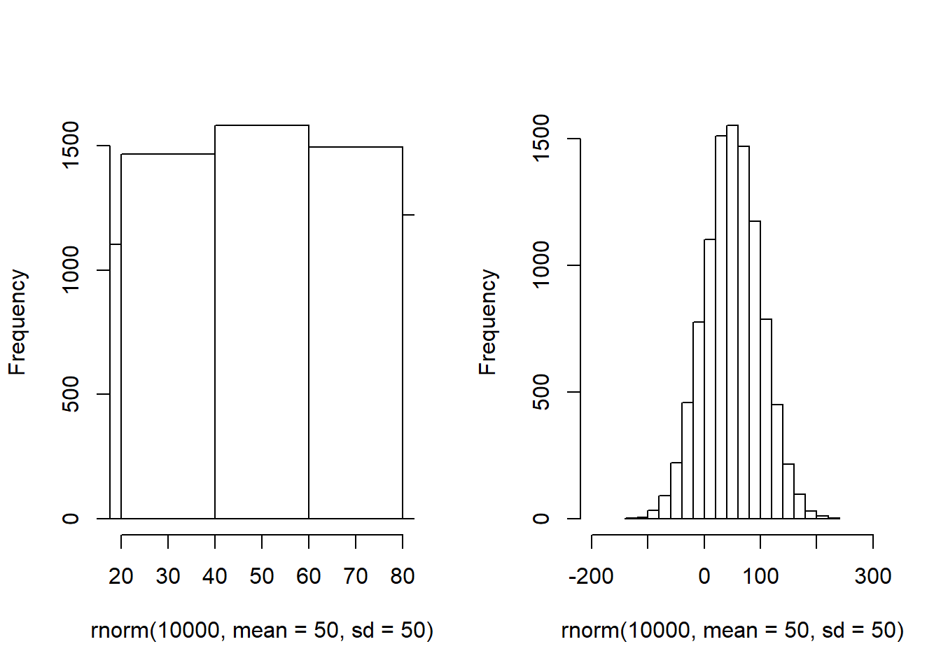
All three of these are normal distributions above, each characterized by a different mean and standard deviation. The histograms above were created such that they deliberately had a particular mean and standard deviation. To create these histograms, we asked R to generate normally distributed data for us using the rnorm function. It is not necessary for you to know how to do this.
It is more important for you to know how to generate a histogram of a variable within an empirical dataset, such as the mtcars data that is built into R.
4.2.2 Make a histogram and boxplot with your data
This section presents examples of how to make histograms and boxplots on a dataset in R.
For example, this is how you can make a histogram of the data in the variable mpg within the mtcars data:
hist(mtcars$mpg)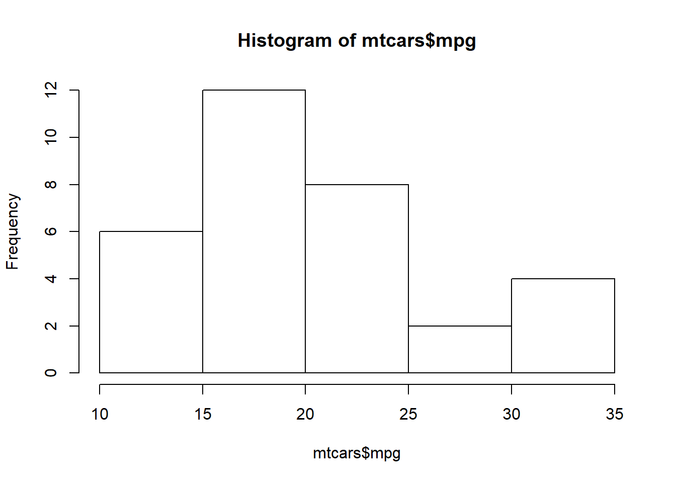
Above, here is what we asked the computer to do:
hist(...)– Make a histogram.mtcars$mpg– Use the data in the variablempg—which is within the datasetmtcars—to make the histogram.
As you can see, the distribution of mpg looks somewhat normally distributed, but it is not nearly as perfect as the normal distributions we saw earlier in this section.
A boxplot can also be a useful way to summarize your data visually. To make a boxplot of the mpg variable from the mtcars data, we can use the following code:
boxplot(mtcars$mpg)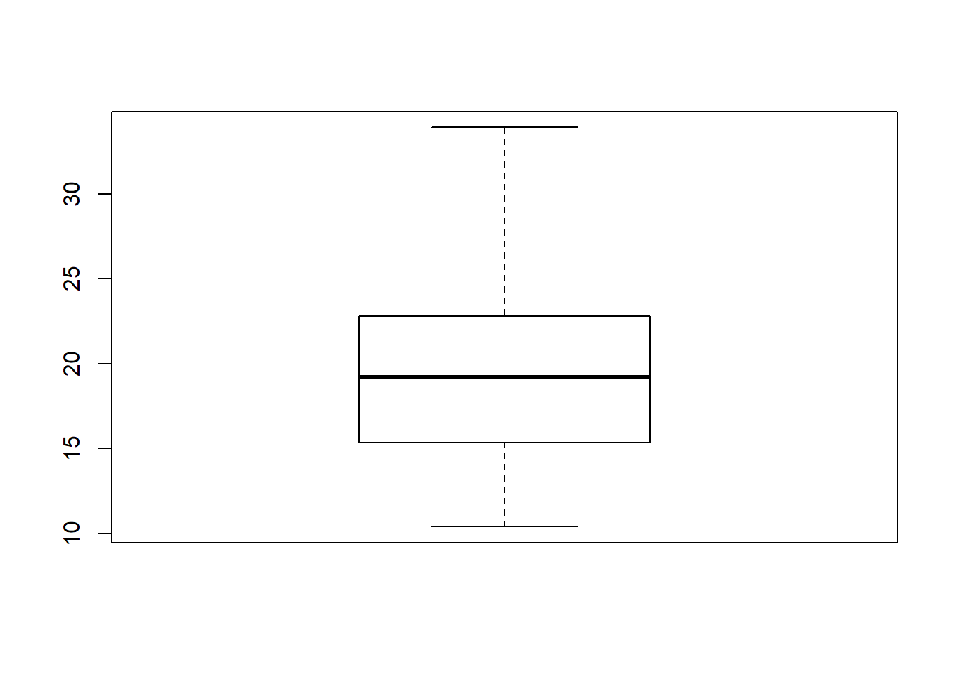
This is what the command above is telling the computer to do:
boxplot(...)– Make a boxplot.mtcars$mpg– This tells the computer that we want to make a box plot to help us visualize the distribution of the variablempg, which is within the datasetmtcars.
The boxplot above tells us a lot of the same information as the summary(...) command did earlier:
- The range of the data is between approximately 10 and 35 miles per gallon.
- The middle 50% of the data—meaning cars in between the first quartile and third quartile—fall between approximately 15 and 25 miles per gallon.
- The median value of
mpgin this data is around 20.
Both boxplots and histograms help us understand the distribution of our data. As you will see, data distributions will be important in a number of ways as you work on increasingly complex analyses.
4.3 Descriptive statistics in R
We will now learn how to calculate selected descriptive statistics in R. First we will go over how to calculate some basic descriptive statistics before seeing how to disaggregate our data into groups before calculating descriptive statistics. Once again, the mtcars dataset that is built into R will be used for examples. Keep in mind that you can run the command ?mtcars to see information about this dataset in RStudio.
4.3.1 Basic descriptives
Let’s start with the summary() command:
summary(mtcars$mpg)## Min. 1st Qu. Median Mean 3rd Qu. Max.
## 10.40 15.43 19.20 20.09 22.80 33.90Remember: mtcars$mpg tells the computer that we want the mpg variable within the dataframe called mtcars. The summary() function then gives us some summary statistics about that variable.
The summary function is useful because it gives us a number of metrics all at once:
- It tells us the minimum (10.4) and maximum (33.9) values of the variable, which gives us an immediate sense of the variable’s range.
- The mean of the variable (20.1) is printed right next to the median.
- Quartile cutoff points are given.
- 1st quartile (15.4): 25% of the data fall below this value and 75% of the data fall above it.
- Median (19.2): Half of the data fall below this value and half fall above it.
- 3rd quartile (22.8): 75% of the data fall below this value and 25% of the data fall above it.
- Example: 25% of the cars in the dataset
mtcarshave anmpgvalue lower than 15.43. 75% of the cars in the datasetmtcarshave anmpgvalue higher than 15.43.
We can also get the standard deviation of the same variable:
sd(mtcars$mpg)## [1] 6.026948Note that if a variable has missing data in it, the sd() function might not work. If you want to calculate the standard deviation of just the data that is not missing, you can add the na.rm = TRUE argument to the function, like this:
sd(mtcars$mpg, na.rm = TRUE)If you just want the mean without seeing everything in the summary() output, you can do this:
mean(mtcars$mpg)## [1] 20.09062That’s the mean mpg of the cars in the mtcars dataset.
Remember that the commands above were run on the dataframe called mtcars. If you want to run these commands for a different dataframe, you’ll have to replace mtcars in the code above with the name of your own dataframe that you are working with (which in your homework assignments will sometimes be called d).
Above, we saw how to calculate some basic descriptive statistics on a single variable. Now what if we want to calculate these statistics for a single variable when it is broken down into groups? Keep reading to find out how to do this!
4.3.2 Grouped descriptives
We will continue to use mtcars as our example data.
What if we want to know the mean fuel efficiency (the mpg variable in mtcars) separately for each group of cars that has the same number of cylinders?
We can generate this type of grouped descriptive statistics with the following code:
if (!require(dplyr)) install.packages('dplyr')
library(dplyr)

dplyr::group_by(mtcars, cyl) %>%
dplyr::summarise(
  count = n(),
  mean = mean(mpg, na.rm = TRUE),
  sd = sd(mpg, na.rm = TRUE)
  )
## # A tibble: 3 x 4
## cyl count mean sd
## * <dbl> <int> <dbl> <dbl>
## 1 4 11 26.7 4.51
## 2 6 7 19.7 1.45
## 3 8 14 15.1 2.56Note that the code above can be difficult to adapt for your own use. To compensate for this, at the end of this section, a generic version of the code above is available.
Here’s what we’re asking the computer to do with the commands above:
if (!require(dplyr)) install.packages('dplyr')– Install the packagedplyrif it is not already installed on the computer.library(dplyr)– Load the package calleddplyr.group_by(mtcars, cyl)– Within the datasetmtcars, create separate groups for observations (rows of data) that have identical numbers of cylinders as each other.%>%– For each of the new groups, do the following.summarise(...)– Produce a table row with the following information. This function has three arguments which I describe below:count = n()– Make a column called count58 which gives the size of the group.mean = mean(mpg, na.rm = TRUE)– Make a column called mean59 which gives the mean of variablempgseparately for each group. Omit any missing values from the calculation.60sd = sd(mpg, na.rm = TRUE)– Make a column called sd61 which gives the standard deviation of variablempgseparately for each group. Omit any missing values from the calculation.62
In the table above (the version using mtcars, not the generic version), we first broke down all of the observations (cars) in the mtcars dataset into three groups, based on how many cylinders the cars have. We see that the cars in this data can have either 4, 6, or 8 cylinders. That’s three different possible number of cylinders that a car can have and therefore we broke the cars up into three groups total. Each row in the table above corresponds to one of these groups.
Here is an explanation of what the table is telling us for each of these three groups of cars:
- 11 cars have 4 cylinders. These 11 cars have a mean
mpgof 26.7 andsdof 4.5. - 7 cars have 6 cylinders. These 7 cars have a mean
mpgof 19.7 andsdof 1.5. - 14 cars have 8 cylinders. These 14 cars have a mean
mpgof 15.1 andsdof 2.6.
To supplement the table above, we can also create a boxplot to accompany the numeric description of our data.
We can generate a boxplot of mpg separated by cyl groups with the following code:
boxplot(mpg ~ cyl, data = mtcars)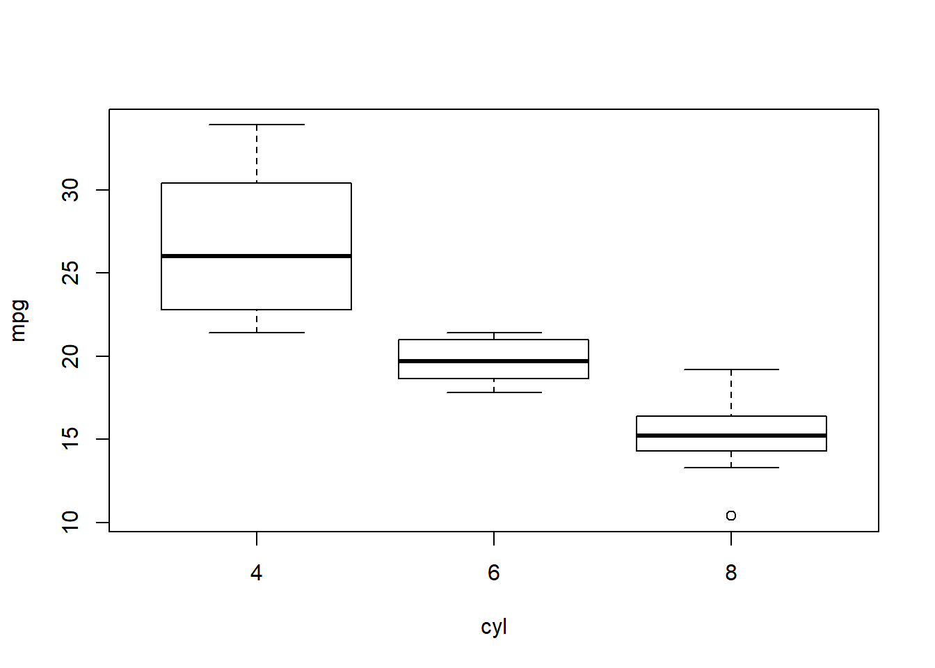
Here is what this code asks the computer to do:
boxplot(...)– Make a boxplot.mpg ~ cyl– This tells the computer that we want a separate boxplot for the variablempggrouped by the variablecyl. This means that the computer will create a separate box plot of the distribution of the variablempgfor each group of observations as they are grouped by the variablecyl.data = mtcars– This tells the computer where to look for the variablesmpgandcyl. They are within the dataset calledmtcars, which is what we are telling the computer here.
You can copy the code in this section and modify it as needed for your own work. Grouped descriptive statistics can be very useful to calculate and display.
4.3.2.1 Generic code for grouped descriptives
The code above that demonstrates how to generate grouped descriptive statistics can be difficult to copy and modify for your specific situation. Below is the generic form of this code, for both the table and the boxplot.
You can copy this code and change the items in CAPITAL LETTERS to generate a grouped descriptive statistics table:
if (!require(dplyr)) install.packages('dplyr')
library(dplyr)

dplyr::group_by(NAMEOFDATASET, NAMEOFGROUPINGVARIABLE) %>%
dplyr::summarise(
  count = n(),
  mean = mean(NAMEOFOUTCOMEVARIABLE, na.rm = TRUE),
  sd = sd(NAMEOFOUTCOMEVARIABLE, na.rm = TRUE)
  )
Here are the steps you can follow when you are using the code above with your own data (or for the assignment in this chapter):
- Copy and paste all of the code into your own code file, starting with the line
if (!require(dplyr)) install.packages('dplyr')and ending with the line). - Replace
NAMEOFDATASETwith the name of your dataset (such asmtcarsordordat). - Replace
NAMEOFGROUPINGVARIABLEwith the name of the variable you want to use to divide the data up into groups (such ascyl). This will often be a categorical variable or a numeric variable with very few possible values. - Replace
NAMEOFOUTCOMEVARIABLEwith the outcome variable—usually a continuous numeric variable such asmpg—that you are interested in learning descriptive statistics for separately in each group of your grouping variable. Note thatNAMEOFOUTCOMEVARIABLEoccurs twice in the code.
And you can copy this code and change the items in CAPITAL LETTERS to generate a grouped boxplot:
boxplot(NAMEOFOUTCOMEVARIABLE ~ NAMEOFGROUPINGVARIABLE, data = NAMEOFDATASET)Here are the steps you can follow when you are using the code above with your own data (or for the assignment in this chapter):
- Copy and paste the entire line of code into your own code file.
- Replace
NAMEOFOUTCOMEVARIABLEwith the outcome variable—usually a continuous numeric variable such asmpg—that you are interested in having on the vertical axis of your boxplot. - Replace
NAMEOFGROUPINGVARIABLEwith the name of the variable you want to use to divide the data up into groups (such ascyl). This will often be a categorical variable or a numeric variable with very few possible values. - Replace
NAMEOFDATASETwith the name of your dataset (such asmtcarsordordat).
Using the code above, you can disaggregate your data and look at outcomes of interest separately for each group. You can display your results both in a grouped table or in the visual form of a boxplot. Examining your data in groups is an important skill that we will return to often in our study of data analysis.
4.3.3 Visualizing and inspecting your data
Until this point in this chapter, you have mostly learned how to execute specific tasks in R. Now we turn to some more conceptual details related to preparing to do your data analysis. The first step of data analysis should be to become familiar with your data through descriptive statistics and visualization (often using visualizations such as histograms, scatterplots, boxplots, and more).
Below are some guidelines to keep in mind as you learn about your data:63
- Make sure that the values for each of your variables are valid (this includes checking for data entry errors or values outside the possible range for a variable).
- Check to see if variables are normally distributed. This is often important to know as you determine which types of statistical tests you can and cannot run on your data.
- Get a feel for how much variability you have in your variables. The descriptive statistics/characteristics we looked at above can be useful for this (especially mean, standard deviation, and shape of a variable’s distribution).
- Check for floor or ceiling effects. For example, if your data comes from an educational assessment tool to which students responded, were questions so easy or so hard that people got them all correct or all wrong?
- If you have demographic variables, look at the characteristics of your sample (this affects generalizability, or how representative of a larger population your data are or are not).
- Identify outliers and make preliminary determination of how you plan to handle them.
- Once you are confident you have a clean dataset, you can score and/or code any variables that are not already ready for analysis. Then you should double-check you have done those calculations correctly, usually by looking in your data spreadsheet and generating many two-way tables.
We will be practicing all of these guidelines throughout this course. Again, the first step of data analysis should be to become familiar with the data.
4.3.4 Outliers
Another important consideration as you prepare to do data analysis is to determine if there are any outliers in your data. If there are, you have to decide how to handle them. Descriptive statistics and charts are especially useful in detecting outliers.
Below are some common options you have as you decide how to handle outliers in your data:64
- Remove (exclude) observations65 that are outliers from your analysis.
- Transform the data, if there is a possible and reasonable transformation that would mitigate any problematic effects of the outliers.
- Change nothing and run your analyses as initially planned.
The strategy you choose to deal with outliers will depend on a lot of factors, and you need to think carefully about how you plan to handle extreme values in your analysis (and you will need to justify this in any findings you report). This will vary from dataset to dataset. You need to figure out what makes the most sense in the context of the research question you are trying to address. This decision-making process does not have any definitive rules. Instead, you will gain experience gradually that will help you decide how to handle outliers.
You have now reached the end of this week’s content. Please proceed to the assignment below.
4.4 Assignment
In this week’s assignment, you will practice analyzing data distributions, generating basic descriptive statistics, and generating grouped descriptive statistics. Please create and save a new RMarkdown file on your computer and do all of your work for this assignment in that file. Remember that—as demonstrated earlier in this chapter—you can write both plain text as well as R code into your RMarkdown file. When you are done, you should knit (export) your RMarkdown file to a format of your choosing (HTML, Word, or PDF) and submit that knitted file to D2L.
The following video shows you one possible way in which you could use RMarkdown to do and submit your assignment. You do not have to do it exactly this way. This is just one option. Since the video is fast-paced, don’t forget that you can pause or rewind it as needed.
How to use RMarkdown for homework assignments:
The video above about using RMarkdown for homework assignments can be accessed externally at https://youtu.be/nqIv9h4nRuE.
Many of the questions in this assignment require you to interpret descriptive statistics. Note that there is not necessarily a single right answer or set of right answers for each question. To a large extent, it is up to you to interpret the descriptive statistics that you generate however you think is meaningful. Of course, the code you use to generate the descriptive statistics (before you conduct your interpretation) does need to accomplish the exact requested task.
In this week’s assignment, please use the dataset called GSSvocab from the car package.66 You can paste the following code into an R code chunk in your RMarkdown file to load the GSSvocab data.
if (!require(car)) install.packages('car')
library(car)

d <- GSSvocab
d <- na.omit(d)
The code above installs and loads the car package, loads the data GSSvocab with the name d, and removes any observations with missing data from the dataset d. After you run the code above, you will do this assignment using the dataset d.
To read about this dataset, you can run the command ?GSSvocab.
4.4.1 Data distributions
In this part of the assignment, you will analyze the distribution of multiple continuous numeric variables in your data.
Task 1: Create a histogram and box plot of the age variable. Describe what you can learn from these charts.
Task 2: Create a histogram and box plot of the vocab variable. Describe what you can learn from these charts.
Task 3: Create a histogram and box plot of the educ variable. Describe what you can learn from these charts.
4.4.2 Basic descriptive statistics
In this part of the assignment, you will practice generating basic descriptive statistics for multiple continuous numeric variables in your data.
Task 4: Run the summary(...) and sd(...) commands on the age variable. What did you learn?
Task 5: Run the summary(...) and sd(...) commands on the vocab variable. What did you learn?
Task 6: Run the summary(...) and sd(...) commands on the educ variable. What did you learn?
4.4.3 Grouped descriptive statistics
Now you will practice generating grouped descriptive statistics and visualizations for multiple continuous numeric variables in your data.
Task 7: Generate both a table67 and a boxplot that shows how vocab scores are distributed across different gender groups. Provide a detailed explanation of what you learned.
Task 8: Generate both a table68 and a boxplot that shows how vocab scores are distributed across different nativeBorn groups. Provide a detailed explanation of what you learned.
4.4.4 Follow up and submission
You have now reached the end of this week’s assignment. The tasks below will guide you through submission of the assignment and allow us to gather questions and/or feedback from you.
Task 9: Please write any questions you have for the course instructors (optional).
Task 10: Please write any feedback you have about the instructional materials (optional).
Task 11: Knit (export) your RMarkdown file into an HTML, Word, or PDF file, as demonstrated earlier in the chapter. This knitted file is the one that you will submit.
Task 12: Please submit your assignment to the D2L assignment drop-box corresponding to this chapter and week of the course. Please e-mail all instructors if you experience any difficulty with this process. If you have trouble getting your RMarkdown file to knit, you can submit your RMarkdown file (instead of an HTML, Word, or PDF file).
Data source: Excel Sample Data. Contextures. https://www.contextures.com/xlsampledata01.html.↩︎
Image source: https://i.stack.imgur.com/hvTdo.png↩︎
We could have called this column anything we wanted.↩︎
We could have called this column anything we wanted.↩︎
In this specific case, it was not essential to include the
na.rm = TRUEargument because the dataset we’re using does not have any missing values.↩︎We could have called this column anything we wanted.↩︎
In this specific case, it was not essential to include the
na.rm = TRUEargument because the dataset we’re using does not have any missing values.↩︎This list was initially provided by Dr. Annie Fox at MGH Institute of Health Professions. It has been slightly modified.↩︎
This list was initially provided by Dr. Annie Fox at MGH Institute of Health Professions. It has been slightly modified.↩︎
Remember, an observation is a row of your data when it is in a spreadsheet. A row of data can be a person, an organization, a group, a car, or anything else about which data has been collected. An observation is also sometimes called a data point.↩︎
You can also choose to use other data if you wish, such as data from a project you plan to do or other data that interests you.↩︎
This means a table that will show you the mean and standard deviation of
vocabfor each level ofgender. Do not use thetable(...)function.↩︎This means a table that will show you the mean and standard deviation of
nativeBornfor each level ofgender. Do not use thetable(...)function.↩︎