Chapter 1 Jan 19–24: Descriptive Statistics and Data Distributions
This is the only chapter you need to look at for the first week of the course, which is January 19–24 2021. You can ignore all subsequent chapters in this e-book, for now.
Please read this entire chapter and then complete the assignment at the end.
I recommend that you quickly skim through the assignment at the end of the chapter before going through this chapter’s content, so that you know in advance the tasks that you will be expected to do.
This week, our goals are to…
Become familiar with this e-book.
Become familiar with basic descriptive statistics and how they are calculated.
Examine different types of data distributions.
Inspect and explore a dataset.
Modify data so that it is ready to be used to answer a research question.
1.1 Course Basics
Since this is the first week of the course, we will go over a few administrative and workflow items now. Please start by watching the following embedded video:
The video above can also be viewed externally at https://youtu.be/09COx-n6m8I.
Below is some information about how to use this e-book and how the course will work on a weekly basis.
Chapter 0 of this e-book contains information about the course. You can refer to it on an as-needed basis. The course calendar and final project sections of Chapter 0 might be particularly useful.
Throughout this e-book, you will find many links that you can click on. These are marked in blue underlined text like this. Any time you see blue text like that, keep in mind that you can click on it! You can practice by clicking here.
Each week of the course, a chapter of this e-book will be assigned. This week, the assigned chapter is Chapter 1, the one you are reading right now. You can look up which chapter is assigned for each week in the course calendar in Chapter 0. This week, you should read through all of the text in this chapter, watch any videos, and then complete the assignment at the end of the chapter. Everything you need to do this week is exclusively in this chapter. And you will do the same for chapters assigned in future weeks.
The due date of each assignment is usually Sunday night at the end of each week. Assignment due dates are given in the course calendar in Chapter 0. Assignments should be submitted in D2L in the appropriate dropbox for each chapter’s work. Any other submission instructions will be included in each individual assignment.
- If you find that the work for a given week is taking you too long, I recommend that you stop and send an e-mail to all course instructors. For example, if you get stuck on the first few tasks in a particular week, I recommend that you stop at that point (or even sooner) and contact us. We can meet on Zoom and work through a section of the content together so that you finish at a pace that is reasonable for your schedule. Please overcommunicate with us rather than undercommunicate. Do not hesitate to contact us!
1.2 Basic Concepts
We will begin by looking at a few foundational concepts in quantitative analysis. Please open the following PowerPoint document and reading the first 20 slides:
Once you have read the first 20 slides at the link above, follow along with the remaining slides (page #21 and up) as needed as you read the rest of the material below in this chapter.
1.3 Descriptive Statistics
Descriptive statistics help us rapidly understand key characteristics of any data we have. We will be using them throughout the course, so it is important to become comfortable with them, starting this week. They key descriptive statistics are: arithmetic mean (often just called the mean), median, mode, range, and standard deviation. Please use the resources below to learn or review how all of these are calculated and what they mean.
Let’s begin by watching this video about mean, median, and mode:5
The video above can also be viewed externally at https://www.youtube.com/watch?v=k3aKKasOmIw.
As an optional (not required) supplement to the video above, you can click the links below to read more about mean, median, and mode at their respective Wikipedia pages, if you would like:
Next, please continue by watching this video about how to calculate standard deviation:6
The video above can be viewed externally at https://www.youtube.com/watch?v=IaTFpp-uzp0.
Note that in the context of the video above, a sample just means a group of numbers. The sample standard deviation just means the standard deviation of a group of numbers.
As an optional (not required) supplement to the video above, you can click the links below to learn more about standard deviation, if you would like:
- Standard deviation Howcast video – This video is a bit rushed and can be good just to refresh how to calculate standard deviation, rather than learn it for the first time.
- Standard deviation on Wikipedia – This page contains some good descriptions of standard deviation as well as another calculation example.
Finally, you should also know how to calculate the range of a set of data. The range is simply the difference between the smallest and largest value in a sample of data or group of numbers. The video below explains how to calculate the range:7
The video above can also be viewed externally at https://www.youtube.com/watch?v=0HS1P3vhNBU.
Now that we have learned about how to describe a set of numbers numerically, let’s move on to some visual ways in which we can describe and learn more about a set of numbers.
1.4 Data Distributions
1.4.1 Histograms
Histograms are an extremely useful tool to describe data. Histograms simply count the number of values that are in your data within selected intervals.
Please watch the following video to familiarize yourself with how a histogram is made:8
The video above can be viewed externally at https://www.youtube.com/watch?v=gSEYtAjuZ-Y.
As an optional (not required) supplement to the video above, you can click the link below to learn more about histograms, if you would like:
1.4.2 Types of distributions
Now we will examine a few examples related to histograms and data distributions. Let’s start by watching the following video, which reviews a number of possible data distributions:9
The video above can be viewed externally at https://www.youtube.com/watch?v=Y53_8WRrPzg.
1.4.3 Normal distributions
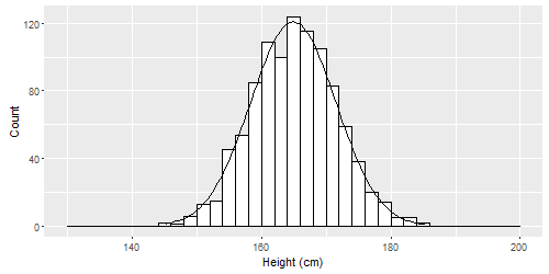
Imagine that we measured the heights of hundreds or thousands of people. It is likely that our histogram of all the heights would look like this:10

This is called a normal distribution. Normal distributions can be spread out wide or very compact, but they all are tallest in the middle and shortest at the ends (the tails). They can all be characterized by a mean and standard deviation. Some examples are below.
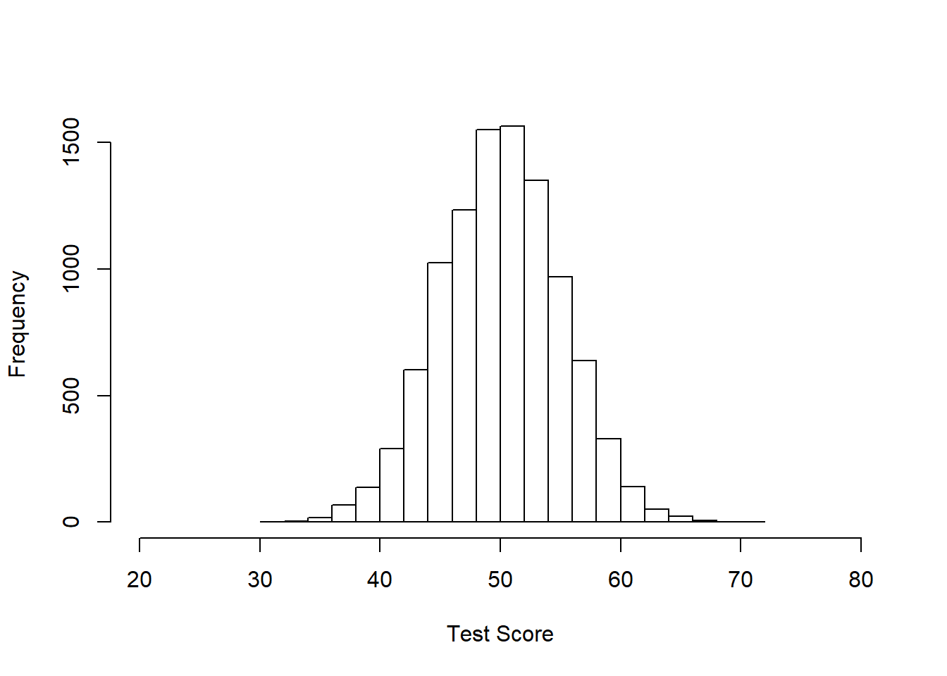
Below is a normal distribution with 10000 samples (10000 measurements of something), mean = 50, and standard deviation = 5. You could pretend this is data on the number of questions that 10000 people got correct on a test. The average score was 50, the average deviation from that score was 5. The minimum score appears to be about 30 and the highest around 70 or 80.

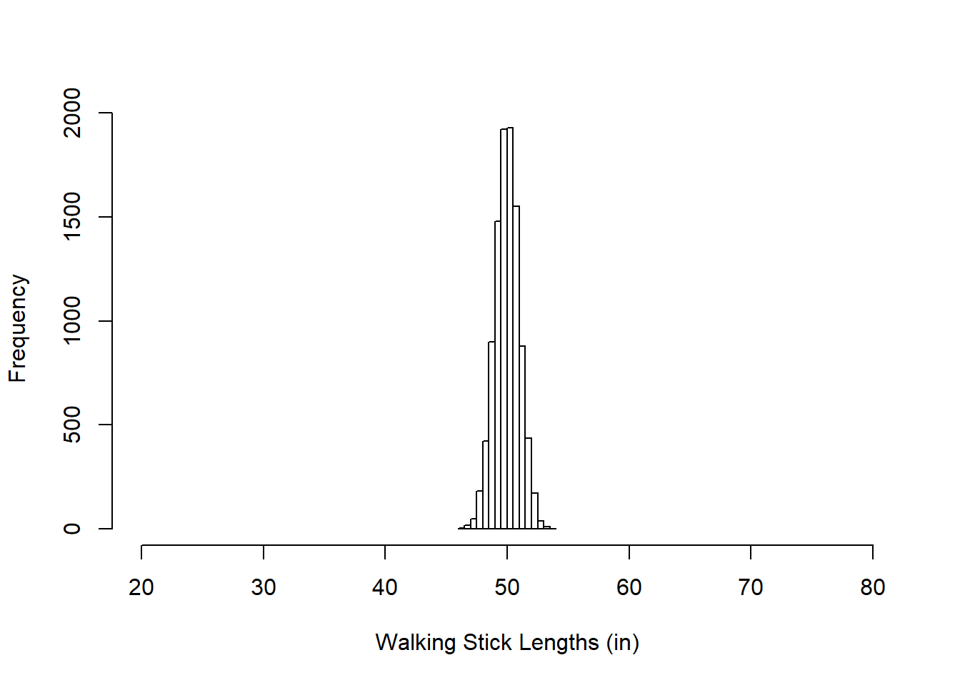
Here below is another with 10000 samples, mean = 50, standard deviation = 1. You can see that this one is much more compact (which I have emphasized by keeping the x-axis range the same as above). You could pretend that these are the lengths of hand-manufactured walking sticks that are meant to be 50 inches in length but aren’t always perfect.

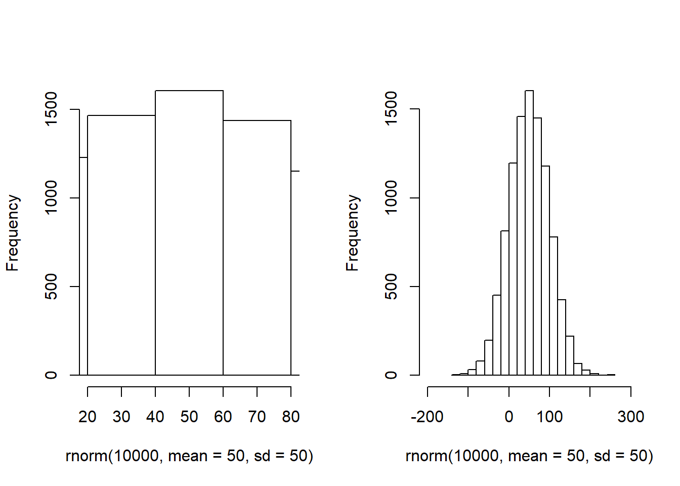
And finally here is another normal distribution with 10000 samples, mean = 50, and standard deviation = 50. The next two histograms both show the same distributions, but with different x-axis ranges and buckets. I’m not sure what this could be an example of!

All three of these are normal distributions, each characterized by a different mean and standard deviation. The mean of a normal distribution that is balanced on both sides, like these ones, will often be the same as the mode of that distribution.
1.4.4 z-scores
We will end our section on data distributions by combining many of the topics we covered above. z-scores combine our knowledge of mean, standard deviation, and data distributions to allow us to understand our data better. Please watch the following video about how z-scores are calculated:11
The video above can be viewed externally at https://www.youtube.com/watch?v=5S-Zfa-vOXs.
These optional resources might also be useful as you think more about z-scores, if you would like to see some more explanations and examples:
1.5 Visualizing and Inspecting Your Data
The first step of data analysis should be to become familiar with your data through descriptive statistics and graphing (often using visualizations such as histograms, scatterplots, boxplots, and more).
Below are some guidelines to keep in mind as you learn about your data:12
- Make sure that the values for each of your variables are valid (this includes checking for data entry errors or values outside the possible range for a variable).
- Check to see if variables are normally distributed. This is often important to know as you determine which types of statistical tests you can and cannot run on your data.
- Get a feel for how much variability you have in your variables. The descriptive statistics/characteristics we looked at above can be useful for this (especially mean, standard deviation, and shape of a variable’s distribution).
- Check for floor or ceiling effects. For example, if your data comes from an educational assessment tool to which students responded, were questions so easy or so hard that people got them all correct or all wrong?
- If you have demographic variables, look at the characteristics of your sample (this affects generalizability, or how representative of a larger population your data are or are not).
- Identify outliers and make preliminary determination of how you plan to handle them.
- Once you are confident you have a clean dataset, you can score and/or code any variables that are not already ready for analysis. Then you should double-check you have done those calculations correctly, usually by looking in your data spreadsheet and generating many two-way tables.
We will be practicing all of these guidelines throughout this course. Again, the first step of data analysis should be to become familiar with the data.
1.5.1 Outliers
Another important consideration as you prepare to do data analysis is to determine if there are any outliers in your data. If there are, you have to decide how to handle them. Descriptive statistics and charts are especially useful in detecting outliers.
Below are some common options you have as you decide how to handle outliers in your data:13
- Remove (exclude) observations14 that are outliers from your analysis.
- Transform the data, if there is a possible and reasonable transformation that would mitigate any problematic effects of the outliers.
- Change nothing and run your analyses as initially planned.
The strategy you choose to deal with outliers will depend on a lot of factors, and you need to think carefully about how you plan to handle extreme values in your analysis (and you will need to justify this in any findings you report). This will vary from dataset to dataset. You need to figure out what makes the most sense in the context of the research question you are trying to address. This decision-making process does not have any definitive rules. Instead, you will gain experience gradually that will help you decide how to handle outliers.
1.6 Basic data analysis in a spreadsheet software
In this section, we will introduce a few techniques for rapidly learning about a dataset using Microsoft Excel or a similar spreadsheet software such as Google Sheets or Open Office. Using a spreadsheet software can be an excellent way to learn about your data and prepare your data for more rigorous quantitative analysis in another software.
Below, we will learn how to calculate descriptive statistics, make selected charts, identify outliers, and sort data within a spreadsheet.
1.6.1 Descriptive statistics
Calculating descriptive statistics rapidly is an extremely valuable skill. The video below demonstrates how to do this in Excel:15
The video above can be viewed externally at https://www.youtube.com/watch?v=-tFWH7AYLek.
Alternatively, the resources below show a different method of rapidly generating descriptive statistics in Excel:
- Descriptive Statistics. Easy Excel. https://www.excel-easy.com/examples/descriptive-statistics.html.
- Descriptive Statistics using “Data Analysis” tool in Excel. ozanteaching. YouTube. https://www.youtube.com/watch?v=5MFjwM6K5Sg.
1.6.2 Boxplot
Boxplots are a very useful tool for visualizing our data. Before we see how to create them in Excel, you can watch the video below if you would like, to understand how they are constructed:16
The video above can be viewed externally at https://www.youtube.com/watch?v=fHLhBnmwUM0.
And now let’s see how to make a boxplot in Excel:17
The video above can be viewed externally at https://www.youtube.com/watch?v=BcwFD0ICOf0.
1.6.3 Identify outliers
The following video shows one effective way to identify outliers in your data using Excel:18
The video above can be viewed externally at https://www.youtube.com/watch?v=dt1MQmMaf4E.
Note that boxplots can also help you identify outliers.
1.6.4 Histogram
The video below shows how to make a histogram in Excel:19
The video above is available externally at https://www.youtube.com/watch?v=is14ehdy7jo.
As an optional additional resource, you can read about how to make a histogram in Excel here:
- Histogram. Easy Excel. https://www.excel-easy.com/examples/histogram.html.
1.6.5 Sorting data
Sometimes, it might be useful to reorder the observations (rows) of your data in a spreadsheet, based on one variable (column) of the data. The video below demonstrates this process in Excel:20
The video above can be viewed externally at https://www.youtube.com/watch?v=KS9N4yAjuYQ.
As an optional additional resource, you can read about sorting data in Excel here:
- Excel 2016 - Sorting Data. GCF Global. https://edu.gcfglobal.org/en/excel2016/sorting-data/1/.
1.7 Assignment
Please complete and submit all of the tasks, which are presented in separate sections below. You can put your responses into a Word document or similar type of document. Any submission format is fine.
Do not hesitate to contact course instructors with any questions or concerns, big or small.
This assignment is due on the night of Sunday January 24 2021.
1.7.1 Conceptual Questions
The tasks below relate the statistical concepts that you learned about in this chapter to quantitative research design.
Task 1: What are Z-scores?
Task 2: Describe one situation where it would be more useful to use z-scores than raw scores when analyzing data.
Task 3: Using your own words, what does the standard deviation tell us, and how is it calculated?
1.7.2 Exploring Data
In this part of the assignment, you will use a dataset called Autism Stigma Data. Click here to access this dataset. Download and then open it in a spreadsheet program of your choice.21
Here is some background on the dataset: A team of researchers have developed an intervention to reduce mental illness stigma among primary care physicians. The intervention is an online training program designed to address the common misconceptions and stereotypes about mental illness. They use a pre-post design, and were interested in changes in both mental illness stigma (operationalized as attitudes towards people with mental illness, measured in the socdist_pre and socdist_post variables in the dataset) and knowledge (operationalized as mental health literacy, measured in the know_pre and know_post variables in the dataset). They also collected demographic information from all participants.
Task 4: Familiarize yourself with the dataset. Look at the variable names, types of variables, labels, value labels, etc. How many variables (columns) are there in this data?
Task 5: What is the primary research question the researchers are trying to address with this study?
Task 6: What is the main independent variable the researchers are interested in?
Task 7: What are the primary dependent variable(s) the researchers are interested in?
Task 8: What are the levels of measurement of each of the variables in the dataset?
For the next few questions on outliers, in addition to visually inspecting the data in a spreadsheet, you might find it useful to make a box plot.
Task 9: Are there any outliers or data entry errors in the dataset? Also explain how you made that determination. Present at least one box plot as part of your answer.
Task 10: How did you decide whether a value was an outlier?
Task 11: For any data entry errors: What kinds of error(s) did you find? How did you decide to “fix” the error?
Before moving forward to the next questions, make sure you are now working with a “clean” dataset in which you have handled any outliers.
Task 12: Report the mean and standard deviation for the pre and post stigma and knowledge variables.
Task 13: Do the stigma and knowledge variables appear to be normally distributed? Use histograms to make a determination and explain your reasoning.
Now, split the data by gender. You can do this by sorting the data by the gender column. Then, copy all of the rows for women into a new spreadsheet and all of the rows for men into yet another empty spreadsheet. Now you are ready to analyze the data separately for men and women.
Task 14: What are the mean and standard deviation for men and women (separately) for each of the stigma and knowledge variables? Are these variables normally distributed? Show the histograms for men and women for each of the stigma and knowledge variables.
Task 15: Based on your preliminary examination of the data, what do you think the next steps should be to answer the research question?
1.7.3 Follow up and submission
You have now reached the end of this week’s assignment. The tasks below will guide you through submission of the assignment and allow us to gather questions and/or feedback from you.
Task 16: Please write any questions you have for the course instructors (optional).
Task 17: Please write any feedback you have about the instructional materials (optional).
Task 18: Please submit your assignment (multiple files are fine) to the D2L assignment drop-box corresponding to this chapter and week of the course. Please e-mail all instructors if you experience any difficulty with this process.
Finding mean, median, and mode. Khan Academy. YouTube. Nov 14 2011. https://www.youtube.com/watch?v=k3aKKasOmIw.↩︎
How To Calculate The Standard Deviation. The Organic Chemistry Tutor. Sep 26 2019. YouTube. https://www.youtube.com/watch?v=IaTFpp-uzp0.↩︎
Finding the Range | How to Find the Range of a Data Set. Math with Mr. J. April 28 2020. YouTube. https://www.youtube.com/watch?v=0HS1P3vhNBU.↩︎
How to create a histogram. Khan Academy. February 4 2015. YouTube. https://www.youtube.com/watch?v=gSEYtAjuZ-Y.↩︎
Classifying shapes of distributions. Khan Academy. June 22 2018. YouTube https://www.youtube.com/watch?v=Y53_8WRrPzg.↩︎
Image source: https://i.stack.imgur.com/hvTdo.png↩︎
Z-score introduction. Khan Academy. June 14 2018. YouTube. https://www.youtube.com/watch?v=5S-Zfa-vOXs.↩︎
This list was initially provided by Dr. Annie Fox at MGH Institute of Health Professions. It has been slightly modified.↩︎
This list was initially provided by Dr. Annie Fox at MGH Institute of Health Professions. It has been slightly modified.↩︎
Remember, an observation is a row of your data when it is in a spreadsheet. A row of data can be a person, an organization, a group, a car, or anything else about which data has been collected. An observation is also sometimes called a data point.↩︎
Excel - Basic Descriptive Statistics (Mean, Variance, Standard Devation, etc.). Jalayer Academy. January 12 2012. YouTube. https://www.youtube.com/watch?v=-tFWH7AYLek.↩︎
Starmer, Josh. Boxplots, Clearly Explained. StatQuest with Josh Starmer. July 10 2017. YouTube. https://www.youtube.com/watch?v=fHLhBnmwUM0↩︎
Creating a boxplot in Microsoft Excel 365. People Analytics Alaska. December 28 2019. YouTube. https://www.youtube.com/watch?v=BcwFD0ICOf0.↩︎
How to Find Outliers with Excel. Absent Data Channel. December 3 2017. YouTube. https://www.youtube.com/watch?v=dt1MQmMaf4E.↩︎
Price, Ryan. How to Make a Histogram in Excel 2016. August 27 2016. YouTube. https://www.youtube.com/watch?v=is14ehdy7jo.↩︎
Excel 2013: Sorting Data. GCFLearnFree.org. November 26 2013. YouTube. https://www.youtube.com/watch?v=KS9N4yAjuYQ.↩︎
You can download and then open the file in Excel or a similar program on your own computer. You might also be able to click on the “Add to My Drive” button to copy it into your own Google Drive account and then open it in Google Sheets.↩︎