Chapter 8 Summarizing data
Motivating scenarios: You want to communicate simple summaries of your data or understand what people mean in their summaries.
Learning goals: By the end of this chapter, you should:
- Be able to explain and interpret summaries of the location and spread of a dataset.
- Recognize and use the mathematical formulae for these summaries.
- Calculate these summaries in R.
- Use a histogram to responsibly interpret a given numerical summary, and to evaluate which summary is most important for a given dataset (e.g. mean vs. median, or variance vs. interquartile range).
8.1 Four things we want to describe
While there are many features of a dataset we may hope to describe, we mostly focus on four types of summaries:
- The location of the data: e.g. mean, median, mode, etc…
- The shape of the data: e.g. skew, number of modes, etc…
- The spread of the data: e.g. range, variance, etc…
- Associations between variables: e.g. correlation, covariance, etc…
Today we focus mainly on the spread and location of the data, but regularly bring up the shape of the data, as the meaning of other summaries depend on the shape of the data. We save summaries of associations between variables for later chapters.
Whenever we summarize data, we are making an estimate from a sample, and do not have a parameter from a population.
In stats we use Greek letters to describe parameter values, and the English alphabet to show estimates from our sample.
We usually call summaries from data sample means, sample variance etc. to remind everyone that these are estimates, not parameters. For some calculations (e.g. the variance) the equations to calculate the parameter from a population differ slightly from equations to estimate it from a sample, because otherwise estimates would be biased.8.2 Data sets for today
We’ll rely on a few data sets to work through these concepts, one from our textbook, and two of which are built into R.
bindindescribes the proportion of sea urchin females of genotype AA or BB at the bindin locus fertilized by sperm from a male with an AA genotype at the lysin gene. These two genes are known to interact to facilitate fertilization in sea urchin.riversgives the lengths (in miles) of 141 “major” rivers in North America, as compiled by the US Geological Survey.
We load the bindin data set with the following code:
bindin_link <- "https://whitlockschluter3e.zoology.ubc.ca/Data/chapter03/chap03q28SeaUrchinBindin.csv"
bindin <- read_csv(bindin_link)
8.3 Measures of location
Figure 8.1: Watch this video on Calling Bullshit on summarizing location (15 min and 05 sec).
We hear and say the word, “Average”, often. What do we mean when we say it? “Average” is an imprecise term for a middle or typical value. More precisely we talk about:
Mean (aka \(\overline{x}\)): The expected value. The weight of the data. We find this by adding up all values and dividing by the sample size. In math notation, this is \(\frac{\Sigma x_i}{n}\), where \(\Sigma\) means that we sum over the first \(i = 1\), second \(i = 2\) … up until the \(n^{th}\) observation of \(x\), \(x_n\). and divide by \(n\), where \(n\) is the size of our sample.
Median: The middle value. We find the median by lining up values from smallest to biggest and going half-way down.
Mode: The most common value in our data set.
Let’s explore this with the bindin data.
To keep things simple, let’s focus on just the BB genotype, isolating it using the filter() function we encountered in Chapter 2. Let’s also arrange() these data from smallest to largest value to make it easiest to find the median.
bindin.BB <- bindin %>%
  filter(populationOfFemale == "BB")%>%
  arrange(percentAAfertilization)

bindin.BB
## # A tibble: 7 × 2
## populationOfFemale percentAAfertilization
## <chr> <dbl>
## 1 BB 0.15
## 2 BB 0.22
## 3 BB 0.3
## 4 BB 0.37
## 5 BB 0.38
## 6 BB 0.5
## 7 BB 0.95We can calculate the sample mean as \(\overline{x} = \frac{\Sigma{x_i}}{n}\) so,
\(\overline{x} = \frac{0.15 + 0.22 + 0.3 + 0.37 + 0.38 + 0.5 + 0.95}{7}\)
\(\overline{x} = \frac{2.87}{7}\)
\(\overline{x}= 0.41\)We can calculate the sample median by going halfway down the table and take the \(\frac{n+1}{2}^{th} = \frac{4+1}{2}^{th} = \frac{8}{2}^{th} = 4^{th}\) value, which is 0.37.
8.3.1 Getting summaries in R
The summarise() function in R reduces a data set to summaries that you ask it for. So, we can use tell R to summarize these data as follows.
bindin.BB %>%
  summarise(mean_fert_1 = sum(percentAAfertilization) / n(),
            mean_fert_2 = mean(percentAAfertilization),
            median_fert = median(percentAAfertilization))
## # A tibble: 1 × 3
## mean_fert_1 mean_fert_2 median_fert
## <dbl> <dbl> <dbl>
## 1 0.41 0.41 0.37For
mean_fert_1we took the sum with thesum()function, and divided by the length, found with then()function.For
mean_fert_2we directly used themean()function. These two values should be the same, and should equal our math above.We found the median with the
median()function.
8.3.2 Getting summaries by group in R
Figure 8.2: Watch this video from Stat 545, which combines a refresher on group_by() and calculates summaries by group (7 min and 25 sec).
Returning to our full data set, let’s say we wanted to get the mean for females from the AA and BB populations, separately. Here, we can combine the group_by() function from Chapter @(rdata) with the summarise() function introduced above.
bindin                                                   %>%
  group_by(populationOfFemale)                           %>%
  summarise(mean_fert   = mean(percentAAfertilization),
            median_fert = median(percentAAfertilization))
## # A tibble: 2 × 3
## populationOfFemale mean_fert median_fert
## <chr> <dbl> <dbl>
## 1 AA 0.788 0.795
## 2 BB 0.41 0.37So, it looks like AA sperm successfully fertilize AA eggs \(\approx 79\%\) of attempts, while sperm from the AA population fertilizes eggs from the BB population in \(\approx 40\%`\) of attempts. These answers are pretty similar whether we look at the median or mean. Later in the term, we look into evaluating how weird it would be to see this extreme of a difference if the females where from the same (statistical) populations.
If you type the code above, R will say something like summarise(…, .groups ="drop_last"). R is saying that it does not know which groups you want it to drop when you are summarizing (if you’re grouping by more than one thing, which we a are not). To make this go away, type:
summarise(..., .groups = "drop_last") to drop the last thing in group_by(),summarise(..., .groups = "drop") to drop all things in group_by(),summarise(..., .groups = "keep") to drop no things in group_by(), orsummarise(..., .groups = "rowwise") to keep each row as its own group.
8.4 Summarizing shape of data
Figure 8.3: The shape of distributions from Crash Course Statistics.
Always look at the data before interpreting or presenting a quantitative summary. A simple histogram is best for one variable, while scatter plots are a good starting place for two continuous variables.
🤔WHY? 🤔 Because knowing the shape of our data is critical for making sense of any summaries.
8.4.1 Shape of data: Skewness
Let us have a look at the river dataset
# ggplot needs tibbles. So
# let's make river_length a column in a tibble called river.length
river.length <- tibble(river_length = rivers)

ggplot(river.length , aes(x=river_length))+
  geom_histogram(bins = 30, color = "white") # for now ignore code for added elaborations (labeling mean and median)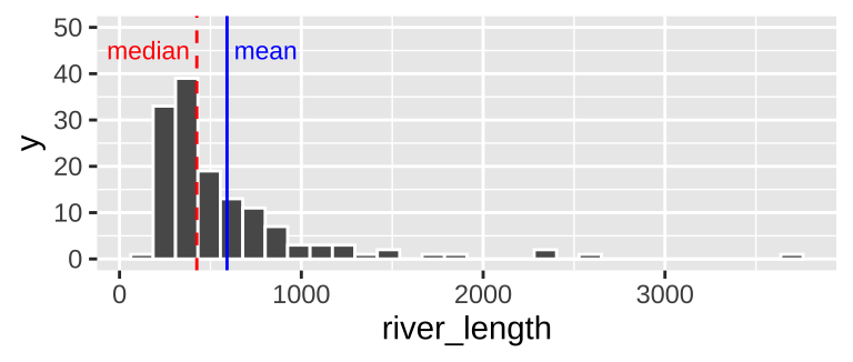
Figure 8.4: Histogram of river length dataset. The median is the dashed red line, and the mean is shown by the solid blue line.
We notice two related things about Figure 8.4:
1. There are a numerous extremely large values.
2. The median is substantially less than the mean.
We call data like that in Figure 8.4 Right skewed, while data with an excess of extremely small values, and with a median substantially greater than the mean are Left skewed.
In Figure 8.5, we show example density plots of left-skewed, unskewed, and right-skewed data.
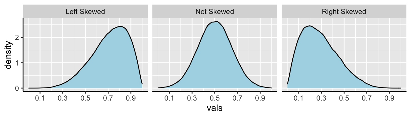
Figure 8.5: Examples of skew.

8.4.2 Shape of data: Unimodal, bimodal, trimodal
ggplot(bindin , aes(x = percentAAfertilization))+
  geom_histogram(bins = 8, color = "white") # for now ignore code for added elaborations (labeling mean and median)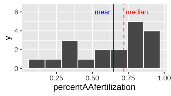
Figure 8.6: Histogram of bindin dataset. The mean is the dashed red line, and the median is shown by the solid blue line.
We notice two things about Figure 8.6.
1. There is an excess of small values and the mean is way smaller than the median, so this is left skewed.
2. It looks like there are two modes here – one near 0.3, and one near 0.8.
We call data with two modes, as we see in 8.6 bimodal. By contrast, the river length data (Fig. 8.4) has only one mode, so it is unimodal. If we had three modes, (i.e. three bumps in a histogram) it would be trimodal (Fig. 8.7).
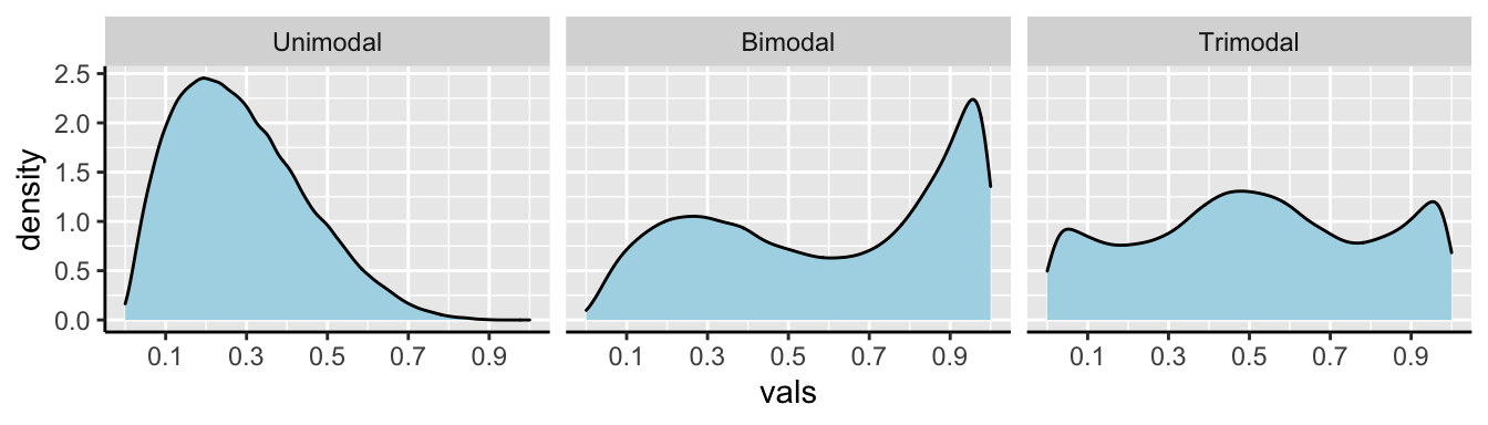
Figure 8.7: Examples of unimodal, bimodal, and trimodal data.
Often, multimodal data sets suggest that our sample contains a mix of observations of individuals from different populations. This may be going on in the bindin data set as we have females from two different populations. This could be happening here, as we recall from our summaries that the different types of females have different means…
Let’s have a look!
ggplot(bindin , aes(x = percentAAfertilization))+
  geom_histogram(binwidth =  .1, color = "white")     +
  facet_wrap(~populationOfFemale, ncol =1, labeller = "label_both")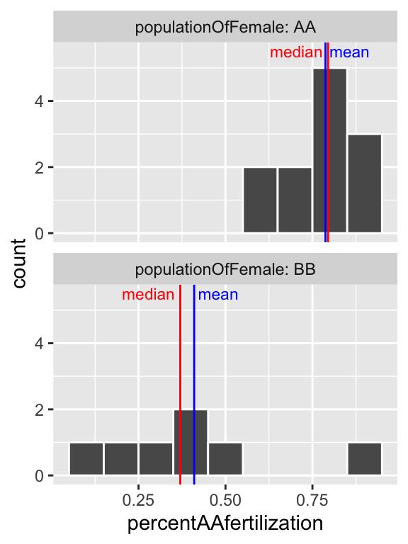
Figure 8.8: Histogram of all bindin data, by female population, and placed in eight bins. The median is the dashed red line, and the median is shown by the solid blue line.
So separating females by population (Fig. 8.8), suggests that the apparent bimodality in fertilization (Fig. 8.6) may reflect the combination of two unimodal populations with difference statistical properties.
8.5 Measures of width
Variability (aka width of the data) is not noise that gets in the way of describing the location. Rather, the variability in a population is itself an important biological parameter which we estimate from a sample. For example, the key component of evolutionary change is the extent of genetic variability, not the mean value in a population.
Common measurements of width are the
- Range: The difference between the largest and smallest value in a data set.
- Interquartile range (IQR): The difference between the \(3^{rd}\) and \(1^{st}\) quartiles.
- Variance: The average squared difference between a data point and the sample mean.
- Standard deviation: The square root of the variance.
- Coefficient of variation: A unitless summary of the standard deviation facilitating the comparison of variances between variables with different means.
8.5.1 Measures of width: Range and Interquartile range (IQR)
We call the range and the interquartile range nonparametric because we can’t write down a simple equation to get them, but rather we describe a simple algorithm to find them (sort, then take the difference between things).
Let’s use a boxplot to illustrate these summaries.
ggplot(river.length , aes(x=1, y=river_length))+
  geom_boxplot() +
  xlim(c(0,2))   +
  scale_y_continuous(trans = "log10", limits = c(100,10000)) +
  annotation_logticks(sides = "l",base = 10, size = .2)+ # put log ticks on bottom "b" and left )
  ggtitle("Boxplot of river lengths") +
  # this last bit is me having fun to add the labels for quantile
  # you wont need t do this, but I shared some fun tricks there
  geom_text(data = .  %>% summarise(river_length=quantile(river_length,probs =seq(0,1,.25)),
                           quantile = c("min", "Q1","median","Q3","max"),),
            aes(x = 1.5, label = quantile),hjust = 0, size=2.5)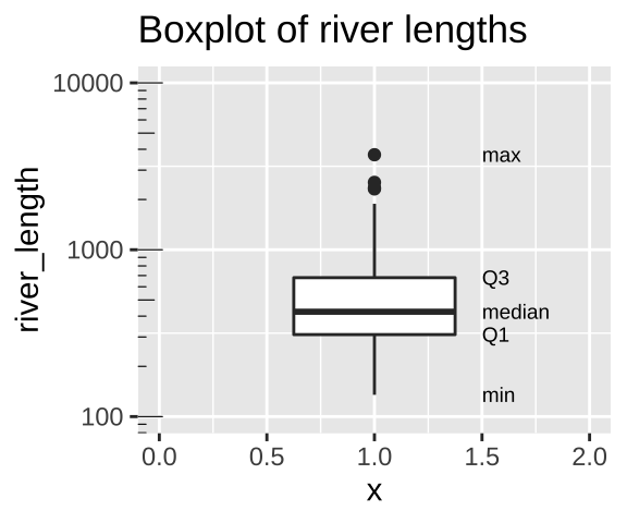
Figure 8.9: Boxplot of river lengths, note that the y axis increases on a log scale (enabled with scale_y_continuous(trans = "log10"). As we will see later in the term, this is often a good way to present and analyze right skewed data.
We calculate the range by subtracting min from max (as noted in Fig. 8.9). But because this value increases with the sample size, it’s not super meaningful, and it is often given to provide an informal description of the width, rather than a serious statistic. I note that sometimes people use range to mean “what is the largest and smallest value?” rather than the difference between theme (in fact that’s what the
range()function in R does).We calculate the interquartile range (IQR) by subtracting Q1 from Q3 (as shown in Fig. 8.9). The IQR is less dependent on sample size than the range, and is therefore a less biased measure of the width of the data.
8.5.1.1 Calculating the range and IQR in R.
Staying with the rivers data set, let’s see how we can calculate these summaries in R. As I showed with the mean, I’ll first work through example codes that shows all the steps and helps us understand what we are calculating, before showing R shortcuts.
To calculate the range, we need to know the minimum and maximum values, which we find with the min() and max().
To calculate the IQR, we find the \(25^{th}\) and \(75^{th}\) percentiles (aka Q1 and Q3), by setting the probs argument in the quantile() function equal to 0.25 and 0.75, respectively.
river.length %>%
  summarise(length_max   = max(river_length),
            length_min   = min(river_length),
            length_range = length_max - length_min,
            length_q3    = quantile(river_length, probs = c(.75)),
            length_q1    = quantile(river_length, probs = c(.25)),
            length_iqr   = length_q3 - length_q1 )
## # A tibble: 1 × 6
## length_max length_min length_range length_q3 length_q1 length_iqr
## <dbl> <dbl> <dbl> <dbl> <dbl> <dbl>
## 1 3710 135 3575 680 310 3708.5.2 Measures of width: Variance, Standard Deviation, and coefficient of variation.
The variance, standard deviation, and coefficient of variation all communicate how far individual observations are expected to deviate from the mean. However, because (by definition) the differences between all observations and the mean sum to zero (\(\Sigma x_i = 0\)), these summaries work from the squared difference between observations and the mean.
To work through these ideas and calculations, let’s return to the bindin data sorted from lowest to highest percent fertilization, and looking only a females from the BB population (we called this bindin.BB). As a reminder, the mean percentage of BB females’ eggs fertilized by AA males was 0.41. Before any calculations, lets make a simple plot to help investigate these summaries:
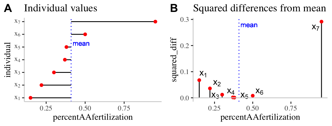
Figure 8.10: Visualizing variability. A) The red dots show the proportion of each females (from population BB) eggs fertilized by males from population AA. The solid black lines show the difference between these values and the mean ( dotted blue line). B) The proportion of each females (from population BB) eggs fertilized by males from population AA is shown on the x-axis. The y-axis shows the squared difference between each observation and the sample mean (dotted blue line). The solid black line highlights the extent of these values.
Calculating the sample variance:
The sample variance, which we call \(s^2\) is the sum of squared differences of each observation from the mean, divided by the sample size minus one. We call the numerator ‘sums of squares x’, or \(SS_x\).
\[s^2=\frac{SS_x}{n-1}=\frac{\Sigma(x_i-\overline{x})^2}{n-1}\].
Here’s how I like to think the steps:
- Getting a measure of the individual differences from the mean, then
- Squaring those diffs to get all the values positive,
- Adding all those up, then dividing them to get something close to the mean of the differences.
- Instead of dividing by N though, we use N-1 to adjust for sample sizes (as we get larger numbers, the -1 gets diminishingly less consequential).
We know that this dataset contains seven observations and so \(n-1 = 7-1=6\), so let’s work towards calculating the Sums of Squares x, \(SS_x\).
Figure 8.10A highlights each value of \(x_i - \overline{x}\) as the length of each line. Figure 8.10B plots the square of these values, \((x_i-\overline{x})^2\) on the y, again highlighting these squared deviations with a line. So to find \(SS_x\)
- We take these values \(SS_x = (0.15 - 0.41)^2 + (0.22 - 0.41)^2 + (0.3 - 0.41)^2 + (0.37 - 0.41)^2 + (0.38 - 0.41)^2 + (0.5 - 0.41)^2 + (0.95 - 0.41)^2\).
- After subtracting the mean from each observation, we find: \((-0.26)^2 + (-0.19)^2 + (-0.11)^2 + (-0.04)^2 + (-0.03)^2 + (0.09)^2 + (0.54)^2\).
- After squaring these values, we find: \(0.0676 + 0.0361 + 0.0121 + 0.0016 + 9e-04 + 0.0081 + 0.2916\).
- And adding these all up, we find: \(SS_x = 0.418\).
- Finally we now plug these values into the equation for the sample variance, \(s^2=\frac{SS_x}{n-1} = \frac{0.418}{7-1} = 0.0697\).
Calculating the sample standard deviation:
The **sample standard deviation*, which we call \(s\), is simply the square root of the variance. So \(s = \sqrt{s^2} = \sqrt{\frac{SS_x}{n-1}}=\sqrt{\frac{\Sigma(x_i-\overline{x})^2}{n-1}}\). So for the example above the sample standard deviation, \(s\) equals \(\sqrt{0.0697} = 0.264\).
🤔 You may ask yourself 🤔 when should you report / use the standard deviation vs the variance? Because they are super simple mathematical transformations of one another, it is usually up to you, just make sure you communicate clearly.
🤔 You may ask yourself 🤔 why teach/learn both the standard deviation and the variance? We teach because both are presented in the literature, and because sometimes one these values or the other naturally fits in a nice equation.Calculating the sample coefficient of variation
The sample coefficient of variation standardizes the sample variance by the sample mean. So the sample coefficient of variation equals the sample standard deviation divided by the sample mean, multiplied by 100, \(CV = 100 \times \frac{s}{\overline{x}}\). So for the example above the sample coefficient of variation equals \(100 \times \frac{0.264}{0.41} = 0.644\%\).
The variance often gets bigger as the mean increase. Take, for example, measurements of weight for ten individuals calculate in pounds or stones. Because there are 14 pounds in a stone, the variance for the same measurements on the same individuals will be fourteen times bigger for measurements in pounds relative to stone. Dividing by the mean removes this effect. Because this standardization results in a unitless measure, we can then meaningfully ask questions like “What is more variable, human weight or the rate or dolphin swim speed.”
🤔You may ask yourself 🤔 when should you report the standard deviation vs the coefficient of variation?
When we are sticking to our study, it is nice to present the standard deviation, because we do not need to do any conversion to make sense of this number.
When comparing studies with different units or measurements, consider the coefficient of variation.
Calculating the variance, standard deviation, and coefficient of variation in R.
Calculating the variance, standard deviation, and coefficient of variation with math in R.
We can calculate these summaries of variability with learning very little new R! Let’s work through this step by step:
# Step one, find the mean and the squared deviation
bindin.BB %>%
  mutate(mean_percentfert       = mean(percentAAfertilization),
         squareddev_percentfert = (percentAAfertilization - mean_percentfert)^2)
## # A tibble: 7 × 4
## populationOfFemale percentAAfertilization mean_percentfert squareddev_percent…
## <chr> <dbl> <dbl> <dbl>
## 1 BB 0.15 0.41 0.0676
## 2 BB 0.22 0.41 0.0361
## 3 BB 0.3 0.41 0.0121
## 4 BB 0.37 0.41 0.00160
## 5 BB 0.38 0.41 0.000900
## 6 BB 0.5 0.41 0.00810
## 7 BB 0.95 0.41 0.292So, now that we have the squared deviations, we can calculate all of our summaries of interest. But there is a bit of new R to learn.
- I introduce the
sqrt()function to find the standard deviation square root of the variance.
- I introduce the
unique()function to go from our mean repeated values of the mean in above, to just one representation of the value in our coefficient of variation calculation.
bindin.BB %>%
  mutate(mean_percentfert       = mean(percentAAfertilization),
         squareddev_percentfert = (percentAAfertilization - mean_percentfert)^2)%>%
  summarise(n_percentfert      = n(),
            SSx_percentfert     = sum(squareddev_percentfert),
            var_percentfert     = sum(squareddev_percentfert) / (n_percentfert-1),
            sd_percentfert      = sqrt(var_percentfert),
            coefvar_percentfert = 100 * sd_percentfert / unique(mean_percentfert ))
## # A tibble: 1 × 5
## n_percentfert SSx_percentfert var_percentfert sd_percentfert coefvar_percentf…
## <int> <dbl> <dbl> <dbl> <dbl>
## 1 7 0.418 0.0697 0.264 64.4Calculating the variance, standard deviation, and coefficient of variation with built in R functions.
The code above shows us how to calculate these values with math, but as we saw with the mean() function, R often has a built-in function to do common statistical procedures, so there’s no sense in writing the code above for a serious analysis. We can use the var() and sd() functions to calculate these summaries more directly.
bindin.BB %>%
  summarise(mean_percentfert    = mean(percentAAfertilization),
            var_percentfert     =  var(percentAAfertilization),
            sd_percentfert      =   sd(percentAAfertilization),
            coefvar_percentfert = 100 * sd_percentfert / mean_percentfert)
## # A tibble: 1 × 4
## mean_percentfert var_percentfert sd_percentfert coefvar_percentfert
## <dbl> <dbl> <dbl> <dbl>
## 1 0.41 0.0697 0.264 64.48.6 Parameters and estimates
Above we discussed estimates of the mean (\(\overline{x} = \frac{\Sigma{x_i}}{n}\)), variance (\(s^2 = \frac{SS_x}{n-1}\)), and standard deviation (\(s = \sqrt{\frac{SS_x}{n-1}}\)). We focus on estimates because we usually have data from a sample and want to learn about a parameter from a sample.
If we had an actual population (or, more plausibly, worked on theory assuming a parameter was known), we use Greek symbols and have slightly difference calculations.
- The population mean \(\mu = \frac{\Sigma{x_i}}{N}\).
- The population variance = \(\sigma^2 = \frac{SS_x}{N}\).
- The population standard deviation \(\sigma = \sqrt{\sigma^2}\).
Where \(N\) is the population size.
🤔 ?Why? 🤔 do we divide the sum of squares by \(n-1\) to calculate the sample variance, and but divide it by \(N\) to calculate the population variance?
Estimate of the variance are biased to be smaller than they actually are if we divide by n (because samples go into estimating the mean too). Dividing byn-1 removes this bias. But if you have a population you are not estimating the mean, you are calculating it, so you divide by N. In any case, this does not matter too much as sample sizes get large.
8.7 Rounding and number of digits, etc…
How many digits should you present when presenting summaries? The answer is: be reasonable.
Consider how much precision you would you care about, and how precise your estimate is. If i get on a scale and it says I weigh 207.12980423544 pounds. I would probably say 207 or 207.1 because scales are generally not accurate to that level or precision.
To actually get R value’s from a tibble we have to pull() out the vector and round() as we see fit. If we don’t pull(), we have to trust that tidyverse made a smart, biologically informed choice of digits – which seems unlikely. If we do not round, R gives us soooo many digits beyond what could possibly be measured.
#Example pulling and rounding estimates
river.length  %>%
  summarise(mean(river_length)) %>%
  pull()
## [1] 591.1844river.length %>%
summarise(mean(river_length)) %>%
pull() %>%
round(digits =2)## [1] 591.18Summarizing data: Definitions, Notation, Equations, and Useful functions
Summarizing data: Definitions, Notation, and Equations
Location of data: The central tendency of the data.
Width of data: Variability of the data.
Summarizing location
Mean: The weight of the data, which we find by adding up all values and dividing by the sample size.
- Sample mean \(\overline{x} = \frac{\Sigma x}{n}\).
- Population mean \(\mu = \frac{\Sigma x}{N}\).
Median: The middle value. We find the median by lining up values from smallest to biggest and going half-way down.
Mode: The most common value in a dataset.
Range: The difference between the largest and smallest value.
Interquartile range (IQR): The difference between the third and first quartile.
Sum of squares: The sum of the squared difference between each value and its expected value. Here \(SS_x = \Sigma(x_i - \overline{x})^2\).
Variance The average squared difference between an observations and the mean for that variable.
- Sample variance: \(s^2 = \frac{SS_x}{n-1}\)
- Population variance: \(\sigma^2 = \frac{SS_x}{N}\)
Standard deviation: The sqaure root of the variance.
- Sample standard deviation: \(s=\sqrt{s^2}\).
- Population standard deviation: \(\sigma=\sqrt{\sigma^2}\).
Coefficient of variation: A unitless summary of the standard deviation facilitating the comparison of variances between variables with different means. \(CV = 100 \times \frac{s}{\overline{x}}\).
Here are the functions we came across in this chapter that help us summarize data.
If your vector has any missing data (or anything else R seen as NA, R will return NA by default when we ask for summaries like the mean, media, variance, etc… This is because R does not know what these missing values are.
NA values add the na.rm = TRUE, e.g. summarise(mean(x,na.rm = TRUE)).
General functions
group_by(): Conduct operations separately by values of a column (or columns).
summarise():Reduces our data from the many observations for each variable to just the summaries we ask for. Summaries will be one row long if we have not group_by() anything, or the number of groups if we have.
sum(): Adding up all values in a vector.
diff(): Subtract sequential entries in a vector.
sqrt(): Find the square root of all entries in a vector.
unique(): Reduce a vector to only its unique values.
pull(): Extract a column from a tibble as a vector.
round(): Round values in a vector to the specified number of digits.
Summarizing location
n(): The size of a sample.
mean(): The mean of a variable in our sample.
median(): The median of a variable in our sample.
max(): The largest value in a vector.min(): The smallest value in a vector.range(): Find the smallest and larges values in a vector. Combine with diff() to find the difference between the largest and smallest value…quantile(): Find values in a give quantile. Use diff(quantile(... , probs = c(0.25, 0.75))) to find the interquartile range.IQR(): Find the difference between the third and first quartile (aka the interquartile range).var(): Find the sample variance of vector.sd(): Find the sample standard deviation of vector.
Optional quiz
Feel free to try this learnR tutorial for more practice.