Chapter 7 Making betteR figures
Motivating scenarios: You know what figure you want to make but need the R skills to go beyond the basics.
Learning goals: By the end of this chapter you should be able to:
- Make figures look like you want them to look.
- Deepen your appreciation and understanding of ggplot.
How to read this chapter: I tried to provide a lot here so that you can make the figures you want to. There is no need to memorize anything here, or read too carefully. Peruse to see how you can improve your plots for the assignment due Monday.
Also – while there is A LOT in this chapter, it does not show you how to do everything you may want to do. That would take numerous books. The best of those books are
= The R Graphics Cookbook (Chang 2020)- ggplot2: Elegant Graphics for Data Analysis (Wickham 2016)
- Data Visualization: A Practical Introduction (Healy 2018)
7.1 How to implement best practices and make fun and attractive plots
In chapter 5 we introduced ggplot as a way to make figures, and in chapter 6 we talked about what makes a good plot. So now you might be a bit frustrated as you know how to make plots in R, and you know what makes a good plot, but you can’t make a good plot in R. I have two answers:
Choosing the right plot for your data can get you far in making a nice exploratory plot, which will be about 95% of the plots you make. So most plots will only require one or two small quick R tricks.
This chapter is here to help you begin with the rest. (See The R Graphics Cookbook (Chang 2020), ggplot2: Elegant Graphics for Data Analysis (Wickham 2016), and Data Visualization: A Practical Introduction (Healy 2018) for more help.)
7.2 Review – what makes a good plot
- Good plots come together to tell the data’s story.
- Good plots are attuned to the audience and method of presentation.
- Good plots are Honest, Transparent, Clear, and Accessible.
We work through these below, spending the most time on making honest, transparent. and clear plots as this is where you’ll have the most R customization.
Datasets below: To minimize the information you need to process, I will stick to very few datasets.
daphnia_resist: Is available from our textbook and shows the resistance of the crustacean Daphnia to a poisonous cyanobacteria across years with high, medium and low concentrations of cyanobacteria. This address the question - can Daphnia evolve to resist poison?
daphnia_resist <- read_csv("https://whitlockschluter3e.zoology.ubc.ca/Data/chapter15/chap15q17DaphniaResistance.csv")7.3 Combining plots to tell a story.
Most analyses require a few graphs to tell the story. Some of these graphs will be spread across a document, while others will be combined in a multi-panel figure.
Always be sure to keep visual metaphors consistent across figures (e.g. colors and shapes should mean the same thing in different figures). This can often be pretty challenging, and we’ll come back to this soon,
Here I focus on making multi-panel figures. There are a bunch of ways to do this in ggplot, but my favorite uses the plot_grid() function in the cowplot package. You do this by saving plots and combining them with plot_grid(). I show a quick example below and urge you to go the help page for more complex issues.
# If you have not installed cowplot, you will need to!
library(cowplot)  # After cowplot is installed you still need to load it with the library function

p1 <- ggplot(daphnia_resist, aes(x = resistance , fill = cyandensity))  +  geom_density(alpha = .4)
p2 <- ggplot(daphnia_resist, aes(x = cyandensity, y = resistance))  +  geom_point()

plot_grid(p1, p2, labels = c("a","b")) function in the [cowplot](https://wilkelab.org/cowplot/index.html) package. Look at the [help page]((https://wilkelab.org/cowplot/articles/plot_grid.html)) for more customization.](Applied_Biostats_2022_files/figure-html/unnamed-chunk-155-1.png)
Figure 7.1: Combining plots with plot_grid() function in the cowplot package. Look at the help page for more customization.
I really like the plot_grid function in cowplot - especially because it allows us to use just one legend (see get_legend()). But I sometime get weird errors that go away if I do the exact same thing another time.
gridExtra and patchwork packages provide different ways to make multi-panel figures. Check them out if you like.
7.4 Making plots attuned to the audience and method of presentation.
7.4.1 Considering your method of presentation
We previously noted that most results are presented in press, in speech, in a poster or online. Most of this chapter and course focuses on presentation in press, but here I have a few resources for alternative modes of presentations.
- For online documents, you can make a shinyapp with the shiny package, or a gif with gganimate to further engage your audience. We may cover this near the end of term, and you might want it in your final project, but for now know that these options exists.
For posters, the ggtextures package allows you to experiment with isotype plots.
For talks you will need to mess with the
themefunction to get change text and label size. I address this common challenge below.
Considering your method of presentation: Adjusting text size
You will need to change your text size for different modes of presentation – e.g. text should be very large for posters and talks. Mastering the theme() function allows us to customize our plots. Most importantly we can change the size of text with the element_text(size = ...) function, which we use after specifying what element we want to change (Fig. 7.2).
ggplot(daphnia_resist, aes(x = cyandensity, y = resistance, color = cyandensity))  +
  geom_point()+
  theme(axis.title.x = element_text(size = 20, color = "orange"),
        axis.text.x  = element_text(size = 15),
        axis.text.y  = element_text(size = 15, color = "firebrick"),
        legend.text  = element_text(color = "purple"),
legend.title = element_text(size = 30, color = "gold")) in [`theme()`](https://ggplot2.tidyverse.org/reference/theme.html). The colors are very bad, and are meant to help you connect our R to the output - you should stay away from doing silly things to your font color.](Applied_Biostats_2022_files/figure-html/theme1-1.png)
Figure 7.2: Changing font size by specifying element_text() in theme(). The colors are very bad, and are meant to help you connect our R to the output - you should stay away from doing silly things to your font color.
Beyond these quick tricks theme() function is super complicated and frustrating. I strongly recommend the ggThemeAssist package as this provides a GUI that lets us point and click our way to our desired figure and then returns the R code (Fig. 7.3). Also, in the past years I have gotten way better at using the theme() function without ggThemeAssist because that package gave me a sense of which arguments to use.
After installing and loading ggThemAssist
- Make a ggplot in the Rscript.
- Select ggplot Theme Assistant from the add-ins drop down menu.
- The gui should show up. After you point and click your way through, the R code will show up in your script.
. Be nice to yourself and get use this package.](https://github.com/calligross/ggthemeassist/blob/master/examples/ggThemeAssist2.gif?raw=true)
Figure 7.3: An example of how to use the ggThemeAssist package from the ggThemeAssist website. Be nice to yourself and get use this package.
7.5 Making Honest, Transparent, Clear, Accessible, and Fun plots
In section 6.4 we said good plots are
- Honest
- Transparent
- Clear
- Accessible
Here I add Fun to the list too! So how do we translate these ideas into R plots? Check out these tips and tricks below!!!
Making and critiquing plots is one of my favorite parts of science – I love it!!!! But I know it can be a huge time suck, and we do not want that. Here are my tips to avoid spending too much time on every figure.
- Know if you are making an explanatory or exploratory figure – and do not try to perfect an exploratory figure.
- Come up with a few standard themes and color schemes that you use most of the time and copy and paste them so that you can make nice plots that you like without customizing each one.
- Get familiar with the most common stuff you will do in ggplot and keep the ggplot cheat sheet, other resources (perhaps figure out which of the additional resources I highlighted here is best for you), and the google nearby.
- If you are making an explanatory plot wait until the last minute to add specific customizations that you do with complex and specific code (e.g. annotation).
7.5.1 Making honest figures
Be sure that your figures do not deceive.
Do not let yourself be deceived by your exploratory figures – you will just waste a lot of your time and energy.
Do not deceive your audience with your explanatory figures, you will lose their trust.
The most common ways figures deceive is with inappropriate limits, nonlinear (or nonsensical) axis scales, or changing data. Here I show how you can use ggplot to prevent these deceptions.
Making Honest figures: Set your limits
The data on daphnia resistance to cyanobacteria is reported as a proportion, which are often best presented on a scale from zero to one. However a simple plot with geom_point() spans the range of the data, and does not go from zero to one. Set limits in the scale_y_continuous() function to change this
ggplot(daphnia_resist, aes(x = cyandensity, y = resistance))  +
  geom_point() +
scale_y_continuous(limits = c(0,1)) or [`scale_y_continuous()`](https://ggplot2.tidyverse.org/reference/scale_continuous.html) functions. *Note* there are other ways to set limits, but this is the way I do it.](Applied_Biostats_2022_files/figure-html/scaleycont-1.png)
Figure 7.4: Set x or y limits in the scale_x_continuous() or scale_y_continuous() functions. Note there are other ways to set limits, but this is the way I do it.
Making Honest figures: Ordering ordinals
The explanatory variable in the daphnia data, on the x axis is the density of cyanobacteria, as high, low, or medium. This order on the x could confuse readers and might deceive them if they did not look carefully. Ordering these from low to medium to high is more natural and would minimize the opportunity for deception.
The forcats package loaded with tidyverse has tools for categorical variables. For example, we can use the fct_relevel function, followed by our categories in our desired order to fix this. NOTE this alters our data before plotting so we do this via the mutate function.
daphnia_resist <- daphnia_resist %>%
  mutate(cyandensity = fct_relevel(cyandensity, "low","med", "high"))

ggplot(daphnia_resist, aes(x = cyandensity, y = resistance))  +
  geom_point() +
scale_y_continuous(limits = c(0,1)) function. Be sure to do this inside [`mutate`](https://dplyr.tidyverse.org/reference/mutate.html), and save this modification.](Applied_Biostats_2022_files/figure-html/xordin-1.png)
Figure 7.5: Set the order of levels with the fct_relevel function. Be sure to do this inside mutate, and save this modification.
Making Honest figures: Do not let jitter deceive
Below, we will see that we often want to spread out our data with the jitter function to avoid overplotting. But a simple jitter can deceive by:
- Giving the impression that an ordinal is continuous and
- Changing continuous response values.
To prevent such deception, I narrow the width of the jitter, make the height zero, and color the data points by category. Because this coloring is redundant, and does not contain additional information we do not need to show a legend.
dishonest_jitter <- ggplot(daphnia_resist, aes(x = cyandensity, y = resistance))  +
  geom_jitter()+
  labs(title = "dishonest jitter")

honest_jitter <- ggplot(daphnia_resist, aes(x = cyandensity, y = resistance, color =  cyandensity))  +
  geom_jitter(height = 0, width = .2, show.legend = FALSE)+
  labs(title = "honest jitter")

plot_grid(dishonest_jitter, honest_jitter, labels = c("a","b"))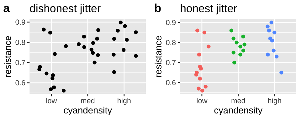
Figure 7.6: jittering can deceive (a), but reasonable precautions prevent this deception (b).
7.5.1.1 Making Honest figures: Notify your audience of nonlinear scales
Now let us take a look at variability in mammal lifespan across species as a function of the species bodyweight. Log-transforming these data can reveal patterns (compare Fig. 7.7b to Fig. 7.7a), but make it clear to the reader that the data are presented on a log scale (That why Fig. 7.7c is the best), so that they do not quickly look at a plot and interpret relationships linearly. The annotation_logticks can help alert readers to the fact that we’re in logscale. Note that we make this log-log plot with the scale_x_continuous() and scale_y_continuous() functions to retain linear numbers but show the data on a log scale.
mammal_lifespan <- read_tsv("http://www.statsci.org/data/general/sleep.txt") # because it is tab delimitted
plotc <- ggplot(mammal_lifespan , aes(x= BodyWt, y = LifeSpan, ))+
  geom_point()+
  scale_x_continuous(trans = "log10")+
  scale_y_continuous(trans = "log10")+
  annotation_logticks(sides = "bl",base = 10, size = .2)+ # put log ticks on bottom "b" and left )
  labs(title = "log10 scale (w. warning)")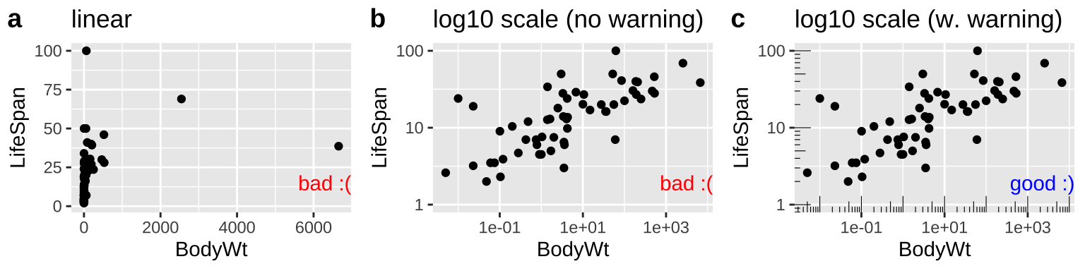
Figure 7.7: Figure a hides the pattern. b log transforms both axes to reveal the log linear relationship, but only a careful reader would notice the axes increase on a \(log_{10}\) scale. c reveals the patterns and notifies the reader that the plot is on \(log_{10}\) scale.
7.5.2 Show your data to be transparent
By showing your data, we mean show the actual data, rather than simply showing means and standard errors, or boxplots. Fortunately, if you start with raw data, R makes it pretty hard to hide it. So long as you give ggplot raw data, most ggplot geoms will show the data. However there are a few things to consider.
Don’t hide your data by overplotting
In Section @(ref:goodplots) we said to avoid overplotting – the hiding of your data by piling too many data points on top of one another.
With a modest sized data set, like the daphnia_resistance data, a simple jitterplot can show data hidden by overplotting (compare Fig. 7.8a to Fig. 7.8b). Remember to adjust the width and height arguments in geom_jitter to make an honest jitterplot.
daphnia_points <- ggplot(daphnia_resist, aes(x = cyandensity, y = resistance, color =  cyandensity))  +
  geom_point(show.legend = FALSE)+
  scale_y_continuous(limits = c(0,1))+
  labs(title = "points hide data")

daphnia_jitter <- ggplot(daphnia_resist, aes(x = cyandensity, y = resistance, color =  cyandensity))  +
  geom_jitter(height = 0, width = .2, show.legend = FALSE)+
  scale_y_continuous(limits = c(0,1))+
labs(title = "jitter shows data").](Applied_Biostats_2022_files/figure-html/jitterp-1.png)
Figure 7.8: When points are on top of each other we cannot see all the data (a). Spread the data out with geom_jitter().
With a larger data set, avoiding overplotting requires more effort. So, while plotting points hides the distribution in the price of diamonds of a given clarity, a simple jitter does not make things much better. Three common solutions to this problem are
- Show the distribution of the data as a violin plot. (I don’t like this because it still hides the data).
- Increase the transparency of points by changing
alphaingeom_jitter().
- Make a sinaplot (with the
geom_sina()function in theggforcepackage). A sina plot is like a violin plot made of data.
Figure 7.9 shows both bad (Fig. 7.9a:c) and good (Fig. 7.9d:e) solutions to this problem. If none of these work for your data, check out Chapter 5 of the R graphics cookbook (Chang 2020).
library(ggforce)
base_diamond <- ggplot(diamonds, aes(x = clarity, y = price))

plot_a <- base_diamond + geom_point()  + labs(title = "geom_point")
plot_b <- base_diamond + geom_violin() + labs(title = "geom_violin")
plot_c <- base_diamond + geom_jitter()  + labs(title = "geom_jitter")
plot_d <- base_diamond + geom_jitter(alpha = 0.0025) + labs(title = "geom_jitter(alpha = 0.0025)")
plot_e <- base_diamond + geom_sina(alpha = 0.0025) + labs(title = "geom_sina")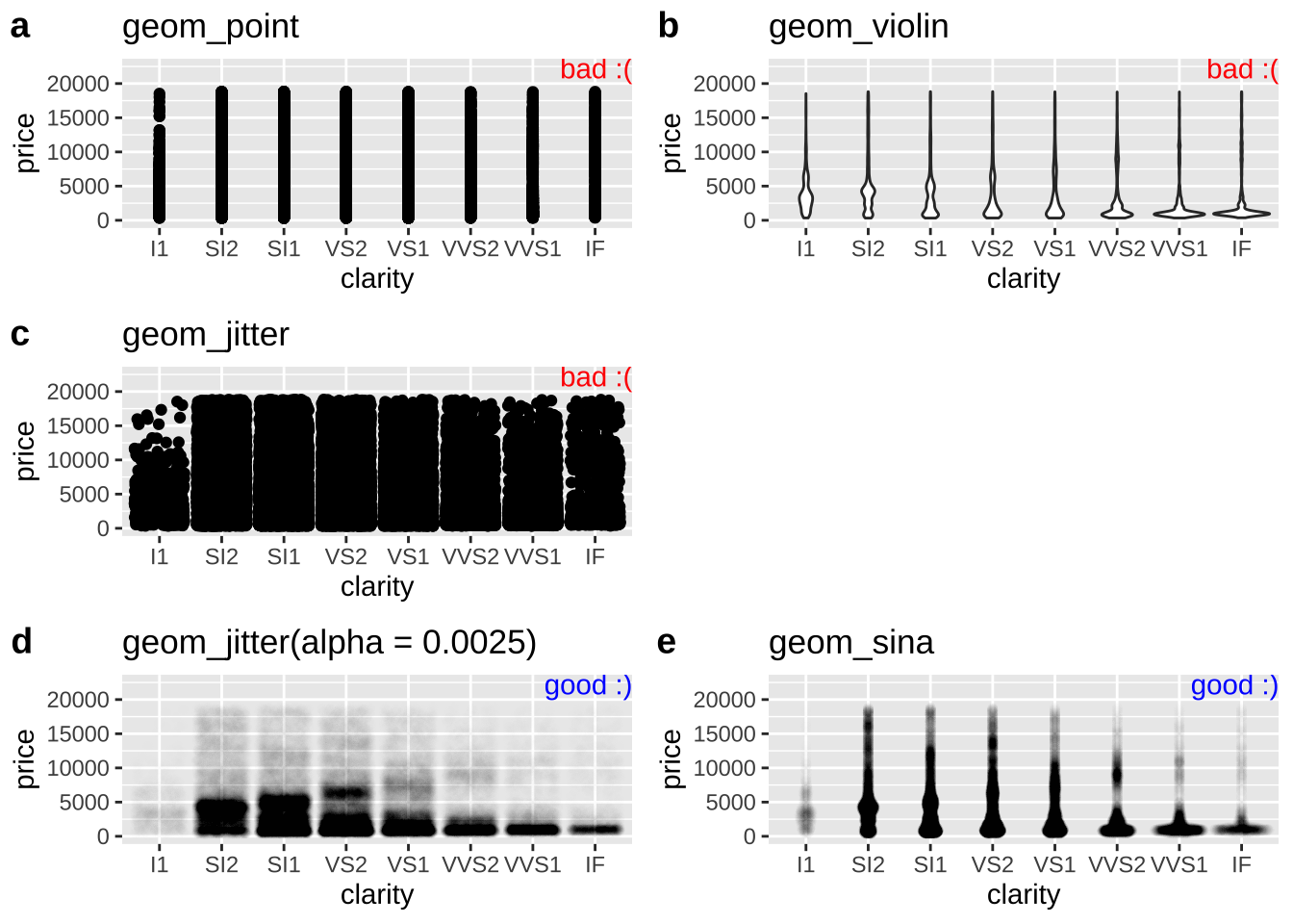
Figure 7.9: Tricks for dealing with dense overplotting. The value of alpha was found by trial and error, and the best choice for alpha will get closer to one as the density of data points decreases.
Don’t hide your data with a boxplot
As we will see when encountering the interquartile range in Chapter 8 boxplots show the quartiles of the data, adding a potentially useful visual summary to a plot. But, boxplots themselves are not a solution to overplotting (Fig. 7.10), and if geom_boxplot() is added after showing the data, the boxes will hide the data.
daphnia_boxplot_a <- ggplot(daphnia_resist, aes(x = cyandensity, y = resistance))  +
  geom_boxplot(outlier.color = NA) +   scale_y_continuous(limits = c(0,1))

daphnia_boxplot_b <- ggplot(daphnia_resist, aes(x = cyandensity, y = resistance))  +
  geom_jitter(width = .2, height = 0) +
  geom_boxplot(outlier.color = NA) +   scale_y_continuous(limits = c(0,1))

daphnia_boxplot_c <- ggplot(daphnia_resist, aes(x = cyandensity, y = resistance))  +
  geom_boxplot(outlier.color = NA) +
  geom_jitter(width = .2, height = 0) +   scale_y_continuous(limits = c(0,1))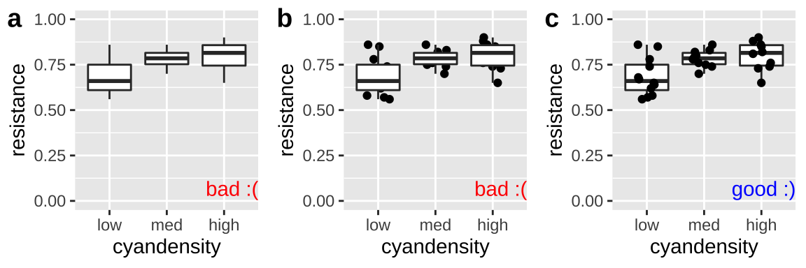
Figure 7.10: Plot c effectively shows the data and summarizes quantiles with a boxplot. The boxplots in a and b hide the data.
7.5.3 Supercharge your ggplot skills to make clear plots
ggplot is great for making clear, explanatory plots, but this requires a bunch of new tricks. Remember that clear plots are easy to interpret and help readers focus on patterns. Below I show some very useful R tricks to achieve these goals. There is a lot here, so I recommend skimming these to understand what you can do, rather than memorizing every trick. Again I strongly recommend the The R Graphics Cookbook (Chang 2020) as a great place to expand your tools.
7.5.3.1 Order categories sensibly
By default, R orders categorical variables alphabetically, which does not make any sense biologically.
Above we used the forcats package to order ordinals as we see fit. But what if there is no natural order for a categorical variable (i.e. it is nominal)? A great way to highlight patterns is to order categories from the greatest to the smallest mean.
Again the forcats package can help. We can use the fct_reorder function to reorder a factor by some other value. NOTE this alters our data before plotting so we do this via the mutate function.
After making Figure 7.11a with the default order of regions, we reorder region by mean student_ratio, in descending order and removing NA values to generate 7.11b with the same code as we used for 7.11a.
student_order_a <-  ggplot(df_ratios, aes(x = region, y = student_ratio, color = region)) +
  geom_jitter(alpha = .3,size = 2, height = 0, width = .15, show.legend = FALSE)+
  scale_y_continuous(limits = c(0,100))

df_ratios <- df_ratios %>%
  mutate(region = fct_reorder(region, student_ratio, mean, na.rm = TRUE,.desc = TRUE))

student_order_b <-  ggplot(df_ratios, aes(x = region, y = student_ratio, color = region)) +
  geom_jitter(alpha = .3,size = 2, height = 0, width = .15, show.legend = FALSE)+
  scale_y_continuous(limits = c(0,100))

plot_grid(student_order_a, student_order_b, labels = c("a","b")) to order nominal categories by a numerical summary. Using the df_ratios data available [here](https://raw.githubusercontent.com/ybrandvain/biostat/master/data/df_ratios.csv).](Applied_Biostats_2022_files/figure-html/fctreorder-1.png)
Figure 7.11: Use fct_reorder to order nominal categories by a numerical summary. Using the df_ratios data available here.
7.5.3.2 Make clear labels
There are a few ways labels can be unclear:
- Labels can run over one another making the hard to read.
- By default, labels take the name of their column in a tibble, but often this is a handy shortcut, not a descriptive name.
- Labels can be missing altogether.
Here is how we can solve these problems in R.
Preventing labels from running over one another
Let us return to our example of variability in student to faculty ratios from Chapter 6. There we noticed that region names ran over each other, and we could fix this by rotating the axes, or ever better, by flipping our coordinates. Figure 7.12 shows how you do this in R.
student_plot_a <- ggplot(df_ratios, aes(x = region, y = student_ratio, color = region)) +
  geom_jitter(alpha = .3,size = 2, height = 0, width = .15, show.legend = FALSE)+
  scale_y_continuous(limits = c(0,100))

student_plot_b <- student_plot_a +
  theme(axis.text.x = element_text(angle = 90))

student_plot_c <- student_plot_a +
  coord_flip()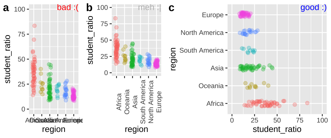
Figure 7.12: Plot c effectively shows the x-axis labels.
Make more descriptive labels
We often want plots with more descriptive labels than we want to type in our data analysis. You can override the defaults labels with the labs() function. You can add math and Greek by using the expression function (Fig 7.13).
student_plot_c   +
labs(y = expression(paste('Students per faculty (', rho, " = ", frac('#  students','#faculty'),")")))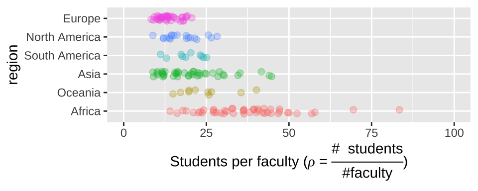
Figure 7.13: Customized labels.
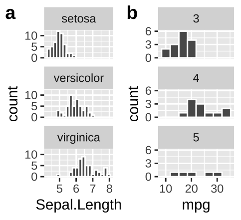
Add labels to facets when ambiguous
- In
irisan educated reader could deduce that the facets designate the species.
- Maybe a reader who knew a lot about cars could guess that the facet in b referred to the number of gears in the car, but I would not have guessed that.
We do not want our readers guessing. At best this is frustrating for them and at worst they guess wrong. We could note the labels in the legend, but that would add to the reader’s cognitive load. Best to include this information in the facet with the labeller function in facet_wrap (Fig. 7.14).
ggplot(mtcars, aes(x = mpg)) +
  geom_histogram(bins = 8, color = "white")+
  facet_wrap(~gear, ncol = 1, labeller = label_both)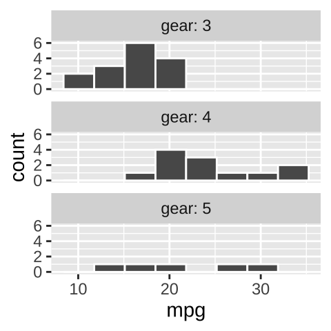
Figure 7.14: Use labeller to add labels to your facets.
7.5.3.3 Add annotations, text, summaries, and lines to point out patterns
This part is very fun, but invites two common pitfalls:
It can be a big time sink.
You can add too much and overwhelm the reader.
We can add statistical summaries, guiding lines, and other useful information to help the reader get more from our plot. For example, in Figure 7.15, we:
- Add the mean and 95% bootstrapped confidence interval for each region by giving the
mean_cl_bootcommand to thestat_summary()function, showing the readers our estimates and uncertainty in them.
- Use
hlineto add a horizontal line (we can also usevline()for a vertical line) to show the overall mean.
- Used the
annotate()function to add the word “mean” above the dashed line to point out that the dashed line shows the mean.
- Used the
geom_textfunction to add text to data points. Note that rather than showing every country, we filtered the data for the countries with the largest and smallest student ratios in Africa, and exceptionally variable region. We did so using our standarddplyrtools (from chapter 3), starting with the data we initially gave ggplot (represented by the.).
ggplot(df_ratios, aes(x = region, y = student_ratio, color = region)) +
  geom_jitter(alpha = .3,size = 2, height = 0, width = .15, show.legend = FALSE)+
  scale_y_continuous(limits = c(0,100)) +
  stat_summary(fun.data = mean_cl_boot, color ="black")+
  geom_hline( yintercept = summarise(df_ratios, mean(student_ratio, na.rm = TRUE)) %>% pull(), lty = 2 )+ # lty = 2 asks for a dashed line
  annotate(x = 3.5, y = 28, label = "mean", geom = "text", size = 3)+
  geom_text(data = . %>%
              filter(region == "Africa") %>%
              filter(student_ratio == max(student_ratio, na.rm = TRUE) |
                       student_ratio == min(student_ratio, na.rm = TRUE)  ),
            aes(label = country), size =3, hjust = 0, show.legend = FALSE)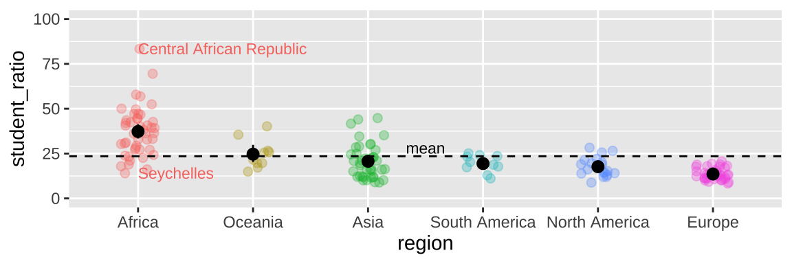
Figure 7.15: Sprucing up our figure!
7.5.3.4 Use direct labeling
There are a bunch of ways to add direct labels. The easiest way is with the annotate() function, introduced above.
But a slicker way is to use geom_text() and summarize your data on the fly (we introduce this in the next chapter).
ggplot(iris, aes(x = Sepal.Length, y = Petal.Length, color = Species)) +
  geom_point(alpha = .2)+
  geom_text(data = . %>%
              group_by(Species) %>%
              summarise_at(c("Sepal.Length", "Petal.Length"), mean),
              aes(label = Species), fontface = "bold")+
  theme(legend.position = "none")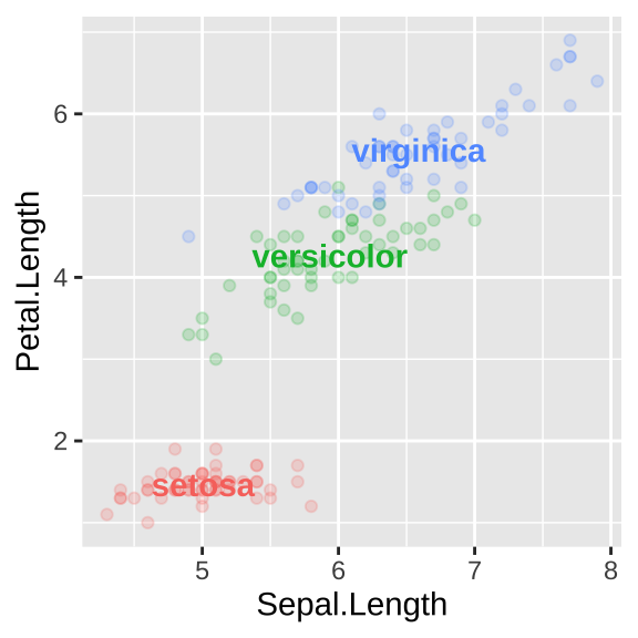
Figure 7.16: Direct labelling
7.5.3.5 Add groups to avoid confusion
R does not naturally know what comes in groups. So, for example, if we are plotting weight of baby chicks on different diets over time (Fig 7.17), or bacterial growth rates over time, we need to tell R to group by bird, or bacteria plate or whatever, otherwise, we get nonsensical plots (e.g. Fig. 7.17a).
In Figure 7.17b, we add groups = Chick in the main aes call when we set up our ggplot.
In Figure 7.17c, we add groups = Chick only to geom_point aes because we want to show how mean chick weight changes over time for each diet.
I include a bit more details on sprucing up plot_grid for the curious.
ChickWeight <- mutate(ChickWeight , Diet = factor(Diet)) # letting R know diet is categorical

chick_plot_a <- ggplot(ChickWeight, aes(x = Time, y = weight, color = Diet))+
     geom_line()

chick_plot_b <- ggplot(ChickWeight, aes(x = Time, y = weight, group = Chick, color = factor(Diet)))+
     geom_line(alpha = .8)

chick_plot_c <-  ggplot(ChickWeight, aes(x = Time, y = weight, color = factor(Diet)))+
     geom_line(aes(group = Chick), alpha = .3)+
     stat_summary(fun= mean, geom = "line", size = 2,alpha = .7)

chick_plots <- plot_grid(chick_plot_a + theme(legend.position = "none") + annotate(x = -Inf, y = Inf, color = "red", label = "bad :(", geom = "text", hjust = -1, vjust = 1) ,
                         chick_plot_b + theme(legend.position = "none") + annotate(x = -Inf, y = Inf, color = "blue", label = "better :|", geom = "text", hjust = -1, vjust = 1),
                         chick_plot_c + theme(legend.position = "none")+ theme(legend.position = "none") + annotate(x = -Inf, y = Inf, color = "blue", label = "better :|", geom = "text", hjust = -1, vjust = 1),
                         labels = c("a","b","c"), nrow = 1)

chick_legend <- get_legend(chick_plot_c + theme(legend.position = "bottom"))

plot_grid(chick_plots,chick_legend, rel_heights = c(8,2), nrow =2)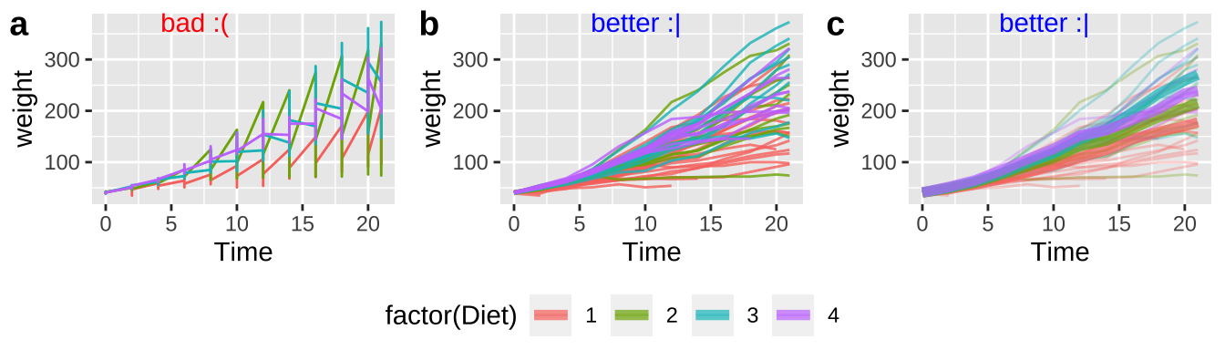
Figure 7.17: Use the groups arguments in aes to keep repeated observations on a single entity together
7.5.3.6 Think about colors
Just like our data type should guide our choices of plot, our data type should guide our color scheme for mapping color onto a variable.
- Use continuous color palettes for continuous variables.
- Use sequential color schemes for ordinal variables.
- Use qualitative color schemes for nominal variables.
I have spent too much of my life choosing colors for plots. I suggest simplifying this choice by using the colorspace package. This package has a range of color schemes you can choose from, and all are meant to minimize confusion for readers with a color vision deficiency. I show how to use this package in Figure 7.18.
library(colorspace)
color_a <- chick_plot_c +
  scale_color_discrete_qualitative(palette = "Harmonic")+
  theme(legend.position = "bottom")+
  labs(title = "Discrete qualitative palettes\nfor nominal variables")

color_b <- mammal_lifespan  %>%
  mutate(Danger = factor(Danger)) %>%  # letting R know Danger is categorical
  ggplot(aes(x= BodyWt, y = LifeSpan,  color = Danger))+
  geom_point(size = 3,alpha = .6)+
  scale_x_continuous(trans = "log10")+
  scale_y_continuous(trans = "log10")+
  annotation_logticks(sides = "bl",base = 10, size = .2)+
  scale_color_discrete_sequential(palette = "Viridis")+
  theme(legend.position = "bottom")+
  labs(title = "Discrete sequential (or diverging)\npalettes for nominal variables")

color_c <- ggplot(mammal_lifespan , aes(x= BodyWt, y = LifeSpan, color = Gestation))+
    geom_point(size = 3,alpha = .6)+
    scale_x_continuous(trans = "log10")+
    scale_y_continuous(trans = "log10")+
    annotation_logticks(sides = "bl",base = 10, size = .2)+
    scale_color_continuous_sequential(palette = "Hawaii")+
    theme(legend.position = "bottom")+
    labs(title = "Continuous sequential (or diverging)\npalettes for nominal variables")

plot_grid(color_a,color_b,color_c, labels = letters[1:3], ncol=2) to specify colors.](Applied_Biostats_2022_files/figure-html/coloR-1.png)
Figure 7.18: Using colorspace to specify colors.
Check out the available palettes and which types of variables they accompany here!
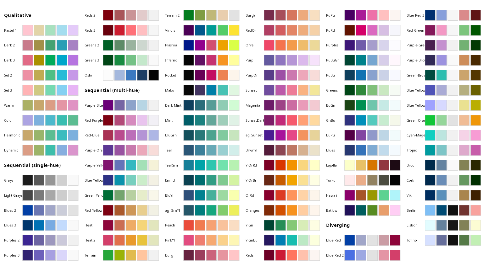](http://colorspace.r-forge.r-project.org/articles/ggplot2_color_scales_files/figure-html/hcl-palettes-1.png)
Figure 7.19: palettes from colorspace
If you are interested in specifying a few colors yourself you can use the scale_color_manual(vals = <vectors of colors>) function where <vector of colors> is the colors you want (e.g. scale_color_manual(vals = c("red", "blue")) will have the first category in red and the second in blue). If you want to have more fun (but likely have harder to read figures), you can try the beyonce or wesanderson packages which have their own color palettes.
7.5.3.7 Avoid distractions
Luckily, R makes adding distracting backgrounds/graphics, 3D, animation, glass slippers and ducks somewhat challenging. But there are enough R packages to make anything possible, and adding these features can be fun. So before adding fancy decorations to a plot, think hard about if you are adding critical information and capturing the attention of readers, or if you are distracting them.
7.5.4 Accessibility and Universal Design
In chapter 6 we discussed the advantages of universal design - so how do we achieve this in R?
7.5.4.1 Consider color vision deficiency
Think of people with color vision deficiency when picking colors
The main reason I pointed out the colorspace package is because they have already picked palettes with accessibility in mind.
Use color vision deficiency emulators to make sure your colors are accessible
Regardless, it is worth checking if your figures are accessible for people with color vision deficiency. We previously checked out an online color vision deficiency emulator. Alternatively you can use the colorblindr package in R as a color vision deficiency emulator.
Use direct labeling to make figures accessible
See above.
7.5.4.2 Modify size of text and points to make figures accessible
We have already discussed changing size in e.g. geom_point() or in theme() (perhaps using ggThemeAssist).
7.5.4.3 Use redundant coding to make figures accessible
Colors can be tough to distinguish (or people might print in black and white). Redundancy in presentation provides readers with multiple opportunities to take the message in. I show some examples in Fig. 7.20:
- Danger is shown by shape and color.
- Danger is shown by shape and color, but shape is made to be a number from one to five, decreasing the reader’s cognitive burden.
- Gestation time is shown by both the size and color of the points.
redundant_coding_a <- mammal_lifespan  %>%
  mutate(Danger = factor(Danger)) %>%  # letting R know Danger is categorical
  ggplot(aes(x= BodyWt, y = LifeSpan,  color = Danger, shape = Danger))+
  geom_point(size = 3,alpha = 1)+
  scale_x_continuous(trans = "log10")+
  scale_y_continuous(trans = "log10")+
  annotation_logticks(sides = "bl",base = 10, size = .2)+
  scale_color_discrete_sequential(palette = "Viridis")+
  theme(legend.position = "bottom")+
  theme_light()

 redundant_coding_b <- redundant_coding_a+
  scale_shape_manual(values = as.character(1:5)) +
  theme(legend.text = element_blank())


 redundant_coding_c <- ggplot(mammal_lifespan , aes(x= BodyWt, y = LifeSpan, color = Gestation, size = Gestation))+
    geom_point(alpha = .6)+
    scale_x_continuous(trans = "log10")+
    scale_y_continuous(trans = "log10")+
    annotation_logticks(sides = "bl",base = 10, size = .2)+
    scale_color_continuous_sequential(palette = "Hawaii")+
  theme_light()

plot_grid(redundant_coding_a, redundant_coding_b, redundant_coding_c, labels = letters[1:3], ncol=2) 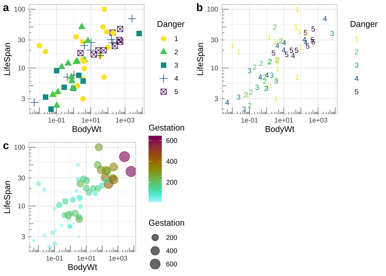
Figure 7.20: Redundant coding provides readers numerous ways to get the message.
Figure 7.21: Watch this video from Stat 545, about making nicer ggplots (7 min and 25 sec). Note that he uses a slightly differe way to use log scale than I showed. No worries, there is more than one right way to do thing in R.
7.6 Extra style
Here, I shout out a few stylistic options to further customize your ggplots that I have used above.
7.6.1 Place your legend
Above we used the legend.position argument in theme() to place a legend on the bottom of a plot. But we can have way more control – play with ggthemeassist to see!
7.6.2 Pick your theme
The default theme for ggplot is not for everyone. Spice up your plot with other themes. I introduced theme_light() above. Other themes come standard with ggplot, and the ggthemes package has even more (Fig. 7.22). You can even make your own theme!
.](images/themes.jpeg)
Figure 7.22: Themes in ggthemes. From Hiroaki Yutani.