Chapter 4 Transforming Variables
4.1 Get Ready
If you want to work through the examples as you read this chapter, make sure to load the descr and Hmisc libraries and the states20.rda and anes20.rda data files. You may have to install the packages if you have not done so already. You’ve used the descr package before, and the Hmisc package is a nice addition that provides a wide variety of functions. In this chapter, we use cut2, a function from Hmisc that helps us collapse numeric variables into a few binned categories. When loading the data sets, you do not need to include the file path if the files are in your working directory.
4.2 Introduction
Before moving on to other graphing and statistical techniques, we need to take a bit of time to explore ways in which we can use R to work with the data to make it more appropriate for the tasks at hand. Some of the things we will do, such as assigning simpler, more intuitive names to variables and data sets, are very basic, while other things are a bit more complex, such as reordering the categories of a variable and combining several variables into a single variable. Everything presented in this chapter is likely to be of use to you in your course assignments and, if you continue on with data analysis, at some point in the future.
4.3 Data Transformations
When working with a data set, even one you put together yourself, it is almost always the case that you will need to change something about the data in order to use it more effectively. Maybe there is just one variable you need to modify in some way, or there could be several variables that need some attention, or perhaps you need to modify the entire data set. Not to fear, though, as these modifications are usually straightforward, especially with practice, and they should make for better research.
Don’t Forget Script Files. As suggested before, one very important part of the data transformation process is record keeping. It is essential that you keep track of the transformations you make. This is where script files come in handy. Save a copy of all of the commands you use by creating and saving a script file in the Source window of RStudio (see Chapter 2 if this is unfamiliar to you). At some point, you are going to have to remember and possibly report the transformations you make. It could be when you turn in your assignment, or maybe when you want to use something you created previously, or perhaps when you are writing a final paper. You cannot and should not just work from memory. Keep track of all changes you make to the data.
4.4 Renaming and Relabeling
Changing Variable Names. One of the simplest forms of data transformation is renaming objects. Sometimes, the data sets we use have what seem like cumbersome variable naming conventions, and it might be easier to work with the data if we renamed the variables. For instance, in the previous chapter, we worked with two variables from the 2020 ANES measuring spending preferences, V201314x (welfare programs) and V201320x (aid to the poor). At some level, these variable names are useful because they are relatively short, but at the same time, they can be hard to use because they have no inherent meaning as variable labels. Let’s face it, “V201314x” might as well be “Vgibberish” for most new users of the ANES surveys. For experienced users, that may not be the case, as “V20” identifies the variable as coming from the 2020 election study, variables in the 1300-range are generally of a type (issue variables), and variables ending in “x” are summary variables that combine responses from previous variables. This is well and good, but for most users it is helpful to use variable names that reflect the content of the variables. This is an easy thing to do and a good place to start learning about transformations. All you have to do is copy the old variables to new objects and use substantively descriptive names for the new objects, as below.
#Copy spending variables into new variables with meaningful names
anes20$welfare_spnd<-anes20$V201314x
anes20$poor_spnd<-anes20$V201320x
In these commands, we are literally telling R to take the contents of the two spending preference variables and put then into two new objects with different names (note the use of <-). One important thing to notice here is that when we created the new variables they were added to the anes20 data set. This is important because if we had created stand alone objects (e.g., welfare_spnd<-anes20$V201314x), they would exist outside the anes20 data set and we would not be able to use any of the other anes20 variables to analyze outcomes on the new variables. For instance, we would not be able to look at the relationship between religiosity and support for welfare spending if the new object was saved outside of the anes20 data set because there would be no way to connect the responses of the two variables.
It is always important to check your work. I’ve lost track of the number of times I thought I had transformed a variable correctly, only to discover later that I had made a silly mistake. A quick look at frequencies of the old and new variables confirms that we have created the new variables correctly.
#Original "Aid to poor"
table(anes20$V201320x)
   1. Increased a lot 2. Increased a little      3. Kept the same
                 2560                  1617                  3213
4. Decreased a little   5. Decreasaed a lot
                  446                   389
#New "Aid to poor"
table(anes20$poor_spnd)
   1. Increased a lot 2. Increased a little      3. Kept the same
                 2560                  1617                  3213
4. Decreased a little   5. Decreasaed a lot
                  446                   389
#Original "Welfare"
table(anes20$V201314x)
   1. Increased a lot 2. Increased a little      3. Kept the same
                 1289                  1089                  3522
4. Decreased a little   5. Decreasaed a lot
                 1008                  1305
#New "Welfare"
table(anes20$welfare_spnd)
   1. Increased a lot 2. Increased a little      3. Kept the same
                 1289                  1089                  3522
4. Decreased a little   5. Decreasaed a lot
                 1008                  1305
It looks like everything worked the way it was supposed to work; the outcomes for the new variables look exactly like the outcome for their original counterparts.
Let’s do this with a couple of other variables from anes20, the party feeling thermometers. These variables are based on questions that asked respondents to rate various individuals and groups on a 0-to-100 scale, where a rating of 0 means you have very cold, negative feelings toward the individual or group, and 100 means you have very warm, positive feelings. In some ways, these sound like ordinal variables, but, owing to the 101-point scale, the feeling thermometers are frequently treated as numeric variables, as we will treat them here. The variable names for the Democratic and Republican feeling thermometer ratings are anes20$V201156 and anes20$V201157, respectively. Again, these variable names do not exactly trip off the tongue, and you are probably going to have to look them up in the codebook every time you want to use one of them. So, we can copy them into new objects and give them more substantively meaningful names.
First, let’s take a quick look at the distributions of the original variables:
#This first bit tells R to show the graphs in one row and two columns
par(mfrow=c(1,2))
hist(anes20$V201156,
     xlab="Rating",
     ylab="Frequency",
     main="V201156")
hist(anes20$V201157,
     xlab="Rating",
     ylab="Frequency",
     main="V201157")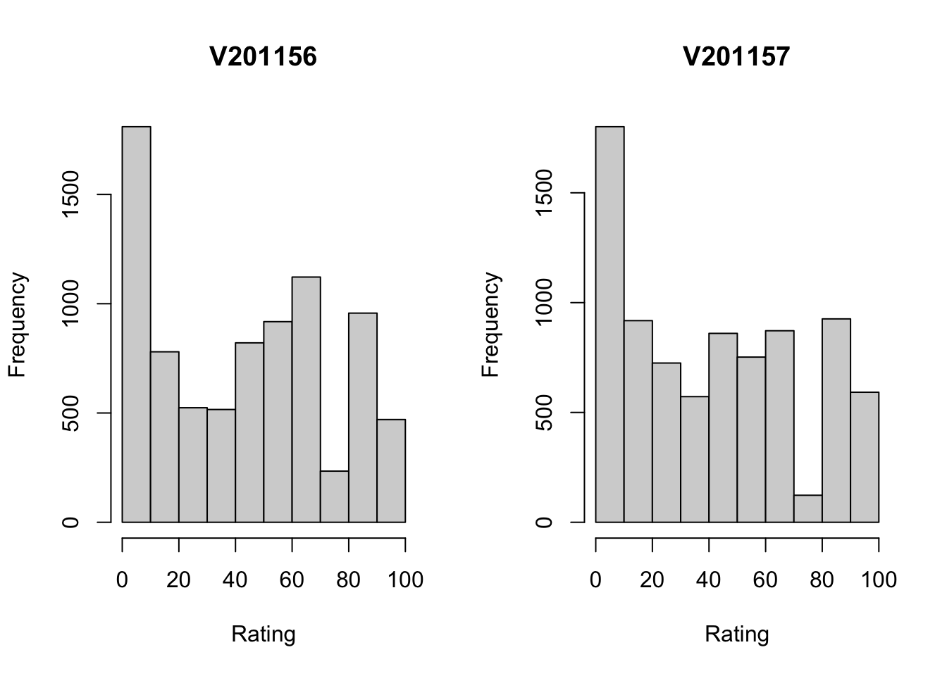
#This last bit tells R to return to showing graphs in one row and one column
par(mfrow=c(1,1))
The first thing to note is how remarkably similar these two distributions are. For both the Democratic (left side) and Republican Parties, there is a large group of respondents that registers very low ratings (0-10 on the scale), and a somewhat even spread of responses along the rest of the horizontal axis. What’s also of note here is that the variable names used (by default) as titles for the graphs give you absolutely no information about what the variables are, as “V201165” and “V201157” have not inherent meaning.
As you now know, we can copy these variables into new variables with more meaningful names.
#Copy feeling thermometers into new variables
anes20$dempty_ft<-anes20$V201156
anes20$reppty_ft<-anes20$V201157
Now, let’s take a quick look at histograms for these new variables, just to make sure they appear the way they should.
#Histograms of feeling thermometers with new variable names
par(mfrow=c(1,2))
hist(anes20$dempty_ft,
     xlab="Rating",
     ylab="Frequency",
     main="dempty_ft")
hist(anes20$reppty_ft,
     xlab="Rating",
     ylab="Frequency",
     main="reppty_ft")
par(mfrow=c(1,1))Everything looks as it should, and the new variable names help us figure which graph represents which party without having to refer to the codebook to check the variable names.
4.4.1 Changing Attributes
Variable Class. When importing the anes20 data set, R automatically classified all non-numeric variables as factor variables. However, when doing this, no distinction was made between ordered and unordered factor variables. For instance, both federal spending variables are recognized as factor variables. Of course, they are factor variables, but they are also ordered variables.
#Check the class of spending preference variables
class(anes20$poor_spnd)
[1] "factor"class(anes20$welfare_spnd)[1] "factor"This may not make much difference, if the alphabetical order of categories matches the substantive ordering of categories, since the default is to sort the categories alphabetically. For instance, the alphabetical ordering of the categories for the spending preference variables is in sync with their substantive ordering because the categories begin with numbers. You can check this using frequencies or by using the levels function.
#Check the the category labels
levels(anes20$poor_spnd)
[1] "1. Increased a lot" "2. Increased a little" "3. Kept the same"
[4] "4. Decreased a little" "5. Decreasaed a lot" levels(anes20$welfare_spnd)[1] "1. Increased a lot" "2. Increased a little" "3. Kept the same"
[4] "4. Decreased a little" "5. Decreasaed a lot" However, this is not always the case, and there could be some circumstances in which R needs to formally recognize that a variable is “ordered” for the purpose of performing some function. It’s easy enough to change the variable class, as shown below, where the class of the two spending preference variables is changed to ordered:
#Change class of spending variables to "ordered"
anes20$poor_spnd<-ordered(anes20$poor_spnd)
anes20$welfare_spnd<-ordered(anes20$welfare_spnd)
Now, let’s double-check to make sure the change in class worked:
class(anes20$poor_spnd)[1] "ordered" "factor" class(anes20$welfare_spnd)[1] "ordered" "factor" These are now treated as ordered factors.
We should also do our due diligence and verify that the feeling thermometers are recognized as numeric.
#Check class of feeling thermometers
class(anes20$dempty_ft)
[1] "numeric"class(anes20$reppty_ft)[1] "numeric"All good with the feeling thermometers. But I knew this already because R would not have produced histograms for variables that were classified as factor variables. Occasionally, you may get an error message because the function you are using requires a certain class of data. For instance, if I try to get a histogram of anes20$poor_spnd, I get the following error: Error in hist.default(anes20$poor_spnd) : 'x' must be numeric. When this happens, check to make sure the variable is properly classified, and change the classification if it is not. If it is properly classified, then use a more appropriate function (barplot in this case).
Value Labels. Occasionally, it makes sense to modify the names of category labels. For instance, in anes20, many of the category labels are very long and make graphs and tables look a bit clunky. The developers of the ANES survey created long, descriptive labels as a way of being faithful to the response categories that were used in the survey itself, which is an important goal, but sometimes this doesn’t work well when displaying the data. You may recall that we already had to modify value labels when producing bar charts for the spending preference variables in Chapter 3 because the original labels were too long:
#names.arg is used to change category labels
barplot(table(anes20$V201320x),
        names.arg=c("Increase/Lot", "Increase", "Same", "Decrease",
                    "Decrease/Lot"),
        xlab="Increase or Decrease Spending on Aid to the Poor?",
        ylab="Number of Cases",
        main="Spending Preference")
In this case, we used names.arg to temporarily replace the existing value labels with shorter labels that fit on the graph. We can use the levels function to change these labels permanently, so we don’t have to add names.arg every time we want to create a bar chart. In addition to using the levels function to view value labels, we can also use it to change those labels. We’ll do this for both spending variables, applying the labels used in the names.arg function in the barplot command. The table below shows the original value labels and the replacement labels for the spending preference variables.
| Original | Replacement |
|---|---|
| 1. Increased a lot | Increase/Lot |
| 2. Increased a little | Increase |
| 3. Kept the same | Same |
| 4. Decreased a little | Decrease |
| 5. Decreased a lot | Decrease/Lot |
In the command below, we tell R to replace the value labels for anes20$poor_spnd with a defined set of alternative labels taken from Table 4.1.
#Assign levels to 'poor_spnd' categories
levels(anes20$poor_spnd)<-c("Increase/Lot","Increase","Same",
                            "Decrease","Decrease/Lot")
It is important that each of the labels is enclosed in quotation marks and that they are separated by commas. We can check our handiwork to make sure that the transformation worked:
#Check levels
levels(anes20$poor_spnd)
[1] "Increase/Lot" "Increase" "Same" "Decrease" "Decrease/Lot"Now, we can get a bar chart with value labels that fit on the horizontal axis without having to use names.arg. Note that the graph uses anes20$poor_spnd, which has the new labels, rather than the original variable, anes20$V201320x.
#Note that this uses new levels, not "names.arg"
barplot(table(anes20$poor_spnd),
        xlab="Increase or Decrease Spending on Aid to the Poor?",
        ylab="Number of Cases",
        main="Spending Preference")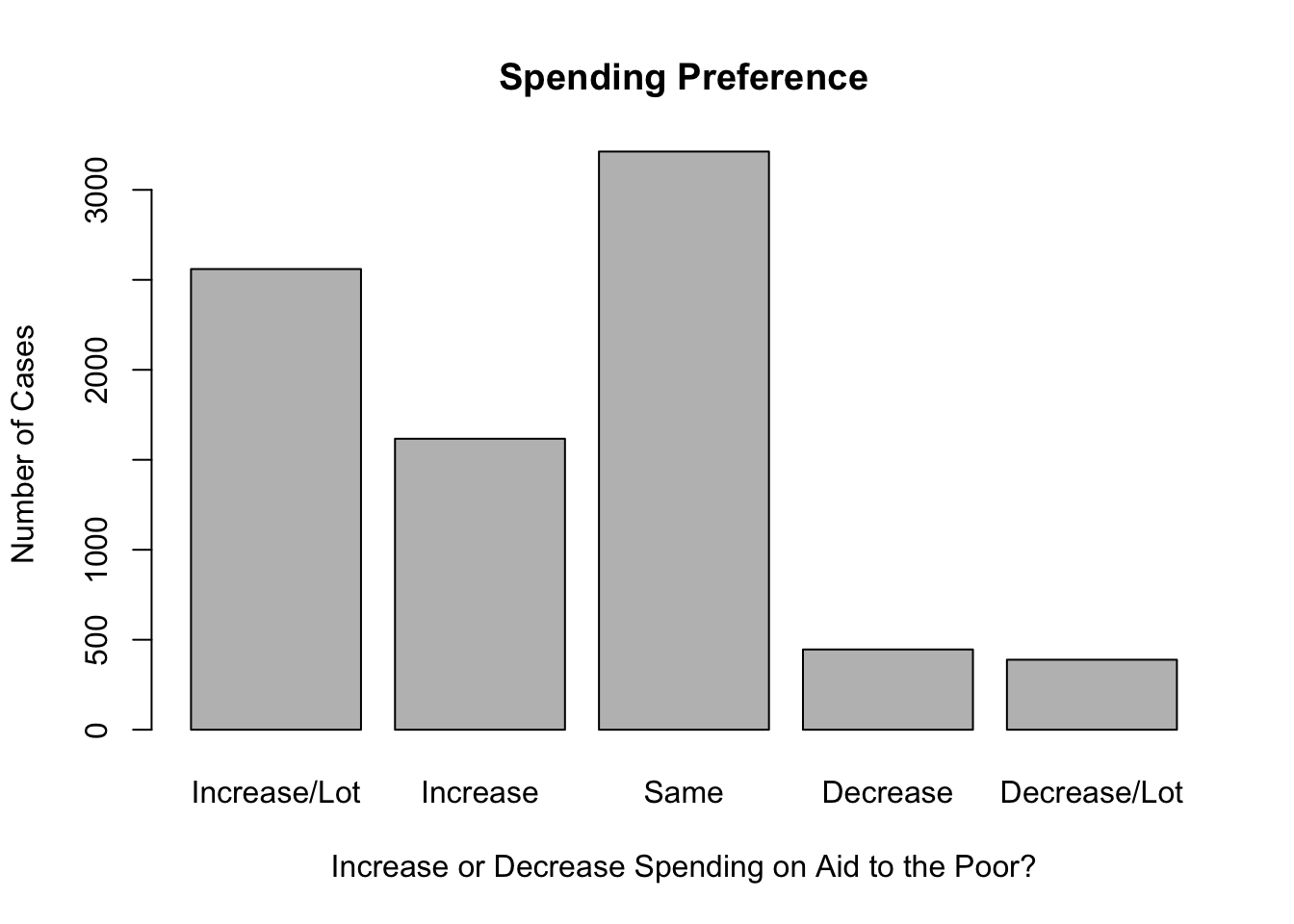
And we should also change the labels for anes20$welfare_spnd.
#Assign levels for 'welfare_spnd'
levels(anes20$welfare_spnd)<-c("Increase/Lot", "Increase", "Same",
                               "Decrease","Decrease/Lot")
#Check levels
levels(anes20$welfare_spnd)
[1] "Increase/Lot" "Increase" "Same" "Decrease" "Decrease/Lot"One very important thing that you should notice about how we changed these value labels is that we did not alter the value labels for the original variables (V201314x and V201320x); those variables still exist in their original form and have the original category labels. Instead, we created new variables and replaced their value labels. One of the first rules of data transformation is to never write over (replace) original data. Once you write over the original data and save the changes, those data are gone forever. If you make a mistake in creating the new variables, you can always create them again. But if you make a mistake with the original data and save your changes, you can’t go back and undo those changes.12
4.5 Collapsing and Reordering Catagories
Besides changing value labels, you might also need to alter the number of categories, or reorder the existing categories of a variable. Let’s start with the two spending preference variables, anes20$poor_spnd and anes20$welfare_spnd. These variables have five categories, ranging from preferring that spending be “increased a lot” to preferring that it be “decreased a lot.” Now, suppose we are only interested in three discrete outcomes, whether people want to see spending increased, decreased, or kept the same. We can collapse the “Increase/Lot” and “Increase” into a single category, and do the same for “Decrease/Lot” and “Decrease”, resulting in a variable with three categories, “Increase”, “Keep Same”, and “Decrease”. Since we know from the work above how the categories are ordered, we can tell R to label the first two categories “Increase”, the third category “Same”, and the last two categories “Decrease”. Let’s start by converting the contents of anes20$poor_spnd to a three-category variable, anes20$poor_spnd.3.13
#create new ordered variable with appropriate name
anes20$poor_spnd.3<-(anes20$poor_spnd)
#Then, write over existing five labels with three labels
levels(anes20$poor_spnd.3)<- c("Increase", "Increase", "Keep Same",
                               "Decrease", "Decrease")
#Check to see if labels are correct
barplot(table(anes20$poor_spnd.3),
        xlab="Spending Preference",
        ylab="Number of Respondents",
        main="Spending Preference: Aid to the Poor")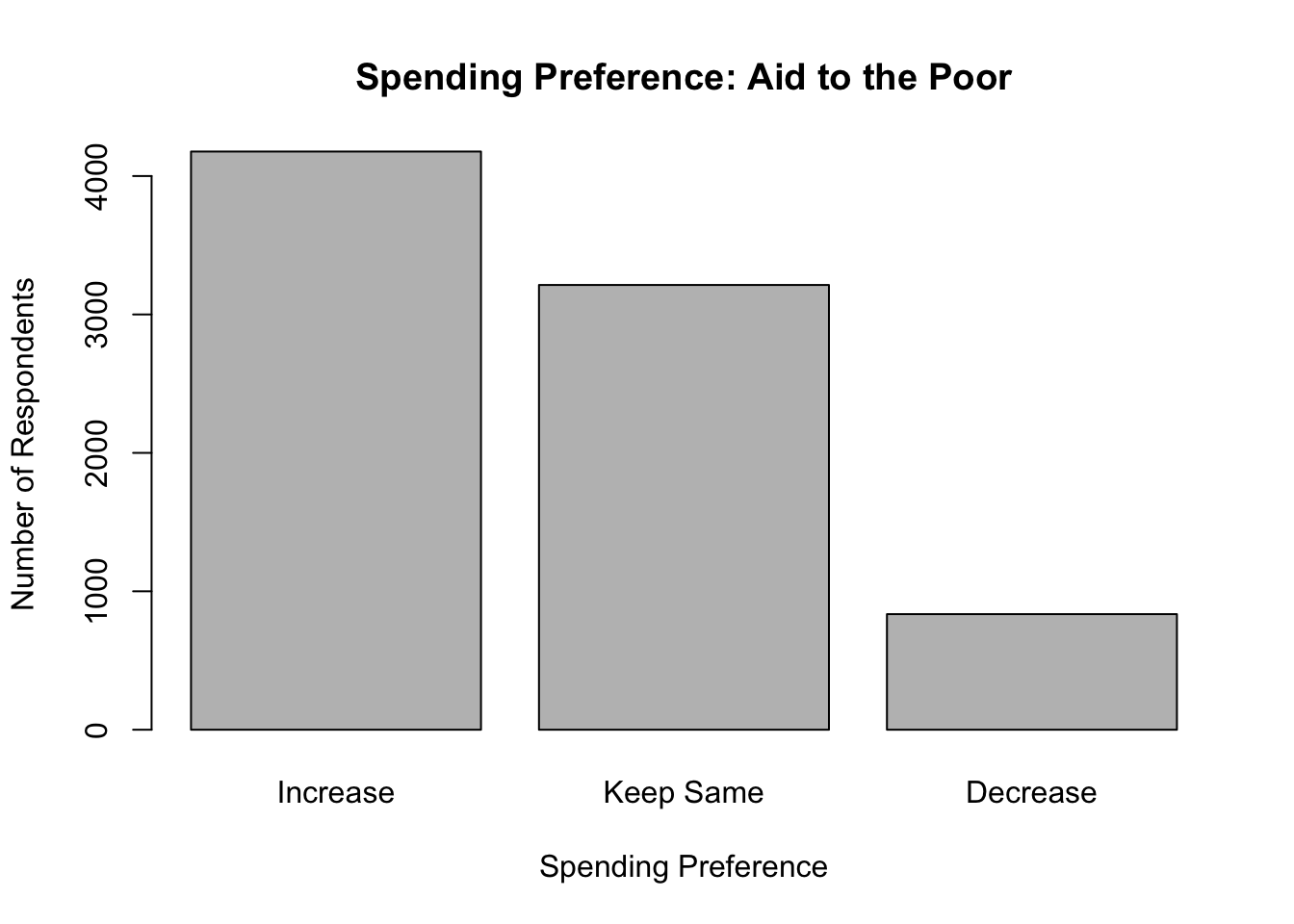
And we can do the same for welfare spending preferences:
#create new ordered variable with appropriate name
anes20$welfare_spnd.3<-(anes20$welfare_spnd)

#Then, write over existing five labels with three labels
levels(anes20$welfare_spnd.3)<- c("Increase", "Increase", "Keep Same",
                                  "Decrease", "Decrease")
#Check to see that the labels are correct
barplot(table(anes20$welfare_spnd.3),
        xlab="Spending Preference",
        ylab="Number of Respondents",
        main="Spending Preference: Welfare Programs")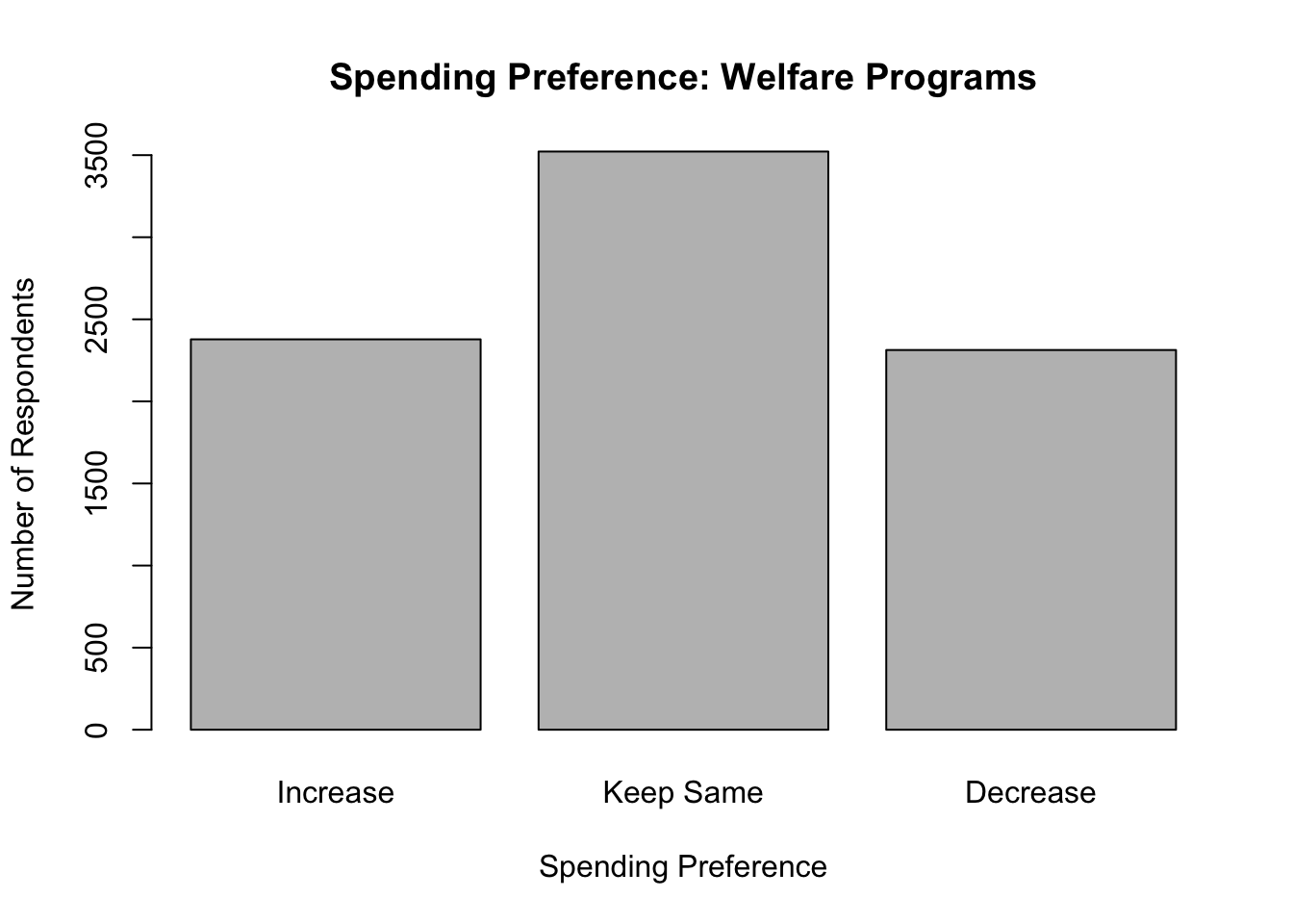
Using three categories clarifies things a bit, but you may have noticed that while the categories are ordered, there is a bit of disconnect between the magnitude of the labels and their placement on the horizontal axis. The ordered meaning of the label of the first category (Increase) is greater than the meaning of the label of the third category (Decrease). In this case, moving from the lowest to highest listed categories corresponds with moving from the highest to lowest labels, in terms of ranked meaning. Technically, this is okay, as long as you can keep it straight in your head, but it can get a bit confusing, especially if you are talking about how outcomes on this variable are related to outcomes on other variables. Fortunately, we can reorder the categories to run from the intuitively “low” value (Decrease) to the intuitively “high” value (Increase).
Let’s do this with poor_spnd.3 and welfare_spnd.3, and then check the levels afterwords. Here, we use ordered to instruct R to use the order of labels specified in the level command. Note that we must use already assigned labels, but can reorder them.
#Use 'ordered' and 'levels' to reorder the categories
anes20$poor_spnd.3<-ordered(anes20$poor_spnd.3,
                            levels=c("Decrease", "Keep Same", "Increase"))

#Use 'ordered' and 'levels' to reorder the categories
anes20$welfare_spnd.3<-ordered(anes20$welfare_spnd.3,
                               levels=c("Decrease", "Keep Same", "Increase"))
#Check the order of categories
levels(anes20$poor_spnd.3)
[1] "Decrease" "Keep Same" "Increase" levels(anes20$welfare_spnd.3)[1] "Decrease" "Keep Same" "Increase" The transformations worked according to plan and there is now a more meaningful match between the label names and their order on graphs and in tables when using these variables.
Sometimes, it is also necessary to reorder categories because the original order makes no sense, given the nature of the variable. Let’s use anes20$V201354, a variable measuring whether respondents favor or oppose voting by mail, as an example.
#Frequency of "vote by mail" variable
freq(anes20$V201354, plot=F)
PRE: Favor or oppose vote by mail
Frequency Percent Valid Percent
1. Favor 2142 25.8696 25.93
2. Oppose 3083 37.2343 37.32
3. Neither favor nor oppose 3036 36.6667 36.75
NA's 19 0.2295
Total 8280 100.0000 100.00Here, you can see there are three categories, but the order does not make sense. In particular, “Neither favor nor oppose” should be treated as a middle category, rather than as the highest category. As currently constructed, the order of categories does not consistently increase or decrease in the level of some underlying scale. It would make more sense for this to be scaled as either “favor-neither-oppose” or “oppose-neither-favor.” Given that “oppose” is a negative term and “favor” a positive one, it probably makes the most sense for this variable to be reordered to “oppose-neither-favor.”
First, let’s create a new variable name, anes20$mail, and replace the original labels to get rid of the numbers and shorten things a bit before we reorder the categories.
#Create new variable
anes20$mail<-(anes20$V201354)
#Create new labels
levels(anes20$mail)<-c("Favor", "Oppose", "Neither")
#Check levels
levels(anes20$mail)
[1] "Favor" "Oppose" "Neither"Now, let’s reorder these categories to create an ordered version of anes20$mail and then check our work.
#Reorder categories
anes20$mail<-ordered(anes20$mail,
                     levels=c("Oppose", "Neither", "Favor"))
#Check Levels
levels(anes20$mail)
[1] "Oppose" "Neither" "Favor" #Check Class
class(anes20$mail)[1] "ordered" "factor" Now we have an ordered version of the same variable that will be easier to use and interpret in the future.
4.6 Combining Variables
It is sometimes very useful to combine information from separate variables to create a new variable. For instance, consider the two feeling thermometers, anes20$dempty_ft and anes20$reppty_ft. Rather than examining each of these variables separately, we might be more interested in how people rate the parties relative to each other based on how they answered both questions. One way to do this is to measure the net party feeling thermometer rating by subtracting respondents’ Republican Party rating from their Democratic Party rating. These sort of mathematical transformations are possible when working with numeric data.
#Subtract the Republican rating from the Democratic rating,
# and store the result in a new variable.
anes20$netpty_ft<-(anes20$dempty_ft-anes20$reppty_ft)
Positive values on the anes20$netpty_ft indicate a higher rating for Democrats than for Republicans, negative values indicate a higher Republican rating, and values of 0 indicate that the respondent rated both parties the same. We can look at a histogram of this variable to get a sense of its distribution.
#Get histogram of 'netpty_ft'
hist(anes20$netpty_ft,
     xlab="Democratic Rating MINUS Republican Rating",
     ylab="Number of Respondents",
     main="Net Feeling Thermometer Rating")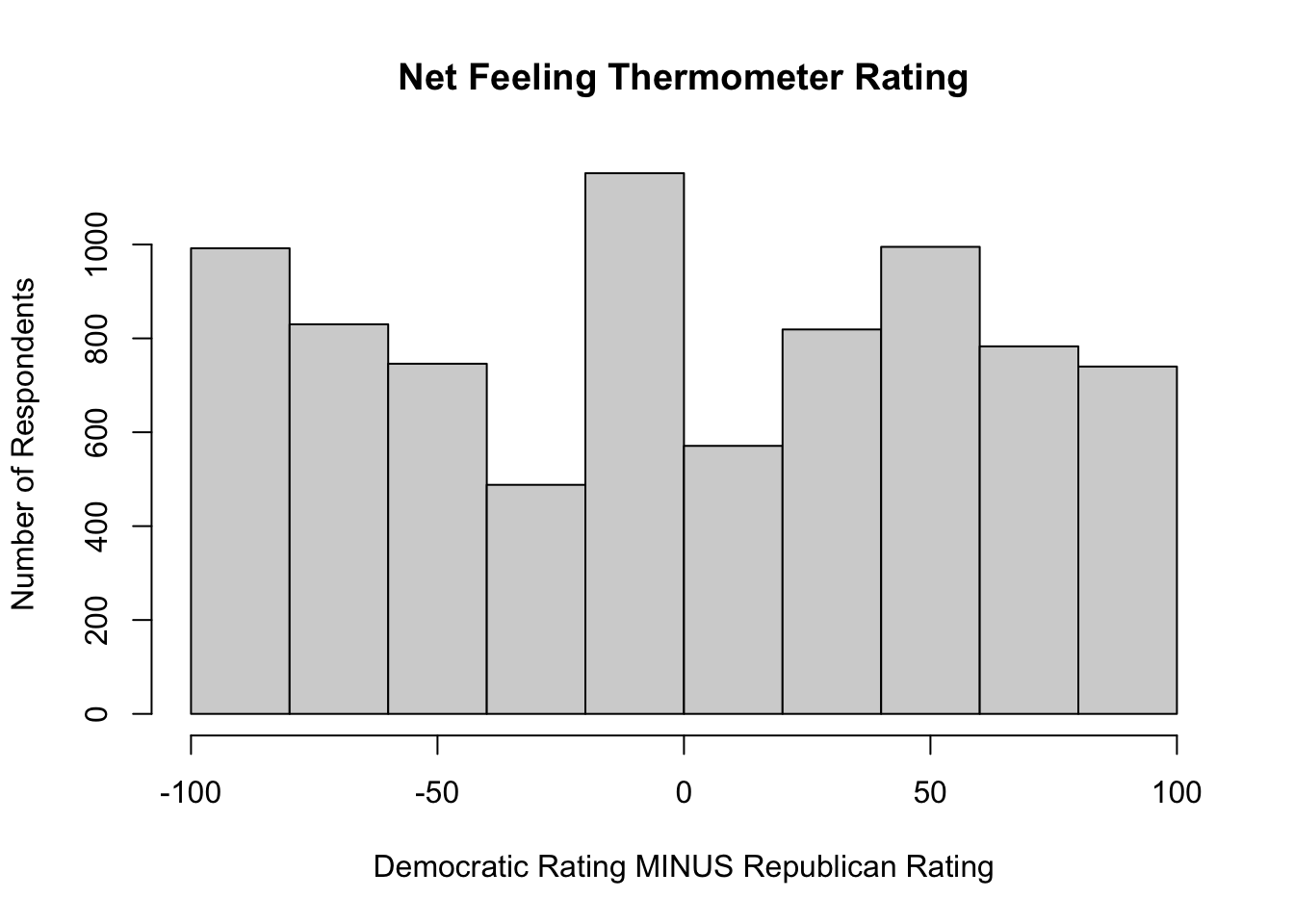
This is an interesting distribution. As you might expect during times of political polarization, there are a lot of respondents at both ends of the distribution, indicating they really liked one party and really disliked the other. But at the same time there are also a lot of respondents at or near 0, indicating they gave the parties very similar ratings.
Suppose what we really want to know is which party the respondents preferred, and we don’t care by how much. We could get this information by transforming this variable into a three-category ordinal variable that indicates whether people preferred the Republican Party, rated both parties the same, or preferred the Democratic Party.
We will do this using the cut2 function (from the Hmisc package), which allows us to specify cut points for putting the data into different bins, similar to how we binned data using the Freq command in Chapter 3. In this case, we want one bin for outcomes less than zero, one for outcomes equal to zero, and one for outcomes greater than zero. Let’s look at how we do this, then I’ll explain how the cut points are determined.
#Collapse "netpty_ft" into three categories: -100 to 0, 0, and 1 to 100
anes20$netpty_ft.3<-ordered(cut2(anes20$netpty_ft, c(0,1)))
#Check the class of the variable
class(anes20$netpty_ft.3)
[1] "ordered" "factor" What this command does is tell R to use the cut2 function to create three categories from anes20$netpty_ft and store them in a new ordered object, anes20$netpty_ft.3. Compared to creating bins with the Freq function in Chapter 3, one important difference here is that the default in cut2 is to create left-closed bins. Because I wanted three categories, I needed to specify two different cut points, 0 and 1. Using this information, R put all responses with values less than zero (the lowest cut point) into one group, all values between zero and one into another group, and all values equal to or greater than one (the highest cut point) into another group. When setting cut points in this way, you should specify one fewer cut than the number of categories you want to create. In this case, I wanted three categories, so I specified two cut points. At the same time, for any given category, you need to specify a value that is one unit higher than the top of the desired interval. Again, in the example above, I wanted the first group to be less than zero, so I specified zero as the cut point. Similarly, I wanted the second category to be zero, so I set the cut point at one.
Let’s take a look at this new variable:
freq(anes20$netpty_ft.3, plot=F)anes20$netpty_ft.3
Frequency Percent Valid Percent Cum Percent
[-100, 0) 3308 39.952 40.76 40.76
0 900 10.870 11.09 51.85
[ 1, 100] 3908 47.198 48.15 100.00
NA's 164 1.981
Total 8280 100.000 100.00 First, it is reassuring to note that the result shows three categories with limits that reflect the desired groupings. Substantively, this shows that the Democratic Party holds a slight edge in feeling thermometer ratings, preferred by 48% compared to 41% for the Republican Party, and that about 11% rated both parties exactly the same. Looking at this table, however, it is clear that we could do with some better value labels. We know that the [-100, 0) category represents respondents who preferred the Republican Party, and respondents in the [1, 100] category preferred the Democratic Party, but this is not self-evident by the labels. So let’s replace the numeric ranges with some more descriptive labels.
#Assign meaningful level names
levels(anes20$netpty_ft.3)<-c("Favor Reps", "Same", "Favor Dems")
freq(anes20$netpty_ft.3, plot=F)
anes20$netpty_ft.3
Frequency Percent Valid Percent Cum Percent
Favor Reps 3308 39.952 40.76 40.76
Same 900 10.870 11.09 51.85
Favor Dems 3908 47.198 48.15 100.00
NA's 164 1.981
Total 8280 100.000 100.00 In the example used above, we had a clear idea of exactly which cut points to use. But sometimes, you don’t care so much about the specific values but are more interested in grouping data into thirds, quarters, or some other quantile. This is easy to do using the cut2 function. For instance, suppose we are using the states20 data set and want to classify the states according to state policy liberalism.
states20$policy_lib [1] -1.960010 -0.091225 -0.927141 -1.947320 2.482550 0.175465 2.318960
[8] 1.279340 -1.029510 -2.130670 2.400100 -1.264240 0.915831 -0.595101
[15] 0.607162 -0.948019 -0.697664 -1.040500 1.467640 1.965980 2.215770
[22] 0.273771 1.175600 -2.525450 -0.809502 0.266881 -0.247498 -0.157274
[29] 0.556355 2.514880 1.216650 2.366970 -1.618320 -1.506380 -0.023545
[36] -1.220600 1.342040 0.330435 1.997590 -2.136130 -1.183450 -1.073470
[43] -0.801661 -1.142160 1.729270 -0.951926 1.310440 -0.203756 0.668763
[50] -1.109640The values on policy liberalism measure (in the data set)states20$pol_lib are a bit hard to interpret on their own. These are standardized scores, so the best way to think about them is that the higher values indicate relatively liberal policies, lower values indicate relatively conservative policies, and values near zero indicate a mixed bag of policies. It might be better in some situations to collapse the values into low, middle, and high categories. To do this, we still use the cut2 command, except that instead of specifying the cut points, we just tell R to create three groups (g=3).
#Collapse "policy_lib" into three roughly equal sized categories
states20$policy_lib.3<-ordered(cut2(states20$policy_lib, g=3))
#Check frequencies for new variable
freq(states20$policy_lib.3, plot=F)
states20$policy_lib.3
Frequency Percent Cum Percent
[-2.525,-0.927) 17 34 34
[-0.927, 0.916) 17 34 68
[ 0.916, 2.515] 16 32 100
Total 50 100 You should notice a couple of things about this transformation. First, although not exactly equal in size, each category has roughly one-third of the observations in it. It’s not always possible to make the groups exactly the same size, especially if values are rounded to whole numbers, but using this method will get you close. Second, as in the first example, we need better value labels. The lowest category represents states with relatively conservative policies, the highest category states with liberal policies, and the middle group represents states with policies that are not consistently conservative or liberal:
#Create meaningful level names
levels(states20$policy_lib.3)<-c("Conservative", "Mixed", "Liberal")
#Check levels
freq(states20$policy_lib.3, plot=F)
states20$policy_lib.3
Frequency Percent Cum Percent
Conservative 17 34 34
Mixed 17 34 68
Liberal 16 32 100
Total 50 100 While these labels are easier to understand, it is important not to lose sight of what they represent, the bottom, middle, and top thirds of the distribution of states20$policy_lib.
4.6.1 Creating an Index
Suppose you are interested in exploring how attitudes toward LGBTQ rights were related to vote choice in the 2020 presidential election. The 2020 ANES includes several questions related to LGTBQ rights. Respondents were asked if they think businesses should be required to provide services to same-sex couples (V201406), whether transgender people should use the bathroom of their birth or identified gender (V201409), whether they favor laws protecting gays and lesbians from job discrimination (V201412), whether gay and lesbian couples should be allowed to adopt children (V201415), and whether gays and lesbians should be allowed to marry (V201416). Any one of these five variables might be a good indicator of support and opposition to LGBTQ rights, but it’s hard to say that one of them is necessarily better than the others. One strategy researchers frequently use in situations such as this is to combine information from all of the variables into a single index. For instance, in this case, we could identify the liberal response category for each variable (using the levels function to see the categories) and then count the number of times respondents gave liberal responses across all five variables. A respondent who gives 0 liberal responses would be considered conservative on LGBTQ issues, and a respondent who gives 5 liberal responses would be considered liberal on LGBTQ issues.
The table below summarizes the information we need to begin the construction of the LGBTQ rights index.
| Variable | Topic | Liberal Outcome |
|---|---|---|
| V201406 | Services to same-sex couples | 2. Should be required to provide services |
| V201409 | Transgender bathroom policy | 2. Bathrooms of their identified gender |
| V201412 | Job discrimination Protections | 1. Favor |
| V201415 | Adoption by gays and lesbians | 1. Yes |
| V201416 | Gay marriage | 1. Allowed to legally marry |
The process for combining these five variables into a single index of support for LGBTQ rights involves two steps. First, for each question, we need to create an indicator variable with a value of 1 for all respondents who gave the liberal response, and a value of 0 for all respondents who gave some other response. Let’s do this first for anes20$V201406 for demonstration purposes.
#Create indicator (0,1) for category 2 of "equal services" variable
anes20$lgbtq1<-as.numeric(anes20$V201406 ==
                  "2. Should be required to provide services")
In this command, we tell R to take the information it has for anes20$V201406 and create a numeric variable, anes20$lgbtq1, in which respondents who gave a response of “2. Should be required to provide services” are given a score of 1, and all other valid responses are scored 0. There are a couple of things to which you need to pay close attention. First, we used double equal signs (==). This is pretty standard in programming languages and is almost always used in R (One exception is if you use “=” instead of “<-” when creating new objects). Second, when identifying the category of interest, everything needs to be written exactly the way it appears in the original variable and must be enclosed in quotation marks. This includes spelling, punctuation, spacing, and letter case. I would have gotten an error message if I had written “2 Should be required to provide services” instead of “2. Should be required to provide services”. Can you spot the difference?
So, now we have an indicator variable identifying respondents who thought businesses should be required to provide services to gays and lesbians, scored 0 and 1. Before creating the other four indicator variables, let’s compare the new variable to the original variable, just to make sure everything is the way it should be.
#Compare indicator variable to original variable
table(anes20$V201406)
           1. Should be allowed to refuse
                                     4083
2. Should be required to provide services
4085 table(anes20$lgbtq1)
   0    1
4083 4085
Here, we see an even split in public opinion on this topic and that the raw frequencies in categories 0 and 1 on anes20$lgbtq1 are exactly what we should expect based on the frequencies in anes20$V201406.
Just a couple of quick side notes before creating the other indicator variables for the index. First, these types of variables are also commonly referred to as indicator, dichotomous, or dummy variables. I tend to use all three terms interchangeably. Second, we have taken information from a factor variable and created a numeric variable. This is important to understand because it can open up the number and type of statistics we can use with data that are originally coded as factor variables.
The code below is used to create the other indicators:
#Create indicator for "bathroom" variable
anes20$lgbtq2<-as.numeric(anes20$V201409 ==
                              "2. Bathrooms of their identified gender")
#Create indicator for "job discrimination" variable
anes20$lgbtq3<-as.numeric(anes20$V201412 == "1. Favor")
#Create indicator for "adoption" variable
anes20$lgbtq4<-as.numeric(anes20$V201415 == "1. Yes")
#Create indicator for "marriage" variable
anes20$lgbtq5<-as.numeric(anes20$V201416 == "1. Allowed to legally marry")
It might be a good exercise for you to copy all of this code and check on your own to see that the transformations have been done correctly.
Now, the second step of the process is to combine all of these variables into a single index. Since these are numeric variables and they are all coded the same way, we can simply add them together. Just to make sure you understand how this works, let’s suppose a respondent gave liberal responses (1) to the first, third, and fifth of the five variables, and conservative responses (0) to the second and fourth ones. The index score for that person would be 1 + 0 + 1 + 0 + 1 = 3.
We can add the dichotomous variables together and look at the frequency table for the new index, anes20$lgbtq_rights.
#Combine five indicator variables into one index
anes20$lgbtq_rights<-(anes20$lgbtq1
                      +anes20$lgbtq2
                      +anes20$lgbtq3
                      +anes20$lgbtq4
                      +anes20$lgbtq5)
#Check the distribution of lgbtq_rights index
freq(anes20$lgbtq_rights, plot=F)
anes20$lgbtq_rights
Frequency Percent Valid Percent
0 458 5.531 5.86
1 766 9.251 9.80
2 935 11.292 11.96
3 1272 15.362 16.27
4 1768 21.353 22.62
5 2617 31.606 33.48
NA's 464 5.604
Total 8280 100.000 100.00The picture that emerges in the frequency table is that there is fairly widespread support for LGBTQ rights, with about 56% of respondents supporting liberal outcomes in at least four of the five survey questions, and very few respondents at the low end of the scale. This point is, I think, made even more apparent by looking at a bar chart for this variable.14
barplot(table(anes20$lgbtq_rights),
        xlab="Number of Rights Supported",
        ylab="Number of Respondents",
        main="Support for LGBTQ Rights")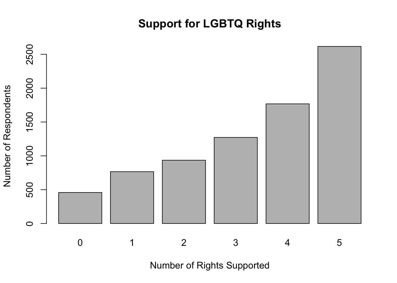
What’s most important here is that we now have a more useful measure of support for LGBTQ rights than if we had used just a single variable out of the list of five reported above. This variable is based on responses to five separate questions and provides a more comprehensive estimate of where respondents stand on LGBTQ rights. In terms of some of the things we covered in the discussion of measurement in Chapter 1, this index is strong in both validity and reliability.
4.7 Saving Your Changes
If you want to keep all of the changes you’ve made, you can save them and write over anes20, or you can save them as a new file, presumably with a slightly altered file name, perhaps something like anes20a. You can also opt not to save the changes and, instead, rely on your script file if you need to recreate any of the changes you’ve made.
Recall from Chapter 2 that the general format for saving r data files is to specify the object you want to save and then the file name and the directory where you want to store the file.
#Format of 'save' function
save(object, file="<FilePath>/filename")
Remember to use getwd see what your current working directory is (this is the place where the file will be saved if you don’t specify a directory in the command), and setwd to change the working directory to place where you want to save the results if you need to.
To save the anes20 data set over itself:
save(anes20, file="<FilePath>/anes20.rda")Saving the original file over itself is okay if you are only adding newly created variables. Remember, though, that if you transformed variables and replaced the contents of original variables (using the same variable names), you cannot retrieve the original data if you save now using the same file name. None of the transformations you’ve done in this chapter are replacing original variables, so you can go ahead and save this file as anes20.
4.8 Next Steps
Hopefully, you are becoming more comfortable working with R and thinking about social and political data. These first four chapters form an important foundation to support learning about social and political data analysis and the ways in which R can be deployed to facilitate that analysis. As you work your way through the next several chapters, you should see that the portions of the text focusing on R are easier to understand, becoming a bit more second nature. The next several chapters will emphasize the statistical elements of data analysis a bit more, but learning more about R still plays an important role. What’s up next is a look at some descriptive statistics that may be familiar to you, measures of central tendency and dispersion. As in the preceding chapters, we will focus on intuitive, practical interpretations of the relevant statistics and graphs. Along the way, there are a few formulas and important concepts to grasp in order to develop a solid understanding of what the data can tell you.
4.9 Exercises
4.9.1 Concepts and Calculations
- The ANES survey includes a variable measuring marital status with six categories, as shown below.
Create a table similar to Table 4.1 in which you show how you would map these six categories on to a new variable with three categories, “Married”, “Never Married”, and “Other.” Explain your decision rule for the way you mapped categories from the old to the new variable.
[1] "1. Married: spouse present"
[2] "2. Married: spouse absent {VOL - video/phone only}"
[3] "3. Widowed"
[4] "4. Divorced"
[5] "5. Separated"
[6] "6. Never married" - The ANES survey also includes a seven-category variable that measures party identification (see blow). Create another table in which you map these seven categories on to a new measure of party identification with three categories, “Democrat,” “Independent,” and “Republican.” Explain your decision rule for the way you mapped categories from the old to the new variable.
[1] "1. Strong Democrat"            "2. Not very strong Democrat"
[3] "3. Independent-Democrat"       "4. Independent"
[5] "5. Independent-Republican"     "6. Not very strong Republican"
[7] "7. Strong Republican" - One of the variables in the anes20 data set (
V201382x) measures people’s perceptions of whether corruption decreased or increased under President Trump.
PRE: SUMMARY: Corruption increased or decreased since Trump
                               Frequency Percent Valid Percent
1. Increased a great deal           3394  40.990        41.415
2. Increased a moderate amount      1068  12.899        13.032
3. Increased a little                203   2.452         2.477
4. Stayed the same                  2371  28.635        28.932
5. Decreased a little                284   3.430         3.466
6. Decreased a moderate amount       592   7.150         7.224
7. Decreased a great deal            283   3.418         3.453
NA's                                  85   1.027
Total                               8280 100.000       100.000
I’d like to convert this seven-point scale into a three-point scale coded in the following order: “Decreased”, “Same”, “Increased”. Which of the two coding schemes presented below accomplishes this the best? Explain why one of the options would give incorrect information.
#Option 1
anes20$crrpt<-ordered(anes20$V201382x)
levels(anes20$crrpt)<-c("Decreased", "Decreased", "Decreased", "Same",
                              "Increased","Increased","Increased")
#Option 2
anes20$crrpt<-ordered(anes20$V201382x)
levels(anes20$crrpt)<-c("Increased","Increased","Increased", "Same",
"Decreased", "Decreased", "Decreased")
anes20$crrpt<-ordered(anes20$crrpt,levels=c("Decreased", "Same","Increased"))4.9.2 R Problems
- Rats! I’ve done it again. I was trying to combine responses to two gun control questions into a single, three-category variable (
anes20$gun_cntrl) measuring support for restrictive gun control measures. The original variables areanes20$V202337(should the federal government make it more difficult or easier to buy a gun?) andanes20$V202342(Favor or oppose banning ‘assault-style’ rifles). Make sure you take a close look at these variables before proceeding.
I used the code shown below to create the new variable, but, as you can see when you try to run it, something went wrong (the resulting variable should range from 0 to 2). What happened? Once you fix the code, produce a frequency table for the new index and report how you fixed it.
anes20$buy_gun<-as.numeric(anes20$V202337=="1. Favor")
anes20$ARguns<-as.numeric(anes20$V202342=="1. More difficult")

anes20$gun_cntrl<-anes20$buy_gun + anes20$ARguns

freq(anes20$gun_cntrl, plot=F)
anes20$gun_cntrl
Frequency Percent Valid Percent
0 7372 89.03 100
NA's 908 10.97
Total 8280 100.00 100Use the mapping plan you produced for Question 1 of the Concepts and Calculations problems to collapse the current six-category variable measuring marital status (
anes20$V201508) into a new variable,anes20$marital, with three categories, “Married”, “Never Married, and”Other.”- Create a frequency table for both
anes20$V201508and the new variable,anes20$marital. Do the frequencies for the categories of the new variable match your expectations, given the category frequencies for the origianal variable?
- Create barplots for both
anes20$V201508andanes20$marital.
- Create a frequency table for both
For this problem, use
anes20$V201231x, the seven-point ordinal scale measuring party identification.- Using the mapping plan you created for Question 2 of the Concepts and Calculations problems, create a new variable named
anes20$ptyID.3that includes three categories, “Democrat,” “Independent,” and “Republican.” - Create a frequency table for both
anes20$V201231xandanes20$ptyID.3. Do you notice any difference in the impressions created by these two tables? - Now create bar charts for the two variables and comment on any differences in the impressions they make on you.
- Do you prefer the frequency table or bar chart as a method for looking at these variables? Why?
- Using the mapping plan you created for Question 2 of the Concepts and Calculations problems, create a new variable named
The table below summarizes information about four variables from the
anes20data set that measure attitudes toward different immigration policies. Take a closer look at each of these variables, so you are comfortable with them.- Use the information in the table to create four numeric indicator (dichotomous) variables (one for each) and combine those variables into a new index of immigration attitudes named
anes20$immig_pol(show all steps along the way). - Create a frequency table OR bar chart for
anes20immig_poland describe its distribution.
- Use the information in the table to create four numeric indicator (dichotomous) variables (one for each) and combine those variables into a new index of immigration attitudes named
| Variable | Topic | Liberal Response |
|---|---|---|
| V202234 | Accept Refugees | 1. Favor |
| V202240 | Path to Citizenship | 1. Favor |
| V202243 | Send back undocumented | 2. Oppose |
| V202246 | Separate undocumented parents/kids | 2. Oppose |
One alternative if this does happen is to go back and download the data from the original source and redo all of the transformations.↩︎
The “.3” extension is to remind me that this is the three-category version of the variable.↩︎
That’s right, this is another example of a numeric variable for which a bar chart works fairly well.↩︎