Chapter 3 Frequencies and Basic Graphs
Get Ready
In this chapter, we explore how to examine the distribution of variables using some basic data tables and graphs. In order to follow along in R, you should load the anes20.rda and states20.rda data files, as shown below. If you have not already downloaded the data sets, see the instructions at the end of the “Accessing R” section of Chapter 2.
If you get errors at this point, check to make sure the files are in your working directory and make sure you spelled the file names correctly and enclosed the file names in quotes.
In addition, you should also load the libraries for descr and Desctools, two packages that provide many of the functions we will be using. You may have to install the packages if you have not done so already.
Introduction
Sometimes, very simple descriptive statistics or graphs can convey a lot of information and play an important role in the presentation of data analysis findings. Advanced statistical and graphing techniques are normally required to speak with confidence about data-based findings, but it is almost always important to start your analysis with some basic tools, for two reasons. First, these tools can be used to alert you to potential problems with the data. If there are issues with the way the data categories are coded, or perhaps with missing data, those problems are relatively easy to spot with some of the simple methods discussed in this chapter. Second, the distribution of values (how spread out they are, or where they tend to cluster) on key variables can be an important part of the story told by the data, and some of this information can be hard to grasp when using more advanced statistics.
Two data sources are used to provide examples in this chapter: a data set comprised of selected variables from the 2020 American National Election Study5, a large-scale academic survey of public opinion in the months just before and after the 2020 U.S. presidential election (saved as anes20.rda), and a state-level data set containing information on dozens of political, social, and demographic variables from the fifty states (saved as states20.rda). In the anes20 data set, most variable names follow the format “V20####”, while in the states20 data set the variables are given descriptive names that reflect the content of the variables. Codebooks for these data sets are included in the appendix to this book.[In the book, or online?]
Frequencies
One of the most basic things we can do is count the number of times different outcomes for a variable occur. Usually, this sort of counting is referred to as getting the frequencies for a variable. There are a couple of ways to go about this. Let’s take a look at a variable from anes20 that measures the extent to which people want to see federal government spending on “aid to the poor” increased or decreased (anes20$V201320x).
One of the first things to do is familiarize yourself with this variable’s categories. You can do this with the levels() command:
#Show the value labels for V201320x, from the anes20 data set.
#If you get an error message, make sure you have loaded the data set.
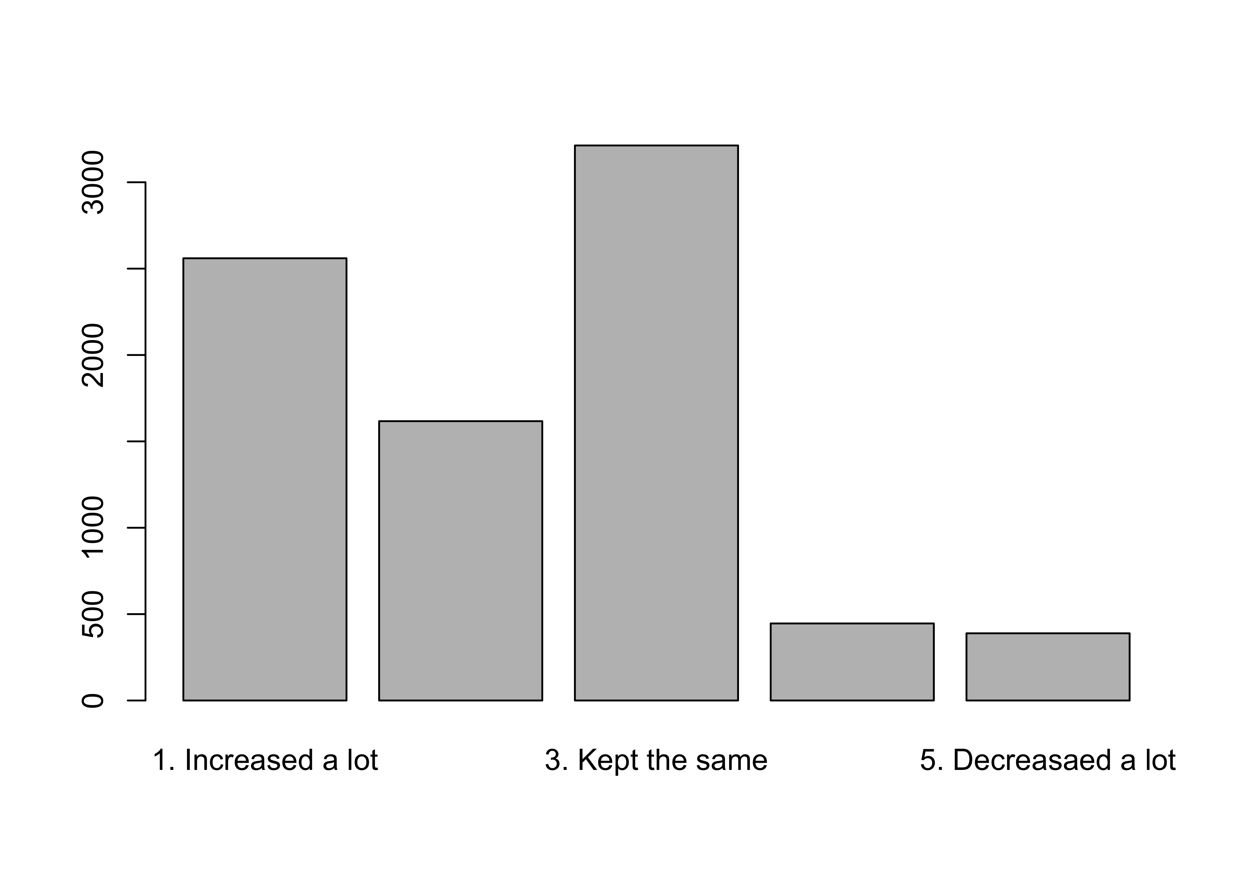
levels(anes20$V201320x)[1] "1. Increased a lot" "2. Increased a little" "3. Kept the same"
[4] "4. Decreased a little" "5. Decreasaed a lot" Here, you can see the category labels, which are ordered from “Increased a lot” at one end, to “Decreased a lot” at the other. This is useful information but what we really want to know is how many survey respondents chose each of these categories. Does one outcome seem like it occurs a lot more than all of the others? Are there some outcomes that hardly ever occur? Do the outcomes generally lean toward the “Increase” or “Decrease” side of the scale?
You need to create a table that summarizes the distribution of responses. This table is usually known as a frequency distribution, or a frequency table. The base R package includes a couple of commands that can be used for this purpose. First, you can use table() to get simple frequencies:
   1. Increased a lot 2. Increased a little      3. Kept the same
                 2560                  1617                  3213
4. Decreased a little   5. Decreasaed a lot
                  446                   389
Now you can see not just the category labels, but also the number of survey respondents in each category. From this, you can see that there is more support for increasing spending on the poor than for decreasing it, and it is clear that the most common choice is to keep spending the same.
Okay, this is useful information and certainly an improvement over just listing all of the data and trying to make sense out of them that way. However, this information could be more useful if we expressed it in relative rather than absolute terms. As useful as the simple raw frequencies are, the drawback is that they are a bit hard to interpret on their own (at least without doing a bit of math in your head). Let’s take the 2560 “Increased a lot” responses as an example. This seems like a lot of support for this position, and we can tell that it is compared to the number of responses in most other categories; but 2560 responses can mean different things from one sample to another, depending on the sample size (2560 out of how many?). Certainly, the magnitude of this number means something different if the total sample is 4000 than if it is 10,000. Since R can be used as an overpowered calculator, we can add up the frequencies from all categories to figure out the total sample size:
#Add up the category frequencies and store them in "sample_size"
sample_size<-2560+1617+3213+446+389
#Print the value of "sample_size"
sample_size
[1] 8225So now we know that there were 8225 total valid responses to the question on aid to the poor, and 2560 of them favored increasing spending a lot. Now we can start thinking about whether that seems like a lot of support, relative to the sample size. What we need to express the frequency of the category outcomes relative to the total number of outcomes. These relative frequencies are usually expressed as percentages or proportions.
Percentages express the relative occurrence of each value of x. For any given category, this is calculated as the number of observations in the category, divided by the total number of valid observations across all categories, multiplied times 100:
\[\text{Category Percent}={\frac{\text{Total cases in category} }{\text{Total valid cases} }}*100\] Or, if you are really itching for something that looks a bit more complicated (but isn’t):
\[\text{Category Percent}={\frac{f_k}{n}}*100\]
Where:
\(f_k\) = frequency, or number of cases in any given category
n = the number of valid cases from all categories
This simple statistic is very important for making relative comparisons. Percent literally means per one-hundred, so regardless of overall sample size, we can look at the category percentages and get a quick, standardized sense of the relative number of outcomes in each category. This is why percentages are also referred to as relative frequencies. In frequency tables, the percentages can range from 0 to 100 and should always sum to 100.
Proportions are calculated pretty much the same way, except without multiplying times 100:
\[\text{Category Proportion}={\frac{\text{Total cases in category} }{\text{Total valid cases} }}\] The main difference here is that proportions range in value from 0 to 1, rather than 0 to 100. It’s pretty straightforward to calculate both the percent and the proportion of respondents who thought that federal spending to aid the poor should be increased:
[1] 31.12462[1] 0.3112462So we see that about 31% of all responses are in this category. What’s nice about percentages and proportions is that, for all practical purposes, the values have the same meaning from one sample to another. In this case, 31.1% (or .311) means that slightly less than one-third of all responses are in this category, regardless of the sample size. Of course, we can also just look at the percentages for the other response categories to gain a more complete understanding of the relative popularity of the response choices.
Fortunately, we do not make this calculation manually for every category. Instead, we can use the prop.table function to get the proportions for all five categories. We need to store the results of the raw frequency table in a new object and then have prop.table use that object to calculate the proportions. Note that I use the extension “.tbl” when naming the new object. This serves as a reminder that this particular object is a table. When you execute commands such as this, you should see the new object appear in the Global Environment window.
#Store the frequency table in a new object called "poorAid.tbl"
poorAid.tbl<-table(anes20$V201320x)

#Create a proportion table using the contents of "poorAid.tbl"
prop.table(poorAid.tbl)
   1. Increased a lot 2. Increased a little      3. Kept the same
           0.31124620            0.19659574            0.39063830
4. Decreased a little   5. Decreasaed a lot
           0.05422492            0.04729483
There are a couple of key takeaway points from this table. First, there is very little support for decreasing spending on federal programs to aid the poor and a lot of support for increasing spending. Only about 10% of all respondents (combining the two “Decreased” categories) favor cutting spending on these programs, compared to just over 50% (combining the two “Increased” categories) who favor increasing spending. Second, the single most popular response is to leave spending levels as they are (39%). Bottom line, there is not much support in these data for cutting spending on programs for the poor.
There are some things to notice about this interpretation. First, I didn’t get too bogged down in comparing all of the reported proportions. If you are presenting information like this, the audience (e.g., your professor, classmates, boss, or client) is less interested in the minutia of the table than the general pattern. Second, while focusing on the general patterns, I did provide a few specifics. For instance, instead of just saying “There is very little support for cutting spending,” I included specific information about the percent who favored and opposed spending and who wanted it kept the same, but without getting too bogged down in details. Finally, I referred to percentages rather than proportions, even though the table reports proportions. This is really just a personal preference, and in most cases it is okay to do this. Just make sure you are consistent within a given discussion.
Okay, so we have the raw frequencies and the proportions, but note that we have to use two different tables to get this information, and those tables are not exactly “presentation ready.” Fear not, for there are a couple of alternatives that save steps in the process and still provide all the information you need in a single table. The first alternative is the freq command, which is provided in the descr package. Here’s what you need to do:
PRE: SUMMARY: Federal Budget Spending: aid to the poor
                      Frequency  Percent Valid Percent
1. Increased a lot         2560  30.9179        31.125
2. Increased a little      1617  19.5290        19.660
3. Kept the same           3213  38.8043        39.064
4. Decreased a little       446   5.3865         5.422
5. Decreasaed a lot         389   4.6981         4.729
NA's                         55   0.6643
Total                      8280 100.0000       100.000
As you can see, we get all of the information provided in the earlier tables, plus some additional information, and the information is somewhat better organized. The first column of data shows the raw frequencies, the second shows the total percentages, and the final column is the valid percentages. The valid percentages match up with the proportions reported earlier, while the “Percent” column reports slightly different percentages based on 8280 responses (the 8225 valid responses and 55 survey respondents who did not provide a valid response). When conducting surveys, some respondents refuse to answer some questions, or may not have an opinion, or might be skipped for some reason. These 55 responses in the table above are considered missing data and are denoted as NA in R. It is important to be aware of the level of missing data and usually a good idea to have a sense of why they are missing. Sometimes, this requires going back to the original codebooks or questionnaires (if using survey data) for more information about the variable. Generally, researchers present the valid percent when reporting results.
So what about table original function, which we originally used to get frequencies? Is it still of any use? You bet it is! In fact, many other functions make use of the information from the table command to create graphics and other statistics, as you will see shortly.
Besides providing information on the distribution of single variables, it can also be useful to compare the distributions of multiple variables if there are sound theoretical reasons for doing so. For instance, in the example used above, the data showed widespread support for federal spending on aid to the poor. It is interesting to ask, though, about how supportive people are when we refer to spending not as “aid to the poor” but as “welfare programs,” which technically are programs to aid the poor. The term “welfare” is viewed by many as a “race-coded” term, one that people associate with programs that primarily benefit racial minorities (mostly African-Americans), which leads to lower levels of support, especially among whites. As it happens, the 2020 ANES asked the identical spending question but substituted “welfare programs” for “aid to the poor,” shown below.
PRE: SUMMARY: Federal Budget Spending: welfare programs
                      Frequency  Percent Valid Percent
1. Increased a lot         1289  15.5676         15.69
2. Increased a little      1089  13.1522         13.26
3. Kept the same           3522  42.5362         42.88
4. Decreased a little      1008  12.1739         12.27
5. Decreasaed a lot        1305  15.7609         15.89
NA's                         67   0.8092
Total                      8280 100.0000        100.00
On balance, there is much less support for increasing government spending on programs when framed as “welfare” than as “aid to the poor.” Almost 51% favored increasing spending on aid to the poor, only 29% favored increased spending on welfare programs. And, while only 10% favored decreasing spending on aid to the poor, 28% favored decreasing funding for welfare programs. Clearly, in their heads, respondents see these two policy areas as different, even though the primary purpose of “welfare” programs is to provide aid to the poor.
This single comparison is a nice illustration of how even very simple statistics can reveal substantively interesting patterns in the data.
The Limits of Frequency Tables
As useful and accessible as frequency tables can be, they are not always as straightforward and easy to interpret as those presented above, especially for many numeric variables. The basic problem is that once you get beyond 7-10 categories, it can be difficult to see the patterns in the frequencies and percentages. Sometimes there is just too much information to sort through effectively. Consider the case of presidential election outcomes in the states in 2020. Here, we will use the states20 data set mentioned earlier in the chapter. The variable of interest is d2pty20, Biden’s percent of the two-party vote in the states.
# Make sure you've loaded the 'states20' data set.
#Frequency table for "d2pty20" in the states
freq(states20$d2pty20, plot=FALSE)
states20$d2pty20
Frequency Percent
27.52 1 2
30.2 1 2
32.78 1 2
33.06 1 2
34.12 1 2
35.79 1 2
36.57 1 2
36.8 1 2
37.09 1 2
38.17 1 2
39.31 1 2
40.22 1 2
40.54 1 2
41.6 1 2
41.62 1 2
41.8 1 2
42.17 1 2
42.51 1 2
44.07 1 2
44.74 1 2
45.82 1 2
45.92 1 2
47.17 1 2
48.31 1 2
49.32 1 2
50.13 1 2
50.16 1 2
50.32 1 2
50.6 1 2
51.22 1 2
51.41 1 2
53.64 1 2
53.75 1 2
54.67 1 2
55.15 1 2
55.52 1 2
56.94 1 2
58.07 1 2
58.31 1 2
58.67 1 2
59.63 1 2
59.93 1 2
60.17 1 2
60.6 1 2
61.72 1 2
64.91 1 2
65.03 1 2
67.03 1 2
67.12 1 2
68.3 1 2
Total 50 100There is not much useful here, other than that vote share ranges from 27.5 to 68.3. Other than that, this frequency table includes too much information to absorb in a meaningful way. There are fifty different values and it is really hard to get a sense of the general pattern in the data.
In cases like this, it is useful to collapse the data into fewer categories that represent ranges of outcomes. Fortunately, the Freq function, does this automatically for numeric variables (note the upper-case F, as R is case-sensitive).
     level  freq   perc  cumfreq  cumperc
1  [25,30]     1   2.0%        1     2.0%
2  (30,35]     4   8.0%        5    10.0%
3  (35,40]     6  12.0%       11    22.0%
4  (40,45]     9  18.0%       20    40.0%
5  (45,50]     5  10.0%       25    50.0%
6  (50,55]     9  18.0%       34    68.0%
7  (55,60]     8  16.0%       42    84.0%
8  (60,65]     4   8.0%       46    92.0%
9  (65,70]     4   8.0%       50   100.0%
Here, you get the raw frequencies, the valid percent (note that there are no NAs listed), the cumulative frequencies, and the cumulative percent. When data are collapsed into ranges like this, the groupings are usually referred to as intervals, classes, or bins, and are labeled with the upper and lower limits of the category. This function uses what are called right closed intervals (indicated by ] on the right side of the interval), so the first bin (also closed on the left, [25,30]) includes all values of presidential approval ranging from 25 to 30, the second bin ((30,35]) includes all values ranging from just more than 30 to 35, and so on. In this instance, binning the data makes a big difference. Now it is much easier to see that there are relatively few states with very high or very low levels of Biden support, and the most states are in the middle of the distribution.
The last two columns provide useful information that was not provided in earlier frequency table, which used the freq (lower-case) function. Of particular use if the cumulative percent, which is the percent of observations in or below (in a numeric or ranking sense) a given category. You calculate the cumulative percent for a given ordered or numeric value by summing the percent with that value and the percent in all lower ranked values. In the table above, the cumulative cumulative percent shows that then-candidate Biden received 50% or less of the two-party vote in exactly half of the states.
You might think that using nine categories is a bit too many, you can adjust the number of categories, as well as the limits of the bins, by using the breaks command. Below, I wanted to create five bins with a width of 10 ranging from 20 to 70 percent of the two party vote.
#Create a frequency table with five user-specified groupings
Freq(states20$d2pty20, breaks=c(20,30,40,50,60,70))
level freq perc cumfreq cumperc
1 [20,30] 1 2.0% 1 2.0%
2 (30,40] 10 20.0% 11 22.0%
3 (40,50] 14 28.0% 25 50.0%
4 (50,60] 17 34.0% 42 84.0%
5 (60,70] 8 16.0% 50 100.0%We’ll explore regrouping data like this in greater detail in the next chapter.
Graphing Outcomes
As useful as frequency tables are, basic univariate graphs complement this information and are sometimes much easier to interpret. As discussed in Chapter 1, data visualizations help contextualize the results, giving the research consumer an additional perspective on the statistical findings. In the graphs examined here, the information presented is exactly the same as some of the information presented in the frequencies discussed above, albeit in a different format.
Bar Charts
Bar charts are simple graphs that summarize the occurrence of outcomes in categorical variables, providing some of the same information found in frequency tables. The category labels are on the horizontal axis, just below the vertical bars; ticks on the vertical axis denote the number (or percent) of cases; and the height of each bar represents the number (or percent) of cases for each category. It is important to understand that the horizontal axis represents categorical differences, not quantitative distances between categories.
The code listed below is used to generate the bar chart for poor_spnd, the variable measuring spending preferences on programs for the poor. Note here that the barplot command uses the initial frequency table, saved earlier as poorAid.tbl, as input, rather than the name of the variable. This illustrates what I mentioned earlier, that even though the table command does not provide a lot of information, it can be used to help with other R commands. It also reinforces an important point: bar charts are the graphic representation of the raw data from a frequency table.
Sometimes you have to tinker a bit with graphs to get them to look as nice as they should. For instance, you might have noticed that not all of the category labels are printed above. This is because the labels themselves are a little bit long and clunky, and with five bars to display, some of them were dropped due to lack of room. We could add a command to reduce the size of the labels, but that can lead to labels that are too small to read easily (still, we will look at that command later). Instead, we can replace the original labels with shorter ones that still represent the meaning of the categories, using the names.arg command. Make sure to notice the quotation marks and commas in the command. Axis labels and a main title are also added to the graph to make it easier for your target audience to understand what’s being presented.
#Same as above but with labels altered for clarity in "names.arg"
barplot(poorAid.tbl,
        names.arg=c("Increase/Lot", "Increase",
                    "Same", "Decrease","Decrease/Lot"),
        xlab="Increase or Decrease Spending on Aid to the Poor?",
        ylab="Number of Cases",
        main="Spending Preference")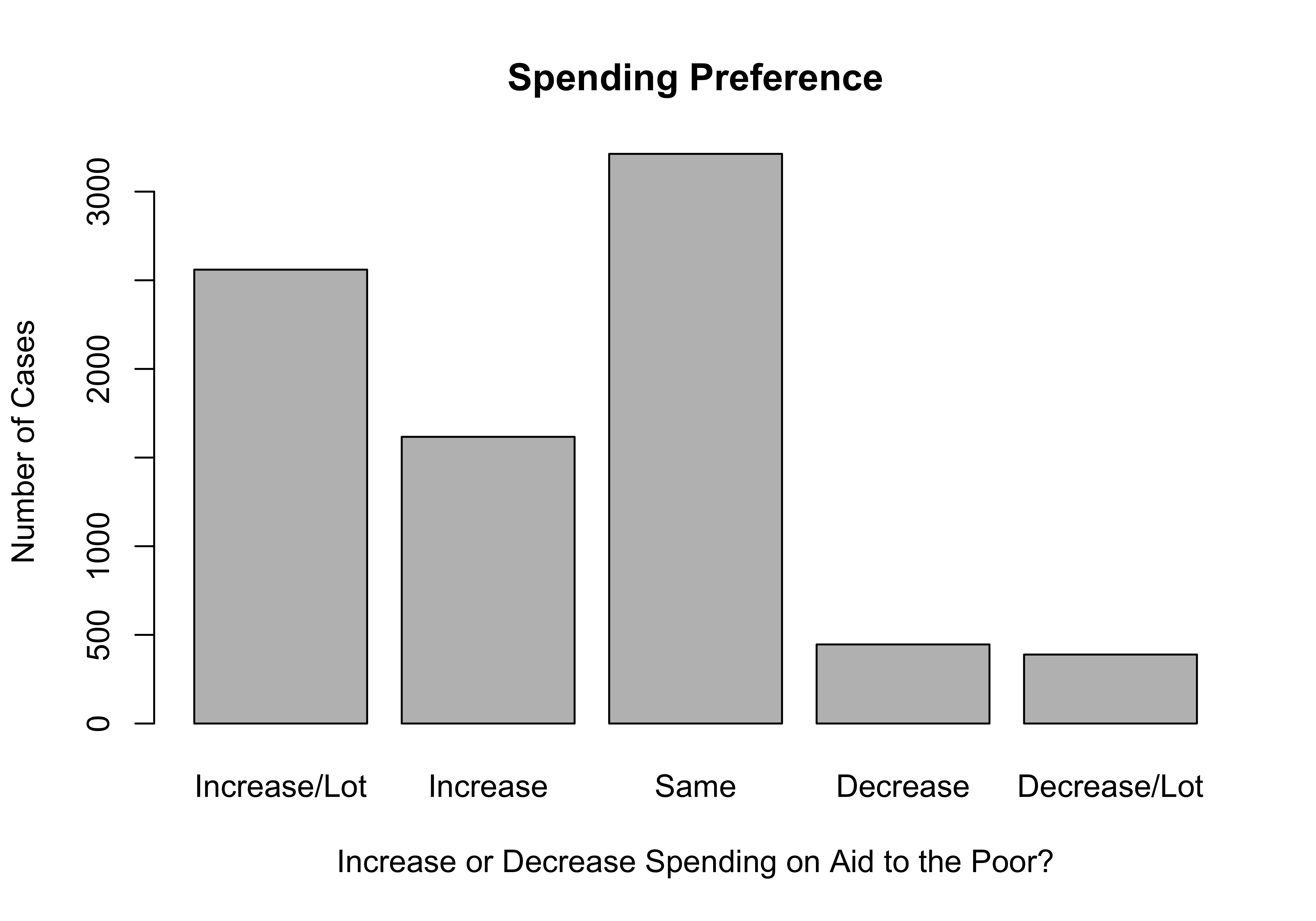
I think you’ll agree that this looks a lot better than the first graph. By way of interpretation, you don’t need to know the exact values of the frequencies or percentages to tell that there is very little support for decreasing spending and substantial support for keeping spending the same or increasing it. This is made clear simply from the visual impact of the differences in the height of the bars. Images like this often make quick and clear impressions on people.
Now let’s compare this bar chart to one for the question that asked about spending on welfare programs. Since we did not save the contents of the original frequency table for this variable to a new object, we can insert table(anes20$V201314x) into the barplot command:
#Tell R to use the contents of "table(anes20$V201314x)" for graph
barplot(table(anes20$V201314x),
        names.arg=c("Increase/Lot", "Increase",
                    "Same", "Decrease", "Decrease/Lot"),
        xlab="Increase or Decrease Spending on Welfare?",
        ylab="Number of Cases",
        main="Spending Preference")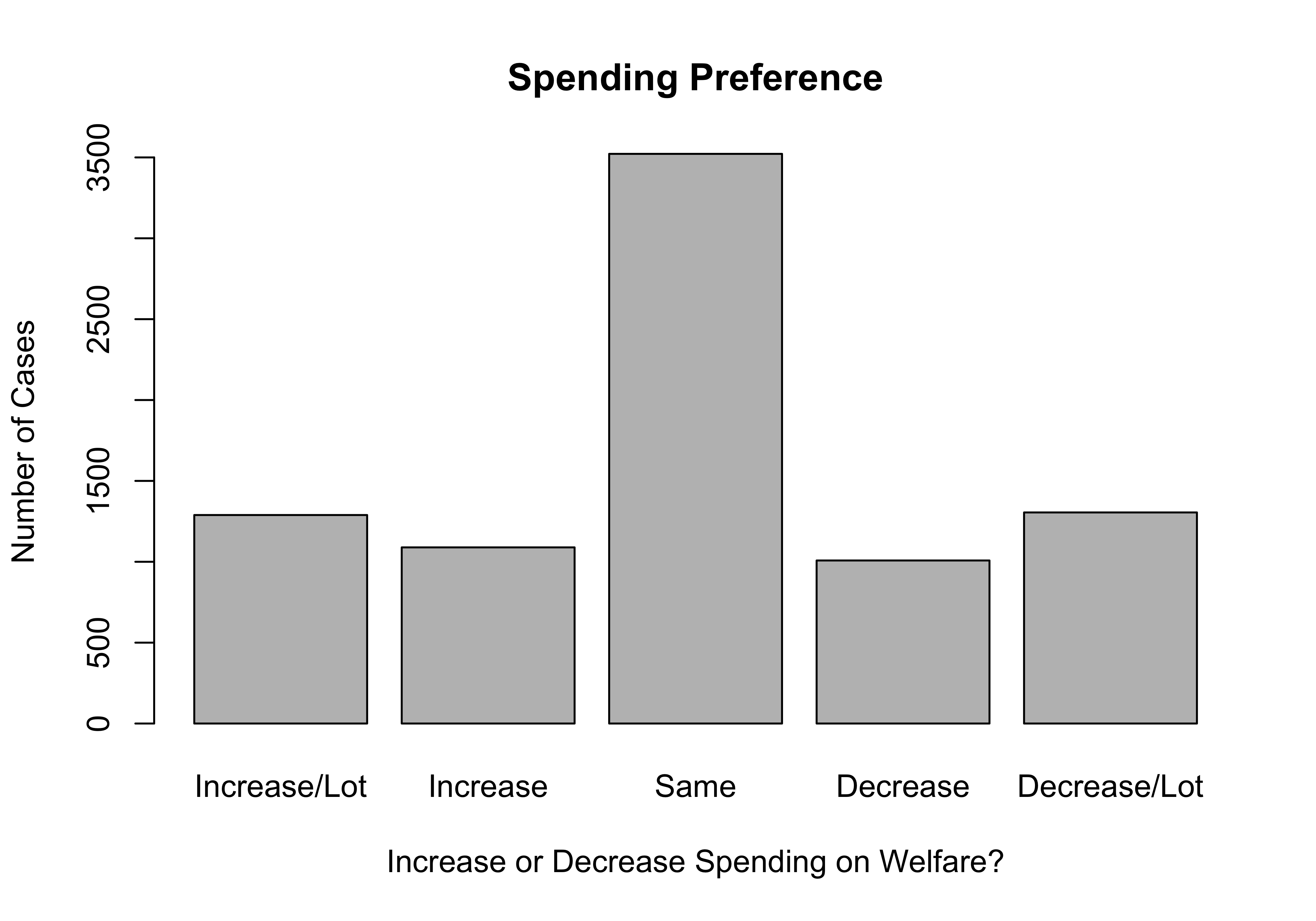
As was the case when we compared the frequency tables for these two variables, the biggest difference that jumps out is the lower level of support for increasing spending, and the higher level of support for decreasing welfare spending, compared to preferences of spending on aid to the poor.
If you prefer to plot the proportions rather than the raw frequencies, you just have to specify that R should use the proportions table as input, and change the y-axis label accordingly:
#Use "prop.table" as input
barplot(prop.table(poorAid.tbl),
        names.arg=c("Increase/Lot", "Increase",
                    "Same", "Decrease","Decrease/Lot"),
        xlab="Increase or Decrease Spending on Aid to the Poor?",
        ylab="Proportion of Cases",
        main="Spending Preference (Relative Frequencies)")
Getting Bar Charts with Frequencies
We have been using the barplot command to get bar charts, but these charts can also be created by modifying the freq command. Throughout the earlier discussion of frequencies, I used commands that look like this:
The plot=FALSE part of the command instructs R not to create a bar chart for the variable. If it is dropped, or if it is changed to plot=TRUE, R will produce a bar chart along with the frequency table. You still need to add commands to create labels and main titles, and to make other adjustments, but you can do all of this within the frequency command. Go ahead, run the following code and see what your get! If you are working in RStudio, you should get the frequency table in the Console window and the bar chart in the Plots window.
freq(anes20$V201320x, plot = TRUE,
     names.arg=c("Increase/Lot", "Increase",
                "Same", "Decrease", "Decrease/Lot"),
     xlab="Increase or Decrease Spending on Welfare?",
     ylab="Number of Cases",
     main="Spending Preference")
PRE: SUMMARY: Federal Budget Spending: aid to the poor
                      Frequency  Percent Valid Percent
1. Increased a lot         2560  30.9179        31.125
2. Increased a little      1617  19.5290        19.660
3. Kept the same           3213  38.8043        39.064
4. Decreased a little       446   5.3865         5.422
5. Decreasaed a lot         389   4.6981         4.729
NA's                         55   0.6643
Total                      8280 100.0000       100.000
Why not just always use the freq command to get bar charts? Why go through the extra steps? Two reasons, really. First, you don’t need a frequency table every time you produce or modify a bar chart. More importantly, however, using the barplot command pushes you a bit more to understand “what’s going on under the hood.” For instance, telling R to use the results of the table command as input for a bar chart helps you understand a bit better what is happening when R creates the graph. If the graph just magically appears when you use the freq command, you are another step removed from the process and don’t even need to think about it. You may recall from Chapter 2 that I discussed how some parts of the data analysis process seem a bit like a black box to students—something goes in, results come out, and we have no idea what’s going on inside the box. Learning about bar charts via the barplot command gives you a little peek inside the black box.
Bar Chart Limitations
Bar charts work really well for most categorical variables because they do not assume any particular quantitative distance between categories on the x-axis, and because categorical variables tend to have relatively few, discrete categories. Bar charts generally do not work well with numeric data, for reasons to be explored in just a bit. That said, there are some instances where this general rule doesn’t hold up. Let’s look at one such exception, using a state policy variable from the states20 data set. Below is a bar chart for abortion_laws, a variable measuring the number of legal restrictions on abortion in the states in 2020.6
barplot(table(states20$abortion_laws),
        xlab="Number of laws Restricting Abortion Access",
        ylab="Number of States",
        cex.axis=.8)#Reduces the axis labels by 80%.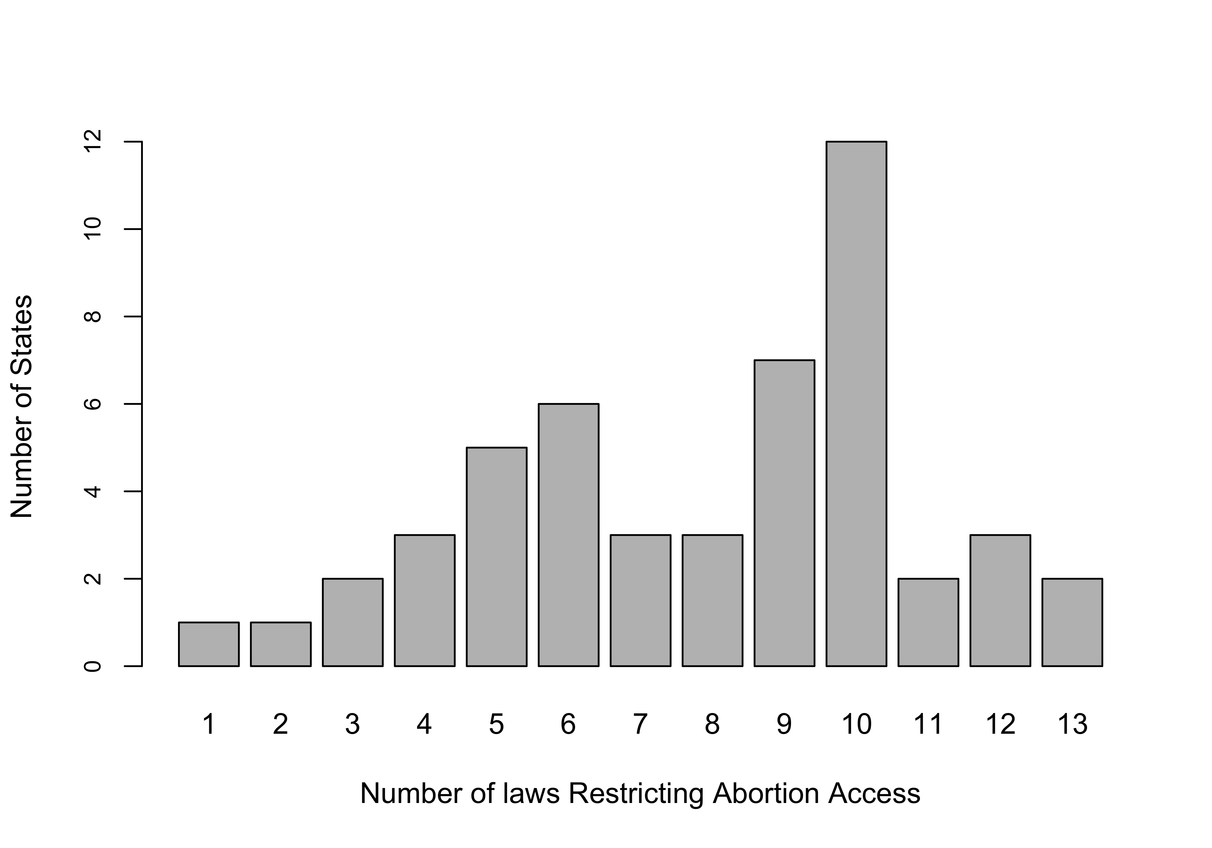
Okay, this is actually kind of a nice looking graph. It’s easy to get a sense of how this variable is distributed: most states have several restrictions and the most common outcomes are states with 9 or 10 restrictions. It is also easier to comprehend than if we got the same information in a frequency table with thirteen categories (go ahead and get a frequency table to see if you agree).
The bar chart works in this instance because there are relatively few, discrete categories, and the categories are consecutive, with no gaps between values. In most cases, numeric variables do not share these characteristics, and bar charts don’t work well. This point is illustrated quite nicely in this graph of Joe Biden’s percent of the two-party vote in the states in the 2020 election.
par(las=2) #This tells R to plot the x-axis labels vertically
barplot(table(states20$d2pty20),
        xlab="Biden % of Two-party Vote",
        ylab="Number of States",
        cex.names = .7)#Reduces the axis labels by 70%.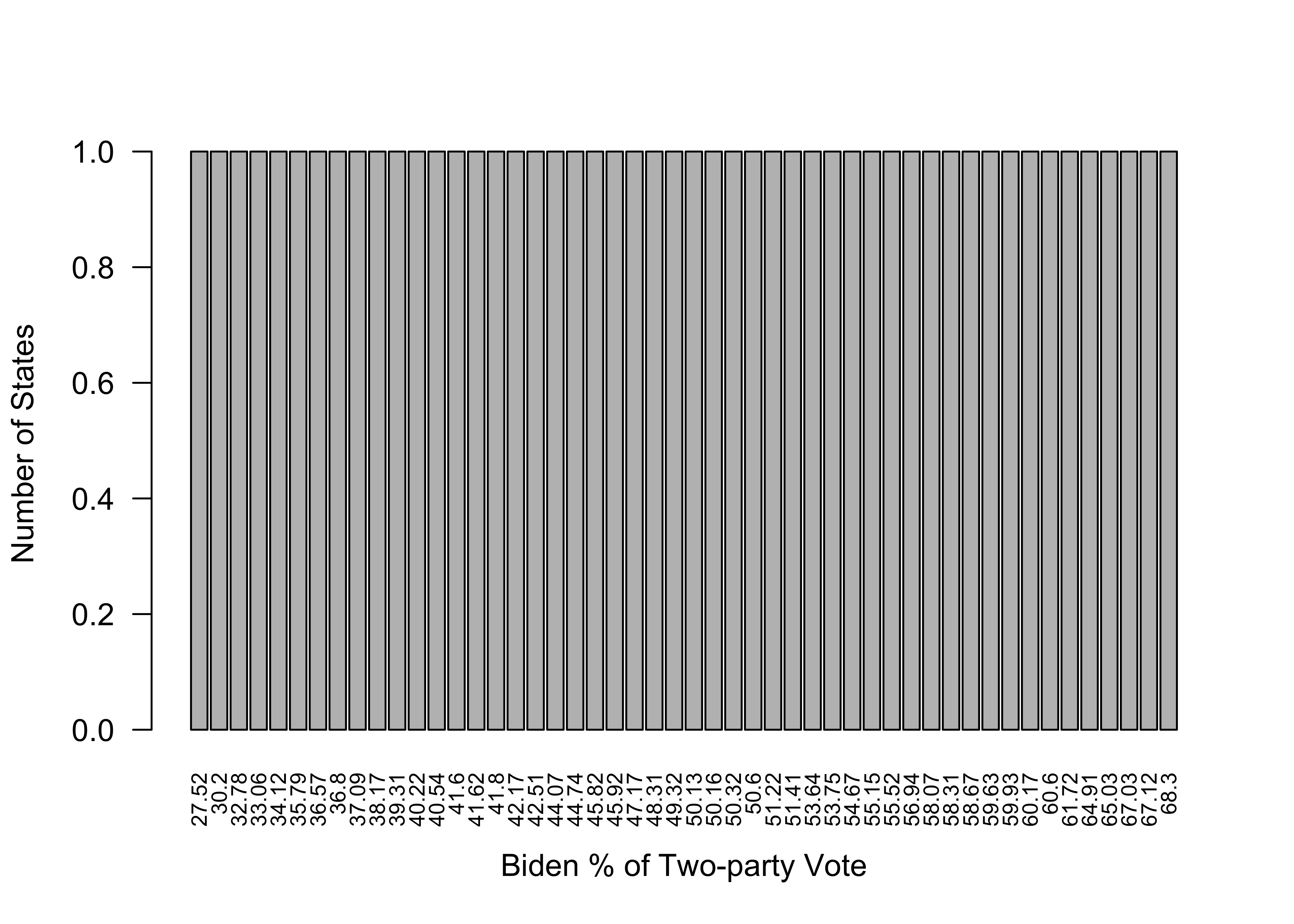
Not to put too fine a point on it, but this is a terrible graph, for many of the same reasons the initial frequency table for this variable was of little value. Other than telling us that the outcomes range from 27.52 to 68.3, there is nothing useful conveyed in this graph. What’s worse, it gives the misleading impression that votes were uniformly distributed between the lowest and highest values. There are a couple of reasons for this. First, no two states had exactly the same outcome, so there are as many distinct outcomes and vertical bars as there are states, leading to a flat distribution. This is likely to be the case with many numeric variables, especially when the outcomes are continuous. Second, the proximity of the bars to each other reflects the rank order of outcomes, not the quantitative distance between categories. For instance, the two lowest values are 27.52 and 30.20, a difference of 2.68, and the third and fourth lowest values are 32.78 and 33.06, a difference of .28. Despite these quantitative differences in the distance between the first and second, and third and fourth outcomes, the spacing between the bars in the bar chart makes it look like the distances are the same. Bottom line, bar charts are great for most categorical data but usually are not the preferred method for graphing numeric data.
Histograms
Histograms were introduced in Chapter 2 as a tool for visualizing how the outcomes of a variable are distributed. It is hard to overstate how useful histograms are for conveying information about the range of outcomes, whether outcomes tend to be concentrated or widely dispersed across that range, and if there is something approaching a “typical” outcome. In short, histograms show us the shape of the data.7
Let’s take another look at Joe Biden’s percent of the two-party vote in the states but this time using a histogram.
#Histogram for Biden's % of the two-party vote in the states
hist(states20$d2pty20,
     xlab="Biden % of Two-party Vote",
     ylab="Number of States",
     main="Histogram of Biden Support in the States")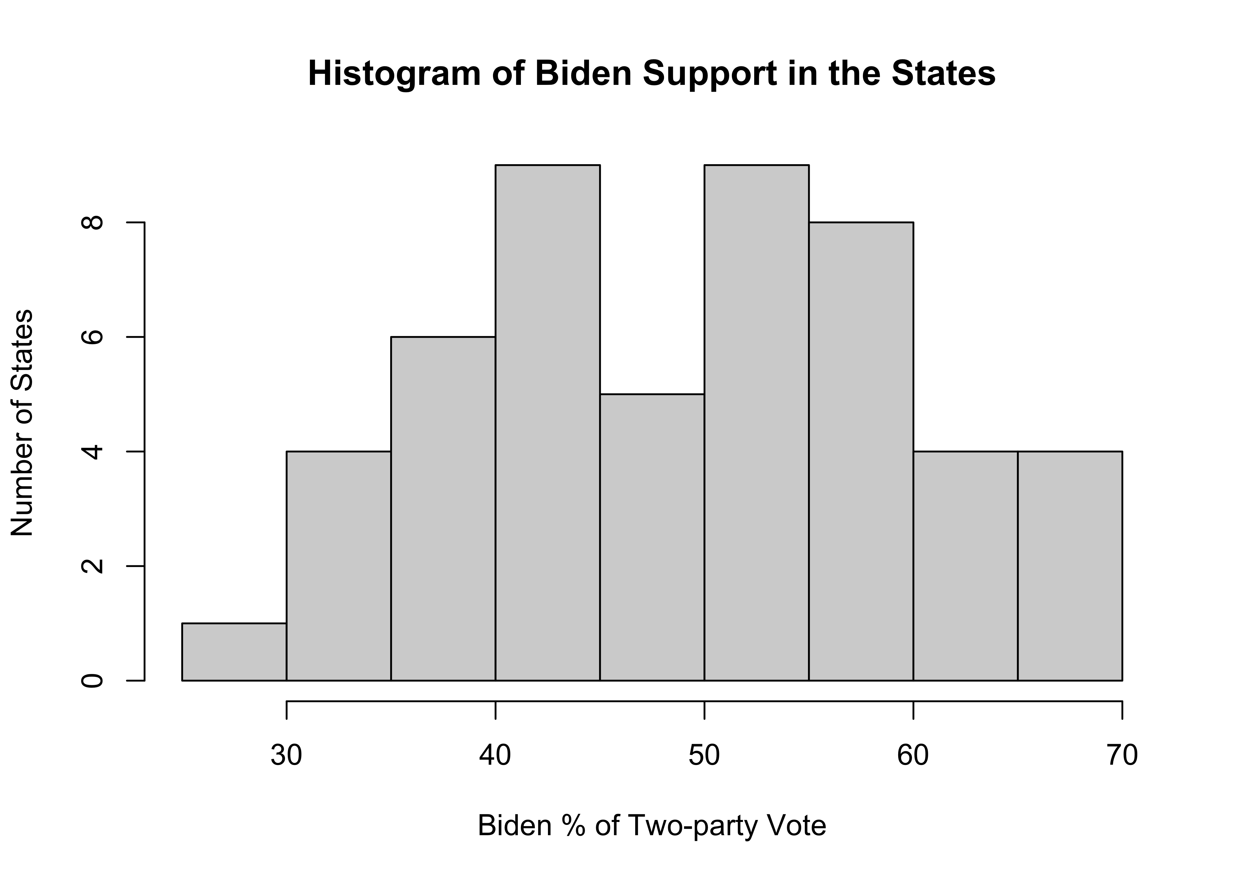
The width of the bars represents a range of values and the height represents the number of outcomes that fall within that range. At the low end there is just one state in the 25 to 30 range, and at the high end, there are four states in the 65 to 70 range. More importantly, there is no clustering at one end or the other, and the distribution is somewhat bell-shaped but with dip in the middle. It would be very hard to glean this information from the frequency table and bar chart for this variable presented earlier.
Just as bar charts are the graphic representation of the raw frequencies for each outcome, we can think of histograms as the graphic representation of the binned frequencies, similar to those produced by the Freq command. In fact, R uses the same rules for grouping observations for histograms as it does for the binned frequencies used in the Freq command used earlier.
You can also examine the relative frequency of histogram bins by adding probability = T to the r code. This produces “density” values on the vertical axis.
#Histogram for Biden's % of the two-party vote in the states
hist(states20$d2pty20,
     probability = T,
     xlab="Biden % of Two-party Vote",
     ylab="Density",
     main="Histogram of Biden Support in the States")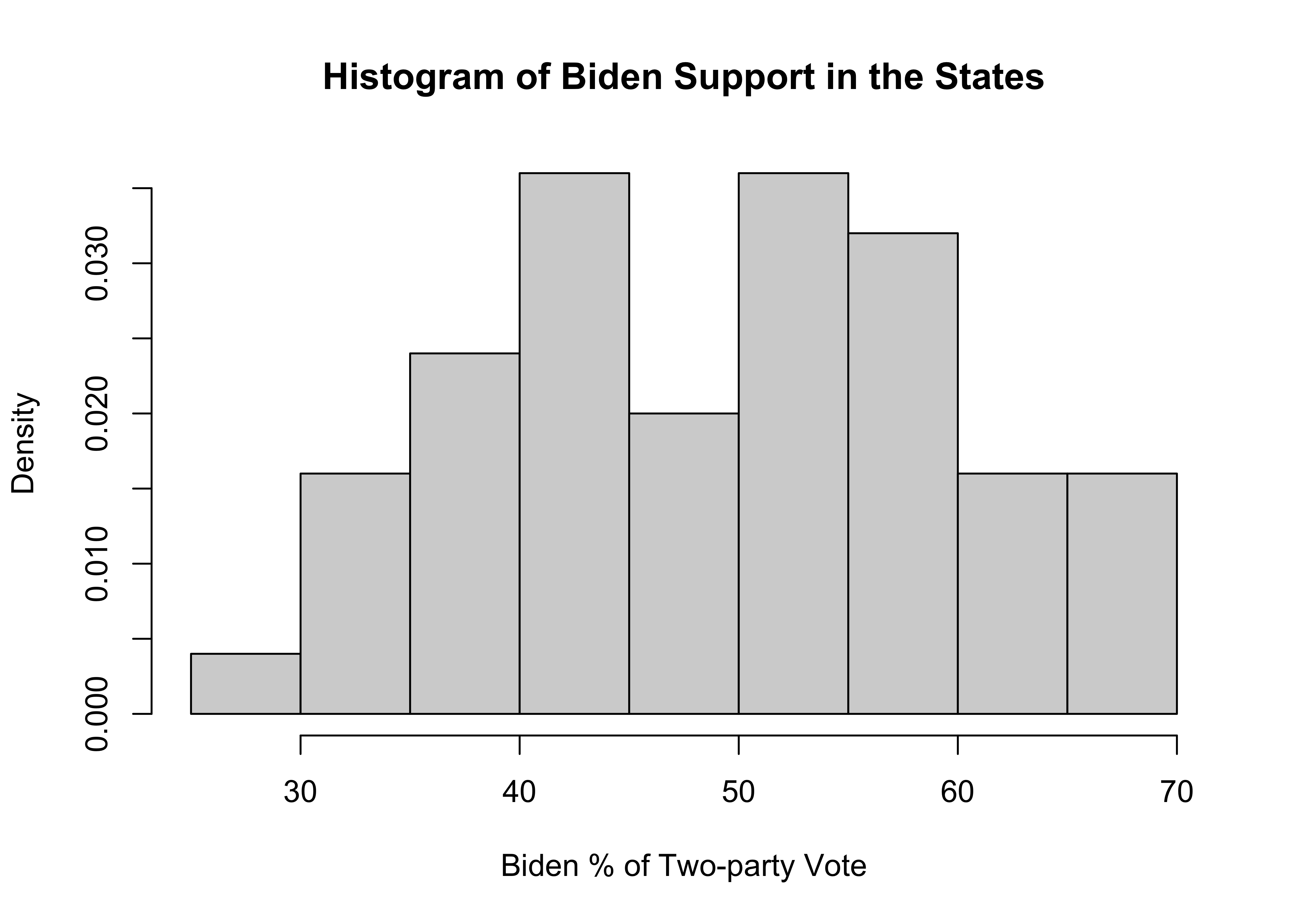
Density values are a particular expression of probability (or percentages), and their application to histograms is easy to understand if we walk through an example with a couple simple calculations. Let’s focus on the fourth bin from the left in the histogram, which ranges from 40 to 45. The density on the vertical axis for this bin .036. If you multiply the value of this density times the width of the interval (5), you get .036*5=.18. This value represents the proportion of states that are in the 40 to 45 bin. This is the same as the binned percentage from the frequency table shown earlier in this chapter, in which 18% of all states were in this interval. The take away is that higher density values reflect higher proportions (percentages), and lower density values reflect lower proportions (percentages).
Density Plots
The concept of density values can be extended to density plots, a close kin to histograms. One slight drawback to histograms is that the chunky nature of the bars can sometimes obscure the more general, continuous shape of the distribution. A density plot helps alleviate this problem by taking information from the variable’s outcomes and generating a line that smooths out the bumpiness of the histogram and summarizes the shape of the distribution. The line should be thought of as an estimate of a theoretical distribution of a continuous variable, based on the underlying patterns in the data.
To get a density plot, you continue to use the plot function, as shown below. Here, the command tells R to create a plot of the density values of states20$d2pty20.
#Generate a density plot with no histogram
plot(density(states20$d2pty20) ,
     xlab="Biden % of Two-Party Vote",
     main="Biden Votes in the States",
     lwd=3)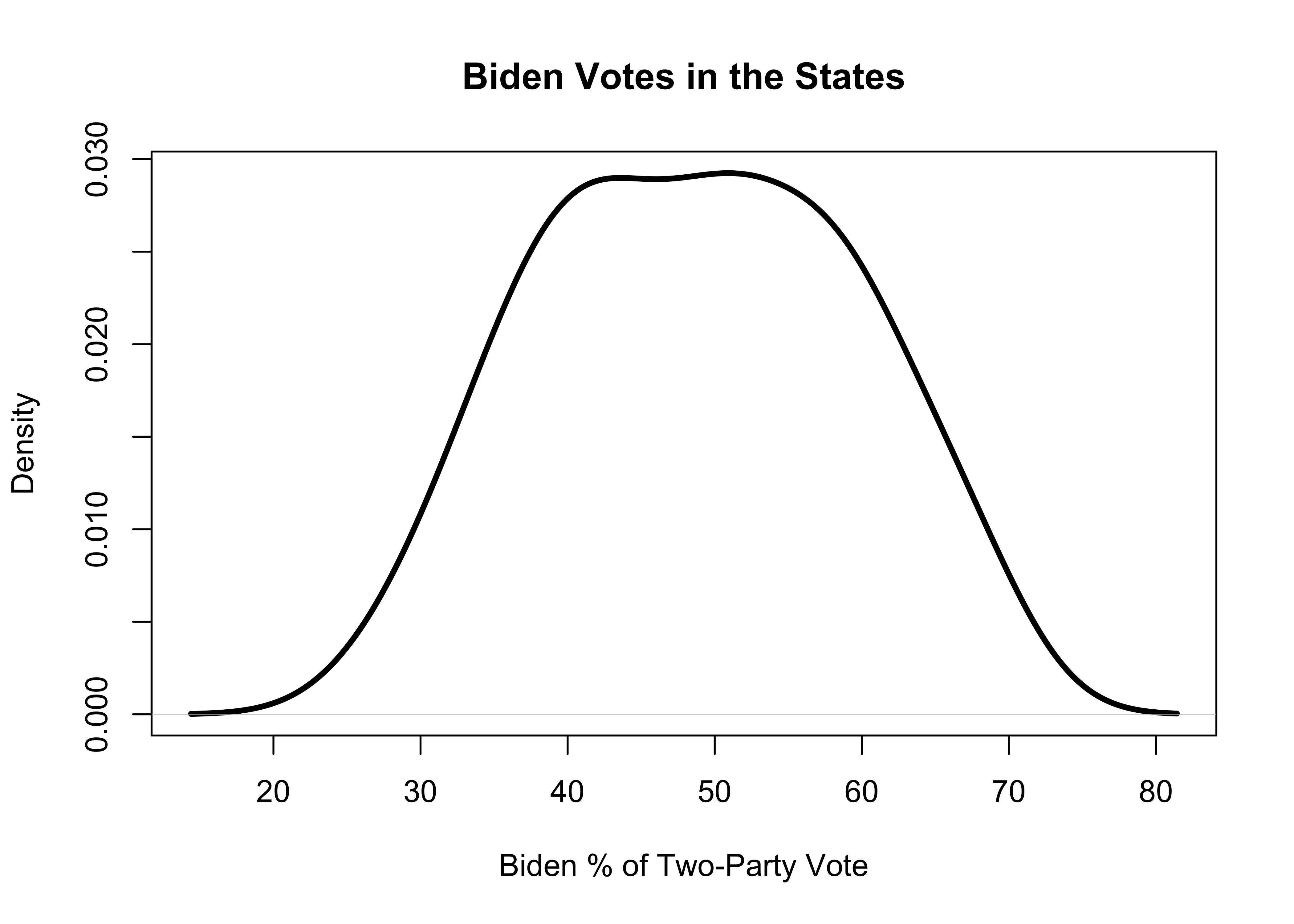
The smoothed density line reinforces the impression from the histogram that there are relatively few states with extremely low or high values, and the vast majority of states are clustered in the 40-60% range. It is not quite a bell-shaped curve–somewhat symmetric, but a bit flatter than a bell-shaped curve. As discussed above, the density values on the vertical axis reflect the relative frequency of the outcomes. That said, it is best to focus on the height on the y-axis for various points on the density line rather than on interpretation of specific density values. Also, note that the density plot is not limited to the same x-axis limits as in the histogram and the solid line can extend beyond those limits as if there were data points out there.
Let’s take a quick look at a density plot for the other numeric variable used in this chapter, abortion laws in the states.
#Density plot for Number of abortion laws in the states
plot(density(states20$abortion_laws),
     xlab="Number of Laws Restricting Access to Abortions",
     main="Abortion Laws in the States",
     lwd=3)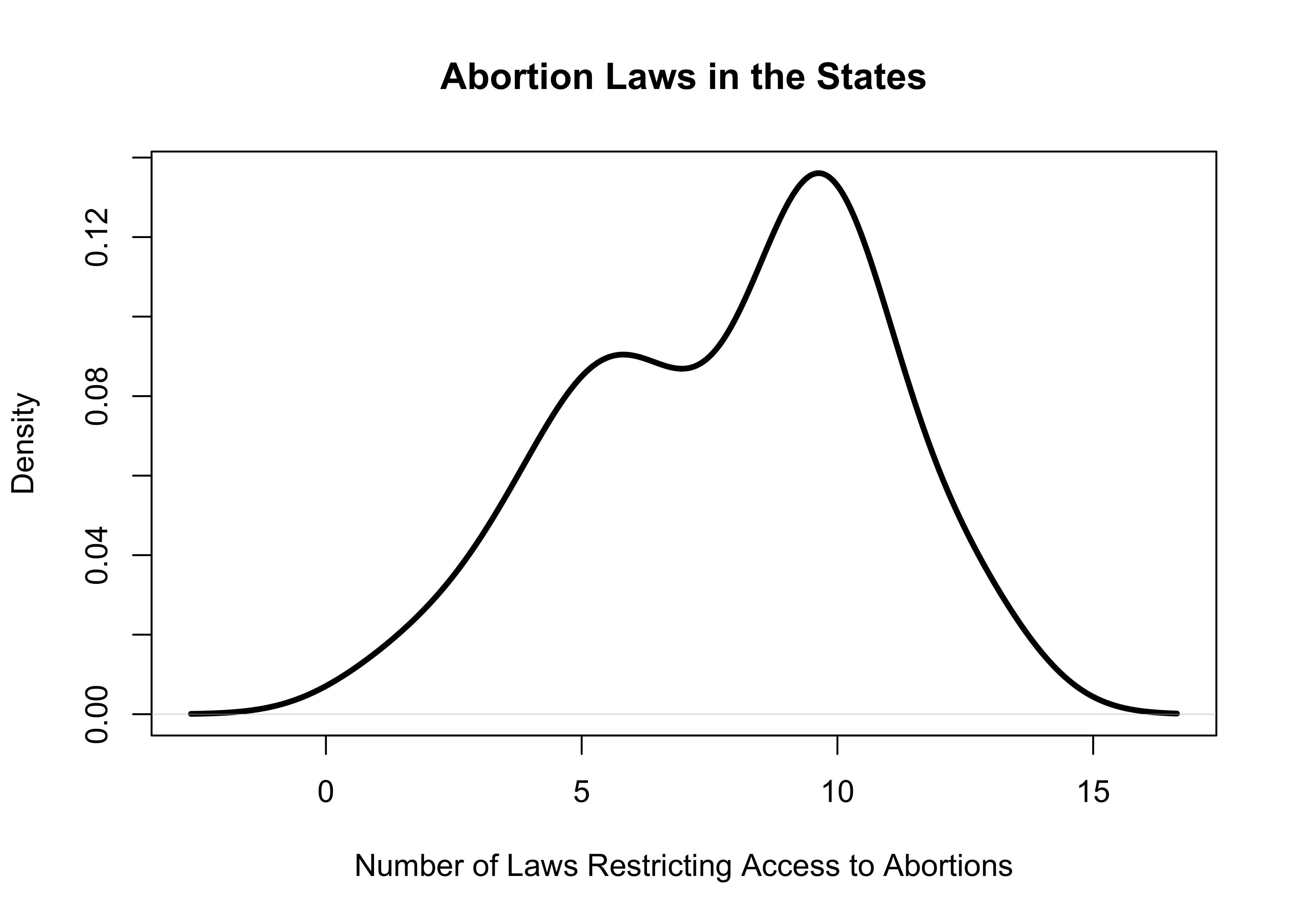
This plot shows that the vast majority of the states have more than five abortion restrictions on the books and the distribution is sort of bimodal (two primary groupings) at around five and ten restrictions.
A few Add-ons for Graphing
As you progress through the remaining chapters in this book, you will learn a lot more about how to use graphs to illuminate interesting things about your data. Before moving on to the next chapter, I want to show you a few things you can do to change the appearance of the simple bar charts and histograms we have been working with so far.
col=" "is used to designate the color of the bars. Gray is the default color, but you can choose to use some other color if it makes sense to you. You can get a list of all colors available in R by typingcolors()at the prompt in the console window.horiz=Tis used if you want to flip a bar chart so the bars run horizontally from the vertical axis. This is not available for histograms.breaks=is used in a histogram to change the number of bars (bins) used to display the data. We used this command earlier in the discussion of setting specific bin ranges in frequency tables, but for right now we will just specify a single number that determines how many bars will be used.
The examples below add some of this information to graphs we examined earlier in this chapter.
#Use five bins and color them white
hist(states20$d2pty20,
     xlab="Biden % of Two-party Vote",
     ylab="Number of States",
     main="Histogram of Biden Support in the States",
     col="white", #Use white to color the bars
     breaks=5) #Use just five categories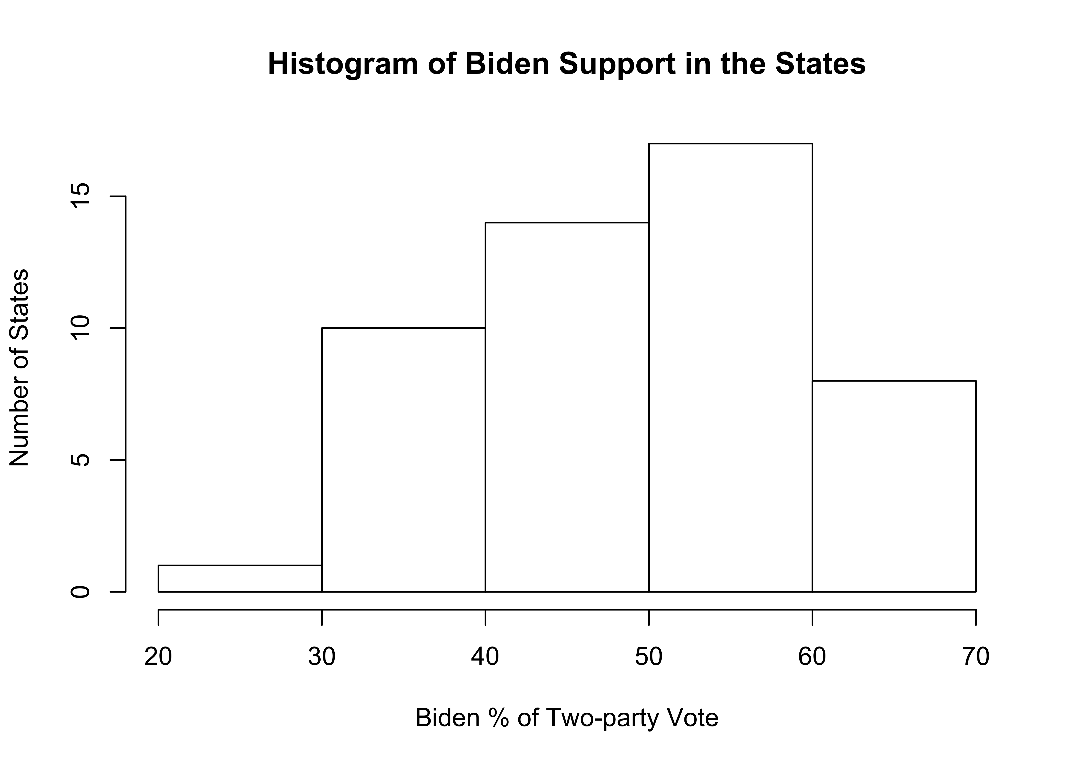
As you can see, things turned out well for the histogram with just five bins, though I think five is probably too few and obscures some of the important variation in the variable. If you decided you prefer a certain color but not the default gray, you just change col="white" to something else. Go ahead, give it try!
The graph below is a first attempt at flipping the barplot for attitudes toward the spending on aid for the poor, using white horizontal bars.
#Horizontal bar chart with white bars
barplot(poorAid.tbl,
        names.arg=c("Increase/Lot", "Increase", "Same",
                    "Decrease","Decrease/Lot"),
        xlab="Number of Cases",
        ylab="Increase or Decrease Spending on Aid to the Poor?",
        main="Spending Preference",
        horiz=T, #Plot bars horizontally
        col="white") #Use white to color the bars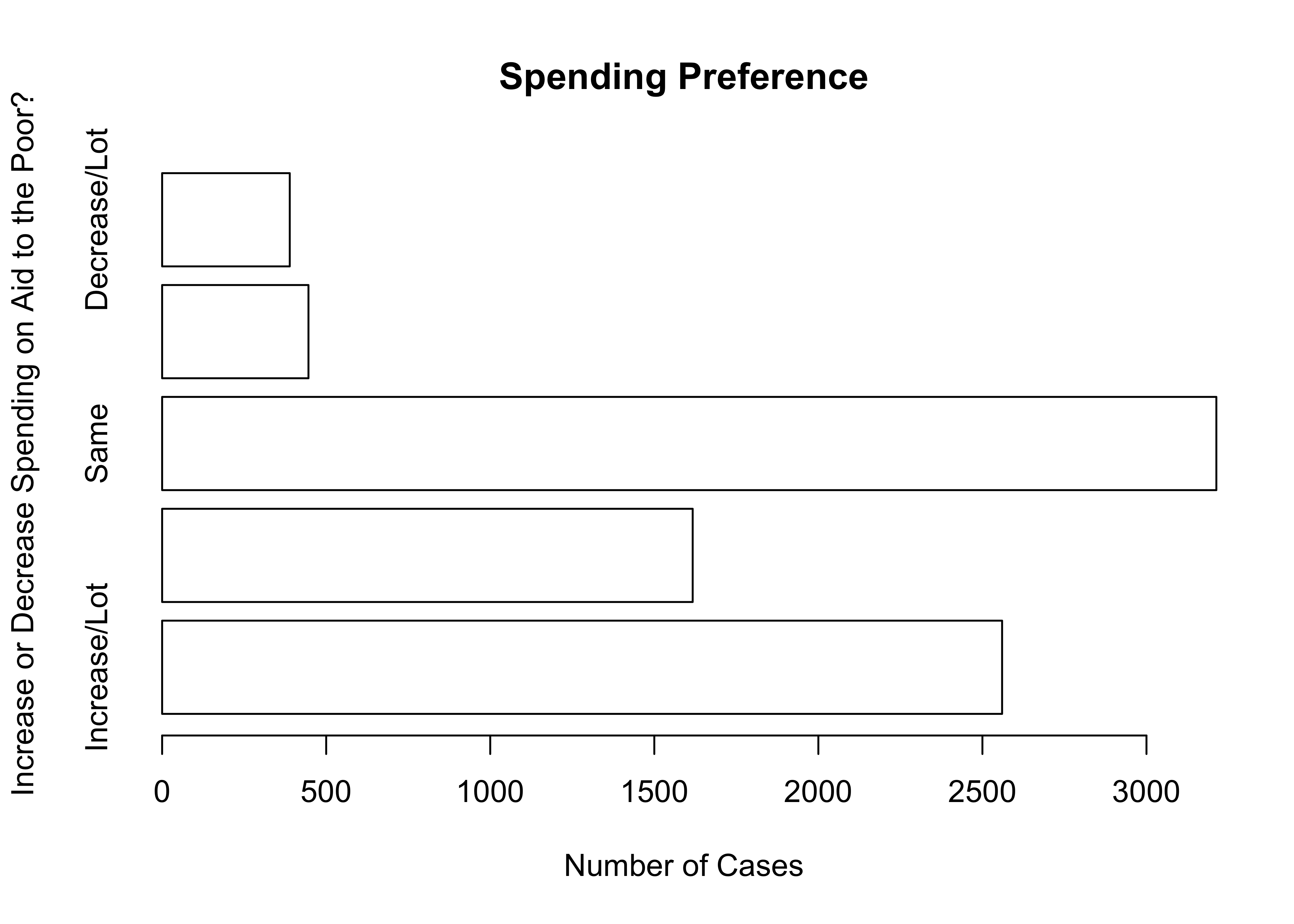
As you can see, the horizontal bar chart for spending preferences turns out to have a familiar problem: the value labels are too large and don’t all print. This isn’t horrible but it could be improved by making room for all value labels, as I’ve done below 8.
First, par(las=2) instructs R to print the value labels sideways. Anytime you see par followed by other terms in parentheses, it is a command to alter the graphic parameters. The labels were still a bit too long to fit, so I increased the margin on the left with par(mar=c(5,8,4,2)). This command sets the margin size for the graph, where the order of numbers is c(bottom, left, top, right). Normally this is set to mar=c(5,4,4,2), so increasing the second number to eight expanded the left margin area and provided enough room for value labels. However, the horizontal category labels overlapped with the y-axis title, so I dropped the axis title and modified the main title to help clarify what the labels represent.
#Change direction of the value labels
par(las=2)
#Change the left border to make room for the labels
par(mar=c(5,8,4,2))
barplot(poorAid.tbl,
        names.arg=c("Increase/Lot", "Increase", "Same",
                    "Decrease","Decrease/Lot"),
        xlab="Number of Cases",
        main="Spending Preference: Aid to the Poor",
        horiz=T,
        col="white",)
As you can see, changing the orientation of your bar chart could entail changing any number of other characteristics. If you think the horizontal orientation works best for a particular variable, then go for it. Just take a close look when you are done to make sure everything looks the way it should look. An important lesson to take away from this is that you sometimes have to work hard, trying many different things, to get a particular graph to look as nice as it should.
Whenever you change the graphing parameters as we have done here, you need to change them back to what they were originally. Otherwise, those changes will affect all of your subsequent work.
Next Steps
Simple frequency tables, bar charts, and histograms can provide a lot of interesting information about how variables are distributed. Sometimes this information can tip you off to potential errors in coding or collecting data, but mostly it is useful for “getting to know” the data. Starting with this type of analysis provides researchers with a level of familiarity and connection to the data that can pay dividends down the road when working with more complex statistics and graphs.
As alluded to earlier, you will learn about a lot of other graphing techniques in subsequent chapters, once you’ve become familiar with the statistics that are used in conjunction with those graphs. Prior to that, though, it is important to spend a bit of time learning more about how to use R to transform variables so that you have the data you need to create the best most useful graphs and statistics for your research. This task is taken up in the next chapter.
Exercises
Concepts and Calculations
You might recognize this list of variables from the exercises at the end of Chapter 1. Identify whether a histogram or bar chart would be most appropriate for summarizing the distribution of each variable. Explain your choice.
- Course letter grade
- Voter turnout rate (%)
- Marital status (Married, divorced, single, etc)
- Occupation (Professor, cook, mechanic, etc.)
- Body weight
- Total number of votes cast in an election
- #Years of education
- Subjective social class (Poor, working class, middle class, etc.)
- % of people living below poverty level income
- Racial or ethnic group identification
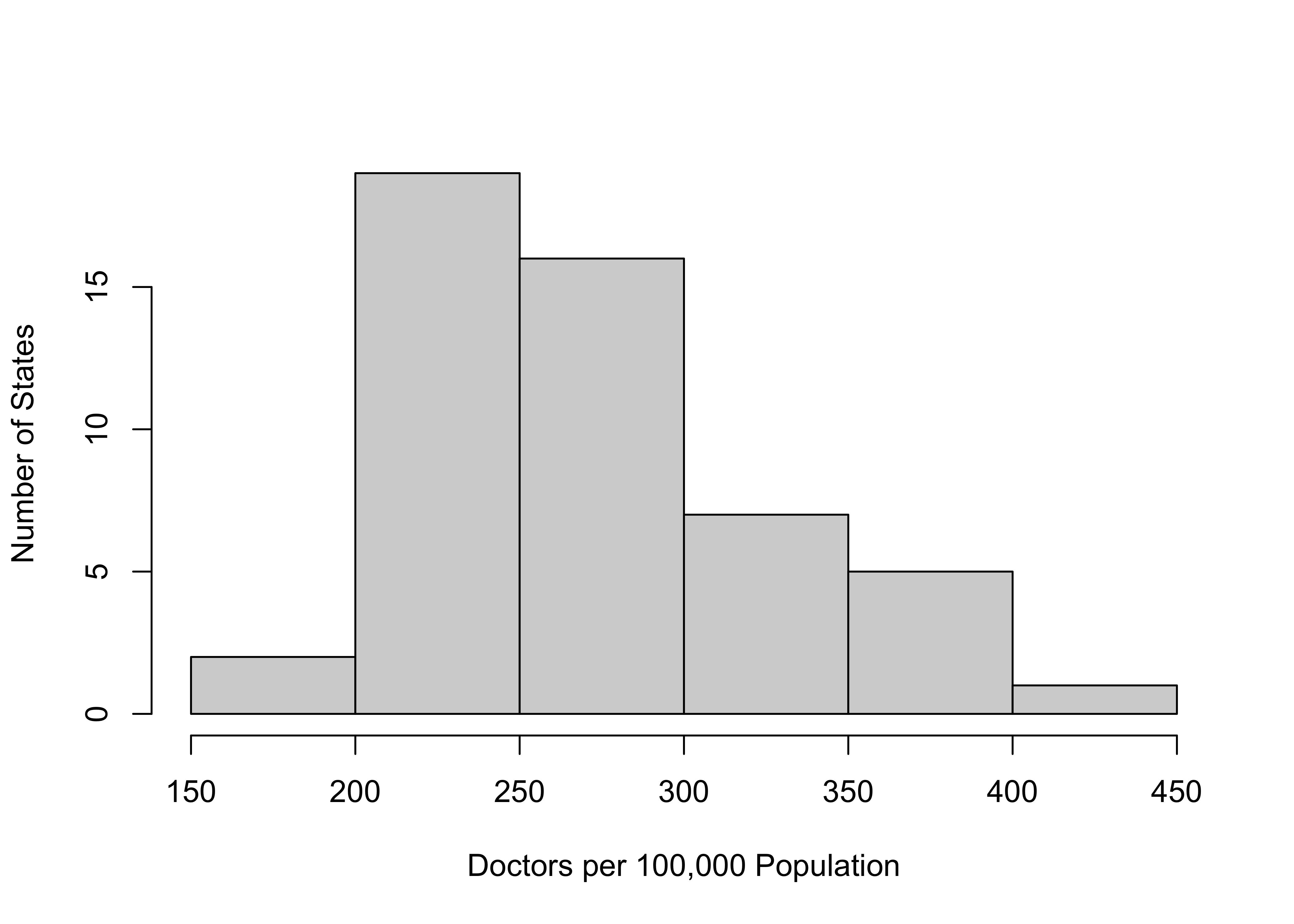
This histogram shows the distribution of medical doctors per 100,000 population across the states.
- Assume that you want to describe this distribution to someone who does not have access to the histogram. What do you tell them?
- Given that the intervals in the histogram are right-closed, what range of values are included in the 250 to 300 interval? How would this be different if the intervals were left-closed.
- Assume that you want to describe this distribution to someone who does not have access to the histogram. What do you tell them?
A group of students on a college campus interviewed 300 students to get their evaluations of different aspects of campus life. One question they asked was, “Overall, how satisfied are you with the quality of instruction in your courses?” The response categories and frequencies are presented below. Fill in the missing information in the Percent and Cumulative Percent columns and describe the overall level of satisfaction with instruction at this university.
Frequency Percent Cumulative % Very Dissatisfied 45 Somewhat Dissatisfied 69 Somewhat Satisfied 120 Very Satisfied 66
R Problems
- I’ve tried to get a bar chart for
anes20$V201119, a variable that measures how happy people are with the way things are going in the U.S., but I keep getting an error message. Can you figure out what I’ve done wrong? Diagnose the problem and present the correct barplot.
barplot(anes20$V201119,
        xlab="How Happy with the Way Things Are Going?",
        ylab="Number of Respondents")
Choose the most appropriate type of frequency table (
freqorFreq) to summarize the distribution of values for the three variables listed below. Make sure to look at the codebooks so you know what these variables represent. Present the tables and provide a brief summary of their contents. Justifyt your choice of tables.- Variables:
anes20$V202178,anes20$V202384, andstates20$union.
- Variables:
For the same set of variables listed above in question #2, choose the appropriate type of graph (bar chart or histogram) for visualizing the distributions of the variables and discuss what you see. As above, make sure to justify your choice of graphing technique.
Create a histogram and a density plot for
states20$beer, a variable that measures the per capita gallons of beer consumed in the states, making sure to create appropriate axis titles. In your opinion, is the density plot or the histogram easier to read and understand? Explain your response.
American National Election Studies. 2021. ANES 2020 Time Series Study Full Release . July 19, 2021 version. www.electionstudies.org↩︎
Note that the data for this variable do not reflect the sweeping changes to abortion laws in the states that took place in 2021 and 2022.↩︎
There are other graphing methods that provide this type of information, but they require a bit more knowledge of measures of central tendency and variation, so they will be presented in later chapters.↩︎
One option not shown here is to reduce the size of the labels using
cex.names. Unfortunately, you have to cut the size in half to get them to fit, rendering them hard to read.↩︎