Chapter 14 Correlation and Scatterplots
Get Started
This chapter expands the discussion of measures of association to include methods commonly used to measure the strength and direction of relationships between numeric variables. To follow along in R, you should load the countries2 data set and attach the libraries for the following packages: descr, DescTools, Hmisc, ppcor, and readxl.
Relationships between Numeric Variables
Crosstabs, chi-square, and measures of association are valuable and important techniques when using factor variables, but they do not provide a sufficient means of assessing the strength and direction of relationships when the independent and dependent variables are numeric. For instance, I have data from roughly 190 different countries and I am interested in explaining cross-national differences in life expectancy (measured in years). One potential explanatory variable is the country-level fertility rate (births per woman of childbearing age), which I expect to be negatively related to life expectancy. These are both ratio-level variables, and a crosstab for these two variables would have more than 100 columns and more than 100 rows since very few countries will have exactly the same values on these variables. This would not be a useful crosstab.
Before getting into the specifics of how to evaluate this type of relationship, let’s look at some descriptive information for these two variables:
#Display histograms side-by-side (one row, two columns)
par(mfrow = c(1,2))
hist(countries2$lifexp, xlab="Life Expectancy",
     main="",
     cex.lab=.7, #Reduce the size of the labels and
     cex.axis=.7)# axis values to fit
hist(countries2$fert1520, xlab="Fertility Rate",
     main="",
    cex.lab=.7, #Reduce the size of the labels and
     cex.axis=.7)# axis values to fit
On the left, life expectancy presents with a bit of negative skew (mean=72.6, median=73.9, skewness=-.5), the modal group is in the 75-80 years-old category, and there is quite a wide range of outcomes, spanning from around 53 to 85 years. When you think about the gravity of this variable–how long people tend to live–this range is consequential. In the graph on the right, the pattern for fertility rate is a mirror image of life expectancy–very clear right skew (mean=2.74, median=2.28, skewness.93), modal outcomes toward the low end of the scale, and the range is from 1-2 births per woman in many countries to more than 5 for several countries.35
Before looking at the relationship between these two variables, let’s think about what we expect to find. I anticipate that countries with low fertility rates have higher life expectancy than those with high fertility rates (negative relationship), for a couple of reasons. First, in many places around the world, pregnancy and childbirth are significant causes of death in women of childbearing age. While maternal mortality has declined in much of the “developed” world, it is still a serious problem in many of the poorest regions. Second, higher birth rates are also associated with high levels of infant and child mortality. Together, these outcomes associated with fertility rates auger for a negative relationship between fertility rate and life expectancy.
Scatterplots
Let’s look at this relationship with a scatterplot. Scatterplots are like crosstabs in that they display joint outcomes on both variables, but they look a lot different due to the nature of the data:
#Scatterplot(Independent variable, Dependent variable)
#Scatterplot of "lifexp" by "fert1520"
plot(countries2$fert1520, countries2$lifexp,
     xlab="Fertility Rate",
     ylab="Life Expectancy")
In the scatter plot above, the values for the dependent variable span the vertical axis, values of the independent variable span the horizontal axis, and each circle represents the value of both variables for a single country. There appears to be a strong pattern in the data: countries with low fertility rates tend to have high life expectancy, and countries with high fertility rates tend to have low life expectancy. In other words, as the fertility rate increases, life expectancy declines. You might recognize this from the discussion of directional relationships in crosstabs as the description of a negative relationship. But you might also notice that the pattern looks different (sloping down and to the right) from a negative pattern in a crosstab. This is because the low values for both the independent and dependent variables are in the lower left-corner of the scatter plot while they are in the upper-left corner of the crosstabs.
When looking at scatterplots, it is sometimes useful to imagine something like a crosstab overlay, especially since you’ve just learned about crosstabs. If there are relatively empty corners, with the markers clearly following an upward or downward diagonal, the relationship is probably strong, like a crosstab in which observations are clustered in diagonal cells. We can overlay a horizontal line at the mean of the dependent variable and a vertical line at the mean of the independent variable to help us think of this in terms similar to a crosstab:
plot(countries2$fert1520, countries2$lifexp, xlab="Fertility Rate",
     ylab="Life Expectancy")
#Add horizontal and vertical lines at the variable means
abline(v=mean(countries2$fert1520, na.rm = T),
       h=mean(countries2$lifexp, na.rm = T), lty=c(1,2))
#Add legend
legend("topright", legend=c("Mean Y", "Mean X"),lty=c(1,2), cex=.9)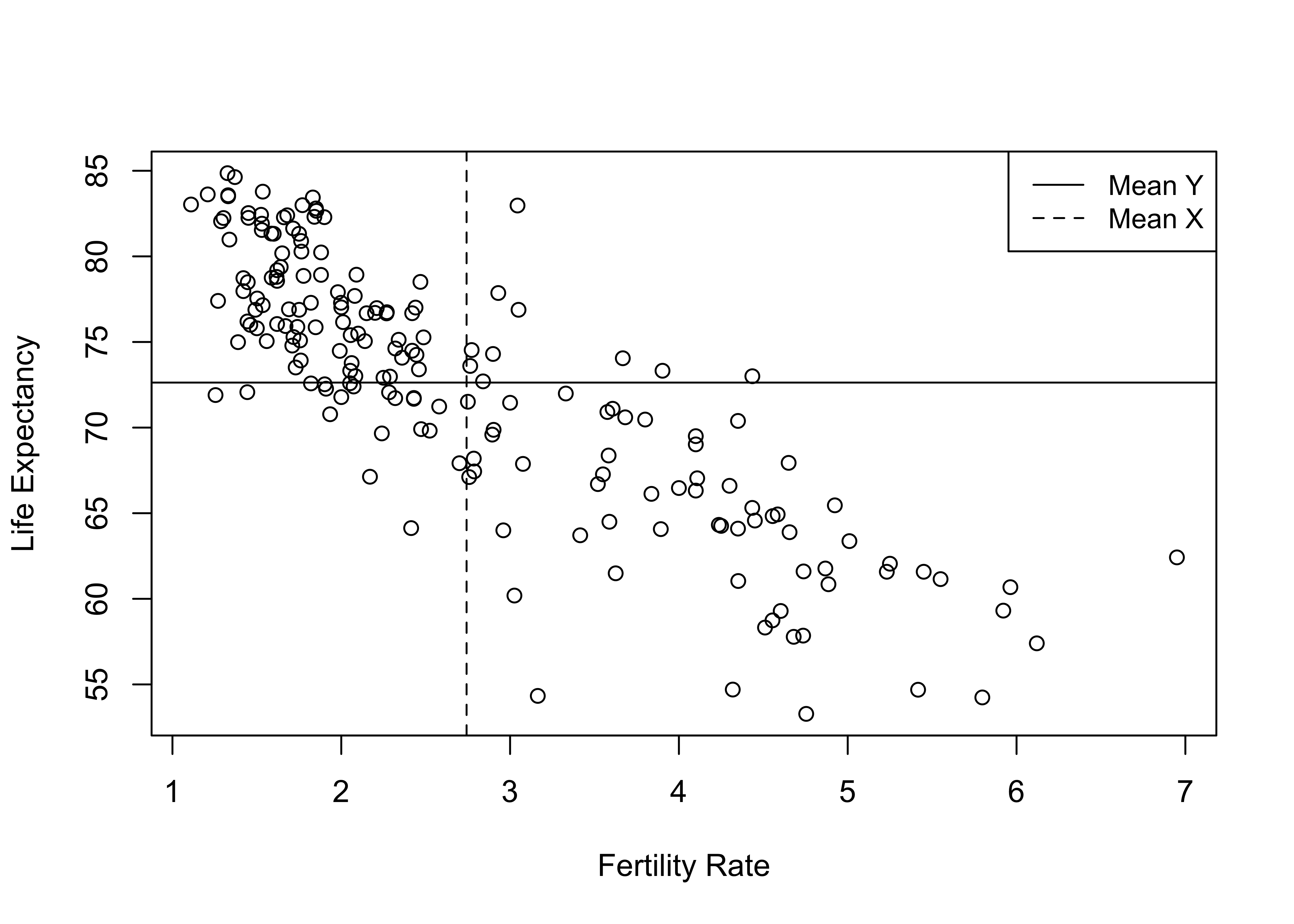
Using this framework helps illustrate the extent to which high or low values of the independent variable are associated with high or low values of the dependent variable. The vast majority of cases that are below average on fertility are above average on life expectancy (upper-left corner), and most of the countries that are above average on fertility are below average on life expectancy (lower-right corner). There are only a few countries that don’t fit this pattern, found in the upper-right and lower-left corners. Even without the horizontal and vertical lines for the means, it is clear from looking at the pattern in the data that the typical outcome for the dependent variable declines as the value of the independent variable increases. This is what a strong negative relationship looks like.
Just to push the crosstab analogy a bit farther, we can convert these data into high and low categories (relative to the means) on both variables, create a crosstab, and check out some of measures of associations used in the Chapter 13.
#Collapsing "fert1520" at its mean value into two categories
countries2$Fertility.2<-cut2(countries2$fert1520,
                      cut=c(mean(countries2$fert1520, na.rm = T)))
#Assign labels to levels
levels(countries2$Fertility.2)<- c("Below Average", "Above Average")
#Collapsing "lifexp" at its mean value into two categories
countries2$Life_Exp.2= cut2(countries2$lifexp,
                    cut=c(mean(countries2$lifexp, na.rm = T)))
#Assign labels to levels
levels(countries2$Life_Exp.2)<-c("Below Average", "Above Average")
crosstab(countries2$Life_Exp.2,countries2$Fertility.2,
         prop.c=T,
         plot=F)
Cell Contents
|-------------------------|
| Count |
| Column Percent |
|-------------------------|
==============================================================
countries2$Fertility.2
countries2$Life_Exp.2 Below Average Above Average Total
--------------------------------------------------------------
Below Average 20 63 83
17.9% 86.3%
--------------------------------------------------------------
Above Average 92 10 102
82.1% 13.7%
--------------------------------------------------------------
Total 112 73 185
60.5% 39.5%
==============================================================This crosstab reinforces the impression that this is a strong negative relationship: 86.3% of countries with above average fertility rates have below average life expectancy, and 82.1% of countries with below average fertility rates have above average life expectancy. The measures of association listed below confirm this. According to Lambda, information from fertility rate variable reduces error in predicting life expectancy by 64%. In addition, the values of Cramer’s V (.67) and tau-b (-.67) confirm the strength and direction of the relationship. Note that tau-b also confirms the negative relationship.
#Get measures of association
Lambda(countries2$Life_Exp.2,countries2$Fertility.2, direction=c("row"),
       conf.level = .05)
lambda lwr.ci upr.ci
0.63855 0.63467 0.64244 Cramer V lwr.ci upr.ci
0.67262 0.66801 0.67723 tau_b lwr.ci upr.ci
-0.67262 -0.67608 -0.66915 The crosstab and measures of association together point to a strong negative relationship. However, a lot of information is lost by just focusing on a two-by-two table that divides both variables at their means. There is substantial variation in outcomes on both life expectancy and fertility within each of the crosstab cells, variation that can be exploited to get a more complete sense of the relationship. For example, countries with above average levels of fertility range from about 2.8 to 7 births per woman of childbearing age, and countries with above average life expectancy have outcomes ranging from about 73 to 85 years of life expectancy. But the crosstab treats all countries in each cell as if they have the same outcome—high or low on the independent and dependent variables. Even if we expanded this to a 4x4 or 5x5 table, we would still be losing information by collapsing values of both the independent and dependent variables. What we need is a statistic that utilizes all the variation in both variables, as represented in the scatterplot, and summarizes the extent to which the relationship follows a positive or negative pattern.
Pearson’s r
Similar to ordinal measures of association, a good interval/ratio measure of association is positive when values of X that are relatively high tend to be associated with values of Y that are relatively high, and values of X that are relatively low are associated with values of Y that are relatively low. And, of course, a good measure of association should be negative when values of X that are relatively high tend to be associated with values of Y that are relatively low, and values of X that are relatively low are associated with values of Y that are relatively high.
One way to capture these positive and negative patterns is to express the value of all observations as deviations from the means of both the independent variable \((x_i-\bar{x})\) and the dependent variable \((y_i-\bar{y})\). Then, we can multiply the deviation from \(\bar{x}\) times the deviation from \(\bar{y}\) to see if the observation follows a positive or negative pattern.
\[(x_i-\bar{x})(y_i-\bar{y})\]
If the product is negative, the observation fits a negative pattern (think of it like a dissimilar pair from crosstabs); if the product is positive, the observation fits a positive pattern (think similar pair). We can sum these products across all observations to get a sense of whether the relationship, on balance, is positive or negative, in much the same way as we did by subtracting dissimilar pairs from similar pairs for gamma in Chapter 13.
Pearson’s correlation coefficient (r) does this and can be used to summarize the strength and direction of a relationship between two numeric variables:
\[r=\frac{\sum(x_i-\bar{x})(y_i-\bar{y})}{\sqrt{\sum(x_i-\bar{x})^2\sum(y_i-\bar{y})^2}}\]
Although this formula may look a bit dense, it is quite intuitive. The numerator is exactly what we just discussed, a summary of the positive or negative pattern in the data. The denominator standardizes the numerator by the overall levels of variation in X and Y and provides -1 to +1 boundaries for Pearson’s r. As was the case with the ordinal measures of association, values near 0 indicate a weak relationship and the strength of the relationship grows stronger moving from 0 to -1 or +1.
Calculating Pearson’s r
Let’s work our way through these calculations just once for the relationship between fertility rate and life expectancy, using a random sample of only ten countries (Afghanistan, Bhutan, Costa Rica, Finland, Indonesia, Lesotho, Montenegro, Peru, Singapore, and Togo). The scatterplot below shows that even with just ten countries a pattern emerges that is similar to that found in the scatterplot from the full set of countries—as fertility rates increase, life expectancy decreases.
#import "X10countries "Excel" file. Check file path if you get an error
X10countries <- read_excel("~/Dropbox/Rdata/10countries.xlsx")
#Plot relationship for 10-country sample
plot(X10countries$fert1520, X10countries$lifexp,
     xlab="Fertility Rate",
     ylab="Life Expectancy")
We can use data on the dependent and independent variables for these ten countries to generate the components necessary for calculating Pearson’s r.
#Deviation of y from its mean
X10countries$ydev=X10countries$lifexp-mean(X10countries$lifexp)
#Deviation of x from its mean
X10countries$xdev=X10countries$fert1520-mean(X10countries$fert1520)
#Cross-product of x and y deviations from their means
X10countries$ydev_xdev=X10countries$ydev*X10countries$xdev
#Squared deviation of y from its mean
X10countries$ydevsq=X10countries$ydev^2
#Squared deviation of x from its mean
X10countries$xdevsq=X10countries$xdev^2
The table below includes the country names, the values of the independent and dependent variables, and all the pieces needed to calculate Pearson’s r for the sample of ten countries shown in the scatterplot. It is worth taking the time to work through the calculations to see where the final figure comes from.
| Country | lifexp | fert1520 | ydev | xdev | ydev_xdev | ydevsq | xdevsq |
|---|---|---|---|---|---|---|---|
| Afghanistan | 64.8 | 4.555 | -7.44 | 2.064 | -15.355 | 55.354 | 4.259 |
| Bhutan | 71.2 | 2.000 | -1.04 | -0.491 | 0.511 | 1.082 | 0.241 |
| Costa Rica | 80.3 | 1.764 | 8.06 | -0.727 | -5.863 | 64.964 | 0.529 |
| Finland | 81.9 | 1.530 | 9.66 | -0.961 | -9.287 | 93.316 | 0.924 |
| Indonesia | 71.7 | 2.320 | -0.54 | -0.172 | 0.093 | 0.292 | 0.030 |
| Lesotho | 54.3 | 3.164 | -17.94 | 0.673 | -12.069 | 321.844 | 0.453 |
| Montenegro | 76.9 | 1.751 | 4.66 | -0.741 | -3.452 | 21.716 | 0.549 |
| Peru | 76.7 | 2.270 | 4.46 | -0.221 | -0.987 | 19.892 | 0.049 |
| Singapore | 83.6 | 1.209 | 11.36 | -1.282 | -14.568 | 129.050 | 1.644 |
| Togo | 61 | 4.352 | -11.24 | 1.860 | -20.908 | 126.338 | 3.460 |
Here, the first two columns of numbers are the outcomes for the dependent and independent variables, respectively, and the next two columns express these values as deviations from their means. The fifth column of data represents the cross-products of the mean deviations for each observation, and the sum of that column is the numerator for the equation. Since 8 of the 10 of the cross-products are negative, the numerator is negative (-81.885), as shown below. We can think of this numerator as measuring the covariation between x and y.
#Multiply and sum the y and x deviations from their means
numerator=sum(X10countries$ydev_xdev)
numerator
[1] -81.885The last two columns measure squared deviations from the mean for both y and x, and their column totals (summed below) capture the total variation in y and x, respectively. The square root of the product of the variation in y and x (135.65) constitutes the denominator in the equation, giving us:
var_y=sum(X10countries$ydevsq)
var_x=sum(X10countries$xdevsq)
denominator=sqrt(var_x*var_y)
denominator
[1] 100.61Now, let’s plug in the values for the numerator and denominator and calculate Pearson’s r.
\[r=\frac{\sum(x_i-\bar{x})(y_i-\bar{y})}{\sqrt{\sum(x_i-\bar{x})^2\sum(y_i-\bar{y})^2}}=\frac{-81.885}{100.61}= -.81391\]
This correlation confirms a strong negative relationship between fertility rate and life expectancy in the sample of ten countries. Before getting too far ahead of ourselves, we need to be mindful of the fact that we are testing a hypothesis regarding these two variables. In this case, the null hypothesis is that there is no relationship between these variables:
H0: \(\rho=0\)
And the alternative hypothesis is that we expect a negative correlation:
H1: \(\rho<0\)
A t-test can be used to evaluate the null hypothesis that Pearson’s r equals zero. We can get the results of the t-test and check the calculation of the correlation coefficient for this small sample, using the cor.test function in R:
    Pearson's product-moment correlation

data:  X10countries$lifexp and X10countries$fert1520
t = -3.96, df = 8, p-value = 0.0042
alternative hypothesis: true correlation is not equal to 0
95 percent confidence interval:
 -0.95443 -0.37798
sample estimates:
     cor
-0.81391
Here, we find the correlation coefficient (-.81), a t-score (-3.96), a p-value (.004), and a confidence interval for r (-.95, -.38). R confirms the earlier calculations, and that the correlation is statistically significant (reject H0) even though the sample is so small.
We are really interested in the correlation between fertility rate and life expectancy among the full set of countries, so let’s see what this looks like for the original data set.
    Pearson's product-moment correlation

data:  countries2$lifexp and countries2$fert1520
t = -21.2, df = 183, p-value <2e-16
alternative hypothesis: true correlation is not equal to 0
95 percent confidence interval:
 -0.88042 -0.79581
sample estimates:
     cor
-0.84326
For the full 185 countries shown in the first scatterplot, the correlation between fertility rate and life expectancy is -.84. There are a few things to note about this. First, this is a very strong relationship. Second, the negative sign confirms that the predicted level of life expectancy decreases as the fertility rate increases. There is a strong tendency for countries with above average levels of fertility rate to have below average levels of life expectancy. Finally, it is interesting to note that the correlation from the small sample of ten countries is similar to that from the full set of countries in both strength and direction of the relationship. Three cheers for random sampling!
Other Independent Variables
Of course, we don’t expect that differences in fertility rates across countries are the only thing that explains differences in life expectancy. In fact, there are probably several other variables that play a role in shaping country-level differences in life expectancy. The mean level of education is one such factor. The scatterplot below shows the relationship between the mean years of education and life expectancy. Here, you see a pattern opposite of that shown in the first figure: as education increases so does life expectancy.
#Scatterplot for "lifexp" by "mnschool"
plot(countries2$mnschool, countries2$lifexp,
     xlab="Mean Years of School",
     ylab="Life Expectancy")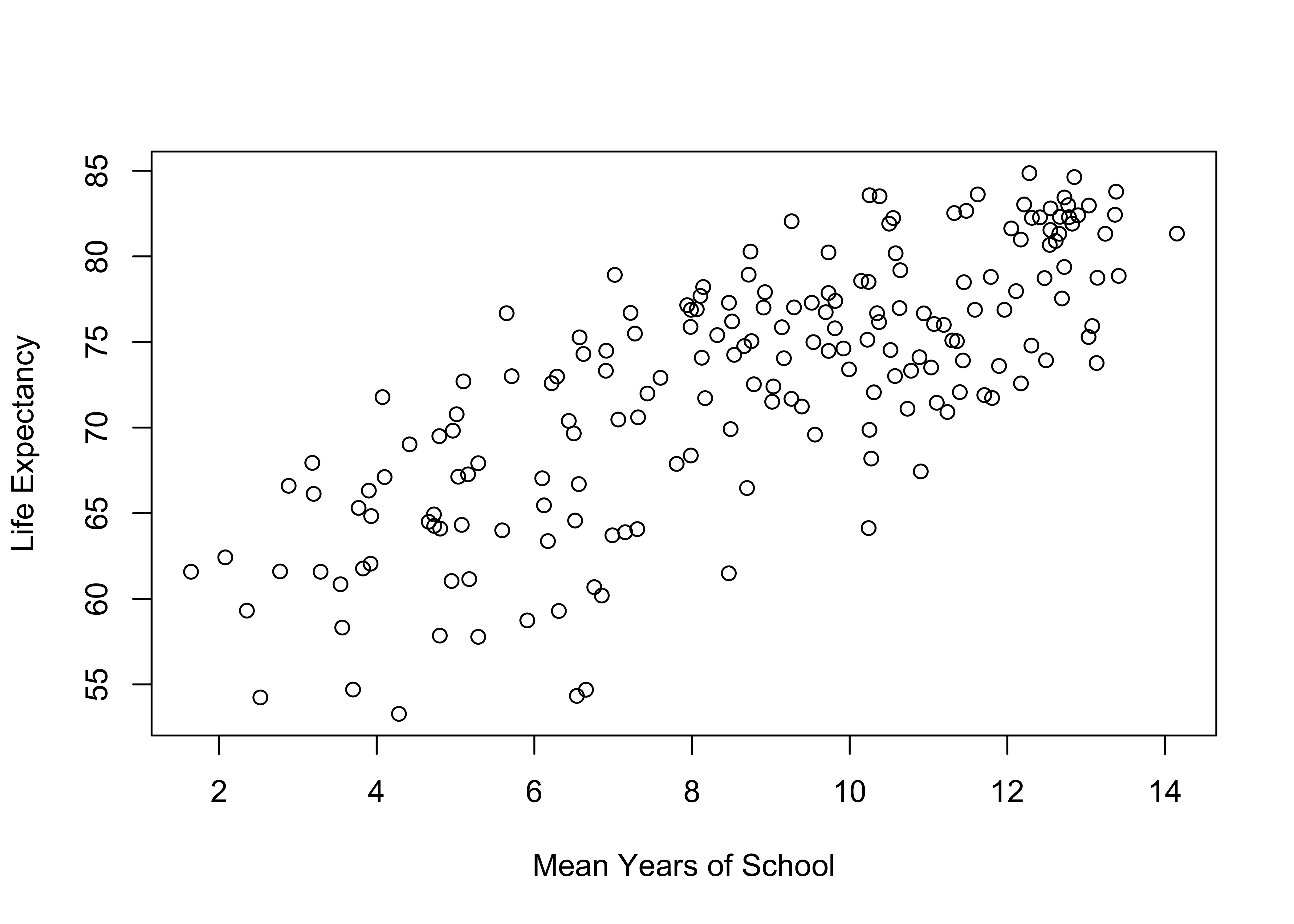
Again, we find a couple of corners in this graph relatively empty, signaling a fairly strong relationship. In this case, the upper-left (low on x, high on y) and lower-right (high on x, low on y) corners are empty, which is what we expect with a strong, positive relationship. Similar to the relationship between fertility and life expectancy, there is a clear pattern in the data that doesn’t require much effort see. This is the first sign of a strong relationship. If you have to look closely to try to determine if there is a directional pattern to the data, then the relationship probably isn’t a very strong one. While there is a clear positive trend in the data, the observations are not quite as tightly clustered as in the first scatterplot, so the relationship might not be quite as strong. Eyeballing the data like this is not very definitive, so we should have R produce the correlation coefficient to get a more precise sense of the strength and direction of the relationship.
    Pearson's product-moment correlation

data:  countries2$lifexp and countries2$mnschool
t = 16.4, df = 187, p-value <2e-16
alternative hypothesis: true correlation is not equal to 0
95 percent confidence interval:
 0.70301 0.82125
sample estimates:
    cor
0.76862
This confirms a strong (r=.77), statistically significant, positive relationship between the level of education and life expectancy. Though not quite as strong as the correlation between fertility and life expectancy (r=-.84), the two correlations are similar enough in value that I consider them to be of roughly the same magnitude.
The first two independent variables illustrate what strong positive and strong negative relationships look like. In reality, many research ideas don’t pan out and we end up with correlations near zero. If two variables are unrelated there should be no clear pattern in the data points; that is, the data points appear to be randomly dispersed in the scatterplot. The figure below shows the relationship between the logged values of the population size36 and country-level outcomes on life expectancy.
#Take the log of population size (in millions)
countries2$lg10pop<-log10(countries2$pop19_M)
#Scatterplot of "lifexp" by "lg10pop"
plot(countries2$lg10pop,countries2$lifexp,
     xlab="Logged Value of Country Population",
     ylab="Life Expectancy")
As you can see, this is a seemingly random pattern (there is no clear pattern), and correlation for this relationship (below) is -.08 and not statistically significant. This is one example of what a scatterplot looks like when there is no discernible relationship between two variables.
    Pearson's product-moment correlation

data:  countries2$lifexp and countries2$lg10pop
t = -1.17, df = 189, p-value = 0.24
alternative hypothesis: true correlation is not equal to 0
95 percent confidence interval:
 -0.223909  0.058057
sample estimates:
     cor
-0.08462
Variation in Strength of Relationships
The examples presented so far have shown two very strong relationships and one very weak relationship. Given the polarity of these examples, it is worth examining a wider range of patterns you are likely to find when using scatterplots and correlations coefficients. The graphs shown below in Figure 14.1 illustrate positive and negative relationships ranging from relatively weak (.25, -.25), to moderate (.50, -.50), to strong (.75, -.75) patterns.
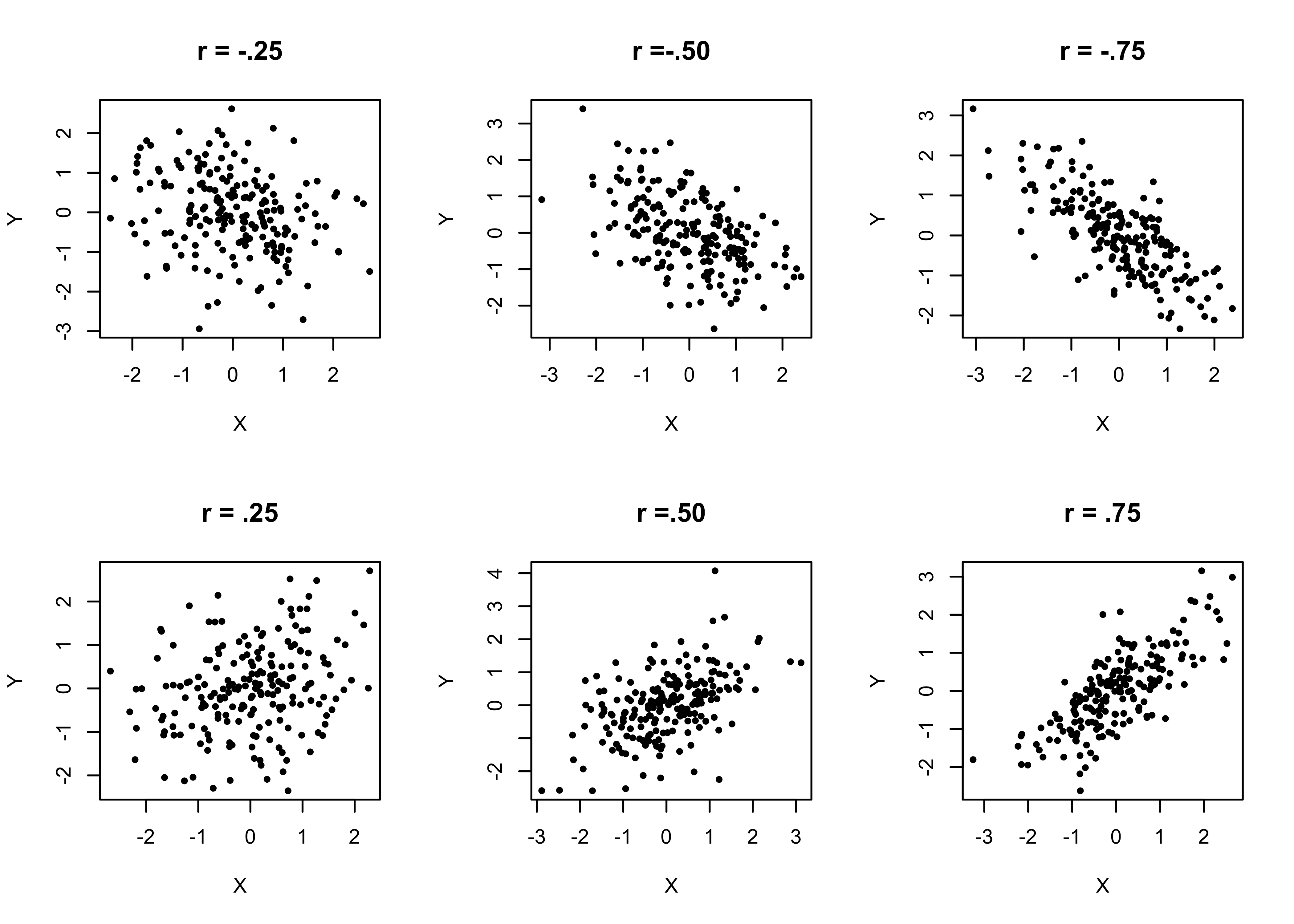
Figure 14.1: Generic Positive and Negative Correlations and Scatterplot Patterns
[Figure************ 14.1 ************about here]
The key take away from this figure is that as you move from left to right, it is easier to spot the negative (top row) or positive (bottom row) patterns in the data, and the increasingly clear pattern in the graphs is reflected in the increasingly large correlation coefficients. It can be difficult to spot positive or negative patterns when the relationship is weak, as evidenced by the two plots in the left column. In the top left graph r=-.25, and in the bottom left graph r=.25, but if you had seen these plots without the correlation coefficients attached to them, you might have assumed that there was no relationship between X and Y in either of them. This is the value of the correlation coefficient, it complements the scatterplots using information from all observations and provides a standard basis for judging the strength and direction of the relationship.
Proportional Reduction in Error
One of the nice things about Pearson’s r is that it can be used as a proportional reduction in error (PRE) statistic. Actually, it is the square of the correlation coefficient that acts as a PRE statistic and tells us how much of the variation (error) in the dependent variable is explained by variance in the independent variable. This statistic, \(r^2\), can be interpreted roughly the same way as lambda and eta2, except that it does not have lambda’s limitations. The values of \(r^2\) for fertility rate, mean level of education, and population are .71, .59, and .007, respectively. This means that using fertility rate as an independent variable reduces error in predicting life expectancy by 71%, while using education level as an independent variable reduces error by 59%, and using population size has no real impact of prediction error. We will return to this discussion in much greater detail in Chapter 15.
Correlation and Scatterplot Matrices
One thing to consider is that the independent variables are not just related to the dependent variable but also to each other. This is an important consideration that we explore here and will take up again in Chapter 16. For now, let’s explore some handy tools for looking at inter-item correlations, the correlation matrix and scatterplot matrix. For both, we need to copy the subset of variables that interest us into a new object and then execute the correlation and scatterplot commands using that object.
#Copy the dependent and independent variables to a new object
lifexp_corr<-na.omit(countries2[,c("lifexp", "fert1520",
                                   "mnschool", "lg10pop")])
#Use "cor" function to get a correlation matrix from the new object
cor(lifexp_corr)
lifexp fert1520 mnschool lg10pop
lifexp 1.000000 -0.840604 0.771580 -0.038338
fert1520 -0.840604 1.000000 -0.765023 0.069029
mnschool 0.771580 -0.765023 1.000000 -0.094533
lg10pop -0.038338 0.069029 -0.094533 1.000000Each entry in this matrix represents the correlation of the intersection column and row variables. For instance, if you read down the first column, you see how each of the independent variables is correlated with the dependent variable (the r=1.00 entries on the diagonal are the intersections of each variable with itself). If you look at the intersection of the “fert1520” column and the “mnschool” row, you can see that the correlation between these two independent variables is a rather robust -.77, whereas scanning across the bottom row, we see that population is not related to fertility rate or to level of education (r=.07 and -.09, respectively). You might have noticed that the correlations with the dependent variable are very slightly different from the separate correlations reported earlier. This is because I used na.omit when taking a subset of variables to delete all missing cases from the matrix. When considering the effects of multiple variables at the same time, an observation that is missing on one of the variables is missing on all of them.
We can also look at a scatterplot matrix to gain a visual understanding of what these relationships look like:
#Use the copied subset of variables for scatterplot matrix
plot(lifexp_corr, cex=.6) #reduce size of markers with "cex"
A scatterplot matrix is fairly easy to read. The row variable is treated as the dependent variable, and the plot at the intersection of each column shows how that variable responds to the column variable. The top row shows the scatterplots for the dependent variable and all independent variables, the second row shows how the fertility rate is related to the other variables, and so on. The plots are condensed a bit, so they are not as clear as the individual scatterplots we looked at above, but the matrix does provide a quick and accessible way to look at all the relationships at the same time.
Overlapping Explanations
With these results in mind, we might conclude that fertility rate and education both are strongly related to life expectancy. However, the simple bivariate (also called zero-order) findings rarely summarize the true impact of one variable on another. This issue was raised back in Chapter 1, in the discussion of the need to control for the influence of potentially confounding variables in order to have confidence in the independent effect of any given variable. The primary reason for this is that often some other variable is related to both the dependent and independent variables and could be “producing” the observed bivariate relationships. In the current example, we need not look any farther than the two variables in question as potentially confounding variables for each other; the level of education and the fertility rate are not just related to life expectancy but are also strongly related to each other (see the correlation matrix above). Therefore, we might be overestimating the impact of both variables by considering them in isolation.
This idea is easier to understand if we think about explaining variation in the dependent variable. As reported earlier, fertility rate and educational attainment explain 71% and 59% of the variance (error) in the dependent variable, respectively. However, these estimates are likely overstatements of the independent impact of both variables because this would mean that together they explain 130% of the variance in the dependent variable, which is not possible (you can’t explain more than 100%). What’s happening here is that the two independent variables co-vary with each other AND with the dependent variable, so there is some double-counting of variance explained.
Consider the Venn Diagram37 below, which illustrates how a dependent variable (Y) is related to two independent variables (X1 and X2), and how those independent variables can be related to each other. In this case, Y is positively correlated with both X1 (r=.69), and X2 (r= .47), and X1 and X2 are strongly correlated with each other (r=.66).
[Figure** 14.2 **about here]
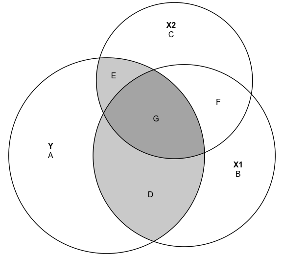
Figure 14.2: Overlapping Explanations of a Dependent Variable
The large circles represent the total variation in Y, X1, and X2, and the overlapping areas represent the correlations between the three variable. Areas D and G reflect the correlation between Y and X1; areas E and G reflect the correlation between Y and X2; and areas G and F reflect the correlation between X1 and X2. Both X1 and X2 explain significant portions of variation in Y but also account for significant portions of each other. Area G, where all three circles overlap, is the area where X1 and X2 share variance with each other and with Y. If we count area G as the portion of Y that is explained by X1 and as the portion of Y that is explained by X2, then we are double-counting this portion of the variance in Y and overestimating the impact of both X1 and X2.
The more overlap between the Y, X1 and X2 circles, the greater the level of shared explanation of the variation in the Y. If we treat the Y, X1, and X2 circles as representing life expectancy, fertility rate, and level of education, respectively, then this all begs the question, “What are the independent effects of fertility rate and level of education on life expectancy, after controlling for the overlap between the two independent variables?”
One important technique for addressing this issue is the partial correlation coefficient, which considers not just how an independent variable is related to a dependent variable but also how it is related to other independent variables and how those other variables are related to the dependent variable. The partial correlation coefficient for a model with two independent variables is usually identified as \(r_{yx_{1}\cdot{x_{2}}}\) (correlation between x1 and y, controlling for x2) and is calculated using the following formula:\[r_{yx_{1}\cdot{x_{2}}}=\frac{r_{x_{1}y}-(r_{yx_{2}})(r_{x_{1}x_{2}})}{\sqrt{1-r^2_{yx_{2}})}\sqrt{1-r^2_{x_{1}x_{2}})}}\]
The key to understanding the partial correlation coefficient lies in the numerator. Here we see that the original bivariate correlation between x1 and y is discounted by the extent to which a third variable (x2) is related to both x1 and y. If there is a weak relationship between x1 and x2 or between y and x2, then the partial correlation coefficient for x1 will be close in value to the zero-order correlation. If there is a strong relationship between x1 and x2 or between y and x2, then the partial correlation coefficient for x1 will be significantly lower in value than the zero-order correlation.
Let’s calculate the partial correlations separately for fertility rate and mean level of education for women, using information from the correlation matrix.
# partial correlation for fertility, controlling for education levels:
pcorr_fert<-(-.8406-(.77158*-0.76502))/(sqrt(1-.77158^2)*sqrt(1- 0.76502^2))
pcorr_fert
[1] -0.61104# partial correlation for education levels, controlling for fertility:
pcorr_educ<-(.77158-(-.8406*-0.76502))/(sqrt(1-.8406^2)*sqrt(1-.76502^2))
pcorr_educ[1] 0.36839Here, we see that the original correlation between fertility and life expectancy (-.84) overstated the impact of this variable quite a bit. When we control for mean years of education, the relationship is reduced to -.61, which is significantly lower but still suggests a somewhat strong relationship. We see a more dramatic reduction in the influence of level of education. When controlling for fertility rate, the relationship between level of education and life expectancy drops from .77 to .37, a fairly steep decline. These findings clearly illustrate the importance of thinking in terms of multiple, overlapping explanations of variation in the dependent variable.
You can get the same results using the pcor function in the ppcor package. The format for this command is pcor.test(y, x, z). Note again that when copying the subset of variables to the new object, I used na.omit to drop any observations that had missing data on any of the three variables.
#Copy subset of variables, dropping missing data
partial<-na.omit(countries2[,c("lifexp", "fert1520", "mnschool")])
#Partial correlation for fert1520, controlling for mnschool
pcor.test(partial$lifexp,partial$fert1520,partial$mnschool)
estimate p.value statistic n gp Method
1 -0.61105 5.1799e-20 -10.356 183 1 pearson#Partial correlation for mnschool , controlling for fert1520
pcor.test(partial$lifexp,partial$mnschool,partial$fert1520) estimate p.value statistic n gp Method
1 0.36838 0.00000031119 5.3162 183 1 pearsonThe calculations were right on target!
Next Steps
What you’ve learned about Pearson’s r in this chapter forms the basis for the rest of the chapters in this book. Using this as a jumping-off point, we investigate a number of more advanced methods that can be used to describe relationships between numeric variables, all falling under the general rubric of “regression analysis.” In the next chapter, we look at how we can expand upon Pearson’s r to predict specific outcomes of the dependent variable using a linear equation that summarizes the pattern seen in the scatterplots. In fact, for the remaining chapters, most scatterplots will also include a trend line that fits the linear pattern in the data. Following that, we will explore how to include several independent variables in a single linear model to predict outcomes of the dependent variable. In doing so, we will also address more fully the issue highlighted in the correlation and scatterplot matrices, highly correlated independent variables. In the end, you will be able to use multiple independent variables to provide a more comprehensive and interesting statistical explanation of the dependent variable.
Exercises
Concepts and calculations
- Use the information in the table below to determine whether there is a positive or negative relationship between X and Y. As a first step, you should note whether the values of X and Y for each observation is above or below their respective means. Then, use this information to explain why you think there is a positive or negative relationship.
| Y | Above or Below Mean of Y? | X | Above or Below Mean of X? | |
|---|---|---|---|---|
| 10 | 17 | |||
| 5 | 10 | |||
| 18 | 26 | |||
| 11 | 21 | |||
| 16 | 17 | |||
| 7 | 13 | |||
| Mean | 11.2 | 17.3 |
Match each of the following correlations to the corresponding scatterplot shown below.
A. r= .80
B. r= -.50
C. r= .40
D. r= -.10
What is the proportional reduction in error for each of the correlations in Question #2?
A researcher is interested in differences in health outcomes across counties. They are particularly interested in whether obesity rates affect diabetes rates in counties, expecting that diabetes rates increase as obesity rates increase. Using a sample of 500 counties, they produce the scatterplot below to support their hypothesis.
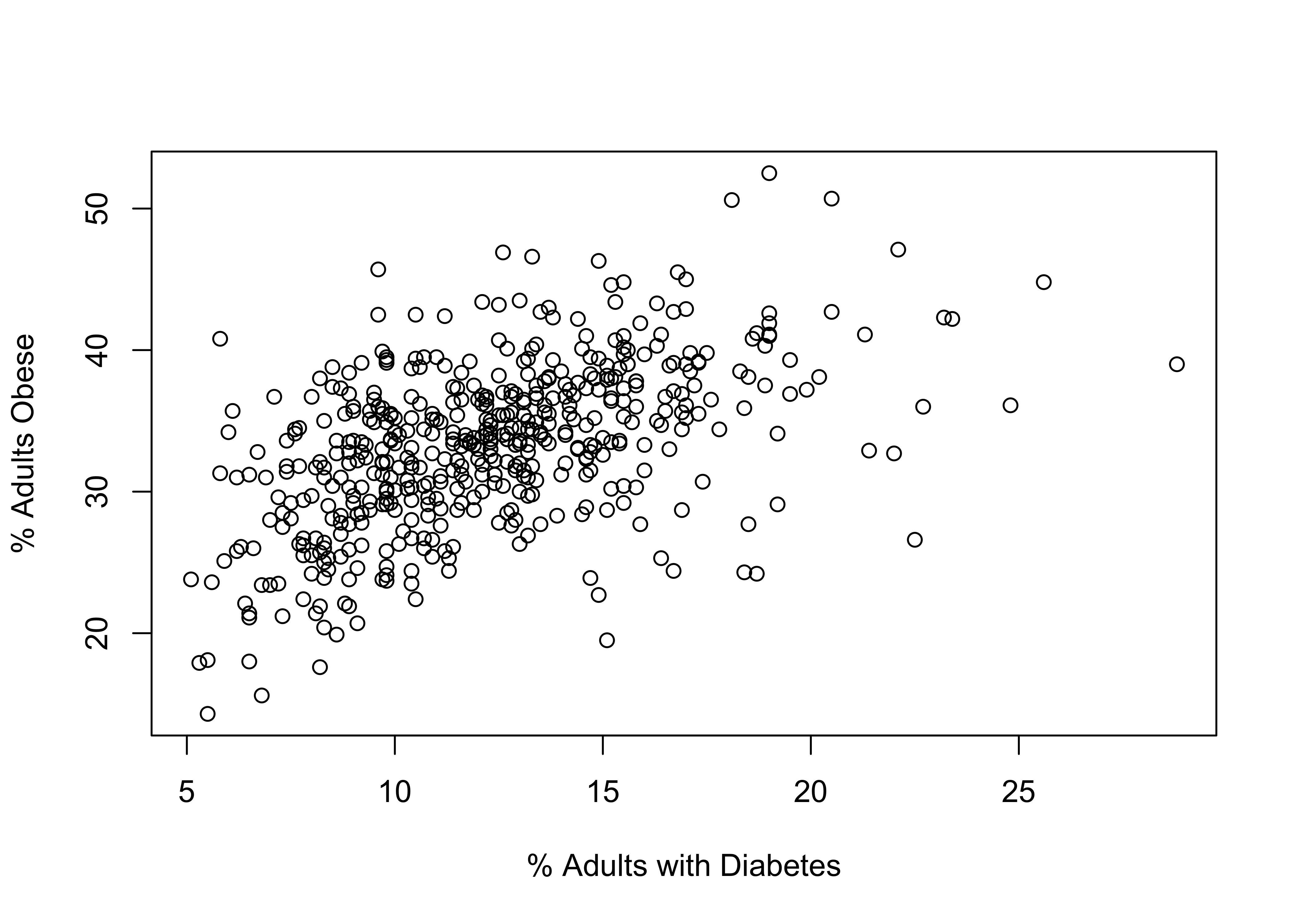
Based on the discussion above, what is the dependent variable?
Is the pattern in the figure positive or negative? Explain your answer.
Is the pattern in the figure strong or weak? Explain your answer.
Based just on eyeballing the data, what’s your best guess for the correlation between these two variables?
This graph contains an important flaw. Can you spot it?
- In which of the following cases are the partial correlations between y and x1 likely to be substantially lower than the zero-order correlations, and in which cases is there likely to be very little difference. Explain. (No calculations necessary).
| \(r_{{y}x_{1}}\) | \(r_{{y}x_{2}}\) | \(r_{{x_{1}}x_{2}}\) | |
|---|---|---|---|
| A. | .55 | .75 | .11 |
| B. | -.68 | .09 | .55 |
| C. | .59 | .55 | -.68 |
| D. | -.63 | .19 | .25 |
| E. | .49 | .64 | .73 |
R Problems
For these exercises, you will use the states20 data set to identify potential explanations for state-to-state differences in infant mortality (states20$infant_mort). Show all graphs and statistical output and make sure you use appropriate labels on all graphs.
Generate a scatterplot showing the relationship between per capita income (
states20$PCincome2020) and infant mortality in the states. Describe contents of the scatterplot, focusing on direction and strength of the relationship. Offer more than just “Weak and positive” or something similar. What about the scatterplot makes it look strong or weak, positive or negative? Then get the correlation coefficient for the relationship between per capita income and infant mortality. Interpret the coefficient and comment on how well it matches your initial impression of the scatterplot.Repeat the same analysis from (1), except now use
lowbirthwt(% of births that are technically low birth weight) as the independent variable. Again, show all graphs and statistical results. Use words to describe and interpret the results.Repeat the same analysis from (1), except now use
teenbirth(the % of births to teen mothers) as the independent variable. Again, show all graphs and statistical results. Use words to describe and interpret the results.Repeat the same analysis from (1), except now use an independent variable of your choosing from the
states20data set that you expect to be related to infant mortality in the states. Justify the variable you choose. Again, show all graphs and statistical results. Use words to describe and interpret the results.
You may have noticed that I did not include the code for these basic descriptive statistics. What R functions would you use to get these statistics? Go ahead, give it a try!↩︎
Recall from Chapter 5 that when variables such as population are severely skewed, we sometimes use the logarithm of the variable to minimize the impact of outliers. In the case of country-level population size, the skewness statistic is 8.3.↩︎
The code for creating this Venn diagram was adapted from examples provided by Andrew Heiss (https://www.andrewheiss.com/blog/2021/08/21/r2-euler/#relationship-between-three-variables).↩︎