Chapter 6 Measures of Dispersion
Get Ready
This chapter examines another important consideration when describing how variables are distributed, the amount of variation or dispersion in the outcomes. We touched on this topic obliquely by considering skewness in the last chapter, but this chapter addresses the issue more directly. In order to follow along in this chapter, you should attach the libraries for the following packages: descr, DescTools, and Hmisc.
You should also load the anes20, states20, and cces20 data sets. The Cooperative Congressional Election Study (cces20) is similar to the ANES in that it is a large scale, regularly occurring survey of political attitudes and behaviors, with both a pre- and post-election wave.
Introduction
While measures of central tendency provide some sense of the typical outcome of a given variable, it is possible for variables with the same mean, median, and mode to have very different looking distributions. Take, for instance the three graphs below, in Figure 6.1 ; all three are perfectly symmetric (no skew), with the same means and medians, but they vary considerably in the level of dispersion around the mean. On average, the data are most tightly clustered around the mean in the first graph, spread out the most in the third graph, and somewhere in between in the second graph. These graphs vary not in central tendency but in how concentrated the distributions are around the central tendency.
[Figure******** 6.1 ********about here]
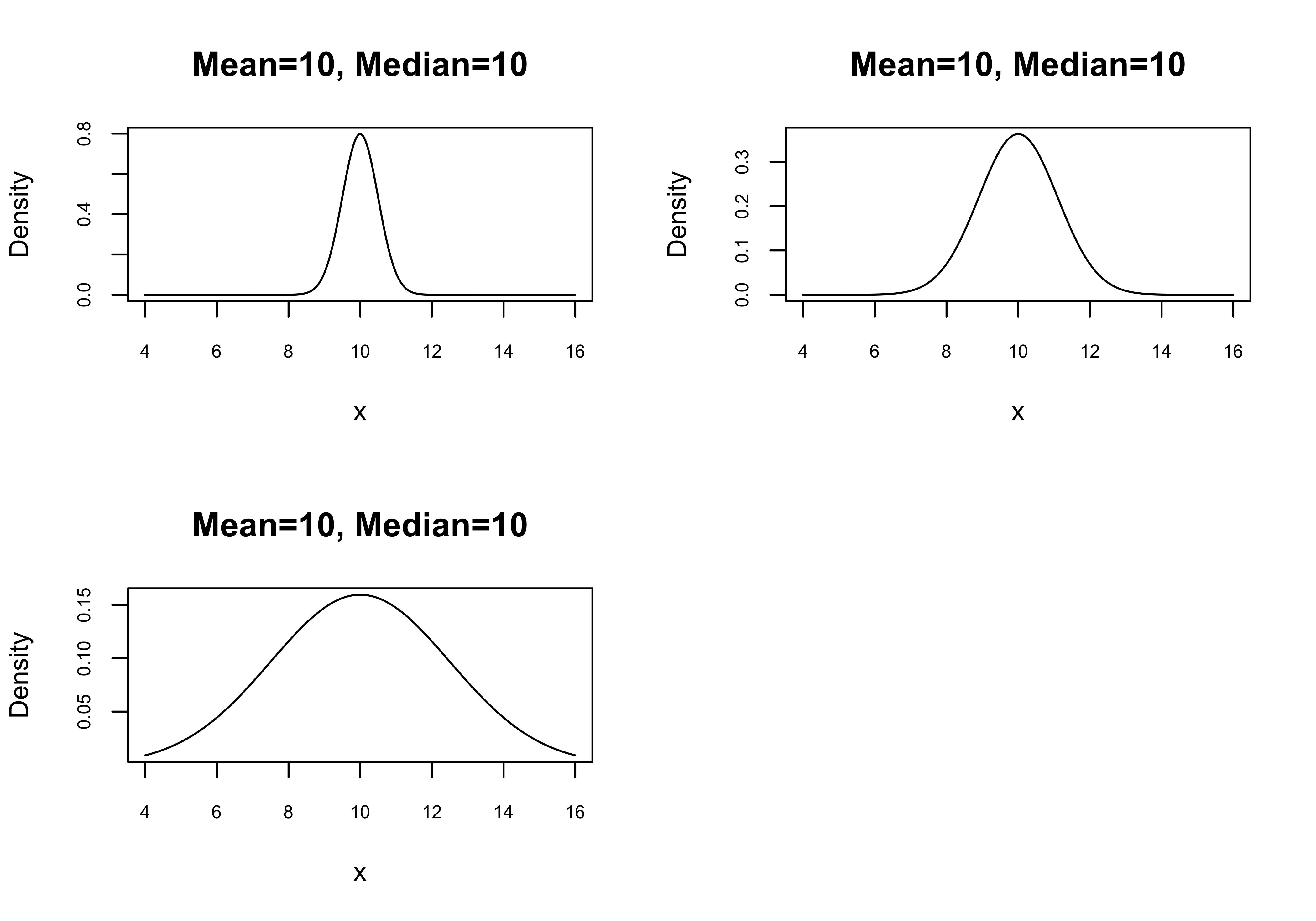
Figure 6.1: Distributions with Identical Central Tendencies but Different Levels of Dispersion
The concentration of observations around the central tendency is an important concept and we are able to measure it in a number of different ways using measures of dispersion. There are two different, related types of measures of dispersion, those that summarize the overall spread of the outcomes, and those that summarize how tightly clustered the observations are around the mean.
Measures of Spread
Although we are ultimately interested in measuring dispersion around the mean, it can be useful sometimes to understand how spread out the observations are. Measures of spread focus on the upper and lower limits of the data, either over the full range of outcomes, or some share of the outcomes.
Range
The range is a measure of dispersion that does not use information about the central tendency of the data. It is simply the difference between the lowest and highest values of a variable. To be honest, this is not always a useful or interesting statistic. For instance, all three of the graphs shown above have the same range (4 to 16) despite the differences in the shape of the distributions. Still, the range does provide some information and could be helpful in alerting you to the presence of outliers, or help you spot coding problems with the data. For example, if you know the realistic range for a variable measuring age in a survey of adults is roughly 18-100(ish), but the data show a range of 18 to 950, then you should look at the data to figure out what went wrong. In a case like this, it could be that a value of 950 was recorded rather than that intended value of 95.
Below, we examine the range for the age of respondents to the cces20 survey. R provides the minimum and maximum values but does not show the width of the range.
#First, create cces20$age, using cces20$birthyr
cces20$age<-2020-cces20$birthyr
#Then get the range for  `age` from the cces20 data set.
range(cces20$age, na.rm=T)
[1] 18 95Here, we see that the range in age in the cces20 sample is from 18 to 95, a perfectly plausible age range (only adults were interviewed), a span of 77 years. Other than this, there is not much to say about the range of this variable.
Interquartile Range (IQR)
One extension of the range is the interquartile range (IQR), which focuses on the middle 50% of the distribution. Technically, the IQR is the range between the value associated with the 25th percentile, and the value associated with the 75th percentile. You may recall seeing this statistic supplied by colleges and universities as a piece of information when you were doing your college search: the middle 50% range for ACT or SAT scores. This is a great illustration of how the inter-quartile range can be a useful and intuitive statistic.
The IQR command in R estimates how wide the IQR is, but does not provide the upper and lower limits. The width is important, but it is the values of the upper and lower limits that are more useful for understanding what the distribution looks like. The summary command provides the 25th (“1st Qu.” in the output) and 75th (“3rd Qu.”) percentiles, along with other useful statistics.
[1] 30 Min. 1st Qu. Median Mean 3rd Qu. Max.
18.00 33.00 49.00 48.39 63.00 95.00 The 25th percentile (“1st Qu”) of cces20$age is associated with the value 33 and the 75th percentile (“3rd Qu”) with the value 63, so the IQR is from 33 to 63 (a difference of 30).
One interesting aspect of the inter-quartile range is that you can think of it as both a measure of dispersion and a measure of central tendency. The upper and lower limits of the IQR define the middle of the distribution, the very essence of central tendency, while the difference between the upper and lower limits is an indicator of how spread out the middle of the distribution is, a central concept to measures of dispersion.
We can use tools learned earlier to visualize the interquartile range of cces20$age, using a histogram with vertical lines marking its upper and lower limits, as shown below.
#Age Histogram
hist(cces20$age, xlab="Age",
     main="Histogram of Age with Interquartile Range")
#Add lines for 25th and 75th percentiles
abline(v=33, lty=2,lwd=2)
abline(v=63, lwd=2)
#Add legend
legend("topright", legend=c("1st Qu.","3rd Qu."), lty=c(2,1))
The histogram follows something similar to a bi-modal distribution, with a dip in the frequency of outcomes in the 40- to 55-years-old range. The thick vertical lines represent the 25th and 75th percentiles, the interquartile range. What’s interesting to think about here is that if the distribution were more bell-shaped, the IQR would be narrower, as more of the sample would be in the 40- to 55-years-old range. Instead, because the center of the distribution is somewhat collapsed, the data are more spread out.
Boxplots
A nice graphing method that focuses explicitly on the range and IQR is the boxplot, shown below. The boxplot is a popular and useful tool, one that is used extensively in subsequent chapters.
I’ve added annotation to the output in Figure 6.2 to make it easier for you to understand the contents of a boxplot. The dark horizontal line in the box is the median, the box itself represents the Inter-quartile Range (middle fifty percent,) and the two end-caps usually represent the lowest and highest values. In cases where there are extreme outliers, they will be represented with small circle outside the upper and lower limits.15 Similar to what we saw in the histogram, the boxplot shows that the middle 50% of outcomes is situated fairly close to the middle of the range, indicating a low level of skewness.
[Figure******** 6.2 ********about here]
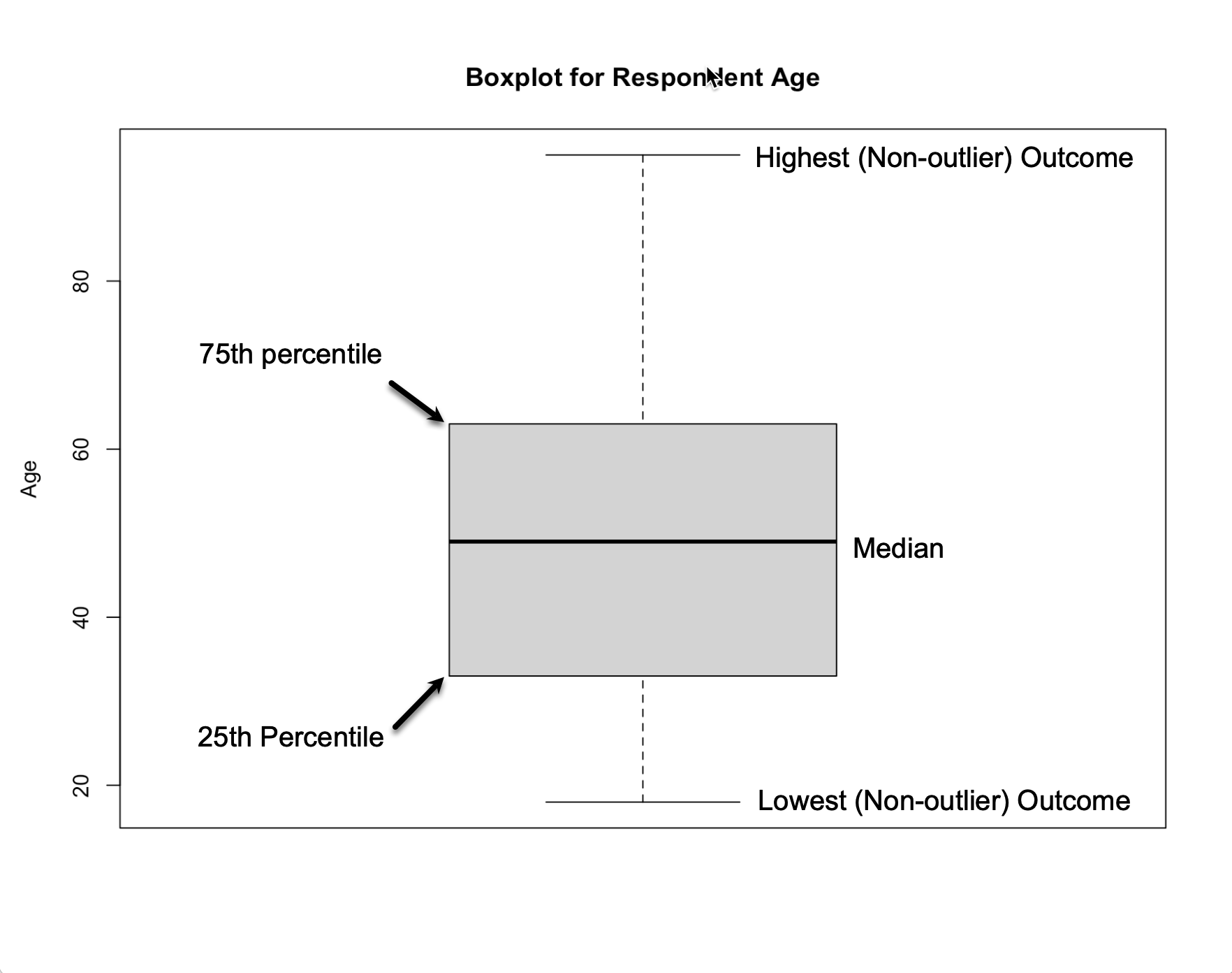
Figure 6.2: Annotated Boxplot for Respondent Age
Now, let’s look at boxplots and associated statistics using some of the variables from the states20 data set that we looked at in Chapter 5: percent of the state population who are foreign-born, and the number of abortion restrictions in state law. Recall from Chapter 5 the skewness statistic for percent foreign born and state abortion restrictions were 1.20 and -.34, respectively. First, you can use the summary command to get the relevant statistics, starting with percent of foreign born.
   Min. 1st Qu.  Median    Mean 3rd Qu.    Max.
  1.400   3.025   4.950   7.042   9.850  21.700
The range for this variable is from 1.4 percent of the state population (West Virginia) to 21.7 percent (California), for a difference of 20.3, and the interquartile range is from 3.025 to 9.85 percent, for a difference of 6.825. The elements of the boxplot—the inter-quartile range, the median, and minimum and maximum values—can help visualize the level of skewness in the data. From the summary statistics, we know that 50% of the outcomes have values between 3.025 and 9.85, that 75% of the observations have values of 9.85 (the high end of the IRQ) or lower, and that the full range of the variable runs from 1.4 to 21.7. This means that most of the observations are clustered at the low end of the scale, which you expect to find when data are positively skewed. The fact that the mid-point of the data (the median) is 4.95, less than a quarter of the highest value, also indicates a clustering at the low end of the scale.
The boxplot provides a visual representation of all of these things.
#Boxplot for % foreign born
boxplot(states20$fb, ylab="% Foreign-born", main="Boxplot of % Foreign-born")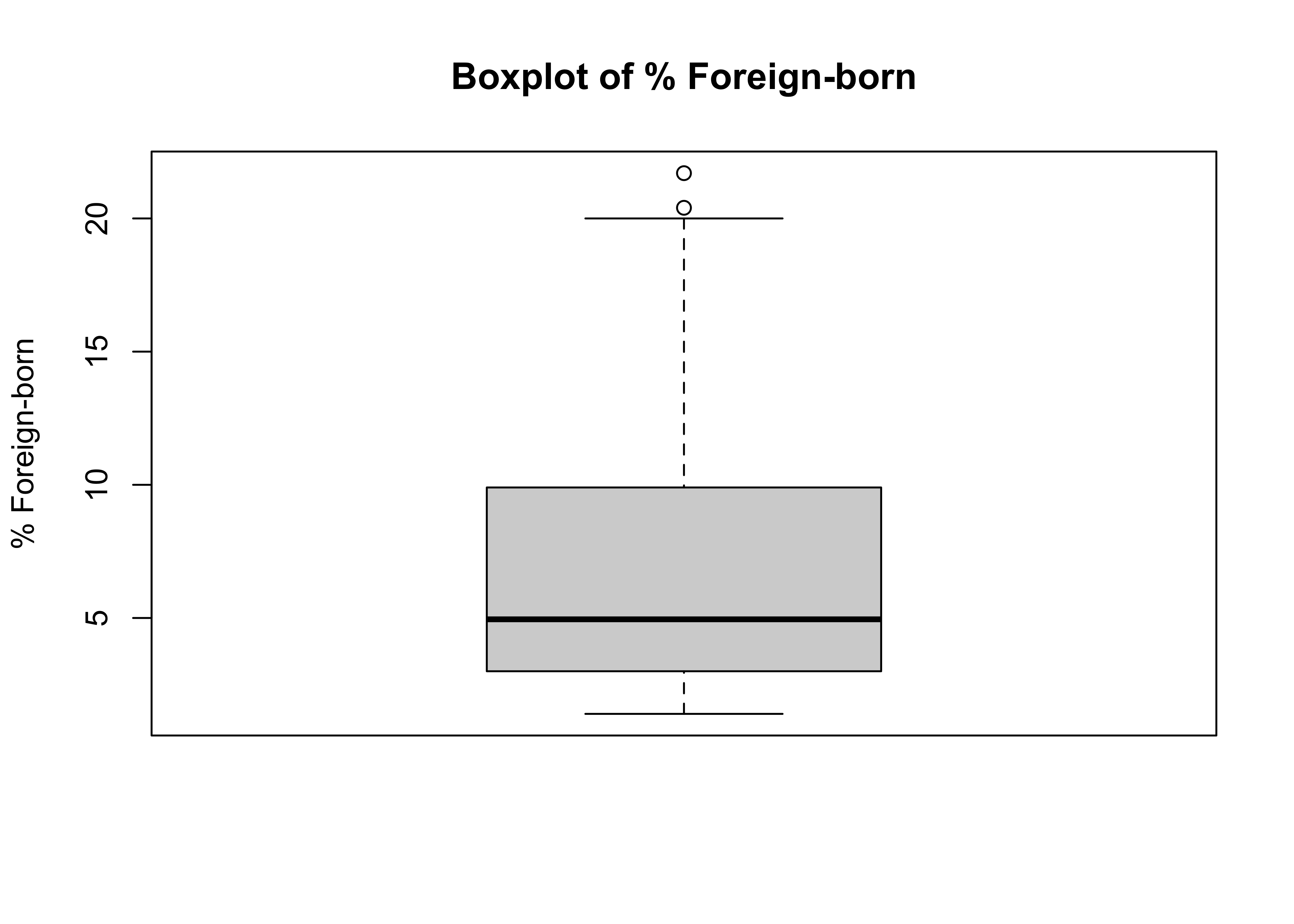
Here, you can see that the “Box” is located at the low end of the range and that there are a couple of extreme outliers (the circles) at the high end. This is what a negatively skewed variable looks like in a box plot. Bear in mind that the level of skewness for this variable is not extreme (1.2), but you can still detect it fairly easily in the box plot. Contrast this to the boxlplot for cces20$age (above), which offers no strong hint of skewness.
Sometimes, it is easier to detect skewness in a boxplot by flipping the plot on its side, so the view is more similar to what you get from a histogram or a density plot. I think this is pretty clear in the horizontal boxplot for states20$fb:
#Horizontal boxplot
boxplot(states20$fb, xlab="% Foreign-born",
        main="Horizontal Boxplot of % Foreign-born",
        horizontal = T) #Horizontal orientation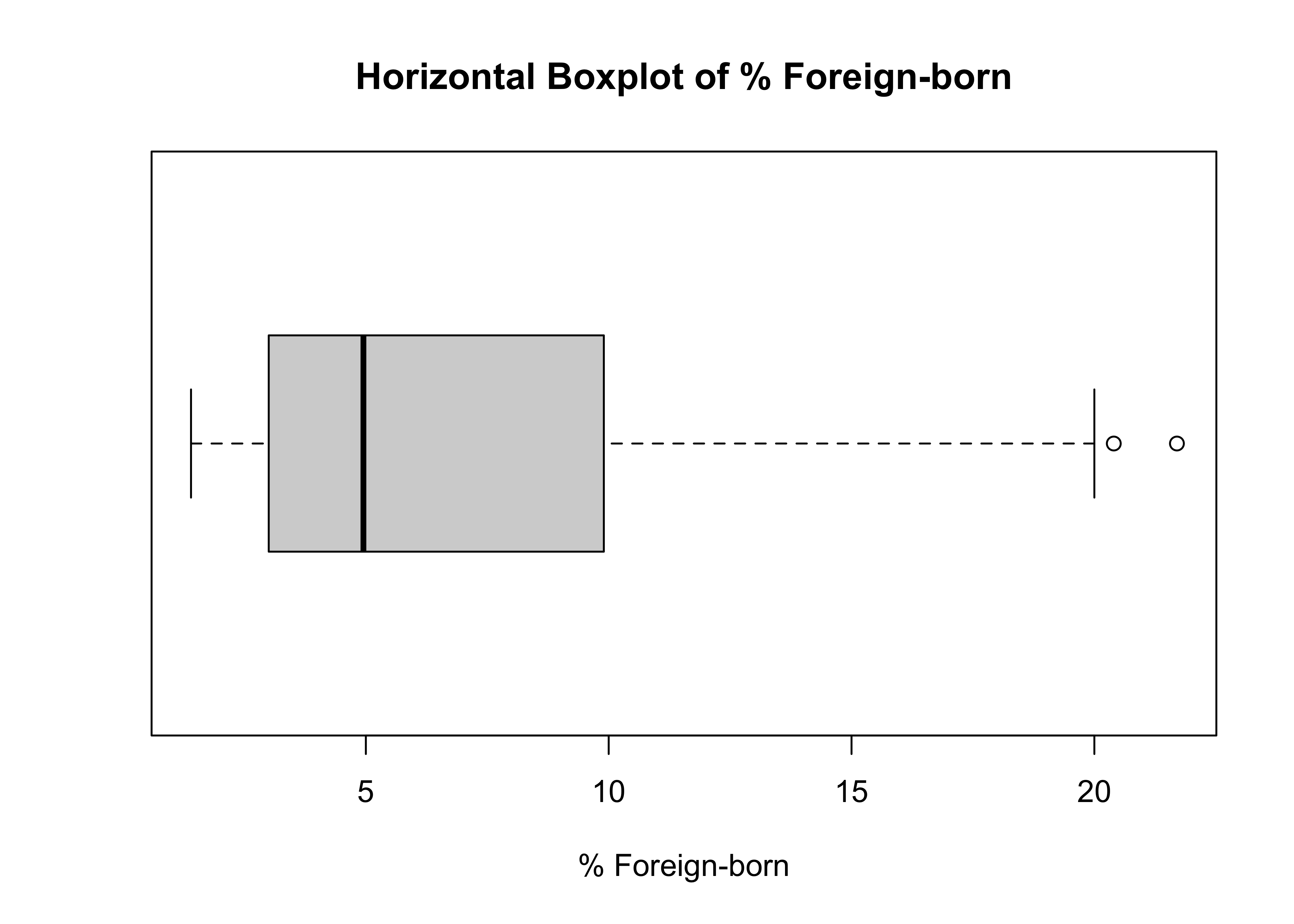
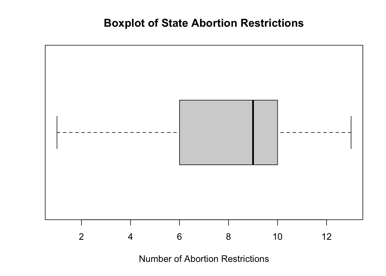
Let’s look at the same information for states20$abortion_laws. We already know from Chapter 5 that there is a modest level of negative skew in this variable, so it might be a bit harder to spot it in the boxplot.
#Boxplot for abortion restriction laws
boxplot(states20$abortion_laws,
        xlab="Number of Abortion Restrictions",
        main="Boxplot of State Abortion Restrictions",
        horizontal = T)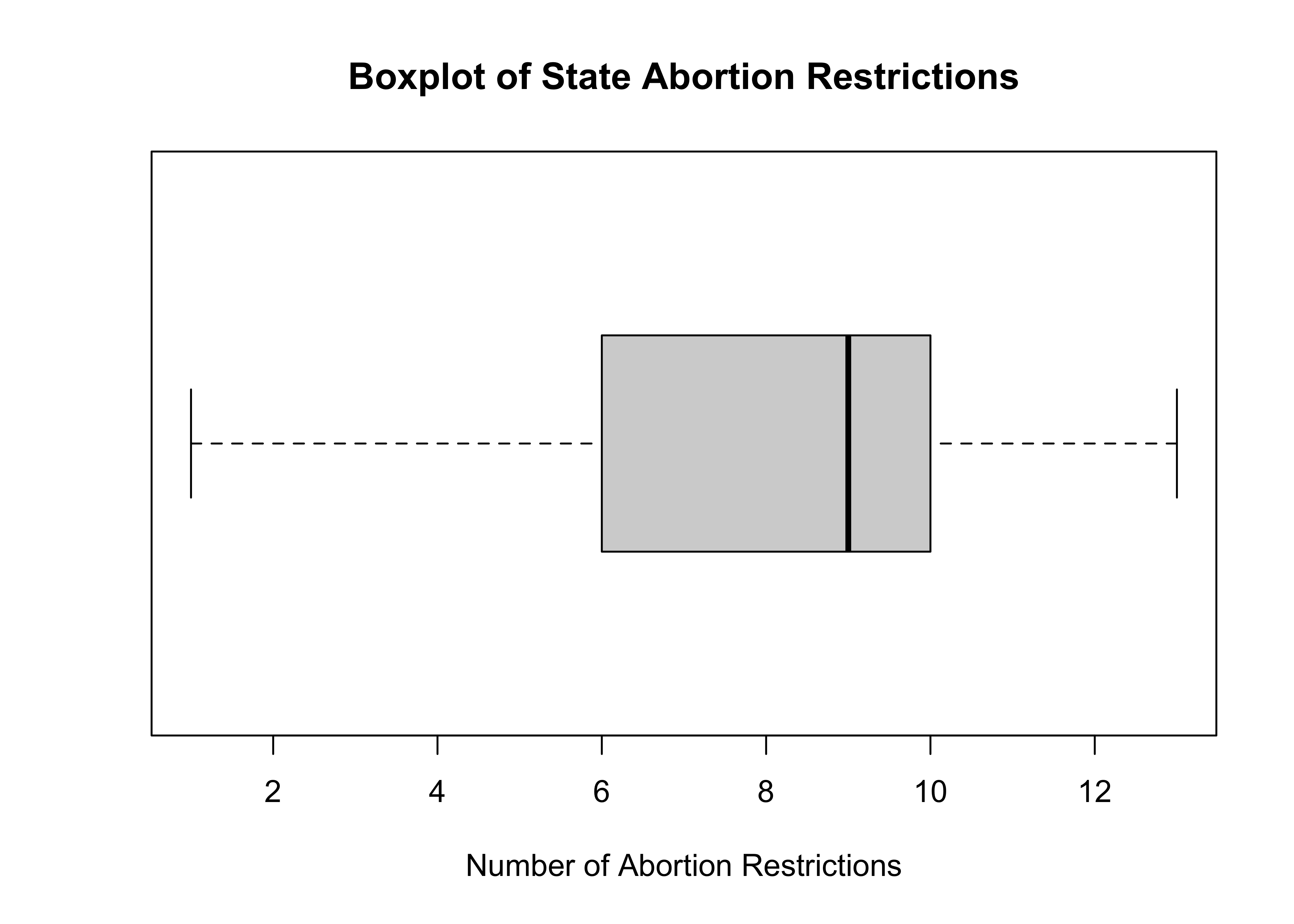
The pattern of skewness is not quite as clear as it was in the example using the foreign-born population, but you can pick up hints of a modest level of negative skewness based on the position of the “Box” along with the location of the median, relative to the range of outcomes.
The IQR with Ordered Variables
The inter-quartile range can also be used for ordinal variables, with limits. For instance, for the ANES question on preferences for spending on the poor (anes20$V201320x), we can determine the IQR from the cumulative relative frequency:
                   level   freq   perc  cumfreq  cumperc
1     1. Increased a lot  2'560  31.1%    2'560    31.1%
2  2. Increased a little  1'617  19.7%    4'177    50.8%
3       3. Kept the same  3'213  39.1%    7'390    89.8%
4  4. Decreased a little    446   5.4%    7'836    95.3%
5    5. Decreasaed a lot    389   4.7%    8'225   100.0%
For this variable, the 25th percentile is in the first category (“Increased a lot”) and the 75 percentile is in the third category (“Kept the same”). The language for ordinal variables is a bit different and not quantitative as when using numeric data. For instance, in this case, it is not appropriate to say the inter-quartile range is 2 (from categories 1 to 3), as the concept of numeric difference doesn’t work well here. Instead, it is more appropriate to say the inter-quartile range is from ‘increased a lot’ to ‘kept the same’, or that the middle 50% hold opinions ranging from ‘increased a lot’ to ‘kept the same’.
Dispersion Around the Mean
If we go back to the three distributions presented earlier in Figure 6.1, it should be clear that what differentiates the plots is not the range of outcomes, but the amount of variation or dispersion around the means. The range and interquartile range have their uses, but they do not measure dispersion around the mean. Instead, we need a statistic that summarizes the typical deviation from the mean. This is not possible for nominal and ordinal variables, but it is an essential concept for numeric variables
6.0.1 Average deviation from the mean
Conceptually, what we are interested in is the average deviation from the mean. However, as you are no doubt saying to yourself right now, taking the average deviation from the mean is a terrible idea, as this statistic is always equal to zero.
\[\text{Average Deviation}=\frac{\sum_{i=1}^n {x_i}-\bar{x}}{n}=0\]
The sum of the positive deviations from the mean will always be equal to the sum of the negative deviations from the mean, and the average deviation is zero. So, in practice, this is not a useful statistic, even though, conceptually, the typical deviation from the mean is what we want to measure. What we need to do, then, is somehow treat the negative values as if they were positive, so the sum of the deviations does not always equal 0.
Mean absolute deviation
One solution is to express deviations from the mean as absolute values. So, a deviation of –2 (meaning two units less than the mean) would be treated the same as a deviation of +2 (meaning two above than the mean). Again, conceptually, this is what we need, the typical deviation from the mean but without offsetting positive and negative deviations.
\[\text{M.A.D}=\frac{\sum_{i=1}^n |{x_i}-\bar{x}|}{n}\] Let’s calculate this using the percent foreign-born (states20$fb):
#Calculate absolute deviations
absdev=abs(states20$fb-mean(states20$fb))
#Sum deviations and divide by n (50)
M_A_D<-sum(absdev)/50
#Display M.A.D
M_A_D
[1] 4.26744We can get the same result using the MeanAD function from the DescTools package:
[1] 4.26744This result shows that, on average, the observations for this variable are within 4.27 units (percentage points, in this case) of the mean.
This is a really nice statistic. It is relatively simple and easy to understand, and it is a direct measure of the typical deviation from the mean. However, there is one drawback that has sidelined the mean absolute deviation in favor of other measures of dispersion. One of the important functions of a mean-based measure of dispersion is to be able to use it as a basis for other statistics, and certain statistical properties associated with using absolute values make the mean absolute deviation unsuitable for those purposes. Still, this is a nice, intuitively clear statistic.
Variance
An alternative to using absolute deviations is to square the deviations from the mean to handle the negative values in a similar way. By squaring the deviations from the mean, all deviations are expressed as positive values. For instance, if you do this for deviations of –2 and +2, both are expressed as +4, the square of their values. These squared deviations are the basis for calculating the variance:
\[\text{Variance }(S^2)=\frac{\sum_{i=1}^n({x_i}-\bar{x})^2}{n-1}\]
This is a very useful measure of dispersion and forms the foundation for many other statistics, including inferential statistics and measures of association. Let’s review how to calculate it, using the percent foreign-born (states20$fb):
Create squared deviations.
#Express each state outcome as a deviation from the mean outcome
fb_dev<-states20$fb-mean(states20$fb)
#Square those deviations
fb_dev.sq=fb_dev^2
Sum the squared deviations and divide by n-1 (49), and you get:
[1] 29.18004Of course, you don’t have to do the calculations on your own. You could just ask R to give you the variance of states20$fb:
[1] 29.18004One difficulty with the variance, at least from the perspective of interpretation, is that because it is expressed in terms of squared deviations, it can sometimes be hard to connect the number back to the original scale. As important as the variance is as a statistic, it comes up a bit short as an intuitive descriptive device for conveying to people how much dispersion there is around the mean. For instance, the resulting number (29.18) is greater than the range of outcomes (20.3) for this variable. This makes it difficult to relate the variance to the actual data, especially if it is supposed to represent the “typical” deviation from the mean. This brings us to the most commonly used measure of dispersion for numeric variables.
Standard Deviation
The standard deviation is the square root of the variance. Its important contribution to consumers of descriptive statistical information is that it returns the variance to the original scale of the variable.
\[S=\sqrt{\frac{\sum_{i=1}^n({x_i}-\bar{x})^2}{n-1}}\]
In the current example, \[S=\sqrt{29.18004}= 5.40\]
Or get it from R:
[1] 5.401855Note that the number 5.40 makes a lot more sense as a measure of typical deviation from the mean for this variable than 29.18 does. Although this is not exactly the same as the average deviation from the mean, it should be thought of as the “typical” deviation from the mean. You may have noticed that the standard deviation is a bit larger than the mean absolute deviation. This will generally be the case because squaring the deviations assigns a bit more weight to relatively high or low values, and also because the denominator for the standard deviation is n-1 instead of n, as it is for the mean absolute deviation.
Importance of scale
Although taking the square root of the variance returns value to the scale of the variable, there is still a wee problem with interpretation. Is a standard deviation of 5.40 a lot of dispersion, or is it a relatively small amount of dispersion? In isolation, the number 5.40 does not have a lot of meaning. Instead, we need to have some standard of comparison. The question should be, “5.40, compared to what?” It is hard to interpret the magnitude of the standard deviation on its own, and it’s always risky to make a comparison of standard deviations across different variables. This is because the standard deviation reflects two things: the amount of dispersion around the mean and the scale of the variable.
The standard deviation reported above comes from a variable that ranges from 1.4 to 21.7, and that scale profoundly affects its value. To illustrate the importance of scale, let’s suppose that instead of measuring the foreign-born population as a percent of the state population, we measure it as a proportion of the state population:
Now, if we get the standard deviation of states20$fb.prop, we see that it is 100 times smaller than the standard deviation for states20$fb:
[1] 0.05401855Does that mean that there is less dispersion around the mean for fb.prop than for fb? No. Relative to their scales, both variables have the same amount of dispersion around their means. The difference is in the scales, nothing else.
So, if we are interested in getting a better intuitive sense of the magnitude of a single standard deviation value, we need to adjust the standard deviation so it is expressed relative to the scale of the variable. One simple but useful statistic for this is the Coefficient of Variation:
\[\text{CV}=\frac{S}{\bar{x}}\]
Here, we express the standard deviation relative to the mean of the variable. Values less than 1 indicate relatively low levels of variation; values greater than 1 indicate high levels of variation.
For states20$fb, the coefficient of variation is:
[1] 0.767091This tells us that the outcomes for the percent foreign-born in the states are relatively concentrated around the mean. One important caveat regarding the coefficient of variation is that it should only be used with variables that have all positive values.
Don’t Make Bad Comparisons
The fact that the size of standard deviation, in part, reflects the scale of the variable also means that we should not make comparisons of it and other measures of dispersion across variables measured on different scales. To understand the issues related to comparing measures of dispersion a bit better, let’s look at side-by-side distributions for three different variables: foreign-born as a percent of the state population, Biden’s share of the two-party vote in the states, and the number of abortion restrictions in the states.
#Three side-by-side boxplots, with labels for the variables
boxplot(states20$fb,  states20$d2pty20, states20$abortion_laws,
        main="A Truly Bad Comparison of Variables",
        names=c("Foreign-born","Biden %", "Abortion Laws"))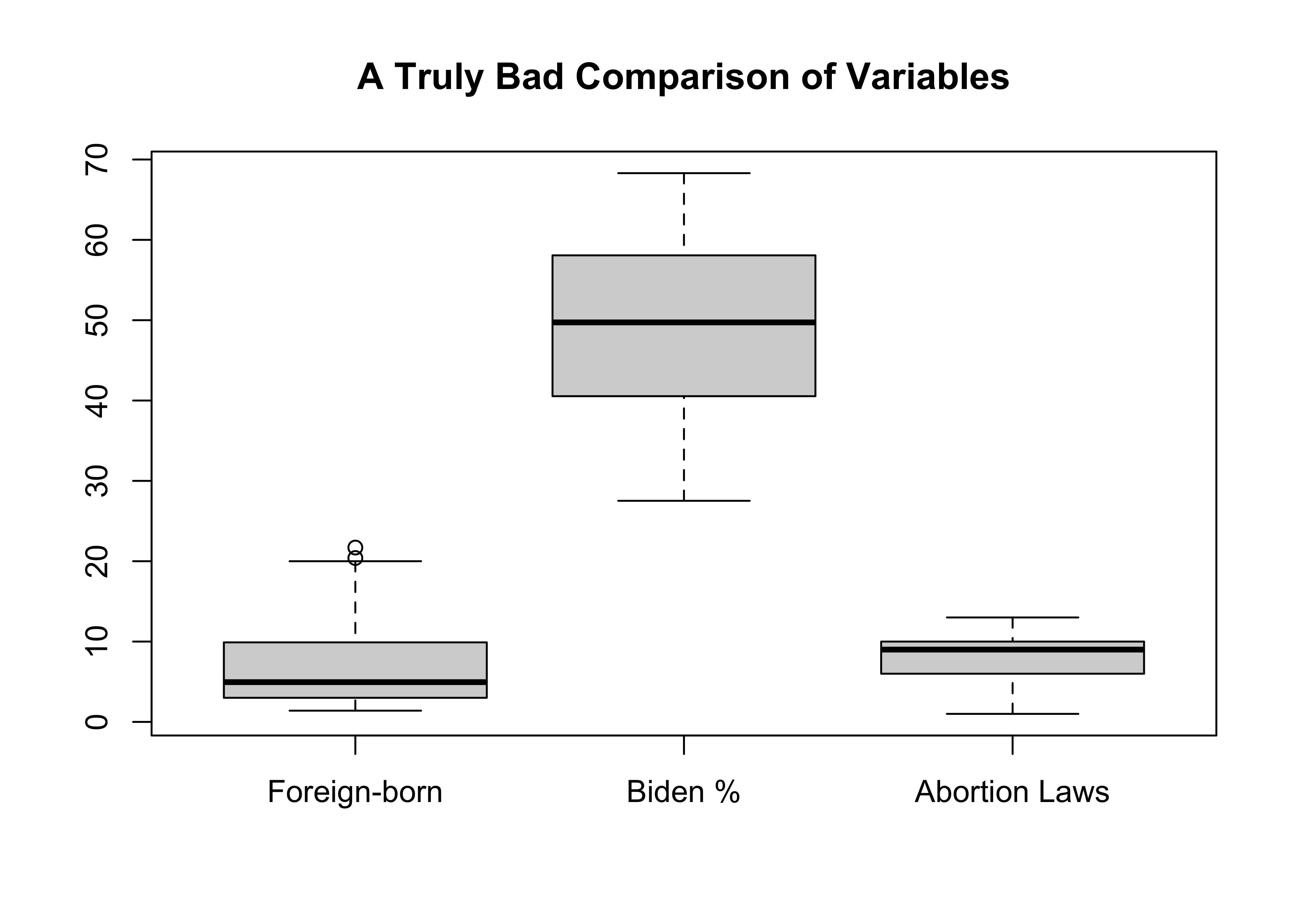
Which of these would you say has the least amount of variation, just based on “eyeballing” the plot? It looks like there is hardly any variation in abortion laws, a bit more variation in the foreign-born percentage of the population, and the greatest variation in Biden’s percent of the two-party vote.
The most important point to take away from this graph is that it is a terrible graph! You should never put three such disparate variables, measuring such different outcomes, and using different scales in the same distribution graph. It’s just not a fair comparison, due primarily to differences in scale. Of course, that’s the point of the graph.
You run into the same problem using the standard deviation as the basis of comparison:
[1] 5.401855[1] 10.62935[1] 2.946045Here we get the same impression regarding relative levels of dispersion across these variables, but this is still not a fair comparison because one of the primary determinants of the standard deviation is the scale of the variable. The larger the scale, the larger the variance and standard deviation are likely to be.
The coefficient of variation is a useful statistic, precisely for this reason. Below, we see that when considering variation relative to the scale of the variables, using the coefficient of variation, the impression of these three variables changes.
[1] 0.767091[1] 0.2177949[1] 0.3738636These results paint a different picture of the level of dispersion in these three variables: the percent foreign-born exhibits the most variation, relative to its scale, followed by abortion laws, and then by Biden’s vote share. The differences in the boxplot were due largely to differences in the scale of the variables. Once that scale is taken into account by the coefficient of variation, the impression of dispersion levels changes a lot.
Dichotomous Variables
It is also possible to think of variation in dichotomous variables. Consider, for example, the numeric indicator variable we created and used in Chapters 4 and 5 measuring whether respondents in the ANES 2020 survey supported (1) or opposed (0) adoption by gay and lesbian couples. Since all observations are scored 0 or 1, it might seem strange to think about variation around the mean in this variable. Still, because we are working with numeric data, it is possible to calculate the variance and standard deviation for these types of variables.
First, let’s reconstruct and examine this variable.
anes20$lgbtq4
      Frequency Percent Valid Percent
0          1598  19.300          19.6
1          6554  79.155          80.4
NA's        128   1.546
Total      8280 100.000         100.0
About 19.6% in 0 (No) and 80.4% in 1 (Yes). Does that seem like a lot of variation? It’s really hard to tell without understanding what a dichotomous variable with a lot of variation would look like.
First, think about what would this variable look like if there were no variation in its outcomes. All of the observations (100%) would be in one category. Okay, so what would it look like if there was maximum variation? Half the observations would be in 0 and half in 1; it would be 50/50. The distribution for anes20$lgbtq4 seems closer to no variation than to maximum variation.
We use a different formula to calculate the variance in dichotomous variables:
\[S^2=p(1-p)\]
Where \(p\) is the proportion in category 1.
In this case: S2=(.196*.804) = .1576
The standard deviation, of course, is the square root of the variance:
\[S=\sqrt{p(1-p)}=\sqrt{.1576}=.397\]
Let’s check our work in R:
[1] 0.3970124What does this mean? How should it be interpreted? With dichotomous variables like this, the interpretation is a bit harder to grasp than with a continuous numeric variable. One way to think about it is that if this variable exhibited maximum variation (50% in one category, 50% in the other), the value of the standard deviation would be \(\sqrt{(p(1-p)}=.50\). To be honest, though, the real value in calculating the standard deviation for a dichotomous variable is not in the interpretation of the value, but in using it to calculate other statistics in later chapters.
Dispersion in Categorical Variables?
Is it useful to think about variation in multi-category nominal-level variables for which the values have little or no quantitative meaning? Certainly, it does not make sense to think about calculating a mean for categorical variables, so it doesn’t make sense to think in terms of dispersion around the mean. However, it does make sense to think of variables in terms of how diverse the outcomes are; whether they tend to cluster in one or two categories (concentrated) or spread out more evenly across categories (diverse or dispersed), similar to the logic used with evaluating dichotomous variables.
Let’s take a look at a five-category nominal variable from the 2020 ANES survey measuring the race and ethnicity of the survey respondents (anes20$raceth is a recoded version of anes20V201549x). The response categories are White (non-Hispanic), Black (non-Hispanic), Hispanic, Asian and Pacific Islander (non-Hispanic), and a category that represents other identities.
#Create five-category race/ehtnicity variable
anes20$raceth.5<-anes20$V201549x
levels(anes20$raceth.5)<-c("White(NH)","Black(NH)","Hispanic",
                           "API(NH)","Other","Other")

freq(anes20$raceth.5, plot=F)
PRE: SUMMARY: R self-identified race/ethnicity
Frequency Percent Valid Percent
White(NH) 5963 72.017 72.915
Black(NH) 726 8.768 8.877
Hispanic 762 9.203 9.318
API(NH) 284 3.430 3.473
Other 443 5.350 5.417
NA's 102 1.232
Total 8280 100.000 100.000What we need is a measure that tells how dispersed the responses are relative to a standard that represents maximum dispersion. Again, we could ask what this distribution would look like if there was no variation at all in responses. It would have 100% in a single category. What would maximum variation look like? Since there are five valid response categories, the most diverse set of responses would be to have 20% in each category. This would mean that responses were spread out evenly across categories, as diverse as possible. The responses for this variable are concentrated in “White(NH)” (73%), indicating not a lot of variation.
The Index of Qualitative Variation (IQV) can be used to calculate how close to the maximum level of variation a particular distribution is.
The formula for the IQV is:
\[IQV=\frac{K}{K-1}*(1-\sum_{k=1}^n p_k^2)\]
Where:
K= Number of categories
k = specific categories
\(p\) = Proportion in category k
This formula is saying to sum up all of the squared category proportions, subtract that sum from 1, and multiply the result times the number of categories divided by the number of categories minus 1. This last part adjusts the main part of the formula to take into account the fact that it is harder to get to maximum diversity with fewer categories. There is not an easy-to-use R function for calculating the IQV, so let’s do it the old-fashioned way:
\[\text{IQV}=\frac{5}{4}*(1-(.72915^2+.08877^2+.09318^2+.03473^2+.05417^2))=.56\] Note: the proportions are taken from the valid percentages in the frequency table.
We should interpret this as meaning that this variable is about 56% as diverse as it could be, compared to maximum diversity. In other words, not terribly diverse.
The Standard Deviation and the Normal Curve
One of the interesting uses of the standard deviation lies in its application to the normal curve (also known as the normal distribution, sometimes as the bell curve). The normal curve can be thought of as a density plot that represents the distribution of a theoretical variable that has several important characteristics:
- It is single-peaked
- The mean, median, and mode have the same value
- It is perfectly symmetrical and “bell” shaped
- Most observations are clustered near the mean
- Its tails extend infinitely
Before describing how the standard deviation is related to the normal distribution, I want to be clear about the difference between a theoretical distribution and an empirical distribution. A theoretical distribution is one that would exist if certain mathematical conditions were satisfied. It is an idealized distribution. An empirical distribution is based on the measurement of concrete, tangible characteristics of a variable that actually exists. The normal distribution is derived from a mathematical formula and has all of the characteristics listed above. In addition, another important characteristic for our purposes lies in its relationship to the standard deviation:
68.26% of the area under the curve lies within one standard deviation of the mean (if we think of the area under the curve as representing the outcomes of a variable, 68% of all outcomes are within one standard deviation of the mean);
95.24% of the area under the curve lies within two standard deviations of the mean;
and 99.72% of the area under the curve lies within three standard deviations of the mean.
This relationship is presented below in Figure 6.3, using the Standard Normal Distribution:16
[Figure******** 6.3 ********about here]
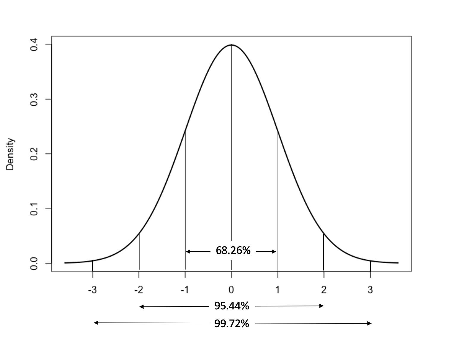
Figure 6.3: The Standard Deviation and the Standard Normal Distribution
Note that these guidelines apply to areas above and below the mean together. So, for instance, when we say that 68.26% of the area under the curve falls within one standard deviation of the mean, we mean that 34.13% of the area is found between the mean and one standard deviation above the mean, and 34.13% of the area is found between the mean and one standard deviation below the mean.
Let’s apply the guidelines in Figure 6.3 to some real data. Suppose that we know that one of the respondents from the cces20 sample is 66 years old, and someone wants to know if that respondent is relatively old, given the sample. Of course, you know from earlier in the chapter that the sample does not include anyone under 18 years of age and that the mean is 48.39 years old, so you’re not so sure that this respondent is really that old, relative to the rest of the sample.
One way to get a sense of how old they are, relative to the rest of the sample, would be to assume that age is normally distributed and then apply what we know about the standard deviation and the normal curve to this variable. To do this we would need to know how many standard deviations above the mean the 66-year-old is. The result statistic is called a z-score. Z-scores transform the original (raw) values of a numeric variable into the number of standard deviations above or below the mean that those values are. Z-scores are calculated as:
\[Z_i=\frac{x_i-\bar{x}}{S}\]
The values of any numeric variable can be transformed into z-scores. Knowing the z-score for a particular outcome on most variables gives you a sense of how typical it is. If your z-score on a midterm exam is .01, then you’re very close to the average score. If your z-score is +2 then you did a great job, relative to everyone else. If your z-score is –1, then you struggled on the exam, relative to everyone else.
Let’s transform the 66-year-old respondent’s age into a z-score. First, we take the raw difference between the mean and the respondent’s age, 66:
[1] 17.61So, the 66-year-old respondent is just about 18 years older than the average respondent. This seems like a lot, but thinking about this relative to the rest of the sample, it depends on how much variation there is in the age of respondents. For this particular sample, we can evaluate this with the standard deviation, which is 17.66.
[1] 17.65902So, now we just need to transform the raw difference (17.61) into a z-score that expresses the difference in terms of how many standard deviations this 66-year-old respondent is above the mean age in this sample. Since the respondent is 17.61 years older than the average respondent, and the standard deviation for this variable is 17.66, we know that the 66-year-old is close to one standard deviation above the mean:
[1] 0.9971687Let’s think back to the normal distribution in Figure 6.3 and assume that age is a normally distributed variable. We know that the 66-year-old respondent is about one standard deviation above the mean. What is the area under the curve to the left of +1 standard deviations? Since we know that 50% of the area under the curve (think of this as 50% of the observations of a normally distributed variable) lies to the left (below) of the mean, and 34.13% lies between the mean and +1 standard deviation, we can also say that 84.13% (50+34.13) of the area under the curve lies to the left of +1 standard deviation above the mean. Therefore, we might expect that the 66-year-old respondent is somewhere in the neighborhood of the 84th percentile for age in this sample.
Of course, empirical variables such as age are unlikely to be normally distributed. Still, for most variables, if you know that an outcome is one standard deviation or more above the mean, you can be confident that, relative to that variable’s distribution, the outcome is a fairly high value. Likewise, an outcome that is one standard deviation or more below the mean is relatively low. And, of course, an outcome that is two standard deviations (below) above the mean is very high (low), relative to the rest of the distribution.
I suggested above that the relationship between the standard deviation and the normal curve could be applied to empirical variables to get a general sense of how typical different outcomes are. Consider how this works for the age variable we used above. While I estimated (with the z-score) that a 66-year-old in the sample would be in the 84th percentile, the actual distribution for age in the cces20 sample shows that 82.1% of the sample is 66 years old or younger. I was able to find this number by creating a new variable that had two categories: one for those respondents less than or equal to 66 years old and one for those who are older than 66:
#Create a new variable for age (18-66 and 67+)
cces20$age_66=factor(cut2(cces20$age, c(67)))
levels(cces20$age_66)= c("18-66", "67 and older")
freq(cces20$age_66,  plot=F)
cces20$age_66
Frequency Percent
18-66 50050 82.05
67 and older 10950 17.95
Total 61000 100.00One reason the estimate from this empirical sample is so close to the expectations based on the theoretical normal distribution is that the distribution for age does not deviate drastically from normal (See histogram below). The solid curved line in Figure 6.4 is the normal distribution, and the vertical line identifies the cutoff point for 66-years-old.
[Figure** 6.4 **about here]
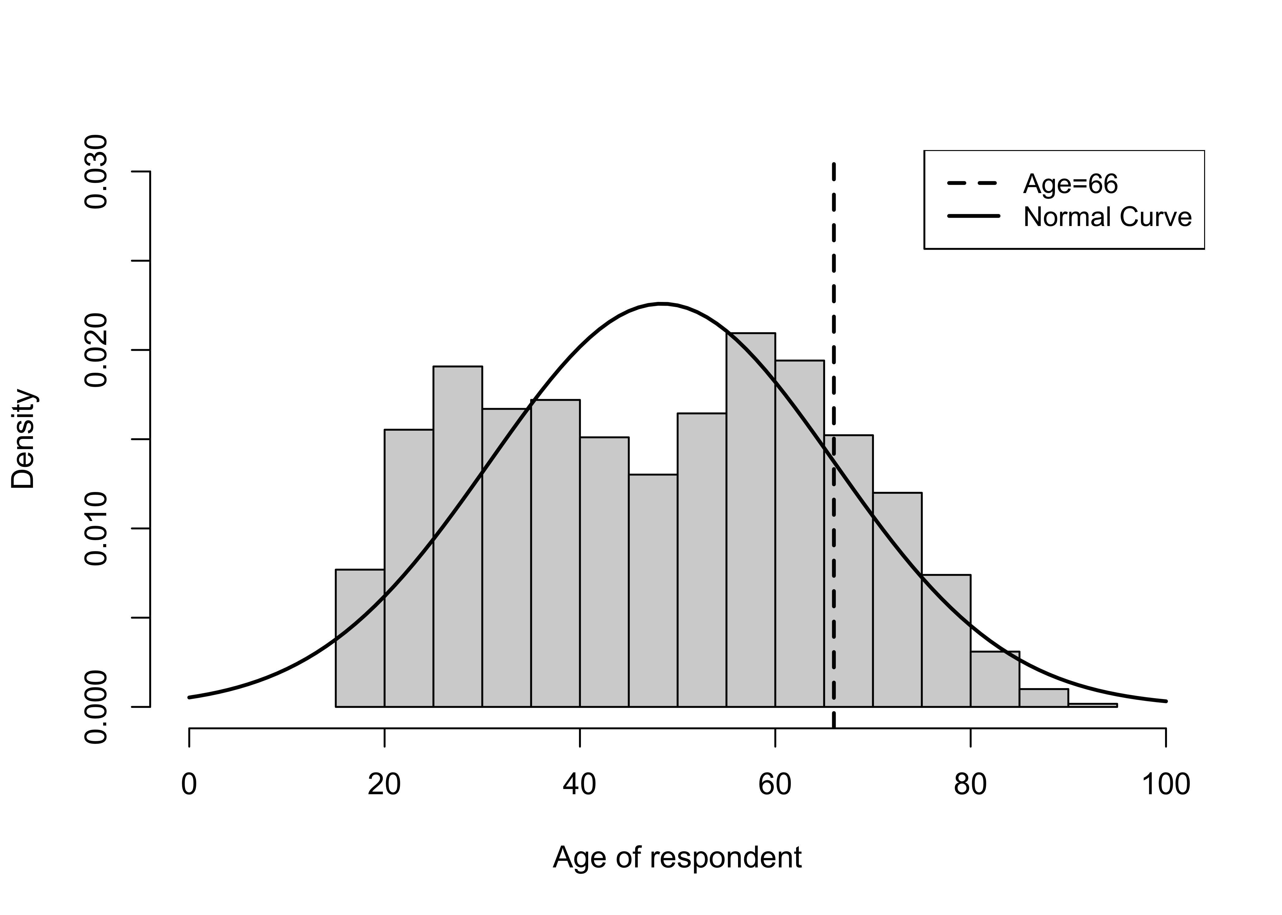
Figure 6.4: Comparing the Empirical Histogram for Age with the Normal Curve
Really Important Caveat
Just to be clear, the guidelines for estimating precise areas under the curve, or percentiles for specific outcomes apply strictly only for normal distributions. That is how we will apply them in later chapters. Still, as a rule of thumb, the guidelines give a sense of how relatively high or low outcomes are for empirical variables.
Calculating Area Under a Normal Curve
We can use a couple of different methods to calculate the area under a normal curve above or below any given z-score. We can go “old school” and look at a standard z-distribution table, like the one below.17 In this table, the left side column represents different z-score values, to one place to the right of the decimal point, and the column headers are the second z-score digit to the right of the decimal. The numbers inside the table represent the area under the curve to the left of any given z-score (given by the intersection of the row and column headers).
[Table 6.1 about here]
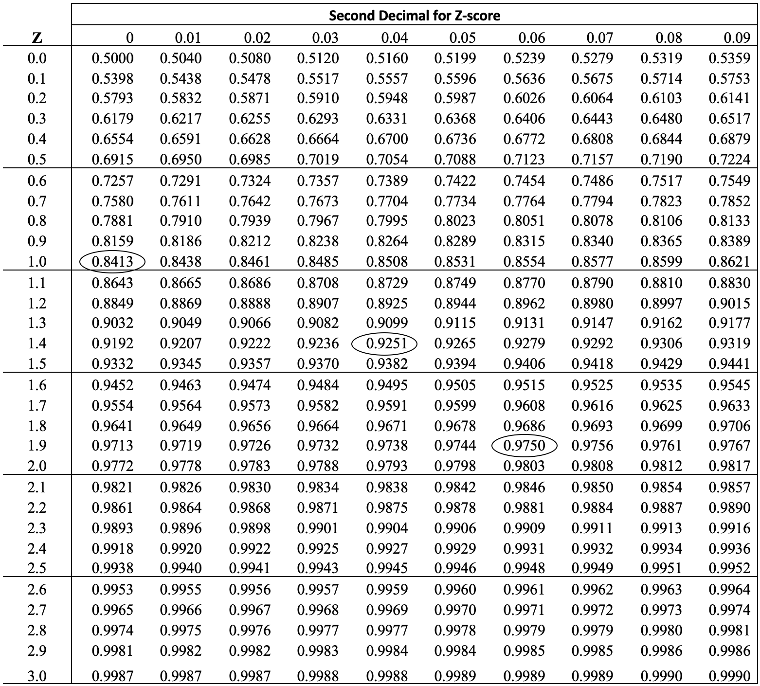
So, for instance, if you look at the intersection of 1.0 on the side and 0.00 at the top (z=1.0), you see the value of .8413. This means, as we already know, that approximately 84% of the area under the curve is below a z-score of 1.0. Of course, this also means that approximately 16% of the area lies above z=1.0, and approximately 34% lies between the mean and a z-score of 1.0. Likewise, we can look at the intersection of 1.9 (row) and .06 (column) to find the area under the curve for z-score of 1.96. The area to the left of z=1.96 is 95.7%, and the area to the right of z=1.96 is 2.5% of the total area under the curve. Let’s walk through this once more, using z=1.44. What is the area to the left, to the right, and between the mean and z=1.44:
- To the left: .9251 (found at the intersection of 1.4 (row) and .04 (column))
- To the right: (1-.9251) = .0749
- Between the mean and 1.44: (.9252-.5) = .4251
If these results confuse you, make sure to check in with your professor.
So, that’s the “old-School” way to find areas under the normal distribution. I think it is helpful to use a table like this when you first learn this material, but there is an easier and more precise way to do this using R. You can use the pnorm function to find areas under the curve for any given z-score. By default, this function displays the area under the curve to the left of specified z-scores. Let’s check our work above for z=1.44.
[1] 0.9250663So far, so good. R can also give you the area to the right of a z-score. Simply add lower.tail = F to the pnorm command:
#Get area under the curve for to the right of z=1.44
#Add "lower.tail = F"
pnorm(1.44, lower.tail = F)
[1] 0.0749337And the area between the mean and z=1.44:
[1] 0.4250663One Last Thing
Thus far you have used specific functions, such as sd(), var, IQR, and range to get individual statistics, or summary to generate some of these statistics together. There is another important function that provides all of these statistics, plus many more, and can save you the bother of running several different commands to get the information you want. Desc is part of the DescTools package and provides summaries of the underlying statistical properties of variables. If you drop plot=F from the command shown below, you also get a histogram, boxplot, and density plot, though they are not quite “publication ready.” Let’s check this out using states20$fb:
------------------------------------------------------------------------------
states20$fb (numeric)

  length       n    NAs  unique     0s    mean  meanCI'
      50      50      0      45      0   7.042   5.507
          100.0%   0.0%           0.0%           8.577

     .05     .10    .25  median    .75     .90     .95
   2.145   2.290  3.025   4.950  9.850  14.990  19.370

   range      sd  vcoef     mad    IQR    skew    kurt
  20.300   5.402  0.767   3.262  6.825   1.203   0.449

lowest : 1.4, 1.8, 2.1, 2.2 (2), 2.3 (2)
highest: 15.8, 18.6, 20.0, 20.4, 21.7

' 95%-CI (classic)
Desc provides you with almost all of the measures of central tendency and dispersion you’ve learned about so far, plus a few others. A couple of quick notes: the lower limit of the IQR is displayed under .25 (25th percentile), the upper limit under .75 (75th percentile), and the width is reported under IQR. Also, “mad” reported here is not the mean absolute deviation from the mean (it is the median absolute deviation).
Next Steps
Measures of dispersion–in particular the variance and standard deviation–will make guest appearances in almost all of the remaining chapters of this book. As suggested above, the importance of these statistics goes well beyond describing the distribution of variables. In the next chapter, you will see how the standard deviation and normal distribution can be used to estimate probabilities. Following that, we examine the crucial role the standard deviation plays in statistical inference. Several chapters later, we will also see that the variances of independent and dependent variables are used to form the basis for correlation and regression analyses.
The next two chapters address issues related to probability, sampling, and statistical inference. You will find this material a bit more abstract than what we’ve done so far, and I think you will also find it very interesting. The content of these chapters is very important to understanding concepts related to something you may have heard of before, even if just informally, “statistical significance.” For many of you, this will be strange, new material: embrace it and enjoy the journey of discovery!
Exercises
Concepts and Calculations
As usual, when making calculations, show the process you used.
- Use the information provided below about three hypothetical variables to determine of the variables appears to be skewed in one direction of the other. Explain your conclusions.
| Variable | Range | IQR | Median |
|---|---|---|---|
| Variable 1 | 1 to 1200 | 500 to 800 | 650 |
| Variable 2 | 30 to 90 | 40 to 50 | 45 |
| Variable 3 | 3 to 35 | 20 to 30 | 23 |
- The list of voter turnout rates in twelve Wisconsin counties that you used for an exercise in Chapter 5 are reproduced below, with two empty columns added: one for the deviation of each observation from the mean, and another for the square of that deviation. Fill in this information and:
Calculate the mean absolute deviation and the standard deviation. Interpret these statistics. Which one do you find easiest to understand? Why?
Next, calculate the coefficient of variation for this variable. How do you interpret this statistic?
| Wisconsin County | % Turnout | \(X{_i}-\bar{X}\) | \((X{_i}-\bar{X})^2\) |
|---|---|---|---|
| Clark | 63 | ||
| Dane | 87 | ||
| Forrest | 71 | ||
| Grant | 63 | ||
| Iowa | 78 | ||
| Iron | 82 | ||
| Jackson | 65 | ||
| Kenosha | 71 | ||
| Marinette | 71 | ||
| Milwaukee | 68 | ||
| Portage | 74 | ||
| Taylor | 70 |
Across the fifty states, the average cumulative number of COVID-19 cases per 10,000 population in August of 2021 was 1161, and the standard deviation was 274. The cases per 10,000 were 888 in Virginia and 1427 in South Carolina. Using what you know about the normal distribution, and assuming this variable follows a normal distribution, what percent of states do you estimate had values equal to or less than Virginia’s, and what percent do you expect to have had values equal to or greater than South Carolina’s? Explain how you reached your conclusions.
The average voter turnout rate across the fifty states in the 2020 presidential election was 67.4% of eligible voters, and the standard deviation was 5.8. Calculate the z-scores for the following list of states and identify which state is most extreme and which state is least extreme.
| State | Turnout (%) | z-score |
|---|---|---|
| OK | 54.8 | |
| WV | 57.0 | |
| SC | 64.0 | |
| GA | 67.7 | |
| PA | 70.7 | |
| NJ | 74.0 | |
| MN | 79.6 |
- This horizontal boxplot illustrates the distribution of per capita income across the states. Discuss the discuss the distribution, paying attention to the range, the inter-quartile range, and the median. Are there any signs of skewness here? Explain.
- The survey of 300 students you used for one of the assignments in Chapter 3 included a question about the political leanings of students. Based on the responses provided below, how would you describe the amount of variation in student political leanings. Calculate and use the Index of Qualitative Variation to answer this questions.
| Political Leaning | Frequency | Percent |
|---|---|---|
| Far Left | 35 | 11.67 |
| Liberal | 100 | 33.33 |
| Moderate | 75 | 25.0 |
| Conservative | 66 | 22.0 |
| Far Right | 24 | 8.0 |
R Problems
Using the
pnormfunction, estimate the area under the normal curve for each of the following each of the following:- Above Z=1.8
- Below Z= -1.3
- Between Z= -1.3 and Z=1.8
For the remaining problems, use
countries2data set. One important variable in thecountries2data set islifexp, which measures life expectancy. Create a histogram, a boxplot, and a density plot, and describe the distribution of life expectancy across countries. Which of these graphing methods do you think is most useful for getting a sense of how much variation there is in this variable? Why? What about skewness? What can you tell from these graphs? Be specific.Use the results of the
Desccommand to describe the amount of variation in life expectancy, focusing on the range, inter-quartile range, and standard deviation. Make sure to provide interpretations of these statistics.Now, suppose you want to compare the amount of variation in life expectancy to variation in Gross Domestic Product (GDP) per capita (
countries2$gdp_pc). What statistic should you use to make this comparison? Think about this before proceeding. UseDescto get the appropriate statistic. Justify your choice and discuss the difference between the two variables.Choose a different numeric variable from the
countries2data set that interests you, then create a histogram for that variable that includes vertical lines for the lower and upper limits of the inter-quartile range, add a legend for the vertical lines, and add a descriptive x-axis label. Describe what you see in the graph you created.
Outliers are defined \(Q1-1.5*IQR\) and \(Q3+1.5*IQR\).↩︎
The standard normal distribution has a mean of 0 and a standard deviation of 1. Other normal distributions share the characteristics listed above but have different means and standard deviations.↩︎
Code for creating this table was adapted from a post by Arthur Charpentier–https://www.r-bloggers.com/2013/10/generating-your-own-normal-distribution-table/.↩︎