Chapter 16 Multiple Regression
16.1 Getting Started
This chapter expands the discussion of regression analysis to include the use of multiple independent variables in the same model. We begin by reviewing the interpretation of the simple regression results, using a method of presentation that can help you communicate your results effectively, before moving on the multiple regression model. To follow along in R, you should load the countries2 data set and attach the libraries for the DescTools and stargazer packages.
16.2 Organizing the Regession Output
Presentation of results is always an important part of the research process. You want to make sure the reader, whether your professor, a client, or your supervisor at work, has an easy time reading and absorbing the findings. Part of this depends upon the descriptions and interpretations you provide, but another important aspect is the physical presentation of the statistical results. You may have noticed the regression output in R is a bit unwieldy and could certainly serve as a barrier to understanding, especially for people who don’t work in R on a regular basis.
Fortunately, there is an R package called stargazer that can be used to produce publication quality tables that are easy to read and include most of the important information from the regression output. In the remainder of this section stargazer is used to produce the results of regression models based on the cross-national analysis of life expectancy that we examined using correlations and scatterplots in Chapter 14. The analysis in Chapter 14 found that fertility rate and the mean level of education were significantly related to life expectancy across countries but that population size was not.
Let’s turn, first, to the analysis of the impact of fertility rates on life expectancy across countries. Similar to regression models used in Chapter 15, the results of the analysis are stored in a new object. However, instead of using summary to view the results, we use stargazer to report the results in the form of a well-organized table. In its simplest form, you just need to tell stargazer to produce a “text” table using the information from the object where you stored the results of your regression model. To add to the clarity of the output, I also include code to generate descriptive labels for the dependent and independent variables. Without doing so, the R variable names would be used, which would be fine for you, but using the descriptive labels makes it easier for everyone to read the table.
#Regression model of "lifexp" by "fert1520"
fertility<-(lm(countries2$lifexp~countries2$fert1520))
#Have 'stargazer' use the information in 'fertility' to create a table
stargazer(fertility, type="text",
          dep.var.labels=c("Life Expectancy"),#Label dependent variable
          covariate.labels = c("Fertility Rate"))#Label independent variable
===============================================
                        Dependent variable:
                    ---------------------------
                          Life Expectancy
-----------------------------------------------
Fertility Rate               -4.911***
                              (0.231)

Constant                     85.946***
                              (0.700)

-----------------------------------------------
Observations                    185
R2                             0.711
Adjusted R2                    0.710
Residual Std. Error      4.032 (df = 183)
F Statistic          450.410*** (df = 1; 183)
===============================================
Note:               *p<0.1; **p<0.05; ***p<0.01
As you can see, stargazer produces a neatly organized, easy to read table, one that stands in stark contrast to the standard regression output from R.47 You can copy and paste this table into whatever program you are using to produce your document. Remember, though, that when copying and pasting R output, you need to use a fixed-width format such consolas or courier, otherwise your columns will wander about and the table will be difficult to read.
We can use stargazer to present the results of the models for the education and population models alongside those from the fertility model, all in one table. All you have to do is run the other two models, save the results in new, differently named objects, and add the new object names and descriptive labels to the command line. One other thing I do here is suppress the printing of the F-ratio and degrees of freedom omit.stat=c("f"). This helps fit the three models into one table.
#Run education and population models
education<-(lm(countries2$lifexp~countries2$mnschool))
pop<-(lm(countries2$lifexp~log10(countries2$pop19_M)))
#Have 'stargazer' use the information in ''fertility', 'education',
#and 'pop' to create a table
stargazer(fertility, education, pop, type="text",
          dep.var.labels=c("Life Expectancy"),#Label dependent variable
          covariate.labels = c("Fertility Rate", #Label 'fert1529'
                               "Mean Years of Education", #Label 'mnschool'
                               "Log10 Population"),#Label 'log10pop'
          omit.stat=c("f")) #Drop F-stat to make room for three columns
==========================================================================
                                       Dependent variable:
                        --------------------------------------------------
                                         Life Expectancy
                              (1)              (2)              (3)
--------------------------------------------------------------------------
Fertility Rate             -4.911***
                            (0.231)

Mean Years of Education                      1.839***
                                             (0.112)

Log10 Population                                               -0.699
                                                              (0.599)

Constant                   85.946***        56.663***        73.214***
                            (0.700)          (1.036)          (0.735)

--------------------------------------------------------------------------
Observations                  185              189              191
R2                           0.711            0.591            0.007
Adjusted R2                  0.710            0.589            0.002
Residual Std. Error     4.032 (df = 183) 4.738 (df = 187) 7.423 (df = 189)
==========================================================================
Note:                                          *p<0.1; **p<0.05; ***p<0.01
Most things in the stargazer table are self-explanatory, but there are a couple of things I want to be sure you understand. The dependent variable name is listed above the three models, and the slopes and the constants are listed in the columns headed by the model numbers. Each slope corresponds to the impact of the independent variable listed to the left, in the first column, and the standard error for the slope appears in parentheses just below the slope. In addition, the significance level (p-value) for each slope is denoted by asterisks, with the corresponding values listed below the table. For example, in the fertility model (1), the constant is 85.946, the slope for fertility rate is -4.911, and the p-value is less than .01. These p-values are calculated for two-tailed tests, so they are a bit on the conservative side. Because of this, if you are testing a one-tailed hypothesis and the reported p-value is “*p<.10”, you can reject the null hypothesis since the p-value for a one-tailed test is actually less than .05 (half the value of the two-tailed p-value). Notice, also, that there is no asterisk attached to the coefficient for population size because the slope is not statistically significant.
16.2.1 Summarizing Life Expectancy Models.
Before moving on to multiple regression, let’s review important aspects of the interpretation of simple regression results by looking at the determinants of life expectancy in regression models reported above.
First, the impact of fertility rate on life expectancy (Model 1):
These results can be expressed as a linear equation, where the predicted value of life expectancy is a function of fertility rate: \(\hat{y}= 85.946 - 4.911(fert1520)\)
There is a statistically significant, negative relationship between fertility rate and country-level life expectancy. Countries with relatively high fertility rates tend to have relatively low life expectancy. More specifically, for every one-unit increase in fertility rate, life expectancy decreases by 4.911 years.
This is a strong relationship. Fertility rates explains approximately 71% of the variation in life expectancy across nations.
For the impact of level of education on life expectancy (Model 2):
These results can be expressed as a linear equation, where the predicted value of life expectancy is: \(\hat{y}= 56.663 +1.839(mnschool)\)
There is a statistically significant, positive relationship between average years of education and country-level life expectancy. Generally, countries with relatively high levels of education tend to have relatively high levels of life expectancy. More specifically, for every one-unit increase in average years of education, country-level life expectancy increases by 1.839 years.
This is a fairly strong relationship. Educational attainment explains approximately 59% of the variation in life expectancy across nations.
For the impact of population size on life expectancy (Model 3):
- Population size has no impact of country-level life expectancy.
The finding for log10(pop) provides a perfect opportunity to demonstrate what a null relationship looks like. Note that the constant in the population model (73.214) is very close to the value of the mean of the dependent variable (72.639). This is because the independent variable does not offer a significantly better prediction than we get from simply using \(\bar{Y}\) to predict \(Y\). In fact, in bi-variate regression models in which \(b=0\), the intercept equals the mean of the dependent variable and the “slope” is a perfectly flat horizontal line at \(\bar{Y}\). Check out the scatterplot below, where the solid line is the prediction based on the regression equation using the log of country population as the independent variable, and the dashed line is the predicted outcome (the mean of Y) if the slope equals exactly 0:
#Plot of 'lifexp" by 'log10(pop)'
plot(log10(countries2$pop), countries2$lifexp, ylab=" Life Expectancy",
     xlab="Log10 of Population")
#plot regression line from 'pop' model (above)
abline(pop)
#plot a horizontal line at the mean of 'lifexp'
abline(h=mean(countries2$lifexp, na.rm=T), lty=2)
#Add legend
legend("bottomleft", legend=c("Y=73.21-.699X", "Mean of Y"),
       lty=c( 1,2), cex=.6)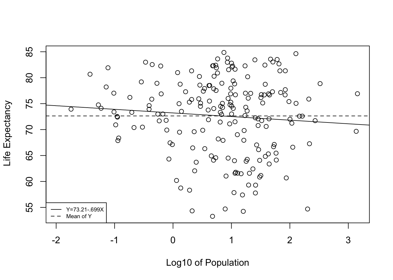
As you can see, the slope of the regression line is barely different from what we would expect if b=0. This is a perfect illustration of support for the null hypothesis. The regression equation offers no significant improvement over predicting \(y\) with no regression model; that is, predicting outcomes on \(y\) with \(\bar{y}\).
16.3 Multiple Regression
To this point, we have findings from three different regression models, but we know from the discussion of partial correlations in Chapter 14 that the models overlap with each other somewhat in the accounting of variation in life expectancy. We also know that this overlap leads to an overestimation of the strength of the relationships with the dependent variable when the independent variables are considered in isolation. It is possible to extend the partial correlation formula presented in Chapter 14 to account for multiple overlapping relationships, but we would still be relying on correlations, which, while very useful, do not provide the predictive capacity you get from regression analysis. Instead, we can extend the regression model to include several independent variables to accomplish the same goal, but with greater predictive capacity. Multiple regression analysis enables us to move beyond partial correlations to consider the impact of each independent variable on the dependent variable, controlling for the influence of all of the other independent variables on the dependent variable and on each other.
The multiple regression extends the simple model by adding independent variables:
\[y_i= a + b_1x_{1i}+ b_2x_{2i}+ \cdot \cdot \cdot + b_kx_{ki} + e_i\]
Where:
\({y}_i\) = the predicted value of the dependent variable
\(a\) = the sample constant (aka the intercept)
\(x_{1i}\) = the value of x1
\(b_1\) = the partial slope for the impact of x1, controlling for the impact of other variables
\(x_{2i}\) = the value of x2
\(b_2\) = the partial slope for the impact of x2, controlling for the impact of other variables
\(k\)= the number of independent variables
\(e_i\) = error term; the difference between the predicted and actual values of y (\(y_i-\hat{y}_i\)).
The formulas for estimating the constant and slopes for a model with two independent variables are presented below:
\[b_1=\left (\frac{s_y}{s_1} \right) \left (\frac{r_{y1}-r_{y2}r_{12}}{1-r^2_{12}} \right) \]
\[b_2=\left (\frac{s_y}{s_2}\right)\left(\frac{r_{y2}-r_{y1}r_{12}}{1-r^2_{12}}\right)\]
\[a=\bar{Y}-b_1\bar{X}_1-b_2\bar{X}_2\] We won’t calculate the constant and slopes, but I want to point out that they are based on the relationship between each of the independent variables and the dependent variable and also the interrelationships among the independent variables. You should recognize the right side of the formula as very similar to the formula for the partial correlation coefficient. This illustrates that the partial regression coefficient is doing the same thing that the partial correlation does: it gives an estimate of the impact of one independent variable while controlling for how it is related to the other independent variables AND for how the other independent variables are related to the dependent variable. The primary difference is that the partial correlation summarizes the strength and direction of the relationship between x and y, controlling for other specified variables, while the partial regression slope summarizes the expected change in y for a unit change in x, controlling for other specified variables and can be used to predict outcomes of y. As we add independent variables to the model, the level of complexity for calculating the slopes increases, but the basic principle of isolating the independent effects of multiple independent variables remains the same.
To get multiple regression results from R, you just have to add the independent variables to the linear model function, using the “+” sign to separate them. Note that I am using stargazer to produce the model results and that I only specified one model (fit), since all three variables are now in the same model.48
#Note the "+" sign before each additional variable.
#See footnote for information about "na.action"
#Use '+' sign to separate the independent variables.
fit<-lm(countries2$lifexp~countries2$fert15 +
           countries2$mnschool+
           log10(countries2$pop),na.action=na.exclude)
#Use 'stargazer' to produce a table for the three-variable model
stargazer(fit, type="text",
          dep.var.labels=c("Life Expectancy"),
          covariate.labels = c("Fertility Rate",
                               "Mean Years of Education",
                               "Log10 Population"))
===================================================
                            Dependent variable:
                        ---------------------------
                              Life Expectancy
---------------------------------------------------
Fertility Rate                   -3.546***
                                  (0.343)

Mean Years of Education          0.750***
                                  (0.140)

Log10 Population                   0.296
                                  (0.340)

Constant                         75.468***
                                  (2.074)

---------------------------------------------------
Observations                        183
R2                                 0.748
Adjusted R2                        0.743
Residual Std. Error          3.768 (df = 179)
F Statistic              176.640*** (df = 3; 179)
===================================================
Note:                   *p<0.1; **p<0.05; ***p<0.01
This output looks a lot like the output from the individual models, except now we have coefficients for each of the independent variables in a single model.
Here’s how I would interpret the results:
Two of the three independent variables are statistically significant: fertility rate has a negative impact on life expectancy, and educational attainment has a positive impact. The p-values for the slopes of these two variables are less than .01. Population size has no impact on life expectancy.
For every additional unit of fertility rate, life expectancy is expected to decline by 3.546 years, controlling for the influence of other variables. So, for instance, if Country A and Country B are the same on all other variables, but Country A’s fertility rate is one unit higher than Country B’s, we would predict that Country A’s life expectancy is expected to be be 3.546 years less than Country B’s.
For every additional year of mean educational attainment, life expectancy is predicted to increase by .75 years, controlling for the influence of other variables. So, if Country A and Country B are the same on all other variables, but Country A’s outcome mean level of education is one unit higher than Country B’s, we expect that Country A’s life expectancy should be about .75 years higher than Country B’s.
Together, these three variables explain 74.8% of the variation in country-level life expectancy.
You can also write this out as a linear equation, if that helps you with interpretation:
\[\hat{\text{lifexp}}= 75.468-3.546(\text{fert1520})+.75(\text{mnschool})-.296(\text{log10(pop)})\]
One other thing that is important to note is that the slopes for fertility and level of education are much smaller than they were in the bivariate (one independent variable) models, reflecting the consequence of controlling for overlapping influences. For fertility rate, the slope changed from -4.911 to -3.546, a 28% decrease; while the slope for education went from 1.839 to .75, a 59% decrease in impact. This is to be expected when two highly correlated independent variables are put in the same multiple regression model.
16.3.1 Assessing the Substantive Impact
Sometimes, calculating predicted outcomes for different combinations of the independent variables can give you a better appreciation for the substantive importance of the model. We can use the model estimates to predict the value of life expectancy for countries with different combinations of outcomes on these variables. We do this by plugging in the values of the independent variables, multiplying them times their slopes, and then adding the constant, similar to the calculations made in Chapter 15 (Table 15.2). Consider two hypothetical countries that have very different, but realistic outcomes on the fertility and education but are the same on population:
| Country | Fertility Rate | Mean Education | Logged Population |
|---|---|---|---|
| Country A | 1.8 | 10.3 | .75 |
| Country B | 3.9 | 4.9 | .75 |
Country B has a higher fertility rate and lower value on educational attainment than Country A, so we expect it to have an overall lower predicted outcome on life expectancy. Let’s plug in the numbers and see what we get.
For Country A:
\(\hat{y}= 75.468 -3.546(1.8) +.75(10.3) +.296(.75) = 77.03\)
For Country B:
\(\hat{y}= 75.468 -3.546(3.9) + .75(4.9) +.296(.75) = 65.54\)
The predicted life expectancy in Country A is almost 11.5 years higher than in Country B, based on differences in fertility and level of education. Given the gravity of this dependent variable—how long people are expected to live—this is a very meaningful difference. It is important to understand that the difference in predicted outcomes would be much narrower if the model did not fit the data as well as it does. If fertility and education levels were not as strongly related to life expectancy, then differences in their values would not predict as substantial differences in life expectancy.
16.4 Model Accuracy
Adjusted R2. The new model R2 (.748) appears to be an improvement over the strongest of the bi-variate models (fertility rate), which had an R2 of .711. However, with regression analysis, every time we add a variable to the model the R2 value will increase by some slight magnitude simply because each variable in the model explains one data point. So, the question for us is whether there was a real increase in the R2 value beyond what you could expect simply due to adding two variables. One way to address this is to “adjust” the R2 to take into account the number of variables in the model. The adjusted R2 value can then be used to assess the fit of the model.
The formula for the adjusted R2 is:
\[R^2_{adj}= 1-(1-R^2) \left(\frac{N-1}{N-k-1}\right)\]
Here, \(N-K-1\) is the degrees of freedom for the regression model, where N=sample size (183), and K=number of variables (3). One thing to note about this formula is that the impact of additional variables on the value of R2 is greatest when the sample size is relatively small. As N increases, the difference between R2 and adjusted R2 for additional variables grows smaller.
For the model above, with the R2 value of .7475 (carried out four places to the right of the decimal, which is what R uses for calculating the adjusted R2):
\[R^2_{adj}= 1-(.2525) \left(\frac{182}{179}\right)=.743\]
This new estimate is slightly smaller than the unadjusted R2, but still represents a real improvement over the strongest of the bivariate models, in which the adjusted R2 was .710.
Root Mean Squared Error. The R2 (or adjusted R2) statistic is a nice measure of the explanatory power of the models, and a higher R2 for a given model generally means less error. However, the R2 statistic does not tell us exactly how much error there is in the model estimates. For instance, the results above tell us that the model explains about 74% of the variation in life expectancy, but that piece of information does not speak to the typical error in prediction (\((y_1-\hat{y})^2\)). Yes, the model reduces error in prediction by quite a lot, but how much error is there, on average? For that, we can use a different statistic, the Root Mean Squared Error (RMSE). The RMSE reflects the typical error in the model. It simply takes the square root of the mean squared error:
\[RMSE=\sqrt{\frac{\sum(y_i-\hat{y})^2}{N-k-1}}\]
The sum of squared residuals (error) constitutes the numerator, and the model degrees of freedom (see above) constitute the denominator. Let’s run through these calculations for the regression model.
#Calculate squared residuals using the saved residuals from "fit"
residsq <- residuals(fit)^2

#Sum the squared residuals, add "na.rm" because of missing data
sumresidsq<-sum(residsq, na.rm=T)
sumresidsq
[1] 2541.9#Divide the sum of squared residuals by N-K-1 and take the square root
RMSE=sqrt(sumresidsq/179)
RMSE[1] 3.7684The resulting RMSE can be taken as the mean prediction error. For the model above, RMSE= 3.768. This appears in the regression table as “Residual Std Error: 3.768 (df = 179)”
One drawback to RMSE is that “3.768” has no standard meaning. Whether it is a lot or a little error depends on the scale of the dependent variable. For a dependent variable that ranges from 1 to 15 and has a mean of 8, this could be a substantial amount of error. However, for a variable like life expectancy, which ranges from about 52 to 85 and has a mean of 72.6, this is not much error. The best use of the RMSE lies in comparison of error across models that use the same dependent variable. For instance, we will be adding a couple of new variables to the regression model in the next section and the RMSE will give us a sense of how much more accurate the new model is in comparison to the current model.
This comparability issue points to a key advantage of the (adjusted) R2: its value has a standard meaning, regardless of the scale of the dependent variable. In the current model, the adjusted=R2 (.743) means there is a 74.3% reduction in error, and this interpretation would hold whether the scale of the variable is 1 to 15, 82 to 85, or 1 to 1500.
16.5 Predicted Outcomes
It is useful to think of the strength of the model in terms of how well its predictions correlate overall with the dependent variable. In the initial discussion of the simple bivariate regression model, I pointed out that the square root of the R2 is the correlation between the independent and dependent variables. We can think of the multiple regression model in a similar fashion: the square root of R2 is the correlation (Multiple R) between the dependent variable and the predictions from the regression model. By this, I mean that Multiple R is literally the correlation between the observed values of of the dependent variable (y) and the values predicted by the regression model (\(\hat{y}\)).
We can generate predicted outcomes based on the three-variable model and look at a scatterplot of the predicted and actual outcomes to gain an appreciation for how well the model explains variation in the dependent variable.
First, generate predicted outcomes (yhat) for all observations, based on their values of the independent variables, using information stored in fit.
#Use information stored in "fit" to predict outcomes
countries2$yhat<-(predict(fit))
The scatterplot illustrating the relationship between the predicted and actual values of life expectancy is presented below.
#Use predicted values as an independent variable in the scatterplot
plot(countries2$yhat,countries2$lifexp,
     xlab="Predicted  Life Expectancy",
     ylab = "Actual  Life Expectancy")
#Plot the regression line
abline(lm(countries2$lifexp~countries2$yhat))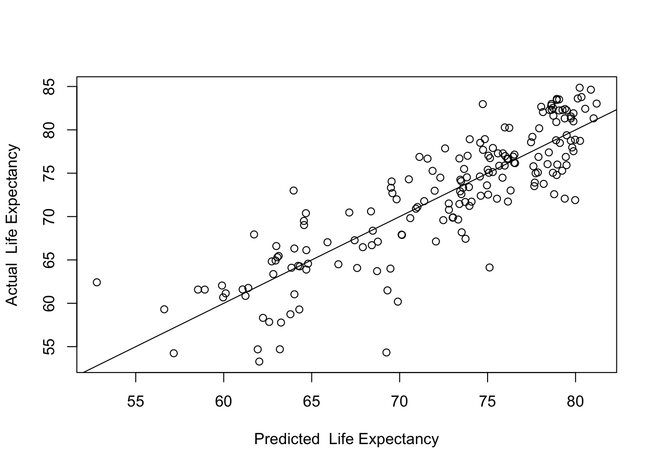
Here we see the predicted values along the horizontal axis, the actual values on the vertical axis, and a fitted (regression) line. The key takeaway from this plot is that the model fits the data fairly well. The correlation (below) between the predicted and actual values is .865, which, when squared, equals .748, the R2 of the model.
#get the correlation between y and yhat
cor.test(countries2$lifexp, countries2$yhat)
    Pearson's product-moment correlation

data:  countries2$lifexp and countries2$yhat
t = 23.1, df = 181, p-value <2e-16
alternative hypothesis: true correlation is not equal to 0
95 percent confidence interval:
 0.82270 0.89713
sample estimates:
    cor
0.86458
16.5.1 Identifying Observations
In addition to plotting the predicted and actual data points, you might want to identify some of the observations that are relative outliers (that don’t fit the pattern very well). In the scatterplot shown above, there are no extreme outliers but there are a few observations whose actual life expectancy is quite a bit less than their predicted outcome. These observations are the farthest below the prediction line. We should change the plot command so that it lists the country code for each country, similar to what we did at the end of Chapter 15, thus enabling us to identify these and any other outliers.
plot(countries2$yhat,countries2$lifexp,
     xlab="Predicted  Life Expectancy",
     ylab = "Actual  Life Expectancy",
     cex=.01)
#"cex=.01" reduces the marker size to to make room for country codes
text(countries2$yhat,countries2$lifexp, countries2$ccode, cex=.6)
#This tells R to use the country code to label the yhat and y coordinates
abline(lm(countries2$lifexp~countries2$yhat))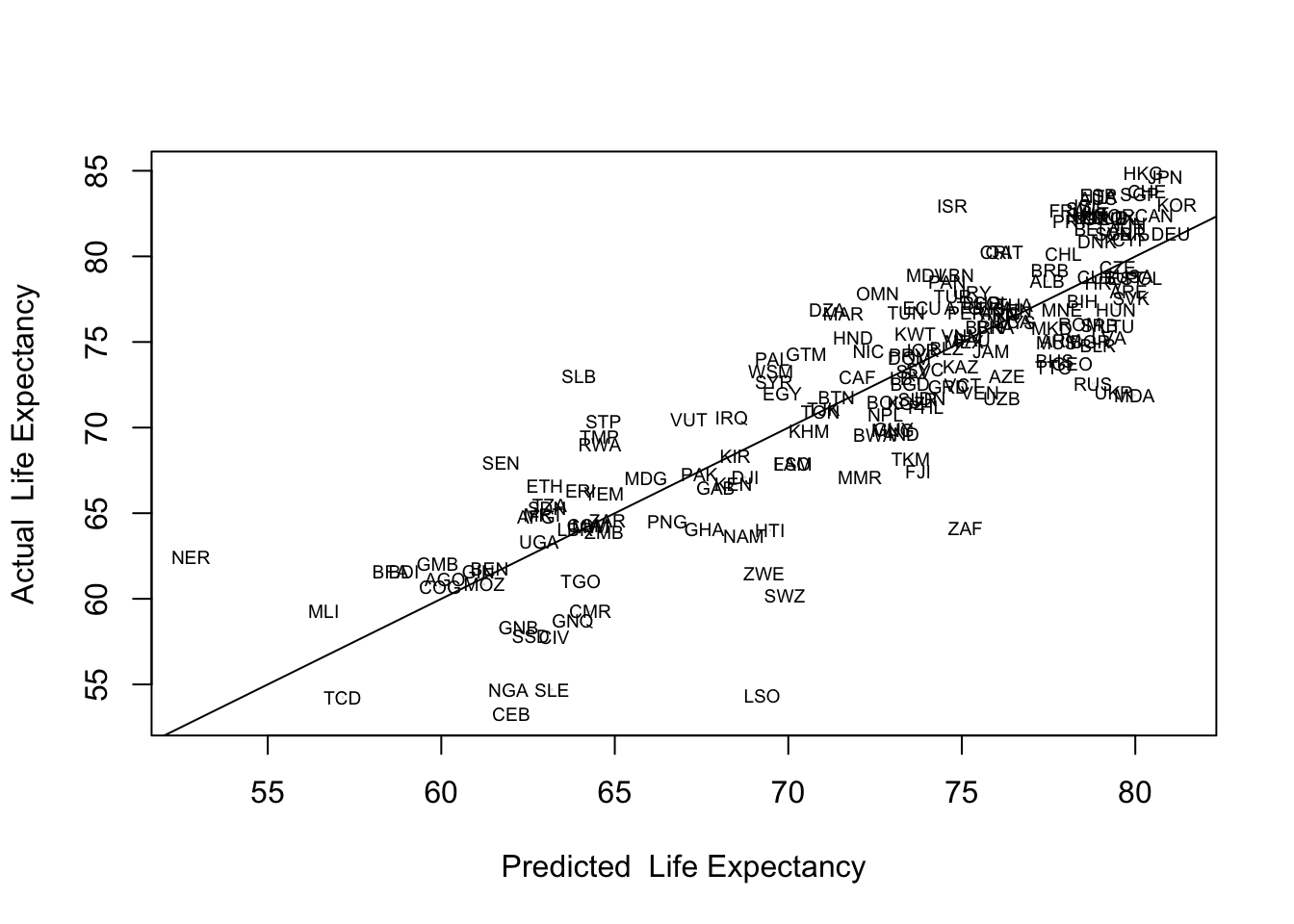
Based on these labels, several countries stand out as having substantially lower than predicted life expectancy: Central African Republic (CEB), Lesotho (LSO), Nigeria (NGA), Sierra Leone (SLE), South Africa (ZAF), and Swaziland (SWZ). This information is particularly useful if it helps you identify patterns that might explain outliers of this sort. For instance, if these countries shared an important characteristic that we had not yet put in the model, we might be able to improve the model by including that characteristic. In this case, the first thing that stands out is that these are all sub-Saharan African countries. At the same time, predictions for most African countries are closer to the regression line, and one of the countries that stands out for having higher than expected life is expectancy is Niger (NER), another African country. While it is important to be able to identify the data points and think about what the outliers might represent, it is also important to focus on broad, theoretically plausible explanations that might contribute to the model in general and could also help explain the outliers. One thing that is missing in this model that might help explain differences in life expectancy is access to health care, which we will take up in the next chapter.
16.6 Next Steps
It’s hard to believe we are almost to the end of this textbook. It wasn’t so long ago that you were looking at bar charts and frequencies, perhaps even having a bit of trouble getting the R code for those things to work. You’ve certainly come a long way since then!
You now have a solid basis for using and understanding regression analysis, but there are just a few more things you need to learn about in order to take full advantage of this important analytic tool. The next chapter takes up issues related to making valid comparisons of the relative impact of the independent variables, problems created when the independent variables are very highly correlated with each other or when the relationship between the independent and dependent variables does not follow a linear pattern. Then, Chapter 18 provided a brief overview of a number of important assumptions that underlie the regression model. It’s exciting to have gotten this far, and I think you will find the last few topics interesting and important additions to what you already know.
16.7 Exercises
16.7.1 Concepts and Calculations
- Answer the following questions regarding regression model below, which focuses on multiple explanations for county-level differences in internet access, using a sample of 500 counties. The independent variables are the percent of the county population living below the poverty rate, the percent of the county population with advanced degrees, and the logged value of population density (logged because density is highly skewed).
=====================================================
                              Dependent variable:
                          ---------------------------
                            % With Internet Access
-----------------------------------------------------
Poverty Rate (%)                   -0.761***
                                    (0.038)

Advanced Degrees (%)               0.559***
                                    (0.076)

Log10(Population Density)          2.411***
                                    (0.401)

Constant                           79.771***
                                    (0.924)

-----------------------------------------------------
Observations                          500
R2                                   0.605
Adjusted R2                          0.602
Residual Std. Error            5.684 (df = 496)
F Statistic                252.860*** (df = 3; 496)
=====================================================
Note: *p<0.1; **p<0.05; ***p<0.01- Interpret the slope for poverty rate
- Interpret the slope for advanced degrees
- Interpret the slope for the log of population density
- Evaluate the fit of the model in terms of explained variance
- What is the typical error in the model? Does that seem like a small or large amount of error?
- Use the information from the model in Question #1, along with the information presented below to generate predicted outcomes for two hypothetical counties, County A and County B. Just to be clear, you should use the values of the independent variable outcomes and the slopes and constant to generate your predictions.
| County | Poverty Rate | Adv. Degrees | Log10(Density) | Prediction? |
|---|---|---|---|---|
| A | 19 | 4 | 1.23 | |
| B | 11 | 8 | 2.06 |
- Prediction of County A:
- Prediction of County B:
- What did you learn from predicting these hypothetical outcomes that you could not learn from the model output?
16.7.2 R Problems
- Building on the regression models from the R problems in the last chapter, use the
states20data set and run a multiple regression model with infant mortality (infant_mort) as the dependent variable, and per capita income (PCincome2020), the teen birth rate (teenbirth), and percent low birth weight birthslowbirthwtas the independent variables. Store the results of the regression model in an object calledrhmwrk.
- Produce a readable table with
stargazerusing the following command:.
stargazer(rhmwrk, type="text",
          dep.var.labels = "Infant Mortality",
          covariate.labels = c("Per capita Income", "%Teen Births",
"Low Birth Weight"))- Based on the results of this regression model, discuss the determinants of infant mortality in the states. Pay special attention to the direction and statistical significance of the slopes, and to all measures of model fit and accuracy.
- Use the following command to generate predicted values of infant mortality in the states from the regression model produced in problem #1.
#generate predicted values
states20$yhat<-predict(rhmwrk)- Now, produce a scatterplot of predicted and actual levels of infant mortality and replace the scatterplot markers with state abbreviations (see Chapter 15 homework). Make sure this scatterplot includes a regression line showing the relationship between predicted and actual values.
- Generally, does it look like there is a good fit between the model predictions and the actual levels of infant mortality? Explain.
- Identify states that stand out as having substantially higher or lower than expected levels of infant mortality. Do you see any pattern among these states?
You might get this warning message when you use stargazer: “length of NULL cannot be changed”. This does not affect your table so you can ignore it. ↩︎
na.action=na.excludeis included in the command because I want to add some of the hidden information fromfit(predicted outcomes) to thecountries2data set after the results are generated. Without adding this to the regression command, R would skip all observations with missing data when generating predictions and the rows of data for the predictions would not match the appropriate rows in the original data set. This is a bit of a technical point. Ignore it if it makes no sense to you.↩︎