Chapter 11 Hypothesis Testing with Multiple Groups
11.1 Get Ready
This chapter extends the examination of mean differences to include comparisons among several subgroup means. Examining differences between two subgroup means is an important and useful method of hypothesis testing in the social and natural sciences. It is not, however, without limitations. For example, in most cases, independent variables have more than just two categories or can be collapsed from continuous values into several discrete categories. Relying on just two outcomes when it is possible to use several categories limits information on the independent variable when it is not necessary to do so. This is what we explore in the pages that follow. To follow along in R, you should load the countries2 data set and attach the libraries for the following packages: descr, DescTools, gplots, effectsize, and Hmisc.
11.2 Internet Access as an Indicator of Development
Suppose we are interested in studying indicators of development around the world. One thing we might use for this purpose is access to the internet. By now, access to the internet is not considered a luxury, but has come to be thought of as an important part of infrastructure, similar to roads, bridges, and more basic forms of communication. The variable internet in the countries2 data set provides an estimate of the country-level percent of households that have regular access to the internet. We will focus on this as the dependent variable in this chapter. Before delving into the factors that might explain differences in internet access, we should get acquainted with its distribution, using a histogram and some basic descriptive statistics. Let’s start with a histogram:
hist(countries2$internet, xlab="% Internet Access",
     ylab="Number of Countries", main="")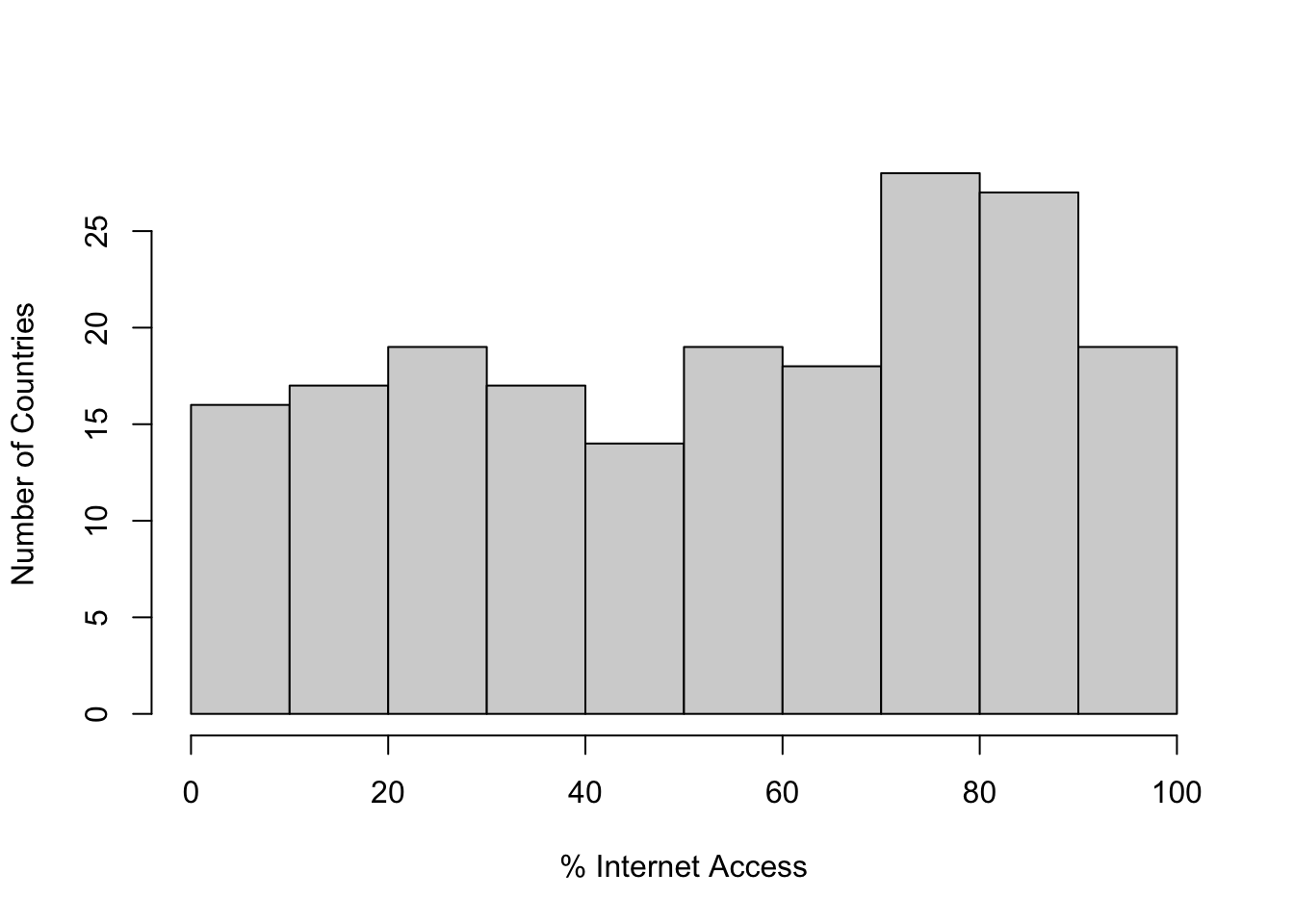
Here we see a fairly even distribution from the low to the middle part of the scale, and then a spike in the number of countries in the 70-90% access range. The distribution looks a bit left-skewed, though not too severely. We can also get some descriptive statistics to help round out the picture:
#Get some descriptive statistics for internet access
summary(countries2$internet, na.rm=T)
Min. 1st Qu. Median Mean 3rd Qu. Max. NA's
0.0 27.6 58.4 54.2 79.6 99.7 1 Skew(countries2$internet, na.rm=T)[1] -0.2114sd(countries2$internet, na.rm = T)[1] 28.79The mean, median, and skew statistics confirm the initial impression of relatively modest negative skewness. Both the histogram and descriptive statistics also show that there is a lot of variation in internet access around the world, with the bottom quarter of countries having access levels ranging from about 0% to about 28% access, and the top quarter of countries having access levels ranging from about 80% to almost 100% access.33 As with many such cross-national comparisons, there are clearly some “haves” and “have nots” when it comes to internet access.
To add a bit more context and get us thinking about the factors that might be related to country-level internet access, we can look at the types of countries that tend to have relatively high and low levels of access. To do this, we use the order function that was introduced in Chapter 2. The primary difference with the use of this function here is that there are missing data for many variables in the countries2 data set, so we need to omit the missing observations (na.last = NA) so they are not listed at the end of data set.
#Sort the data set by internet access, omitting missing data.
#Store the sorted data in a new object
sorted_internet<-countries2[order(countries2$internet, na.last = NA),]
#The first six rows of two variables from the sorted data set
head(sorted_internet[, c("wbcountry", "internet")])
wbcountry internet
190 Korea (Democratic People's Rep. of) 0.000
180 Eritrea 1.309
194 Somalia 2.004
185 Burundi 2.661
176 Guinea-Bissau 3.931
188 Central African Republic 4.339#The last six rows of the same two variables
tail(sorted_internet[, c("wbcountry", "internet")]) wbcountry internet
21 Liechtenstein 98.10
31 United Arab Emirates 98.45
42 Bahrain 98.64
5 Iceland 99.01
64 Kuwait 99.60
45 Qatar 99.65Do you see anything in these sets of countries that might help us understand and explain why some countries have greater internet access than others? First, there are clear regional differences: most of the countries with high levels of internet access ( > 98% access) are small, middle-eastern or northern European countries, while countries with the most limited access (< 4.4% access) are almost all African counties. Beyond regional patterns, one thing that stands out is the differences in wealth in the two groups of countries: those with greater access tend to be wealthier and more industrialized than those countries with the least amount of access.
11.2.1 The Relationship between Wealth and Internet Access
Does knowing the level of wealth in countries help explain variation in access to the internet across countries? It seems from the lists of countries above, and from research on economic development that there is a connection between the two variables. We test this idea using GDP per capita (countries2$gdp_pc) as a measure of wealth. If our intuition is right, we should, see on average, higher levels of internet access as per capita GDP increases.
As a first step, and as a bridge to demonstrating the benefit of using multiple categories of the independent variable, we explore the impact of GDP on internet access using a simple t-test for the difference between two groups of countries, those in the top and bottom halves of the distribution of GDP. Let’s create a new, two-category variable measuring high and low GDP, and then let’s look at a box plot and the mean differences. The cut2 command tells R to slice the original variable into two equal-size pieces (g=2) and store it in the new object, countries2$gdp2.
#Create two-category GDP variable
countries2$gdp2<-cut2(countries2$gdp_pc, g=2)
#Assign levels to "gdp2"
levels(countries2$gdp2)<-c("Low", "High")
Now, let’s use compmeans to examine the mean differences in internet access between low and high GDP countries. Note that I added an “X” to each box to reflect the mean of the dependent variable within the columns.
#Evaluate mean internet access, by level of gdp
compmeans(countries2$internet, countries2$gdp2,
          xlab="GDP per Capita",
          ylab="Number of Countries")
#Add points to the plot, reflecting mean values of internet access
#"pch" sets the marker type, "cex" sets the marker size
points(c(33.39, 76.41),pch=4, cex=2)
Mean value of "countries2$internet" according to "countries2$gdp2"
Mean N Std. Dev.
Low 33.39 92 19.36
High 76.41 91 16.28
Total 54.78 183 27.99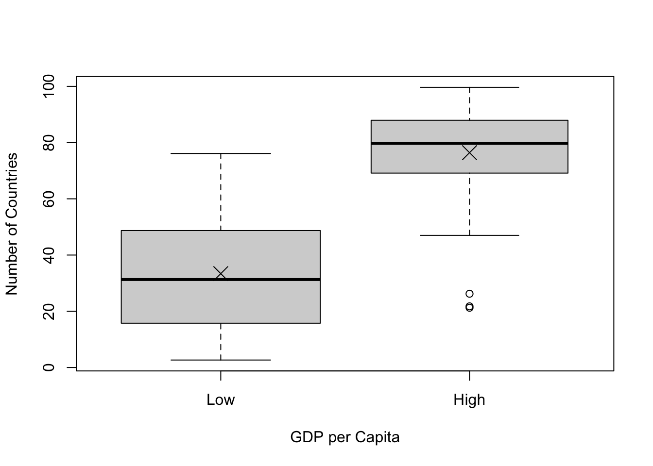
In this graph, we see what appears to be strong evidence that GDP per capita is related to internet access: on average, 33.4% of households in countries in the bottom half of GDP have internet access, compared to 76.4% in countries in the top half of the distribution of per capita GDP. The boxplot provides a dramatic illustration of this difference, with the vast majority of low GDP countries also having low levels of internet access, and the vast majority of high GDP countries having high levels of access. We can do a t-test and get the Cohens-D value just to confirm that this is indeed a statistically significant and strong relationship.
#Test for the impact of "gdp2" on internet access
t.test(countries2$internet~countries2$gdp2, var.equal=T)
    Two Sample t-test

data:  countries2$internet by countries2$gdp2
t = -16, df = 181, p-value <2e-16
alternative hypothesis: true difference in means between group Low and group High is not equal to 0
95 percent confidence interval:
 -48.24 -37.80
sample estimates:
 mean in group Low mean in group High
             33.39              76.41
#Get Cohen's D for the impact of "gdp2" on internet access
cohens_d(countries2$internet~countries2$gdp2)Cohen's d | 95% CI
--------------------------
-2.40 | [-2.78, -2.02]
- Estimated using pooled SD.These tests confirm the expectations, with a t-score of -16.3, a p-value close to 0, and Cohen’s D=-2.40 (a very strong relationship).34
This is all as expected, but we can do a better job of capturing the relationship between GDP and internet access by taking fuller advantage of the variation in per capita GDP. By creating and using just two categories of GDP, we are treating all countries in the “Low” GDP category as if they are the same (low on GDP) and all countries in the the “High” GDP category as if they are the same (high on GDP) even though there is a lot of variation within these categories. The range in outcomes within the “Low” GDP group is from $725 to $13,078, and in the “High” GDP category it is from $13,654 to $114,482. Certainly, we should expect that the differences in GDP within the high and low categories should be related to difference in internet access within those categories, and that relying on such overly broad categories as “High” and “Low” represents a loss of important information.
We can take greater advantage of the variation in per capita GDP by dividing the countries into four quartiles instead of two halves:
#Create a four-category GDP variable
countries2$gdp4<-cut2(countries2$gdp_pc, g=4)
#Assign levels
levels(countries2$gdp4)<-c("Q1", "Q2", "Q3", "Q4")
Again, we start the analysis by looking at the differences in mean levels of internet access across levels of GDP per capita, using the compmeans function:
#Evaluate mean internet access, by level of gdp
compmeans(countries2$internet,countries2$gdp4,
           xlab="GDP per Capita (Quartile)",
          ylab="% Households with Internet Access")
Mean value of "countries2$internet" according to "countries2$gdp4"
Mean N Std. Dev.
Q1 19.39 46 11.427
Q2 47.38 46 15.073
Q3 65.91 45 15.097
Q4 86.68 46 9.441
Total 54.78 183 27.994#Add points to the plot reflecting mean values of internet access
points(c(19.39, 47.38,65.91,86.68),pch=4, cex=2)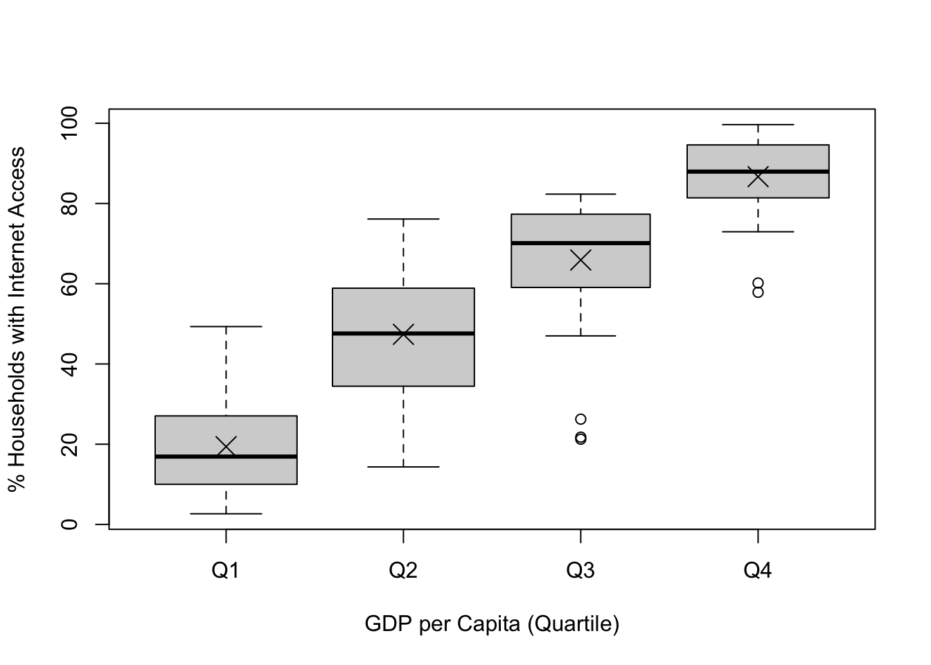
The mean level of internet access increases from about 19.4% for countries in the first quartile to 47.4% in the second quartile, to 65.9% for the third quartile, to 86.7% in the top quartile. Although there is a steady increase in internet access as GDP per capita increases, there still is considerable variation in internet access within each category of GDP. Because of this variation, there is overlap in the internet access distributions across levels of GDP. There are some countries in the lowest quartile of GDP that have greater access to the internet than some countries in the second and third quartiles; some in the second quartile with higher levels of access than some in the third and fourth quartiles; and so on.
On its face, this looks like a strong pattern, but the key question is whether the differences in internet access across levels of GDP are great enough, relative to the level of variation within categories, that we can determine that there is a significant relationship between the two variables.
11.3 Analysis of Variance
Using Analysis of Variance (ANOVA), we are able to judge whether there are significant differences in the mean value of the dependent variable across categories of the independent variable. This significance is a function of both the magnitude of the mean differences between categories and the amount of variation within categories. If there are relatively small differences in the mean level of the dependent variable across categories of the independent variable, or relatively large variances in the dependent variable within categories of the independent variable, the differences in the data may be due to random error.
Just as with the t-test, we use ANOVA to test a null hypothesis. The null hypothesis in ANOVA is that the mean value of the dependent variable does not vary across the levels of the independent variable:
\[H_0:\mu_1=\mu_2=\mu_3=\mu_4\]
In other words, in the example of internet access and GDP, the null hypothesis would be that the average level of internet access is unrelated to the level of GDP. Of course, we will observe some differences in the level of internet access across different levels of GDP. It’s only natural that there will be some differences. The question is whether these differences are substantial enough that we can conclude they are real differences and not just apparent differences that are due to random variation. When the null hypothesis is true, we expect to see relatively small differences in the mean of the dependent variable across values of the independent variable. So, for instance, when looking at side-by-side box plots, we would expect to see a lot of overlap in the distributions of internet access across the four level of per capita GDP.
Technically, H1 states that at least one of the mean differences is statistically significant, but we are usually a bit more casual and state it something like this:
\[H_1: \text{The mean level of internet access in countries varies across levels of GDP}\] Even though we usually have expectations regarding the direction of the relationship (high GDP associated with high level of internet access), the alternative hypothesis does not state a direction, just that there are some differences in mean levels of the dependent variable across levels of the independent variable.
Now, how do we test this? As with t-tests, it is the null hypothesis that we test directly. I’ll describe the ideas underlying ANOVA in intuitive terms first, and then we will move on to some formulas and technical details.
Recall that with the difference in means test we calculated a t-score that was based on the size of the mean difference between two groups divided by the standard error of the difference. The mean difference represented the impact of the independent variable, and the standard error reflected the amount of variation in the data. If the mean difference was relatively large, or the standard error relatively small, then the t-score would usually be larger than the critical value and we could conclude that there was a significant difference between the means.
We do something very similar to this with ANOVA. We use an estimate of the overall variation in means between categories of the independent variable (later, we call this “Mean Square Between”) and divide that by an estimate of the amount of variation around those means within categories (later, we call this “Mean Squared Error”). Mean Squared Between represents the size of the effect, and Mean Squared Error represents the amount of variation. The resulting statistic is called an F-ratio and can be compared to a critical value of F to determine if the variation between categories (magnitude of differences) is large enough relative to the total variation within categories that we can conclude that the differences we see are note due to sampling error. In other words, can we reject the null hypothesis?
11.3.1 Important concepts/statistics:
To fully grasp what is going on with ANOVA, you need to understand the concept of variation in the dependent variable and break it down into its component parts.
Sum of Squares Total (SST). This is the total variation in y, the dependent variable; it is very similar to the variance, except that we do not divide through by the n-1. We express each observation of \(y\) (dependent variable) as a deviation from the mean of y (\(\bar{y}\)), and square the deviations. Then, sum the squared deviations to get the Sum of Squares Total (SST):
\[SST=\sum{(y_i-\bar{y})^2}\]
Let’s calculate this in R for the dependent variable, countries2$internet:35
#Generate mean of "countries2$internet"
mn_internet=mean(countries2$internet[countries2$gdp_pc!="NA"], na.rm=T)
#Generate squared deviation from "mn_internet"
dev_sq=(countries2$internet-mn_internet)^2
#Calculate sst (sum of squared deviations)
sst<-sum(dev_sq[countries2$gdp_pc!="NA"], na.rm=T)
sst
[1] 142629\[SST=142629.5\]
This number represents the total variation in y. The SST can be decomposed into two parts, the variation in y between categories of the independent variable (the variation in means reported in compmeans) and the amount of variation in y within categories of the independent variable (in spirit, this is reflected in the separate standard deviations in the compmeans results). The variation between categories is referred to as Sum of Squares Between (SSB) and the variation within categories is referred to as sum of squares within (SSW).
\[SST=SSB+SSW\]
Sum of Squares Within is the sum of the variance in y within categories of the independent variable:
\[SSW= \sum{(y_i-\bar{y_k})^2}\]
where \(\bar{y_k}\) is the mean of y within a category of the independent variable.
Here we subtract the mean of y for each category (k) from each observation in the respective category, square those differences and sum them across categories. It should be clear that SSW summarizes the variations around the means of the dependent variable within each category of the independent variable similar to variation seen in the side-by-side distributions shown in the barplot presented above.
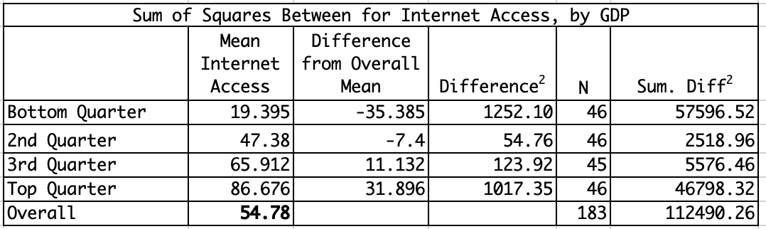
Sum of Squares Between (SSB) summarizes the variation in mean values of y across categories of the independent variable:
\[SSB=\sum{N_k(\bar{y}_k-\bar{y})^2}\]
where \(\bar{y}_k\) is the mean of y within a given category of x, and \(N_k\) is the number of cases in the category k.
Here we subtract the overall mean of the dependent variable from the mean of the dependent variable in each category (k) of the independent variable, square that difference, and then multiply it times the number of observations in the category. We then sum this across all categories. This provides us with a good sense of how much the mean of y differs across categories of x, weighted by the number of observations in each category. You can think of SSB as representing the impact of the independent variable on the dependent variable. If y varies very little across categories of the independent variable, then SSB will be small; if it varies a great deal, then SSB will be larger.
Using information from the compmeans command, we can calculate the SSB (Table 11.1). In this case, the sum of squares between = 112490.26.
Since we now know SST and SSB, we can Calculate SSW:
\[SSW=SST-SSB\] \[SSW= 142629.5-112490.26 =30139.24\]
Degrees of freedom. In order to use SSB and SSW to calculate the F-ratio we need to calculate their degrees of freedom.
For SSW: \(df_w=n-k\) (\(183-4 = 179\))
For SSB: \(df_b=k-1\) (\(4-1 =3\))
Where n=total number of observations, k=number of categories in x.
The degrees of freedom can be used to standardize SSB and SSW, so we can evaluate the variation between groups in the context of the variation within groups. Here, we calculate the Mean Squared Error36 (MSE), based on SSW, and Mean Squared Between, based on the SSB:
Mean Squared Error (MSE) = \[\frac{SSW}{df_w} =\frac{30139.24}{179}= 168.4\]
Mean Square Between (MSB) = \[\frac{SSB}{df_b}=\frac{112490.26}{3}= 37496.8\]
As described earlier, you can think of the MSB as summarizing the differences in mean outcomes in the dependent variable across categories of the independent variable, and the MSE as summarizing the amount of variation around those means. As with t and z tests, we need to compare the magnitude of the differences across groups to the amount of variation in the dependent variable.
This brings us to the F-ratio, which is the actual statistic used to determine the significance of the relationship:
\[F=\frac{MSB}{MSE}\]
In this case, \[F=\frac{37496.8}{168.4} = 222.7\]
Similar to the t and z-scores, if the value we obtain is greater the critical value of F (the value that would give you an alpha area of .05 or less), then we can reject H0. We can use R to find the critical value for F. Using the qf function, we need to specify the desired p-value (.05), the degrees of freedom between, (3), the degrees of freedom within (174), and that we want the p-value for the upper-tail of the distribution.
#Get critical value of F for p=.05, dfb=3, dfw=179
qf(.05, 3, 179, lower.tail=FALSE)
[1] 2.655In this case, the critical value for dfw=179, dfb=3 is 2.66. The shape of the F-distribution is different from the t and z distributions: it is one-tailed (hence the non-directional alternative hypothesis), and the precise shape is a function of the degrees of freedom. The figure below illustrates the shape of the f-distribution and the critical value of F for dfw=179, dfb=3, and a p-value of .05.
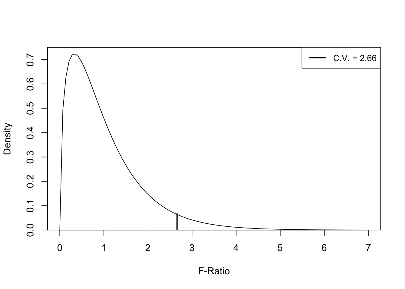
Figure 11.1: F-Distribution and Critical Value for dfw=179, dfb=3, p=.05
Any obtained F-ratio greater than 2.66 provides a basis for rejecting the null hypothesis, as it would indicate less than a .05 probability of getting a difference in means pattern of this magnitude or greater from a population in which there were no difference in the group means. The obtained value (F=222.7) far exceeds the critical value, so we reject H0.
11.4 Anova in R
The ANOVA function in R is very simple: aov(dependent variable~independent variable). When using this function, the results of the analysis should be stored in a new object, which is labeled fit_gdp in the particular case.
#ANOVA--internet access, by level of gdp
#Store in 'fit_gdp'
fit_gdp<-aov(countries2$internet~countries2$gdp4)
We can use the summary command to view the information stored in fit_gdp:
#Show results of ANOVA
summary(fit_gdp)
Df Sum Sq Mean Sq F value Pr(>F)
countries2$gdp4 3 112490 37497 223 <2e-16 ***
Residuals 179 30140 168
---
Signif. codes: 0 '***' 0.001 '**' 0.01 '*' 0.05 '.' 0.1 ' ' 1
12 observations deleted due to missingnessHere’s how to interpret these results. The first row, labeled with the independent variable name, is the “between” results, and the second row, labeled “Residuals”, is the “within” results. Df represents degrees of freedom (df-between=3, df-within=179) for the ANOVA model. Mean Square Between (MSB) is the first number under Mean Sq, and mean squared error (MSE) is the second number. The f-statistic is \(\frac{MSB}{MSE}\) and is found in the column headed by F value. The p-value associated with the F-statistic is in the column under Pr(>F) and is the probability that the pattern of mean differences found in the data could come from a population in which there is no difference in internet access across the four categories of the independent variable. This probability is very close to 0 (note the three asterisks are used to specify that \(p\le 0\)).
We conclude from this ANOVA model that differences in GDP are related to differences in internet access across countries. We reject the null hypothesis.
The p-value from the ANOVA model tells us there is a statistically significant relationship, but it does not tell us much about how important the individual group differences are. It is possible to have a significant F-ratio but still have fairly small differences between the group means, with only one of the group differences being statistically significant, so we need to take a bit closer look at a comparison of the group means to each other. We can see which group differences are statistically significant, using the TukeyHSD command (HSD stands for Honest Significant Difference).
#Examine the individual mean differences
TukeyHSD(fit_gdp)
Tukey multiple comparisons of means
95% family-wise confidence level
Fit: aov(formula = countries2$internet ~ countries2$gdp4)
$`countries2$gdp4`
diff lwr upr p adj
Q2-Q1 27.99 20.97 35.00 0
Q3-Q1 46.52 39.46 53.57 0
Q4-Q1 67.28 60.26 74.30 0
Q3-Q2 18.53 11.48 25.59 0
Q4-Q2 39.30 32.28 46.31 0
Q4-Q3 20.76 13.71 27.82 0This output compares the mean level of internet access across all combinations of the four groups of countries, producing six comparisons. For instance, the first row compares countries in the second quartile to countries in the first quartile. The first number in that row is the difference in internet access between the two groups (27.99), the next two numbers are the confidence interval limits for that difference (20.97 to 35.00), and the last number is the p-value for the difference (0). Looking at this information, it is clear the significant f-value is not due to just one or two significant group differences, but that all groups are statistically different from each other.
These group-to-group patterns, as well as those from the boxplots help to contextualize the overall findings from the ANOVA results. The F-ratio doesn’t tell us much about the individual group differences, but the size of the mean differences in the compmeans results, the boxplots, and the TukeyHSD comparisons do provide a lot of useful information about what’s going on “under the hood” of a significant F-test.
11.5 Effect Size
Similar to Cohen’s D, which was used to assess the strength of the relationship in a t-test, we can use eta-squared (\(\eta^2\)) to assess the strength of the relationship between two variables when the independent variable has more than two categories. Eta-squared measures the share of the total variance in the dependent variable (SST) that is attributable to variation in the dependent variable across categories of the independent variable (SSB).
\[\eta^2=\frac{SSB}{SST}=\frac{112490}{142629}=.79\]
Now, let’s check the calculations using R:
#Get eta-squared (measure of effect size) using 'fit_gdp'
eta_squared(fit_gdp)
For one-way between subjects designs, partial eta squared is equivalent to eta squared.
Returning eta squared.# Effect Size for ANOVA
Parameter | Eta2 | 95% CI
-------------------------------------
countries2$gdp4 | 0.79 | [0.75, 1.00]
- One-sided CIs: upper bound fixed at [1.00].One of the things I like a lot about eta-squared is that it has a very intuitive interpretation. Eta-squared is bound by 0 and 1, where 0 means that independent variable does not account for any variation in the dependent variable and 1 means the independent variable accounts for all of the variation in the dependent variable. In this case, we can say that differences in per capita GDP explain about 79% of the variation in internet access across countries. This represents a strong relationship between these two variables. There are no strict guidelines for what constitutes strong versus weak relationships based on eta-squared, but here is my take:
| Eta-Squared | Effect Size |
|---|---|
| .1 | |
| .2 | Weak |
| .3 | |
| .4 | Moderate |
| .5 | |
| .6 | Strong |
| .7 | |
| .8 | Very Strong |
11.5.1 Plotting Multiple Means
Similar to examining mean differences between two groups, we can use bar charts and means plots to visualize differences across multiple groups, as shown below.
#Use 'aggregate' to get group means
agg_internet<-aggregate(countries2$internet,
                        by=list(countries2$gdp4), FUN=(mean), na.rm=TRUE)
#Get a barplot using information from 'agg_internet'
barplot(agg_internet$x~agg_internet$Group.1, xlab="GDP Per Capita Quartiles",
        ylab="% Households with Internet Access")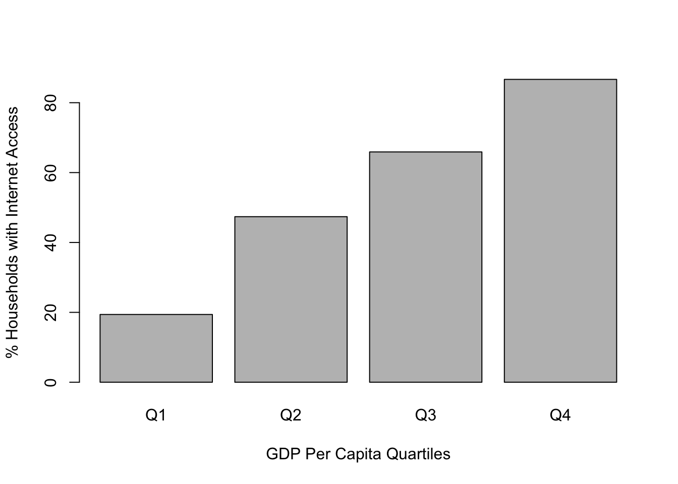
#Use 'plotmeans' to view relationship
plotmeans(countries2$internet~countries2$gdp4,
          n.label= F,
          xlab="GDP Per Capita Quartiles",
        ylab="% Households with Internet Access")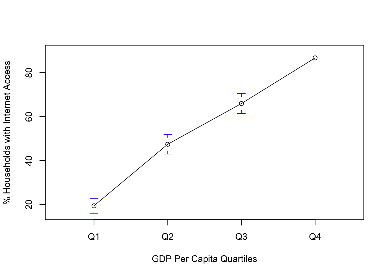
Regardless of which method you use–boxplot (used earlier), bar plot, or means plot–the data visualizations for this relationship reinforce the ANOVA findings: there is a strong relationship between per capita GDP and internet access around the world. This buttresses the argument that internet access is a good indicator of economic development.
11.6 Population Size and Internet Access
Let’s take a look at another example, using the same dependent variable, but this time we will focus on how internet access is influenced by population size. I can see plausible arguments that smaller countries might be expected to have greater access to the internet, and I can see arguments for why larger countries should be expected to have greater internet access. For right now, though, let’s assume that we think the mean level of internet access varies across levels of population size, though we are not sure how.
First, let’s create the four-category population variable:
#Create four-category measure of population size
countries2$pop4<-cut2(countries2$pop, g=4)
#Assign levels
levels(countries2$pop4)<-c("Q1", "Q2", "Q3", "Q4")
Now, let’s look at some preliminary evidence, using compmeans:
#Examine internet access, by pop4
compmeans(countries2$internet, countries2$pop4,
          xlab="Population size (Quartile)",
          ylab="% Internet Access")
#Add markers for group means
points(c(58.44,57.39,46.5,54.5), pch=4, cex=2)
Mean value of "countries2$internet" according to "countries2$pop4"
Mean N Std. Dev.
Q1 58.44 48 26.85
Q2 57.39 49 29.90
Q3 46.50 49 30.87
Q4 54.53 48 26.54
Total 54.19 194 28.79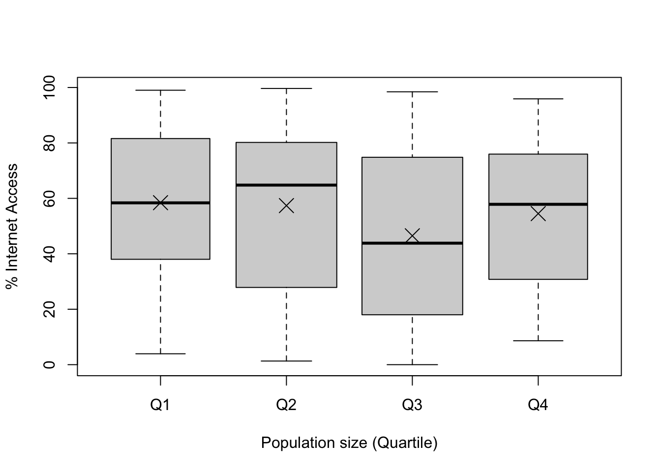
Hmmm. This is interesting. The mean outcomes across all groups are fairly similar to each other and not terribly different from the overall mean (54.2%). In addition, all of the within-group distributions overlap quite a bit with all others. So, we have what looks like very little between-group variation and a lot of within-group variation. ANOVA can sort this out and tell us if there is a statistically significant relationship between country size and internet access.
#Run ANOVA for impact of population size on internet access
fit_pop<-aov(countries2$internet~countries2$pop4)
#View results
summary(fit_pop)
Df Sum Sq Mean Sq F value Pr(>F)
countries2$pop4 3 4275 1425 1.74 0.16
Residuals 190 155651 819
1 observation deleted due to missingnessOkay, well, that’s pretty definitive. The p-value associated with the F-ratio is .16, meaning that the probability of getting an F-ratio of 1.74 from a population in which the null hypothesis (\(H_0:\mu_1=\mu_2=\mu_3 =\mu_4\)) is true is .16, which far exceeds the standard .05 cutoff point for rejecting the null hypothesis. This point is also illustrated in Figure 11.1 (below), where we can see that the obtained f-ratio (1.74) is well below the critical value (2.65). Given these results, we fail to reject H0. There is no evidence here that internet access is affected by population size.
#Get critical value of F for p=.05, dfb=3, dfw=190
qf(.05, 3, 190, lower.tail=FALSE)
[1] 2.652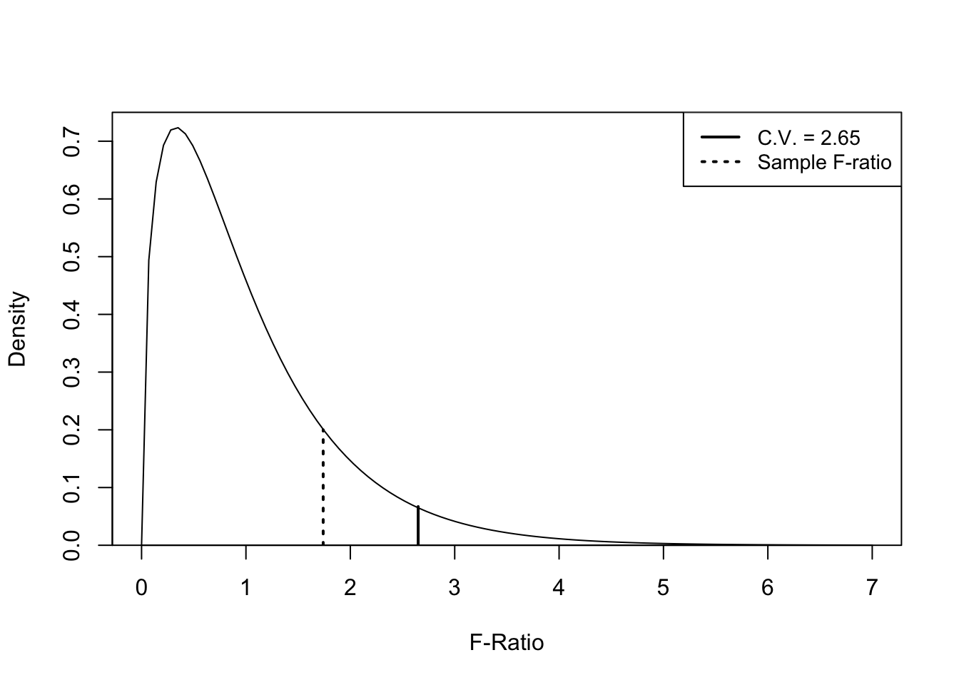
Figure 11.2: F-ratio and Critical Value for Impact of Population Size on Internet Access
We can check to see if any of the group differences are significant, using the TukeyHSD command:
#Examine individual mean differences
TukeyHSD(fit_pop)
Tukey multiple comparisons of means
95% family-wise confidence level
Fit: aov(formula = countries2$internet ~ countries2$pop4)
$`countries2$pop4`
diff lwr upr p adj
Q2-Q1 -1.057 -16.123 14.008 0.9979
Q3-Q1 -11.947 -27.012 3.119 0.1718
Q4-Q1 -3.914 -19.057 11.229 0.9083
Q3-Q2 -10.889 -25.877 4.098 0.2387
Q4-Q2 -2.857 -17.922 12.209 0.9609
Q4-Q3 8.033 -7.033 23.099 0.5122Still nothing here. None of the six mean differences are statistically significant. There is no evidence here to suggest that population size has any impact on internet access.
11.7 Connecting the T-score and F-Ratio
If you are having trouble understanding ANOVA, it might be helpful to reinforce that the F-ratio is providing the same type of information you get from a t-score. Both are test statistics that compare the impact of the independent variable on the dependent variable while taking into account the amount of variation in the dependent variable. One way to appreciate how similar they are is to compare the f-ratio and t-score when an independent variable has only two categories. At the beginning of this chapter, we looked at how GDP is related to internet access, using a two-category measure of GDP. The t-score for the difference in this example was -16.276. Although we wouldn’t normally use ANOVA when the independent variable has only two categories, there is nothing technically wrong with doing so, so let’s examine this same relationship using ANOVA:
#ANOVA with a two-category independent variable
fit_gdp2<-aov(countries2$internet~countries2$gdp2)
summary(fit_gdp2)
Df Sum Sq Mean Sq F value Pr(>F)
countries2$gdp2 1 84669 84669 264 <2e-16 ***
Residuals 181 57960 320
---
Signif. codes: 0 '***' 0.001 '**' 0.01 '*' 0.05 '.' 0.1 ' ' 1
12 observations deleted due to missingnessHere, we see that, just as with the t-test, the results point to a statistically significant relationship between these two variables. Of particular interest here is that the F-ratio is 264.4 (before rounding), while the t-score was -16.261 (before rounding). What do these two numbers have in common? It turns out, a lot. Just to reinforce the fact that F and t are giving you the same information, note that the square of the t-score (\(16.261^2\)) equals 264.42, almost exactly the value of the F-ratio (difference due to rounding). With a two-category independent variable, \(F=t^2\). The f-ratio and the t-score are doing exactly the same thing, providing evidence of how likely it is to obtain a pattern of differences from the data if there really is no difference in the population.
11.8 Next Steps
T-tests and ANOVA are great tools to use when evaluating variables that influence the outcomes quantitative dependent variables. However, we are often interested in explaining outcomes on ordinal and nominal dependent variables. For instance, when working with public opinion data it is very common to be interested in political and social attitudes measured on ordinal scales with relatively few, discrete categories. In such cases, mean-based statistics are not appropriate. Instead, we can make use of other tools, notably crosstabs, which you have already seen (Chapter 7), ordinal measures of association (effect size), and a measure of statistical significance more suited to ordinal and nominal-level data (chi-square). The next two chapters cover these topics in some detail, helping to round out your introduction to hypothesis testing.
11.9 Exercises
11.9.1 Concepts and Calculations
- The table below represents the results of two different experiments. In both cases, a group of political scientists were trying to determine if voter turnout could be influenced by different types of voter contacting (phone calls, knocking on doors, or fliers sent in the mail). One experiment took place in City A, and the other in City B. The table presents the mean level of turnout and the standard deviation for participants in each contact group in each city. After running an ANOVA test to see if there were significant differences in the mean turnout levels across the three voter contacting groups, the researchers found a significant F-ratio in one city but not the other. In which city do you think they found the significant effect? Explain your answer. (Hint: you don’t need to calculate anything.)
| City A | City B | ||||
|---|---|---|---|---|---|
| Mean | Standard Deviation | Mean | Standard Deviation | ||
| Phone | 55.7 | 7.5 | Phone | 57.7 | 4.3 |
| Door Knock | 60.3 | 6.9 | Door Knock | 62.3 | 3.7 |
| 53.2 | 7.3 | 55.2 | 4.1 |
When testing to see if poverty rates in U.S. counties are related to internet access across counties, a researcher divided counties into four roughly equal sized groups according to their poverty level and then used ANOVA to see if poverty had a significant impact on internet access. The critical value for F in this case is 2.61, the MSB=27417, and the MSE=52. Calculate the F-ratio and decide if there is a significant relationship between poverty rates and internet access across counties. Explain your conclusion.
A recent study examined the relationship between race and ethnicity and the feeling thermometer rating (0 to 100) for Big Business, using data from the 2020 American National Election Study. The results are presented below. Summarize the findings, paying particular attention to statistical significance and effect size. Do any findings stand out as contradictory or surprising?
                  Df  Sum Sq Mean Sq F value    Pr(>F)
anes20$raceth.5    4   16717    4179    8.16 0.0000015 ***
Residuals       7259 3716102     512
---
Signif. codes:  0 '***' 0.001 '**' 0.01 '*' 0.05 '.' 0.1 ' ' 1
1016 observations deleted due to missingness
# Effect Size for ANOVA
Parameter | Eta2 | 95% CI
-----------------------------------------
anes20$raceth.5 | 4.48e-03 | [0.00, 1.00]
- One-sided CIs: upper bound fixed at [1.00].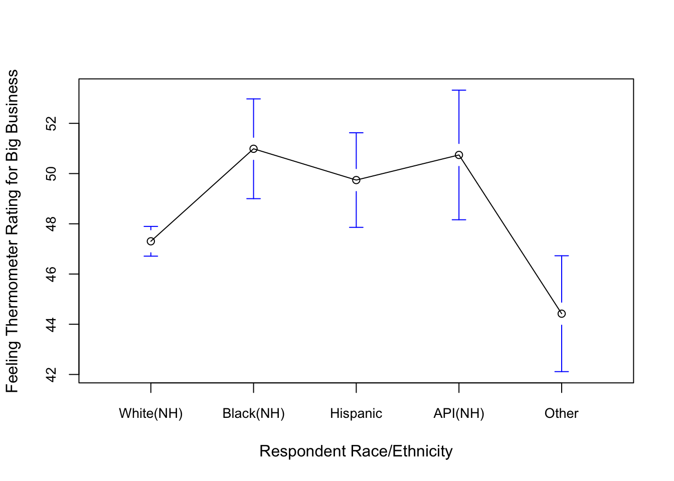
11.9.2 R Problems
For these questions, we will expand upon the R assignment from Chapter 10. First, create the sample of 500 counties, as you did in Chapter 10, using the code below.
set.seed(1234)
#create a sample of 500 rows of data from the county20large data set
covid500<-sample_n(county20large, 500)
We will stick with
covid500$cases100k_sept821as the dependent variable, andcovid500$postgradas the independent variable. Before getting started with the analysis, describe the distribution of the dependent variable using either a histogram, a density plot, or a boxplot. Supplement the discussion of the graph with relevant descriptive statistics.Using
cut2, convert the independent variable (covid500$postgrad) into a new independent variable with four categories (data$newvariable<-cut2(data$oldvariable, g=# of groups). Name the new variablecovid500$postgrad4. Uselevelsto assign intuitive labels to the categories, and generate a frequency table to check that this was done correctly.State the null and alternative hypotheses for using ANOVA to test the differences in levels of COVID-19 cases across categories of educational attainment.
Use
compmeansand the boxplot that comes with it to illustrate the apparent differences in levels of COVID-19 cases across the four categories of educational attainment. Use words to describe the apparent effects, referencing both the reported means and the pattern in the boxplot.Use
aovto produce an ANOVA model and check to see if there is a significant relationship between the COVID-19 cases and the level of education in the counties. Comment on statistical significance overall as well and between specific groups. You will need theTukeyHSDfunction for the discussion of specific differences.Use eta-squared to assess the strength of the relationship.
What do you think of the findings? Stronger or weaker than you expected? What other variables do you think might be related to county-level COVID-19 cases?
Make sure you can tell where I got these numbers.↩︎
The negative t-score and Cohen’s D value are correct here, since they are based on subtraction of the mean from the second group (high GDP) from the mean of the first group (Low GDP).↩︎
This part of the first line,
[countries2$gdp_pc!="NA"], ensures that the mean of the dependent variable is taken just from countries that have valid observations on the independent variable.↩︎The term “error” may be confusing to you. In data analysis, people often use “error” and “variation” interchangeably, since both terms refer to deviation from some predicted outcome, such as the mean.↩︎