Chapter 10 Hypothesis Testing with Two Groups
Getting Ready
This chapter extends the discussion of hypothesis testing to include the comparison of means and proportions across population subgroups. To follow along in R, you should load the anes20.rda data set. We will be using a lot of techniques from separate packages, so also make sure you attach the following libraries: DescTools, Hmisc, gplots, descr, and effectsize.
Testing Hypotheses about Two Means
A common use of hypothesis testing involves examining the difference between two sample means. For instance, instead of testing hypotheses about the level of support for a political candidate or some group in the population as a whole, it is often more interesting to speculate about differences in support across population subgroups, such as men and women, whites and people of color, city dwellers and suburbanites, religious and secular voters, etc. When comparing subgroups like these, we are really asking if variables such as sex, race, place of residence, and religiosity influence or are related to differences in the dependent variable.
Let’s begin looking at sex-based differences in political attitudes, commonly referred to as the gender gap. We’ll start with a somewhat obvious dependent variable for testing the presence of a gender gap in political attitudes, the feeling thermometer rating for feminists. As a quick reminder, the feeling thermometers in the American National Election Study ask people to rate how they feel about certain groups and individuals on a 0 (negative, “cool” feelings) to 100 (positive, “warm” feelings) scale. Which group do you think is likely to rate feminists the highest, men or women?26 Although both women and men can be feminists (or anti-feminists), the connection between feminism and the fight for the rights of women leads quite reasonably to the expectation that women support feminists at higher levels than men do.
Before shedding light on this with data, let’s rename the ANES measures for respondent sex (anes20$V201600) and the feminist feeling thermometer (anes20$V202160) so they are a bit easier to use in subsequent commands
#Create new respondent sex variable
anes20$Rsex<-factor(anes20$V201600)
#Assign category labels
levels(anes20$Rsex)<-c("Male", "Female")
#Create new feminist feeling thermometer variable
anes20$femFT<-anes20$V202160
Generating Subgroup Means
There are a couple of relatively simple ways to examine subgroup means, in this case the mean levels of support for feminists among men and women. First, you can use the aggregate function to get the subgroup means or many other statistics. Since we are thinking of subgroup analysis as a way of testing hypotheses, it is useful to think of the format of this function as: aggregate(dependent, by=list(independent), FUN=stat_you_want). In this case, we are telling R to generate the mean outcomes of the dependent variable for different categories of the independent variable.
For sex-based differences on the Feminist Feeling Thermometer:
#Store the mean Feminist FT, by sex, in a new object
agg_femFT <-aggregate(anes20$femFT, by= list(anes20$Rsex),
                      FUN=mean, na.rm=TRUE)
#List the results of the aggregate command
agg_femFT
Group.1 x
1 Male 54.54
2 Female 62.55What this table shows is that the average feeling thermometer for feminists was 62.55 for women and 54.44 for men, a difference of about eight points on a scale from 0 to 100. So, it looks like there is a difference in attitudes toward feminists, with women viewing them more positively than men. At the same time, it is important to note that both groups, on average, have positive feelings toward feminists.
Another useful R function we can use to compare the means of these two groups is compmeans, which produces subgroup means and standard deviations, as well as a boxplot that shows the distribution of the dependent variable for each value of the independent variable. The format for this command is: compmeans(dependent, independent). You should also include axis labels and other plot commands (see below) since a boxplot is included by default (you can suppress it with plot=F). When you run this command, you will get a warning message telling you that there are missing data. Don’t worry about this for now unless the number of missing cases seems relatively large compared to the sample size.
#List the dependent variable first, then the independent variable.
#Add graph commands
compmeans(anes20$femFT, anes20$Rsex,
          xlab="Sex",
          ylab="Feminist Feeling Thermometer",
          main="Feminist Feeling Thermometer, by Sex")
Warning in compmeans(anes20$femFT, anes20$Rsex, xlab = "Sex", ylab = "Feminist
Feeling Thermometer", : 1007 rows with missing values dropped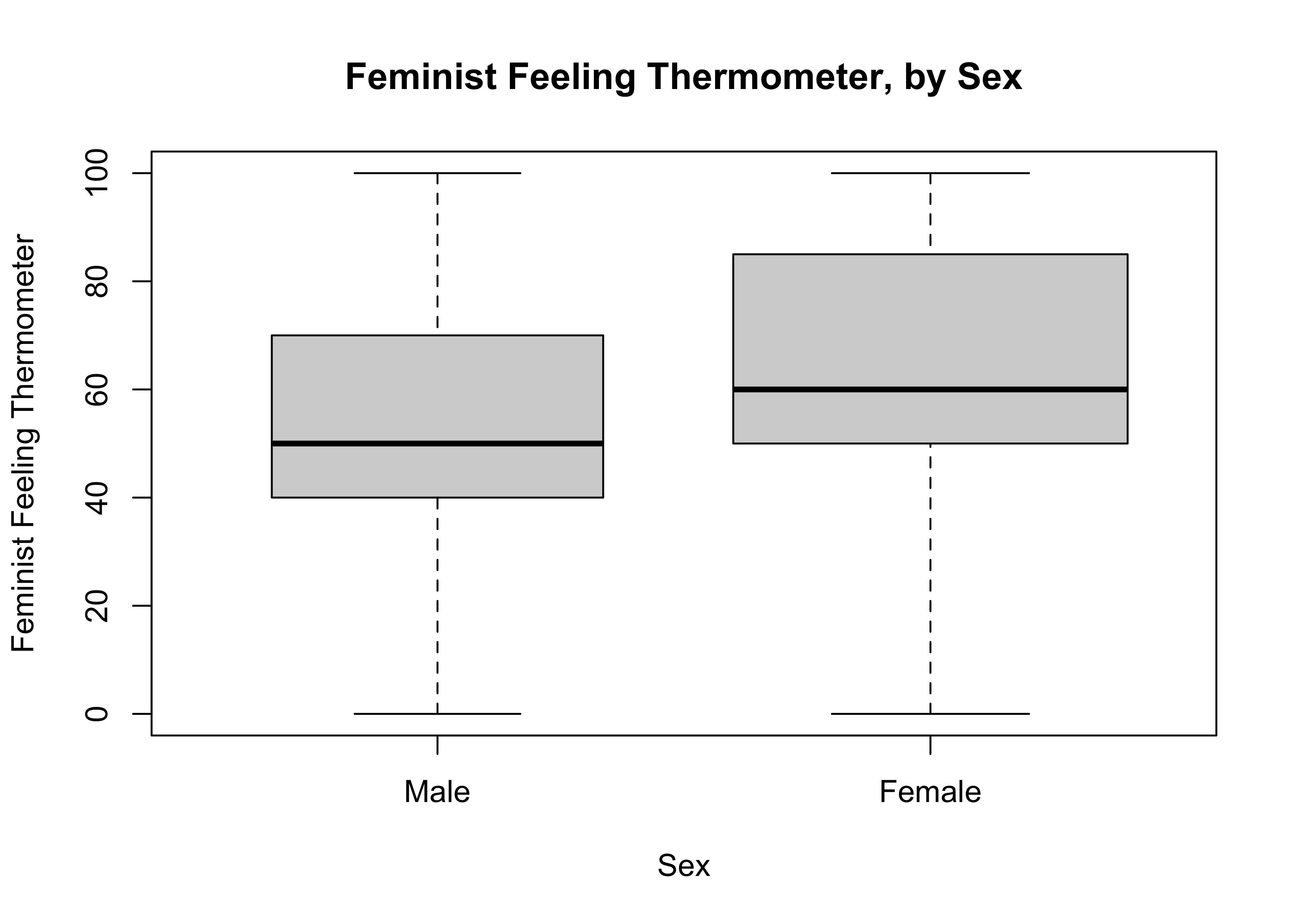
Mean value of "POST: Feeling thermometer: feminists" according to "anes20$Rsex"
        Mean    N Std. Dev.
Male   54.54 3321     26.11
Female 62.55 3952     26.75
Total  58.89 7273     26.76
First, note that the subgroup means are the same as those produced using the aggregate command. The key difference in the numeric output is that you also get information on the standard deviation in both subgroups, as well as the mean and standard deviation for the full sample.
In addition, the boxplot produced by the compmeans command provides a visualization of the two subgroup distributions side-by-side, giving us a chance to see how similar or dissimilar they are. Remember, the box plots do not show the differences in means, but they do show differences in medians and interquartile ranges, both of which can be indicative of group-based differences in outcomes on the dependent variable. The side-by-side distributions in the box plot do appear to be different, with the distribution of outcomes concentrated a bit more at the high end of the feeling thermometer among women than among men.
So, it looks like there is a gender gap in attitudes toward feminists, with women rating feminists about eight points (8.01) higher than men rate them. But there is a potential problem with this conclusion. The main problem is that we are using sample data and we know from sampling theory that it is possible to find a difference in the sample data even if there really is no difference in the population. The question we need to answer is whether the difference we observe in this sample is large enough that we can reject the possibility that there is no difference between the two groups in the population. In other words, we need to expand the logic of hypothesis test developed earlier to incorporate differences between two sample means.
Hypothesis Testing with Two means
When comparing means, the language of hypothesis test changes just a bit.
H0:\(\mu_1=\mu_2\) There is no relationship. The means are equal in the population.
Alternative hypotheses state that there is a relationship in the population:
H1:\(\mu_1\ne\mu_2\) The means differ in the population (two-tailed).
H1:\(\mu_1<\mu_2\) There is a negative difference in the population (one-tailed).
H1:\(\mu_1>\mu_2\) There is a positive difference in the population (one-tailed).
The logic of hypothesis testing for mean differences is very much the same as that for a single mean: If we observe a difference between two sample subgroup means, we must ask if there is really a difference between these groups in the population, or if the sample difference is due to random variation. In other words, is the difference large enough that we can attribute it to something other than sampling error? If so, then we can reject the null hypothesis.
The difference between the two sample means (\(\bar{x}_1 -\bar{x}_2\)) is a sample statistic, so the sampling distribution for the difference between the two groups has the same properties as the sampling distribution for a single mean: if the sample difference comes from a large, random sample, the sampling distribution will follow a normal curve and the mean will equal the difference between the two subgroups in the population (\(\mu_1-\mu_2\)).
A Theoretical Example
Figure 10.1 extends the example used in Chapter 9 to illustrate the logic of hypothesis testing for mean differences. If H0 is true, and there is no difference between the two groups in the population, how likely is it that we would get a sample difference of the magnitude of \(\bar{x}_1 -\bar{x}_2\)?
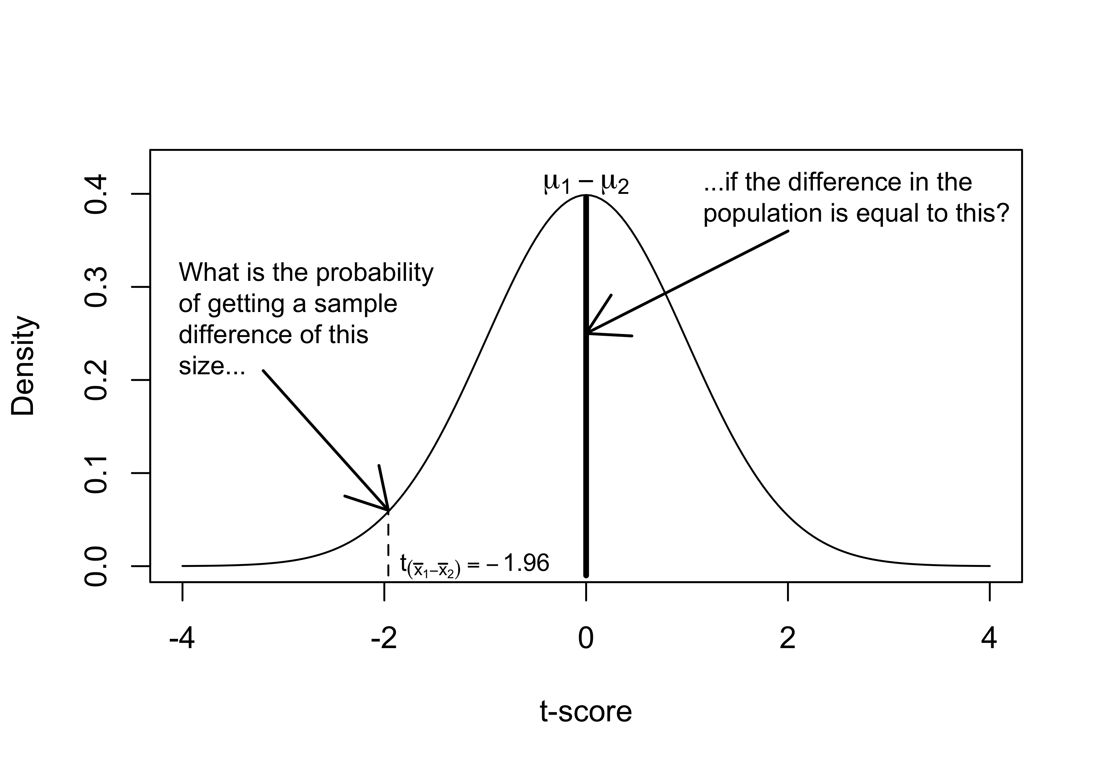
Figure 10.1: The Logic of Hypothesis Testing
To answer this, we need to transform \(\bar{x}_1 -\bar{x}_2\) from a raw score for the difference into a standard score (t or z-score). Since we are working with a sample, we focus on t-scores in this application. Recall, though, that the calculation for a t-score is the same as for a z-score:
\[t=\frac{(\bar{x}_{1}-\bar{x}_{2})-(\mu_1-\mu_2)}{S_{\bar{x}_{1}-\bar{x}_{2}}}\]
However, since we always assume that \(\mu_{1} - \mu_{2}\) = 0, we are asking if the sample finding is different from 0, and the equation becomes:
\[t=\frac{(\bar{x}_{1}-\bar{x}_{2})}{S_{\bar{x}_{1}-\bar{x}_{2}}}\]
So, as we did with a single mean, we divide the raw score difference by the standard error of the sampling distribution to convert the raw difference into a t-score. The standard error of the difference is a function of the variance in both subgroups, along with the sample sizes. Since we do not know the population variances, we rely on sample variances to estimate them:
\[S_{\bar{x}_{1}-\bar{x}_{2}}=\sqrt{\frac{S_1^2}{n_1}+\frac{S_2^2}{n_2}}\]
Where \(S_1^2\) and \(S_2^2\) are the sample variances of the sub-groups.
The standard error represents the standard deviation of the sampling distribution that would result from repeated (large, random) samples from which we would calculate differences between the group means. The t-score expresses the raw difference between the two groups ( \(\bar{x}_1 -\bar{x}_2\)) relative to the standard error of the sampling distribution.
In Figure 10.1, the t score for the difference is -1.96, which means that the sample difference is 1.96 standard errors below the hypothesized population difference. What is the probability of getting a t-score of this magnitude if there is really no difference between the two groups in the population? That probability is equal to the area to the left of t=-1.96 (the same for both t- and z-scores with a large sample), which is .025. So, with a one-tailed hypothesis we would reject H0 because there is less than a .05 probability that it is true.
Returning to the Empirical Example
Okay, now let’s apply this to the sex-based differences in feeling thermometer rating for feminists. The null hypothesis, of course, states that there is no difference between the groups.
H0: \(\mu_{W} = \mu_{M}\)
What about the alternative hypothesis? Do we expect the mean for women to be higher or lower than that of men? Since high values signify more positive evaluations, I anticipate that the mean for women is higher than the mean for men:
H1: \(\mu_{W}>\mu_{M}\)
We can use the same process we used to test hypotheses about single means.
Choose a p-value (\(\alpha\) area) for determining level of statistical significance required for rejecting \(H_0\). (Usually .05)
Find the critical value of t associated with \(\alpha\). This depends on the degrees of freedom.
When testing the difference between two means, degrees of freedom is equal to \(n-2\), reflecting the fact that we are using information from two means instead of one. In this case, the degrees of freedom is a very large number (\(7273-2=7271\)), and the critical value for a one-tailed test is -1.645, essentially the same as if we were using the z-distribution. Recall that as the sample size increases the t-distribution grows increasingly similar to the z-distribution.
[1] -1.645Calculate the t-score from the sample data.
Compare t-score to the critical value. If \(|t| > |c.v.|\), then reject H0; if \(|t| <|c.v.|\), then fail to reject H0.
Calculating the t-score
First, we’ll plug the appropriate numbers into the t-score formula to illustrate a bit more concretely how we arrive at the t-score for the difference. All of the input for these calculations are taken from the compmeans results.
\[t=\frac{54.54-62.55}{\sqrt{\frac{26.11^2}{3321}+\frac{26.75^2}{3952}}}=\frac{-8.01}{.6216}=-12.89\]
You may have noticed that I subtracted the mean for women from the mean for men in the numerator, leading to a negative t-score. The reason for this is that the R function for conducting t-tests subtracts the second value (the mean for women) it encounters from the first value (the mean for men) by default, so the calculation above is set up to reflect what we should expect to find when using R. The negative value makes sense in the context of our expectations, since it means that the value for women is higher than the value for men.
In this case, the t-score far exceeds the critical value (-1.645), so we reject the null hypothesis and conclude that there is a gender gap in evaluations of feminists on the feeling thermometer scale, with women providing higher ratings of feminists than those provided by men.
T-test in R
The R command for conducting a t-test (t.test) is straightforward and easy to use. The format is t.test(dependent~independent). The ~ symbol is used in this and other functions to signal that you are using a formula that specifies a dependent and independent variable.
    Welch Two Sample t-test

data:  anes20$femFT by anes20$Rsex
t = -13, df = 7111, p-value <2e-16
alternative hypothesis: true difference in means between group Male and group Female is not equal to 0
95 percent confidence interval:
 -9.231 -6.794
sample estimates:
  mean in group Male mean in group Female
               54.54                62.55
There are a few important things to pick up on here. First, the reported t-score (-13) is very close to the one we calculated (-12.89), the difference due to rounding in the R output. Second, the reported p-value is 2e-16. Recall from earlier that scientific notation like this is used as a shortcut when the actual numbers have several digits. In this case, the notation means that the p-value is less than .0000000000000002. Since R uses a two-tailed test by default, this is the total area under the curve at the two tails combined. This means that there is virtually no chance the null hypothesis is true. Of course, for a one-tailed test, we still reject the null hypothesis since the p-value is even lower.
The t.test output also provides a 95% confidence interval around the sample estimate of the difference between the two groups. The way to interpret this is that you can be 95% certain that interval between -9.231 and -6.794 includes the population value. Importantly, since the confidence interval does not include 0 (no difference), we can also use this as a basis for rejecting the null hypothesis. Finally, you probably noticed that the reported degrees of freedom (7111) is different than what I calculated above (7271). This is because one of the assumptions underlying t-tests is that the variances in the two groups are the same. If they are not, then some corrections need to be made, including adjustments to the degrees of freedom. The Welch’s two-sample test used by R does not assume that the two sample variances are the same and, by default, always makes the correction. In this case, with such a large sample, the findings are not really affected by the correction other than the degrees of freedom. This makes the Welch’s two-sample test a slightly more conservative test, which I see as a virtue.
You can also run a one-tailed test and assume equal variances, as I’ve done below. As you can see, the results are virtually identical, other than the degrees of freedom and the confidence interval.
#t.test with one-tailed test and equal variance
t.test(anes20$femFT~anes20$Rsex, alternative="less", var.equal=T)
    Two Sample t-test

data:  anes20$femFT by anes20$Rsex
t = -13, df = 7271, p-value <2e-16
alternative hypothesis: true difference in means between group Male and group Female is less than 0
95 percent confidence interval:
   -Inf -6.987
sample estimates:
  mean in group Male mean in group Female
               54.54                62.55
Let’s take a quick look at another application of the gender gap, but this time using a less obvious dependent variable, the feeling thermometer for “Big Business” (anes20$V202163). While this variable is not as directly connected to gender-related issues, it is reasonable to expect that female respondents are less supportive of big business than are male respondents if for no other reason than that women tend to be more liberal than men. Again, though, this connection is not as obvious as it was in the previous example.
#Create new object, "anes20$busFT
anes20$busFT<-anes20$V202163
#T-test for sex-based differences in 'busFT'
t.test(anes20$busFT~anes20$Rsex)
    Welch Two Sample t-test

data:  anes20$busFT by anes20$Rsex
t = 2.1, df = 7015, p-value = 0.04
alternative hypothesis: true difference in means between group Male and group Female is not equal to 0
95 percent confidence interval:
 0.07143 2.16569
sample estimates:
  mean in group Male mean in group Female
               48.41                47.29
First, there is a statistically significant difference in support for big business between male and female respondents. The t-score is 2.1 and the p-value is .04 (less than .05), so we reject the null hypothesis. The average rating among male respondents is 48.41 and the average among female respondents is 47.29, a difference of just 1.12. The 95% confidence interval for this difference ranges from .07143 to 2.16569. As expected, given the p-value, this confidence interval does not include 0. There is a relationship between sex and support for big business.
Statistical Significance vs. Effect Size
The example of attitudes toward big business illustrates an important issue related to statistical significance: sometimes, statistically significant findings represent relatively small substantive effects. In this case, we have a statistically significant difference between two groups, but that difference is only 1.12 on a dependent variable that is scaled from 0 to 100. Yes, male and female respondents hold different attitudes toward big business, but just barely different!
This finding highlights an important issue: statistically significant differences are different from 0 but that doesn’t mean they are large differences. Let’s put this finding in the context of the sample size and other results. Two important factors influence the size of the t-score, the magnitude of the effect and the size of the sample. As a consequence, when the sample size is very large, as in this case (n>7200), the standard error for the difference between two groups is so small that sometimes even relatively trivial subgroup differences are statistically significant; the relationship exists, but it is of little consequence.
We can appreciate this by comparing this result to the earlier example using the feminist feeling thermometer. The difference between men and women on the feminist feeling thermometer was 8.01, more than seven times the size of the difference in ratings of big business, yet both findings are statistically significant. This is an important issue in statistical analysis, as it is often the case that the focus on statistical significance leaves substantive importance unattended.
What this discussion points to is the need to complement the findings related to statistical significance with a measure of the size of the effect. One such statistic that is used a lot in conjunction with t-tests is Cohen’s D. The most direct way to calculate D is to express the difference between the two group means relative to the size of the pooled standard deviation.27
\[D=\frac{\bar{x}_1 -\bar{x}_2}{S}\] All of this information can be obtained from the following compmeans output:
Mean value of "POST: Feeling thermometer: feminists" according to "anes20$Rsex"
        Mean    N Std. Dev.
Male   54.54 3321     26.11
Female 62.55 3952     26.75
Total 58.89 7273 26.76Mean value of "POST: Feeling thermometer: big business" according to
"anes20$Rsex"
Mean N Std. Dev.
Male 48.41 3337 23.01
Female 47.29 3953 22.38
Total 47.80 7290 22.67The values of Cohen’s D for the Feminist and Big Business feeling thermometer tests are calculated below:
[1] -0.2993[1] 0.0494Let’s check our work with the R command for getting Cohen’s D:
Warning: Missing values detected. NAs dropped.Cohen's d | 95% CI
--------------------------
-0.30 | [-0.35, -0.26]
- Estimated using pooled SD.Warning: Missing values detected. NAs dropped.Cohen's d | 95% CI
------------------------
0.05 | [0.00, 0.10]
- Estimated using pooled SD.As expected, the effect size is much greater for the gender gap on the feminist feeling thermometer than it is for the big business feeling thermometer. Notice also that the R output shows a negative effect for the feminist feeling thermometer model and a positive effect for the big business model, reflecting the direction of the difference between group means.
Although we have shown that the impact of respondent sex is much greater when looking at the feminist feeling thermometer than when using the big business feeling thermometer, this still doesn’t tell us if the effect is strong or weak, other than in comparison to the meager impact in the case of the big business feeling thermometer. In absolute terms, how strong is this effect? Does \(D=-.30\) indicate a strong or weak effect on its own? The table below provides some conventional guidelines for evaluating the substantive meaning of Cohen’s D values.
[table 10.1 about here]
| Cohen’s D | Effect Size |
|---|---|
| .1 | |
| .2 | Small |
| .3 | |
| .4 | |
| .5 | Medium |
| .6 | |
| .7 | |
| .8 | Large |
Note that these are all positive values, but the finding of \(D=-.3\) should be treated the same as \(D=.3\). Using the guidelines in Table 10.1, it is fair to describe the impact of respondent sex on the feminist feeling thermometer rating is small to medium while the impact on big business ratings is tiny at best.
Difference in Proportions
Finally, we can also extend difference in means hypothesis testing to differences between group proportions. For instance, suppose I’m interested in the gender gap in abortion attitudes, a topic that is frequently assumed to be an important issue on which men and women disagree. The ANES has a few variables measuring abortion attitudes, including one that it has used for the past few decades. Respondents are asked which of the listed position best matches with their position on abortion.
“1. By law, abortion should never be permitted”
“2. The law should permit abortion only in case of rape, incest, or when the woman’s life is in danger”
“3. The law should permit abortion other than for rape/incest/danger to woman but only after need clearly established”
“4. By law, a woman should always be able to obtain an abortion as a matter of personal choice”
“Other”
One thing we can do with this variable is focus on whether respondents think abortion should never be permitted (the first category) and create a new variable distinguishing between those who do and do not think abortion should be banned. To do this, I relabeled the categories and then created a numeric dichotomous variable scored 1 for those who think abortion should never be permitted and 0 for all other responses.
#Create abortion attitude variable
anes20$banAb<-factor(anes20$V201336)
#Change levels to create two-category variable
levels(anes20$banAb)<-c("Illegal","Other","Other","Other","Other")
#Create numeric indicator for "Illegal"
anes20$banAb.n<-as.numeric(anes20$banAb=="Illegal")
The mean of this variable is the proportion who think abortion should never be permitted. Based on conventional wisdom, and on the gender gaps reported in earlier in this chapter, the expectation is that the proportion of women who think abortion should never be permitted is lower than the proportion of men who support this position.
Since these means are actually proportions:
H0: \(P_{W}=P_{M}\)
H1: \(P_{W}<P_{M}\)
Let’s see what the sample statistics tell us about the sex-based difference in the proportion who support banning all abortions. In this case, we suppress the boxplot because it is not a useful tool for examining variation in dichotomous outcomes (Go ahead and generate a boxplot if you want to see what I mean).
Warning in compmeans(anes20$banAb.n, anes20$Rsex, plot = F): 130 rows with
missing values dropped
Mean value of "anes20$banAb.n" according to "anes20$Rsex"
Mean N Std. Dev.
Male 0.1041 3728 0.3054
Female 0.1074 4422 0.3097
Total 0.1059 8150 0.3077Two things stand out from this table. First, banning abortions completely is not a popular position; only 10.59% of respondents support this position. Second, there doesn’t seem to be much real difference between men and women on this issue (just .0033), and women are ever-so-slightly more likely than men to take this position.
Still, even with a difference so small, the question for us is whether this represents a real difference in the population or is due to random error. Given the sample size, even small differences could be statistically significant. We know that the data do not support the original alternative hypothesis (\(P_{W}<P_{M}\)), but it is still interesting to know is the difference between men and women is statistically significant. To figure this out, we need to estimate the probability of getting a sample difference of this magnitude from a population in which there is no difference between the two groups. Of course, since the mean difference is opposite of what we originally expect, we should use a two-tailed test (\(P_{W}\ne P_{M}\)).
So, we need to go through the process again of calculating a t-score for the difference between the two groups and compare it to the critical value (1.96 for a two-tailed test). The formula should look very familiar to you, as it is the same as that for the difference between two means (because the sample proportions are means of dichotomous variables):
\[t=\frac{(p_1-p_2)-(P_1-P_2)}{S_{p_1-p_2}}=\frac{(p_1-p_2)}{S_{p_1-p_2}}= \frac{.1041-.1074}{S_{p_1-p_2}}\] Fair enough, this all looks good. We just divide the difference between the two sample proportions by the standard error of the difference. It gets a bit more complicated when calculating the standard error of the difference:
\[S_{p_1-p_2}= \sqrt{p_u(1-p_u)} * \sqrt{\frac{N_1+N_2}{N_1N_2}}\] Here, \(p_u\) is the estimate of the population proportion (\(P\)), which can get from the compmeans table (.1059), and \(N_{1}\) and \(N_{2}\), which you can also get from the compmeans table, are the sample sizes for \(p_{1}\) and \(p_{2}\), respectively. The proportion in the full sample supporting a ban on abortions is .1059, so \(S_{p_1-p_2}\) is:
#Calculate the standard error for the difference
sqrt(.1059*(1-.1059))*sqrt((3728+4422)/(3728*4422))
[1] 0.006842\(S_{p_1-p_2}\)=.006842, so:
\[t=\frac{.0033}{.006842}=.4823\]
Okay, now let’s see what R tells us.
    Welch Two Sample t-test

data:  anes20$banAb.n by anes20$Rsex
t = -0.49, df = 7952, p-value = 0.6
alternative hypothesis: true difference in means between group Male and group Female is not equal to 0
95 percent confidence interval:
 -0.01674  0.01006
sample estimates:
  mean in group Male mean in group Female
              0.1041               0.1074
It looks like our calculations were just about spot on. There is no significant relationship between respondent sex and supporting a ban on abortions. None whatsoever. The t-score is only -.49, far less than a critical value of 1.96, and the reported p-value is .626, meaning there is a pretty good chance of drawing a sample difference of this magnitude from a population in which there is no real difference. This is also reflected in the confidence interval for the difference (-.0167 to .01), which includes the value of 0 (no difference). So, we fail to reject the null hypothesis.
What about conventional wisdom? Doesn’t everyone know that there is a huge gender gap on abortion? Sometimes, conventional wisdom meets data and conventional wisdom loses. Results similar to the one presented above are not unusual in quantitative studies of public opinion on this issue. Sometimes there is no gender gap, and sometimes there is a gap, but it tends to be a small one. For instance, if we focus on the other end of the original abortion variable and create a dichotomous variable indicating those who think abortion generally should be available as a matter of choice, we find a significant gender gap:
#Create "choice" variable
anes20$choice<-factor(anes20$V201336)
#Change levels to create two-category variable
levels(anes20$choice)<-c("Other","Other","Other","Choice by Law","Other")
#Create numeric indicator for "Choice by law"
anes20$choice.n<-as.numeric(anes20$choice=="Choice by Law")
    Welch Two Sample t-test

data:  anes20$choice.n by anes20$Rsex
t = -4.5, df = 7923, p-value = 0.000008
alternative hypothesis: true difference in means between group Male and group Female is not equal to 0
95 percent confidence interval:
 -0.07134 -0.02782
sample estimates:
  mean in group Male mean in group Female
              0.4622               0.5118
Here, we see that there is a statistically significant difference between male and female respondents on this position, with about 46% of men and 51% of women favoring abortion availability as a matter of choice. But the substantive difference is not very large: a bit less than half the male respondents and just more than half the female respondents support this position. We can confirm the limited effect size with Cohen's h, an alternative to Cohen’s D that should be used when comparing proportions (Cohen’s D will give you the same value in this case):
Cohen's h |       95% CI
------------------------
0.10      | [0.06, 0.14]
Yes, \(h=.10\) confirms that though this is a statistically significant relationship, it is not a very strong one. This gives us one non-significant finding on abortion attitudes and one finding that is statistically significant but weak. This combination of findings is in keeping with research in this area. We will return to this issue in chapter 13, where we will utilize information from all categories of the abortion variable to provide a more thorough evaluation of the relationship between sex and abortion attitudes.
Plotting Mean Differences
As you saw earlier in the chapter, you can get boxplot comparison of the two groups with the compmeans command. This mode of comparison is useful for getting a sense of where the middle of the distributions are located, as well as how much the distributions for the two groups overlap. What’s missing from a side-by-side boxplot graph, however, is a graphic comparison of the means themselves. One thing we can do to remedy this is add markers to the boxplots to identify the group means, as shown below for the gender gap in the feminist feeling thermometer.
Boxplots with Means
First, you create a boxplot (boxplot(dependent~independent)) with appropriate axis labels. Then, you add a shape that identifies the mean outcomes for each group, using the points function to identify the mean values. In this case, I added an X for each mean outcome using pch=4, and doubled the size of the markers with cex=2. Since I had already created and saved the mean values earlier, using the aggregate function, I was able to use that saved object (agg_femFT) to create the points. If you do not have the means saved, but know what they are, you can also add them separately to the points command, as shown in the alternative code below. Fiddle around a bit to the values for pch and cex to see how they change the graph.
#Create a boxplot
boxplot(anes20$femFT~anes20$Rsex,
        xlab="Respondent Sex",
        ylab="Feminist Feeling Thermometer")
#Add points to the plot reflecting mean values
#Use below, or points(c("55.54", "62.55"), pch=4, cex=2)
points(agg_femFT, pch=4, cex=2)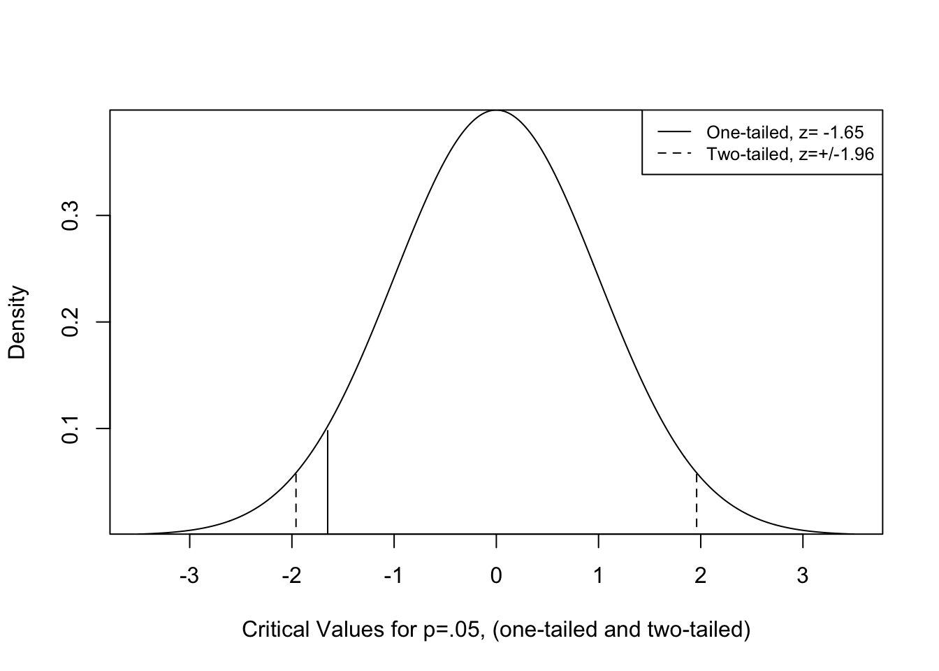
One of the nice things about the addition of the means to this graph is that it reinforces how small the difference in mean outcomes is, even though it is statistically significant.
Bar Charts
It is also good to explore alternatives to the boxplots that focus more exclusively on the mean values. You are already familiar with one popular alternative, the bar chart. In this case, we want the height of the bars to represent the mean levels of the dependent variable for each of the two subgroups. Once again, we can use the results from the aggregate() command. R stored this object as a data.frame (agg_femFT) with two variables, x, the group means, and Group.1 , the group labels. We use this information to create a bar chart using the format barplot(dependent~independent), and add some labels:
#Use 'barplot' to show the mean outcomes of "femFT" by sex
barplot(agg_femFT$x~agg_femFT$Group.1,
        xlab="Sex of Respondent",
        ylab="Mean Feminist Feeling Thermometer")
This bar plot does a nice job of showing the difference between the two groups while also communicating that difference in the context of the scale of the dependent variable. It shows that there is a difference, but a somewhat modest one.
Means Plot
Another option for graphing the mean differences is plotmeans, a function found in the gplots package. The structure of this command is straight forward: plotmeans(dependent~independent). Let’s take a close look at the means plot for sex-based differences in the feminist feeling thermometer.
#Use 'plotmeans' to show the mean outcomes of "femFT" by sex
plotmeans(anes20$femFT~anes20$Rsex,
          n.label=F, #Do not include the number of observations
          ylab="Mean Feminist Feeling Thermometer",
          xlab="Respondent Sex")
What you see here are two small circles representing the mean outcomes on the dependent variable for each of the two independent variable categories and error bars (vertical lines within end caps) representing the confidence intervals around each of the two subgroup means. As you can see, there appears to be a substantial difference between the two groups. This is represented by the vertical distance between the group means (the circles), but also by the fact that neither of the confidence intervals overlaps with the other group mean. If the confidence interval of one group overlaps with the mean of the other, then the two groups are not statistically different from each other.
I like using plotmeans as a graphing tool, but one drawback is that it can create the impression that the difference between the two groups is more meaningful than it is. Note in this graph that the span of the y-axis is only as wide as the lowest and highest confidence limits. There is nothing technically wrong with this. However, since the scale of the dependent variable is from 0 to 100, restricting the view to these narrow limits can make it seem that there is a more important difference between the two groups than there actually is. This is why it is important to measure the effect size with something like Cohen’s D and to pay attention to the scale of the dependent variable when evaluating the size of the subgroup differences. It is worth pointing out that this “scale” problem was not a problem for the boxplot or the bar chart.
What’s Next?
It is quite common to make comparisons between two groups as we have done in this chapter. However, we are frequently interested in comparisons across more than just two groups. For instance, if you think back to some of the other group characteristics mentioned at the beginning of this chapter–race and ethnicity, place of residence, and religiosity–it is easy to see how we could compare several subgroups at the same time. In the case of race and ethnicity, while the dominant comparison tends to be between whites and people of color, it is probably more useful to take full advantage of the data and compare outcomes among several groups–whites, blacks, Hispanics, Asian-Americans and Pacific Islanders, and other identities. While t-tests play a role in these types of comparisons, a more appropriate method is Analysis of Variance (ANOVA), a statistical technique we take up in the next chapter.
Exercises
Concepts and Calculations
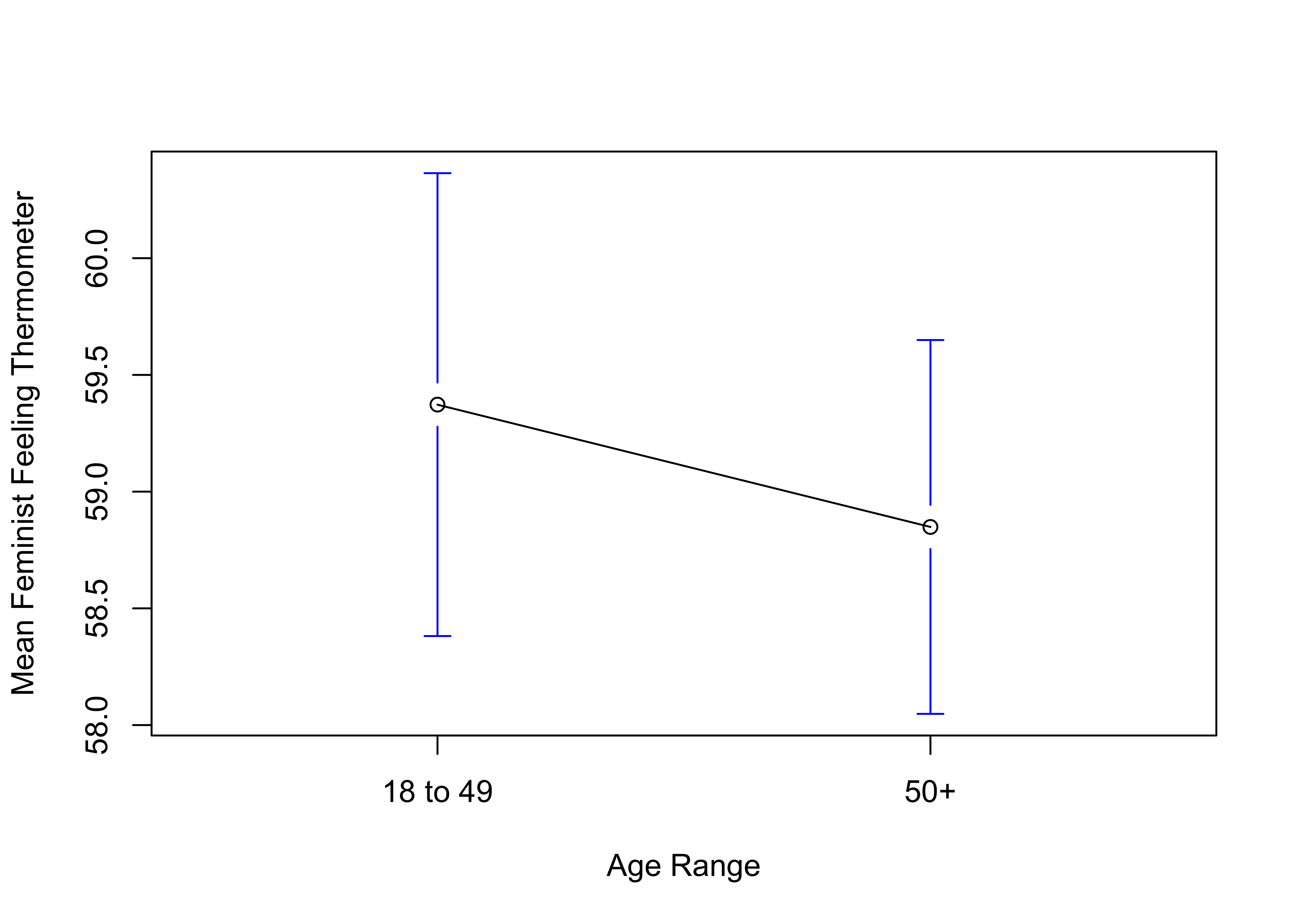
- The means plot below illustrates the mean feeling feminist thermometer rating for two groups of respondents, those aged 18 to 49, and those aged 50 and older. Based just on this graph, does there appear to be relationship between age and support for feminists? Justify and explain your answer.
In response to the student survey that was used for the exercises in earlier chapters, a potential donor wants to provide campus bookstore with gift certificates as a way of defraying the cost of books and supplies. In consultation with the student government leaders, the donor decides to prioritize first and second year students for this program because they think that upper-class students spend as less than other on books and supplies. Before finalizing the decision, the student government wants to test whether there really is a difference in the spending patterns of the two groups of students.
A. What are the null and alternative hypotheses for this problem? Explain.
B. Using the data listed below, test the null hypothesis and summarize your findings for the student government. Is there a significant relationship between class standing and expenditures? Is the relationship strong?
C. Based on these findings, should the donor prioritize first and second year students for assistance? Be sure to go beyond just reciting the statistics when you answer this question.
| 1st & 2nd Year | Upper-class | |
|---|---|---|
| Mean | $358 | $340 |
| Std. Dev | 77 | 79 |
| n | 165 | 135 |
- On a number of cultural, demographic, and political measures, the states in the American South stand out as somewhat different from the rest of the country. The results shown here summarize the mean levels of several different variables in southern and non-southern states, along with the overall standard deviation for those variables. Use this information to calculate the difference between the means of the two groups of states for each variable, along with Cohen’s D. For which variable is the impact of region the strongest? For which variable is the impact of region the weakest? Do any of these differences surprise you?
| Variable | South Mean | Non-South Mean | Standard Deviation |
|---|---|---|---|
| Gallons of Beer Per Capita | 32.8 | 32.1 | 5.3 |
| Congregations per 10k | 16.9 | 12.1 | 5.3 |
| Diabetes % | 12.6 | 9.7 | 1.9 |
| Gun Deaths per 100k | 16.6 | 11.8 | 4.9 |
| Tax Burden | 8.8 | 9.6 | 1.3 |
- A researcher is interested in examining the relationship between veteran status, measured with a dichotomous variable (0=Never served, 1=Veteran or currently serving), and support for the military, measured with a 0 to 100 military feeling thermometer. Convert each of the following statements of research expectations into formal alternative hypotheses that can be used to test for mean differences in support for the military between veterans and non-veterans. Also, what is the null hypothesis?
I expect the level of support for the military to be higher among veterans than among non-veterans.
I expect that there is a difference in support for the military between veterans and non-veterans.
I expect the level of support for the military to be lower among veterans than among non-veterans.
R Problems
For these problems, use the county20large data set to examine how county-level educational attainment is related to COVID-19 cases per100k population. You need to load the following libraries: dplyr,Hmisc, gplots, descr, effectsize.
- The first thing you need to do is take a sample of 500 counties from the
counties20largedata set and store that sample in a new data set,covid500, using the command listed below.
set.seed(1234)
#create a sample of 500 rows of data from the county20large data set
covid500<-sample_n(county20large, 500)
The sample_n command samples rows of data from the data set, so we now have 500 randomly selected counties with all data on all of the variables in the data set. The dependent variable in this assignment is covid500$cases100k_sept821 (cumulative COVID-19 cases per 100,000 people, up to September 8, 2021), and the independent variable is two-category version of covid500$postgrad, the percent of adults in the county with a post-graduate degree. The expectation that case rates are lower in counties with relatively high levels of education than in other counties.
Transform
covid500$postgradinto a two-category variable with a roughly equal number of counties in each category. Store this variable in a new object namedcovid500$postgrad2and label the categories “Low Education” and “High Education”. The generic format isdata$newvariable<-cut2(data$oldvariable, g=# of groups). If you are unclear about how to do this, go back and take a quick look at the variable transformation section of Chapter 4 for a refresher. Produce a frequency table forcovid500$postgrad2to check on the transformation.State a null and alternative hypothesis for this pair of variables.
Use the
compmeanscommand to estimate the level of COVID-19 cases per 100k in low and high education counties. Describe the results. What do the data and boxplot tell you? Make sure to use clear, intuitive labels for the boxplot and make specific references to the group means.Conduct a t-test for the difference in COVID-19 rates between low and high education counties. Interpret the results.
Add a means plot (
plotmeanscommand) and Cohen’s D (cohens_dcommand) and discuss what additional insights they provide.
Here, it is important to acknowledge multiple other forms of gender identity and gender expression, including but not limited to transgender, gender-fluid, non-binary, and intersex. The survey question used in the 2020 ANES, as well as in most research on “gender gap” issues, utilizes a narrow sense of biological sex, relying on response categories of “Male” and “Female.”↩︎
You also can calculate \(D\) with information provided in the R
t.testoutput: \(D=\frac{2*t}{\sqrt{df}}\). This formula uses the t-score as an estimate of impact but then deflates it by taking into account sample size via \(df\).↩︎