4.3 Charting
Quantmod draw nice charts of following common types:
- line
- bars
- candlesticks
We can use chartSeries() and specify the types directly.
4.3.1 Line Chart
The line chart displays closing price of the stock.
The following code shows price of AAPL in 2007 by using the subset option. The option theme is set to be chartTheme(‘white’) as the default option chartTheme(‘black’) is not printer-friendly.
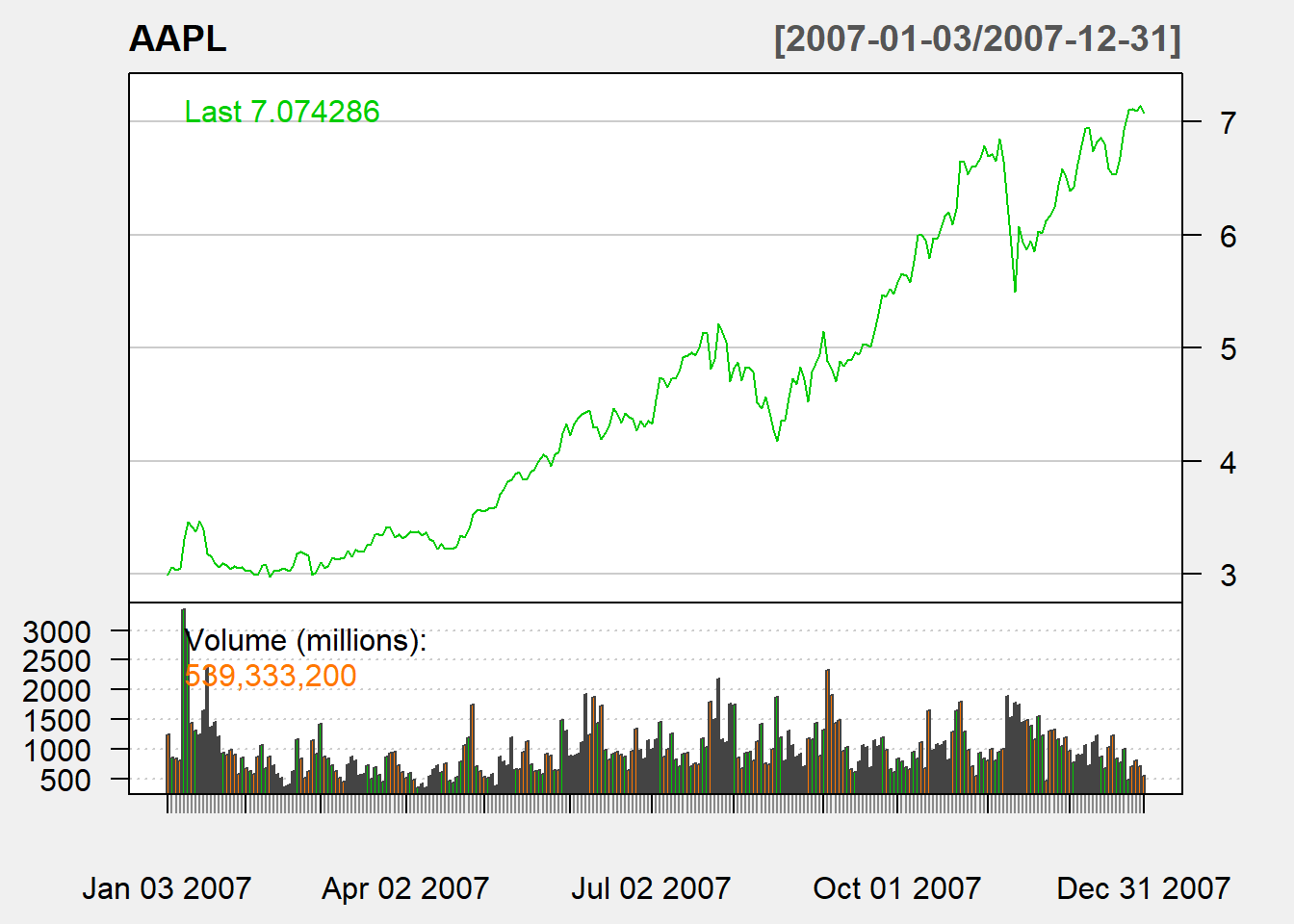
Besides the line chart at the top, the bottom part of the chart is volume.
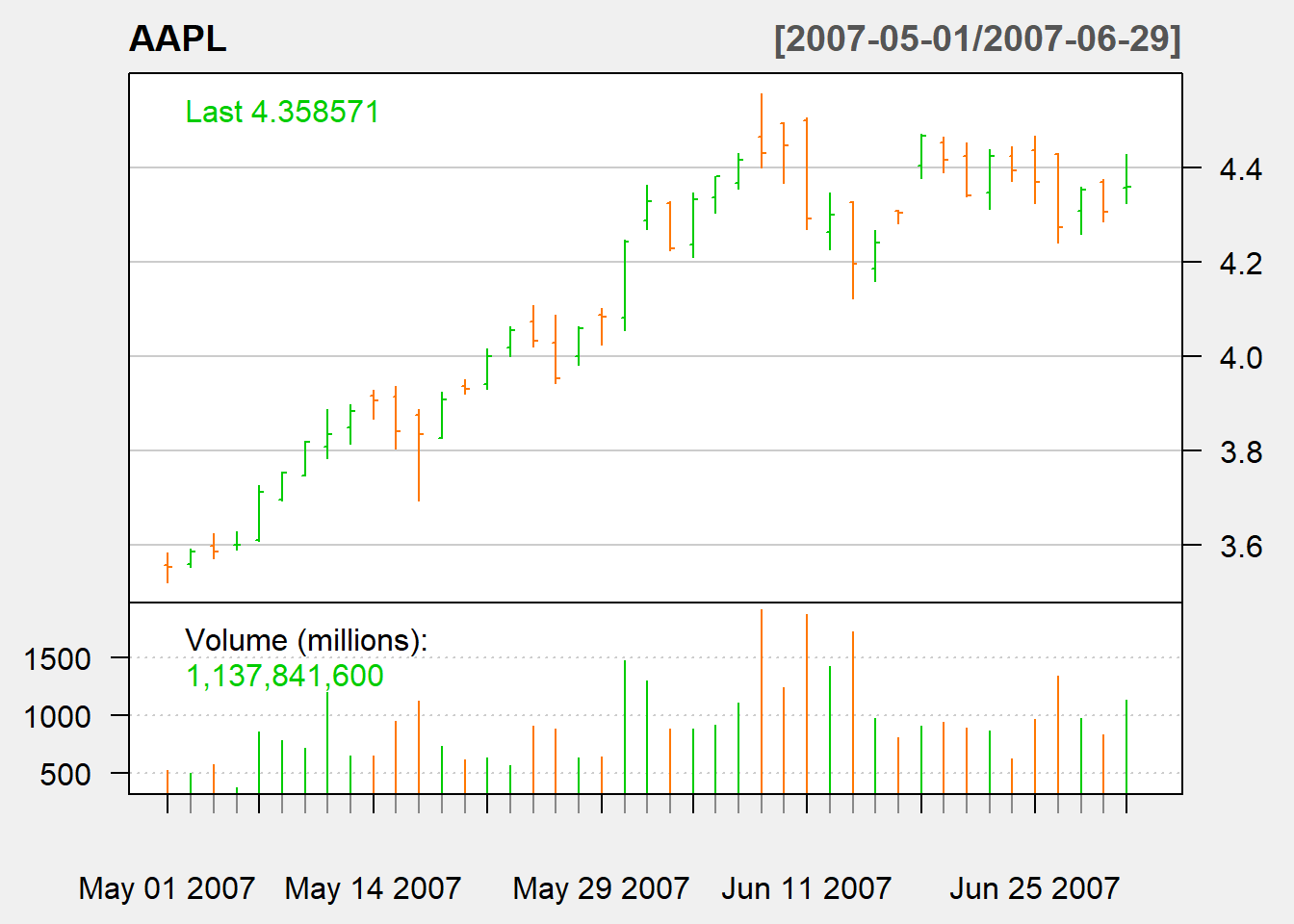
4.3.2 Bar Chart
The bar chart displays open, high, low, close, and volume closing price of the stock. The top of the bar is high and the bottom of the bar is low. The left stick is open and the right stick is close.
If the close is higher than open, the bar is green color. Otherwise, it is in orange color. Hence, the coloring is easy to see in the screen but not easy for black and white printing.
The follwoing bar chart displays stock price of AAPL in May to June 2007 by using the subset option.
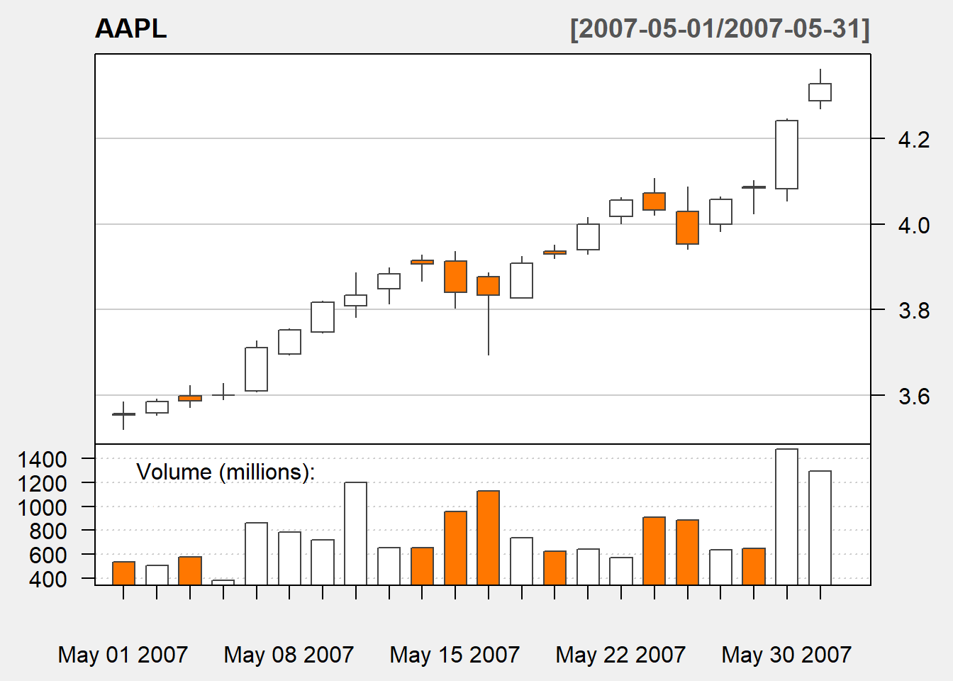
4.3.3 Candle Stick Chart
A candle stick chart is very similar to a bar chart. It also displays open, high, low, close, and volume closing price of the stock.
The top of a candle stick is high and the bottom of a candle stick is low. The two ends of the body of candle is either open or close, depending on whether open is higher than close, which is also represented by orange(red,black) or green(white) color.
If the close is higher than open, the bar is green color. Otherwise, it is in orange color.
The following candle stick chart displays stock price of AAPL in May only.
chartSeries(AAPL,
            type="candlesticks",
            subset='2007-05',
            up.col = 'white',
            down.col = 'black',
            theme=chartTheme('white'))