24 Tutorial 8 - Hypothesis Testing
24.0.1 The t distribution in R
R has several built-in functions for the t distribution. They’re listed in a table below along with brief descriptions of what each one does.
| t distribution function | What it does |
|---|---|
dt(x, df) |
Calculates P(X = x) on a t distribution with df degrees of freedom |
pt(q, df, lower.tail = TRUE) |
Calculates P(X <= x) on a t distribution with df degrees of freedom |
qt(p, df, lower.tail = TRUE) |
Returns value(s) of a given percentile p which come from a t distribution with df degrees of freedom |
rt(n, df) |
Generates n random numbers which follow a t distribution with df degrees of freedom |
t.test(x, y = NULL, alternative = c("two.sided", "less", "greater"), mu, paired = FALSE) |
Conducts unpaired (paired = FALSE) and paired (paired = TRUE) t tests on given vector(s) (x and y) of data for a given population mean (mu) and a given alternative hypothesis (alternative = c("two.sided", "less", "greater")). |
The shape of the t distribution is very similar to that of the normal distribution. However, it varies according to the given number of degrees of freedom. Below is a plot which illustrates this. The solid blue curve represents the standard normal distribution, and the solid red curve represents the t distribution with 1 degree of freedom, which is the lowest possible number for this value for this distribution. The dashed curves represent t distributions with 2, 4 and 8 degrees of freedom. Notice that as the number of degrees of freedom increases, the t distribution increasingly resembles the normal distribution.
data.frame(x = seq(-3, 3, 0.01),
           nprob = dnorm(seq(-3, 3, 0.01), 0, 1),
           tprob1 = dt(seq(-3, 3, 0.01), 1),
           tprob2 = dt(seq(-3, 3, 0.01), 2),
           tprob4 = dt(seq(-3, 3, 0.01), 4),
           tprob8 = dt(seq(-3, 3, 0.01), 8)) %>% ggplot(aes(x)) +
  geom_line(aes(y = nprob), color = 'blue', size = 1) +
  geom_line(aes(y = tprob1), color = 'red', size = 1) +
  geom_line(aes(y = tprob2), color = 'green', size = 1, linetype = 'dashed') +
  geom_line(aes(y = tprob4), color = 'purple', size = 1, linetype = 'dashed') +
  geom_line(aes(y = tprob8), color = 'brown', size = 1, linetype = 'dashed') +
  scale_x_continuous(breaks = seq(-3, 3, 1)) + labs(y = 'Probability') +
  labs(title = 'Normal distribution and t distributions',
       subtitle = '1, 2, 4, 8 degrees of freedom') +
  theme_bw()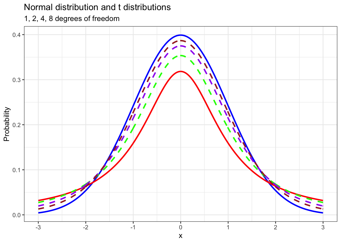
We use the t distribution when we don’t know the population level standard deviation of a variable that we’re studying. The test statistic that we use in hypothesis tests for a single mean with the t distribution is the t statistic. A function for calculating a t statistic for a given population mean is below. x_bar represents the mean of the sample that is being used for the hypothesis test. mu represents the population mean. sd represents the standard deviation of the sample, and n represents the size of the sample. We will make use of this later.
24.0.2 Estimating average gasoline taxes using t.test()
The following question comes from Mathematical Statistics with Applications (7th ed.) by Wackerly, Mendenhall and Scheaffer.
Drivers in the United States often complain that taxes on gasoline are too high. According to the American Petroleum Institute, a lobbying group, the per gallon tax that was levied on gasoline in 2005 was 18.4 cents per gallon. However, state and local taxes were quite varied over the same period, ranging from 7.5 cents per gallon to 32.1 cents per gallon in a sample of 18 large cities. The sample data is given below in the vector called gas_taxes.
gas_taxes <- c(42.89, 53.91, 48.55, 47.90, 47.73, 46.61,
               40.45, 39.65, 38.65, 37.95, 36.80, 35.95,
               35.09, 35.04, 34.95, 33.45, 28.99, 27.45)
Is there enough evidence to conclude at a 95% confidence level (or 5% significance level) that the average tax per gallon of gas in the US in 2005 was less than 45 cents?
To answer this question, we need to use the t distribution, and we’re going to do that using the t.test() function. For our purposes, we need to give this function three arguments. The first, x, is the vector of data that we want to use in our hypothesis test. The second, mu, is the population mean. The third argument, alternative is our alternative hypothesis. In this case, we set alternative = 'less' because we’re conducting a lower tailed hypothesis test.
##
##  One Sample t-test
##
## data:  gas_taxes
## t = -3.2359, df = 17, p-value = 0.002429
## alternative hypothesis: true mean is less than 45
## 95 percent confidence interval:
##      -Inf 42.48275
## sample estimates:
## mean of x
##  39.55611
The information t.test() returns is quite detailed. It tells us what kind of test we conducted (“One sample t-test”), on what data (gas_taxes), our test statistic (t = -3.2359), the degrees of freedom in the t distribution that was used for the test (df = 17) and most importantly, our p value (0.002429). It tells us a few other things too, but we don’t need to worry about that stuff right now.
One thing that this function does not do is tell us the result of our test. Should we reject our null hypothesis or not? It does not say. We have to figure this out on our own using the information that t.test() returns.
The first thing we’ll do is draw the position of our test statistic on a plot of a t distribution with 17 degrees of freedom.
data.frame(x = seq(-3.5, 3.5, 0.01),
           prob = dt(seq(-3.5, 3.5, 0.01), 17)) %>% ggplot(aes(x, prob)) +
  geom_line(size = 1, color = 'blue') +
  scale_x_continuous(breaks = c(-3.2359, qt(0.05, 17), -1, 0, 1, 2, 3)) +
  stat_function(fun = dt,
                args = list(df = 17),
                geom = 'area',
                fill = 'red',
                alpha = 0.3,
                xlim = c(-3.5, qt(0.05, 17))) +
  stat_function(fun = dt,
                args = list(df = 17),
                geom = 'area',
                fill = 'blue',
                alpha = 0.3,
                xlim = c(qt(0.05, 17), 3.5)) +
  geom_vline(xintercept = -3.2359,
             color = 'red',
             size = 1,
             linetype = 'dashed') + theme_bw() +
  theme(axis.text.x = element_text(angle = 90, hjust = 1),
        axis.title.x = element_blank()) +
  labs(y = 'Probability',
       title = 't distribution',
       subtitle = 'df = 17') +
  annotate(geom = 'text', x = 0, y = 0.2, label = '0.95', size = 10, color = 'blue') +
  annotate(geom = 'text', x = -2.15, y = 0.015, label = '0.05', size = 6, color = 'red')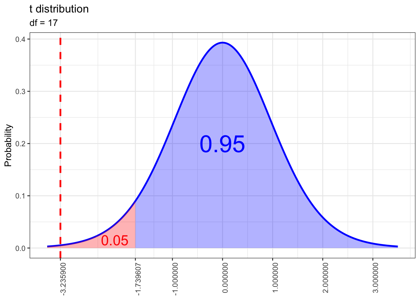
Notice that our test statistic lies well within the rejection region. We can extract the corresponding p value from another run of t.test(). It’s clear that this p value is well below our significance level of 0.05, so we have sufficient evidence to conclude that the average per gallon gas tax in the US in 2005 was less than 45 cents.
## [1] 0.002428782If all we want is the one sided p value, we can also calculate it using pt(), but we need to calculate a t statistic for the mean of gas_taxes first. To do that, we’ll use the t_stat() function we created at the end of the last section.
gas_t <- t_stat(mean(gas_taxes), 45, sd(gas_taxes), length(gas_taxes))

pt(gas_t, length(gas_taxes) - 1)
## [1] 0.00242878224.0.3 Final math grades for Portuguese high school students
The following demos are based on the Student Performance Data Set which is stored at the Machine Learning Repository of the University of California, Irvine. Special thanks to Paolo Cortez of University of Minho for providing clarification about some details of this data. The original data along with the paper in which it appears are both linked below.
https://archive.ics.uci.edu/ml/datasets/Student+Performance
http://www3.dsi.uminho.pt/pcortez/student.pdf
Before proceeding, I want to strongly recommend that my students read the paper that is linked above. Although it contains a lot of methods and terminology that are way beyond the scope of this course, this paper provides a preview of some of the things that are possible if you continue your Statistics and statistical programming education. Also please pay special attention to which programming language was used by the authors in their analysis of this data!!!
The student performance data consists of two separate datasets: one which focuses on scores in a math course and one that focuses on scores in a Portuguese language course. According to the paper that was written using this data (linked above), the data was collected at two Portuguese high schools during the 2005-2006 school year. The authors of the paper decided to focus on scores in math and Portuguese language because the skills students develop in these classes are vital for success in related courses, such as Physics and History. The datasets include not only scores collected at the beginning, middle and end of the school year for math and Portuguese, but also information about factors that may influence student performance, such as number of absences, whether the student drinks alcohol on weekends, whether they take extra paid classes in these subjects outside of school and so on.
For this demo we will focus on the math data. And instead of loading the data from the internet like usual, we’ll download it and load it inside of RStudio instead in order to save time. Fortunately for us this data is already clean and ready to be analyzed too, so after loading it we’re going to have a look at what it consists of and proceed directly to our analysis of it.
## 'data.frame':    395 obs. of  33 variables:
##  $ school    : Factor w/ 2 levels "GP","MS": 1 1 1 1 1 1 1 1 1 1 ...
##  $ sex       : Factor w/ 2 levels "F","M": 1 1 1 1 1 2 2 1 2 2 ...
##  $ age       : int  18 17 15 15 16 16 16 17 15 15 ...
##  $ address   : Factor w/ 2 levels "R","U": 2 2 2 2 2 2 2 2 2 2 ...
##  $ famsize   : Factor w/ 2 levels "GT3","LE3": 1 1 2 1 1 2 2 1 2 1 ...
##  $ Pstatus   : Factor w/ 2 levels "A","T": 1 2 2 2 2 2 2 1 1 2 ...
##  $ Medu      : int  4 1 1 4 3 4 2 4 3 3 ...
##  $ Fedu      : int  4 1 1 2 3 3 2 4 2 4 ...
##  $ Mjob      : Factor w/ 5 levels "at_home","health",..: 1 1 1 2 3 4 3 3 4 3 ...
##  $ Fjob      : Factor w/ 5 levels "at_home","health",..: 5 3 3 4 3 3 3 5 3 3 ...
##  $ reason    : Factor w/ 4 levels "course","home",..: 1 1 3 2 2 4 2 2 2 2 ...
##  $ guardian  : Factor w/ 3 levels "father","mother",..: 2 1 2 2 1 2 2 2 2 2 ...
##  $ traveltime: int  2 1 1 1 1 1 1 2 1 1 ...
##  $ studytime : int  2 2 2 3 2 2 2 2 2 2 ...
##  $ failures  : int  0 0 3 0 0 0 0 0 0 0 ...
##  $ schoolsup : Factor w/ 2 levels "no","yes": 2 1 2 1 1 1 1 2 1 1 ...
##  $ famsup    : Factor w/ 2 levels "no","yes": 1 2 1 2 2 2 1 2 2 2 ...
##  $ paid      : Factor w/ 2 levels "no","yes": 1 1 2 2 2 2 1 1 2 2 ...
##  $ activities: Factor w/ 2 levels "no","yes": 1 1 1 2 1 2 1 1 1 2 ...
##  $ nursery   : Factor w/ 2 levels "no","yes": 2 1 2 2 2 2 2 2 2 2 ...
##  $ higher    : Factor w/ 2 levels "no","yes": 2 2 2 2 2 2 2 2 2 2 ...
##  $ internet  : Factor w/ 2 levels "no","yes": 1 2 2 2 1 2 2 1 2 2 ...
##  $ romantic  : Factor w/ 2 levels "no","yes": 1 1 1 2 1 1 1 1 1 1 ...
##  $ famrel    : int  4 5 4 3 4 5 4 4 4 5 ...
##  $ freetime  : int  3 3 3 2 3 4 4 1 2 5 ...
##  $ goout     : int  4 3 2 2 2 2 4 4 2 1 ...
##  $ Dalc      : int  1 1 2 1 1 1 1 1 1 1 ...
##  $ Walc      : int  1 1 3 1 2 2 1 1 1 1 ...
##  $ health    : int  3 3 3 5 5 5 3 1 1 5 ...
##  $ absences  : int  6 4 10 2 4 10 0 6 0 0 ...
##  $ G1        : int  5 5 7 15 6 15 12 6 16 14 ...
##  $ G2        : int  6 5 8 14 10 15 12 5 18 15 ...
##  $ G3        : int  6 6 10 15 10 15 11 6 19 15 ...
According to the codebook for this dataset, the G1, G2 and G3 variables represent student grades measured on a 20 point scale (the standard in Portugal) at the first period, second period and end of the school year. Let’s have a look at how these values are distributed.
g1_plot <- math_data %>% ggplot() +
  geom_histogram(aes(G1,
                     stat(count / sum(count))),
                 color = 'black',
                 binwidth = 1) +
  labs(x = 'Score',
       y = 'Proportion',
       title = 'Distribution of first \nperiod math grades') +
  theme_bw()

g2_plot <- math_data %>% ggplot() +
  geom_histogram(aes(G2,
                     stat(count / sum(count))),
                 color = 'black',
                 binwidth = 1) +
  labs(x = 'Score',
       y = 'Proportion',
       title = 'Distribution of second \nperiod math grades') +
  theme_bw()

g3_plot <- math_data %>% ggplot() +
  geom_histogram(aes(G3,
                     stat(count / sum(count))),
                 color = 'black',
                 binwidth = 1) +
  labs(x = 'Score',
       y = 'Proportion',
       title = 'Distribution of final \nmath grades') +
  theme_bw()

ggarrange(g1_plot, g2_plot, g3_plot, ncol = 3)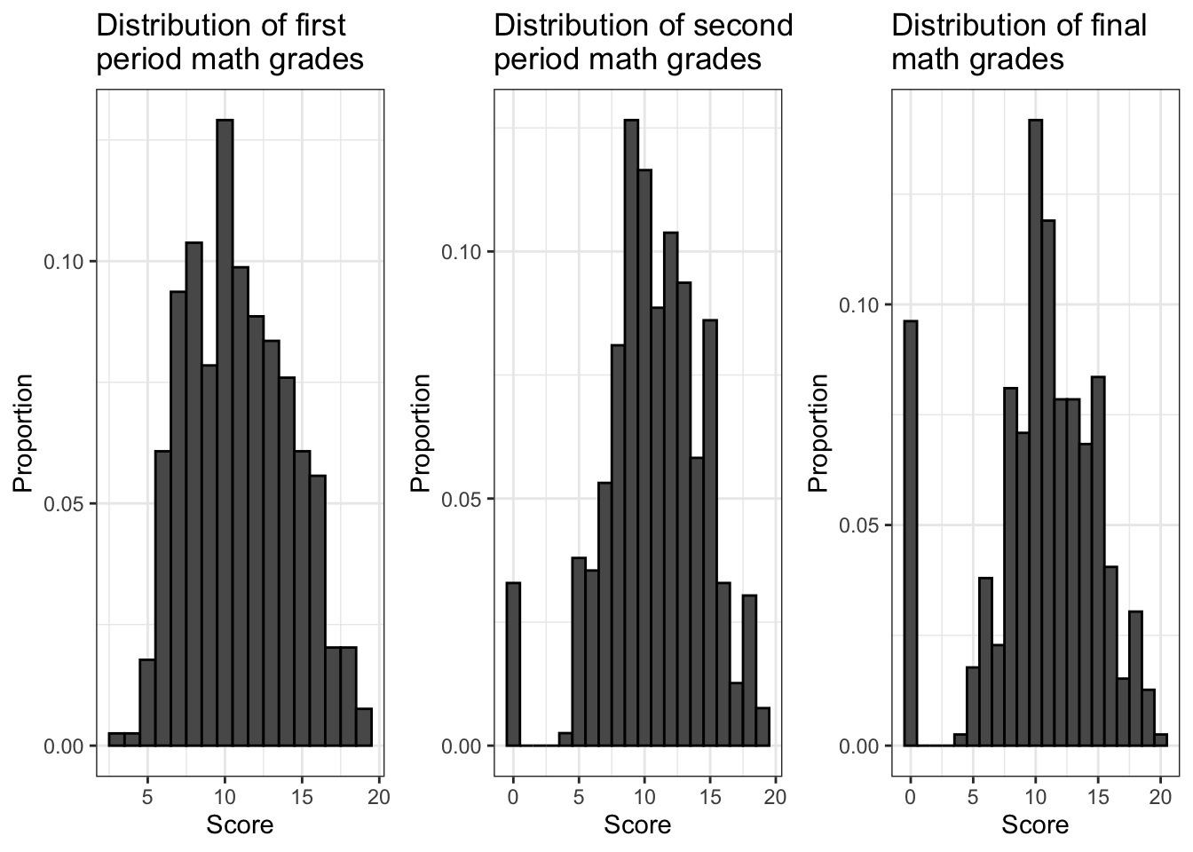
Look closely at the left sides of the histograms. As the school year went on, it appears that the number of students with a score of 0 for their math course increased. This is a very strange pattern. But is it a meaningful one? Probably not. The most likely explanation is that as the school year went on, the number of students who dropped out of the study increased, and whenever this happened the researchers recorded their grades for subsequent periods as 0. (Of course it’s possible that there were some students who finished the school year with a grade of 0 for their math course, but the number who did this poorly is probably negligible, and these students would be part of a larger subset of the population anyway, which is the subset of students who failed their math course.) To deal with this, we’re going to focus on final course grades (G3) and we’re going to exclude all students for whom this information seems to be missing.
Now let’s have a closer look at the final course grades for students who completed the study.
math_filtered %>% ggplot() +
  geom_histogram(aes(G3,
                     stat(count / sum(count))),
                 color = 'black',
                 binwidth = 1) +
  geom_vline(xintercept = mean(math_filtered$G3),
             color = 'red',
             size = 1,
             linetype = 'dashed') +
  labs(x = 'Score',
       y = 'Proportion',
       title = 'Distribution of final math grades',
       subtitle = 'Scores of 0 filtered out') +
  scale_x_continuous(breaks = seq(4, 20)) +
  theme_bw()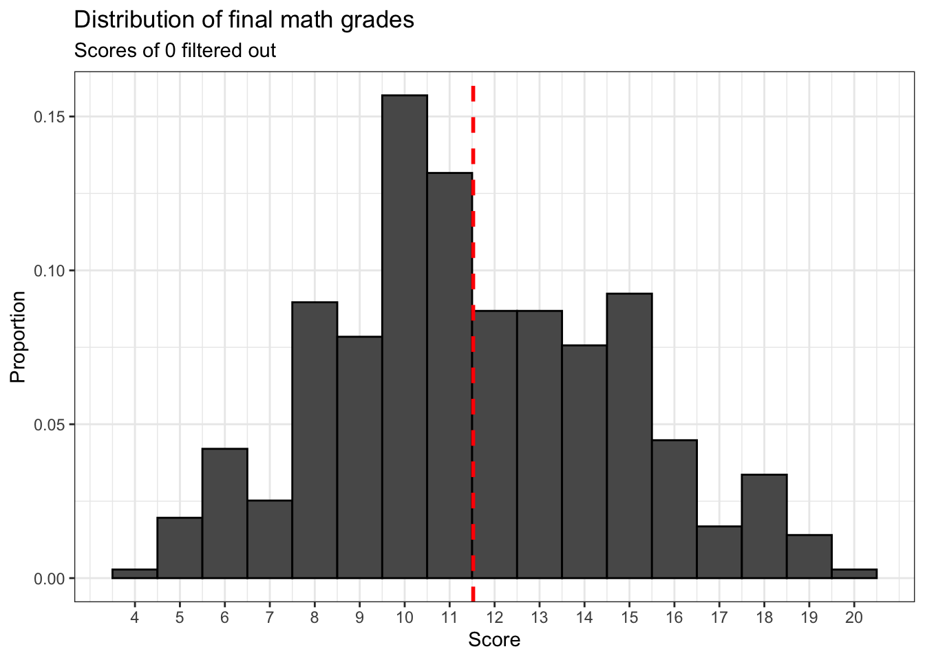
It appears that final math course grades follow an approximately normal distribution.
Now let’s conduct a hypothesis test using this data. According to the paper by Cortez and Silva, the threshold for a passing grade on the 20 point Portuguese grade scale is 10 points. Is there sufficient evidence to conclude that the mean final math grade (math_filtered$G3) is different from 10?
##
##  One Sample t-test
##
## data:  math_filtered$G3
## t = 8.9199, df = 356, p-value < 2.2e-16
## alternative hypothesis: true mean is not equal to 10
## 95 percent confidence interval:
##  11.18784 11.85978
## sample estimates:
## mean of x
##  11.52381
Judging from the p value we get, there is sufficient evidence to conclude that the population level average final math grade is not 10 points.
Here’s a more interesting question: is there sufficient evidence to conclude that the population level average math grade is greater than 10 points?
##
##  One Sample t-test
##
## data:  math_filtered$G3
## t = 8.9199, df = 356, p-value < 2.2e-16
## alternative hypothesis: true mean is greater than 10
## 95 percent confidence interval:
##  11.24208      Inf
## sample estimates:
## mean of x
##  11.52381
Judging from the p value we get, indeed there is. This is good news considering the relatively bleak description in the paper by Cortez and Silva of Portuguese high school student performance compared to their peers elsewhere in Europe. Failure and drop out rates are relatively high in Portugal, but at least a typical student almost certainly passed their math course in the 2005-2006 school year.
24.0.4 Final math grades and weekend alcohol consumption
Now let’s examine whether or not different subsets of students in this sample have statistically significant differences in their final math grades.
Let’s start by filtering math_filtered for certain values of Walc, a variable which provides information about weekend alcohol consumption. This variable has five values which range from 1 to 5, with 1 representing “very low” and 5 representing “very high”. And let us also assume that a value of 1 for this variable indicates that a student does not consume alcohol on weekends at all.
wknd_drinkers <- math_filtered %>% filter(Walc > 1)

wknd_non_drinkers <- math_filtered %>% filter(Walc == 1)

drinker_scores <- math_filtered %>% filter(Walc > 1) %>% ggplot() +
  geom_bar(aes(G3,
               stat(count / sum(count))),
           color = 'black') +
  geom_vline(xintercept = mean(wknd_drinkers$G3),
             size = 1,
             color = 'red',
             linetype = 'dashed') +
  labs(x = 'Score',
       y = 'Proportion',
       title = 'Final math grades \nfor students who \ndrink alcohol on weekends',
       subtitle = 'Walc > 1, n = 224') +
  theme_bw()

sober_scores <- math_filtered %>% filter(Walc == 1) %>% ggplot() +
  geom_bar(aes(G3,
               stat(count / sum(count))),
           color = 'black') +
  geom_vline(xintercept = mean(wknd_non_drinkers$G3),
             size = 1,
             color = 'red',
             linetype = 'dashed') +
  labs(x = 'Score',
       y = 'Proportion',
       title = 'Final math grades \nfor students do not \ndrink alcohol on weekends',
       subtitle = 'Walc = 1, n = 133') +
  theme_bw()

ggarrange(drinker_scores, sober_scores)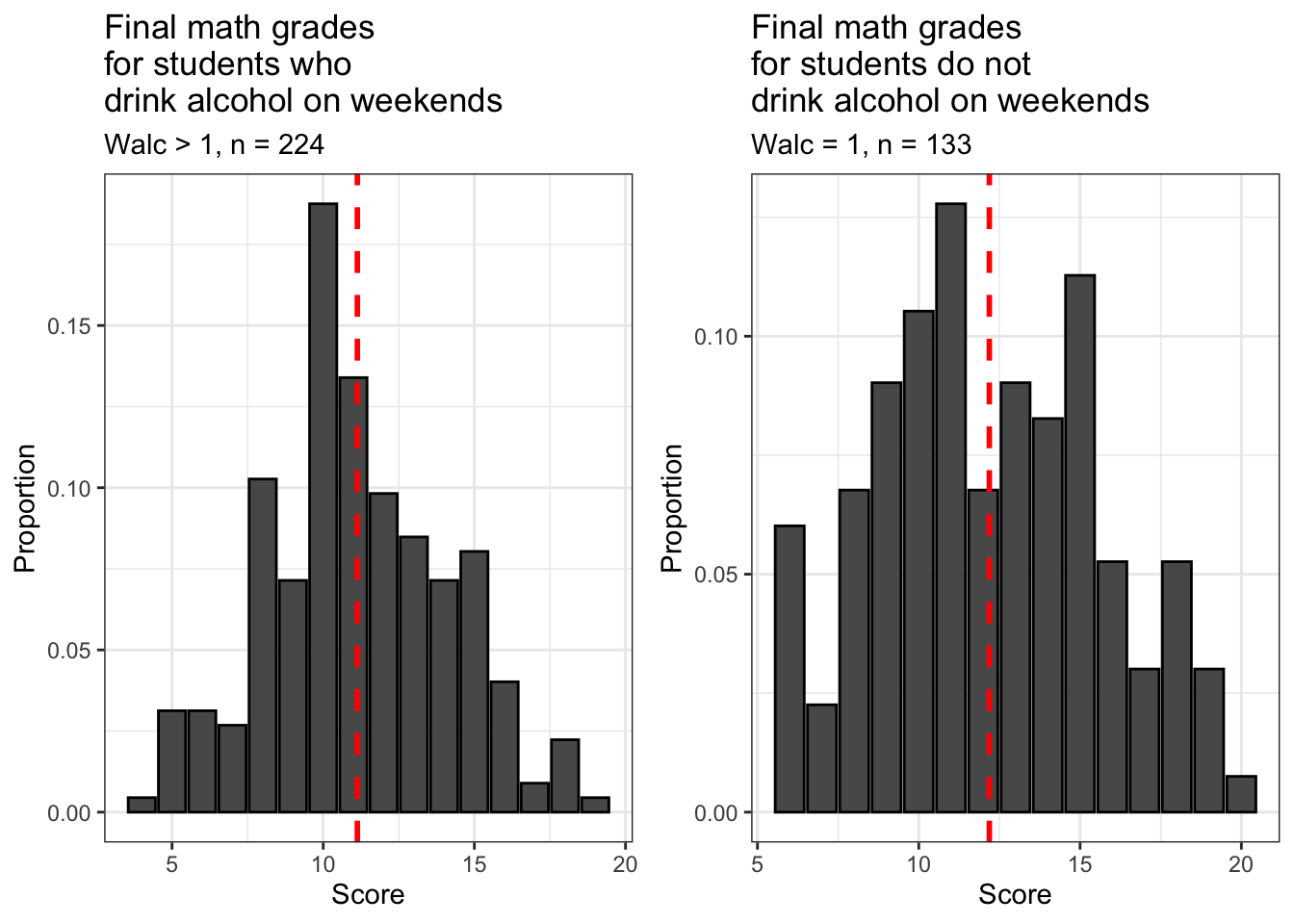
Both subsets of our filtered sample are approximately normally distributed. Notice that about 2/3 of students from the filtered sample (n = 224) drink alcohol on weekends, while about 1/3 do not (n = 133). At least at the two high schools covered by this dataset, it’s normal for students to drink alcohol at least sometimes on the weekends.
Are the means of these subsets of our filtered sample different? Let’s have a look.
## [1] 12.18797 11.12946These two subsets indeed have different means and they probably match your intuition: students who don’t drink alcohol on the weekends have a higher average final math course grade than those who do.
However, this raises a new and important question: is this difference that we’ve observed due to random variation, or is there sufficient evidence to conclude that the difference in means is statistically significant? We can answer this question using t.test() too, although its application will be different from our previous uses of it.
The first thing we need to do is create a new variable in math_filtered which indicates whether a student is a drinker or not. We will classify students with a value of greater than 1 for Walc as drinkers and those with a value of 1 for Walc as non-drinkers.
Now we will conduct an unpaired two sample t test for the difference between the two means we calculated a moment ago. We will use an unpaired test because for a paired test, our samples must be of equal size. But as we observed earlier, the numbers of drinking and non-drinking students in math_filtered are not equal.
For this use of t.test(), our first argument is G3 ~ weekend_drinker. Putting G3 before the tilde (~) indicates that this is the dependent variable and putting weekend_drinker after it indicates that this is the independent variable. Basically, we’re telling t.test() to split our grade data (G3) into two groups according to the values of weekend_drinker, which are TRUE and FALSE for weekend drinking and weekend non-drinking students respectively. t.test() then calculates the means for these two groups of students and then the difference between these means and then uses that to conduct the hypothesis test.
The most interesting question for us right now is this: is there sufficient evidence to conclude that students who do not drink alcohol on the weekends have a higher average final math course grade than students who do drink alcohol on the weekends?
##
##  Welch Two Sample t-test
##
## data:  G3 by weekend_drinker
## t = 2.9198, df = 246.38, p-value = 0.001913
## alternative hypothesis: true difference in means is greater than 0
## 95 percent confidence interval:
##  0.4599558       Inf
## sample estimates:
## mean in group FALSE  mean in group TRUE
##            12.18797            11.12946
Judging from the p value of our hypothesis test, the answer to this question is yes, because the p value of the difference between these means (the non-drinker mean minus the drinker mean) is much smaller than our significance level.
That last result was pretty interesting, but it raises another question. All we were able to conclude with the last test is that the difference between these means is greater than 0. But what is the biggest difference in means that’s statistically significant?
The most efficient way to try to answer this question is to repeat this test for many different estimated differences. We can do that very quickly by using a for loop. The estimated differences and p values from each test can be extracted and stored in a dataframe and we can use that to make a nifty plot. Let’s conduct hypothesis tests for estimated differences in these means that range from 0 to 1 in increments of 0.01.
p_vals <- data.frame(matrix(nrow = 0, ncol = 2))

for (diff in seq(0, 1, 0.01)){
  test <- t.test(G3 ~ weekend_drinker,
         data = math_filtered,
         mu = diff,
         alternative = 'greater')

  row <- data.frame(mu = test$null.value, p_value = test$p.value)

  p_vals <- rbind(p_vals, row)
}

p_vals %>% ggplot() +
  geom_line(aes(mu, p_value), size = 1) +
  geom_hline(yintercept = 0.05,
             color = 'red') +
  scale_x_continuous(breaks = seq(0, 1, 0.1)) +
  scale_y_continuous(breaks = c(0, 0.05, 0.1, 0.2, 0.3, 0.4)) +
  labs(x = 'Estimated difference in means',
       y = 'p value of corresponding hypothesis test',
       title = 'Difference in average final math course grades \nfor non-drinking and drinking students',
       subtitle = 'p values for 100 unpaired difference in means tests') +
  theme_bw()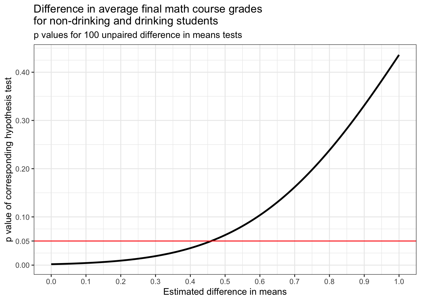
The plot above shows how the p value of the difference in means test that we just performed increases as the estimated difference in means increases. A red horizontal line is drawn at y = 0.05 because this is our significance level. For p values less than this, we reject our null hypothesis and for p values larger than this, we fail to reject it.
Judging from the plot, it looks like the highest statistically significant difference between these means that we tested is about 0.45. Let’s see what the p value for this estimate of our difference in means and a few estimates that are of similar size are.
##                         mu    p_value
## difference in means43 0.43 0.04211179
## difference in means44 0.44 0.04462401
## difference in means45 0.45 0.04725634
## difference in means46 0.46 0.05001247
## difference in means47 0.47 0.05289610
Carried out to R’s default number of digits, it looks like 0.45 is the highest statistically significant difference in means that we tested. This is because its p value is just under the significance level. 0.46 has a p value that’s just above the significance level.
24.0.5 Extra paid classes and final math grades
Now let’s have a look at another variable, paid, which indicates whether or not a student takes extra paid math classes outside of school.
math_filtered %>% ggplot() +
  geom_bar(aes(paid),
           color = 'black') +
  labs(x = 'Does a given student take extra paid math classes off campus?',
       y = 'Frequency',
       title = 'Popularity of paid off campus math classes') +
  theme_bw()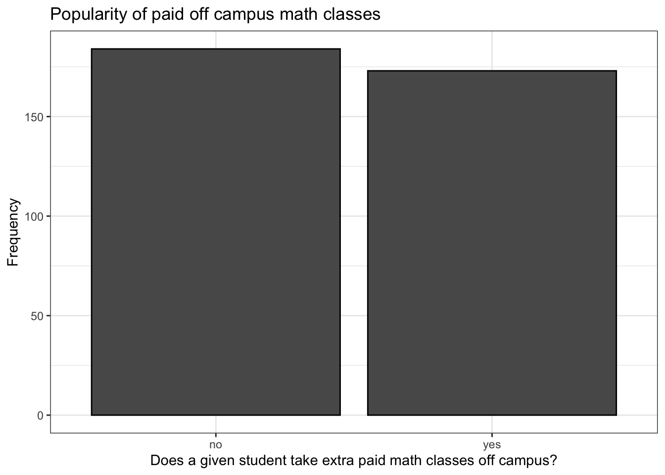
This is a pretty surprising result, at least to me. Classes like this are very popular in mainland China and supplementary education for primary and secondary school students is a multibillion dollar industry here. It’s much less popular in the US and I expected that the situation would be similar in Portugal and that this similarity would be reflected in this sample, but I was wrong. This is also a surprising result given what was said in the paper by Cortez and Silva about high rates of failure and dropping out among Portuguese secondary school students. Then again, without these classes, failure and dropout rates might be even higher.
Anyway, let’s have a look at how grades for these two groups of students are distributed.
more_classes_dat <- math_filtered %>% filter(paid == 'yes')

no_classes_dat <- math_filtered %>% filter(paid == 'no')

more_classes <- math_filtered %>% filter(paid == 'yes') %>% ggplot() +
  geom_histogram(aes(G3,
                     stat(count / sum(count))),
                 color = 'black',
                 binwidth = 1) +
  geom_vline(xintercept = mean(more_classes_dat$G3),
             color = 'red',
             size = 1,
             linetype = 'dashed') +
  labs(x = 'Score',
       y = 'Proportion',
       title = 'Final math course grades \nfor students who took paid \noff campus classes',
       subtitle = 'n = 173') +
  theme_bw()

no_classes <- math_filtered %>% filter(paid == 'no') %>% ggplot() +
  geom_histogram(aes(G3,
                     stat(count / sum(count))),
                 color = 'black',
                 binwidth = 1) +
  geom_vline(xintercept = mean(more_classes_dat$G3),
             color = 'red',
             size = 1,
             linetype = 'dashed') +
  labs(x = 'Score',
       y = 'Proportion',
       title = 'Final math course grades for \nstudents who did not take paid \noff campus classes',
       subtitle = 'n = 183') +
  theme_bw()

ggarrange(more_classes, no_classes)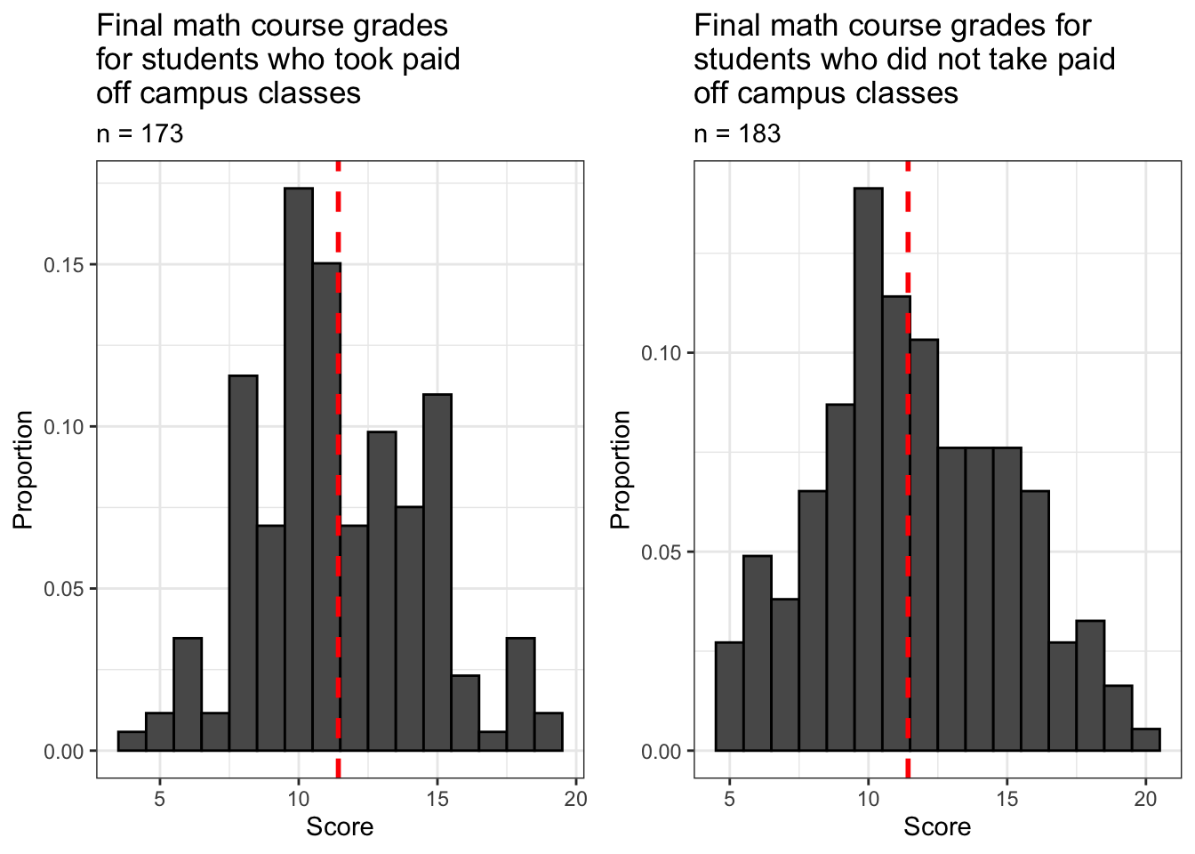
Both samples are approximately normally distributed. How do the means of these samples compare?
## [1] 11.42775 11.61413A strange result indeed, at least in my opinion. These results show that students in our filtered sample who took extra paid math classes on campus ended the school year with a lower average final math course grade than those who didn’t. My first guess was that the average for students who took extra classes would be higher because they got more instruction and more help. Then again, perhaps they would have done even worse without this intervention.
Now let’s run another hypothesis test to answer an important and interesting question: is there sufficient evidence to conclude that the difference in average final math course grades for students who did and did not take extra paid off campus math classes is different from zero? I.e., is the difference in means that we observed above due to chance or is it the result of some non-random pattern?
##
##  Welch Two Sample t-test
##
## data:  G3 by paid
## t = 0.54661, df = 354.09, p-value = 0.585
## alternative hypothesis: true difference in means is not equal to 0
## 95 percent confidence interval:
##  -0.4842183  0.8569878
## sample estimates:
##  mean in group no mean in group yes
##          11.61413          11.42775
Judging from this result, it appears that this difference in means that we observed is due to randomness and we therefore must fail to reject our null hypothesis that the difference between these means is different from zero. This strongly suggests that these supplementary math classes some of these students were taking probably were not actually helping them!
24.0.6 Final words
It is important to remember that the results we’ve seen so far are limited conclusions. The hypothesis tests we’ve conducted simply indicate that the questions we’ve attempted to answer deserve further investigation and we therefore have not answered them conclusively, and this is true despite the outcomes of the tests. For instance, we need to know more about the characteristics of students who take extra paid math classes to understand why they aren’t getting better results than their peers despite the extra help they’re getting because this was not an experiment. Students were not split into a treatment and control group and assigned at random to one of these groups, so the students who self-selected for participation in these classes may have characteristics besides their decision to take these classes that may make it harder for them to excel in their math course. This means that in this data it is impossible for us to meaningfully isolate the effect of extra paid math classes on the learning outcomes of students who have taken them. Notice that we are still wondering about this despite the fact that we failed to reject the null hypothesis in our test of the difference in average scores between these two groups of students. (Of course we could say similar things about students who drink alcohol on the weekends because they also self-selected. And it would be unethical and illegal to even try to split minors into treatment and control groups where the treatment is weekend alcohol consumption.)