20 Tutorial 6: The Normal Distribution
20.0.1 The normal distribution in R
R has several built-in functions for the normal distribution. They’re listed in a table below along with brief descriptions of what each one does.
| Normal distribution function | What it does |
|---|---|
dnorm(x, mean = 0, sd = 1) |
Calculates P(X = x) for a given mean and standard deviation. Default mean is 0 and default standard deviation is 1. |
pnorm(q, mean = 0, sd = 1, lower.tail = TRUE) |
Calculates P(X <= x) for a given mean and standard deviation. Default mean is 0 and default standard deviation is 1. Calculates P(X > x) when lower.tail = FALSE. |
rnorm(n, mean = 0, sd = 1) |
Generates n random numbers which follow the normal distribution for a given mean and standard deviation. Default mean is 0 and default standard deviation is 1. |
qnorm(p, mean = 0, sd = 1, lower.tail = TRUE) |
Returns critical values in the normal distribution for a given percentile with a given mean and a given standard deviation. Default mean is 0 and default standard deviation is 1. This function is useful when constructing confidence intervals. |
The process of putting together a basic plot of the normal distribution is a bit more complicated than the one we’ve used for other distributions so far.
data.frame(x = c(-3.5, 3.5)) %>% ggplot(aes(x)) +
  stat_function(fun = dnorm,
                n = 1000,
                args = list(mean = 0,
                            sd = 1),
                size = 1) +
  theme_bw() +
  labs(y = 'Density f(x)',
       title = 'The normal distribution N(0, 1)') +
  scale_x_continuous(breaks = seq(-3, 3))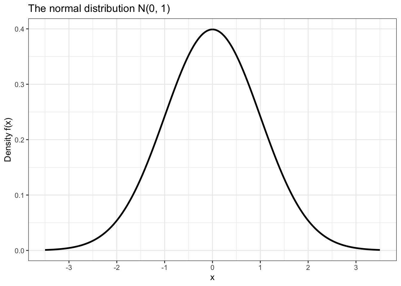
Notice that in the plot above in order to draw the curve we had to use a function called stat_function().
The first argument, fun, tells it which function to use when drawing. We set fun = dnorm so that we could use dnorm() to draw for a domain of [-3.5, 3.5].
The second argument, n, is the number of points between which we want to plot. I chose a high number because this makes the distance between the points so small that the curve looks perfectly smooth.
The last argument, args, is a list of arguments that need to be passed to fun in order to make it work properly. Since fun = dnorm, we need to pass arguments that we would pass to dnorm, in this case the mean and standard deviation of the normal distribution curve that we would like to plot.
We can use pnorm() to calculate cumulative probabilities. For example, let’s calculate the probability that our random variable X takes a value less than or equal to -1. We can also plot this probability by shading the appropriate area under the normal distribution curve in ggplot2.
## [1] 0.1586553data.frame(x = c(-3.5, 3.5)) %>% ggplot(aes(x)) +
stat_function(fun = dnorm,
n = 1000,
args = list(mean = 0,
sd = 1),
size = 1) +
geom_area(stat = 'function',
fun = dnorm,
fill = 'blue',
xlim = c(-1, -3.5),
alpha = 0.3) +
theme_bw() +
labs(y = 'Density f(x)',
title = 'The normal distribution N(0, 1)',
subtitle = 'P(X >= -1)') +
scale_x_continuous(breaks = seq(-3, 3))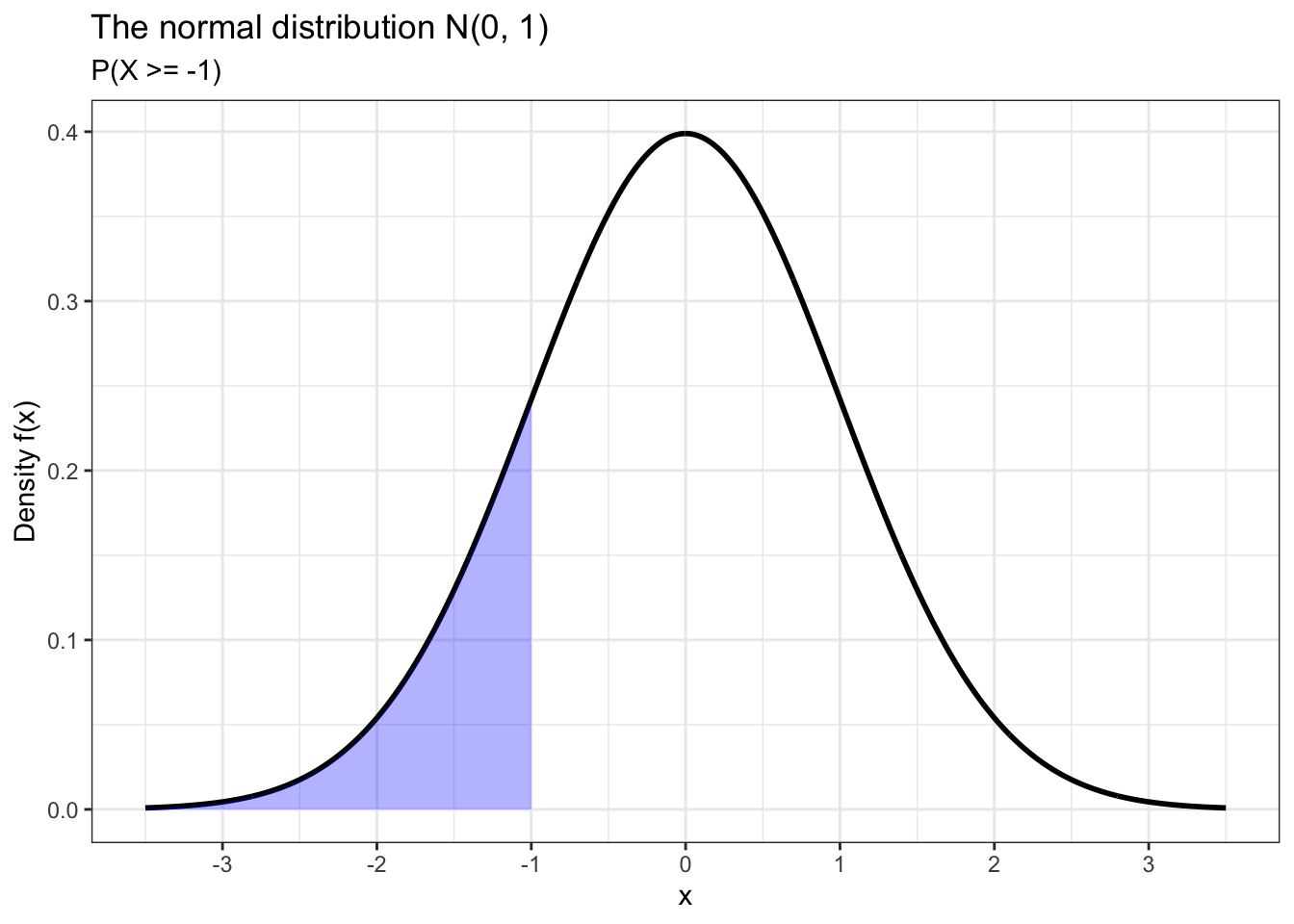
We can also calculate the probability that X takes some value within a certain interval. For example, let’s calculate P(-2 <= X <= 1) and plot this probability using ggplot2.
## [1] 0.8185946data.frame(x = c(-3.5, 3.5)) %>% ggplot(aes(x)) +
stat_function(fun = dnorm,
n = 1000,
args = list(mean = 0,
sd = 1),
size = 1) +
geom_area(stat = 'function',
fun = dnorm,
fill = 'blue',
xlim = c(-2, 1),
alpha = 0.3) +
theme_bw() +
labs(y = 'Density f(x)',
title = 'The normal distribution N(0, 1)',
subtitle = 'P(-2 <= X <= 1)') +
scale_x_continuous(breaks = seq(-3, 3))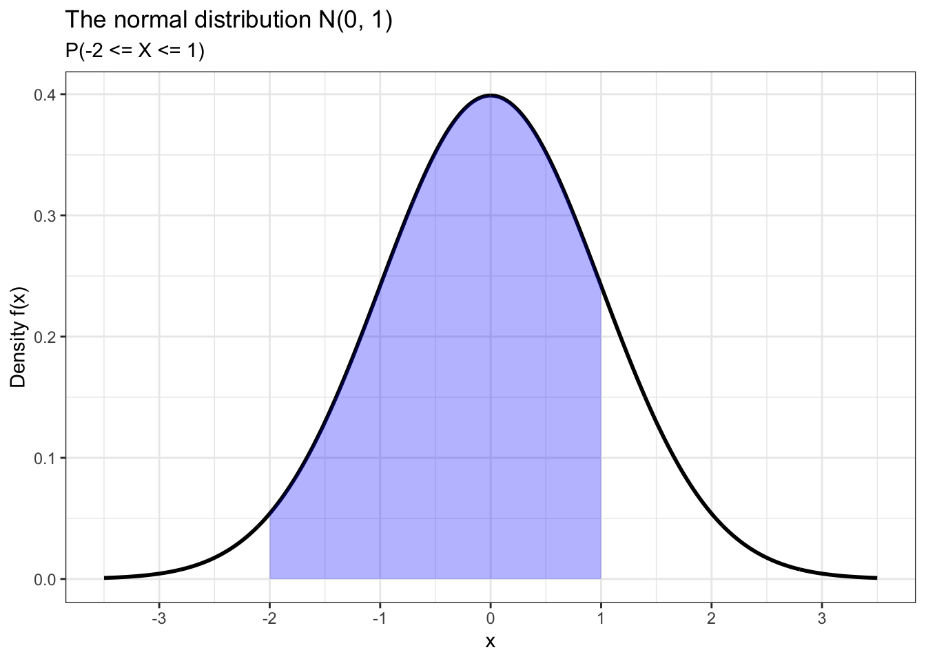
The purpose of rnorm() should be obvious. It works the same way as other functions we’ve used to randomly generate numbers which follow a certain distribution with given parameters. As for qnorm(), this function is useful for finding critical values that we need to construct confidence intervals. But in this tutorial we will use it to calculate percentiles.
There is one more type of plot that we need to know about when we’re thinking about the normal distribution: the qq (quantile-quantile) plot.
df <- data.frame(data = rnorm(50, 0, 1))

df %>% ggplot(aes(sample = data)) +
  stat_qq(color = 'blue', alpha = 0.3) +
  stat_qq_line() +
  theme_bw()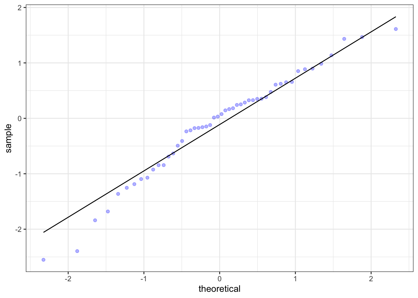
The qq plot is used to assess the normality of a distribution of sample data. The better the data points fit the qq line, the more normal the data is. The data in the plot above appears to be pretty normal, as onne would expect from data generated using rnorm(). This type of assessment is also possible with density plots and histograms, but it is generally easier for the viewer to do it using this type of plot. QQ plots also tend to make it easier to spot outliers, as we will see later.
20.0.2 Distributions of heights
The dslabs package contains a dataset called heights. It has two variables: sex, which indicates whether a respondent is male or female, and height, which is the respondent’s height in inches. The first thing we’re going to do with this data is convert the height measurements to centimeters from inches.
##      sex height
## 1   Male     75
## 2   Male     70
## 3   Male     68
## 4   Male     74
## 5   Male     61
## 6 Female 65hist <- heights %>% ggplot() +
geom_histogram(aes(height,
stat(count / sum(count))),
color = 'black',
binwidth = 2.54) +
geom_vline(xintercept = mean(heights$height),
color = 'red',
size = 1,
linetype = 'dashed') +
labs(x = 'Self-reported height in centimeters (x)',
y = 'Proportion',
title = 'Histogram of self-reported heights') +
scale_x_continuous(breaks = c(140,
160,
round(mean(heights$height), 0),
180,
200)) +
theme_bw()
dens <- heights %>% ggplot() +
geom_density(aes(height),
size = 1,
fill = 'grey',
alpha = 0.3) +
geom_vline(xintercept = mean(heights$height),
color = 'red',
linetype = 'dashed',
size = 1) +
labs(x = 'Self-reported height in centimeters (x)',
y = 'Density f(x)',
title = 'Density plot of heights') +
scale_x_continuous(breaks = c(140,
160,
round(mean(heights$height), 0),
180,
200)) +
theme_bw()
ggarrange(hist, dens, nrow = 2)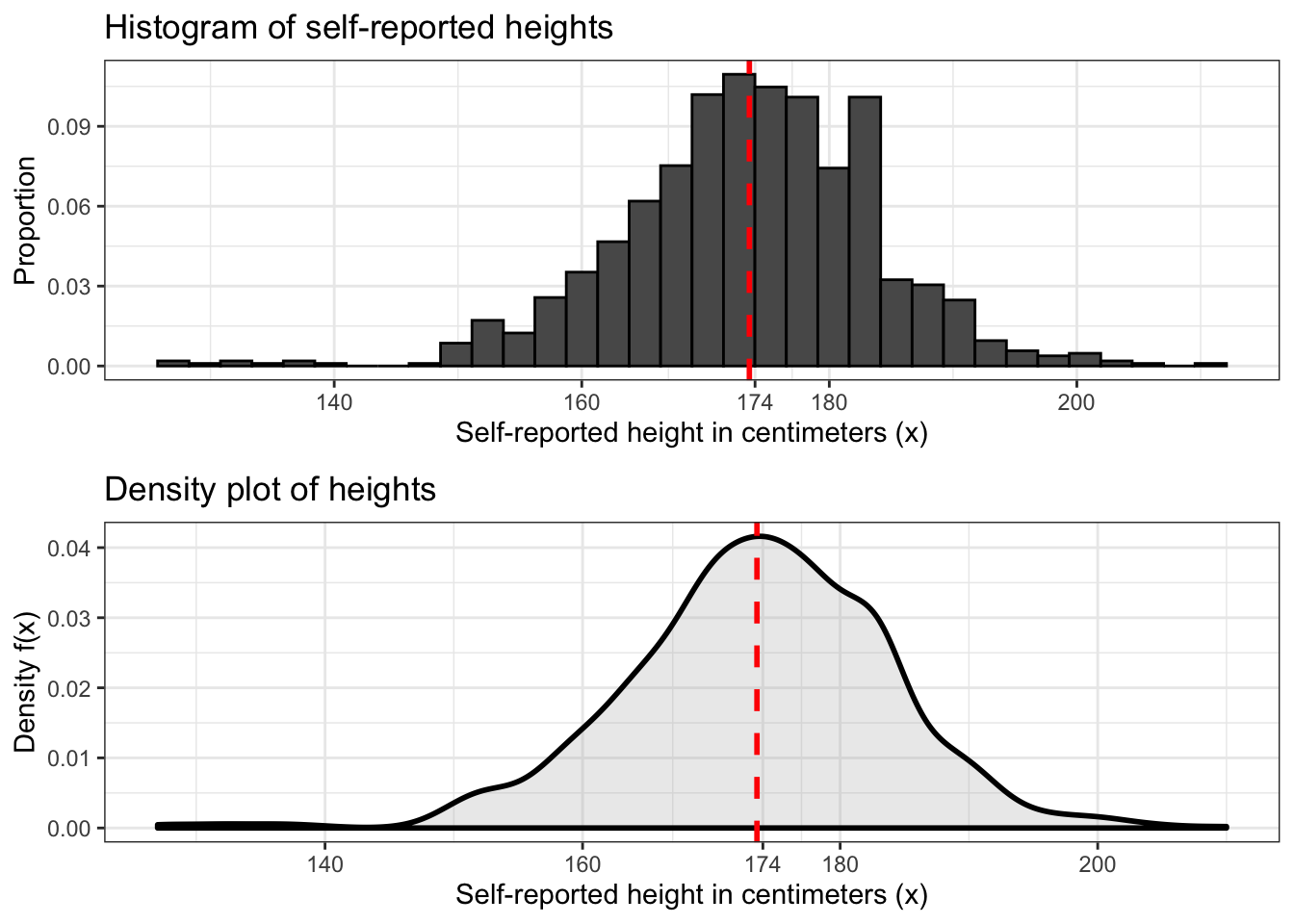
The last two distributions we worked with were the binomial and Poisson distributions, which are discrete distributions. To plot these distributions we used histograms. This type of plot is most suitable for discrete data because the bins divide it into discrete groups.
We can also use histograms with continuous data. Above is a histogram of our height data with a vertical dashed line marking the average.
Another type of plot that we can use to represent continuous data is the density plot. This plot is more suitable for continuous data because it’s basically a histogram with a bin size of zero. An example is shown above under the traditional histogram.
Now let’s do something a little more interesting. Let’s make density plots for male and female heights and plot them on top of each other to see which sex in this dataset tends to be taller. You can probably already guess which group, but we need to show this visually.
male_heights <- heights %>% filter(sex == 'Male')
female_heights <- heights %>% filter(sex == 'Female')

heights %>% ggplot() +
  geom_density(aes(height,
                   color = sex,
                   fill = sex),
               size = 1,
               alpha = 0.3) +
  geom_vline(xintercept = mean(male_heights$height),
             linetype = 'dashed',
             color = 'turquoise',
             size = 1) +
  geom_vline(xintercept = mean(female_heights$height),
             linetype = 'dashed',
             color = 'salmon',
             size = 1) +
  labs(x = 'Self-reported height in centimeters (x)',
       y = 'Density f(x)',
       title = 'Distributions of male and female heights') +
  theme_bw()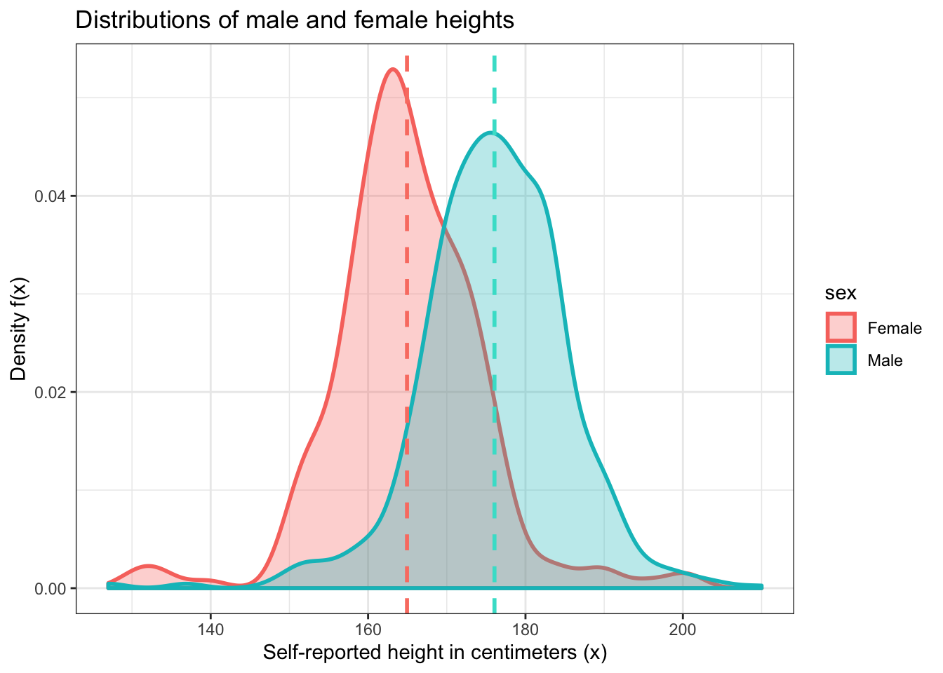
Now let’s try to use this information to answer a somewhat interesting question. What is the probability that a randomly selected woman in this dataset will have a height that is greater than the average male height in this dataset?
Before we try to calculate this probability, let’s make sure we understand what we’re trying to accomplish.
First, we need to know that we’re trying to calculate a right tail probability. The lower bound of this probability is the average height of males in this dataset. This is about 176 centimeters.
## [1] 176.0595Next, we need to find the proportion of female heights that are greater than this value. This is our answer, but we should also visualize it. This will be pretty complicated because construction of this figure is beyond ggplot2’s basic capabilities. But the goal we are trying to accomplish is a pretty common one, so through a lot of searching and persistence we can figure out how to do it because R is so flexible.
##       pctile
## 1 0.07142857
y <- female_heights$height
cutoff <- quantile(y, 1 - 0.07142857)
hist.y <- density(y, from = min(female_heights$height),
to = max(female_heights$height)) %$% data.frame(x = x, y = y) %>% mutate(area = x >= cutoff)
hist.y %>% ggplot(aes(x = x, ymin = 0, ymax = y, fill = area)) +
geom_ribbon(alpha = 0.3,
show.legend = FALSE) +
geom_line(aes(y = y),
color = 'salmon',
size = 1) +
geom_vline(xintercept = cutoff,
size = 1,
linetype = 'dashed',
color = 'turquoise') +
labs(x = 'Self-reported height in centimeters (x)',
y = 'Density f(x)',
title = 'Self-reported female heights') +
theme_bw()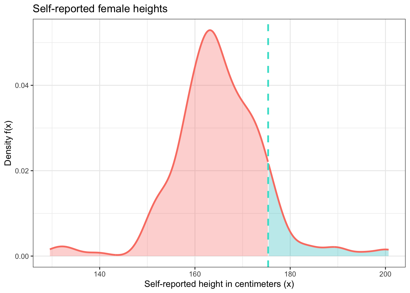
One thing that you may have been thinking throughout this part of the tutorial is that the density plot for female heights looks like the normal distribution. This is actually a reasonable way to think about this. If we draw a normal distribution curve over this density plot, we can see that it fits pretty well. The main reason why it’s not a perfect fit is because the number of observations is relatively small, so there is a lot of random variation. If our sample size was much larger, we would see a much better fit.
The qq plot we see below is even more convincing because of its tightness of fit, although it also reveals that there are some outliers on both ends of the sample distribution. But this is not very surprising given what we already know anecdotally about human heights.
f_dens <- female_heights %>% ggplot() +
  geom_density(aes(height),
               color = 'salmon',
               fill = 'salmon',
               alpha = 0.3,
               size = 1) +
  stat_function(fun = dnorm,
                args = list(mean = mean(female_heights$height),
                            sd = sd(female_heights$height)),
                size = 1) +
  labs(x = 'Self-reported height in centimeters (x)',
       y = 'Density f(x)',
       title = 'Distribution of self-reported female heights') +
  theme_bw()

f_qq <- female_heights %>% ggplot(aes(sample = scale(height))) +
  stat_qq(color = 'salmon',
          alpha = 0.4) +
  stat_qq_line() +
  theme_bw()

ggarrange(f_dens, f_qq, nrow = 2)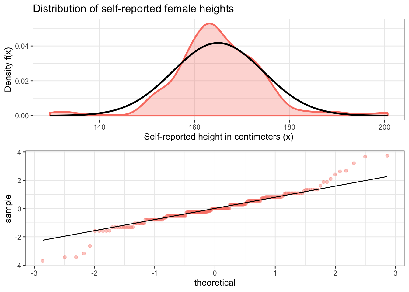
Before we move on to the next example, it’s important to point out an important implication of the above findings: since this data is normally distributed, we can use the normal distribution to estimate theoretical probabilities related to it. We won’t get the same exact probabilities as we get from our data itself. But since female heights are normally distributed, we can make reasonable estimates of probabilities related to female heights using this distribution.
For example, let’s calculate the theoretical probability that a randomly selected woman will have a height greater than the average male height. And let’s continue to use our sample data for the mean and standard deviation of this distribution as well as our estimate for this female height. We’ll compare this to the empirical proportion we calculated earlier.
## [1] 0.1223237## empirical_proportion
## 1 0.07142857f_dens + geom_vline(xintercept = mean(male_heights$height),
size = 1,
linetype = 'dashed',
color = 'turquoise')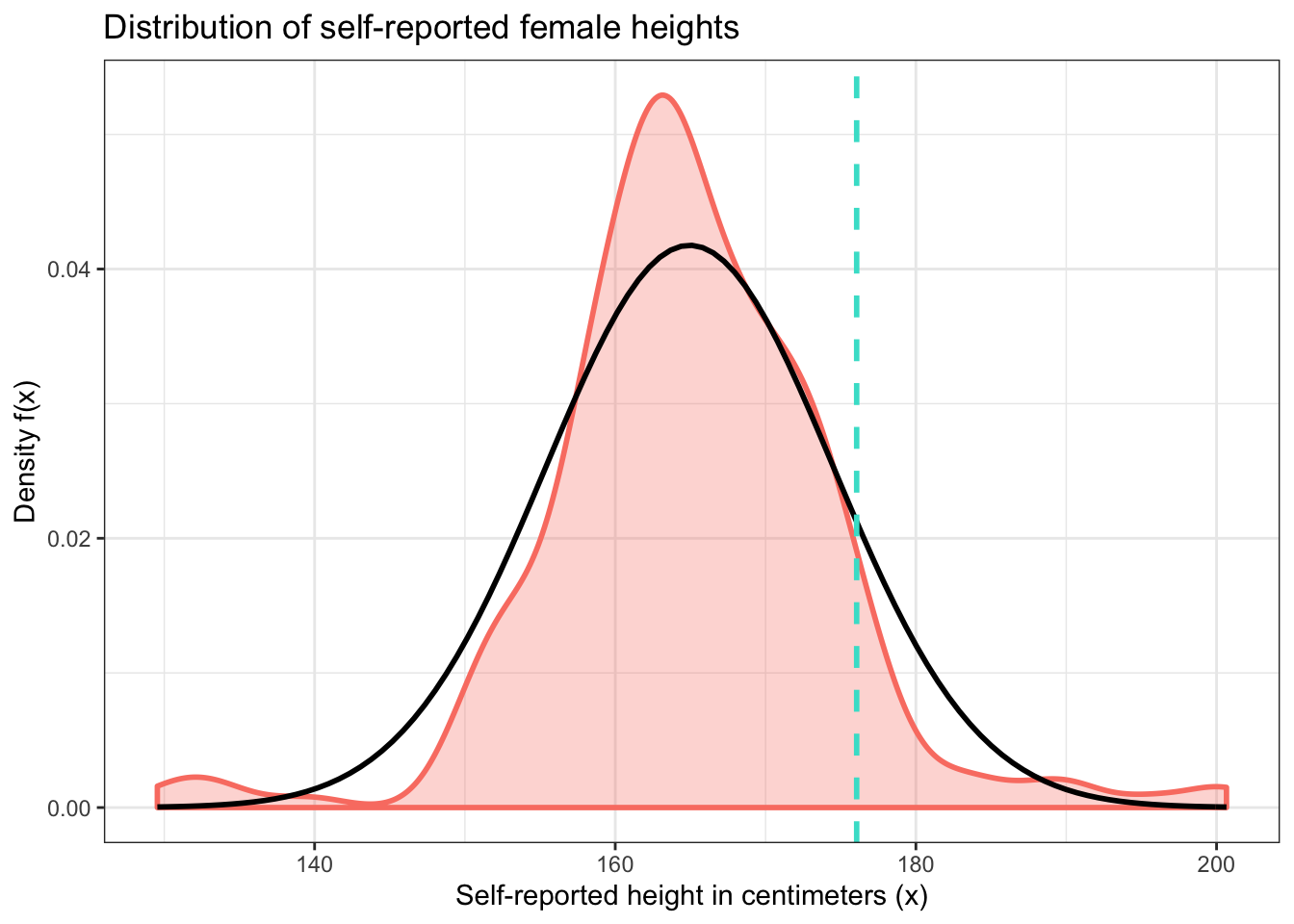
These values are somewhat close, but random variation in the sample keeps them somewhat far apart too. Notice how the areas under the density curves to the right of the dashed line above differ from one another. Should we trust our sample or the normal distribution more? It depends on what question we’re trying to answer. But in general, the normal distribution is more useful because it applies to the entire population of women, and not just those in our sample.
20.0.3 Birth weights of babies
The following question is adapted from Probability with Applications in R by Robert Dobrow.
The birth weights of babies are known to be normally distributed with a mean weight of 120 ounces and a standard deviation of 20 ounces.
A “low birth weight” baby is one that is born in the 5th percentile of this distribution. This is of concern for a variety of reasons, such as the fact that low birth weight babies have lower rates of survival than normal birth weight babies.
Using the information above, we can calculate the threshold for a low birth weight baby. A baby that is born at this weight or lower is considered low birth weight. We can use the qnorm() function to do this. The first argument is the percentile we’re aiming for (in this case the fifth percentile) and the second and third arguments are the mean and standard deviation of the normal distribution curve that we’re considering, in this case 120 and 20 respectively.
## [1] 87.10293baby_data <- data.frame(data = c(-3.5 * 20 + 120, 3.5 * 20 + 120))
baby_data %>% ggplot(aes(data)) +
stat_function(fun = dnorm,
args = list(mean = 120,
sd = 20),
size = 1) +
stat_function(fun = dnorm,
args = list(mean = 120,
sd = 20),
xlim = c(50, qnorm(0.05, 120, 20)),
geom = 'area',
fill = 'red',
alpha = 0.3) +
labs(x = 'Weight of baby at birth (ounces) (x)',
y = 'Density f(x)',
title = 'Distribution of baby birth weights (ounces)') +
theme_bw()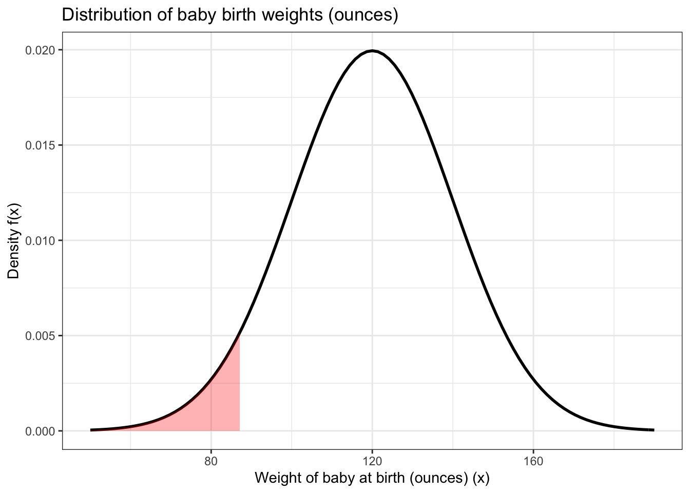
This returns a value of about 87.1 ounces. The shaded area under the curve above represents the population of babies that are of low birth weight.
Another birth weight category is “very low birth weight”, which is a birth weight less than or equal to 52 ounces. In what percentile is this weight threshold?
To answer this question, we can use pnorm(). But we aren’t going to bother plotting the probability because it’s so small.
## [1] 0.0003369293Now let’s use the information we’ve found so far to answer a trickier question: given that a baby is born with low birth weight, what is the probability that this baby has very low birth weight?
This is a conditional probability question. The most transparent and intuitive way to answer this is to save the two relevant probabilities that we need to calculate the conditional one as variables and then use them together in a subsequent step to calculate the answer.
p_low <- pnorm(qnorm(0.05, 120, 20), 120, 20)

p_very_low <- pnorm(52, 120, 20)

p_very_low_given_low <- p_very_low / p_low

p_very_low_given_low
## [1] 0.00673858520.0.4 SAT and ACT scores
The following problem is adapted from Probability with Applications in R by Robert Dobrow.
ACT scores are normally distributed with a mean of 18 and a standard deviation of 6. SAT scores are normally distributed with a mean of 500 and a standard deviation of 100.
Suppose a student named Jill takes the SAT and gets a score of 680. Her classmate Jack plans to take the ACT. What score does Jack need to get so that he does as well as Jill?
This question seems poorly phrased at first. How can we compare SAT and ACT scores if they’re measured on different scales? Since these test scores are normally distributed, all we need to do is standardize the scores for both tests. We can do this using z scores, which is something that you have certainly learned about if you’ve taken a Statistics class before. Z scores for SAT and ACT scores will make these test scores comparable because they’ll be on the same scale. We will then compare them using the standard normal distribution, which has a mean of 0 and a standard deviation of 1.
To calculate z scores, we’re going to create a simple function called z_score() which contains the formula for calculating this value. Its arguments are the variables that we need for this formula. Let’s try it out on Jill’s SAT score of 680.
z_score <- function(x, mean, sd){
  z_score <- (x - mean) / sd
  return(z_score)
}

z_score(680, 500, 100)
## [1] 1.8## [1] 0.9640697This answer tells us that Jill’s score is 1.8 standard deviations above the average for the SAT. This corresponds to a score that is in about the 96th percentile, meaning she did better than about 96% of students who took this test. Below are standardized and non-standardized visualizations of this result.
jill_scaled <- data.frame(x = c(-3.5, 3.5)) %>% ggplot(aes(x)) +
  stat_function(fun = dnorm,
                n = 1000,
                args = list(mean = 0,
                            sd = 1),
                size = 1) +
  geom_area(stat = 'function',
            fun = dnorm,
            fill = 'blue',
            xlim = c(-3.5, 1.8),
            alpha = 0.3) +
  theme_bw() +
  labs(x = 'Score',
    y = 'Density f(x)',
       title = 'Standardized distribution \nof SAT scores N(0, 1)',
       subtitle = 'Approximate 96th percentile') +
  scale_x_continuous(breaks = c(-3, -2, -1, 0, 1, 1.8, 3))

jill_not_scaled <- data.frame(x = c(-3.5 * 100 + 500, 3.5 * 100 + 500)) %>% ggplot(aes(x)) +
  stat_function(fun = dnorm,
                n = 1000,
                args = list(mean = 500,
                            sd = 100),
                size = 1) +
  stat_function(fun = dnorm,
            fill = 'blue',
            args = list(500, 100),
            xlim = c(-3.5 * 100 + 500, 1.8 * 100 + 500),
            alpha = 0.3,
            geom = 'area') +
  theme_bw() +
  labs(y = 'Density f(x)',
       title = 'Distribution \nof SAT scores N(500, 100)',
       subtitle = 'Approximate 96th percentile') +
  scale_x_continuous(breaks = c(200, 400, 600, 680, 800))

ggarrange(jill_scaled, jill_not_scaled)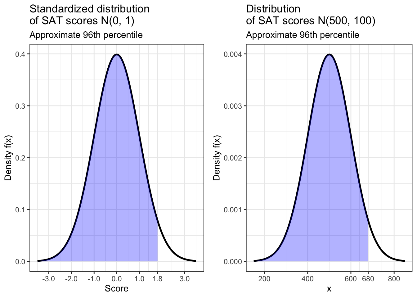
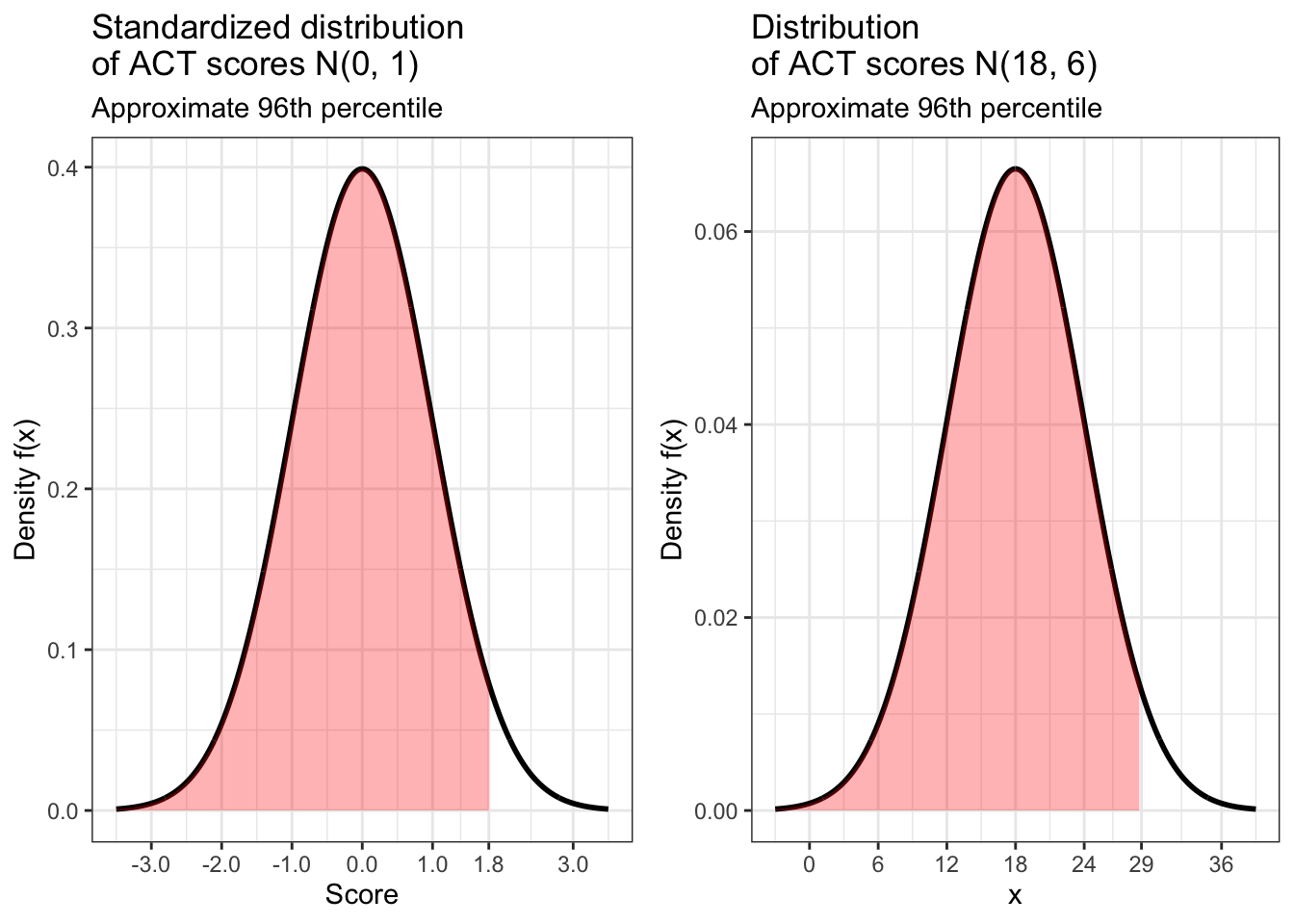
In order for Jack to do equally well on the ACT, he needs to score in the same percentile for that test. What score does this correspond to for this test? Once again we turn to qnorm() for this calculation.
## [1] 28.8According to our calculation, in order for Jack to do as well on the ACT as Jill did on the SAT, he would need to get a score of 28.8. But this should probably be rounded up to 29 because the ACT only gives scores that are whole numbers. Below is are standardized and non-standardized visualizations of our results.
jack_scaled <- data.frame(x = c(-3.5, 3.5)) %>% ggplot(aes(x)) +
  stat_function(fun = dnorm,
                n = 1000,
                args = list(mean = 0,
                            sd = 1),
                size = 1) +
  geom_area(stat = 'function',
            fun = dnorm,
            fill = 'red',
            xlim = c(-3.5, 1.8),
            alpha = 0.3) +
  theme_bw() +
  labs(x = 'Score',
    y = 'Density f(x)',
       title = 'Standardized distribution \nof ACT scores N(0, 1)',
       subtitle = 'Approximate 96th percentile') +
  scale_x_continuous(breaks = c(-3, -2, -1, 0, 1, 1.8, 3))

jack_not_scaled <- data.frame(x = c(-3.5 * 6 + 18, 3.5 * 6 + 18)) %>% ggplot(aes(x)) +
  stat_function(fun = dnorm,
                n = 1000,
                args = list(mean = 18,
                            sd = 6),
                size = 1) +
  stat_function(fun = dnorm,
            fill = 'red',
            args = list(18, 6),
            xlim = c(-3.5 * 6 + 18, 1.8 * 6 + 18),
            alpha = 0.3,
            geom = 'area') +
  theme_bw() +
  labs(y = 'Density f(x)',
       title = 'Distribution \nof ACT scores N(18, 6)',
       subtitle = 'Approximate 96th percentile') +
  scale_x_continuous(breaks = c(0, 6, 12, 18, 24, 29, 36))

ggarrange(jack_scaled, jack_not_scaled)