7 Tutorial 1 - Exploratory Data Analysis
This tutorial is based on data from a survey of randomly seleced students conducted in a Statistics course at the University of California, Berkeley in 1994.
The original data, along with more detailed information about what each variable in the dataset represents, can be found at the link below. More background information about the data will be included in the lab assignment.
https://www.stat.berkeley.edu/users/statlabs/labs.html
7.0.0.1 Our survey data at a glance
The data for this tutorial was downloaded from the above website and imported by me into RStudio using the “Import Dataset” button in the top right window of the program. We will learn about loading data directly from the web later.
In addition, for the sake of simplicity I have “cleaned” this data myself before writing this tutorial. There will be another tutorial later about how exactly I did this.
On with the show!
The first thing we need to do with our data is have a look at its structure. The str() function is great for this. Lets see what it does!
## 'data.frame':    91 obs. of  15 variables:
##  $ time : num  2 0 0 0.5 0 0 0 0 2 0 ...
##  $ like : Factor w/ 6 levels "Never played",..: 5 5 5 5 5 5 4 5 5 5 ...
##  $ where: Factor w/ 7 levels "Arcade","Arcade and home (both console and computer)",..: 7 7 1 7 7 5 7 7 5 7 ...
##  $ freq : Factor w/ 5 levels "Daily","Weekly",..: 2 3 3 3 4 4 4 4 1 4 ...
##  $ busy : Factor w/ 3 levels "No","Yes","No response": 1 1 1 1 1 1 1 1 3 1 ...
##  $ educ : Factor w/ 3 levels "No","No response",..: 3 1 1 3 3 1 1 1 3 3 ...
##  $ sex  : Factor w/ 2 levels "Female","Male": 1 1 2 1 1 2 2 1 2 2 ...
##  $ age  : int  19 18 19 19 19 19 20 19 19 19 ...
##  $ home : Factor w/ 2 levels "No","Yes": 2 2 2 2 2 1 2 2 1 2 ...
##  $ math : Factor w/ 3 levels "No","No response",..: 1 3 1 1 3 1 3 1 1 3 ...
##  $ work : int  10 0 0 0 0 12 10 13 0 0 ...
##  $ own  : Factor w/ 2 levels "No","Yes": 2 2 2 2 1 1 2 1 1 2 ...
##  $ cdrom: Factor w/ 3 levels "No","No response",..: 1 3 1 1 1 1 1 1 1 1 ...
##  $ email: Factor w/ 2 levels "No","Yes": 2 2 2 2 2 1 2 2 1 2 ...
##  $ grade: Factor w/ 3 levels "A","B","C": 3 1 2 2 2 2 2 2 3 3 ...
The output above tells us a lot about our data. Thanks to str() we now know that our data consists of 91 observations of 15 variables, and that the variables are a combination of factors, numerics and integers.
Some of the information about certain variables was too big to fit into this brief summary though. For instance, like is a factor variable with six levels, but the summary above only prints one of these levels. Using the levels() function on video$like, we can print all of the levels of this variable.
## [1] "Never played" "No response"  "Not at all"   "Not really"
## [5] "Somewhat"     "Very much"
R has more functions for summarizing data that you may find more useful depending on the situation. One is names(), which simply lists the names of all of the variables in a data frame. This is useful if you’re having trouble remembering the exact name of a variable.
##  [1] "time"  "like"  "where" "freq"  "busy"  "educ"  "sex"   "age"
##  [9] "home"  "math"  "work"  "own"   "cdrom" "email" "grade"
Another is summary(), which numerically summarizes all of the variables passed to it.
##       time                  like
##  Min.   : 0.000   Never played: 1
##  1st Qu.: 0.000   No response : 1
##  Median : 0.000   Not at all  : 7
##  Mean   : 1.243   Not really  :13
##  3rd Qu.: 1.250   Somewhat    :46
##  Max.   :30.000   Very much   :23
##
##                                          where             freq
##  Arcade                                     : 7   Daily      : 9
##  Arcade and home (both console and computer): 1   Weekly     :28
##  Arcade and Home(console or computer)       : 5   Monthly    :18
##  Computer and console                       :14   Semesterly :23
##  Console                                    :15   No response:13
##  No response                                :18
##  Personal computer                          :31
##           busy             educ        sex          age         home
##  No         :63   No         :41   Female:38   Min.   :18.00   No :22
##  Yes        :11   No response:13   Male  :53   1st Qu.:19.00   Yes:69
##  No response:17   Yes        :37               Median :19.00
##                                                Mean   :19.52
##                                                3rd Qu.:20.00
##                                                Max.   :33.00
##
##           math         work        own             cdrom    email
##  No         :61   Min.   : 0.00   No :24   No         :71   No :19
##  No response: 1   1st Qu.: 0.00   Yes:67   No response: 5   Yes:72
##  Yes        :29   Median : 5.00            Yes        :15
##                   Mean   :10.37
##                   3rd Qu.:14.50
##                   Max.   :99.00
##
##  grade
##  A: 8
##  B:52
##  C:31
##
##
##
##
Notice that the above output contains two types of summaries. For numeric information summary() returns the mean, median, maximum value, minimum value and the first and third quartiles. For factor variables, this function returns the frequencies for each level of the factor.
A word of caution about using summary() with datasets that consist of many variables: unless directed to do otherwise, summary() will summarize all of the variables in a given dataframe and far more information than you likely need will be printed.
To focus only on certain variables which interest you, you can also pass variables to summary() individually by using the $ operator.
For example, we saw in our initial summary of our data that some of the factor variables contained a level called No response. Let us focus on the like variable for now.
## Never played  No response   Not at all   Not really     Somewhat
##            1            1            7           13           46
##    Very much
##           23
One person did not respond to the question and another answered that they had never played video games on any platform before. Keep these findings in mind because we will be returning to them later.
7.0.0.2 Visualizing our data
Sometimes visual summaries of data can tell us more than text summaries. Below is a basic bar plot using the ggplot2 package from tidyverse which shows the frequencies of each response to the question which corresponds to the like variable.
video %>% ggplot() +
  geom_bar(aes(like), color = 'black') +
  theme_bw() +
  labs(y = 'Frequency of response',
       title = 'Do you like to play video games?') +
  theme(axis.text.x = element_text(angle = 45,
                                   hjust = 1),
        axis.title.x = element_blank())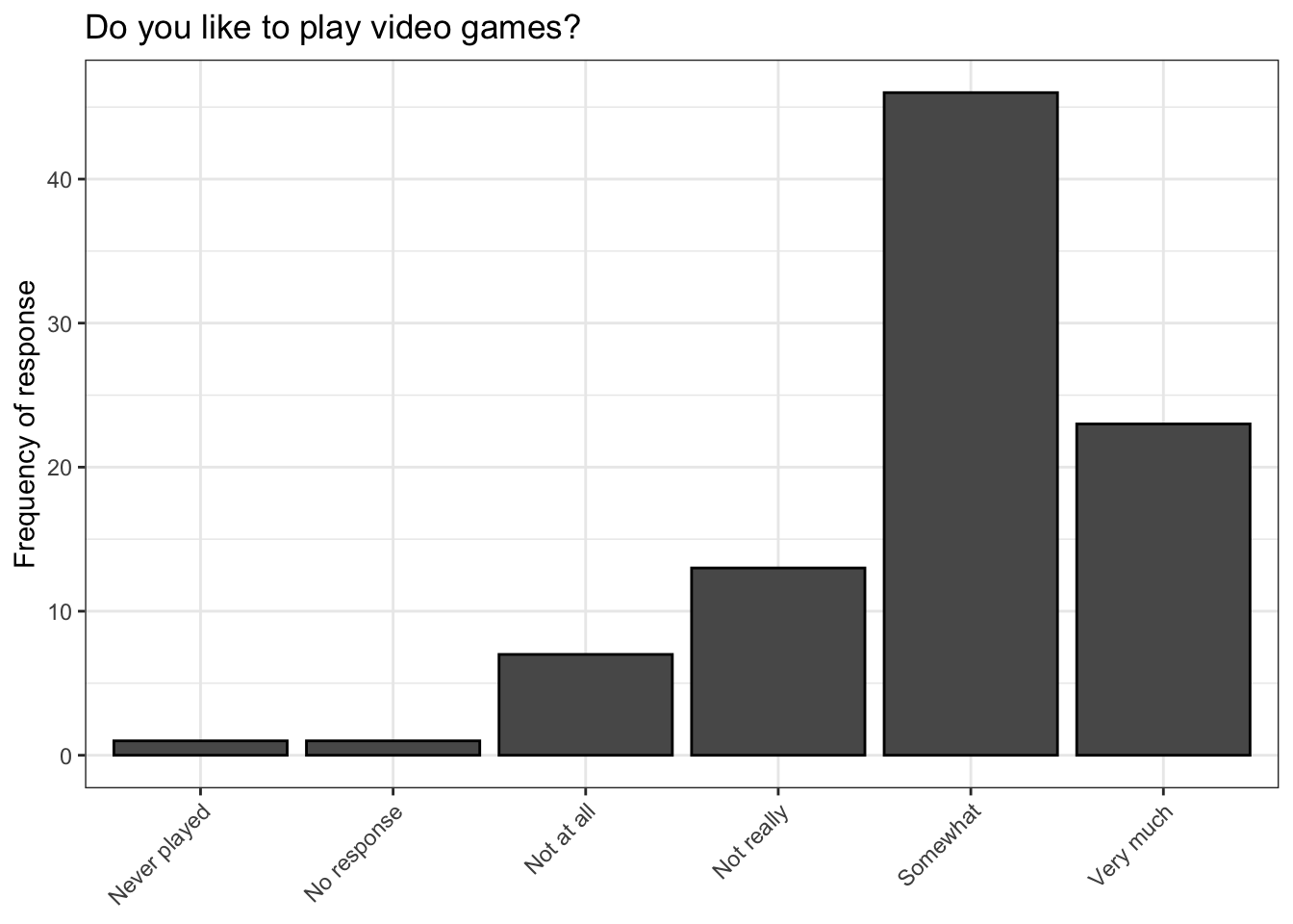
The above plot looks nice, but it does not tell us anything that summary() cannot tell us about like.
Lets attempt to answer a more interesting question using the bar plot: How do responses to this question differ between men and women?
video %>% ggplot() +
  geom_bar(aes(like, fill = sex),
           color = 'black') +
  theme_bw() +
  labs(y = 'Proportion',
       x = '',
       title = 'Do you like to play video games?',
       fill = 'Sex of respondent') +
  theme(axis.text.x = element_text(angle = 45,
                                   hjust = 1))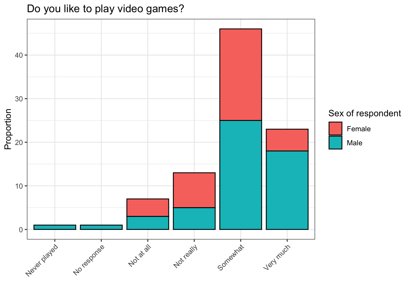
The plot above looks similar to our first plot, but it’s more colorful because the bars are broken into pieces whose sizes depend on the number of males and females who responded in certain ways to the question which corresponds to like. We did this by setting the fill argument inside of geom_bar(aes()) equal to the variable sex. (geom_bar(aes(fill = sex)))
Still, it is somewhat hard to read. How can this plot be improved?
video %>% ggplot() +
  geom_bar(aes(like, fill = sex),
           color = 'black',
           position = 'fill') +
  theme_bw() +
  labs(y = 'Proportion',
       x = '',
       title = 'Do you like to play video games?',
       fill = 'Sex of respondent') +
  theme(axis.text.x = element_text(angle = 45,
                                   hjust = 1))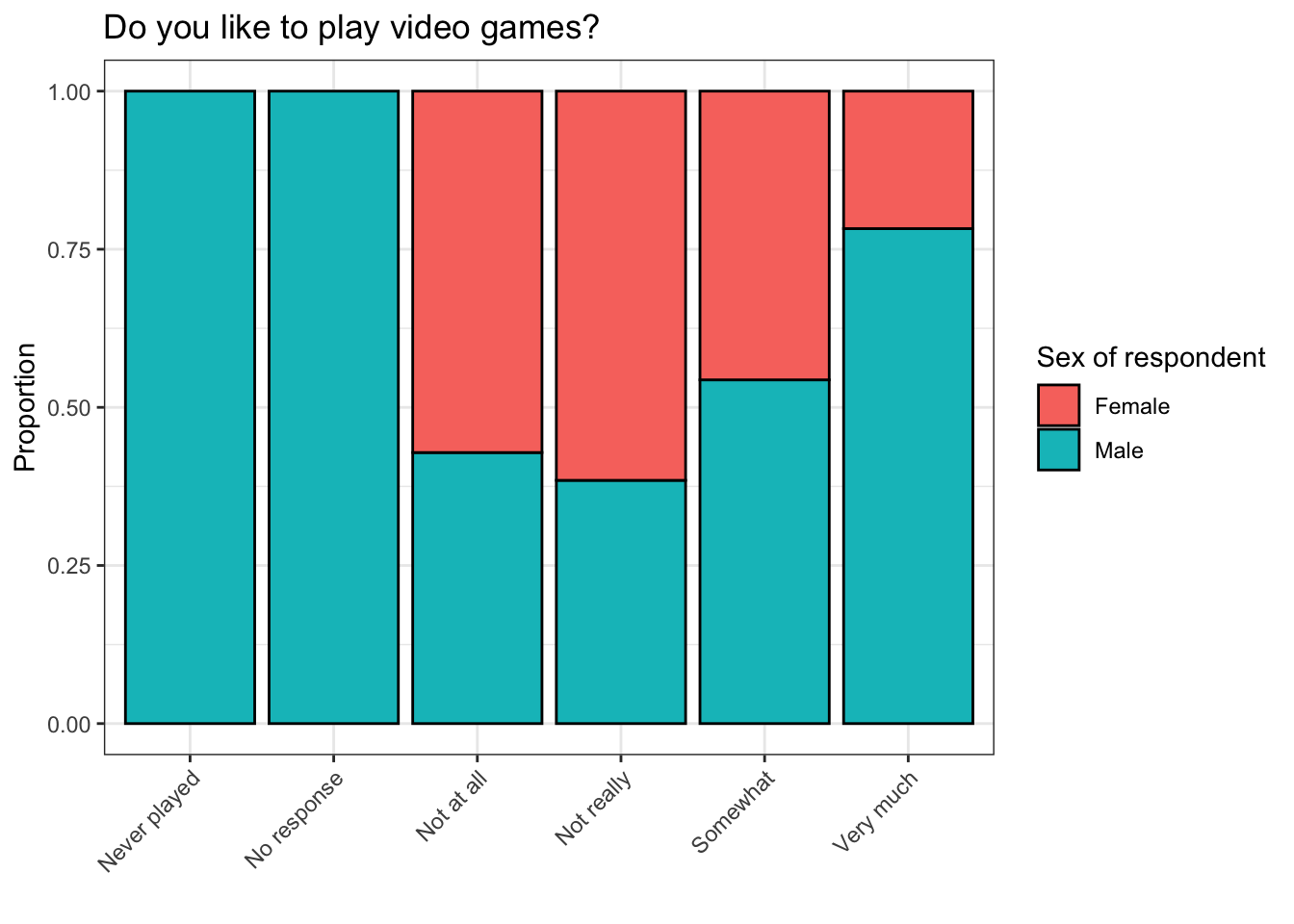
The plot above is called a stacked bar plot. Instead of plotting the frequency at which males and females responded to a certain question in a certain way, it shows what proportion of each response was given by males and females. I.e., approximately 75% of respondents who said they like to play video games very much were male, and about 25% were female.
This plot is much better than the one we started with, but it can still be improved.
## Never played  No response   Not at all   Not really     Somewhat
##            1            1            7           13           46
##    Very much
##           23
Recall that there were two observations in which the level for like was Never played and No response. These are not very interesting observations because one respondent probably has no opinion about playing video games and the opinion of the other respondent is unknowable. The presence of these observations in our stacked bar plot is also somewhat misleading.
How can we remove these levels from our plot? The filter() function from dplyr, part of the tidyverse, will be useful here.
video %>% filter(like != c('No response', 'Never played')) %>% ggplot() +
  geom_bar(aes(like, fill = sex),
           color = 'black',
           position = 'fill') +
  theme_bw() +
  labs(y = 'Proportion',
       title = 'Do you like to play video games?',
       fill = 'Sex of respondent') +
  theme(axis.text.x = element_text(angle = 45,
                                   hjust = 1),
        axis.title.x = element_blank())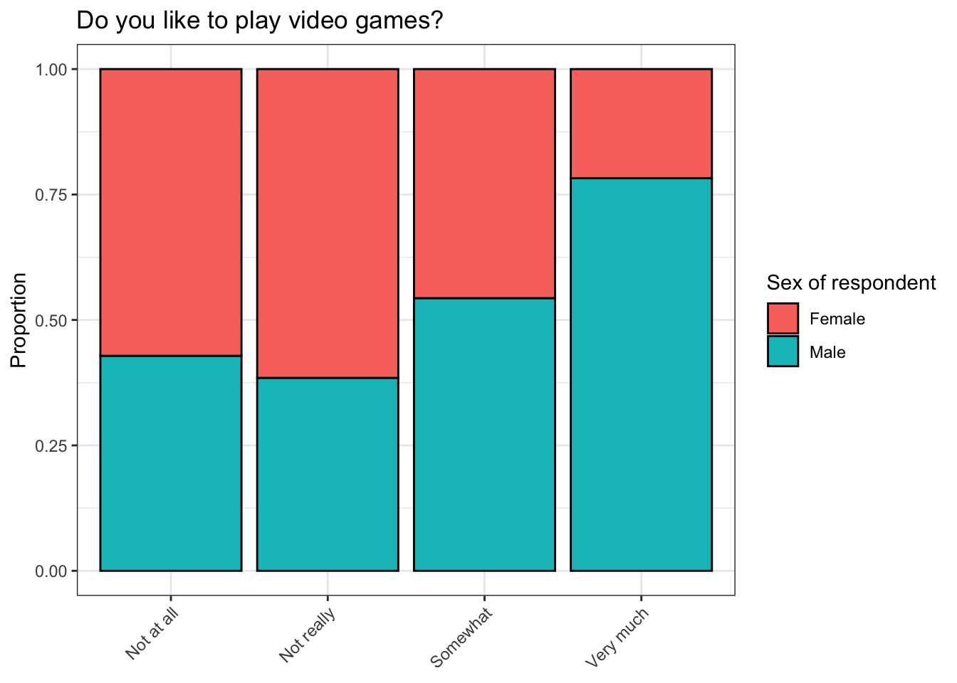
Notice that we were able to filter out multiple levels for the factor variable like that we did not want in our plot by putting them into a vector. It is possible to do the same with levels that you do want by using = instead of !=, but we chose to do the latter here because this allowed us to create a significantly shorter filtering vector.
Now our plot is a lot more informative. One conclusion that we can immediately draw about the respondents in this survey is that males were more likely than females to give a positive answer to the question corresponding to like, and negative answers to this question were more common among females. In addition, our visual summary looks great!
7.0.0.3 Summarizing data using table() and prop.table()
We can also summarize the above information in text using the table() and prop.table() functions.
##
##          Never played No response Not at all Not really Somewhat Very much
##   Female            0           0          4          8       21         5
##   Male              1           1          3          5       25        18
When used by itself on a factor variable, table() returns the frequencies at which each level of this variable occurs in a given dataset. Sometimes this will be what you want to do, but sometimes it will not be enough.
##
##          Never played No response Not at all Not really   Somewhat
##   Female   0.00000000  0.00000000 0.04395604 0.08791209 0.23076923
##   Male     0.01098901  0.01098901 0.03296703 0.05494505 0.27472527
##
##           Very much
##   Female 0.05494505
##   Male   0.19780220
In order to turn this information into a proportion table, you have to wrap it in the prop.table() function. By default, prop.table() calculates the proportion of responses for each combination of the given variables for all total observations. E.g., about 27.5% of respondents in this survey were males who “somewhat” like to play video games.
##
##          Never played No response Not at all Not really  Somewhat
##   Female    0.0000000   0.0000000  0.5714286  0.6153846 0.4565217
##   Male      1.0000000   1.0000000  0.4285714  0.3846154 0.5434783
##
##          Very much
##   Female 0.2173913
##   Male   0.7826087
By setting the value of the margin argument to 2, this directs the function to calculate the proportions by adding down the columns. This is the type of proportion table that best corresponds to the stacked bar plot we made above. E.g., approximately 54% of respondents in this survey who “somewhat” like to play video games are males.
##
##          Never played No response Not at all Not really   Somewhat
##   Female   0.00000000  0.00000000 0.10526316 0.21052632 0.55263158
##   Male     0.01886792  0.01886792 0.05660377 0.09433962 0.47169811
##
##           Very much
##   Female 0.13157895
##   Male   0.33962264
prop.table() has additional functionality. If you set margin equal to 1, it will add across the rows to calculate the proportions instead. E.g., about 47% of males who responded to this survey were ones who “somewhat” like to play video games.
7.0.0.4 One more tool for transforming/summarizing data: cut()
Recall that in our dataset there is a variable called work, which according to the website from which we got this data, contains information about “[h]ours worked for pay in the week prior to survey”.
##    Min. 1st Qu.  Median    Mean 3rd Qu.    Max.
##    0.00    0.00    5.00   10.37   14.50   99.00
The above summary is a bit suspicious. Are there actually respondents in this survey who work 99 hours a week?
The answer to this question is most likely no. The reason why some of the responses were coded as 99 is because one of the common ways of representing missing data regardless of which software or programming language was used to create it is to code it in this way. I.e., observations with a value of 99 for the work variable did not work 99 hours per week. Rather, they simply did not answer this question. More information about common conventions for missing data is available in the link below, though this link focuses on SPSS and not R.
https://www.ibm.com/support/knowledgecenter/en/SS3RA7_17.0.0/clementine/missing_values_overview.html
Missing data in R is usually represented as NA and R has lots of functions for dealing with it. More information about missing data in R specifically is available at the links below.
https://datascienceplus.com/missing-values-in-r/
https://www.r-bloggers.com/data-types-part-4-logical-class/
Now that we have established that there were almost certainly no observations in this survey for which 99 actually means “worked for 99 paid hours in the week prior to the survey”, what can we do about it? We will return to this question later, so please keep it in mind.
First, lets have a look at our data using a histogram.
video %>% ggplot() +
  geom_histogram(aes(work),
                 color = 'black') +
  theme_bw() +
  labs(x = 'Paid hours worked in week prior to survey',
       y = 'Frequency of response',
       title = 'Respondent work habits')
## `stat_bin()` using `bins = 30`. Pick better value with `binwidth`.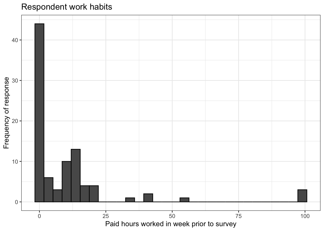
The plot above is a good start, but it has some problems. It’s a bit hard to read, for one thing. And do we really need so many bins? There are two arguments in geom_histogram() that we can try manipulating to try to improve our plot: bins, which controls the number of bins into which our data is divided, and binwidth, which controls the width of the bins in the histogram.
plot1 <- video %>% ggplot() +
  geom_histogram(aes(work),
                 color = 'black',
                 fill = 'red',
                 binwidth = 10) +
  theme_bw() +
  labs(x = 'Paid hours worked in week prior to survey',
       y = 'Frequency of response',
       title = 'Respondent work habits')

plot2 <- video %>% ggplot() +
  geom_histogram(aes(work),
                 color = 'black',
                 fill = 'blue',
                 bins = 10) +
  theme_bw() +
  labs(x = 'Paid hours worked in week prior to survey',
       y = 'Frequency of response',
       title = 'Respondent work habits')

ggarrange(plot1, plot2)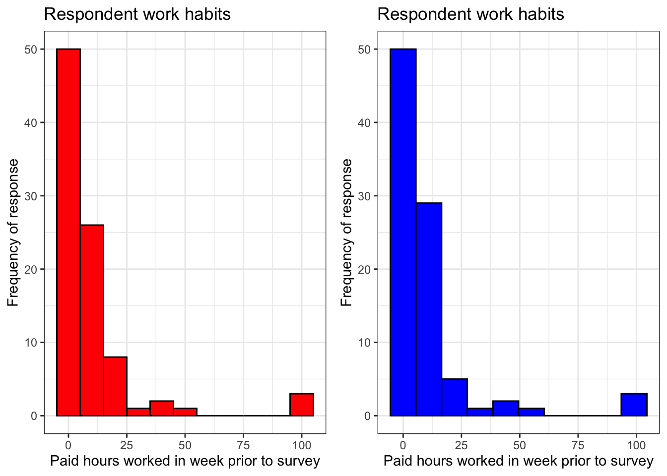
The red histogram on the left has a binwidth value of 10 and the blue histogram on the left has a bins value of 10. If you look very closely, you will notice that these histograms are not identical. 10 bars would fit in the left plot and 9 bars would fit in the right plot, although it is somewhat hard to tell because we lack values for work that would fit into some of the bars in both plots.
These plots are a bit more informative than our first histogram for this variable because the values for work are binned in a more intuitive way than before. This variable contains information about respondents’ weekly work schedules, and by dividing responses into groups of size 0-10 hours, 10-20 hours, etc., we can see more quickly how many students work very little or not at all, how many work part-time, how many work full time and how many manage to work overtime while taking this class.
However, do either of these plots actually tell us these things unambiguously? Look at the labels on the x axis. The answer is clearly no. So what do we do now?
The main problem with our histograms so far is the data they represent is not clearly divided in any rational way. A moment ago we decided that dividing values of work into groups of 10 would be a good way to bin the data, but we were unable to do this using arguments in geom_histogram(), so we need to create custom bins for this variable. To do this, we will use the cut() function.
cut() has two required arguments. The first is the variable that is to be binned, in this case video$work. The second is breaks, whose value must be a vector which contains the numeric boundaries of the bins you want to create.
work has a minimum value of 0 and a maximum value of 99, so we should make 10 bins into which all of this data can fit. This means we need a sequence of numbers that goes from 0 to 100 in increments of 10. The fastest way to do this is using the function seq().
## [1] 0 10 20 30 40 50 60 70 80 90 100The first and second arguments of seq() are the starting and ending values of the sequence of numbers to be created. By default, the sequence will be divided into units of 1. To change the size of this increment, use the third argument. Above we see an example of this: a sequence of numbers from 0 to 100 with an increment size of 10. We will save this as breaks because we need to use it together with cut().
Now we will divide our values for video$work into groups of size 10.
##  [1] (0,10]   <NA>     <NA>     <NA>     <NA>     (10,20]  (0,10]
##  [8] (10,20]  <NA>     <NA>     <NA>     <NA>     <NA>     <NA>
## [15] (10,20]  <NA>     (0,10]   <NA>     <NA>     (0,10]   (10,20]
## [22] (0,10]   <NA>     <NA>     <NA>     <NA>     <NA>     (0,10]
## [29] <NA>     <NA>     <NA>     (90,100] <NA>     (0,10]   (10,20]
## [36] (0,10]   <NA>     <NA>     <NA>     (10,20]  (0,10]   <NA>
## [43] (0,10]   (90,100] (90,100] (10,20]  <NA>     <NA>     (10,20]
## [50] <NA>     <NA>     <NA>     (10,20]  (0,10]   (10,20]  (0,10]
## [57] <NA>     (0,10]   <NA>     <NA>     <NA>     (10,20]  <NA>
## [64] (10,20]  (30,40]  (10,20]  <NA>     (10,20]  (0,10]   <NA>
## [71] <NA>     (0,10]   (10,20]  <NA>     (30,40]  <NA>     (10,20]
## [78] (10,20]  (50,60]  (0,10]   <NA>     (0,10]   (10,20]  (10,20]
## [85] (10,20]  <NA>     <NA>     (10,20]  (30,40]  (0,10]   (0,10]
## 10 Levels: (0,10] (10,20] (20,30] (30,40] (40,50] (50,60] ... (90,100]
It looks like something went wrong. Some of our data has gotten binned, but most of the data cut() has returned is missing. Could this be because we are missing lots of values for video$work?
##  [1] 10  0  0  0  0 12 10 13  0  0  0  0  0  0 14  0  2  0  0  9 15 10  0
## [24]  0  0  0  0 10  0  0  0 99  0 10 12  5  0  0  0 20  5  0 10 99 99 15
## [47]  0  0 15  0  0  0 16  7 15  5  0  6  0  0  0 18  0 20 35 19  0 20  8
## [70]  0  0 10 16  0 40  0 15 16 55 10  0 10 15 15 15  0  0 14 40  5  5
It looks like we have numeric values for video$work every observation in our dataset. If you compare this printout with the one we have for our first use of cut() above, you’ll notice that cut() is having trouble dealing with observations for which the value of work is 0. To fix this, we need to use one of the optional arguments for cut(), include.lowest.
##  [1] [0,10]   [0,10]   [0,10]   [0,10]   [0,10]   (10,20]  [0,10]
##  [8] (10,20]  [0,10]   [0,10]   [0,10]   [0,10]   [0,10]   [0,10]
## [15] (10,20]  [0,10]   [0,10]   [0,10]   [0,10]   [0,10]   (10,20]
## [22] [0,10]   [0,10]   [0,10]   [0,10]   [0,10]   [0,10]   [0,10]
## [29] [0,10]   [0,10]   [0,10]   (90,100] [0,10]   [0,10]   (10,20]
## [36] [0,10]   [0,10]   [0,10]   [0,10]   (10,20]  [0,10]   [0,10]
## [43] [0,10]   (90,100] (90,100] (10,20]  [0,10]   [0,10]   (10,20]
## [50] [0,10]   [0,10]   [0,10]   (10,20]  [0,10]   (10,20]  [0,10]
## [57] [0,10]   [0,10]   [0,10]   [0,10]   [0,10]   (10,20]  [0,10]
## [64] (10,20]  (30,40]  (10,20]  [0,10]   (10,20]  [0,10]   [0,10]
## [71] [0,10]   [0,10]   (10,20]  [0,10]   (30,40]  [0,10]   (10,20]
## [78] (10,20]  (50,60]  [0,10]   [0,10]   [0,10]   (10,20]  (10,20]
## [85] (10,20]  [0,10]   [0,10]   (10,20]  (30,40]  [0,10]   [0,10]
## 10 Levels: [0,10] (10,20] (20,30] (30,40] (40,50] (50,60] ... (90,100]By setting include.lowest = TRUE, we told cut() to include the lowest value for work in its classification process. It did not do that before. Notice that values for work that are 0 have been classified as [0,10]. This [ symbol indicates that 0 is included in this interval. It means the same thing that you learned about square brackets for representing sequences of numbers in math class long ago. (( also means the same thing you learned about for round brackets whenn they’re used to represent sequences of numbers.)
We will save the above result from cut() as video$work_binned so that we can use it in a histogram.
video %>% ggplot() +
  geom_histogram(aes(work_binned),
                 stat = 'count',
                 bins = breaks,
                 color = 'black') +
  scale_x_discrete(drop = FALSE) +
  labs(y = 'Frequency',
       title = 'Paid hours worked by respondents in week prior to survey') +
  theme_bw() +
  theme(axis.text.x = element_text(angle = 45,
                                   hjust = 1),
        axis.title.x = element_blank())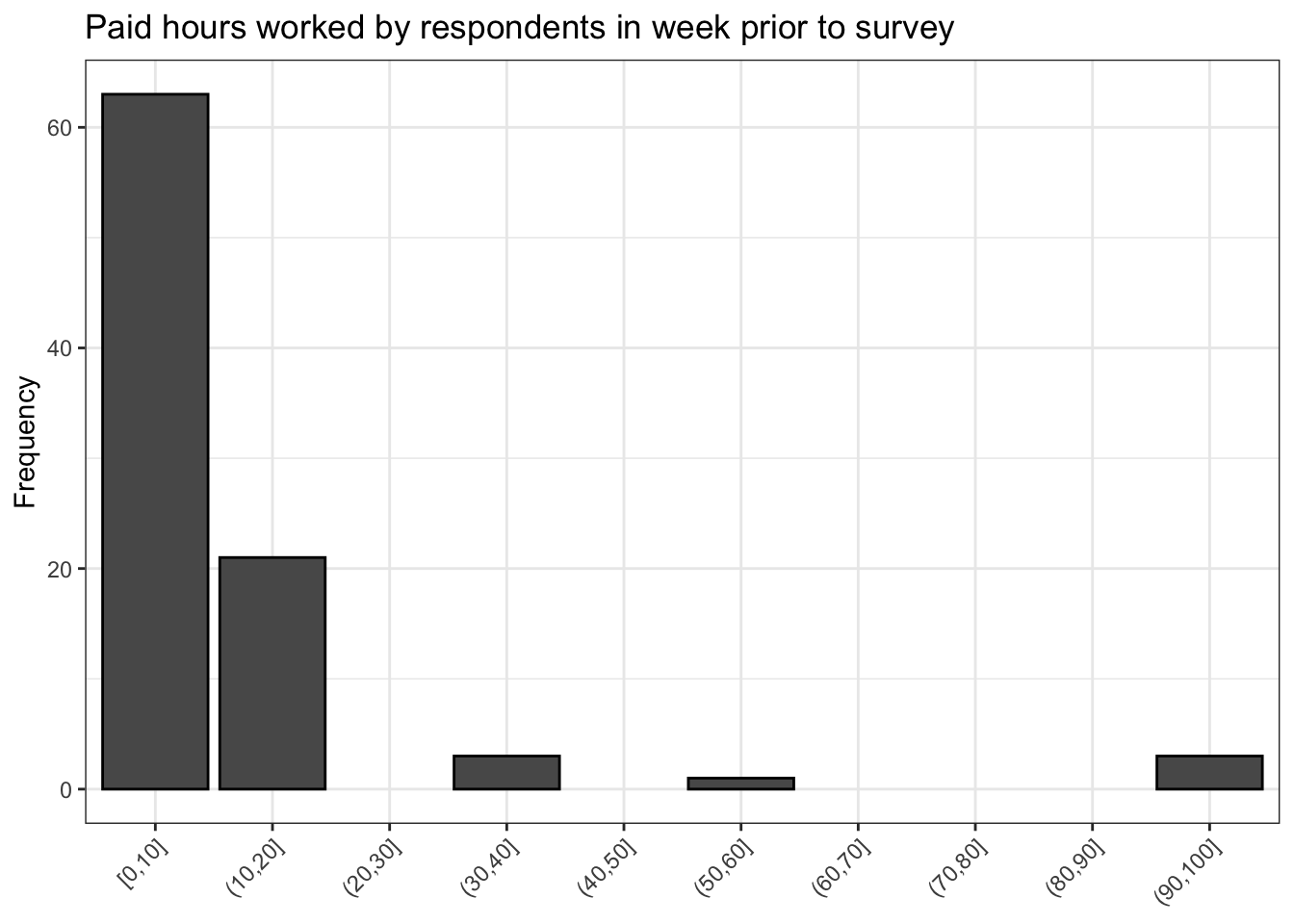
The above histogram looks great. Now we have 10 clearly labelled bins. However, there are still a couple of problems: one of the bins is clearly mislabled.
Recall that a value of 99 for work actually means the respondent did not answer this question in this survey. The reason why we have not dealt directly with this yet is because work is a numeric variable, so changing 99 to a more intuitive value like No response is not possible because No response is a string, not a numeric, and columns of dataframes can only store one kind of data. In other words, video$work cannot contain both numeric and string data. It can only contain one kind or the other.
## [1] "factor"## [1] "[0,10]" "(10,20]" "(20,30]" "(30,40]" "(40,50]" "(50,60]"
## [7] "(60,70]" "(70,80]" "(80,90]" "(90,100]"## chr [1:10] "[0,10]" "(10,20]" "(20,30]" "(30,40]" "(40,50]" "(50,60]" ...That is why it is good that we have created the variable work_binned. It is a factor variable, and we can change one of the levels of this variable to No response because all of the levels of this variable are strings. How can we do that?
##  [1] "[0,10]"   "(10,20]"  "(20,30]"  "(30,40]"  "(40,50]"  "(50,60]"
## [7] "(60,70]" "(70,80]" "(80,90]" "(90,100]"## [1] 10## [1] "(90,100]"levels(video$work_binned)[length(levels(video$work_binned))] <- 'No response'
levels(video$work_binned)## [1] "[0,10]" "(10,20]" "(20,30]" "(30,40]" "(40,50]"
## [6] "(50,60]" "(60,70]" "(70,80]" "(80,90]" "No response"First, we need to select the very last value in the sequence levels(video$work_binned), which is (90,100], because this is the level whose value we want to change. We can do this by using indexing.
To select the desired value of levels(video$work_binned), we could count the number of values by hand to get the index value we need, but this is inefficient and prone to error. Instead, it is smarter to wrap levels(video$work_binned) in the length() function because that will return the number of levels for video$work_binned, which is also the index value of (90,100]. Notice that when we index levels(video$work_binned) using length(levels(video$work_binned)) R only returns (90,100].
Finally, in order to change the last level of video$work_binned to a value that makes more sense, in this case No response, we simply save levels(video$work_binned)[length(levels(video$work_binned))] as No response.
When we inspect our result by printing levels(video$work_binned) again, we see that the last value in the sequence is indeed No response! Now our nicely binned plot is much more informative.
video %>% ggplot() +
  geom_histogram(aes(work_binned),
                 stat = 'count',
                 bins = breaks,
                 color = 'black') +
  scale_x_discrete(drop = FALSE) +
  labs(y = 'Frequency',
       title = 'Paid hours worked by respondents in week prior to survey') +
  theme_bw() +
  theme(axis.text.x = element_text(angle = 45,
                                   hjust = 1),
        axis.title.x = element_blank())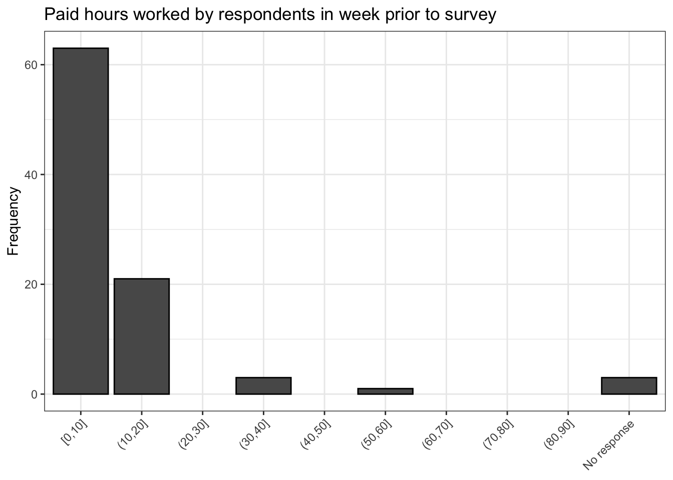
7.0.0.5 More resources
Below are a few links which contain lots of examples of different types of plots that you can make with ggplot2. And don’t forget about your DataCamp courses! Those also contain a lot of great ggplot2 examples, as well as examples for lots of other types of work you might want to do.
https://mathstat.slu.edu/~speegle/_book/ggplot-and-descriptive-statistics.html
http://r-statistics.co/Top50-Ggplot2-Visualizations-MasterList-R-Code.html
https://www.datanovia.com/en/blog/ggplot-examples-best-reference/
You can use Google to figure out how to perform more specific tasks with this package and anything else you might want to do with R. Programming of any type requires you to be a very self directed learner, so get searching!