26 Utility functions
26.1 Selecting data by date
Selecting by date/time in R can be intimidating for new users—and time-consuming for all users. The selectByDate function aims to make this easier by allowing users to select data based on the British way of expressing date i.e. d/m/y. This function should be very useful in circumstances where it is necessary to select only part of a data frame.
First load the packages we need.
## select all of 1999
data.1999 <- selectByDate(mydata, start = "1/1/1999", end = "31/12/1999")
head(data.1999)
# A tibble: 6 × 10
date ws wd nox no2 o3 pm10 so2 co pm25
<dttm> <dbl> <int> <int> <int> <int> <int> <dbl> <dbl> <int>
1 1999-01-01 00:00:00 5.04 140 88 35 4 21 3.84 1.02 18
2 1999-01-01 01:00:00 4.08 160 132 41 3 17 5.24 2.7 11
3 1999-01-01 02:00:00 4.8 160 168 40 4 17 6.51 2.87 8
4 1999-01-01 03:00:00 4.92 150 85 36 3 15 4.18 1.62 10
5 1999-01-01 04:00:00 4.68 150 93 37 3 16 4.25 1.02 11
6 1999-01-01 05:00:00 3.96 160 74 29 5 14 3.88 0.725 NAtail(data.1999)# A tibble: 6 × 10
date ws wd nox no2 o3 pm10 so2 co pm25
<dttm> <dbl> <int> <int> <int> <int> <int> <dbl> <dbl> <int>
1 1999-12-31 18:00:00 4.68 190 226 39 NA 29 5.46 2.38 23
2 1999-12-31 19:00:00 3.96 180 202 37 NA 27 4.78 2.15 23
3 1999-12-31 20:00:00 3.36 190 246 44 NA 30 5.88 2.45 23
4 1999-12-31 21:00:00 3.72 220 231 35 NA 28 5.28 2.22 23
5 1999-12-31 22:00:00 4.08 200 217 41 NA 31 4.79 2.17 26
6 1999-12-31 23:00:00 3.24 200 181 37 NA 28 3.48 1.78 22## easier way
data.1999 <- selectByDate(mydata, year = 1999)
## more complex use: select weekdays between the hours of 7 am to 7 pm
sub.data <- selectByDate(mydata, day = "weekday", hour = 7:19)
## select weekends between the hours of 7 am to 7 pm in winter (Dec, Jan, Feb)
sub.data <- selectByDate(mydata, day = "weekend", hour = 7:19,
month = c(12, 1, 2))The function can be used directly in other functions. For example, to make a polar plot using year 2000 data:
polarPlot(selectByDate(mydata, year = 2000), pollutant = "so2")26.2 Making intervals — cutData
The cutData function is a utility function that is called by most other functions but is useful in its own right. Its main use is to partition data in many ways, many of which are built-in to openair
Note that all the date-based types e.g. month/year are derived from a column date. If a user already has a column with a name of one of the date-based types it will not be used.
For example, to cut data into seasons:
# A tibble: 6 × 11
  date                   ws    wd   nox   no2    o3  pm10   so2    co  pm25
  <dttm>              <dbl> <int> <int> <int> <int> <int> <dbl> <dbl> <int>
1 1998-01-01 00:00:00  0.6    280   285    39     1    29  4.72  3.37    NA
2 1998-01-01 01:00:00  2.16   230    NA    NA    NA    37 NA    NA       NA
3 1998-01-01 02:00:00  2.76   190    NA    NA     3    34  6.83  9.60    NA
4 1998-01-01 03:00:00  2.16   170   493    52     3    35  7.66 10.2     NA
5 1998-01-01 04:00:00  2.4    180   468    78     2    34  8.07  8.91    NA
6 1998-01-01 05:00:00  3      190   264    42     0    16  5.50  3.05    NA
# ℹ 1 more variable: season <ord>
This adds a new field season that is split into four seasons. There is an option hemisphere that can be used to use southern hemisphere seasons when set as hemisphere = "southern".
The type can also be another field in a data frame e.g.
# A tibble: 6 × 11
  date                   ws    wd   nox   no2    o3 pm10         so2    co  pm25
  <dttm>              <dbl> <int> <int> <int> <int> <fct>      <dbl> <dbl> <int>
1 1998-01-01 00:00:00  0.6    280   285    39     1 pm10 22 t…  4.72  3.37    NA
2 1998-01-01 01:00:00  2.16   230    NA    NA    NA pm10 31 t… NA    NA       NA
3 1998-01-01 02:00:00  2.76   190    NA    NA     3 pm10 31 t…  6.83  9.60    NA
4 1998-01-01 03:00:00  2.16   170   493    52     3 pm10 31 t…  7.66 10.2     NA
5 1998-01-01 04:00:00  2.4    180   468    78     2 pm10 31 t…  8.07  8.91    NA
6 1998-01-01 05:00:00  3      190   264    42     0 pm10 1 to…  5.50  3.05    NA
# ℹ 1 more variable: season <ord>data(mydata) ## re-load mydata freshThis divides PM10 concentrations into four quantiles — roughly equal numbers of PM10 concentrations in four levels.
Most of the time users do not have to call cutData directly because most functions have a type option that is used to call cutData directly e.g.
polarPlot(mydata, pollutant = "so2", type = "season")However, it can be useful to call cutData before supplying the data to a function in a few cases. First, if one wants to set seasons to the southern hemisphere as above. Second, it is possible to override the division of a numeric variable into four quantiles by using the option n.levels. More details can be found in the cutData help file.
26.3 Selecting run lengths of values above a threshold — pollution episodes
A seemingly easy thing to do that has relevance to air pollution episodes is to select run lengths of contiguous values of a pollutant above a certain threshold. For example, one might be interested in selecting O3 concentrations where there are at least 8 consecutive hours above 90~ppb. In other words, a selection that combines both a threshold and persistence. These periods can be very important from a health perspective and it can be useful to study the conditions under which they occur. But how do you select such periods easily? The selectRunning utility function has been written to do this. It could be useful for all sorts of situations e.g.
Selecting hours when primary pollutant concentrations are persistently high — and then applying other openair functions to analyse the data in more depth.
In the study of particle suspension or deposition etc. it might be useful to select hours when wind speeds remain high or rainfall persists for several hours to see how these conditions affect particle concentrations.
It could be useful in health impact studies to select blocks of data where pollutant concentrations remain above a certain threshold.
As an example we are going to consider O3 concentrations at a semi-rural site in south-west London (Teddington). The data can be downloaded as follows:
ted <- importKCL(site = "td0", year = 2005:2009, met = TRUE)
## see how many rows there are
nrow(ted)
[1] 43824We are going to contrast two pollution roses of O3 concentration. The first shows hours where the criterion is not met, and the second where it is met. The subset of hours is defined by O3 concentrations above 90 ppb for periods of at least 8-hours i.e. what might be considered as ozone episode conditions.
ted <- selectRunning(ted, pollutant = "o3",
                         threshold = 90,
                         run.len = 8)
The selectRunning function returns a new column criterion that flags whether the condition is met or not. The user can control the text provided, which by default is “yes” and “no”.
table(ted$criterion)
   no   yes
42425  1399
Now we are going to produce two pollution roses shown in Figure 26.1. Note, however that many other types of analysis could be carried out now the data have been partitioned.
pollutionRose(ted, pollutant = "o3",
          type = "criterion")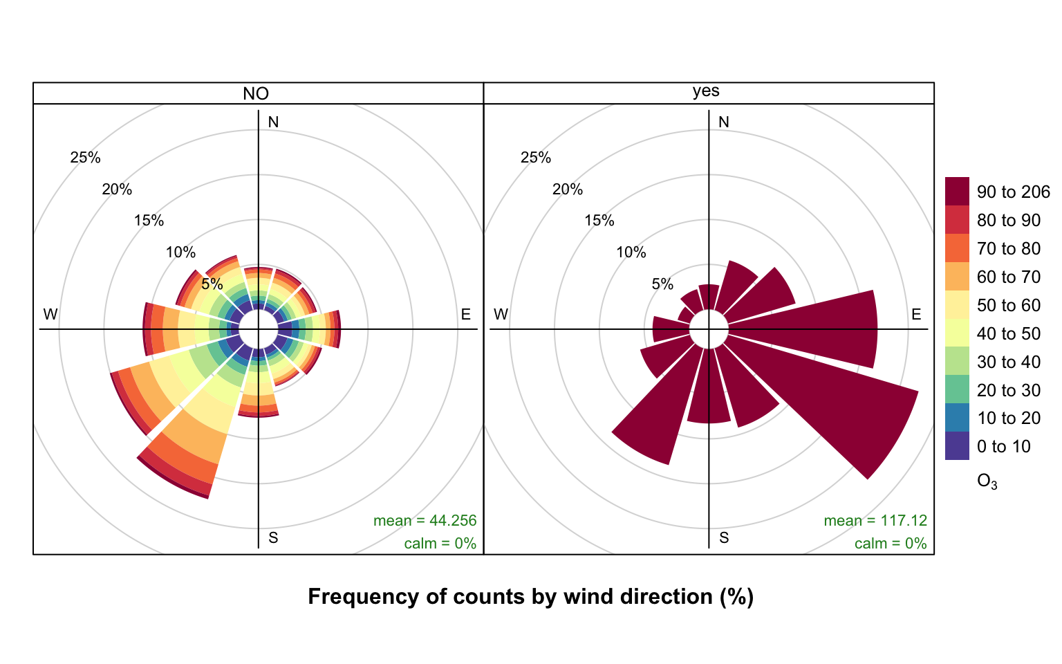
selectRunning function to select episode hours to produce pollution roses of O3 concentration.
The results are shown in Figure 26.1. The pollution rose for the “no” criterion (left plot of Figure 26.1) shows that the highest O3 concentrations tend to occur for wind directions from the south-west, where there is a high proportion of measurements. By contrast, the when the criterion is met (right plot of Figure 26.1) is very different. In this case there is a clear set of conditions where these criteria are met i.e. lengths of at least 8-hours where the O3 concentration is at least 90 ppb. It is clear the highest concentrations are dominated by south-easterly conditions i.e. corresponding to easterly flow from continental Europe where there has been time to the O3 chemistry to take place.
The code below shows (as an example), that the summer of 2006 had a high proportion of conditions where the criterion was met.
timeProp(ted, pollutant = "o3",
         proportion = "criterion",
         avg.time = "month",
         cols = "viridis")
It is also useful to consider what controls the highest NOx concentrations at a central London roadside site. For example, the code below (not plotted) shows very strongly that the persistently highest NOx concentrations are dominated by south-westerly winds. As mentioned earlier, there are many other types of analysis that can be carried out now the data set identifies where the criterion is or is not met.
episode <- selectRunning(mydata, pollutant = "nox",
                         threshold = 500,
                         run.len = 5)

pollutionRose(episode, pollutant = "nox", type = "criterion")
26.4 Calculating rolling means
Some air pollution statistics such as for O3 and particulate matter are expressed as rolling means and it is useful to be able to calculate these. It can also be useful to help smooth-out data for clearer plotting. The rollingMean function makes these calculations. One detail that can be important is that for some statistics a mean is only considered valid if there are a sufficient number of valid readings over the averaging period. Often there is a requirement for at least 75% data capture. For example, with an averaging period of 8 hours and a data capture threshold of 75%, at least 6 hours are required to calculate the mean.
The function is called as follows; in this case to calculate 8-hour rolling mean concentrations of O3.
mydata <- rollingMean(mydata, pollutant = "o3", width = 8,
                       new.name = "rollingo3", data.thresh = 75)
tail(mydata)
# A tibble: 6 × 11
date ws wd nox no2 o3 pm10 so2 co pm25
<dttm> <dbl> <int> <int> <int> <int> <int> <dbl> <dbl> <int>
1 2005-06-23 07:00:00 1.5 250 404 156 4 49 NA 1.81 28
2 2005-06-23 08:00:00 1.5 260 388 145 6 48 NA 1.64 26
3 2005-06-23 09:00:00 1.5 210 404 168 7 58 NA 1.29 34
4 2005-06-23 10:00:00 2.6 240 387 175 10 55 NA 1.29 34
5 2005-06-23 11:00:00 3.1 220 312 125 15 52 NA 1.29 33
6 2005-06-23 12:00:00 3.1 220 287 119 17 55 NA 1.29 35
# ℹ 1 more variable: rollingo3 <dbl>Note that calculating rolling means shortens the length of the data set. In the case of O3, no calculations are made for the last 7 hours.
Type ?rollingMean into R for more details. Note that the function currently only works with a single site.
26.5 Aggregating data by different time intervals
Aggregating data by different averaging periods is a common and important task. There are many reasons for aggregating data in this way:
Data sets may have different averaging periods and there is a need to combine them. For example, the task of combining an hourly air quality data set with a 15-minute average meteorological data set. The need here would be to aggregate the 15-minute data to 1-hour before merging.
It is extremely useful to consider data with different averaging times straightforwardly. Plotting a very long time series of hourly or higher resolution data can hide the main features and it would be useful to apply a specific (but flexible) averaging period to the data for plotting.
Those who make measurements during field campaigns (particularly for academic research) may have many instruments with a range of different time resolutions. It can be useful to re-calculate time series with a common averaging period; or maybe help reduce noise.
It is useful to calculate statistics other than means when aggregating e.g. percentile values, maximums etc.
For statistical analysis there can be short-term autocorrelation present. Being able to choose a longer averaging period is sometimes a useful strategy for minimising autocorrelation.
In aggregating data in this way, there are a couple of other issues that can be useful to deal with at the same time. First, the calculation of proper vector-averaged wind direction is essential. Second, sometimes it is useful to set a minimum number of data points that must be present before the averaging is done. For example, in calculating monthly averages, it may be unwise to not account for data capture if some months only have a few valid points.
When a data capture threshold is set through data.thresh it is necessary for timeAverage to know what the original time interval of the input time series is. The function will try and calculate this interval based on the most common time gap (and will print the assumed time gap to the screen). This works fine most of the time but there are occasions where it may not e.g. when very few data exist in a data frame. In this case the user can explicitly specify the interval through interval in the same format as avg.time e.g. interval = "month". It may also be useful to set start.date and end.date if the time series do not span the entire period of interest. For example, if a time series ended in October and annual means are required, setting end.date to the end of the year will ensure that the whole period is covered and that data.thresh is correctly calculated. The same also goes for a time series that starts later in the year where start.date should be set to the beginning of the year.
All these issues are (hopefully) dealt with by the timeAverage function. The options are shown below, but as ever it is best to check the help that comes with the openair package.
To calculate daily means from hourly (or higher resolution) data:
daily <- timeAverage(mydata, avg.time = "day")
daily
# A tibble: 2,731 × 11
date ws wd nox no2 o3 pm10 so2 co pm25
<dttm> <dbl> <dbl> <dbl> <dbl> <dbl> <dbl> <dbl> <dbl> <dbl>
1 1998-01-01 00:00:00 6.84 188. 154. 39.4 6.87 18.2 3.15 2.70 NaN
2 1998-01-02 00:00:00 7.07 223. 132. 39.5 6.48 27.8 3.94 1.77 NaN
3 1998-01-03 00:00:00 11.0 226. 120. 38.0 8.41 20.2 3.20 1.74 NaN
4 1998-01-04 00:00:00 11.5 223. 105. 35.3 9.61 21.0 2.96 1.62 NaN
5 1998-01-05 00:00:00 6.61 237. 175. 46.0 4.96 24.2 4.52 2.13 NaN
6 1998-01-06 00:00:00 4.38 197. 214. 45.3 1.35 34.6 5.70 2.53 NaN
7 1998-01-07 00:00:00 7.61 219. 193. 44.9 4.42 31.0 5.67 2.48 NaN
8 1998-01-08 00:00:00 8.58 216. 161. 43.1 4.96 36 4.68 2.10 NaN
9 1998-01-09 00:00:00 6.7 206. 163. 38 3.62 38.0 5.13 2.36 NaN
10 1998-01-10 00:00:00 2.98 167. 219. 44.9 0.375 37.0 4.91 2.23 NaN
# ℹ 2,721 more rows
# ℹ 1 more variable: rollingo3 <dbl>Monthly 95th percentile values:
monthly <- timeAverage(mydata, avg.time = "month",
                       statistic = "percentile",
                       percentile = 95)
monthly
# A tibble: 90 × 11
date ws wd nox no2 o3 pm10 so2 co pm25
<dttm> <dbl> <dbl> <dbl> <dbl> <dbl> <dbl> <dbl> <dbl> <dbl>
1 1998-01-01 00:00:00 11.2 45 371 68.6 14 53 11.1 3.99 NA
2 1998-02-01 00:00:00 8.16 16.7 524. 92 7 68.9 17.5 5.63 NA
3 1998-03-01 00:00:00 10.6 37.6 417. 85 15 61 18.4 4.85 NA
4 1998-04-01 00:00:00 8.16 44.4 384 81.5 20 52 14.6 4.17 NA
5 1998-05-01 00:00:00 7.56 40.6 300 80 25 61 12.7 3.55 40
6 1998-06-01 00:00:00 8.47 50.7 377 74.2 15 53 12.2 4.28 33.9
7 1998-07-01 00:00:00 9.22 36.7 386. 80.0 NA 52.4 13.9 4.52 32
8 1998-08-01 00:00:00 7.92 48.4 337. 87.0 16 58.2 13.0 3.78 38
9 1998-09-01 00:00:00 6 66.7 334. 81.3 14 64 18.2 4.25 47
10 1998-10-01 00:00:00 12 33.9 439. 84 15.1 54 12.0 4.81 33
# ℹ 80 more rows
# ℹ 1 more variable: rollingo3 <dbl>2-week averages but only calculate if at least 75% of the data are available:
twoweek <- timeAverage(mydata, avg.time = "2 week",
                       data.thresh = 75)
twoweek
# A tibble: 196 × 11
date ws wd nox no2 o3 pm10 so2 co pm25
<dttm> <dbl> <dbl> <dbl> <dbl> <dbl> <dbl> <dbl> <dbl> <dbl>
1 1997-12-29 00:00:00 6.98 212. 167. 41.4 4.63 29.3 4.47 2.17 NA
2 1998-01-12 00:00:00 4.91 221. 173. 42.1 4.70 28.8 5.07 1.86 NA
3 1998-01-26 00:00:00 2.78 242. 233. 51.4 2.30 34.9 8.07 2.45 NA
4 1998-02-09 00:00:00 4.43 215. 276. 57.1 2.63 43.7 8.98 2.94 NA
5 1998-02-23 00:00:00 6.89 237. 248. 56.7 4.99 28.8 9.79 2.57 NA
6 1998-03-09 00:00:00 2.97 288. 160. 44.8 5.64 32.7 8.65 1.62 NA
7 1998-03-23 00:00:00 4.87 192. 224. 53.6 5.52 35.9 10.2 2.34 NA
8 1998-04-06 00:00:00 3.24 294. 144. 43.4 10.1 23.8 5.48 1.40 NA
9 1998-04-20 00:00:00 4.38 195. 177. 47.6 10.5 31.4 5.54 1.73 NA
10 1998-05-04 00:00:00 3.97 285. 134. 45.5 10.2 38.6 5.49 1.41 24.6
# ℹ 186 more rows
# ℹ 1 more variable: rollingo3 <dbl>Note that timeAverage has a type option to allow for the splitting of variables by a grouping variable. The most common use for type is when data are available for different sites and the averaging needs to be done on a per site basis.
First, retaining by site averages:
# import some data for two sites
dat <- importUKAQ(c("kc1", "my1"), year = 2011:2013)

# annual averages by site
timeAverage(dat, avg.time = "year", type = "site")
# A tibble: 6 × 17
site date co nox no2 no o3 so2 pm10 pm2.5
<fct> <dttm> <dbl> <dbl> <dbl> <dbl> <dbl> <dbl> <dbl> <dbl>
1 London Ma… 2011-01-01 00:00:00 0.656 306. 97.2 137. 18.5 6.86 38.4 24.5
2 London Ma… 2012-01-01 00:00:00 0.589 313. 94.0 143. 15.0 8.13 30.8 21.5
3 London Ma… 2013-01-01 00:00:00 0.506 281. 84.7 128. 17.7 5.98 29.1 20.1
4 London N.… 2011-01-01 00:00:00 0.225 53.8 36.1 11.6 39.4 2.06 23.7 16.3
5 London N.… 2012-01-01 00:00:00 0.266 57.4 36.7 13.3 38.5 2.03 20.2 14.6
6 London N.… 2013-01-01 00:00:00 0.250 57.9 36.9 13.7 38.4 2.01 23.1 14.7
# ℹ 7 more variables: v10 <dbl>, v2.5 <dbl>, nv10 <dbl>, nv2.5 <dbl>, ws <dbl>,
# wd <dbl>, air_temp <dbl>Retain site name and site code:
# can also retain site code
timeAverage(dat, avg.time = "year", type = c("site", "code"))
# A tibble: 6 × 18
site code date co nox no2 no o3 so2 pm10
<fct> <fct> <dttm> <dbl> <dbl> <dbl> <dbl> <dbl> <dbl> <dbl>
1 London Ma… MY1 2011-01-01 00:00:00 0.656 306. 97.2 137. 18.5 6.86 38.4
2 London Ma… MY1 2012-01-01 00:00:00 0.589 313. 94.0 143. 15.0 8.13 30.8
3 London Ma… MY1 2013-01-01 00:00:00 0.506 281. 84.7 128. 17.7 5.98 29.1
4 London N.… KC1 2011-01-01 00:00:00 0.225 53.8 36.1 11.6 39.4 2.06 23.7
5 London N.… KC1 2012-01-01 00:00:00 0.266 57.4 36.7 13.3 38.5 2.03 20.2
6 London N.… KC1 2013-01-01 00:00:00 0.250 57.9 36.9 13.7 38.4 2.01 23.1
# ℹ 8 more variables: pm2.5 <dbl>, v10 <dbl>, v2.5 <dbl>, nv10 <dbl>,
# nv2.5 <dbl>, ws <dbl>, wd <dbl>, air_temp <dbl>Average all data across sites (drops site and code):
timeAverage(dat, avg.time = "year")# A tibble: 3 × 16
date co nox no2 no o3 so2 pm10 pm2.5 v10
<dttm> <dbl> <dbl> <dbl> <dbl> <dbl> <dbl> <dbl> <dbl> <dbl>
1 2011-01-01 00:00:00 0.439 181. 67.1 74.9 31.5 4.31 31.4 20.5 5.40
2 2012-01-01 00:00:00 0.424 182. 64.7 76.7 26.9 5.08 25.6 18.1 4.23
3 2013-01-01 00:00:00 0.378 169. 60.7 70.7 28.0 3.79 26.8 17.4 4.29
# ℹ 6 more variables: v2.5 <dbl>, nv10 <dbl>, nv2.5 <dbl>, ws <dbl>, wd <dbl>,
# air_temp <dbl>timeAverage also works the other way in that it can be used to derive higher temporal resolution data e.g. hourly from daily data or 15-minute from hourly data. An example of usage would be the combining of daily mean particle data with hourly meteorological data. There are two ways these two data sets can be combined: either average the meteorological data to daily means or calculate hourly means from the particle data. The timeAverage function when used to ‘expand’ data in this way will repeat the original values the number of times required to fill the new time scale. In the example below we calculate 15-minute data from hourly data. As it can be seen, the first line is repeated four times and so on.
data15 <- timeAverage(mydata,
                      avg.time = "15 min",
                      fill = TRUE)
head(data15, 20)
# A tibble: 20 × 11
date ws wd nox no2 o3 pm10 so2 co pm25
<dttm> <dbl> <int> <int> <int> <int> <int> <dbl> <dbl> <int>
1 1998-01-01 00:00:00 0.6 280 285 39 1 29 4.72 3.37 NA
2 1998-01-01 00:15:00 0.6 280 285 39 1 29 4.72 3.37 NA
3 1998-01-01 00:30:00 0.6 280 285 39 1 29 4.72 3.37 NA
4 1998-01-01 00:45:00 0.6 280 285 39 1 29 4.72 3.37 NA
5 1998-01-01 01:00:00 2.16 230 NA NA NA 37 NA NA NA
6 1998-01-01 01:15:00 2.16 230 NA NA NA 37 NA NA NA
7 1998-01-01 01:30:00 2.16 230 NA NA NA 37 NA NA NA
8 1998-01-01 01:45:00 2.16 230 NA NA NA 37 NA NA NA
9 1998-01-01 02:00:00 2.76 190 NA NA 3 34 6.83 9.60 NA
10 1998-01-01 02:15:00 2.76 190 NA NA 3 34 6.83 9.60 NA
11 1998-01-01 02:30:00 2.76 190 NA NA 3 34 6.83 9.60 NA
12 1998-01-01 02:45:00 2.76 190 NA NA 3 34 6.83 9.60 NA
13 1998-01-01 03:00:00 2.16 170 493 52 3 35 7.66 10.2 NA
14 1998-01-01 03:15:00 2.16 170 493 52 3 35 7.66 10.2 NA
15 1998-01-01 03:30:00 2.16 170 493 52 3 35 7.66 10.2 NA
16 1998-01-01 03:45:00 2.16 170 493 52 3 35 7.66 10.2 NA
17 1998-01-01 04:00:00 2.4 180 468 78 2 34 8.07 8.91 NA
18 1998-01-01 04:15:00 2.4 180 468 78 2 34 8.07 8.91 NA
19 1998-01-01 04:30:00 2.4 180 468 78 2 34 8.07 8.91 NA
20 1998-01-01 04:45:00 2.4 180 468 78 2 34 8.07 8.91 NA
# ℹ 1 more variable: rollingo3 <dbl>The timePlot can apply this function directly to make it very easy to plot data with different averaging times and statistics.
26.6 Calculating percentiles
calcPercentile makes it straightforward to calculate percentiles for a single pollutant. It can take account of different averaging periods, data capture thresholds — see Section 26.5 for more details.
For example, to calculate the 25, 50, 75 and 95th percentiles of O3 concentration by year:
calcPercentile(mydata, pollutant  = "o3",
               percentile = c(25, 50, 75, 95),
               avg.time = "year")
date percentile.25 percentile.50 percentile.75 percentile.95
1 1998-01-01 2 4 7 16
2 1999-01-01 2 4 9 21
3 2000-01-01 2 4 9 22
4 2001-01-01 2 4 10 24
5 2002-01-01 2 4 10 24
6 2003-01-01 2 4 11 24
7 2004-01-01 2 5 11 23
8 2005-01-01 3 7 16 2826.7 Correlation matrices
Understanding how different variables are related to one another is always important. However, it can be difficult to easily develop an understanding of the relationships when many different variables are present. One of the useful techniques used is to plot a correlation matrix, which provides the correlation between all pairs of data. The basic idea of a correlation matrix has been extended to help visualise relationships between variables by (Friendly, 2002) and (Sarkar, 2007).
The corPlot shows the correlation coded in three ways: by shape (ellipses), colour and the numeric value. The ellipses can be thought of as visual representations of scatter plot. With a perfect positive correlation a line at 45 degrees positive slope is drawn. For zero correlation the shape becomes a circle — imagine a ‘fuzz’ of points with no relationship between them.
With many variables it can be difficult to see relationships between variables i.e. which variables tend to behave most like one another. For this reason hierarchical clustering is applied to the correlation matrices to group variables that are most similar to one another (if cluster = TRUE.)
An example of the corPlot function is shown in Figure 26.2. In this Figure it can be seen the highest correlation coefficient is between PM10 and PM2.5 (r = 0. 84) and that the correlations between SO2, NO2 and NOx are also high. O3 has a negative correlation with most pollutants, which is expected due to the reaction between NO and O3. It is not that apparent in Figure 26.2 that the order the variables appear is due to their similarity with one another, through hierarchical cluster analysis. In this case we have chosen to also plot a dendrogram that appears on the right of the plot. Dendrograms provide additional information to help with visualising how groups of variables are related to one another. Note that dendrograms can only be plotted for type = "default" i.e. for a single panel plot.
corPlot(mydata, dendrogram = TRUE)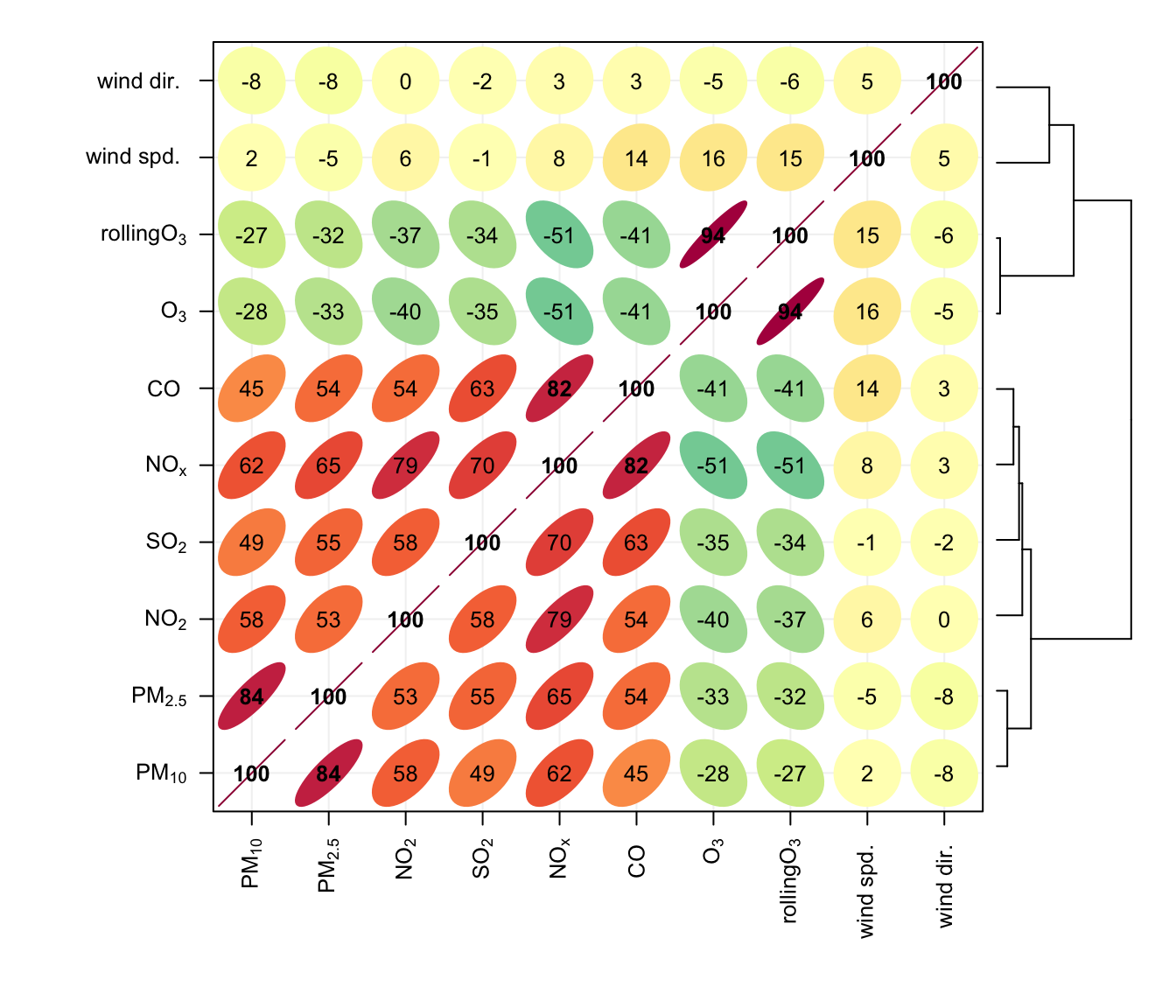
Note also that the corPlot accepts a type option, so it possible to condition the data in many flexible ways, although this may become difficult to visualise with too many panels. For example:
corPlot(mydata, type = "season")When there are a very large number of variables present, the corPlot is a very effective way of quickly gaining an idea of how variables are related. As an example (not plotted) it is useful to consider the hydrocarbons measured at Marylebone Road. There is a lot of information in the hydrocarbon plot (about 40 species), but due to the hierarchical clustering it is possible to see that isoprene, ethane and propane behave differently to most of the other hydrocarbons. This is because they have different (non-vehicle exhaust) origins. Ethane and propane results from natural gas leakage whereas isoprene is biogenic in origin (although some is from vehicle exhaust too). It is also worth considering how the relationships change between the species over the years as hydrocarbon emissions are increasingly controlled, or maybe the difference between summer and winter blends of fuels and so on.
hc <- importUKAQ(site = "my1", year = 2005, hc = TRUE)
## now it is possible to see the hydrocarbons that behave most
## similarly to one another
corPlot(hc)