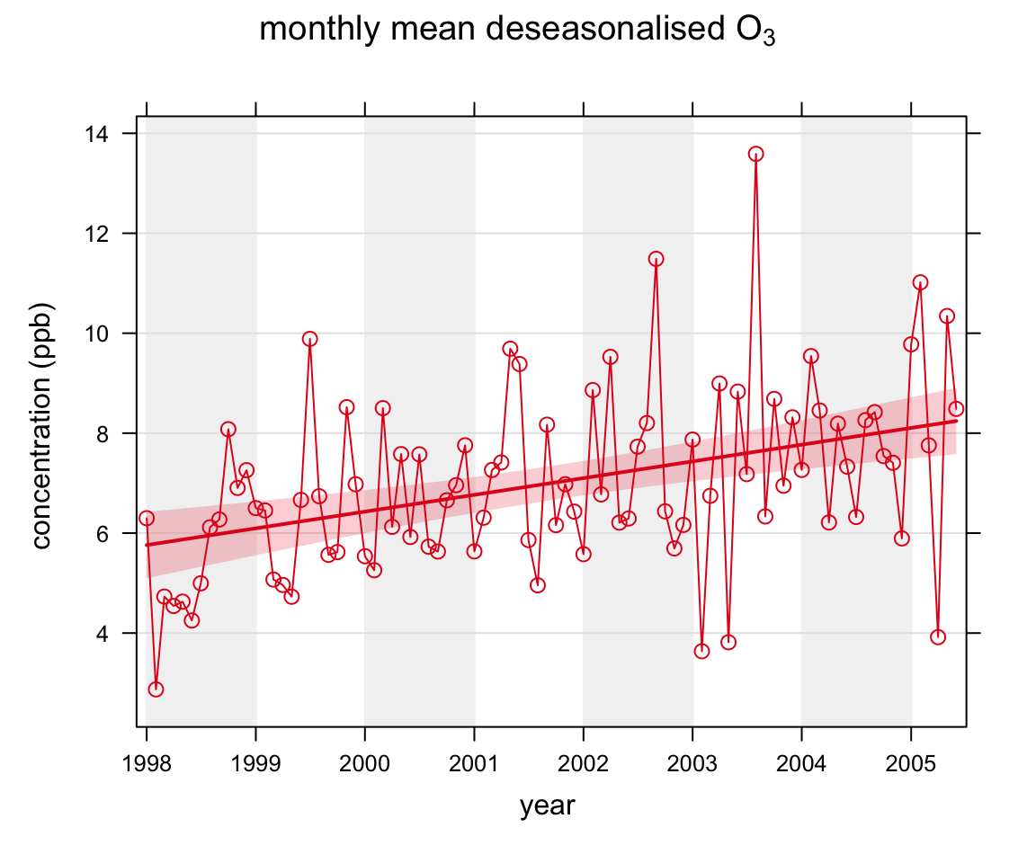
smoothTrend(mydata, pollutant = "o3", deseason = TRUE,
type = "wd")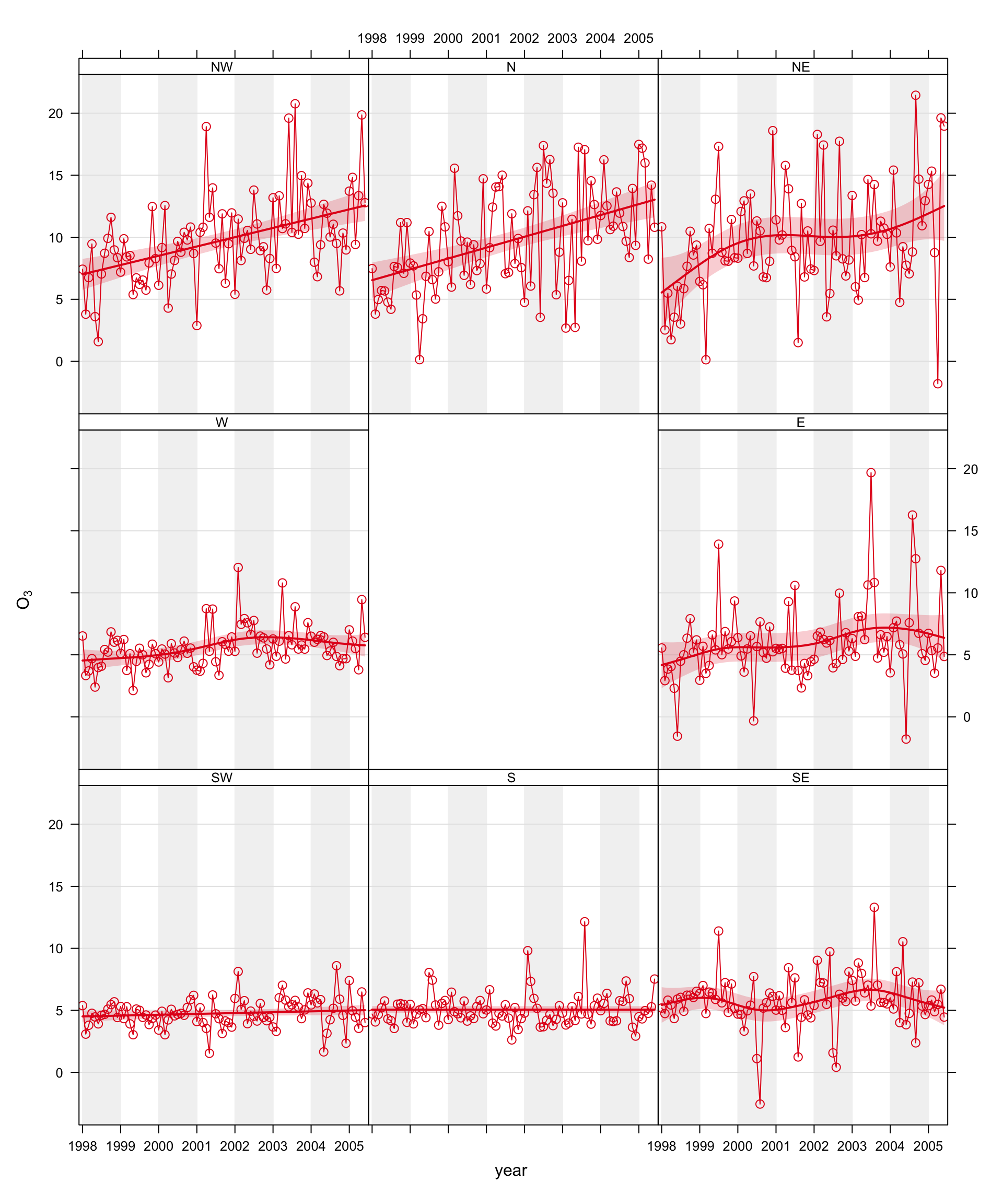
smoothTrend function applied to Marylebone Road. The shading shows the estimated 95% confidence intervals.
The smoothTrend function calculates smooth trends in the monthly mean concentrations of pollutants. In its basic use it will generate a plot of monthly concentrations and fit a smooth line to the data and show the 95% confidence intervals of the fit. The smooth line is essentially determined using Generalized Additive Modelling using the mgcv package. This package provides a comprehensive and powerful set of methods for modelling data. In this case, however, the model is a relationship between time and pollutant concentration i.e. a trend. One of the principal advantages of this approach is that the amount of smoothness in the trend is optimised in the sense that it is neither too smooth (therefore missing important features) nor too variable (perhaps fitting ‘noise’ rather than real effects). Some background information on the use of this approach in an air quality setting can be found in Carslaw et al. (2007).
Appendix C considers smooth trends in more detail and considers how different models can be developed that can be quite sophisticated. Readers should consider this section if they are considering trend analysis in more depth.
The user can select to deseasonalise the data first to provide a clearer indication of the overall trend on a monthly basis. The data are deseasonalised using the stl function. The user may also select to use bootstrap simulations to provide an alternative method of estimating the uncertainties in the trend. In addition, the simulated estimates of uncertainty can account for autocorrelation in the residuals using a block bootstrap approach.
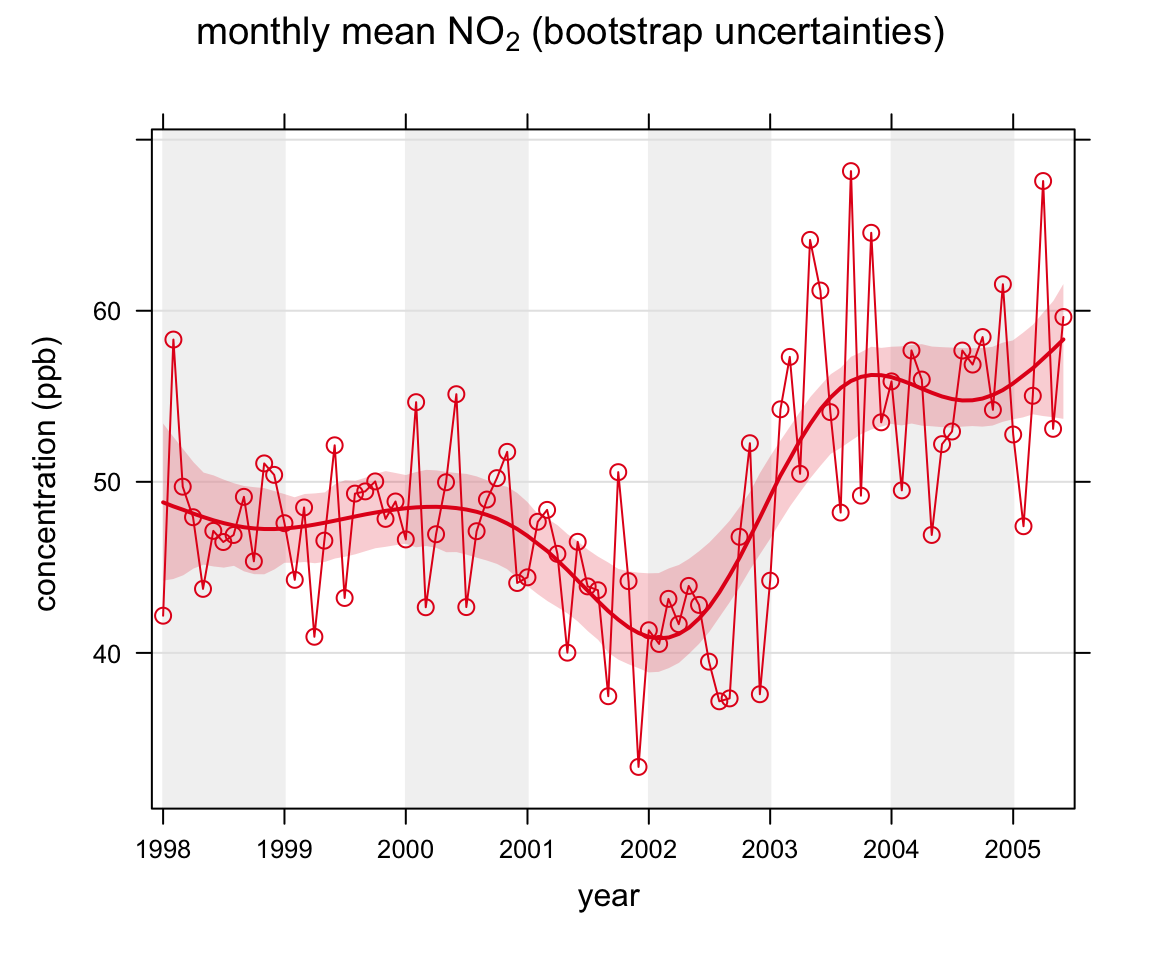
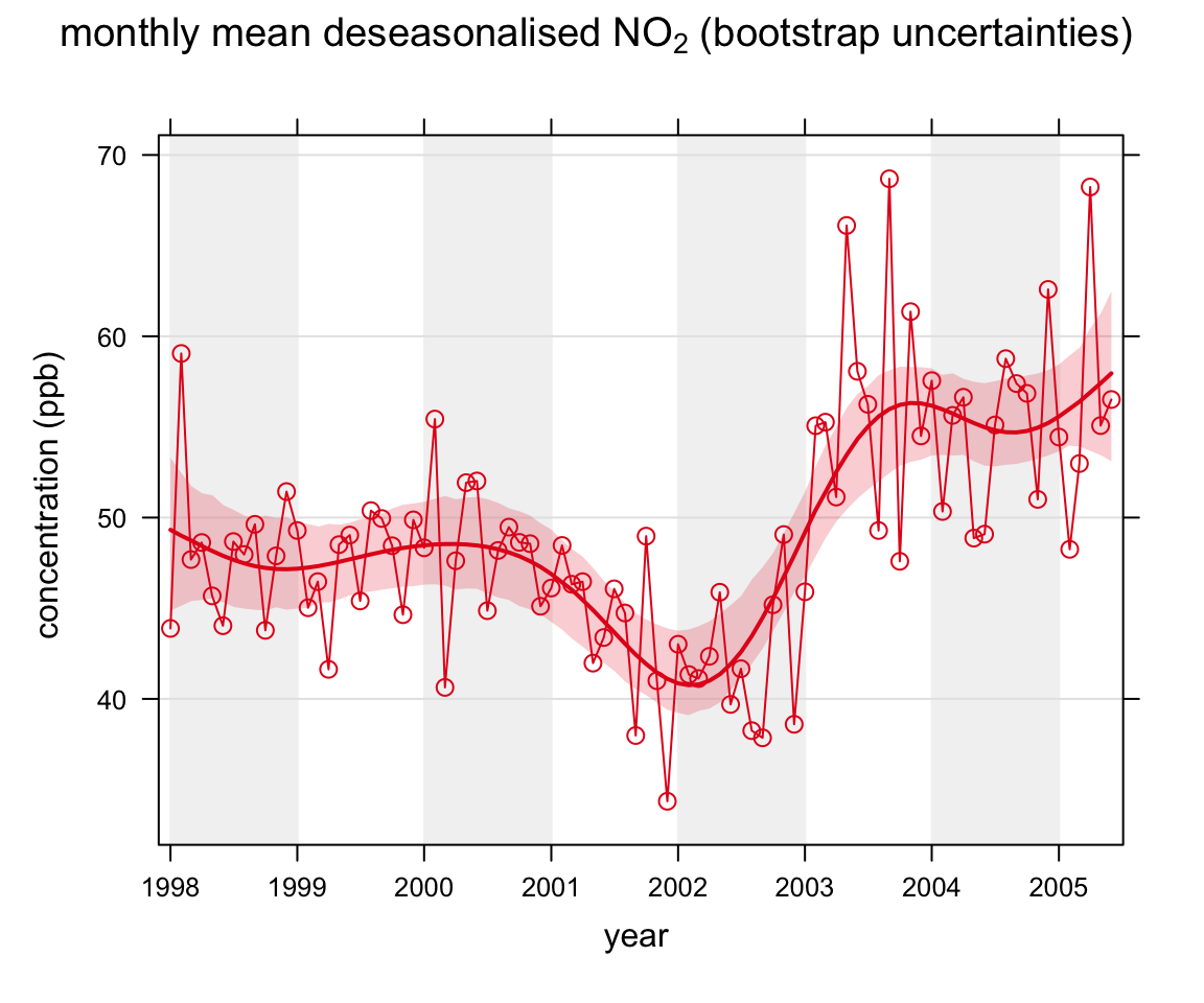
We apply the function to concentrations of O3 and NO2 using the code below. The first plot shows the smooth trend in raw O3 concentrations, which shows a very clear seasonal cycle. By removing the seasonal cycle of O3, a better indication of the trend is given, shown in the second plot. Removing the seasonal cycle is more effective for pollutants (or locations) where the seasonal cycle is stronger e.g. for ozone and background sites. Figure 16.1 shows the results of the simulations for NO2 without the seasonal cycle removed. It is clear from this plot that there is little evidence of a seasonal cycle. The principal advantage of the smoothing approach compared with the Theil-Sen method is also clearly shown in this plot. Concentrations of NO2 first decrease, then increase strongly. The trend is therefore not monotonic, violating the Theil-Sen assumptions. Finally, the last plot shows the effects of first deseasonalising the data: in this case with little effect.
library(openair) # load the package

smoothTrend(mydata, pollutant = "o3", ylab = "concentration (ppb)",
            main = "monthly mean o3")

smoothTrend(mydata, pollutant = "o3", deseason = TRUE, ylab = "concentration (ppb)",
            main = "monthly mean deseasonalised o3")

smoothTrend(mydata, pollutant = "no2", simulate = TRUE, ylab = "concentration (ppb)",
            main = "monthly mean no2 (bootstrap uncertainties)")

smoothTrend(mydata, pollutant = "no2", deseason = TRUE, simulate =TRUE,
            ylab = "concentration (ppb)",
            main = "monthly mean deseasonalised no2 (bootstrap uncertainties)")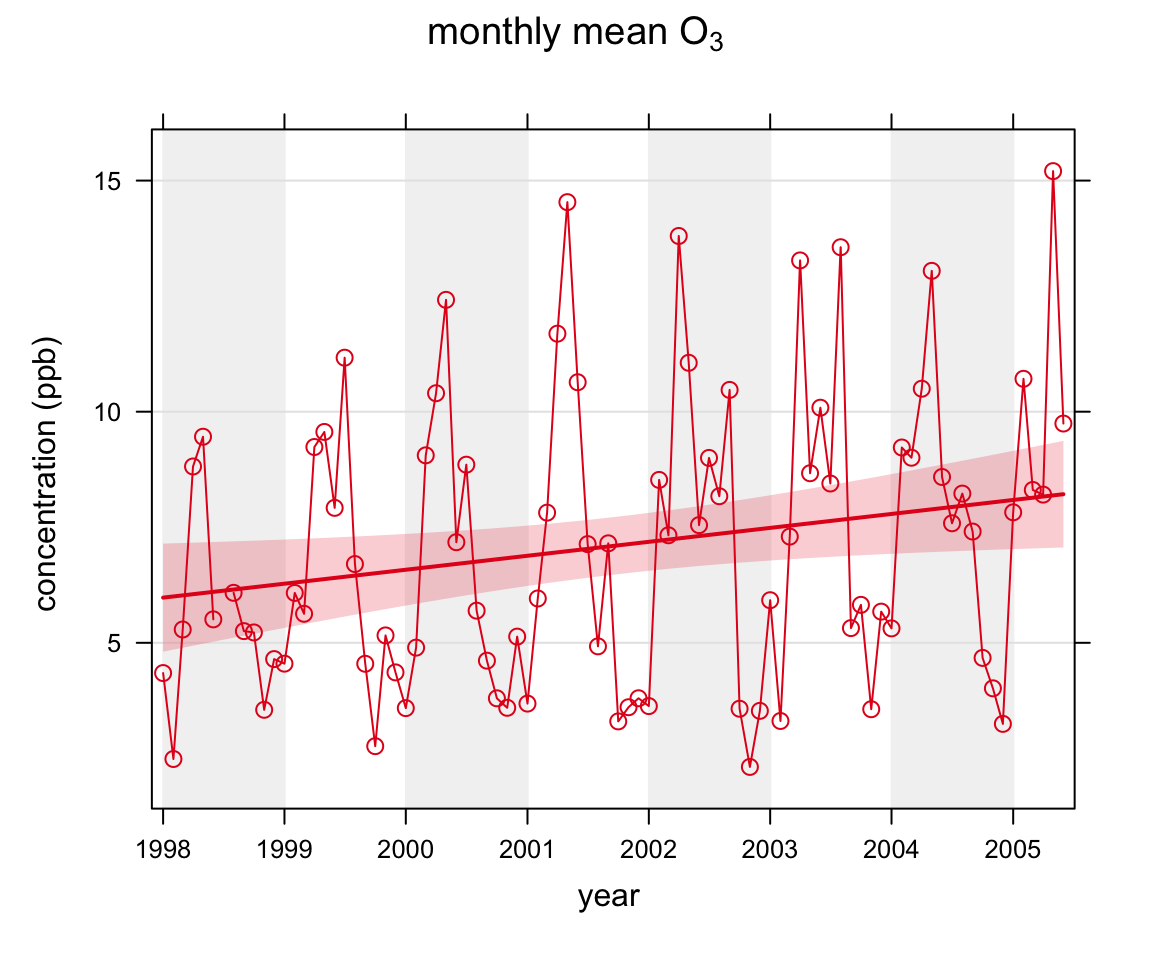
smoothTrend function applied to Marylebone Road.’
The smoothTrend function share many of the functionalities of the TheilSen function. Figure 16.2 shows the result of applying this function to O3 concentrations. The code that produced Figure 16.2 was:
smoothTrend(mydata, pollutant = "o3", deseason = TRUE,
type = "wd")smoothTrend function applied to Marylebone Road. The shading shows the estimated 95% confidence intervals.
The smoothTrend function can easily be used to gain a large amount of information on trends easily. For example, how do trends in NO2, O3 and PM10 vary by season and wind sector. There are 8 wind sectors and four seasons i.e. 32 plots. In Figure 16.3 all three pollutants are chosen and two types (season and wind direction). We also reduce the number of axis labels and the line to improve clarity. There are numerous combinations of analyses that could be produced here and it is very easy to explore the data in a wide number of ways.
smoothTrend(mydata, pollutant = c("no2", "pm10", "o3"),
            type = c("wd", "season"),
            date.breaks = 3, lty = 0)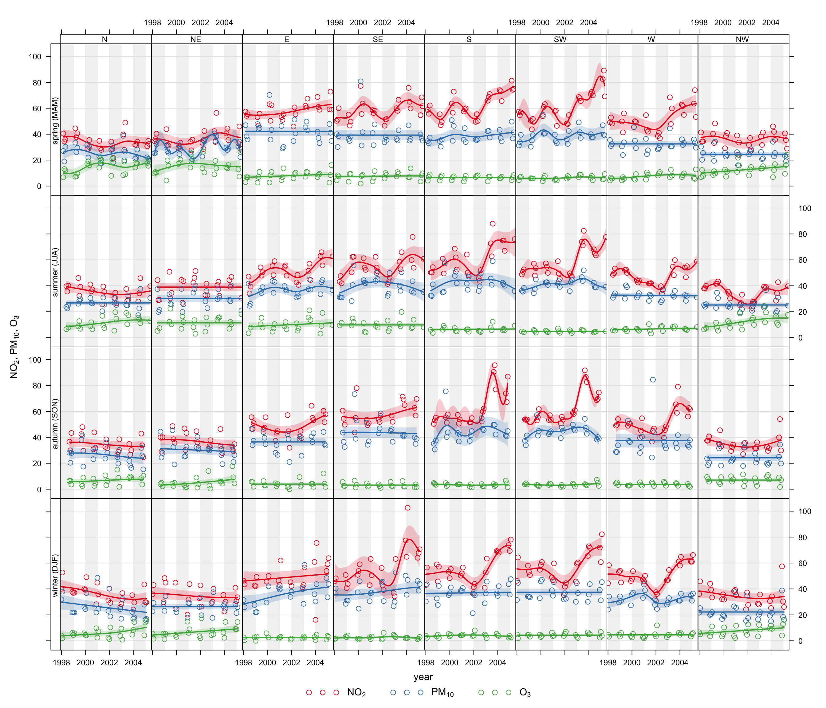
smoothTrend function applied to three pollutants, split by wind sector and season.
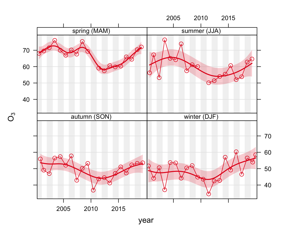
If the interest is in considering seasonal trends, it makes sense to set the averaging time to ‘season’ and also show each season in a separate panel. In Figure 16.4 some data is imported for O3 from Lullington Heath on the south coast of England. This plot shows there is strongest evidence for an increase in O3 concentrations during springtime from about 2012 onwards. A probable reason for this increase is a general reduction in NOx concentrations.
lh <- importUKAQ(site = "lh", year = 2000:2019)smoothTrend(lh, pollutant = "o3",
avg.time = "season",
type = "season",
date.breaks = 4)