# load packages for this section
library(tidyverse)
library(openair)
library(worldmet)

aq <- importUKAQ("my1", year = 2022, meteo = FALSE)
met <- importNOAA(year = 2022)
aq <- left_join(aq, met, by = "date")17 Dilution lines and pollutant ratios
17.1 Background
The behaviour of pollutants in the atmosphere is highly complex, which can make it difficult to understand the influence that different sources have on concentrations. Across all time scales dispersion processes have a strong influence on how emissions dilute in the atmosphere. However, when considering two pollutants, some of these complexities can be reduced. In a dispersion plume from a single source, the ratio between two pollutant concentrations will remain constant in the absence of loss e.g. through deposition or through chemical reaction. This characteristic of constant ratios in dispersing plumes can be exploited through different analysis approaches.
Bentley (2004) considered the relationship between two pollutants in a range of interesting ways, which have not been widely adopted but are nevertheless useful. Bentley (2004) considered the relationship between two pollutants with the aim of understanding the ratio, which can then be compared with emission inventories. The approach is to consider the issue from the perspective of a local source being mixed into background air. Both the background air and source contributions in terms of concentrations will vary, which can make it difficult to establish a pollutant ratio for a dominant source. This approach has also been used to consider vehicle emission quantification using high time resolution data (at 1-Hz) by Farren et al. (2023).
Bentley, S.T., 2004. Graphical techniques for constraining estimates of aerosol emissions from motor vehicles using air monitoring network data. Atmospheric Environment 38, 1491–1500. https://doi.org/10.1016/j.atmosenv.2003.11.033
Farren, N.J., Schmidt, C., Juchem, H., Pöhler, D., Wilde, S.E., Wagner, R.L., Wilson, S., Shaw, M.D., Carslaw, D.C., 2023. Emission ratio determination from road vehicles using a range of remote emission sensing techniques. Science of The Total Environment 875, 162621. https://doi.org/10.1016/j.scitotenv.2023.162621
The idea is to exploit the fact that for a local dispersing plume, the ratio between two pollutants would be expected to be invariant. The main approach is to look in time series data over short periods of time where, in a dispersing plume, the ratio between two pollutants is constant. For hourly data for example, considering the relationship between two pollutants over three consecutive hours using a linear regression can be used to identify short periods where the ratio (the slope from a regression) is constant (or close to constant). By considering high R2 values (typically > 0.9 to 0.95), these conditions correspond to constant ratios between two pollutants, which would be indicative of the behaviour of a diluting plume. The regression itself is a rolling regression e.g. first consider hours 1 to 3, then 2 to 4 and so on. The approach becomes clearer by considering an example.
17.2 Examples
As an example we will import some roadside monitoring data for 2022 and combine it with measured meteorological data rather than modelled (hence meteo = FALSE).
Next we will consider the relationship between PM2.5 and NOx with a 3-hour rolling regression window. The data frame returned (out) has the rolling 3-hour regression fit information and other variables that can be used for plotting and post-processing.
x <- "nox"
y <- "pm2.5"
out <- runRegression(aq, x = x, y = y, run.len = 3)

# look at returned data
out
# A tibble: 7,356 × 12
date date_start date_end intercept slope
<dttm> <dttm> <dttm> <dbl> <dbl>
1 2022-01-24 14:00:00 2022-01-24 13:00:00 2022-01-24 15:00:00 35.5 -0.0611
2 2022-01-24 15:00:00 2022-01-24 14:00:00 2022-01-24 16:00:00 -8.70 0.297
3 2022-01-24 16:00:00 2022-01-24 15:00:00 2022-01-24 17:00:00 31.2 -0.0451
4 2022-01-24 17:00:00 2022-01-24 16:00:00 2022-01-24 18:00:00 43.5 -0.175
5 2022-01-24 18:00:00 2022-01-24 17:00:00 2022-01-24 19:00:00 35.3 -0.0780
6 2022-01-24 19:00:00 2022-01-24 18:00:00 2022-01-24 20:00:00 33.7 -0.0558
7 2022-01-24 20:00:00 2022-01-24 19:00:00 2022-01-24 21:00:00 35.1 -0.0710
8 2022-01-24 21:00:00 2022-01-24 20:00:00 2022-01-24 22:00:00 36.7 -0.0888
9 2022-01-24 22:00:00 2022-01-24 21:00:00 2022-01-24 23:00:00 60.2 -0.496
10 2022-01-24 23:00:00 2022-01-24 22:00:00 2022-01-25 00:00:00 41.4 -0.189
# ℹ 7,346 more rows
# ℹ 7 more variables: r_squared <dbl>, nox_1 <dbl>, nox_2 <dbl>, pm2.5_1 <dbl>,
# pm2.5_2 <dbl>, delta_nox <dbl>, delta_pm2.5 <dbl>The output contains all regression fits, but it is useful to filter the data to extract the good fits (R2 > 0.95), as well as some other filtering. For this example, we also filter for quite large changes in NOx over 3 hours (> 100 μg m-3), which will be dominated by changes in concentrations due to local sources (the main interest) — and also to make the plots below a bit clearer. The filtering of the slopes trims some extreme values and again make the plots easier to interpret.
Another step that is useful is to identify the filtered data (out_filter) in the original data set so that can be processed in different ways. The code below identified all the 3-hour periods and combines them into a single data frame.
The next few plots should make the purpose of this analysis clearer. Figure 17.1 shows the relationship between NOx and PM2.5 for the filtered data, illustrating that there is quite a lot of variation in the concentration of PM2.5 for a particular concentration of NOx.
# use a light theme
theme_set(theme_light())

ggplot(aq_select, aes(.data[[x]], .data[[y]])) +
  geom_point() +
  ylab(quickText("pm2.5 (ug/m3)")) +
  xlab(quickText("nox (ug/m3)"))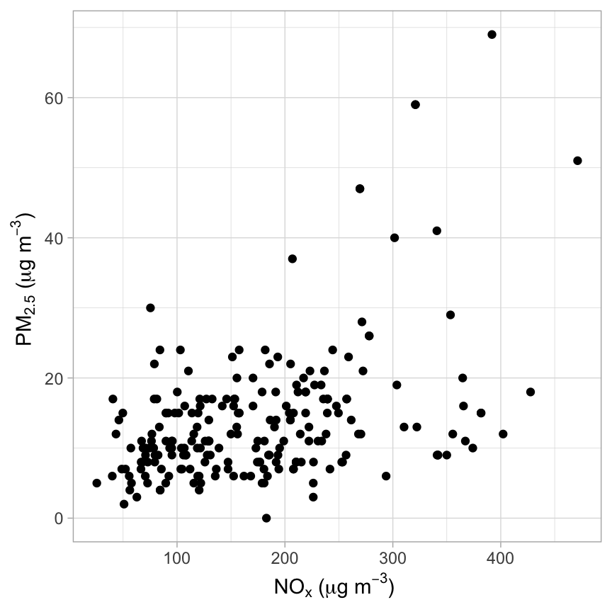
Next, we will plot the ‘dilution lines’ — the result of the rolling regressions for the filtered data. The plot is shown in Figure 17.2, which uses the same data as Figure 17.1. What is striking about Figure 17.2 is that over 3-hour periods there are so many lines that have a similar slope, which changes the impression of the data shown in Figure 17.1. Remember that the data were filtered for quite large changes in NOx, so Figure 17.2 shows the corresponding change in PM2.5 , which highlights consistent behaviour.
The dilution lines shown in Figure 17.2 have also been coloured by the minimum value of PM2.5 in each case, which can be thought of as the prevailing background concentration of PM2.5 (the y-intercept of the individual regressions). An interpretation of Figure 17.2 is that the background PM2.5 can vary a lot but there is a local source in addition to the background air that has a rather consistent behaviour with similar ratios of PM2.5 to NOx.
# sticks
x1 <- paste0(x, "_1")
x2 <- paste0(x, "_2")
y1 <- paste0(y, "_1")
y2 <- paste0(y, "_2")

ggplot(out_filter, aes(
  x = .data[[x1]],
  y = .data[[y1]],
  xend = .data[[x2]],
  yend = .data[[y2]],
  colour = .data[[y1]]
)) +
  geom_segment() +
  scale_color_gradientn(colours = openColours("turbo", 100)) +
  guides(col = guide_colourbar(title = quickText("Background\nPM2.5"))) +
  ylab(quickText("pm2.5 (ug/m3)")) +
  xlab(quickText("nox (ug/m3)"))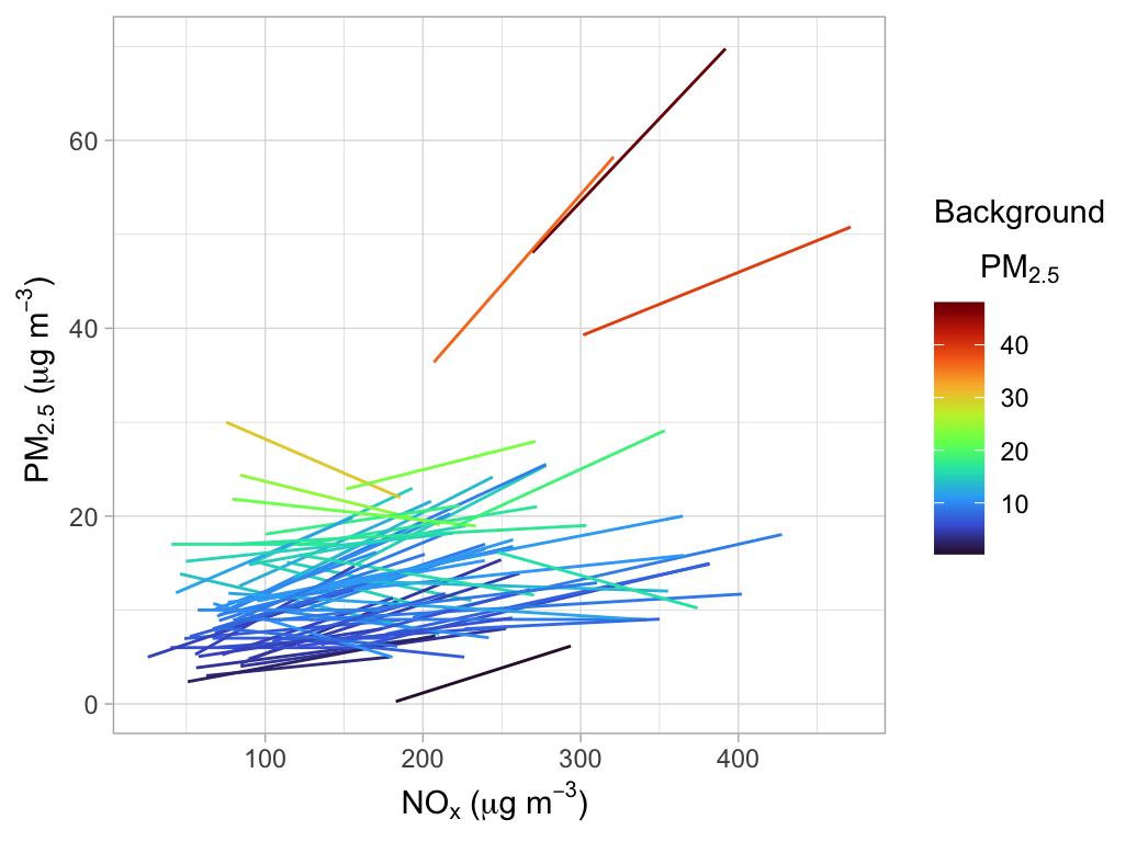
To get more quantitative information from Figure 17.2, the slope can be extracted and plotted as a density plot distribution. Furthermore, the mode of the distribution can also be estimated, as shown in Figure 17.3. These results show that the mode is about 0.04 for the mass ratio of PM2.5/NOx. Given that this estimate is based on ‘dilution events’ when the change in NOx concentrations is quite large, the value of 0.04 is an estimate of the traffic emissions ratio of PM2.5/NOx, which could consist of both direct exhaust emissions and non-exhaust emissions. Note that if a NOx change of 50 μg m-3 had been used, the mode estimate is very similar (0.039) to the case where the change was 100 μg m-3. This result seems reasonable in that a change of 50 or 100μg m-3 are both quite large and would both be indicative of a change in concentration due to a proximate source.1
It should be noted in Figure 17.2 and Figure 17.3 there is still a distribution of slopes, even if they look reasonably consistent. This is expected for a few reasons. First, even if the extracted dilution lines were 100% associated with a road traffic source, the emission rate and relationship between NOx and PM2.5 would not be expected to be constant. Second, it is still possible that dilution lines can be affected by changing background concentrations to some extent, and third, there could still be an influence from other sources. However, it is clear there is a remarkable consistency in the dilution line slopes shown in Figure 17.2.
# mode estimate
density_estimate <- density(out_filter$slope)
mode_value <- density_estimate$x[which.max(density_estimate$y)]

# density plot
ggplot(out_filter, aes(x = slope)) +
  geom_density() +
  theme_minimal() +
  geom_vline(xintercept = mode_value,
             lty = 5,
             colour = "tomato") +
  geom_text(
    x = 0.11,
    y = 8,
    label = paste("Mode =", round(mode_value, 3)),
    colour = "tomato",
    size = 4
  ) +
  coord_cartesian(xlim = c(0, 0.2))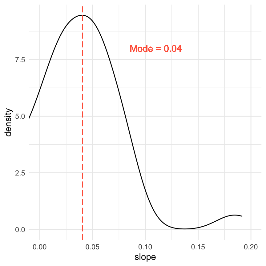
As a final step, we can explore the filtered data further. For example, we might want to explore the extent to which the ratio of PM2.5/NOx varies by wind direction and wind speed. A polar plot of NOx concentrations (not shown for 2022 data but easily plotted), shows the dominance of southerly winds and the influence of vehicles on Marylebone Road. This is shown in Figure 17.4, which highlights that there is quite a lot of variation in the slope value by wind direction. Focusing only on southerly winds (where there is a dominant traffic effect), the ratio of PM2.5/NOx is lower in the south-west quadrant than the south-east quadrant, which might reflect different vehicle emissions behaviour along the road. Note that in plotting Figure 17.4, Nonparametric Wind Regression (see Section 8.4) was used because the filtered data does not contain enough information to use a GAM.
polarPlot(aq_select, pollutant = "slope", statistic = "nwr")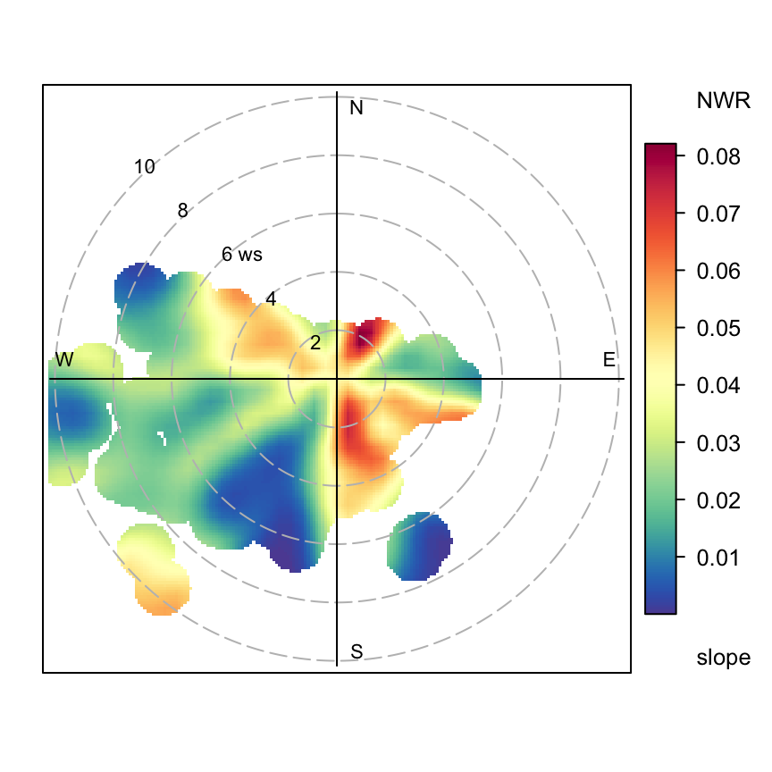
A value of 100 μg m-3 was used to make the plots clearer.↩︎