library(openair) # load the package

data2003 <- selectByDate(mydata, year = 2003)
scatterPlot(data2003, x = "nox", y = "no2")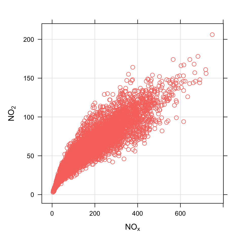
Scatter plots are extremely useful and a very commonly used analysis technique for considering how variables relate to one another. R does of course have many capabilities for plotting data in this way. However, it can be tricky to add linear relationships, or split scatter plots by levels of other variables etc. The purpose of the scatterPlot function is to make it straightforward to consider how variables are related to one another in a way consistent with other openair functions. We have added several capabilities that can be used just by setting different options, some of which are shown below.
There is less need for this function now that ggplot2 is available, but it still has some benefits for intercative use.
A smooth fit is automatically added to help reveal the underlying relationship between two variables together with the estimated 95% confidence intervals of the fit. This is in general an extremely useful thing to do because it helps to show the (possibly) non-linear relationship between variables in a very robust way — or indeed whether the relationship is linear.
It is easy to add a linear regression line. The resulting equation is shown on the plot together with the R\(^2\) value.
For large data sets there is the possibility to ‘bin’ the data using hexagonal binning or kernel density estimates. This approach is very useful when there is considerable over-plotting.
It is easy to show how two variables are related to one another dependent on levels of a third variable. This capability is very useful for exploring how different variables depend on one another and can help reveal the underlying important relationships.
A plot of two variables can be colour-coded by a continuous colour scale of a third variable.
It can handle date/time x-axis formats to provide an alternative way of showing time series, which again can be colour-coded by a third variable.
The scatterPlot function isn’t really specific to atmospheric sciences, in the same way as other plots. It is more a function for convenience, written in a style that is consistent with other openair functions. Nevertheless, along with the timePlot function they do form an important part of openair because of the usefulness of understanding how variables relate to one another. Furthermore, there are many options to make it easy to explore data in an interactive way without worrying about processing data or formatting plots.
We provide a few examples of use and as usual, users are directed towards the help pages (type ?scatterPlot) for more extensive examples.
First we select a subset of data (2003) using the openair selectByDate function and plot NOx vs. NO2
library(openair) # load the package
data2003 <- selectByDate(mydata, year = 2003)
scatterPlot(data2003, x = "nox", y = "no2")Often with several years of data, points are over-plotted and it can be very difficult to see what the underlying relationship looks like. One very effective method to use in these situations is to ‘bin’ the data and to colour the intervals by the number of counts of occurrences in each bin. There are various ways of doing this, but ‘hexagonal binning’ is particularly effective because of the way hexagons can be placed next to one another.1 To use hexagonal binning it will be necessary to install the hexbin package:
Now it should be possible to make the plot by setting the method option to method = "hexbin", as shown in Figure 27.2. The benefit of hexagonal binning is that it works equally well with enormous data sets e.g. several million records. In this case Figure 27.2 provides a clearer indication of the relationship between NOx and NO2 than Figure 27.1 because it reveals where most of the points lie, which is not apparent from Figure 27.1. Note that For method = "hexbin" it can be useful to transform the scale if it is dominated by a few very high values. This is possible by supplying two functions: one that applies the transformation and the other that inverses it. For log scaling for example (the default), trans = function(x) log(x) and inv = function(x) exp(x). For a square root transform use trans = sqrt and inv = function(x) x^2. To not apply any transformation trans = NULL and inv = NULL should be used.
scatterPlot(data2003, x = "nox", y = "no2", method = "hexbin", col= "turbo")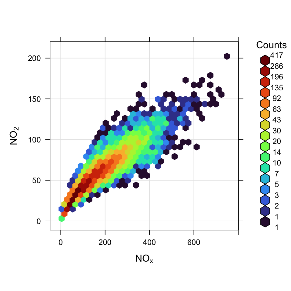
Note that when method = "hexbin" there are various options that are useful e.g. a border around each bin and the number of bins. For example, to place a grey border around each bin and set the bin size try:
scatterPlot(mydata, x = "nox", y = "no2",
            method = "hexbin", col = "turbo",
            border = "grey", xbin = 15)
The hexagonal binning and other binning methods are useful but often the choice of bin size is somewhat arbitrary. Another useful approach is to use a kernel density estimate to show where most points lie. This is possible in scatterPlot with the method = "density" option. Such a plot is shown in Figure 27.3.
scatterPlot(selectByDate(mydata, year = 2003),
            x = "nox", y = "no2",
            method = "density",
            cols = "turbo")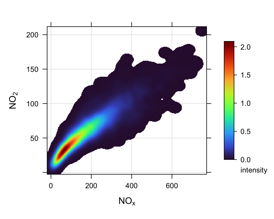
Sometimes it is useful to consider how the relationship between two variables varies by levels of a third. In openair this approach is possible by setting the option type. When type is another numeric variables, four plots are produced for different quantiles of that variable. We illustrate this point by considering how the relationship between NOx and NO2 varies with different levels of O3. We also take the opportunity to not plot the smooth line, but plot a linear fit instead and force the layout to be a 2 by 2 grid.
scatterPlot(data2003, x = "nox", y = "no2",
            type = "o3", smooth = FALSE,
            linear = TRUE, layout = c(2, 2))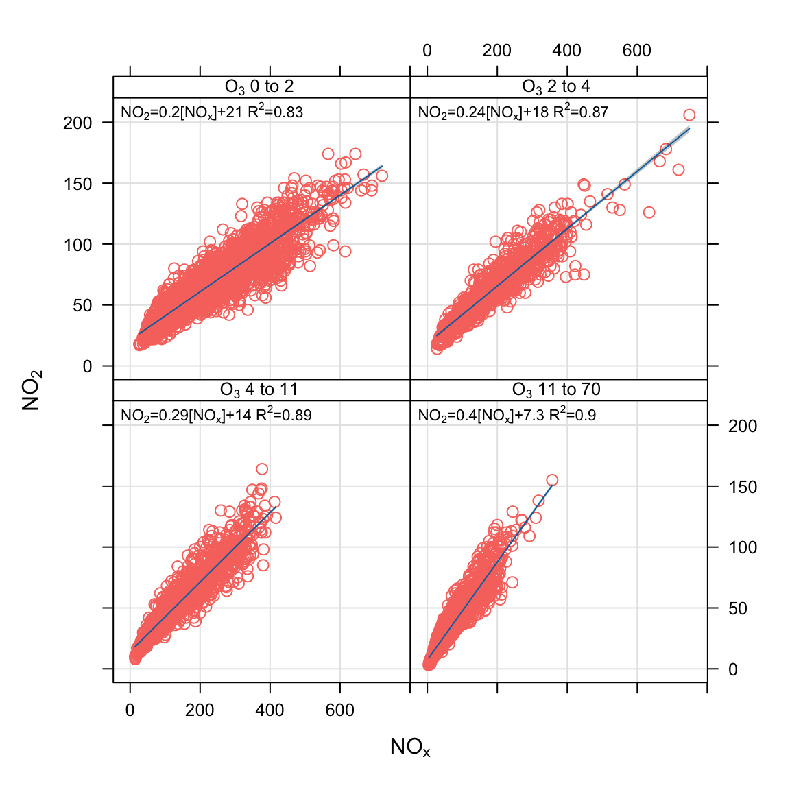
Below is an extended example that brings together data manipulation, refined plot options and linear fitting of two variables with NOx. The aim is to plot the weekly concentration of NOx against PM10 and PM2.5 and fit linear equations to both relationships. To do this we need the \(x\) variable as NOx and the \(y\) variable as PM10 or PM2.5, which means we also need a column that will act as a grouping column i.e. identifies whether the \(y\) is PM10 or PM2.5.
# load the packages we need
library(tidyverse)

# select the variables of interest
subdat <- select(mydata, date, nox, pm10, pm25) # calculate weekly averages
subdat <- timeAverage(subdat, avg.time = "week")

# reshape so we have two variable columns
subdat <- pivot_longer(subdat, cols = c(pm10, pm25),
                       names_to = "pollutant")
head(subdat)
# A tibble: 6 × 4
date nox pollutant value
<dttm> <dbl> <chr> <dbl>
1 1997-12-29 00:00:00 128. pm10 21.8
2 1997-12-29 00:00:00 128. pm25 NaN
3 1998-01-05 00:00:00 189. pm10 33.6
4 1998-01-05 00:00:00 189. pm25 NaN
5 1998-01-12 00:00:00 203. pm10 29.1
6 1998-01-12 00:00:00 203. pm25 NaN Now we will plot weekly NOx versus PM10 and PM2.5 and fit a linear equation to both — and adjust some of the symbols (shown in Figure 27.5).
scatterPlot(subdat, x = "nox", y = "value",
            group = "pollutant",
            pch = 21:22, cex = 1.6,
            fill = c("dodgerblue", "tomato"),
            col = "white",
            linear = TRUE,
            xlab = "nox (ppb)",
            ylab = "PM concentration (ug/m3)")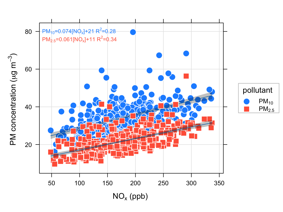
To gain a better idea of where the data lie and the linear fits, adding some transparency helps:
scatterPlot(subdat, x = "nox", y = "value",
            group = "variable",
            pch = 21:22, cex = 1.6,
            fill = c("dodgerblue", "tomato"),
            col = "white",
            linear = TRUE,
            xlab = "nox (ppb)",
            ylab = "PM concentration (ug/m3)",
            alpha = 0.2)
The above example will also work with type. For example, to consider how NOx againts PM10 and PM2.5 varies by season:
scatterPlot(subdat, x = "nox", y = "value",
            group = "variable",
            pch = 21:22, cex = 2,
            fill = c("dodgerblue", "tomato"),
            col = "white", linear = TRUE,
            xlab = "nox (ppb)",
            ylab = "PM concentration (ug/m3)",
            type = "season")
Finally, we show how to plot a continuous colour scale for a third numeric variable setting the value of z to the third variable. Figure 27.6 shows again the relationship between NOx and NO2 but this time colour-coded by the concentration of O3. We also take the opportunity to split the data into seasons and weekday/weekend by setting type = c("season", "weekend"). There is an enormous amount of information that can be gained from plots such as this. Differences between weekdays and the weekend can highlight changes in emission sources, splitting by seasons can show seasonal influences in meteorology and background O3 and colouring the data by the concentration of O3 helps to show how O3 concentrations affect NO2 concentrations. For example, consider the summertime-weekday panel where it clearly shows that the higher NO2 concentrations are associated with high O3 concentrations. Indeed there are some hours where NO2 is >100 ppb at quite low concentrations of NOx (\(\approx\) 200 ppb). It would also be interesting instead of using O3 concentrations from Marylebone Road to use O3 from a background site.
Figure 27.6 was very easily produced but contains a huge amount of useful information showing the relationship between NOx and NO2 dependent upon the concentration of O3, the season and the day of the week. There are of course numerous other plots that are equally easily produced.
scatterPlot(data2003,
            x = "nox", y = "no2", z = "o3",
            type = c("season", "weekend"),
            limits = c(0, 30))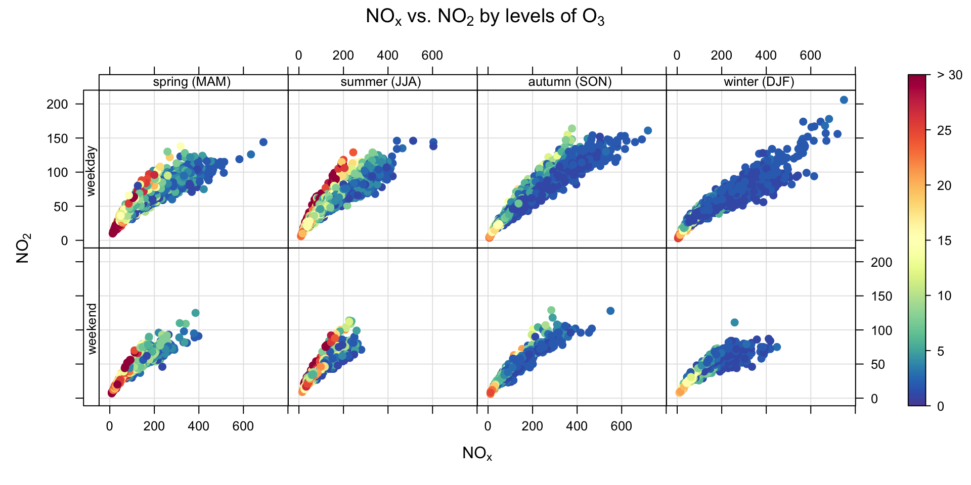
Figure 27.7 shows that scatterPlot can also handle dates on the x-axis; in this case shown for SO2 concentrations coloured by wind direction for August 2003.
scatterPlot(selectByDate(data2003, month = 8),
            x = "date", y = "so2",
             z = "wd")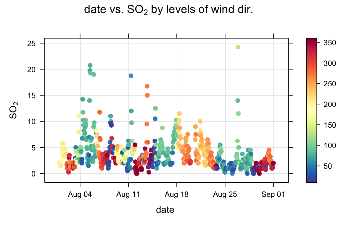
Similar to Chapter 11, scatterPlot can also plot wind vector arrows if wind speed and wind direction are available in the data frame. Figure 27.8 shows an example of using the windflow option. The Figure also sets many other options including showing the concentration of O3 as a colour, setting the colour scale used and selecting a few days of interest using the selectByDate function. Figure 27.8 shows that when the wind direction changes to northerly, the concentration of NO2 decreases and that of O3 increases.
scatterPlot(selectByDate(mydata, start = "1/6/2001",
                         end = "5/6/2001"),
            x = "date", y = "no2", z = "o3",
            col = "increment",
            windflow = list(scale = 0.15),
            key.footer = "o3\n (ppb)",
            main = NULL, ylab = "no2 (ppb)")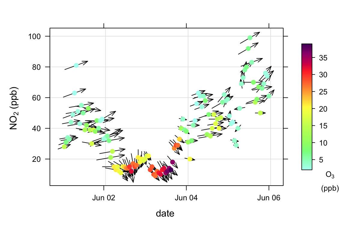
In fact it is not possible to have a shape with more than 6 sides that can be used to forma a lattice without gaps.↩︎