24  Directional Analysis

Putting polar plots on an interactive map

Author

Jack Davison

Abstract
One of the headline features of openairmaps is creating maps using directional analysis plots as markers. Being able to place a polar plot or similar visualisation on a map can allow us to gain additional insight from our analysis, permitting us to easily compare different sites and further understand their geographic context. This page introduces the polarMap() family of functions, and the suite of customisations available to users.

24.1 Data Requirements

openairmaps contains the polar_data dataset to allow users to test the directional analysis functions. The structure of this data set is provided below, and a summary is given in Table 24.1. The important feature of this data when compared to openair::mydata is latitude and longitude information, which openairmaps needs to place the directional analysis markers in the correct positions.

library(openairmaps)
dplyr::glimpse(polar_data)
Rows: 35,040
Columns: 13
$ date       <dttm> 2009-01-01 00:00:00, 2009-01-01 01:00:00, 2009-01-01 02:00…
$ nox        <dbl> 113, 40, 48, 36, 40, 50, 50, 53, 80, 111, 206, 113, 86, 82,…
$ no2        <dbl> 46, 32, 36, 29, 32, 36, 34, 34, 50, 59, 67, 61, 52, 53, 52,…
$ pm2.5      <dbl> 42, 45, 43, 37, 36, 33, 33, 31, 27, 28, 37, 30, 27, 29, 27,…
$ pm10       <dbl> 46, 49, 46, NA, 38, 32, 36, 32, 30, 32, 39, 37, 32, 33, 34,…
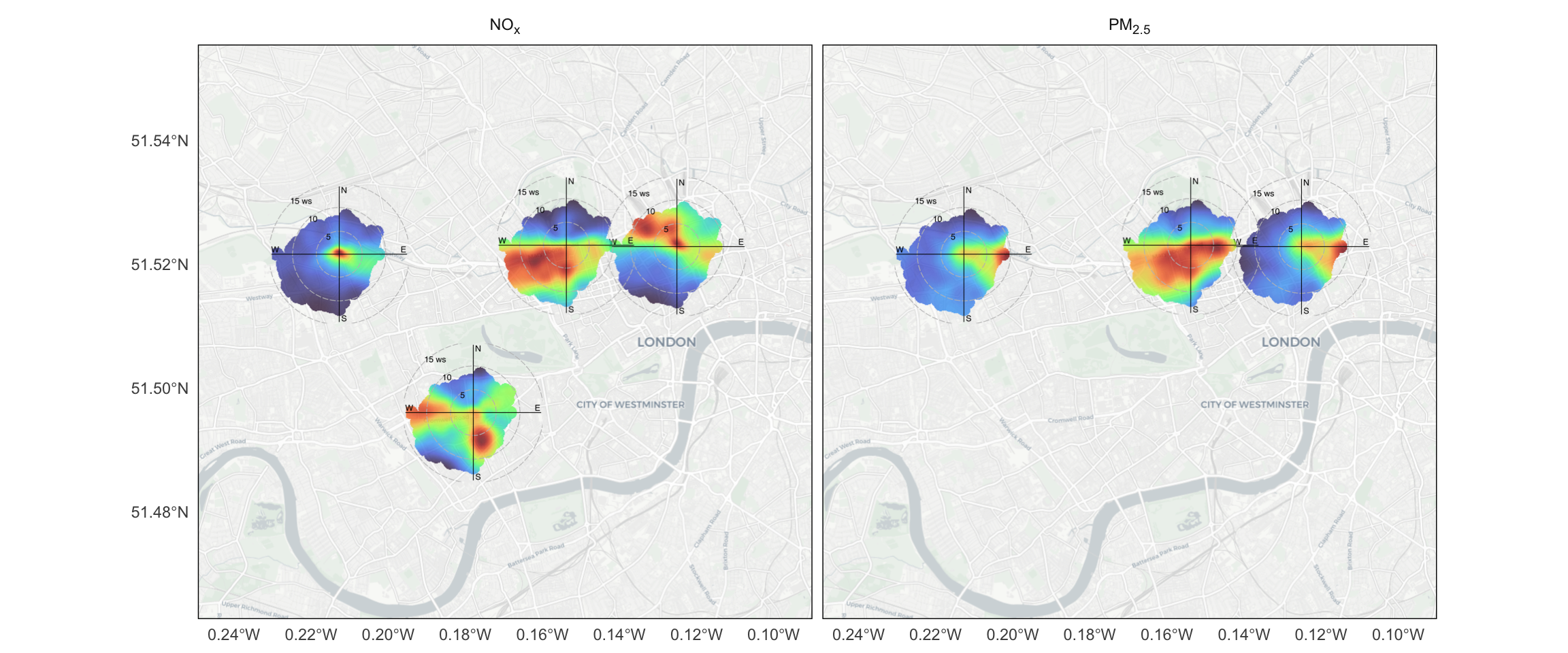
$ site       <chr> "London Bloomsbury", "London Bloomsbury", "London Bloomsbur…
$ lat        <dbl> 51.52229, 51.52229, 51.52229, 51.52229, 51.52229, 51.52229,…
$ lon        <dbl> -0.125889, -0.125889, -0.125889, -0.125889, -0.125889, -0.1…
$ site_type  <chr> "Urban Background", "Urban Background", "Urban Background",…
$ wd         <dbl> 58.92536, 74.46675, 30.00000, 45.00000, 70.00000, 46.63627,…
$ ws         <dbl> 2.066667, 1.900000, 1.550000, 2.100000, 1.500000, 2.100000,…
$ visibility <dbl> 5000.000, 4933.333, 5000.000, 4900.000, 5000.000, 6000.000,…
$ air_temp   <dbl> 0.8666667, 0.8666667, 0.8000000, 0.8500000, 0.8666667, 0.96…
Table 24.1: A statistical summary of the polar_data dataset.
Characteristic London Bloomsbury, N = 8,7601 London Cromwell Road 2, N = 8,7601 London Marylebone Road, N = 8,7601 London N. Kensington, N = 8,7601
date 2009-01-01 to 2009-12-31 23:00:00 2009-01-01 to 2009-12-31 23:00:00 2009-01-01 to 2009-12-31 23:00:00 2009-01-01 to 2009-12-31 23:00:00
nox 71 (44, 122) 138 (96, 199) 258 (139, 419) 34 (19, 65)
no2 52 (36, 71) 69 (53, 88) 99 (67, 141) 29 (15, 48)
pm2.5 13 (10, 19) NA (NA, NA) 19 (13, 27) 10 (7, 17)
pm10 16 (11, 23) NA (NA, NA) 31 (21, 43) 17 (12, 24)
lat 51.522 51.495 51.523 51.521
lon -0.126 -0.179 -0.155 -0.213
wd 213 (134, 265) 213 (134, 265) 213 (134, 265) 213 (134, 265)
ws 3.77 (2.60, 5.30) 3.77 (2.60, 5.30) 3.77 (2.60, 5.30) 3.77 (2.60, 5.30)
visibility 14,436 (11,177, 16,843) 14,436 (11,177, 16,843) 14,436 (11,177, 16,843) 14,436 (11,177, 16,843)
air_temp 12 (7, 16) 12 (7, 16) 12 (7, 16) 12 (7, 16)
1 Range; Median (IQR); Median

If you would prefer to use data from different sites or years, the import*() functions from openair make it easy to obtain pollution data with associated site latitude/longitude. The key thing to remember is to use the meta = TRUE argument when using a function like importAURN() to have the lat/lon (& site type) appended to your imported data.

sunderland <- openair::importAURN(site = c("sun2", "sunr"), year = 2015, meta = TRUE)
names(sunderland)
 [1] "source"    "site"      "code"      "date"      "nox"       "no2"      
 [7] "no"        "o3"        "pm2.5"     "v2.5"      "nv2.5"     "ws"       
[13] "wd"        "air_temp"  "latitude"  "longitude" "site_type"

By “directional analysis”, we are referring to the outputs from openair functions like polarPlot(). As a reminder as to what these figures look like, see Figure 24.1.

set.seed(123)
openair::polarAnnulus(polar_data)
openair::polarFreq(polar_data)
openair::percentileRose(polar_data)
openair::polarPlot(polar_data)
openair::pollutionRose(polar_data)
openair::windRose(polar_data)
openair::polarDiff(polar_data, dplyr::mutate(polar_data, nox = jitter(nox, factor = 5)))
(a) Polar Annulus
(b) Polar Frequency
(c) Percentile Rose
(d) Polar Plot
(e) Pollution Rose
(f) Wind Rose
(g) Polar Diff
Figure 24.1: All of the directional analysis figures which can be plotted on a map.

24.2 Overview

The easiest way to get polar plots on a map is through the use of the all-in-one mapping functions. These are all named using the pattern {function-name}Map, where {function_name} is a short hand for the equivalent openair function. A reference is provided in Table 24.2.

Table 24.2: A reference table for openairmaps directional analysis mapping functions.
openair openairmaps scale arguments unique arguments

polarAnnulus()

annulusMap()

limits

period

polarFreq()

freqMap()

breaks

statistic

percentileRose()

percentileMap()

percentile

polarPlot()

polarMap()

limits

x

pollutionRose()

pollroseMap()

breaks

statistic

windRose()

windroseMap()

ws.int, breaks

polarDiff()

diffMap()

limits

x

Effectively all of these functions have very similar arguments, although some are unique to the specific function (also shown in Table 24.2). The important ones to pay attention to are:

  • data: The data you would like to map. Ensure that lat/lon information is present.1
  • pollutant: The pollutant(s) of interest. If multiple pollutants are provided, a “layer control” menu will allow readers to swap between them.

  • latitude, longitude: The lat/lon column names. If they are not specified, the functions will attempt to guess them based on common names (e.g., “lon”, “lng”, “long” and “longitude” for longitude).

  • control: A column to use to create a “layer control” menu. Specifying control effectively splits the input data along the specified column, creating multiple separate sets of directional analysis plots. Common columns to pass to control will be those created by openair::cutData() or openair::splitByDate().2

  • popup: A column to be used to create a HTML “popup” that appears when users click the markers. This would be useful to label each marker with its corresponding site name or code, although other information could be usefully included (e.g., site type, average pollutant concentrations, and so on). A more complicated popup can be created using the buildPopup() function.

  • label: Much the same as “popup”, but the message will appear when users hover-over the marker rather than click on it. Labels are often much shorter than popups.

  • provider: The leaflet base map provider(s) you’d like to use. If multiple providers are provided, a “layer control” menu will allow readers to swap between them. Note that you can provide multiple pollutants and providers!

  • The “scale” arguments (e.g., limits for polarMap()). By specifying a scale, all polar markers will use the same colour scale, making them quantitatively comparable to one another. Specifying a scale will also draw a shared legend at the top-right of the plot, unless draw.legend is set to FALSE.

  • alpha: Controls the transparency of the polar markers, as sometimes making them semi-transparent may be desirable (for examples, if they are slightly overlapping, or seeing more of the basemap is useful). alpha should be a number between 0 and 1, where 1 is completely opaque and 0 is completely transparent.

  • The two “marker diameter” arguments, which control the size and resolution of the polar markers. It is assumed that circular markers are desired, so any number provided will be used as the marker width and height. If, for whatever reason, a non-circular marker is desired, a vector in the form c(width, height) can be provided.

  • d.icon changes the actual size of the markers on the map, defaulting to 200.

  • d.fig changes the size of the actual openair figure, defaulting to 3.5 inches. In practice, this translates to changing the resolution of the figure on the map, so you should look to adjust d.fig in the same direction as d.icon so that the axis scales remain readable.

  • ...: Any additional arguments to pass to the equivalent openair function.

24.3 Simple Demonstrations

polarMap() is demonstrated in Figure 24.2. Try clicking on each of the markers to see which sites they correspond to.

polarMap(
  polar_data,
  pollutant = "nox",
  latitude = "lat",
  longitude = "lon",
  popup = "site"
)
Figure 24.2: A demonstration of polarMap().

Another example, this time using annulusMap(), is given in Figure 24.3. Note that this time there are two different pollutants plotted, which can be swapped between using the layer control menu. openairmaps automatically deals with subscripts in common pollutant names.

annulusMap(
  polar_data,
  pollutant = c("nox", "no2"), 
  provider = "CartoDB.Positron",
  latitude = "lat",
  longitude = "lon"
)
Figure 24.3: A more complex demonstration, this time using annulusMap().

24.4 Colour Scales

Figure 24.2 could be described as using polarMap() in a “qualitative” mode — each site is using its own colour scale, so they cannot be easily compared quantitatively. There are two ways to use polarMap() in a more “quantitative” way:

  1. Use the appropriate “scale” argument to set a colour scale that all markers will share. For polarMap() (and annulusMap()) this is the “limits” argument, which works the same way as in polarPlot() (and annulusPlot()). In fact, all of the “scales” arguments shown in Table 24.2 work in the exact same way as their corresponding openair function. Setting a shared scale will draw an easy-to-read shared legend, which can be disabled using the draw.legend argument.

  2. Set the key argument to be TRUE, which will draw the colour bar next to each individual marker. This may be advantageous if one site is much more polluted compared to another one, but the individual colour bars can be confusing and difficult to read depending on the chosen base map.

polarMap(
  polar_data,
  pollutant = "nox",
  latitude = "lat",
  longitude = "lon",
  popup = "site",
  limits = c(0, 500)
)
Figure 24.4: A demonstration of polarMap() with a shared colour scale.
polarMap(
  polar_data,
  pollutant = "nox",
  latitude = "lat",
  longitude = "lon",
  popup = "site",
  key = TRUE
)
Figure 24.5: A demonstration of polarMap() with individual colour scales.

24.5 Use of control

Figure 24.6 uses percentileMap() and demonstrates how to use the “control” option to create a custom “layer control” menu and “label” and “popup” to label the markers, as well as passing on arguments to the equivalent openair function — in this case, passing the “intervals” argument to percentileRose() so that all of the markers are on the same radial axis.

polar_data %>%
  openair::cutData("weekend") %>% 
  percentileMap(
    pollutant = "nox",
    control = "weekend",
    latitude = "lat",
    longitude = "lon", 
    provider = "Esri.WorldTopoMap",
    cols = "viridis",
    popup = "site",
    label = "site_type",
    intervals = c(0, 200, 400, 600, 800, 1000)
  )
Figure 24.6: A demonstration of percentileMap() using the ‘control’ option and passing arguments to openair::percentileRose().

24.6 Adding Extra Markers

As openairmaps is built using leaflet, it is easy to add to your directional analysis maps using leaflet functions. For example, you may have the latitude and longitude information of different potential nearby sources like busy roads, industrial activity, transport hubs, and so on. Figure 24.7 shows how you can add an extra marker with an optional popup/label.

Note that, here, the sources data frame only has one row, but there is nothing to stop you from having any number of rows corresponding to different potential sources. As long as each source has a distinct latitude and longitude, a unique marker will be placed on the map.

# data frame of lat/lon
sources <-
  data.frame(lat = 51.5167,
             lng = -0.1769,
             site = "Paddington Station")

# make map
polarMap(polar_data, "nox") %>%
  # add markers
  leaflet::addMarkers(data = sources,
                      popup = ~ site,
                      label = ~ site)
Figure 24.7: Adding a leaflet marker to show nearby sources.

leaflet is well documented here, which details many of the other elements you can add to your maps. Just think of the output of the polarMap() family to be like the output of leaflet() %>% addTiles() and you’ll quickly find yourself layering on more markers, shapes, and other useful map features.

24.7 Building Popups

So far, popups have used a single column to label the markers, but you will often want to encode more data than just the site name or type. For example, you may want to use the site name and type and the average wind speed and the dates it was active! To do so, you can use the buildPopup() function. This function has a handful of arguments:

  • data: the data you are going to use with, e.g., polarMap().

  • cols: the columns you would like to encode in your popup.

  • latitude & longitude: the decimal latitude/longitude, which buildPopup() will use to identify individual sites to create labels for.

  • names: a named vector used to rename columns in the popup.

  • control: optional. This should only be used if you are going to use the control option in, e.g., polarMap() and you’d expect different popups for the different layers (i.e., it isn’t needed for site names/types, but it is needed for pollutant concentrations).

  • fun.character, fun.numeric & fun.dttm: the functions used to summarise character/factor, numeric, and date-time columns. These have nice defaults, but you may wish to override them.

Think of buildPopup() as an intermediate between your data and the polar mapping function. All it does on its own is return the input data with a “popup” column appended, which can then be used with the popup argument of the mapping function. Figure 24.8 demonstrates the use of buildPopup() — try swapping between the layers and clicking on each of the markers.

polar_data %>%
  openair::cutData("weekend") %>%
  buildPopup(
    cols = c("site", "site_type", "date", "nox"),
    names = c(
      "Site" = "site",
      "Site Type" = "site_type",
      "Date Range" = "date",
      "Average nox" = "nox"
    ),
    control = "weekend"
  ) %>%
  pollroseMap(pollutant = "nox",
              popup = "popup",
              breaks = 6,
              control = "weekend")
Figure 24.8: A demonstration of the buildPopup() function.

24.8 Marker Function

The directional analysis marker function is addPolarMarkers(), which behaves similarly (but not identically) to leaflet::addMarkers(). You will need to define the data you’re using, the lat/lng3 columns, a column to distinguish different sites (type), and an openair function (fun). As with leaflet::addMarkers() and similar functions, you can define group and layerId, which allows you to create more complex maps than can be achieved using the all-in-one openairmaps functions.

To demonstrate, Figure 24.9 has been created. This uses the polarFreq() function to plot multiple polar pollutant frequency plots for oxides of nitrogen. What is different about this map is that users can select the specific statistic they are interested in – in this case, mean, median or maximum. This is achieved by using the group arguments and addLayersControl().

library(leaflet)
library(openair)
leaflet() %>%
  addProviderTiles("CartoDB.Voyager") %>% 
  addPolarMarkers(
    lng = "lon", lat = "lat",
    pollutant = "nox",
    group = "Mean",
    data = polar_data,
    fun = polarFreq,
    statistic = "mean"
  ) %>% 
  addPolarMarkers(
    lng = "lon", lat = "lat",
    pollutant = "nox",
    group = "Median",
    data = polar_data,
    fun = polarFreq,
    statistic = "median"
  ) %>% 
  addPolarMarkers(
    lng = "lon", lat = "lat",
    pollutant = "nox",
    group = "Max",
    data = polar_data,
    fun = polarFreq,
    statistic = "max"
  ) %>%
  addLayersControl(
    baseGroups = c("Mean", "Median", "Max")
  )
Figure 24.9: Using addPolarMarkers to create a more complex map.

One could imagine different applications, using this approach. For example:

  • Giving users the option to swap between different periods for a polarAnnulus() map, or different polar coordinates in a polarPlot() map (i.e., different x arguments).

  • Allowing users to swap between different plot types (e.g., have “Wind Rose”, “Pollution Rose” and “Polar Plot” on the layer control menu).

The options are pretty much endless for the kinds of things you could achieve using this approach. If one of the all-in-one functions doesn’t give you the flexibility you need, try to see if you can create your vision yourself from scratch using leaflet and the addPolarMarkers() function.

24.9 Static Maps

While interactive maps are useful for exploratory analysis and HTML documents/websites, there are numerous situations in which a static directional analysis map may be desired. For example, academic publications often demand submissions which compile to PDF. openairmaps provides “static” versions of all seven directional analysis maps, identified by appending the word “Static” to the end of the corresponding interactive map (e.g., polarMapStatic()).

The static maps are designed to be almost identical to the interactive maps, with very similar arguments to help easily switch between the two. There are a handful of exceptions, however:

  • HTML maps have the control argument, whereas static maps have the facet argument. facet creates separate panels in the same figure in place of having a menu to switch between marker sets. Different panels are also created when multiple pollutants are provided. The arrangement of these panels can be controlled using facet.nrow.

  • Static maps naturally do not have the popup and label arguments. However, a benefit of being based in ggplot2 is that limited further customisation is possible, such as manually adding labels using ggplot2::geom_label().

  • HTML maps have different default d.icon and d.fig values.

  • HTML maps use leaflet, whereas static maps use ggplot2 and ggmap. Please see the note below for more information.

API Keys

The “static” directional analysis maps are powered using ggmap. Formerly, ggmap could freely access the “Stamen” tiles to use as a basemap, but recent events mean this is no longer possible. openairmaps users are now required to create an API key for Stadia maps, use ggmap manually to import a basemap, and provide this ggmap object to the ggmap argument. Note that Stadia is free for non-commercial purposes.

More information about ggmap can be found here.

# import a stadia/googlemap (NB: requires API key)
tilemap <- ggmap::get_stadiamap(...)

# use in polarMapStatic
polarMapStatic(
  polar_data,
  pollutant = c("nox","pm2.5"),
  ggmap = tilemap,
  latitude = "lat",
  longitude = "lon",
  d.icon = 100,
  d.fig = 2.5,
  alpha = .75
)

  1. data is an option for all of the directional analysis maps, with the exception of diffMap() which shares the before and after arguments with openair::polarDiff().↩︎

  2. Note that maps can only have one “layer control” menu. Users should therefore only provide multiple pollutants or an argument to control, but never both. If multiple pollutants and control are specified, control will be ignored.↩︎

  3. Marker functions use “lat” and “lng” as argument names for consistency with the leaflet package.↩︎