library(openair)
calendarPlot(mydata, pollutant = "o3", year = 2003)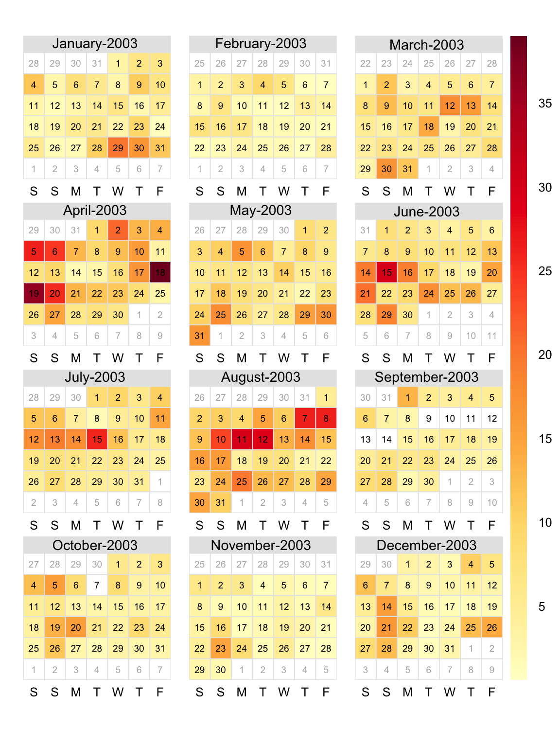
calendarPlot() for O3 concentrations in 2003.
Sometimes it is useful to visualise data in a familiar way. Calendars are the obvious way to represent data for data on the time scale of days or months. The calendarPlot function provides an effective way to visualise data in this way by showing daily concentrations laid out in a calendar format. The concentration of a species is shown by its colour. The data can be shown in different ways. By default, calendarPlot overlays the day of the month. However, if wind speed and wind direction are available then an arrow can be shown for each day giving the vector-averaged wind direction. In addition, the arrow can be scaled according to the wind speed to highlight both the direction and strength of the wind on a particular day, which can help show the influence of meteorology on pollutant concentrations.
calendarPlot can also show the daily mean concentration as a number on each day and can be extended to highlight those conditions where daily mean (or maximum etc.) concentrations are above a particular threshold. This approach is useful for highlighting daily air quality limits e.g. when the daily mean concentration is greater than 50 μg m-3.
The calendarPlot function can also be used to plot categorical scales. This is useful for plotting concentrations expressed as an air quality index i.e. intervals of concentrations that are expressed in ways like ‘very good’, ‘good’, ‘poor’ and so on.
The function is called in the usual way. As a minimum, a data frame, pollutant and year is required. So to show O3 concentrations for each day in 2003 (Figure 13.1). Note that if year is not supplied the full data set will be used.
library(openair)
calendarPlot(mydata, pollutant = "o3", year = 2003)calendarPlot() for O3 concentrations in 2003.
It is sometimes useful to annotate the plots with other information. It is possible to show the daily mean wind angle, which can also be scaled to wind speed. The idea here being to provide some information on meteorological conditions on each day. Another useful option is to set annotate = "value" in which case the daily concentration will be shown on each day. Furthermore, it is sometimes useful to highlight particular values more clearly. For example, to highlight daily mean PM10 concentrations above 50 μg m-3. This is where setting lim (a concentration limit) is useful. In setting lim the user can then differentiate the values below and above lim by colour of text, size of text and type of text e.g. plain and bold.
Figure 13.2 highlights those days where PM10 concentrations exceed 50 μg m-3 by making the annotation for those days bigger, bold and orange. Plotting the data in this way clearly shows the days where PM10 > 50 μg m-3.
Other openair functions can be used to plot other statistics. For example, rollingMean could be used to calculate rolling 8-hour mean O3 concentrations. Then, calendarPlot could be used with statistic = "max" to show days where the maximum daily rolling 8-hour mean O3 concentration is greater than a certain threshold e.g. 100 or 120 μg m-3.
calendarPlot(mydata,
  pollutant = "pm10", year = 2003,
  annotate = "value",
  lim = 50,
  cols = "Purples",
  col.lim = c("black", "orange"),
  layout = c(4, 3)
)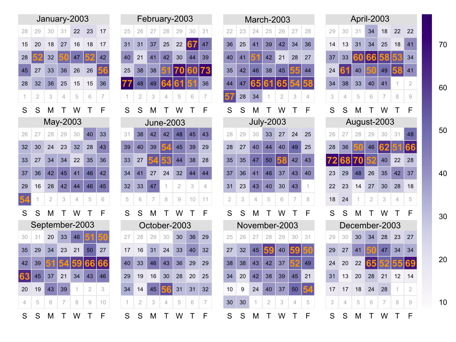
calendarPlot() for PM10 concentrations in 2003 with annotations highlighting those days where the concentration of PM10 >50 μg m-3. The numbers show the PM10 concentration in μg m-3.
To show wind angle, scaled to wind speed (Figure 13.3).
calendarPlot(mydata,
  pollutant = "o3", year = 2003,
  annotate = "ws"
)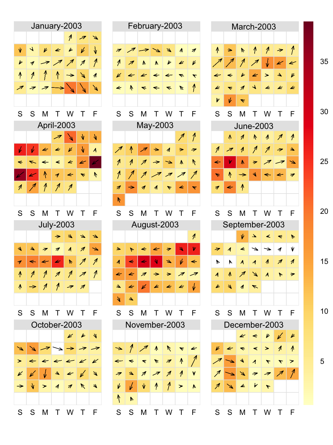
calendarPlot() for O3 concentrations in 2003 with annotations showing wind angle scaled to wind speed i.e. the longer the arrow, the higher the wind speed. It shows for example high O3 concentrations on the 18 and 19th of April were associated with strong north-easterly winds.
Note again that selectByDate can be useful. For example, to plot select months:
calendarPlot(
  selectByDate(mydata,
    year = 2003,
    month = c(6, 7, 8)
  ),
  pollutant = "o3", year = 2003
)
Figure 13.4 shows an example of plotting data with a categorical scale. In this case the options labels and breaks have been used to define concentration intervals and their descriptions. Note that breaks needs to be one longer than labels. In the example in Figure 13.4 the first interval (‘Very low’) is defined as concentrations from 0 to 50 (ppb), ‘Low’ is 50 to 100 and so on. Note that the upper value of breaks should be a number greater than the maximum value contained in the data to ensure that it is encompassed. In the example given in Figure 13.4 the maximum daily concentration is plotted. These types of plots are very useful for considering national or international air quality indexes.
calendarPlot(mydata,
  pollutant = "no2", year = 2003,
  breaks = c(0, 50, 100, 150, 1000),
  labels = c("Very low", "Low", "High", "Very High"),
  cols = "increment", statistic = "max"
)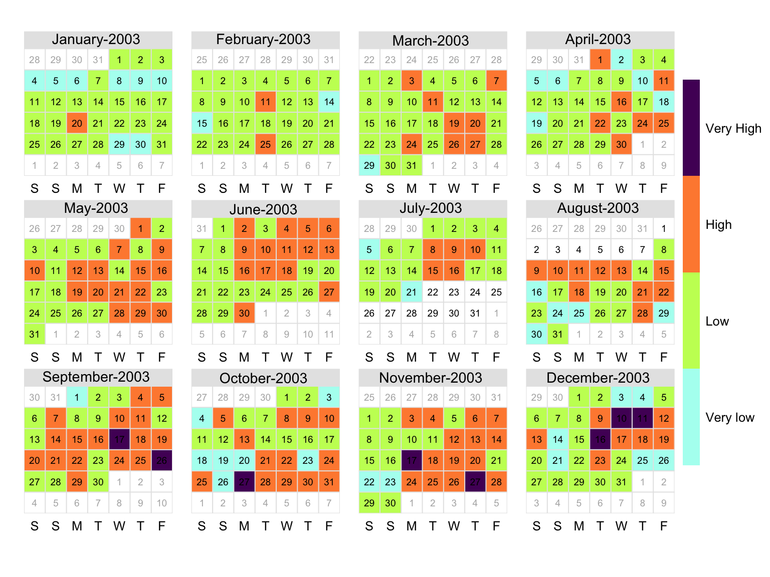
calendarPlot() for NO2 concentrations in 2003 with a user-defined categorical scale.
The user can explicitly set each colour interval:
calendarPlot(mydata,
  pollutant = "no2", year = 2003,
  breaks = c(0, 50, 100, 150, 1000),
  labels = c("Very low", "Low", "High", "Very High"),
  cols = c("lightblue", "forestgreen", "yellow", "red"),
  statistic = "max"
)
Note that in the case of categorical scales it is possible to define the breaks and labels first and then make the plot. For example:
breaks <- c(0, 34, 66, 100, 121, 141, 160, 188, 214, 240, 500)
labels <- c(
  "Low.1", "Low.2", "Low.3", "Moderate.4", "Moderate.5", "Moderate.6",
  "High.7", "High.8", "High.9", "Very High.10"
)

calendarPlot(mydata,
  pollutant = "no2", year = 2003,
  breaks = breaks, labels = labels,
  cols = "turbo", statistic = "max"
)
It is also possible to first use rollingMean() to calculate statistics. For example, if one was interested in plotting the maximum daily rolling 8-hour mean concentration, the data could be prepared and plotted as follows.
## makes a new field 'rolling8o3'
dat <- rollingMean(mydata, pollutant = "o3", hours = 8)
breaks <- c(0, 34, 66, 100, 121, 141, 160, 188, 214, 240, 500)
labels <- c(
  "Low.1", "Low.2", "Low.3", "Moderate.4", "Moderate.5", "Moderate.6",
  "High.7", "High.8", "High.9", "Very High.10"
)

calendarPlot(
  dat,
  pollutant = "rolling8o3",
  year = 2003,
  breaks = breaks,
  labels = labels,
  cols = "daqi",
  statistic = "max"
)
The UK has an air quality index for O3, NO2, PM10 and PM2.5 described in detail at http://uk-air.defra.gov.uk/air-pollution/daqi and COMEAP (2011). The index is most relevant to air quality forecasting, but is used widely for public information. Most other countries have similar indexes. Note that the indexes are calculated for different averaging times dependent on the pollutant: rolling 8-hour mean for O3, hourly means for NO2 and a fixed 24-hour mean for PM10 and PM2.5.
In the code below the labels and breaks are defined for each pollutant to make it easier to use the index in the calendarPlot() function.
## import UK daily air quality info
pt4_daqi <-
  importUKAQ(
    site = "pt4",
    year = 2021,
    data_type = "daqi"
  )

## the labels - same for all species
labels <- c(
  "1 - Low",
  "2 - Low",
  "3 - Low",
  "4 - Moderate",
  "5 - Moderate",
  "6 - Moderate",
  "7 - High",
  "8 - High",
  "9 - High",
  "10 - Very High"
)

# make calendar plot
calendarPlot(
  # just get pm10 data
  mydata = subset(pt4_daqi, pollutant == "pm10"),
  # out "pollutant" is the poll_index column
  pollutant = "poll_index",
  # our breaks - use 0.5 as the breaks need to be between indices
  breaks = seq(0.5, 10.5, 1),
  # set labels (above)
  labels = labels,
  # built-in DAQI colours
  cols = "daqi"
)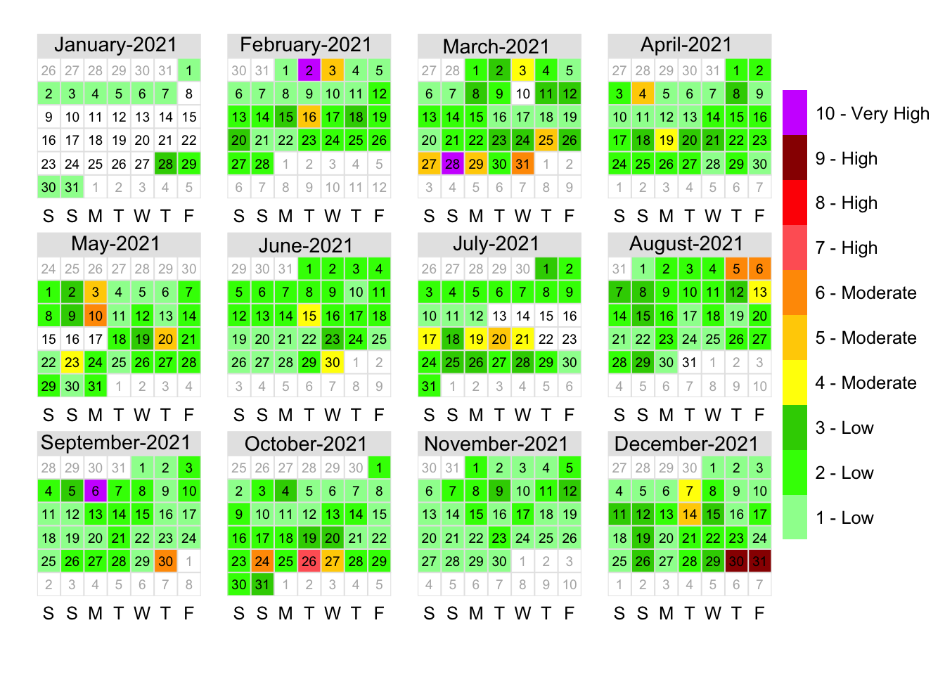
calendarPlot()