This compactly shows the distribution of wind speeds and directions from meteorological measurements. It is similar to the traditional wind rose, but includes a number of enhancements to also show how concentrations of pollutants and other variables vary. It can summarise all available data, or show it by different time periods e.g. by year, month, day of the week. It can also consider a wide range of statistics.
This section shows an example output and use, using our data frame mydata. The function is very simply run as shown in Figure 6.1.
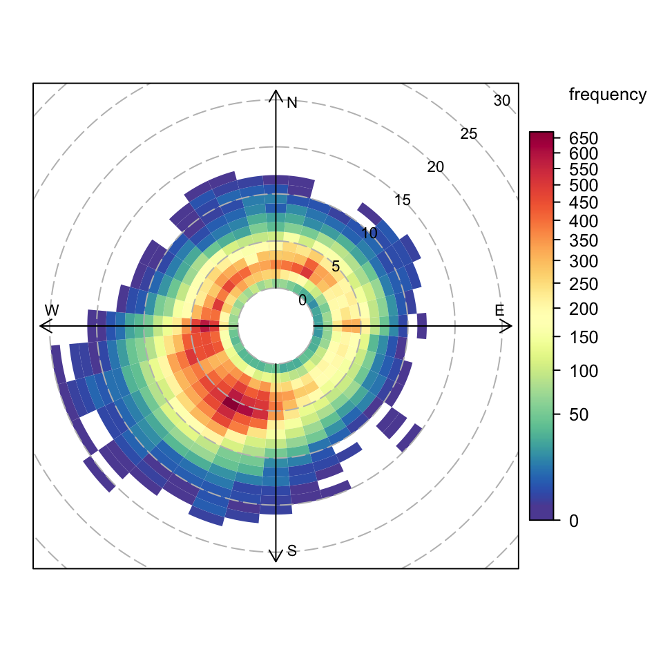
Figure 6.1: Use of polarFreq function to plot wind speed/directions. Each cell gives the total number of hours the wind was from that wind speed/direction in a particular year. The number of hours is coded as a colour scale shown to the right. The scale itself is non-linear to help show the overall distribution. The dashed circular grey lines show the wind speed scale.
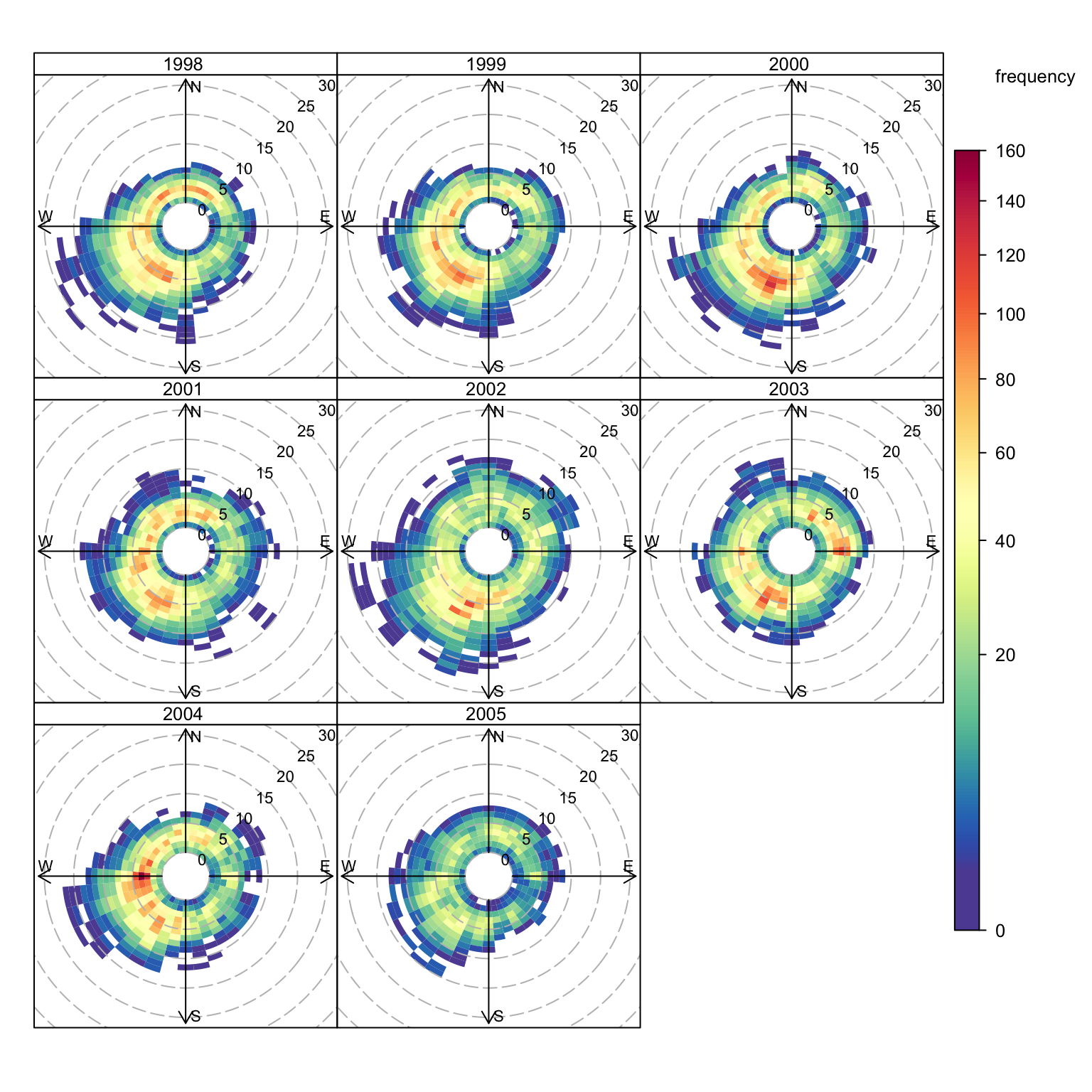
By setting type = "year", the frequencies are shown separately by year as shown in Figure 6.2, which shows that most of the time the wind is from a south-westerly direction with wind speeds most commonly between 2–6 m s-1. In 2000 there seemed to be a lot of conditions where the wind was from the south-west (leading to high pollutant concentrations at this location). The data for 2003 also stand out due to the relatively large number of occasions where the wind was from the east. Note the default colour scale, which has had a square-root transform applied, is used to provide a better visual distribution of the data.
Figure 6.2: Use of polarFreq function to plot wind speed/directions by year. Each cell gives the total number of hours the wind was from that wind speed/direction in a particular year. The number of hours is coded as a colour scale shown to the right. The scale itself is non-linear to help show the overall distribution. The dashed circular grey lines show the wind speed scale. The date range covered by the data is shown in the strip.
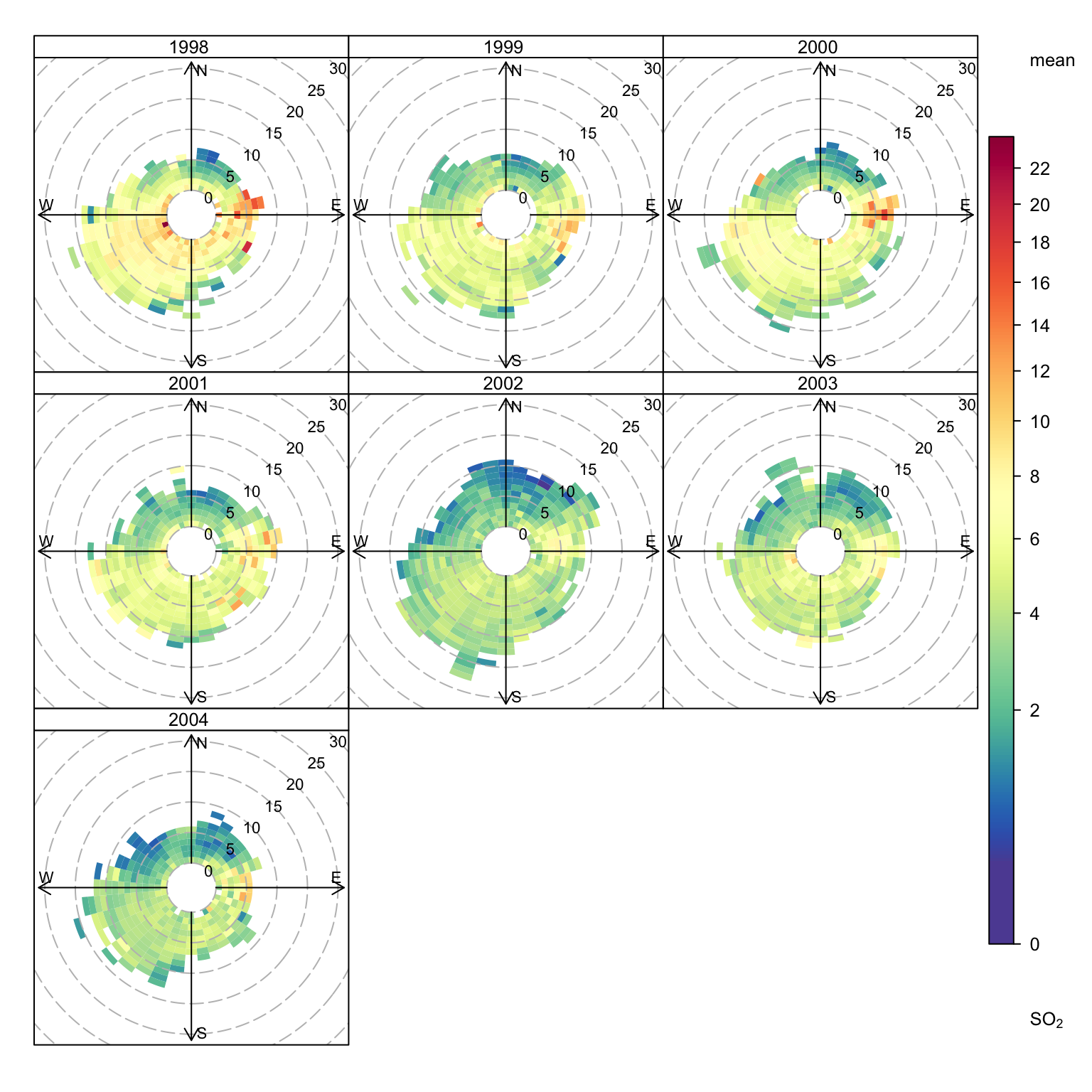
The polarFreq function can also usefully consider pollutant concentrations. Figure 6.3 shows the mean concentration of SO2 by wind speed and wind direction and clearly highlights that SO2 concentrations tend to be highest for easterly winds and for 1998 in particular.
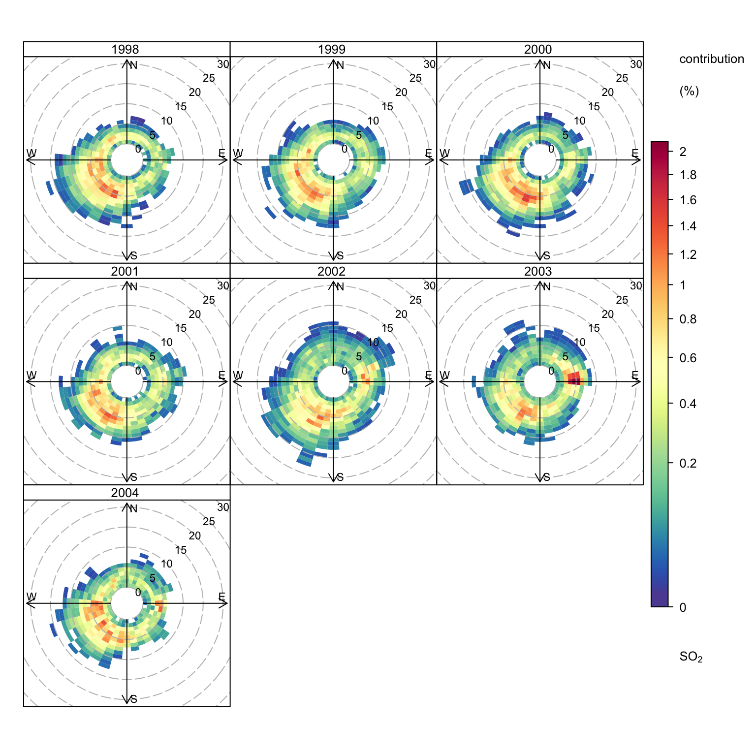
By weighting the concentrations by the frequency of occasions the wind is from a certain direction and has a certain speed, gives a better indication of the conditions that dominate the overall mean concentrations. Figure 6.4 shows the weighted mean concentration of SO2 and highlights that annual mean concentrations are dominated by south-westerly winds i.e. contributions from the road itself — and not by the fewer higher hours of concentrations when the wind is easterly. However, 2003 looks interesting because for that year, significant contributions to the overall mean were due to easterly wind conditions.
These plots when applied to other locations can reveal some useful features about different sources. For example, it may be that the highest concentrations measured only occur infrequently, and the weighted mean plot can help show this.
polarFreq(mydata, pollutant ="so2", type ="year", statistic ="mean", min.bin =2)
Figure 6.3: Use of polarFreq function to plot mean SO2 concentrations (ppb) by wind speed/directions and year.
# weighted mean SO2 concentrationspolarFreq(mydata, pollutant ="so2", type ="year", statistic ="weighted.mean", min.bin =2)
Figure 6.4: Use of polarFreq function to plot weighted mean SO2 concentrations (ppb) by wind speed/directions and year.
Users are encouraged to try out other plot options. However, one potentially useful plot is to select a few specific years of user interest. For example, what if you just wanted to compare two years e.g. 2000 and 2003? This is easy to do by sending a subset of data to the function. Use here can be made of the openairselectByDate function (see Section 26.1).
# wind rose for just 2000 and 2003polarFreq(selectByDate(mydata, year =c(2000, 2003)), cols ="turbo", type ="year")
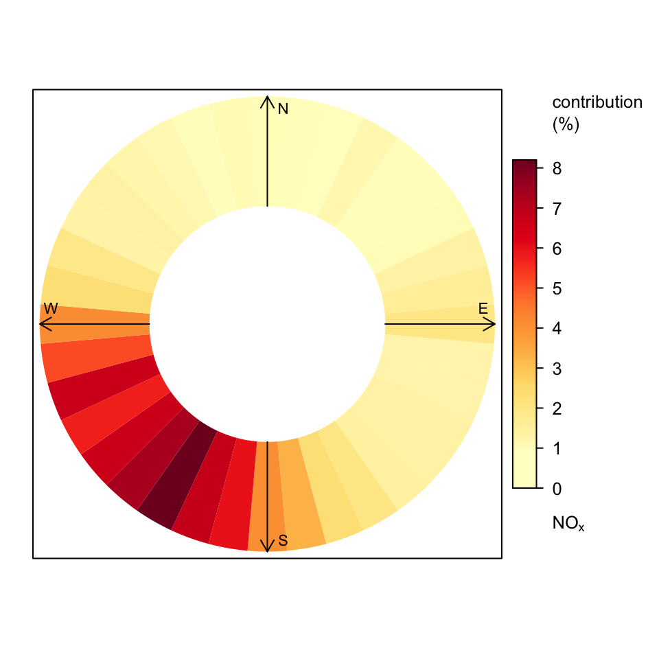
The polarFreq function can also be used to gain an idea about the wind directions that contribute most to the overall mean concentrations. As already shown, use of the option statistic = "weighted.mean" will show the percentage contribution by wind direction and wind speed bin. However, often it is unnecessary to consider different wind speed intervals. To make the plot more effective, a few options are set as shown in Figure 6.5. First, the statistic = "weighted.mean" is chosen to ensure that the plot shows concentrations weighted by their frequency of occurrence of wind direction. For this plot, we are mostly interested in just the contribution by wind direction and not wind speed. Setting the ws.int to be above the maximum wind speed in the data set ensures that all data are shown in one interval. Rather than having a square-root transform applied to the colour scale, we choose to have a linear scale by setting trans = FALSE. Finally, to show a ‘disk’, the offset is set at 80. Increasing the value of the offset will narrow the disk.
While Figure 6.5 is useful — e.g. it clearly shows that concentrations of NOx at this site are totally dominated by south-westerly winds, the use of pollutionRose for this type of plot is more effective, as shown in Chapter 5.
polarFreq(mydata, pollutant ="nox", ws.int =30, statistic ="weighted.mean", offset =80, trans =FALSE, col ="heat")
Figure 6.5: The percentage contribution to overall mean concentrations of NOx at Marylebone Road.