Chapter 14 Analysis of longitudinal outcomes
This chapter discusses the analysis of longitudinal outcomes in randomized clinical trials. Relevant references in this chapter can be found in Diggle et al (2002), Fitzmaurice et al (2004), Hedeker and Gibbons (2006), Lindstrom and Cook (2008) and Twisk (2013).
Different from a cross-sectional study, in a longitudinal study participants are followed over time and repeated measurements at different time points are made from each participant. This is different from survival analysis, where the time to a certain event is the primary focus. Here we observe and analyze changes in response over time for a sample of individuals. To compare treatment groups, we may employ a parallel group design, where every participant is member of a certain treatment group, or a cross-over design, where every participant serves as their own control, so changes treatment over time. We separate longitudinal from cross-sectional effects of predictor variables: longitudinal studies can distinguish changes over time within individuals (ageing effects) from differences among people in baseline levels (cohort effects).
As in cross-sectional studies there are two types of longitudinal study designs: observational and experimental. Here we focus on the latter and consider the analysis of designs of RCTs with longitudinal outcomes. Analyzing longitudinal data, we need to consider both the effect of predictors on response and association among repeated responses over time. This means we need to account for correlation within one individual.
14.1 Continuous longitudinal outcomes
Definition 14.1 Longitudinal data is called balanced, if the same number of observations \(n_i=n\) for each individual \(i= 1,...,m\) at the same time points \(t_{ij}=t_j, j=1,...,n.\)
We use an example from Fitzmaurice et al (2004) about the treatment of lead-exposed children (TLC) to illustrate different methods for the analysis of continuous longitudinal outcomes.
Example 14.1 A placebo-controlled, randomized trial has been conducted to study the effect of an orally administered chelating agent, succimer, in children with confirmed blood lead levels of 20-44 \(\mu\)g/dl. The outcome of interest is the blood lead level at week 0 (baseline), 1, 4 and 6. We consider a balanced subsample of \(n=100\) children from the original dataset, \(50\) children in each group.
The dataset \(\texttt{tlc}\) in the R package \(\texttt{lead.0}\) contains the data in wide and long formats. The wide format records the repeated measurements of the same individual in columns \(\texttt{lead.0, lead.1, lead.4}\) and \(\texttt{lead.6}\). As in Table 14.1, \(\texttt{id}\) identifies each child in the study, and \(\texttt{treat}\) was levels A (active) and P (placebo). A new column \(\texttt{Treatment}\) is created from \(\texttt{treat}\) for readability. Columns \(\texttt{lead.0, lead.1, lead.4, lead.6}\) contain numeric blood lead levels at the four different time points of measurement (week 0, 1, 4 and 6).
| id | treat | lead.0 | lead.1 | lead.4 | lead.6 | Treatment |
|---|---|---|---|---|---|---|
| 1 | P | 30.8 | 26.9 | 25.8 | 23.8 | Placebo |
| 2 | A | 26.5 | 14.8 | 19.5 | 21.0 | Active |
| 3 | A | 25.8 | 23.0 | 19.1 | 23.2 | Active |
| 4 | P | 24.7 | 24.5 | 22.0 | 22.5 | Placebo |
| 5 | A | 20.4 | 2.8 | 3.2 | 9.4 | Active |
| 6 | A | 20.4 | 5.4 | 4.5 | 11.9 | Active |
Different from the above wide format, \(\texttt{tlclong}\) presents data in a long format, because for each \(\texttt{id}\) there are multiple rows to record the lead levels measured at different time points. We transform the week number to a factor variable \(\texttt{fweek}\) (see Table 14.2).
| id | treat | week | lead | fweek | Treatment | |
|---|---|---|---|---|---|---|
| 1.0 | 1 | P | 0 | 30.8 | 0 | Placebo |
| 1.1 | 1 | P | 1 | 26.9 | 1 | Placebo |
| 1.4 | 1 | P | 4 | 25.8 | 4 | Placebo |
| 1.6 | 1 | P | 6 | 23.8 | 6 | Placebo |
| 2.0 | 2 | A | 0 | 26.5 | 0 | Active |
| 2.1 | 2 | A | 1 | 14.8 | 1 | Active |
It is sometimes useful to separate out the baseline values for analysis. So we restructure \(\texttt{tlclong}\) to a long format with 3 rows per patient and the baseline measurement \(\texttt{lead.0}\) as another variable. We call this data \(\texttt{tlclong2}\), which is shown in Table 14.3.
| id | treat | week | lead | fweek | Treatment | lead.0 | |
|---|---|---|---|---|---|---|---|
| 1.1 | 1 | P | 1 | 26.9 | 1 | Placebo | 30.8 |
| 1.4 | 1 | P | 4 | 25.8 | 4 | Placebo | 30.8 |
| 1.6 | 1 | P | 6 | 23.8 | 6 | Placebo | 30.8 |
| 2.1 | 2 | A | 1 | 14.8 | 1 | Active | 26.5 |
| 2.4 | 2 | A | 4 | 19.5 | 4 | Active | 26.5 |
| 2.6 | 2 | A | 6 | 21.0 | 6 | Active | 26.5 |
Figure 14.1 gives the individual and mean response profiles in the two treatment groups. The mean response profiles in the two treatment groups are given in with bold lines.
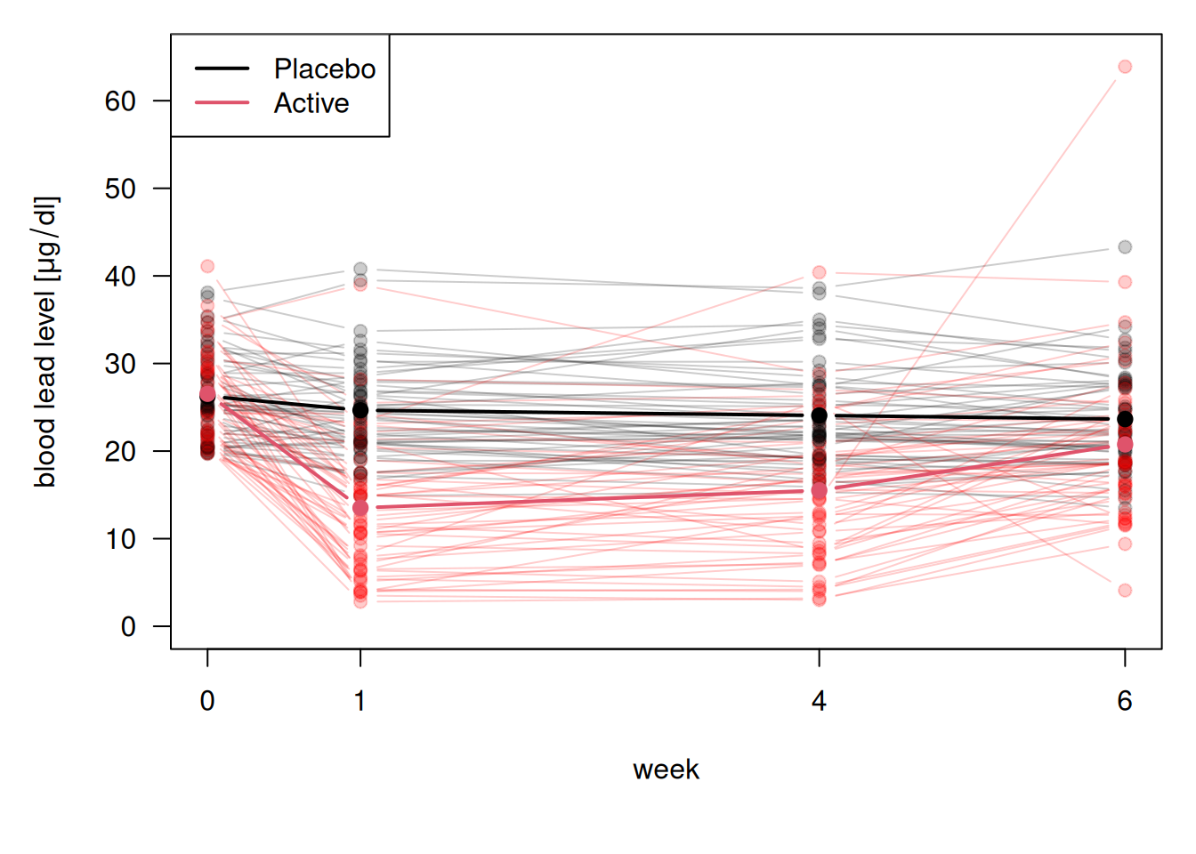
Figure 14.1: Visualization of blood lead levels in the treatment and control group.
At baseline, the mean blood lead levels are nearly the same in the two groups. At week 1 there is a substantial drop in blood lead levels among the children treated with succimer. However, this is followed by a rebound in blood lead levels, as lead stored in the bones and tissues is mobilized and a new equilibrium is achieved. In contrast, for the children treated with placebo, the trend in the mean response over time is relatively flat. The mean in the treatment group remains below the mean in placebo group, but the difference between the two is decreasing over time.
14.1.1 Summary measure analysis
Summary measure analysis uses a (scalar-valued) function of each longitudinal profile, a derived variable, as outcome variable. Typical derived variables are the mean, the slope of a linear regression, or the area under the curve (the integral over the longitudinal profile).
Example 14.1 (continued) Here we present an example of using the area under the curve (AUC) to analyze TLC data. AUC is defined as the integral of each longitudinal profile and subsequent division by 6, so AUC represents the mean lead blood level per week. It can be computed as a weighted average of lead concentration across multiple time points and provides a single number that reflects the magnitude of the outcome across the study period. A higher AUC means more total lead exposure over time.
tlc$AUC <-with(tlc,
               ((lead.1 + lead.0)/2*(1 - 0) +
                  (lead.4 + lead.1)/2*(4 - 1) +
                  (lead.6 + lead.4)/2*(6 - 4))/6)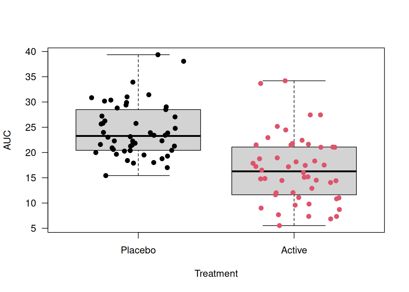
Figure 14.2: Boxplots of Area Under the Curve for tlc dataset
Then we perform a t-test to check whether the mean AUC differs between treatment groups.
##
##  Two Sample t-test
##
## data:  AUC by Treatment
## t = 6.4988, df = 98, p-value = 3.391e-09
## alternative hypothesis: true difference in means between group Placebo and group Active is not equal to 0
## 95 percent confidence interval:
##   5.37376 10.09824
## sample estimates:
## mean in group Placebo  mean in group Active
##               24.3795               16.6435
There is an observed difference of \(24.4 - 16.6 = 7.7\)\(\mu\)g/dl in mean AUC between treatment groups. The small p-value suggests a strong evidence that the mean AUC differs between treatments.
We can also use the Bartlett test for the equal-variance assumption.
##
##  Bartlett test of homogeneity of variances
##
## data:  AUC by Treatment
## Bartlett's K-squared = 2.3681, df = 1, p-value =
## 0.1238
The Bartlett test suggests no significant difference in variances, supporting the use of the t-test with the equal-variance assumption.
14.1.2 Generalized change score analysis and extended ANCOVA
In Chapter 7, we discussed change score analysis and ANCOVA for analyzing baseline and one follow-up. In longitudinal data, there are often more than one follow-up measurements, which means we need to consider the correlation between the follow-up measurements as well. We can handle the baseline values by generalizing the discussed methods. We can either subtract the baseline value from all remaining post-baseline responses (change score analysis), or use the baseline as a covariate in the analysis of post-baseline responses (extended ANCOVA).
14.1.2.1 Correlation structure
These statistical analyses must be adjusted for residual correlation between measurements from the same individual. Hence, we introduce three common correlation structures between observations with their illustrative examples in 3 \(\times\) 3 matrices. More discussions and practical examples will be given in the later sections.
\(\texttt{exchangeable}\): It assumes equal correlations for every pair of observations made from the same individual, no matter how large the distance is. It is also called a “compound symmetry” correlation structure.
\[ \begin{pmatrix} 1 & \rho & \rho \\ \rho & 1 & \rho \\ \rho & \rho & 1 \end{pmatrix} \]
\(\texttt{AR-1}\): It is an autoregressive process of order 1. The correlation structure is the autocorrelation of an AR(1) progress. \[ \begin{pmatrix} 1 & \rho & \rho^2 \\ \rho & 1 & \rho \\ \rho^2 & \rho & 1 \end{pmatrix} \]
\(\texttt{unstructured}\): It assumes different correlations for every pair of observations made from the same individual.
\[ \begin{pmatrix} 1 & \rho_1 & \rho_2 \\ \rho_1 & 1 & \rho_3 \\ \rho_2 & \rho_3 & 1 \end{pmatrix} \]
14.1.2.2 Saturated model
In general, a saturated model is a model that has as many parameters as there are values to be fitted. For an example, see Section 12.3.2. Similarly, the saturated model for balanced longitudinal data fits separate parameter for each time point. It places no structure on the means over time and most easily implemented with a factor variable for time (see example in the next section).
14.1.3 Generalized estimating equations
Generalized Estimating Equations (GEE) extend generalized linear models to accommodate correlated data by modeling the marginal expectation of the outcomes and specifying a “working” correlation structure. For how the GEE’s model works, see Appendix F.2.1.
Example 14.1 (continued) Using the TLC dataset, we look at an example applying \(\texttt{geeglm()}\) function to analyse RCTs with one baseline and more than one follow-up measurements.
Approach 1: Analysis of change scores
Using the variable \(\texttt{lead}\) as outcome and the baseline variable \(\texttt{lead.0}\) as offset is equivalent to a Change Score (CS) approach. We fit a saturated model as a null model, where the mean response is allowed to be different in each week (see 14.1.2.2). But it is unrealistic to assume a time-constant effect of lead, so we include an interaction effect between treatment and week. The full model includes an additional treatment effect which is allowed to change over time.
Assuming independent working correlation (measurements mutually independent), we fit the null and the full model for comparison.
library(geepack)
geeInCSNull <- geeglm(CSNull, id=id, data = tlclong2,
                      corstr = "independence")
geeInCS <- geeglm(CSFull, id=id, data = tlclong2,
                  corstr = "independence")
Table 14.4 shows the estimates and their confidence intervals and p-values from the full model.
| Estimate | 95%-confidence interval | \(p\)-value | |
|---|---|---|---|
| TreatmentActive | -11.41 | from -13.58 to -9.23 | < 0.0001 |
| fweek4 | -0.59 | from -1.41 to 0.23 | 0.16 |
| fweek6 | -1.01 | from -2.07 to 0.04 | 0.06 |
| TreatmentActive:fweek4 | 2.58 | from 0.82 to 4.35 | 0.004 |
| TreatmentActive:fweek6 | 8.25 | from 5.69 to 10.82 | < 0.0001 |
In the output, \(\texttt{TreatmentActive}\) is the main effect for treatment, but to test for an overall treatment effect, we need to test whether all three treatment parameters are different from zero using the function \(\texttt{anova()}\).
## Analysis of 'Wald statistic' Table
##
## Model 1 lead ~ offset(lead.0) + Treatment * fweek
## Model 2 lead ~ offset(lead.0) + fweek
##   Df     X2 P(>|Chi|)
## 1  3 109.99 < 2.2e-16 ***
## ---
## Signif. codes:
## 0 '***' 0.001 '**' 0.01 '*' 0.05 '.' 0.1 ' ' 1
There is strong evidence for treatment effects in week 1, 4 and 6, since the comparison of the full with the null model with \(\texttt{anova()}\) results in a very small \(p\)-value.
Approach 2: Extended ANCOVA model
Again, we compare a null with the full model. The null model contains only the baseline lead and week as variables, while the full model includes an interaction between treatment and week to explore whether there is a treatment effect.
To allow for more flexibility in the model, we assume an unstructured working correlation structure and fit the two models.
geeUnANCOVANull <- geeglm(ANCOVANull, id=id, data = tlclong2,
                          corstr = "unstructured")
geeUnANCOVAFull <- geeglm(ANCOVAFull, id=id, data = tlclong2,
                          corstr = "unstructured")
Table 14.5 summarizes the estimates, confidence intervals, and p-values of the full model.
| Estimate | 95%-confidence interval | \(p\)-value | |
|---|---|---|---|
| lead.0 | 0.81 | from 0.59 to 1.04 | < 0.0001 |
| TreatmentActive | -11.36 | from -13.47 to -9.24 | < 0.0001 |
| fweek4 | -0.59 | from -1.41 to 0.23 | 0.16 |
| fweek6 | -1.01 | from -2.07 to 0.04 | 0.06 |
| TreatmentActive:fweek4 | 2.58 | from 0.82 to 4.35 | 0.004 |
| TreatmentActive:fweek6 | 8.25 | from 5.69 to 10.82 | < 0.0001 |
Using \(\texttt{anova()}\) again, we can see strong evidence for a treatment effect since the p-value is very small.
The baseline variable \(\texttt{lead.0}\) has coefficient \(0.81\). According to Chapter 7, in ANCOVA, this coefficient represents the correlation between baseline and follow-up measurements and can be expected to be between 0 and 1. When it is 1, ANCOVA is the same as the change score analysis.
14.1.4 Generalized least squares
Generalized Least Squares (GLS) is a parametric method for estimating regression parameters when errors are correlated. Different from GEE, GLS uses Maximum Likelihood (\(\texttt{ML}\)) or Restricted Maximum Likelihood (\(\texttt{REML}\)). GLS is more powerful for unbalanced data.
Example 14.1 (continued) Now we study the application of \(\texttt{gls()}\) to the TLC dataset based on an ANCOVA formulation. The data we use here is \(\texttt{tlclong2}\), which is in a long format and has an additional column for baseline \(\texttt{lead.0}\), see Table 14.3. Five attempts using different assumptions on the correlation structures are given below.
library(nlme)
ANCOVAFull <- lead ~ lead.0 + Treatment*fweek

# no correlation
m0 <- gls(ANCOVAFull, data = tlclong2, method = "ML")
# compound symmetry
m1 <- gls(ANCOVAFull, data = tlclong2, method = "ML",
          correlation = corCompSymm(form = ~ 1 | id))
# exponential correlation
m2 <- gls(ANCOVAFull, data = tlclong2, method = "ML",
          correlation = corExp(form = ~ week | id))
# continuous time AR-1
m3 <- gls(ANCOVAFull, data = tlclong2, method = "ML",
          correlation = corCAR1(form = ~ week | id))
# unstructured correlation matrix
m4 <- gls(ANCOVAFull, data = tlclong2, method = "ML",
          correlation = corSymm(form = ~1 | id))
Model \(\texttt{m0}\) is equivalent to a linear model with independence assumption. Model \(\texttt{m1}\) is a uniform correlation model, and the estimate of its correlation parameter \(\rho\) is given in the output.
## Correlation Structure: Compound symmetry
##  Formula: ~1 | id
##  Parameter estimate(s):
##       Rho
## 0.4609822
Model \(\texttt{m2}\) is the exponential correlation model, and the estimate of the range parameter \(1/\phi\) can be found in the output. The range parameter is estimated to be around 3.25, which means that for distance between measurements greater than 3.25, the correlation is considered “small”.
## Correlation Structure: Exponential spatial correlation
##  Formula: ~week | id
##  Parameter estimate(s):
##    range
## 3.253932
Model \(\texttt{m3}\) is a continuous AR(1) model, where the estimated parameter \(\texttt{Phi}\) in the output corresponds to \(\exp(-\phi)=\alpha\) in our version of notation.
## Correlation Structure: Continuous AR(1)
##  Formula: ~week | id
##  Parameter estimate(s):
##       Phi
## 0.7354149
Model \(\texttt{m4}\) is the unstructured correlation model, which allows for a different correlation for every pair of observations made from the same individual. Since the correlation matrix only requires symmetry, the model estimates every off-diagonal correlation parameters.
## Correlation Structure: General
##  Formula: ~1 | id
##  Parameter estimate(s):
##  Correlation:
##   1     2
## 2 0.692
## 3 0.369 0.369
Obtaining treatment estimates
We can obtain the effect estimates, confidence intervals, and p-values from the models by using the \(\texttt{printWaldCI()}\) function in the \(\texttt{R}\) package \(\texttt{biostatUZH}\).
Compare models
We can compare the models using \(\texttt{anova()}\). By comparing the AIC and BIC, and performing a likelihood ratio test, in Table 14.6, we see that the model \(\texttt{m4}\) fits the best. We notice that the log-likelihood, AIC and BIC values are identical in model \(\texttt{m2}\) and \(\texttt{m3}\) because the two models are equivalent.
| Model | df | AIC | BIC | logLik | Test | L.Ratio | p-value | |
|---|---|---|---|---|---|---|---|---|
| m0 | 1 | 8 | 1916.8 | 1946.5 | -950.4 | NA | NA | |
| m1 | 2 | 9 | 1860.6 | 1893.9 | -921.3 | 1 vs 2 | 58.3 | 0e+00 |
| m2 | 3 | 9 | 1871.0 | 1904.3 | -926.5 | NA | NA | |
| m3 | 4 | 9 | 1871.0 | 1904.3 | -926.5 | NA | NA | |
| m4 | 5 | 11 | 1845.8 | 1886.6 | -911.9 | 4 vs 5 | 29.2 | 5e-07 |
Residual analysis
There are different types of residuals that can be calculated from a fitted general linear model. The raw residuals (\(\texttt{type="response"}\)) are calculated using \(r_{ij} = y_{ij} - \boldsymbol{x_{ij}^\top \hat{\beta}}\). The standardized residuals (\(\texttt{type="pearson"}\)) are obtained by dividing the raw residuals by an estimate of the standard deviation, \(\tilde{r}_{ij} = r_{ij} / \hat{\sigma}\). The normalized residuals (\(\texttt{type="normalized"}\)) are adjusted to remove correlations, computed as \(\tilde{n}_i = \mathbf{V}_0^{-1/2} \mathbf{\tilde{r}}_i\), where \(\mathbf{V}_0\) is the estimated correlation matrix of \(\mathbf{r_i}=(r_{i1},\ldots,r_{rm})^\top\). They are used to check for residual correlation. If the assumed correlation structure is correct, then \(\tilde{n}_i \sim \mathop{\mathrm{N}}(\mathbf{0,I})\).
Example 14.1 (continued) Now we apply residual analyses on the fitted model m4.
r1 <- matrix(residuals(m4, type = "response"), ncol=3, byrow=TRUE)
r2 <- matrix(residuals(m4, type = "pearson"), ncol=3, byrow=TRUE)
r3 <- matrix(residuals(m4, type = "normalized"), ncol=3, byrow=TRUE)
Table 14.7 shows an increasing trend in residual variance.
| variance | week 1 | week 4 | week 6 | |
|---|---|---|---|---|
| week 1 | 29.66 | 1.00 | 0.67 | 0.37 |
| week 4 | 31.70 | 0.67 | 1.00 | 0.37 |
| week 6 | 38.82 | 0.37 | 0.37 | 1.00 |
In Table 14.8, the standardized residuals still exhibit an increasing variance.
| variance | week 1 | week 4 | week 6 | |
|---|---|---|---|---|
| week 1 | 0.88 | 1.00 | 0.67 | 0.37 |
| week 4 | 0.94 | 0.67 | 1.00 | 0.37 |
| week 6 | 1.15 | 0.37 | 0.37 | 1.00 |
The normalized residuals in Table 14.9 still exhibit an increasing trend in variance with smaller covariances compared to raw and standardized residuals.
| variance | week 1 | week 4 | week 6 | |
|---|---|---|---|---|
| week 1 | 0.88 | 1.00 | 0.00 | 0.06 |
| week 4 | 1.00 | 0.00 | 1.00 | 0.02 |
| week 6 | 1.15 | 0.06 | 0.02 | 1.00 |
Allowing for variance heterogeneity
We can explore further to allow for heterogeneity in variances and test the evidence for it. Here the \(\texttt{weight=varIdent}\) allows different residual variances in each week.
According to the \(\texttt{anova()}\) output (p-value = 0.34), there is no evidence for heterogeneity of variance.
14.1.5 Random effects model for continuous outcomes
We now introduce random effects into the model to capture individual heterogeneity in the mean response. For the \(i\)-th individual we include the individual-specific random effects \(\boldsymbol{U}_i\): \[\begin{equation} Y_{ij} \,\vert\,\boldsymbol{U}_i,{\epsilon}_{ij} = \boldsymbol{x}_{ij}^{\top}\boldsymbol{\beta} + \boldsymbol{d}_{ij}^{\top}\boldsymbol{U}_i + \epsilon_{ij} \end{equation}\] where the \(\boldsymbol{U}_i\)’s are mutually independent and \(\boldsymbol{U}_i\sim \mathop{\mathrm{N}}_q(\boldsymbol{0}, \boldsymbol{G})\), and \(\epsilon_{ij} \sim \mathop{\mathrm{N}}(0, \tau^2)\). The vector \(\boldsymbol{d}_{ij}\) (dimension \(q \times 1\)) is known and in general a sub-vector of the covariates \(\boldsymbol{x}_{ij}\) (\(p \times 1\)). We obtain a linear mixed effects model with fixed effects \(\boldsymbol{\beta}\) and random effects \(\boldsymbol{U}_i\).
The unknown parameters are \(\beta, \boldsymbol{G}, \tau^2\) and the random effects \(\boldsymbol{U}_i\). We use (RE)ML to estimate \(\beta, \boldsymbol{G}, \tau^2\) and use empirical Bayes to estimate \(\boldsymbol{U}_i\). This mixed effect model will introduce marginal correlation between \(Y_{ij}\) and \(Y_{ik}\) into the model (see equation (F.7) in Appendix F.3).
14.1.5.1 Random intercept model
In a random intercept model, the intercept \({\tilde U}_i=\beta_0+u_i\) is varying between individuals with mean \(\beta_0\) and variance \(\nu^2\). For more detail, see Appendix F.3.2.
Example 14.1 (continued) We fit a random intercept model for TLC data. As before, we include the baseline \(\texttt{lead.0}\) as a covariate.
library(nlme)
## Random intercept model
m1.ri <- lme(lead ~ Treatment * fweek + lead.0, random = ~ 1 | id, data = tlclong2)
## Compound symmetry model (uniform correlation)
m1.uc <- gls(lead ~ Treatment * fweek + lead.0, data = tlclong2,
             correlation = corCompSymm(form = ~ 1 | id))
The treatment effect at week 1 is estimated to be \(\beta=\) \(-11.35\), with confidence interval (-13.67, -9.04). The estimated standard deviation of the random effects is \(\nu=\) \(3.97\), and the estimated residual standard deviation \(\tau=\) \(4.26\).
The random intercept model is equivalent to a uniform correlation model with \(\rho=\nu^2/(\nu^2+\tau^2)\). We can see this by comparing estimate of \(\texttt{Rho}\) in model \(\texttt{m1.uc}\) with the calculated \(\rho\) from model \(\texttt{m1.ri}\) using estimated \(\nu\) and \(\tau\).
The random intercepts estimates are visualized in the beeswarm plot and histogram in Figure 14.3.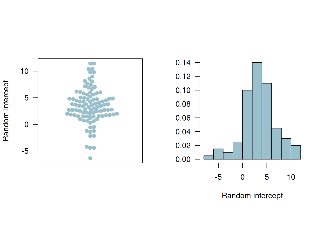
Figure 14.3: Beeswarm plot and histogram of the random intercepts.
14.1.5.2 Random slope model
Now the time points (week 1, 4, and 6) are included in the covariate vector and considered as a random effect. Then \(\boldsymbol{U}_i\) is a 2-dimensional random effect with mean zero and \(2 \times 2\) covariate matrix \(\boldsymbol{G}\) (see Appendix F.3.3).
Example 14.1 (continued) We fit a random slope model for the TLC data. This model allows varying intercepts and effects of treatment for every individual.
From the output we can get the estimated treatment effect, residual standard deviation, and the correlation matrix \(\boldsymbol{G}\).
Table 14.10 summarizes the estimated parameters with their standard errors and p-values.
| term | estimate | conf.low | conf.high | p.value |
|---|---|---|---|---|
| (Intercept) | 3.74 | -1.45 | 8.93 | 0.16 |
| week | -0.20 | -0.55 | 0.15 | 0.26 |
| TreatmentActive | -13.57 | -16.14 | -10.99 | 0.00 |
| lead.0 | 0.80 | 0.62 | 0.99 | 0.00 |
| week:TreatmentActive | 1.59 | 1.09 | 2.09 | 0.00 |
Figure 14.4 shows the fitted individual linear profiles and the mean linear profiles in the two groups. The placebo group has a flat mean fit while the treatment group has an increasing mean fit but remains below that in the placebo group. This is supported by the fact that after the dramatic drop in blood lead levels among the children treated with succimer in week 1, there is a rebound in blood lead levels, as lead stored in the body achieves a new equilibrium.
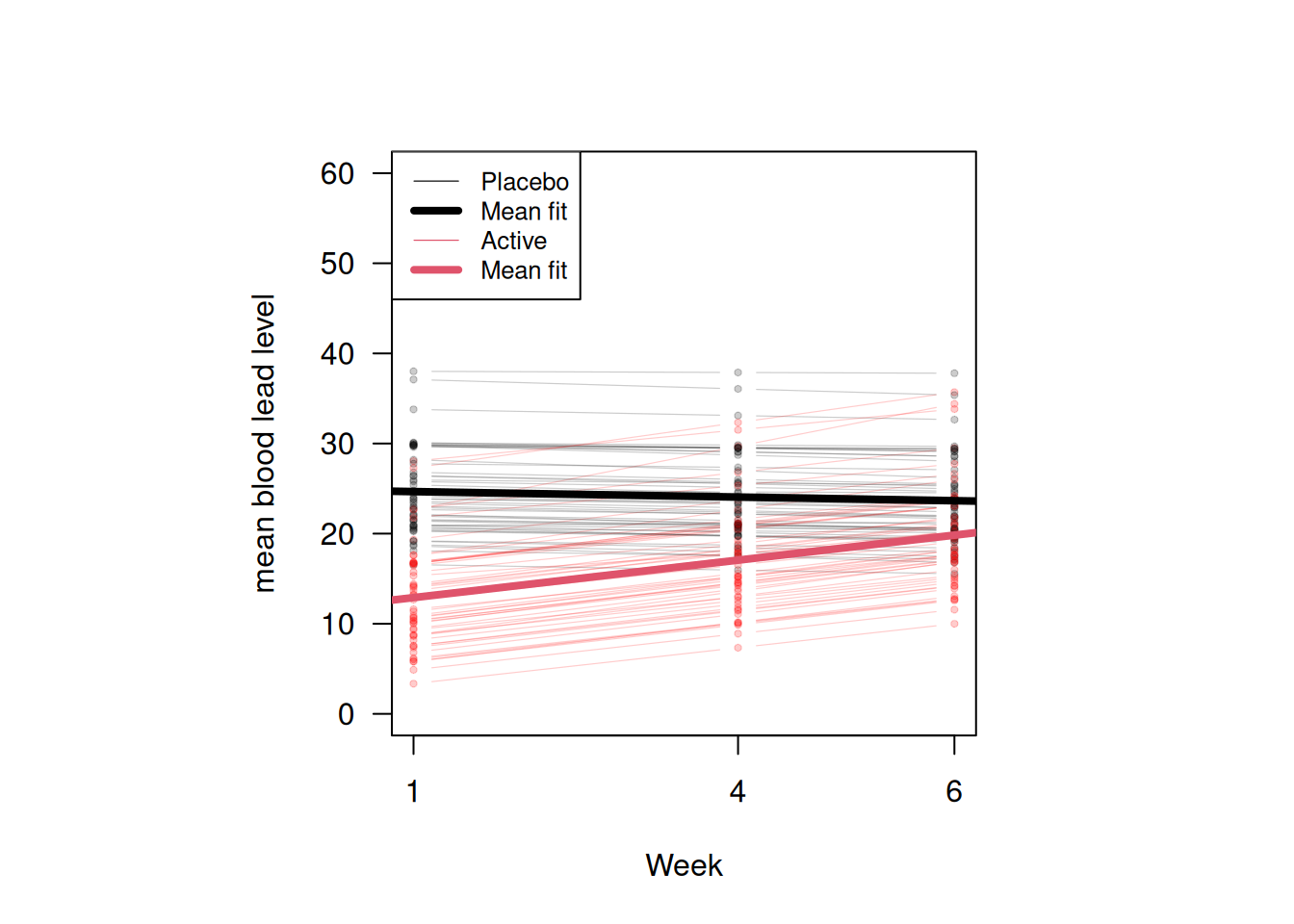
Figure 14.4: Fitted individual linear profiles and mean linear profiles in two groups according to the random slope model.
14.2 Binary longitudinal outcomes
There are generally two approaches for analyzing binary longitudinal data using generalized linear models. The first one is to use marginal models (quasi-likelihood, generalized estimating equations), and the other one is using conditional models (i.e. models with random effects). While the marginal approach allows explicitly for correlation or association between observations made from the same individual, a conditional model assumes independence given the random effects, which implies marginal correlation. For non-normal data, the interpretations of regression coefficients are different between the two methods: the marginal interpretation is about “population-averages”, but the individual/conditional interpretation is “subject-specific”. The first section will focus on the marginal model, and the second section will address the conditional model.
14.2.1 Generalized estimating equations
The basic idea of the marginal approach is to use multivariate generalized estimating equation for non-normal data to take into account correlation between components of the response vector \(\boldsymbol{Y}_i\) (see Appendix G.2 for more details.)
Example 14.2 We will use the dataset \(\texttt{respiratory}\) available in the package \(\texttt{geepack}\), originally from Koch et al (1989). The data are from a clinical trial of patients with respiratory illness, where 111 patients from two different clinics were randomized to receive either placebo or an active treatment. Patients were examined at baseline and at four visits during treatment. The \(\texttt{baseline}\) is always the same for the same patient \(\texttt{id}\). The respiratory status (categorized as 1 = good/response, 0 = poor/no response) was determined at each visit.
The first 6 rows of the dataset are presented in Table 14.11. We notice that the \(\texttt{id}\)’s in center 2 are duplicated with those in center 1, which means the same \(\texttt{id}\) in centers 1 and 2 corresponds to two different individuals. Therefore, we redefine \(\texttt{id}\)’s in center 2 to distinguish individuals from the two centers.
## center 2 is repeated
respiratory$id[respiratory$center == 2] <-
respiratory$id[respiratory$center == 2] + max(respiratory$id)| center | id | treat | sex | age | baseline | visit | outcome |
|---|---|---|---|---|---|---|---|
| 1 | 1 | P | M | 46 | 0 | 1 | 0 |
| 1 | 1 | P | M | 46 | 0 | 2 | 0 |
| 1 | 1 | P | M | 46 | 0 | 3 | 0 |
| 1 | 1 | P | M | 46 | 0 | 4 | 0 |
| 1 | 2 | P | M | 28 | 0 | 1 | 0 |
| 1 | 2 | P | M | 28 | 0 | 2 | 0 |
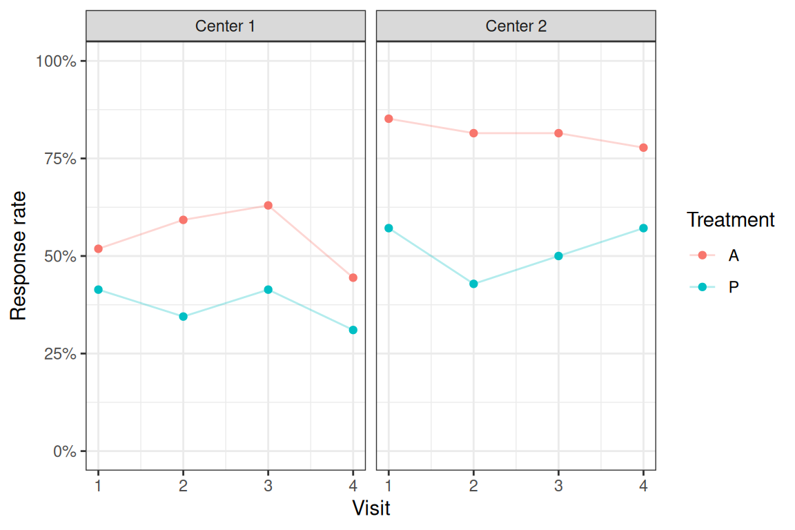
Figure 14.5: Response rates by treatment groups and centers.
Now we use package \(\texttt{geepack}\) to fit GEE models for binary data including the explanatory variables \(\texttt{center, treat, age}\), and \(\texttt{baseline}\). The first model is using an exchangeable correlation structure and the second one is using an unstructured correlation structure.
respiratory$treat <- relevel(respiratory$treat, ref = "P")
respiratory$center <- factor(respiratory$center)
## Fit GEE models
library(geepack)
geeExc <- geeglm(outcome ~ center + treat + age + baseline, data = respiratory,
id = id, family = binomial(link = "logit"),
corstr = "exchangeable")
geeUns <- geeglm(outcome ~ center + treat + age + baseline, data = respiratory,
id = id, family = binomial(link = "logit"),
corstr = "unstructured")
The estimated correlation parameter in the model with exchangeable correlation structure is \(0.33\). In the model with unstructured correlation structure, the estimated correlation matrix is
\[ \begin{pmatrix} 1 & 0.32 & 0.2 & 0.28 \\ 0.32 & 1 & 0.43 & 0.35 \\ 0.2 & 0.43 & 1 & 0.38 \\ 0.28 & 0.35 & 0.38 & 1 \end{pmatrix}. \]
We can see that there is some variation among the correlations in the unstructured model, with values between 0.2 and 0.43.
Looking at the results from the unstructured model in Table 14.12, the treatment increases the odds to respond by a factor of 3.4 compared to placebo, and there is strong evidence that this increase is different from one. We also estimate slightly higher odds to respond for patients in center 2 compared to center 1 (OR = 1.96). Finally, the estimate of baseline suggests that responding already at baseline is strongly associated (OR = 6.6) with responding also in the follow-up visits.
| Odds Ratio | 95%-confidence interval | \(p\)-value | |
|---|---|---|---|
| center2 | 1.96 | from 1.01 to 3.81 | 0.048 |
| treatA | 3.40 | from 1.80 to 6.41 | 0.0002 |
| age | 0.98 | from 0.96 to 1.01 | 0.16 |
| baseline | 6.60 | from 3.42 to 12.73 | < 0.0001 |
However, we need to be careful using the correlation between binary variables. It can be shown that the correlation has bounds depending on the marginal success probabilities, which makes correlation as a measure not optimal for binary variables (see Appendix G.2).
Sometimes more elaborate modelling of the correlation structure may be needed, for example dependence of correlation/association between pairs of observations \(Y_{ij}\) and \(Y_{ik}\) from the \(i\)-the individual on the time distance. Such models can be incorporated using a user defined working correlation structure (\(\texttt{corstr=userdefined}\)) with additional explanatory variables \(\texttt{zcor}\) (typically a function of the time distance) for each pair of observations.
14.2.2 Logistic regression with random effects
We also consider the approach using generalized mixed-effects models, for example the logistic regression with random effects, for analysing binary longitudinal data. For more details, see Appendix G.3.1.
Example 14.2 (continued) Here we continue to use the \(\texttt{respiratory}\) dataset and fit a generalized linear mixed-effects model with a random intercept. After that we compare it with a marginal model (GEE).
library(lme4)
## use age per decade
respiratory$agePerDecade <- respiratory$age/10
## Fit the model
glmer1 <- glmer(outcome ~ 1 + center + treat + agePerDecade + baseline + (1 | id),
                data = respiratory, family = binomial(link = "logit"),
                nAGQ = 25)
The estimated coefficients based on Gauss-Hermite approximation with \(\texttt{nAGQ=25}\) support points are given in Table 14.13. The estimated standard deviation of the intercept is 1.99.
| term | estimate | conf.low | conf.high | p.value |
|---|---|---|---|---|
| (Intercept) | 0.23 | 0.05 | 1.03 | 0.06 |
| center2 | 2.75 | 0.95 | 7.91 | 0.06 |
| treatA | 7.27 | 2.57 | 20.54 | 0.00 |
| agePerDecade | 0.78 | 0.53 | 1.14 | 0.20 |
| baseline | 18.15 | 5.85 | 56.28 | 0.00 |
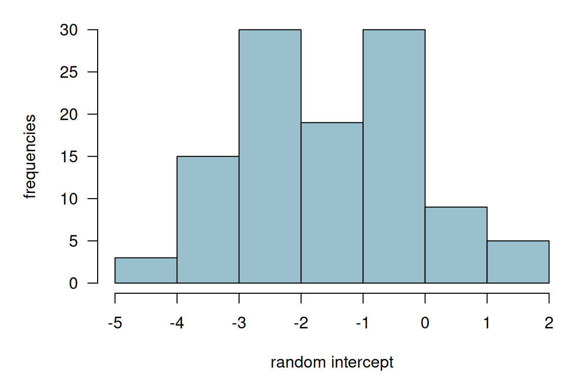
Figure 14.6: Histogram of the estimated random intercepts from model glmer1.
Then, we fit a marginal model using an exchangeable correlation structure.
## Fit GEE model
geeExc <- geeglm(outcome ~ center + treat + agePerDecade + baseline, data = respiratory, id = id,
                 family = binomial(link = "logit"), corstr = "exchangeable")
We then compare the conditional with the marginal estimates by looking at the point estimates and their confidence intervals in Figure 14.7. From the plot, we can see that the odds ratio estimates from the marginal model (geeglm) are all closer to 1 compared to those from the conditional model (glmer). This agrees with the relationship in Equation (G.4).
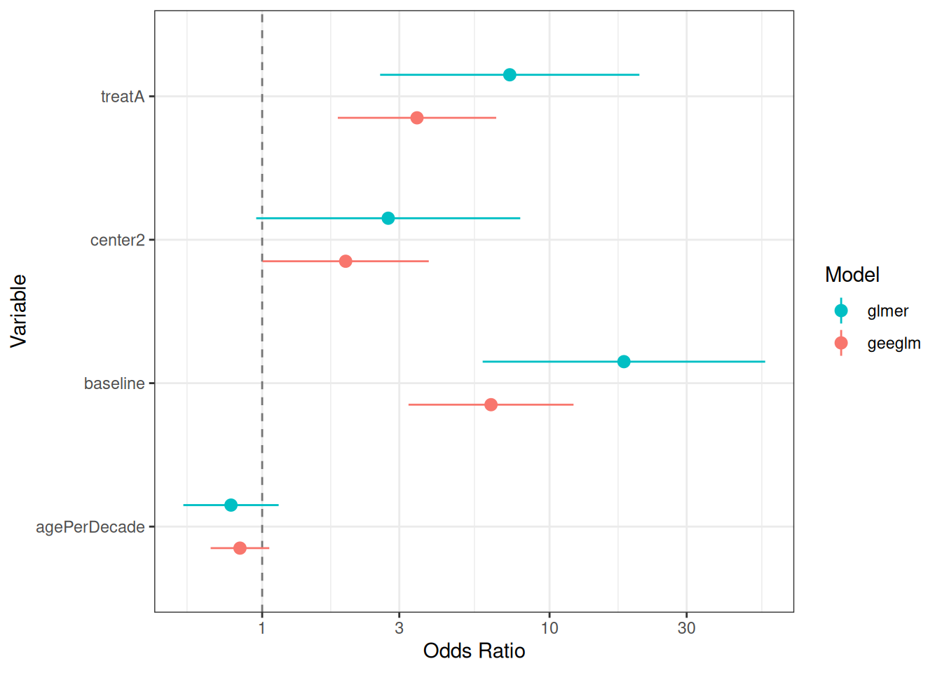
Figure 14.7: Estimated odds ratios and their confidence intervals from conditional and marginal models.
14.3 Sample size calculation
In this section, we consider a continuous outcome case. Suppose the model is \[ Y_{ij} = \beta_0 + \beta_1 x_i + \epsilon_{ij}, \quad j=1,\ldots,n; \quad i=1,\ldots, 2m \] where \(x_i\) is a binary treatment indicator, \(m\) is the number of patients per group and \(n\) is the number of observations per patient. Suppose further that the correlation between observations from the same patient is \(\rho\) (exchangeable correlation). We discussed the usual two independent sample size formula in Section 5.2. For longitudinal data, the normal formula has to be adjusted with the longitudinal design effect: \[ D_{\text{eff}} = \{1 + (n-1) \rho \}/n > \rho \quad \text{ for all $n$}. \] We notice that the design effect cannot be smaller than \(\rho\).
For an arbitrary correlation matrix \(\boldsymbol{R}\), the design factor is \[ D_{\text{eff}} = \{ \boldsymbol{1}^\top \boldsymbol{R}^{-1} \boldsymbol{1}\}^{-1}, \] which is the inverse of the sum of the elements in \(\boldsymbol{R}^{-1}\). The sample size is then obtained by multiplying the standard sample size design with the design effect.
We compare the design effect under exchangeable and AR-1 correlation structure assumptions and different values of \(\rho\) in Figure 14.8. The independence line is the design effect when \(\rho=0\), i.e. no correlation between observations. When \(n\) is 1 or 2, the design effect of the exchangeable and the AR-1 correlation structures are identical, and this is because they give the same correlation structure when \(n\) = 1 or 2. In the AR-1 model, the correlation is smaller as \(n\) increases, so there are less correlation in the data compared to that under exchangeable assumption. Thus, we need a smaller sample size under the AR-1 assumption (design effect smaller) compared to that under exchangeable assumption.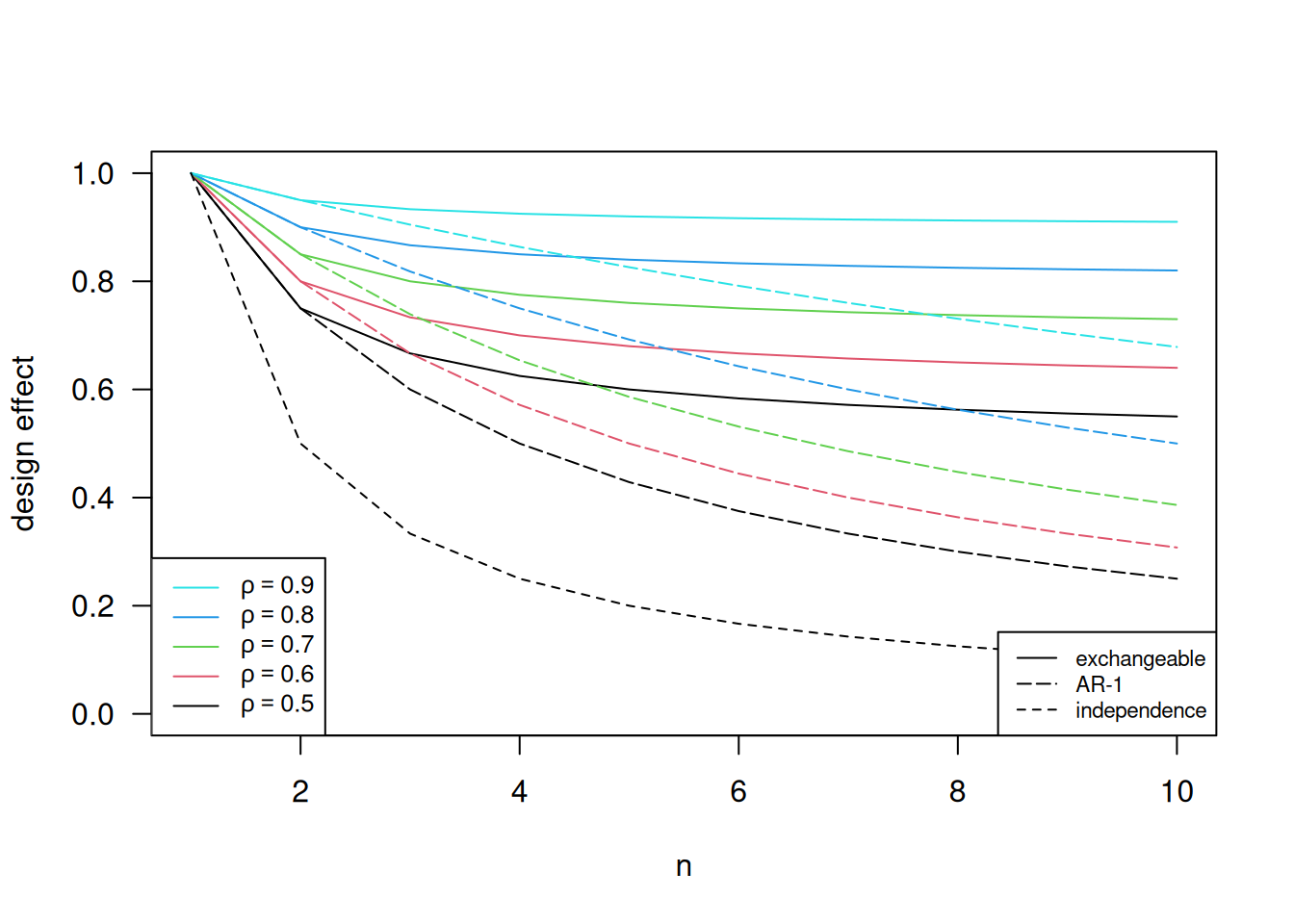
Figure 14.8: Design effects under different correlation structure and different values of \(\rho\).