12.1 饼图
我对饼图是又爱又恨,爱的是它表示百分比的时候,往往让读者联想到蛋糕,份额这类根深蒂固的情景,从而让数字通俗易懂、深入人心,是一种很好的表达方式,恨的也是这一点,我用柱状图表达不香吗?人眼对角度的区分度远不如柱状图呢,特别是当两个类所占的份额比较接近的时候,所以很多时候,除了用饼图表达份额,还会在旁边标上百分比,从数据可视化的角度来说,如图 12.1 所示,这是信息冗余!
BOD %>% transform(., ratio = demand / sum(demand)) %>%
  ggplot(., aes(x = "", y = demand, fill = reorder(Time, demand))) +
  geom_bar(stat = "identity", show.legend = FALSE, color = "white") +
  coord_polar(theta = "y") +
  geom_text(aes(x = 1.6, label = paste0(round(ratio, digits = 4) * 100, "%")),
    position = position_stack(vjust = 0.5), color = "black"
  ) +
  geom_text(aes(x = 1.2, label = Time),
    position = position_stack(vjust = 0.5), color = "black"
  ) +
  theme_void(base_size = 14)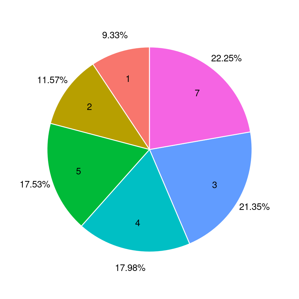
图 12.1: 饼图
plot_ly(type = "pie", ... ) 和添加图层 add_pie() 的效果是一样的
dat = aggregate(carat ~ cut, data = diamonds, FUN = length)
plotly::plot_ly() %>%
  plotly::add_pie(
    data = dat, labels = ~cut, values = ~carat,
    name = "简单饼图1", domain = list(row = 0, column = 0)
  ) %>%
  plotly::add_pie(
    data = dat, labels = ~cut, values = ~carat, hole = 0.6,
    textposition = "inside", textinfo = "label+percent",
    name = "简单饼图2", domain = list(row = 0, column = 1)
  ) %>%
  plotly::layout(
    title = "多图布局", showlegend = F,
    grid = list(rows = 1, columns = 2),
    xaxis = list(showgrid = FALSE, zeroline = FALSE, showticklabels = FALSE),
    yaxis = list(showgrid = FALSE, zeroline = FALSE, showticklabels = FALSE)
  ) %>%
  plotly::config(displayModeBar = FALSE)
图 12.2: 饼图
设置参数 hole 可以绘制环形饼图,比如 hole = 0.6