12.9 密度图
ggplot(mpg, aes(cty)) +
  geom_density(aes(fill = factor(cyl)), alpha = 0.8) +
  labs(
    title = "Density plot",
    subtitle = "City Mileage Grouped by Number of cylinders",
    caption = "Source: mpg",
    x = "City Mileage",
    fill = "# Cylinders"
  )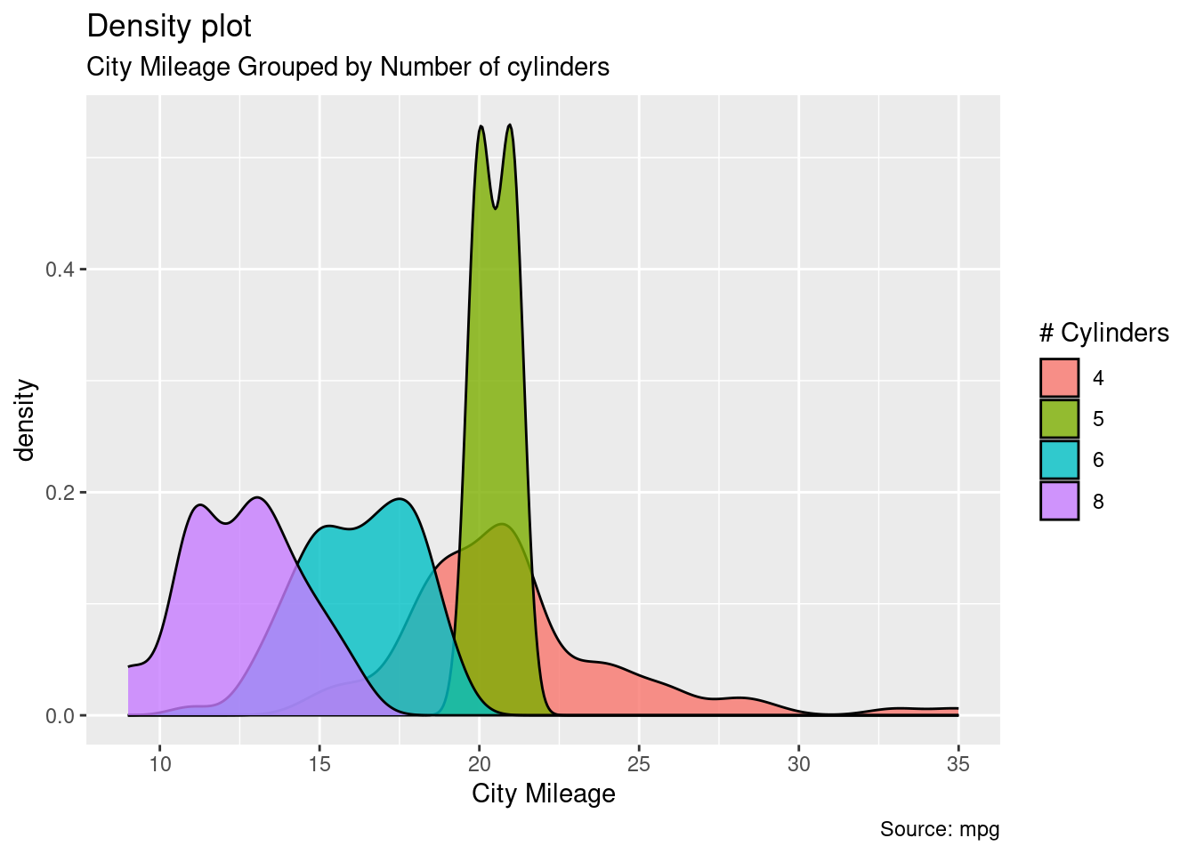
图 12.37: 按汽缸数分组的城市里程
添加透明度,解决遮挡
ggplot(diamonds, aes(x = price, fill = cut)) + geom_density()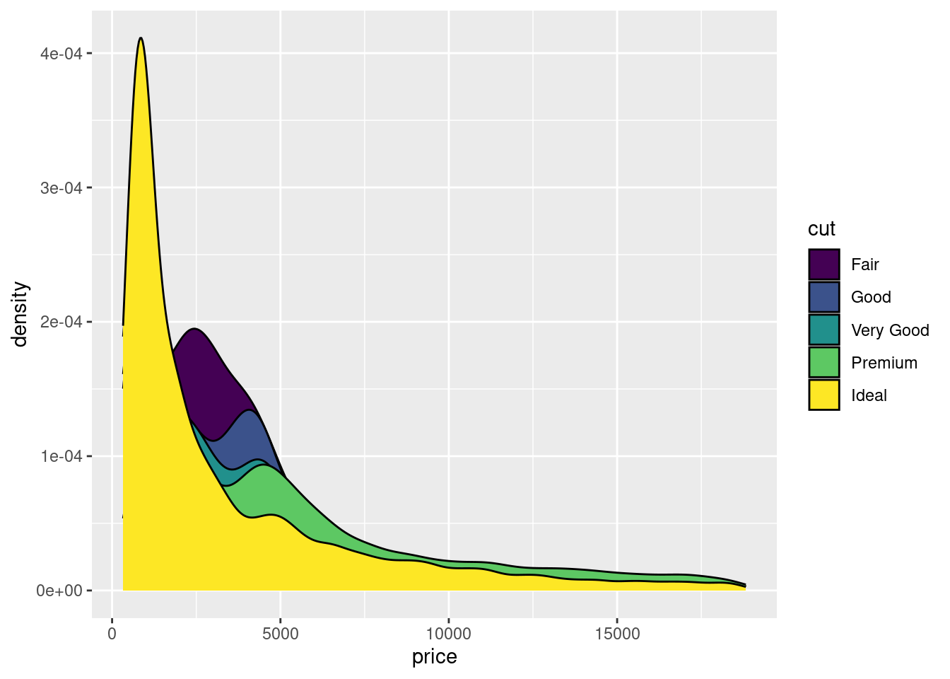
图 12.38: 密度图
ggplot(diamonds, aes(x = price, fill = cut)) + geom_density(alpha = 0.5)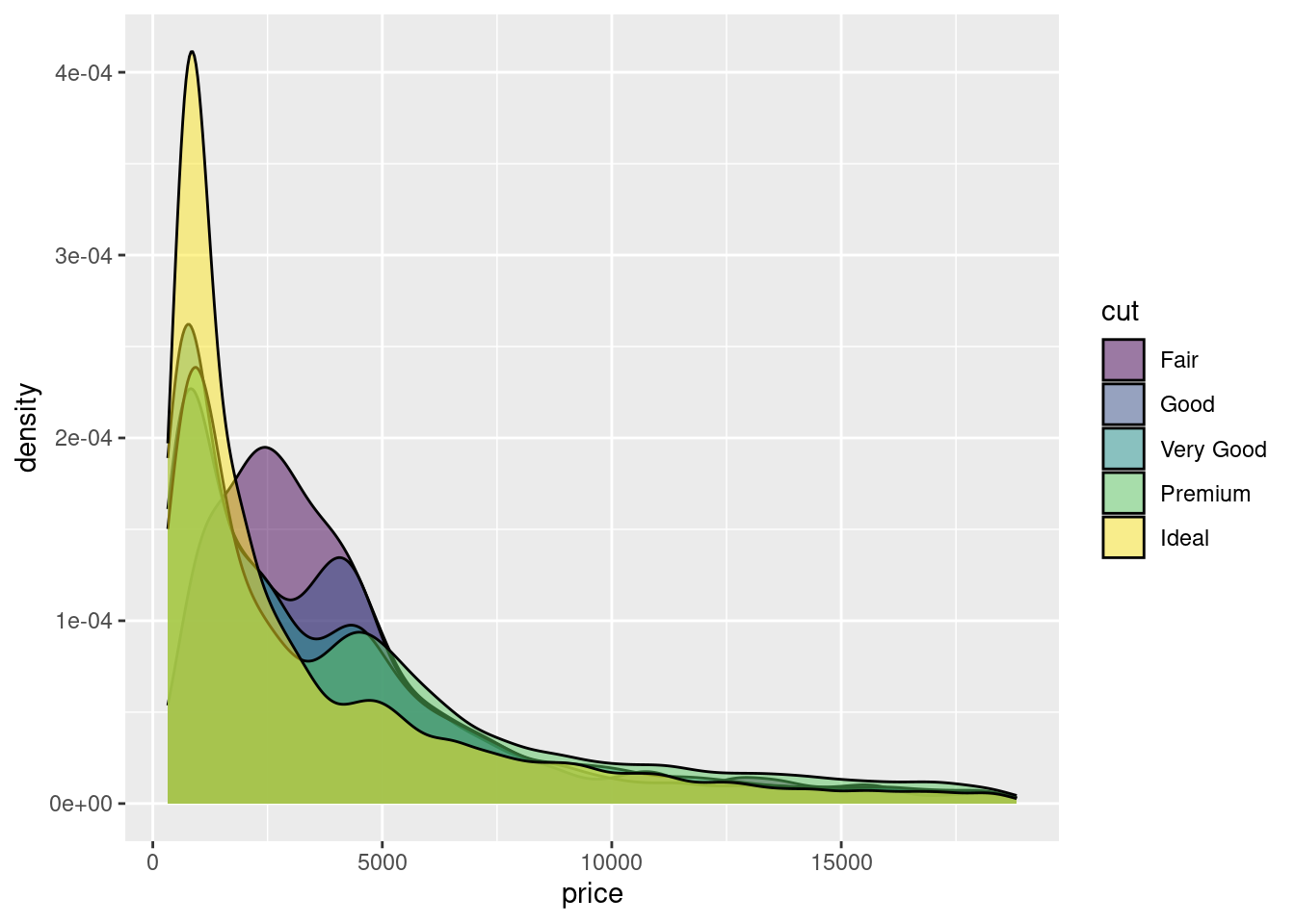
图 12.39: 添加透明度的密度图
堆积密度图
ggplot(diamonds, aes(x = price, fill = cut)) +
  geom_density(position = "stack")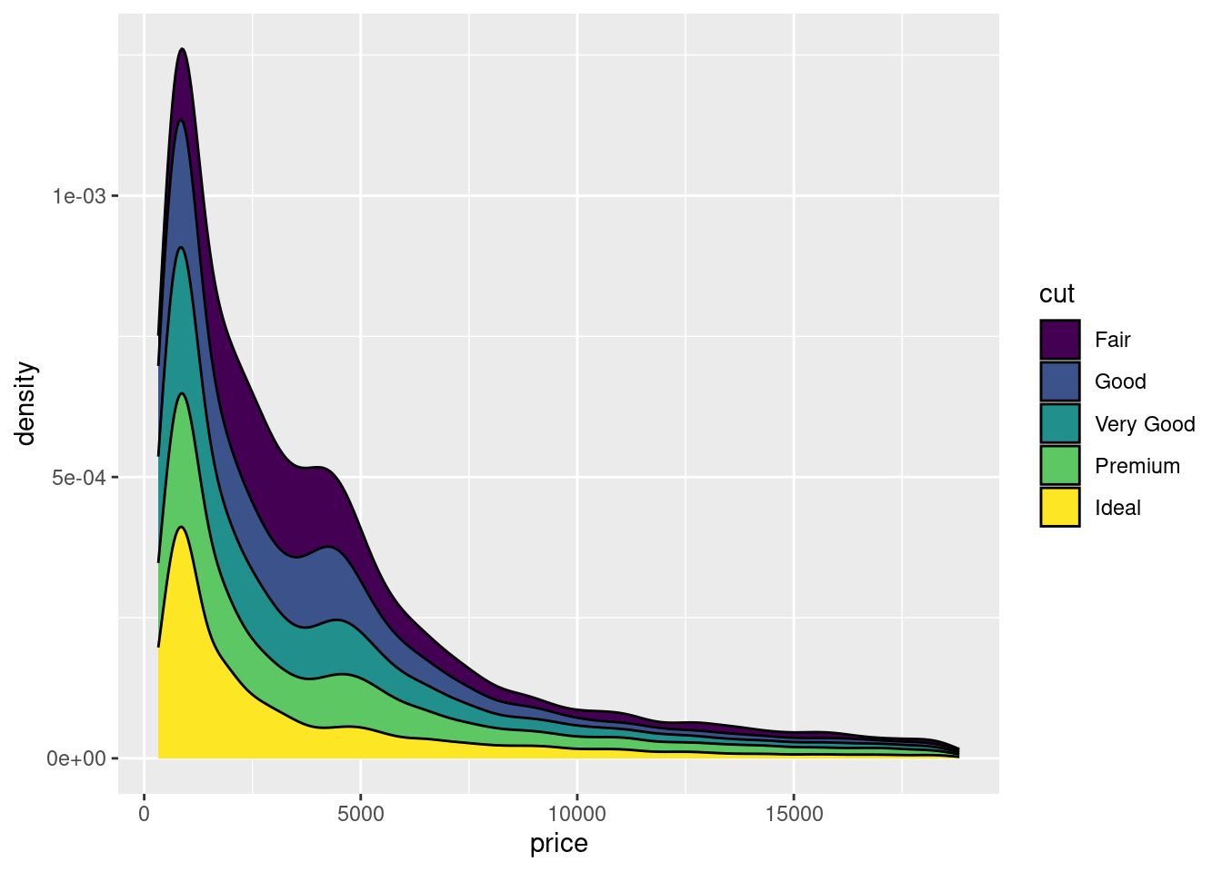
图 12.40: 堆积密度图
条件密度估计
# You can use position="fill" to produce a conditional density estimate
ggplot(diamonds, aes(carat, stat(count), fill = cut)) +
  geom_density(position = "fill")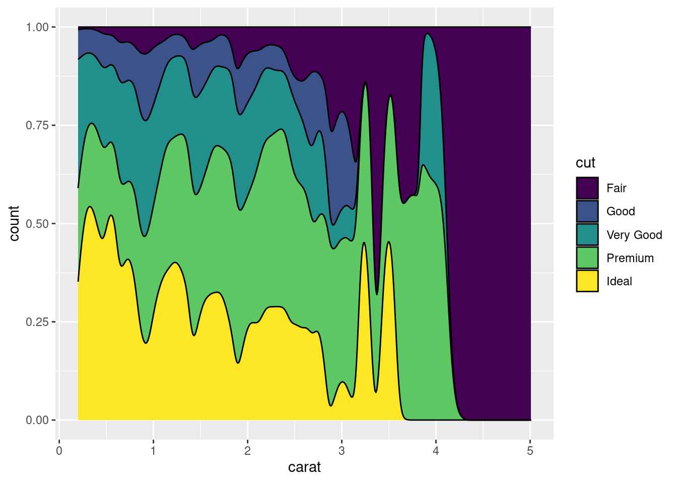
图 12.41: 条件密度估计图
岭线图是密度图的一种变体,可以防止密度曲线重叠在一起
ggplot(diamonds) +
  ggridges::geom_density_ridges(aes(x = price, y = color, fill = color))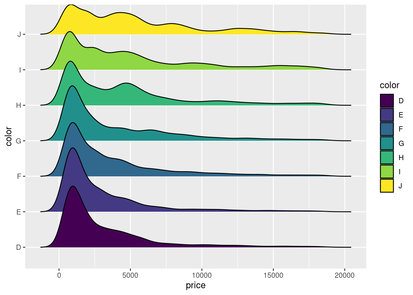
二维的密度图又是一种延伸
ggplot(diamonds, aes(x = carat, y = price)) +
  geom_density_2d(aes(color = cut)) +
  facet_grid(~cut)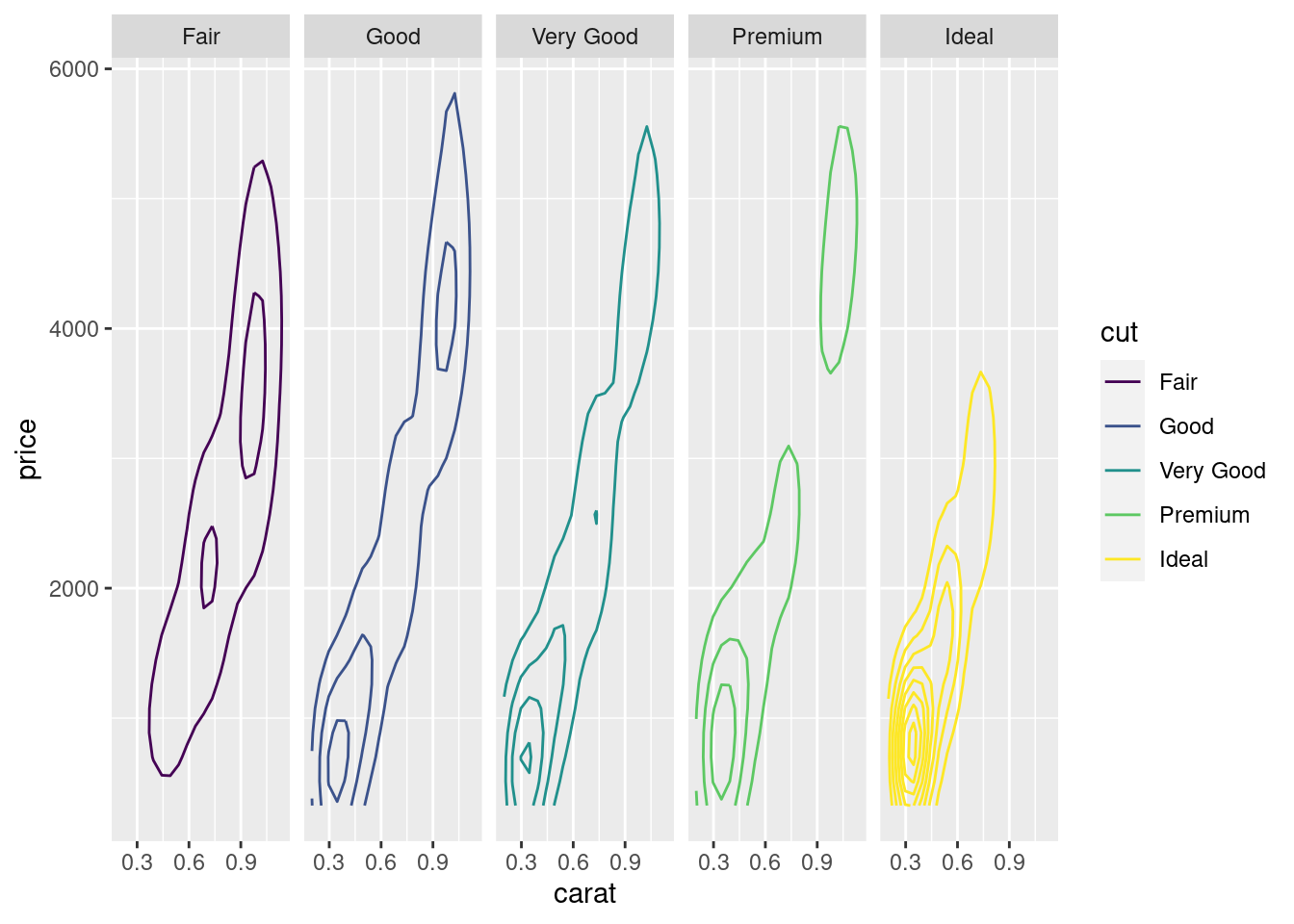
stat 函数,特别是 nlevel 参数,在密度曲线之间填充我们又可以得到热力图
ggplot(diamonds, aes(x = carat, y = price)) +
  stat_density_2d(aes(fill = stat(nlevel)), geom = "polygon") +
  facet_grid(. ~ cut)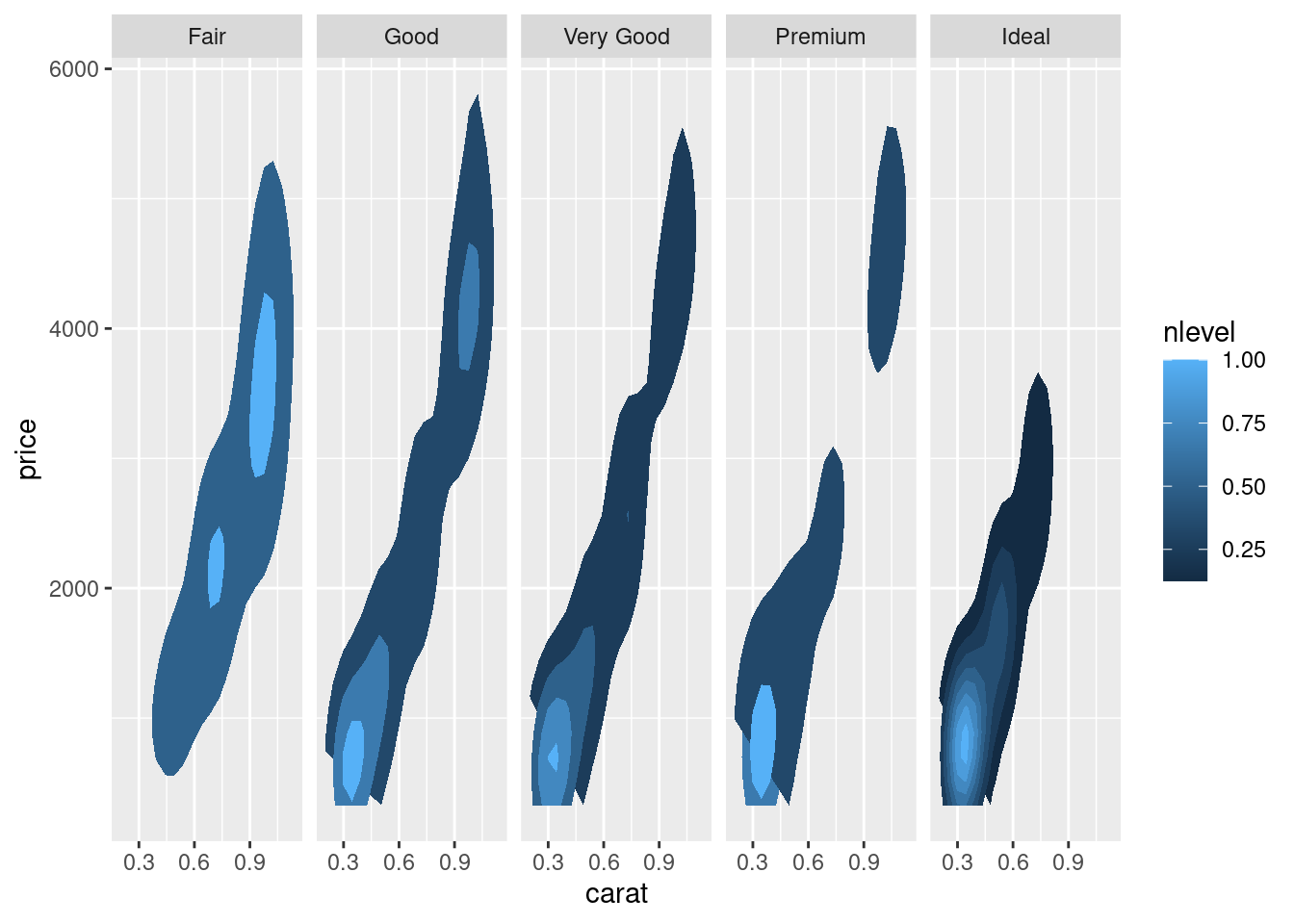
gemo_hex 也是二维密度图的一种变体,特别适合数据量比较大的情形
ggplot(diamonds, aes(x = carat, y = price)) + geom_hex() +
  scale_fill_viridis_c()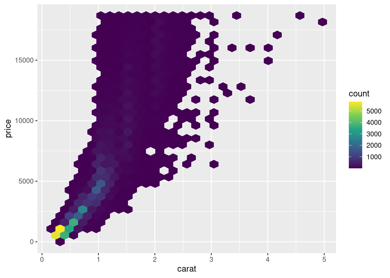
heatmaps in ggplot2 二维密度图
ggplot(faithful, aes(x = eruptions, y = waiting)) +
  stat_density_2d(aes(fill = ..level..), geom = "polygon") +
  xlim(1, 6) +
  ylim(40, 100)

ggplot(faithful, aes(x = eruptions, y = waiting)) +
  stat_density2d(aes(fill = stat(level)), geom = "polygon") +
  scale_fill_viridis_c(option = "viridis") +
  xlim(1, 6) +
  ylim(40, 100)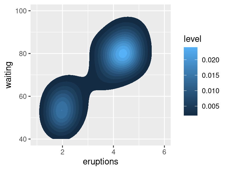
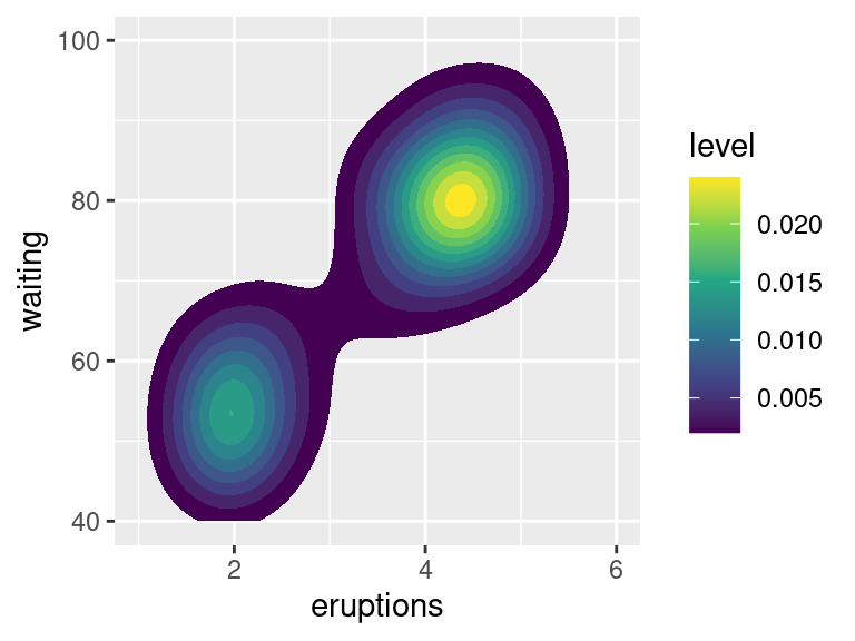
图 12.42: 二维密度图
MASS::kde2d() 实现二维核密度估计,ggplot2 包提供了两种等价的绘图方式
stat_density_2d()和..stat_density2d()和stat()
plotly::plot_ly(
  data = faithful, x = ~eruptions,
  y = ~waiting, type = "histogram2dcontour"
) %>%
  plotly::config(displayModeBar = FALSE)
图 12.43: 二维直方图/密度图/轮廓图
# plot_ly(faithful, x = ~waiting, y = ~eruptions) %>%
#   add_histogram2d() %>%
#   add_histogram2dcontour()
延伸一下,热力图
library(KernSmooth)
den <- bkde2D(x = faithful, bandwidth = c(0.7, 7))
# 热力图
p1 <- plotly::plot_ly(x = den$x1, y = den$x2, z = den$fhat) %>%
  plotly::config(displayModeBar = FALSE) %>%
  plotly::add_heatmap()

# 等高线图
p2 <- plotly::plot_ly(x = den$x1, y = den$x2, z = den$fhat) %>%
  plotly::config(displayModeBar = FALSE) %>%
  plotly::add_contour()

htmltools::tagList(p1, p2)