10.1 绘图基本要素
10.1.1 点线
点和线是最常见的画图元素,在 plot 函数中,分别用参数 pch 和 lty 来设定类型,点的大小、线的宽度分别用参数 cex 和 lwd 来指定,颜色由参数 col 设置。参数 type 不同的值设置如下,p 显示点,l 绘制线,b 同时绘制空心点,并用线连接,c 只有线,o 在线上绘制点,s 和 S 点线连接绘制阶梯图,h 绘制类似直方图一样的垂线,最后 n 表示什么也不画。
点 points 、线 grid 背景线 abline lines rug 刻度线(线段segments、箭头arrows)、
## -------- Showing all the extra & some char graphics symbols ---------
pchShow <-
  function(extras = c("*", ".", "o", "O", "0", "+", "-", "|", "%", "#"),
             cex = 2, ## good for both .Device=="postscript" and "x11"
             col = "red3", bg = "gold", coltext = "brown", cextext = 1.2,
             main = paste(
               "plot symbols :  points (...  pch = *, cex =",
               cex, ")"
             )) {
    nex <- length(extras)
    np <- 26 + nex
    ipch <- 0:(np - 1)
    k <- floor(sqrt(np))
    dd <- c(-1, 1) / 2
    rx <- dd + range(ix <- ipch %/% k)
    ry <- dd + range(iy <- 3 + (k - 1) - ipch %% k)
    pch <- as.list(ipch) # list with integers & strings
    if (nex > 0) pch[26 + 1:nex] <- as.list(extras)
    plot(rx, ry, type = "n", axes = FALSE, xlab = "", ylab = "", main = main)
    abline(v = ix, h = iy, col = "lightgray", lty = "dotted")
    for (i in 1:np) {
      pc <- pch[[i]]
      ## 'col' symbols with a 'bg'-colored interior (where available) :
      points(ix[i], iy[i], pch = pc, col = col, bg = bg, cex = cex)
      if (cextext > 0) {
        text(ix[i] - 0.3, iy[i], pc, col = coltext, cex = cextext)
      }
    }
  }

pchShow()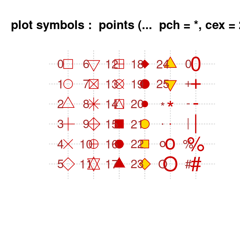
图 10.1: 不同的 pch 参数值
## ------------ test code for various pch specifications -------------
# Try this in various font families (including Hershey)
# and locales.  Use sign = -1 asserts we want Latin-1.
# Standard cases in a MBCS locale will not plot the top half.
TestChars <- function(sign = 1, font = 1, ...) {
  MB <- l10n_info()$MBCS
  r <- if (font == 5) {
    sign <- 1
    c(32:126, 160:254)
  } else if (MB) 32:126 else 32:255
  if (sign == -1) r <- c(32:126, 160:255)
  par(pty = "s")
  plot(c(-1, 16), c(-1, 16),
    type = "n", xlab = "", ylab = "",
    xaxs = "i", yaxs = "i",
    main = sprintf("sign = %d, font = %d", sign, font)
  )
  grid(17, 17, lty = 1)
  mtext(paste("MBCS:", MB))
  for (i in r) try(points(i %% 16, i %/% 16, pch = sign * i, font = font, ...))
}
TestChars()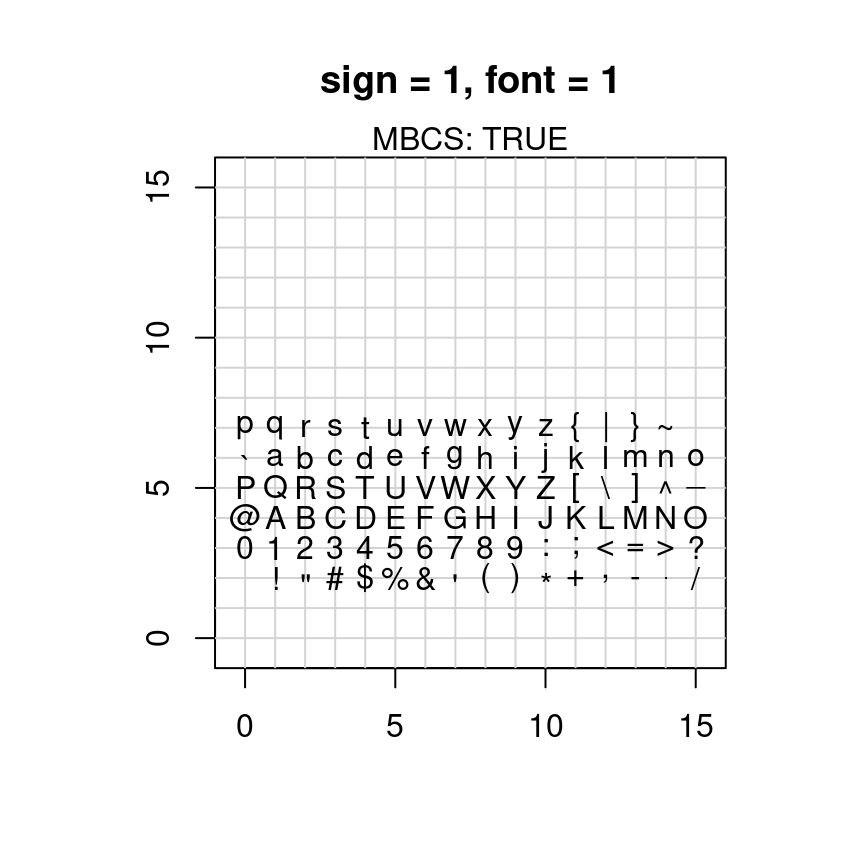
图 10.2: pch 支持的字符
try(TestChars(sign = -1))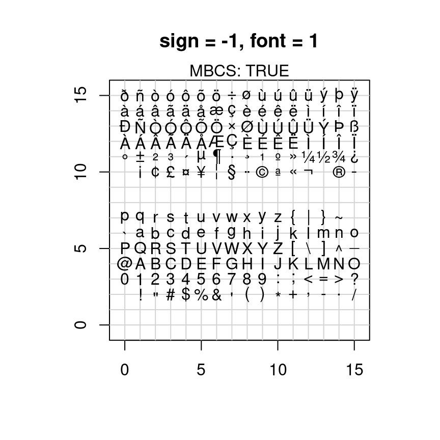
图 10.3: pch 支持的字符
TestChars(font = 5) # Euro might be at 160 (0+10*16).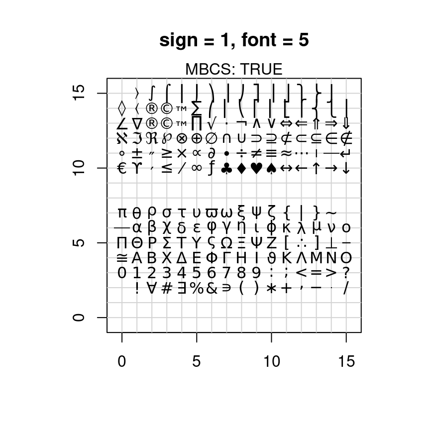
图 10.4: pch 支持的字符
# macOS has apple at 240 (0+15*16).
try(TestChars(-1, font = 2)) # bold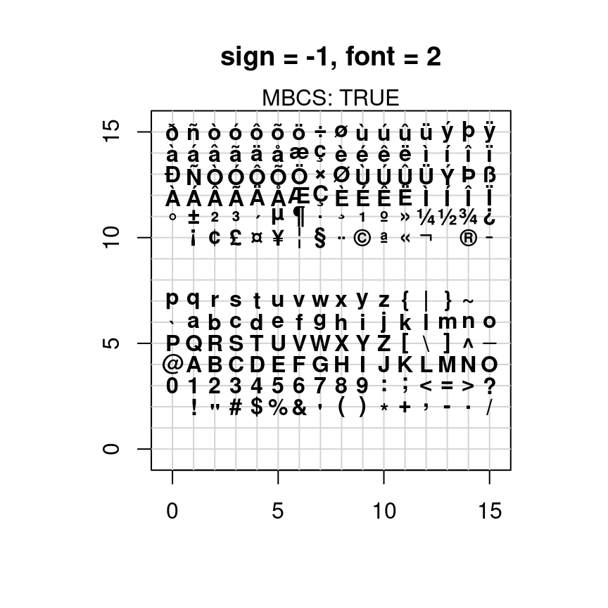
图 10.5: pch 支持的字符
x <- 0:12
y <- sin(pi / 5 * x)
par(mfrow = c(3, 3), mar = .1 + c(2, 2, 3, 1))
for (tp in c("p", "l", "b", "c", "o", "h", "s", "S", "n")) {
  plot(y ~ x, type = tp, main = paste0("plot(*, type = \"", tp, "\")"))
  if (tp == "S") {
    lines(x, y, type = "s", col = "red", lty = 2)
    mtext("lines(*, type = \"s\", ...)", col = "red", cex = 0.8)
  }
}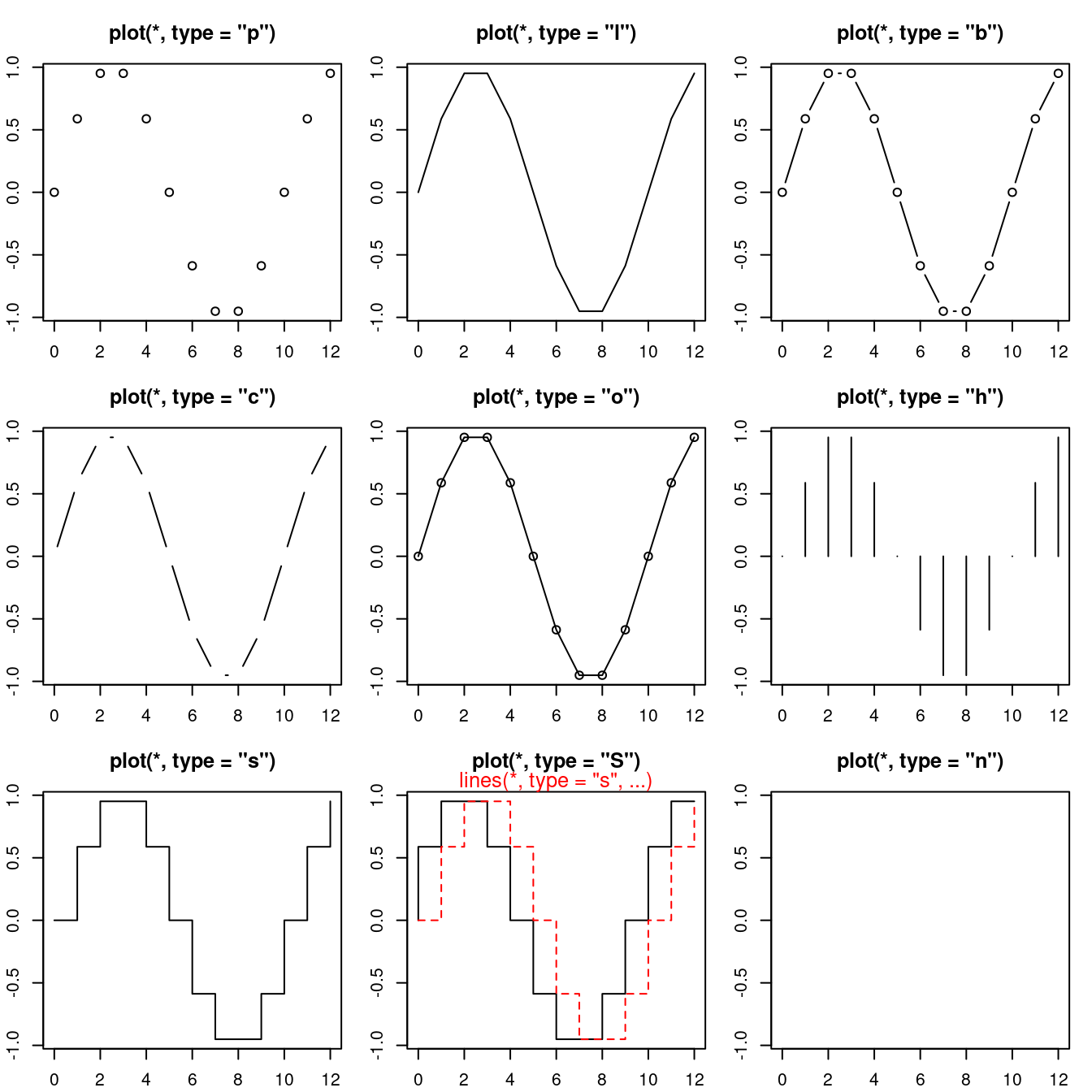
图 10.6: 不同的 type 参数值
颜色 col 连续型和离散型
线帽/端和字体的样式
# 合并为一个图 三条粗横线 横线上三种字形
plot(c(1, 20), c(1, 20), type = "n", ann = FALSE)
lines(x = c(5, 15), y = c(5, 5), lwd = 15, lend = "round")
text(10, 5, "Hello, Helvetica", cex = 1.5, family = "sans", pos = 1, offset = 1.5)
text(5, 5, "sans", cex = 1.5, family = "sans", pos = 2, offset = .5)
text(15, 5, "lend = round", pos = 4, offset = .5)

lines(x = c(5, 15), y = c(10, 10), lwd = 15, lend = "butt")
text(10, 10, "Hello, Helvetica", cex = 1.5, family = "mono", pos = 1, offset = 1.5)
text(5, 10, "mono", cex = 1.5, family = "mono", pos = 2, offset = .5)
text(15, 10, "lend = butt", pos = 4, offset = .5)

lines(x = c(5, 15), y = c(15, 15), lwd = 15, lend = "square")
text(10, 15, "Hello, Helvetica", cex = 1.5, family = "serif", pos = 1, offset = 1.5)
text(5, 15, "serif", cex = 1.5, family = "serif", pos = 2, offset = .5)
text(15, 15, "lend = square", pos = 4, offset = .5)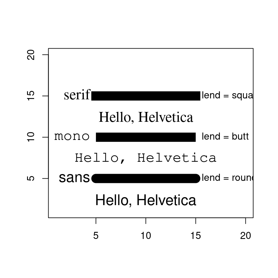
图 10.7: 不同的线端样式
lend:线端的样式,可用一个整数或字符串指定:
- 0 或 “round” 圆形(默认)
- 1 或 “butt” 对接形
- 2 或 “square” 方形
10.1.2 区域
矩形,多边形,曲线交汇出来的区域 面(矩形rect,多边形polygon)、路径 polypath 面/多边形 rect 颜色填充
# From the manual
ch.col <- c(
  "rainbow(n, start=.7, end=.1)",
  "heat.colors(n)",
  "terrain.colors(n)",
  "topo.colors(n)",
  "cm.colors(n)"
) # 选择颜色
n <- 16
nt <- length(ch.col)
i <- 1:n
j <- n / nt
d <- j / 6
dy <- 2 * d
plot(i, i + d,
  type = "n",
  yaxt = "n",
  ylab = "",
  xlab = "",
  main = paste("color palettes; n=", n)
)
for (k in 1:nt) {
  rect(i - .5, (k - 1) * j + dy, i + .4, k * j,
    col = eval(parse(text = ch.col[k]))
  ) # 咬人的函数/字符串解析为/转函数
  text(2 * j, k * j + dy / 4, ch.col[k])
}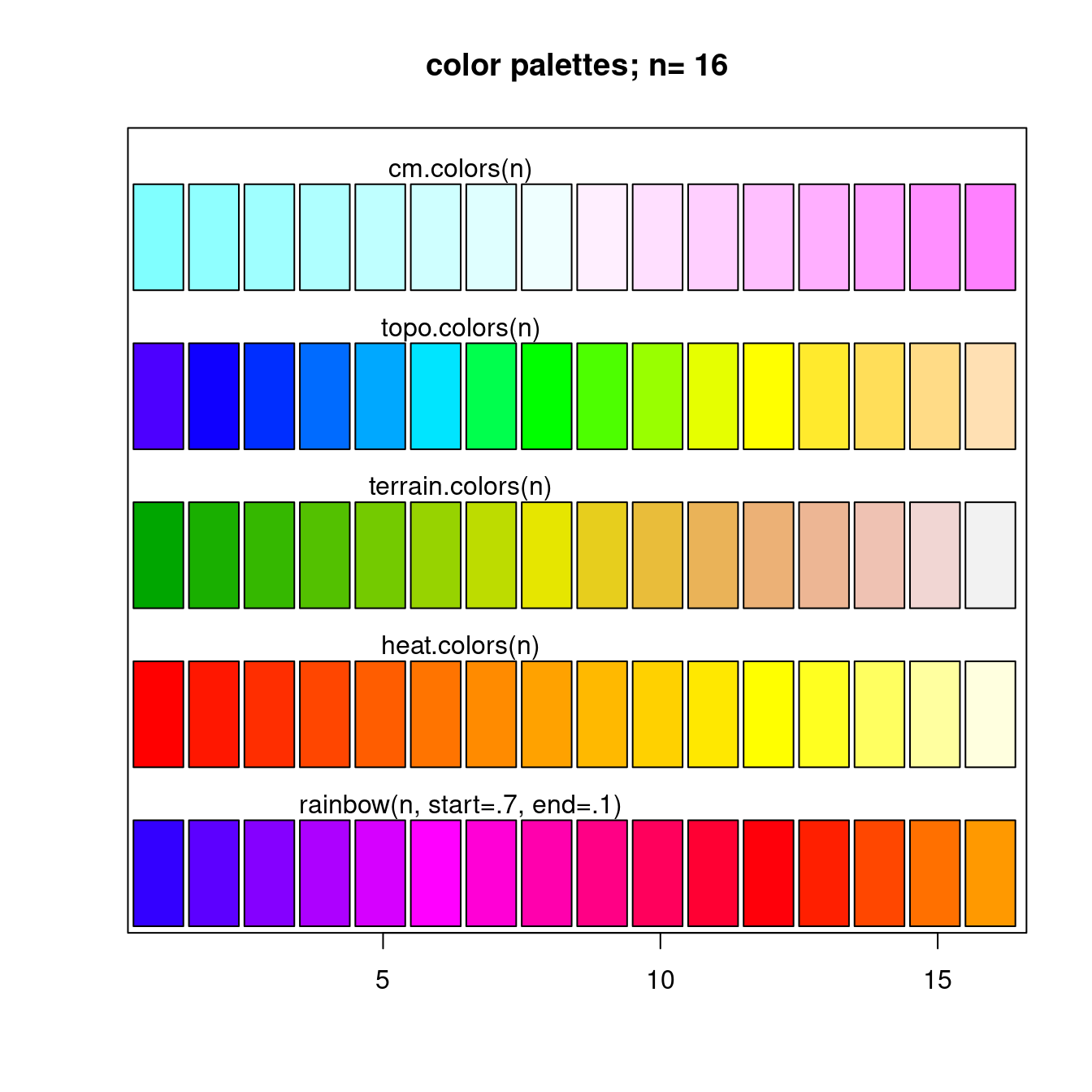
图 10.8: rect 函数画长方形
clip(x1, x2, y1, y2) 在用户坐标中设置剪切区域
x <- rnorm(1000)
hist(x, xlim = c(-4, 4))
usr <- par("usr")
clip(usr[1], -2, usr[3], usr[4])
hist(x, col = "red", add = TRUE)
clip(2, usr[2], usr[3], usr[4])
hist(x, col = "blue", add = TRUE)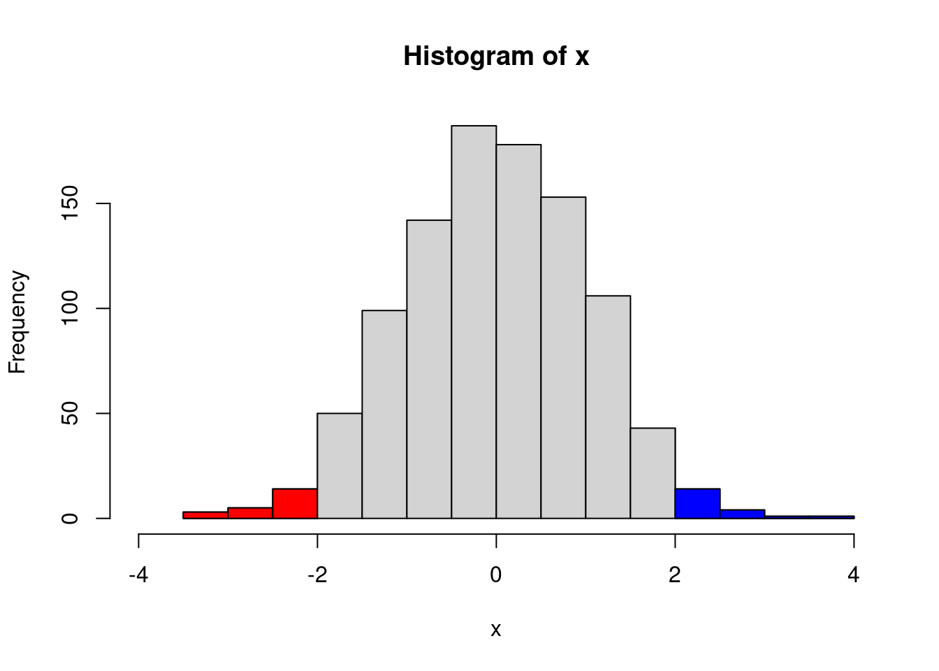
do.call("clip", as.list(usr)) # reset to plot regionmy.col <- function(f, g, xmin, xmax, col, N = 200,
xlab = "", ylab = "", main = "") {
x <- seq(xmin, xmax, length = N)
fx <- f(x)
gx <- g(x)
plot(0, 0,
type = "n",
xlim = c(xmin, xmax),
ylim = c(min(fx, gx), max(fx, gx)),
xlab = xlab, ylab = ylab, main = main
)
polygon(c(x, rev(x)), c(fx, rev(gx)),
col = "#EA4335", border = 0
)
lines(x, fx, lwd = 3, col = "#34A853")
lines(x, gx, lwd = 3, col = "#4285f4")
}
my.col(function(x) x^2, function(x) x^2 + 10 * sin(x),
-6, 6,
main = "The \"polygon\" function"
)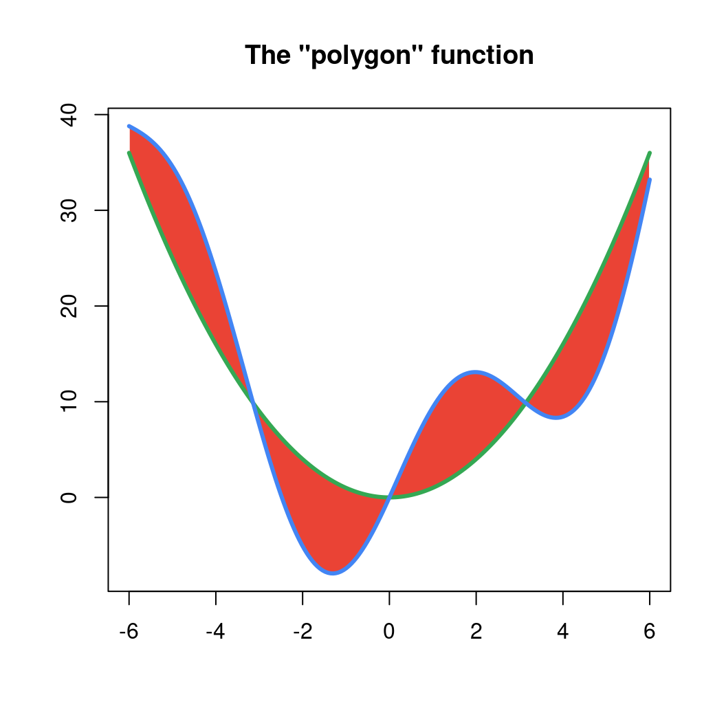
图 10.9: 区域重叠 polygon 函数
各种符号 10.10
plot(0, 0,
  xlim = c(1, 5), ylim = c(-.5, 4),
  axes = F,
  xlab = "", ylab = ""
)
for (i in 0:4) {
  for (j in 1:5) {
    n <- 5 * i + j
    points(j, i,
      pch = n,
      cex = 3
    )
    text(j, i - .3, as.character(n))
  }
}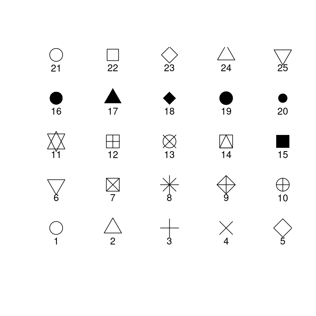
图 10.10: cex 支持的符号
点、线、多边形和圆聚集在图 10.11 中
# https://jeroen.github.io/uros2018/#23
plot.new()
plot.window(xlim = c(0, 100), ylim = c(0, 100))
polygon(c(10, 40, 80), c(10, 80, 40), col = "hotpink")
text(40, 90, labels = "My drawing", col = "navyblue", cex = 3)
symbols(c(70, 80, 90), c(20, 50, 80),
  circles = c(10, 20, 10),
  bg = c("#4285f4", "#EA4335", "red"), add = TRUE, lty = "dashed"
)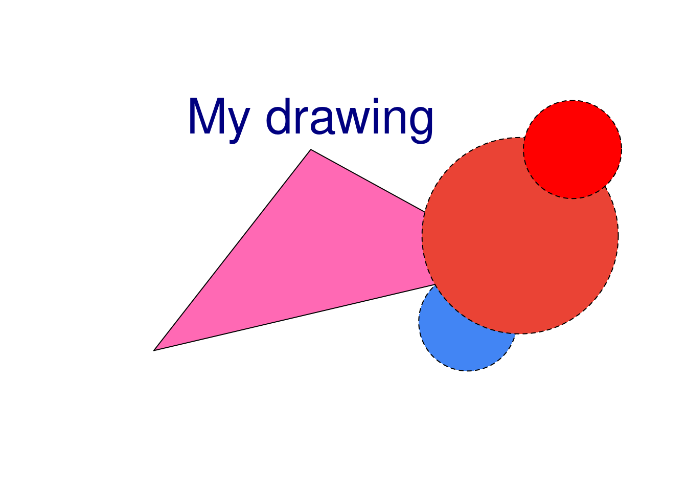
图 10.11: 多边形和符号元素
在介绍各种统计图形之前,先介绍几个绘图函数 plot 和 text 还有 par 参数设置, 作为最简单的开始,尽量依次介绍其中的每个参数的含义并附上图形对比。
y <- x <- 1:4
plot(x, y, ann = F, col = "blue", pch = 16)
text(x, y,
  labels = c("1st", "2nd", "3rd", "4th"),
  col = "red", pos = c(3, 4, 4, 1), offset = 0.6
)
ahat <- "sigma"
# title(substitute(hat(a) == ahat, list(ahat = ahat)))
title(bquote(hat(a) == .(ahat)))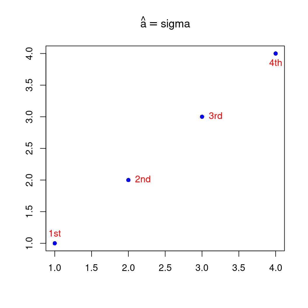
图 10.12: pos 位置参数
其中 labels, pos 都是向量化的参数
10.1.3 参考线
矩形网格线是用做背景参考线的,常常是淡灰色的细密虚线,plot 函数的 panel.first 参数和 grid 函数常用来画这种参考线
# modified from https://yihui.name/cn/2018/02/cohen-s-d/
n <- 30 # 样本量(只是一个例子)
x <- seq(0, 12, 0.01)
par(mar = c(4, 4, 0.2, 0.1))
plot(x / sqrt(n), 2 * (1 - pt(x, n - 1)),
  xlab = expression(d = x / sqrt(n)),
  type = "l", panel.first = grid()
)
abline(v = c(0.01, 0.2, 0.5, 0.8, 1.2, 2), lty = 2)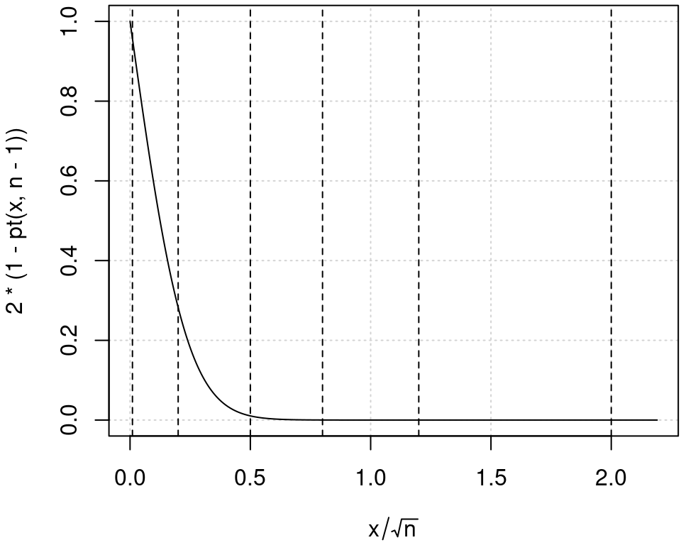
图 10.13: 添加背景参考线
10.1.4 坐标轴
图形控制参数默认设置下 par 通常的一幅图形,改变坐标轴标签是很简单的
x <- 1:100
y <- runif(100, -2, 2)
plot(x, y)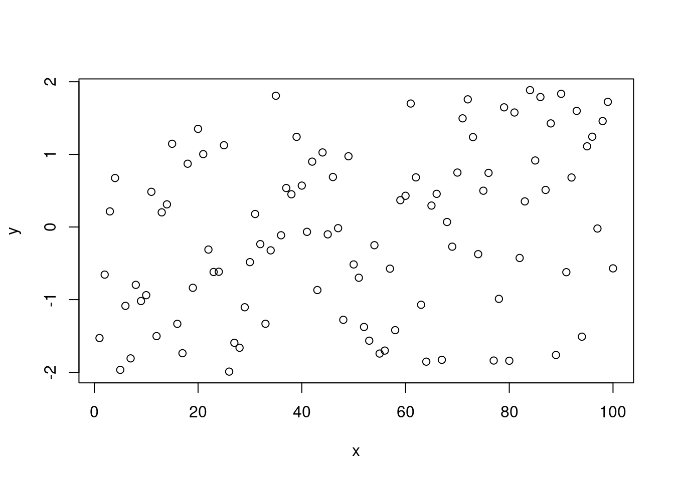
plot(x, y, xlab = "Index", ylab = "Uniform draws")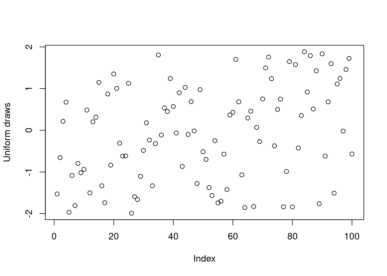
改变坐标轴标签和标题
op <- par(no.readonly = TRUE) # 保存默认的 par 设置
par(cex.lab = 1.5, cex.axis = 1.3)
plot(x, y, xlab = "Index", ylab = "Uniform draws")

# 设置更大的坐标轴标签内容
par(mar = c(6, 6, 3, 3), cex.axis = 1.5, cex.lab = 2)
plot(x, y, xlab = "Index", ylab = "Uniform draws")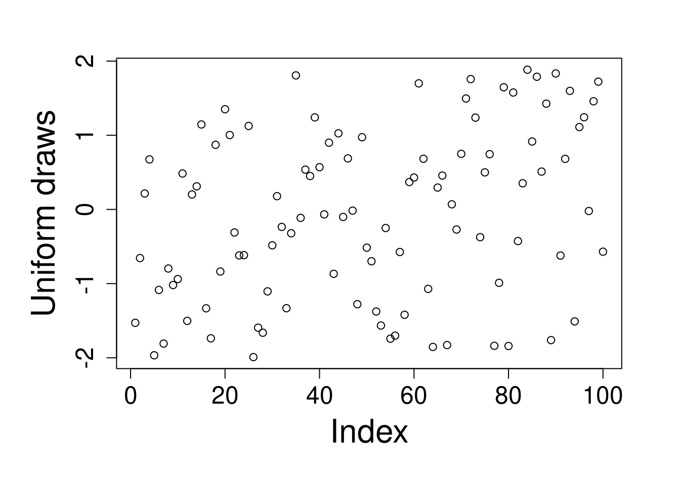
使用 axis 函数可以更加精细地控制坐标轴
par(op) # 恢复默认的 par 设置
plot(x, y, xaxt = "n") # 去掉 x 轴
axis(side = 1, at = c(5, 50, 100)) # 添加指定的刻度标签
指定刻度标签的内容
plot(x, y, yaxt = "n")
axis(side = 2, at = c(-2, 0, 2), labels = c("Small", "Medium", "Big"))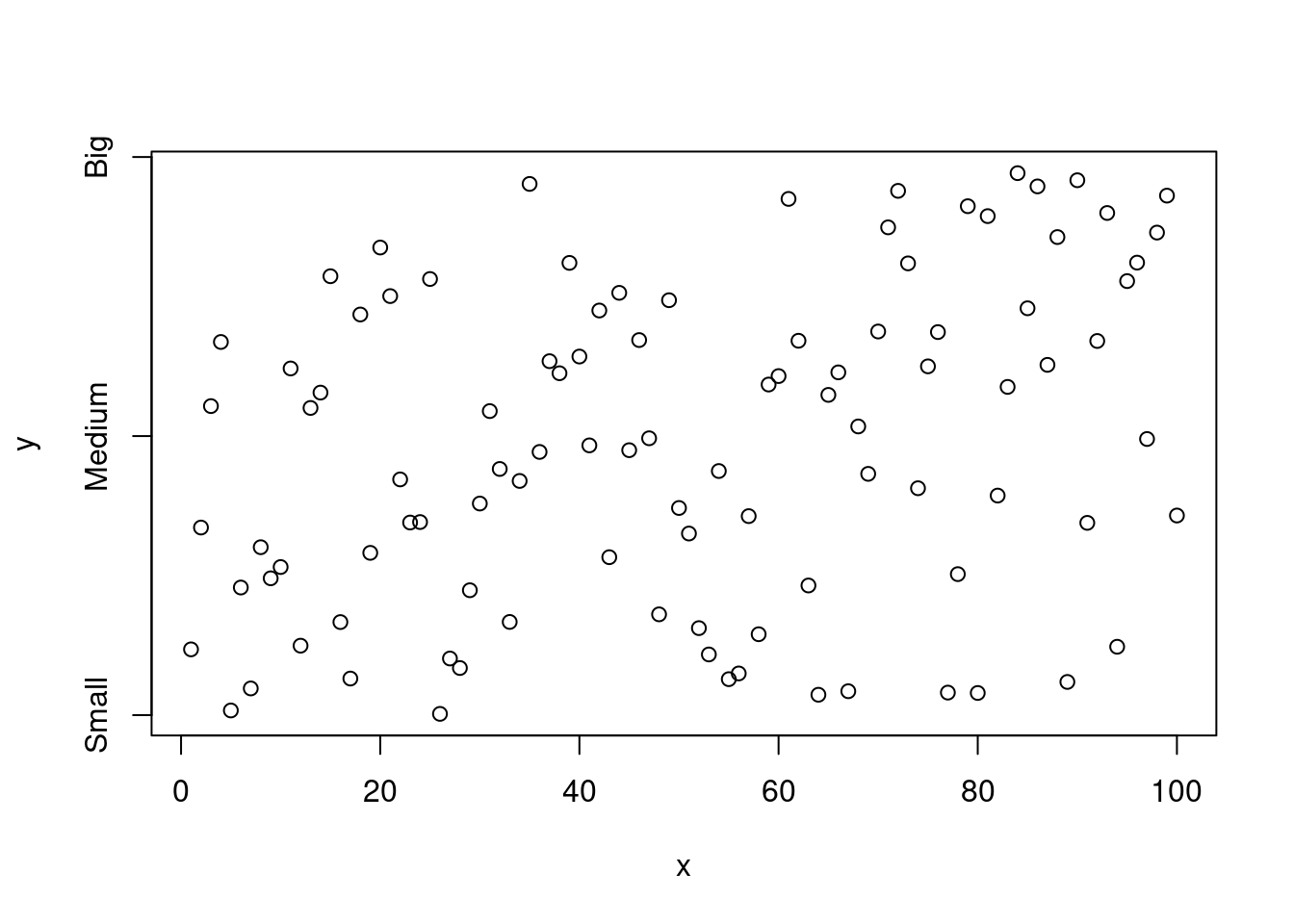
控制刻度线和轴线和刻度标签
plot(x, y)
axis(side = 3, at = c(5, 25, 75), lwd = 4, lwd.ticks = 2, col.ticks = "red")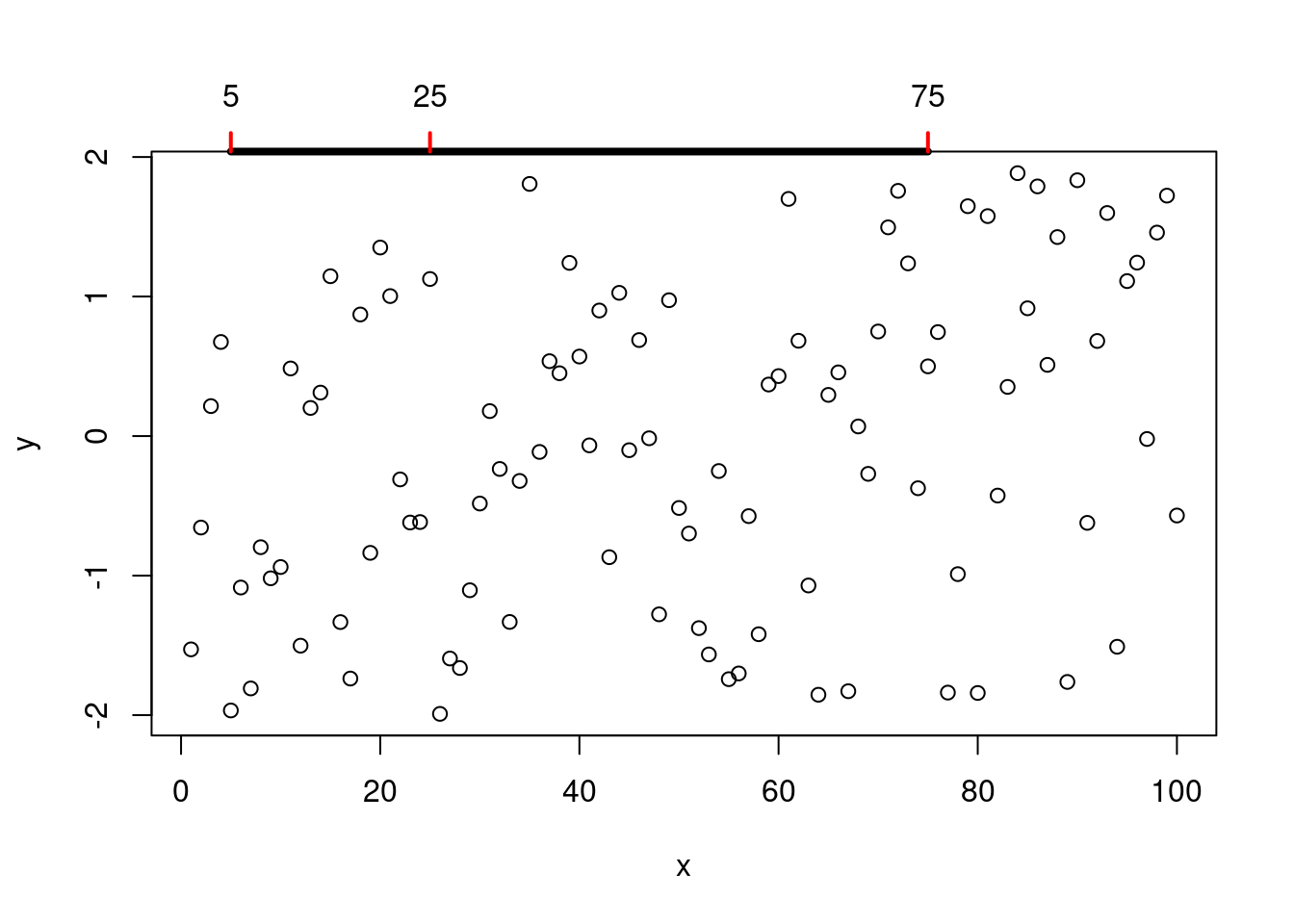
还可以把 box 移除,绘图区域的边框去掉,只保留坐标轴
plot(x, y, bty = "n", xaxt = "n", yaxt = "n")
axis(side = 1, at = seq(0, 100, 20), lwd = 3)
axis(side = 2, at = seq(-2, 2, 2), lwd = 3)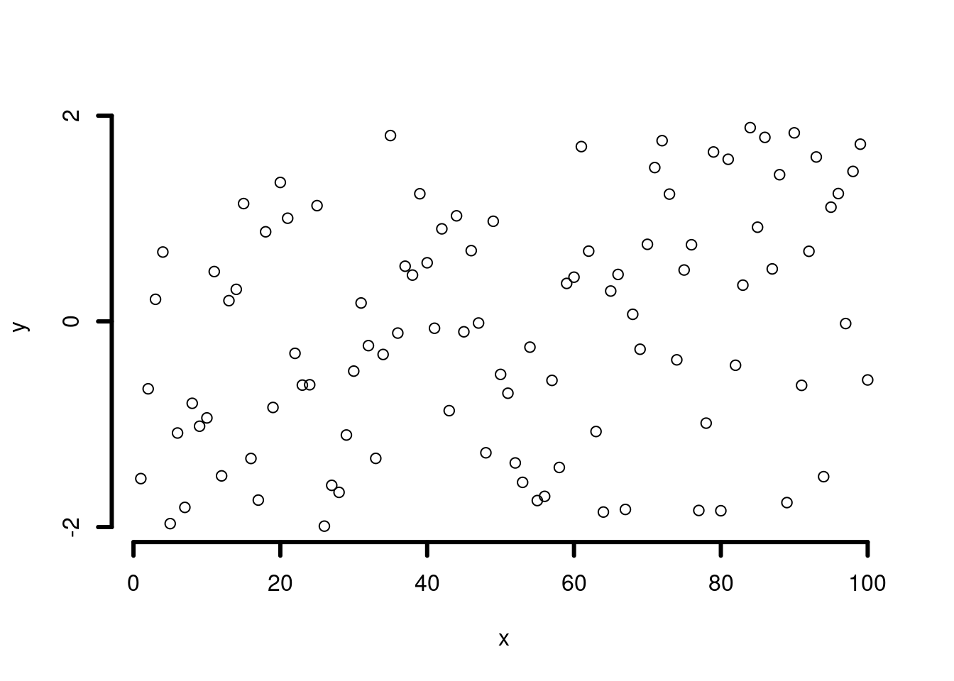
# 双Y轴
N <- 200
x <- seq(-4, 4, length = N)
y1 <- sin(x)
y2 <- cos(x)
op <- par(mar = c(5, 4, 4, 4)) # Add some space in the right margin
# The default is c(5,4,4,2) + .1
xlim <- range(x)
ylim <- c(-1.1, 1.1)
plot(x, y1,
  col = "blue", type = "l",
  xlim = xlim, ylim = ylim,
  axes = F, xlab = "", ylab = "", main = "Title"
)
axis(1)
axis(2, col = "blue")
par(new = TRUE)
plot(x, y2,
  col = "red", type = "l",
  xlim = xlim, ylim = ylim,
  axes = F, xlab = "", ylab = "", main = ""
)
axis(4, col = "red")
mtext("First Y axis", 2, line = 2, col = "blue", cex = 1.2)
mtext("Second Y axis", 4, line = 2, col = "red", cex = 1.2)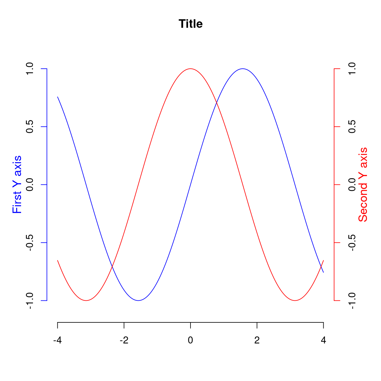
图 10.14: 两个 Y 轴
# 1,2,3,4 分别代表下左上右四个位置调整坐标轴标签的距离
## Changing default gap between labels:
plot(c(0, 100), c(0, 50), type = "n", axes = FALSE, ann = FALSE)
title(quote("axis(1, .., gap.axis = f)," ~ ~ f >= 0))
axis(2, at = 5 * (0:10), las = 1, gap.axis = 1 / 4)
gaps <- c(4, 2, 1, 1 / 2, 1 / 4, 0.1, 0)
chG <- paste0(
  ifelse(gaps == 1, "default:  ", ""),
  "gap.axis=", formatC(gaps)
)
jj <- seq_along(gaps)
linG <- -2.5 * (jj - 1)
for (j in jj) {
  isD <- gaps[j] == 1 # is default
  axis(1,
    at = 5 * (0:20), gap.axis = gaps[j], padj = -1, line = linG[j],
    col.axis = if (isD) "forest green" else 1, font.axis = 1 + isD
  )
}
mtext(chG,
  side = 1, padj = -1, line = linG - 1 / 2, cex = 3 / 4,
  col = ifelse(gaps == 1, "forest green", "blue3")
)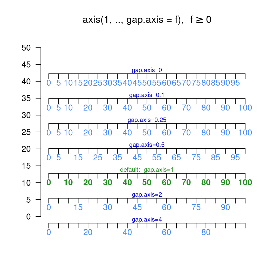
图 10.15: gap.axis用法
## now shrink the window (in x- and y-direction) and observe the axis labels drawn旋转坐标轴标签
# Rotated axis labels in R plots
# https://menugget.blogspot.com/2014/08/rotated-axis-labels-in-r-plots.html
# Example data
tmin <- as.Date("2000-01-01")
tmax <- as.Date("2001-01-01")
tlab <- seq(tmin, tmax, by = "month")
lab <- format(tlab, format = "%Y-%b")
set.seed(111)
x <- seq(tmin, tmax, length.out = 100)
y <- cumsum(rnorm(100))

# Plot
# png("plot_w_rotated_axis_labels.png", height = 3,
#     width = 6, units = "in", res = 300)
op <- par(mar = c(6, 4, 1, 1))
plot(x, y, t = "l", xaxt = "n", xlab = "")
axis(1, at = tlab, labels = FALSE)
text(
  x = tlab, y = par()$usr[3] - 0.1 * (par()$usr[4] - par()$usr[3]),
  labels = lab, srt = 45, adj = 1, xpd = TRUE
)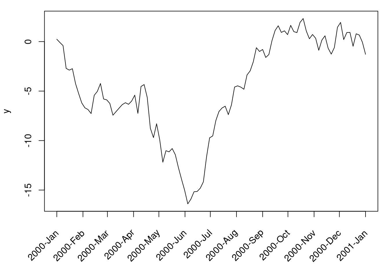
par(op)
# dev.off()
旋转坐标抽标签的例子来自手册《R FAQ》的第7章第27个问题 [12],在基础图形中,旋转坐标轴标签需要 text() 而不是 mtext(),因为后者不支持par("srt")
## Increase bottom margin to make room for rotated labels
par(mar = c(5, 4, .5, 2) + 0.1)
## Create plot with no x axis and no x axis label
plot(1:8, xaxt = "n", xlab = "")
## Set up x axis with tick marks alone
axis(1, labels = FALSE)
## Create some text labels
labels <- paste("Label", 1:8, sep = " ")
## Plot x axis labels at default tick marks
text(1:8, par("usr")[3] - 0.5,
  srt = 45, adj = 1,
  labels = labels, xpd = TRUE
)
## Plot x axis label at line 6 (of 7)
mtext(side = 1, text = "X Axis Label", line = 4)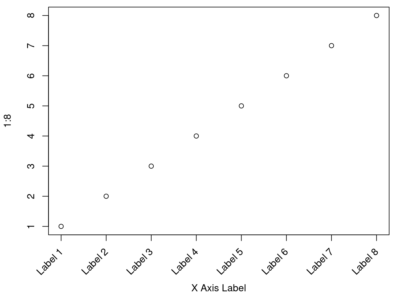
图 10.16: 旋转坐标轴标签
srt = 45 表示文本旋转角度, xpd = TRUE 允许文本越出绘图区域,adj = 1 to place the right end of text at the tick marks;You can adjust the value of the 0.5 offset as required to move the axis labels up or down relative to the x axis. 详细地参考 [13]
10.1.5 刻度线
通过 par 或 axis 函数实现刻度线的精细操作,tcl 控制刻度线的长度,正值让刻度画在绘图区域内,负值正好相反,画在外面,mgp 参数有三个值,第一个值控制绘图区域和坐标轴标题之间的行数,第二个是绘图区域与坐标轴标签的行数,第三个绘图区域与轴线的行数,行数表示间距
par(tcl = 0.4, mgp = c(1.5, 0, 0))
plot(x, y)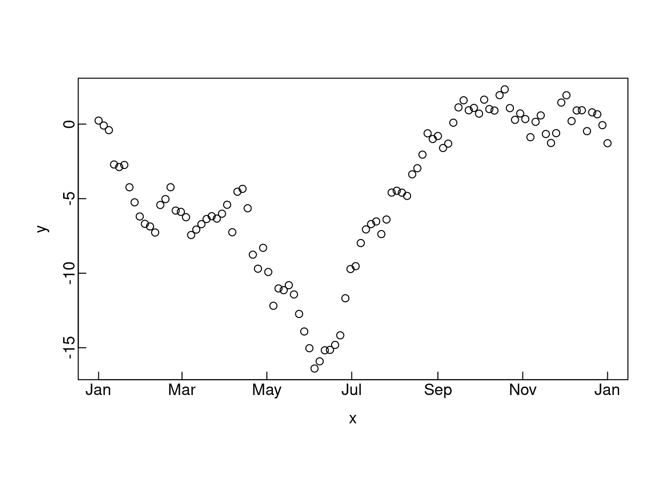
# 又一个例子
par(op)
plot(x, y, xaxt = "n", yaxt = "n", xlab = "", ylab = "")
axis(side = 1, at = seq(5, 95, 30), tcl = 0.4, lwd.ticks = 3, mgp = c(0, 0.5, 0))
mtext(side = 1, text = "X axis", line = 1.5)
# mtext 设置坐标轴标签
axis(side = 2, at = seq(-2, 2, 2), tcl = 0.3, lwd.ticks = 3, col.ticks = "orange", mgp = c(0, 0, 2))
mtext(side = 2, text = "Numbers taken randomly", line = 2.2)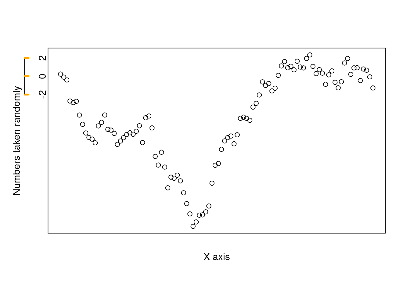
10.1.6 标题
添加多个标题
N <- 200
x <- runif(N, -4, 4)
y <- sin(x) + .5 * rnorm(N)
plot(x, y, xlab = "", ylab = "", main = "")
mtext("Subtitle", 3, line = .8)
mtext("Title", 3, line = 2, cex = 1.5)
mtext("X axis", 1, line = 2.5, cex = 1.5)
mtext("X axis subtitle", 1, line = 3.7)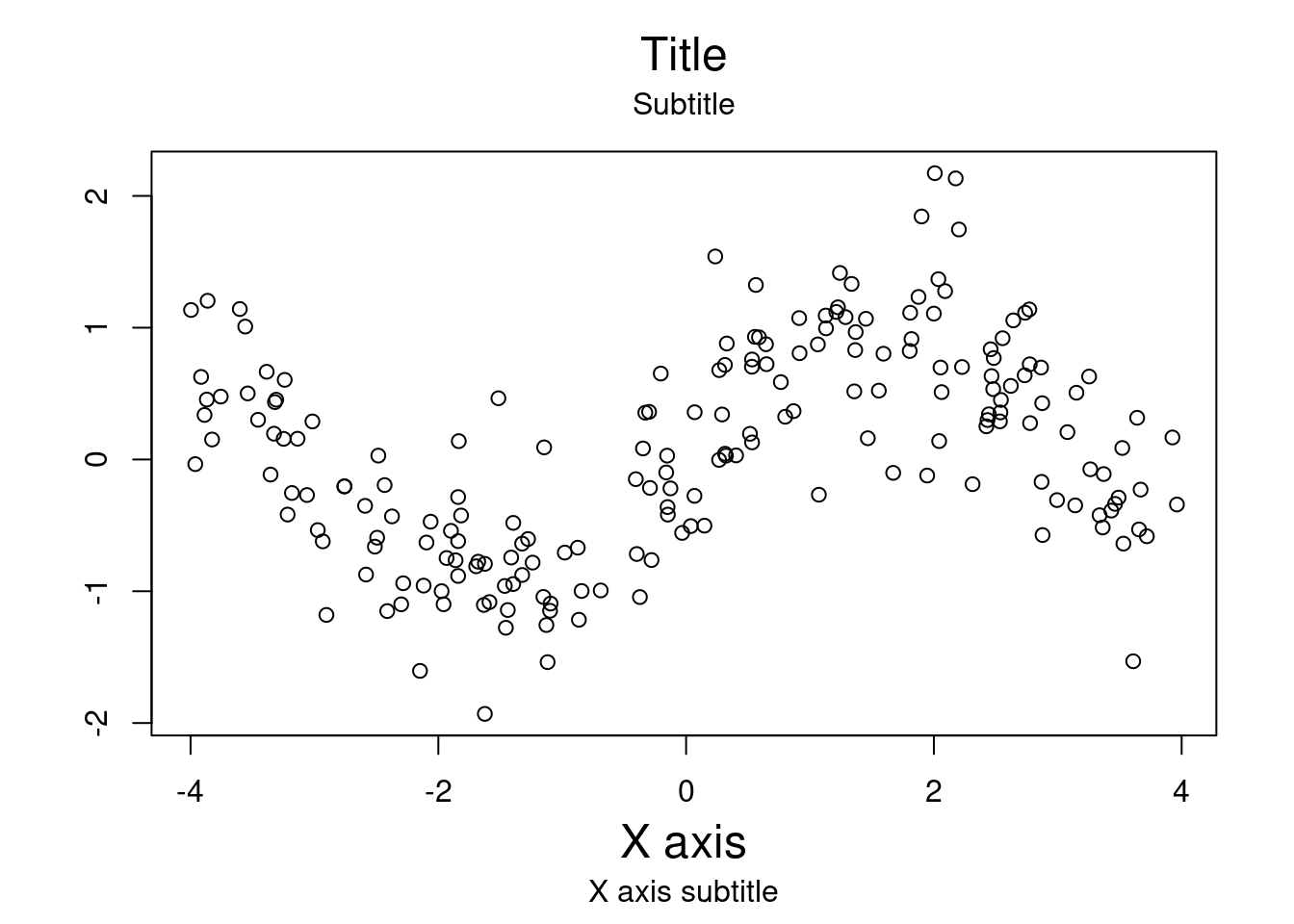
图 10.17: 图标题/子标题 x轴标题/子标题
10.1.7 注释
# 自定义坐标轴
plot(c(1, 1e6), c(-pi, pi),
  type = "n",
  axes = FALSE, ann = FALSE, log = "x"
)
axis(1,
  at = c(1, 1e2, 1e4, 1e6),
  labels = expression(1, 10^2, 10^4, 10^6)
)
axis(2,
  at = c(-pi, -pi / 2, 0, pi / 2, pi),
  labels = expression(-pi, -pi / 2, 0, pi / 2, pi)
)
text(1e3, 0, expression(italic("Customized Axes")))
box()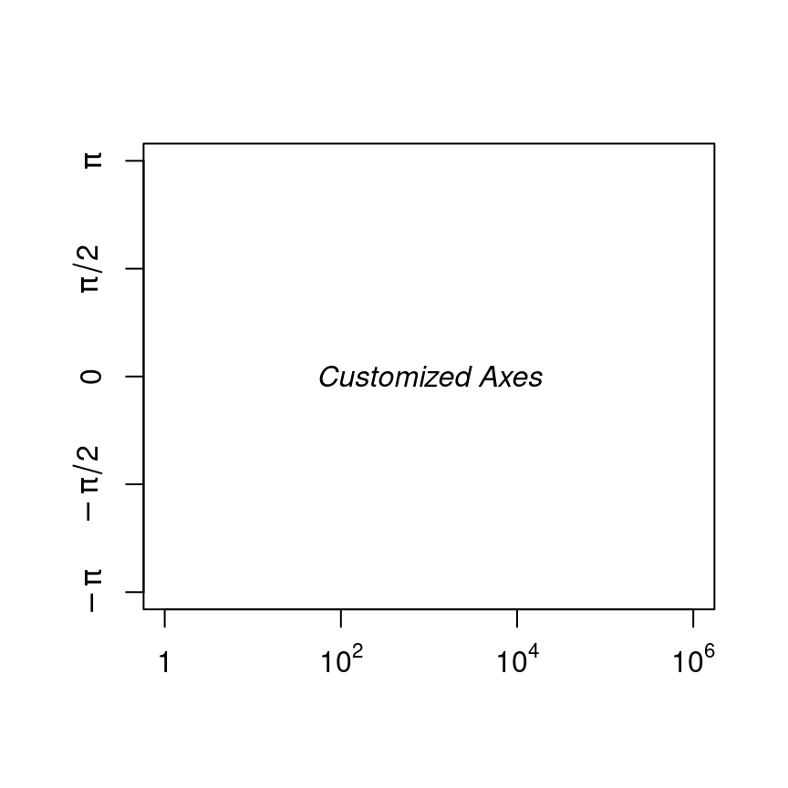
图 10.18: 创建自定义的坐标轴和刻度标签
在标题中添加数学公式
x <- seq(-5, 5, length = 200)
y <- sqrt(1 + x^2)
plot(y ~ x,
  type = "l",
  ylab = expression(sqrt(1 + x^2))
)
title(main = expression(
  "graph of the function f"(x) == sqrt(1 + x^2)
))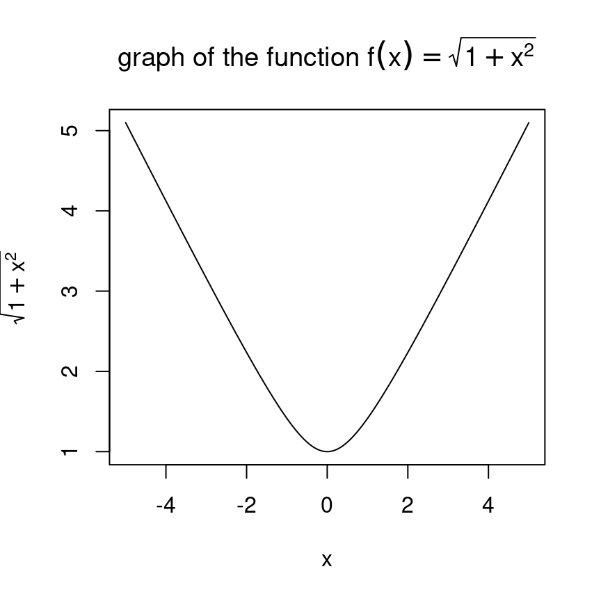
图 10.19: 标题含有数学公式
修改参数使用 substitute 函数批量生成
x <- seq(-5, 5, length = 200)
for (i in 1:4) { # 画四个图
  y <- sqrt(i + x^2)
  plot(y ~ x,
    type = "l",
    ylim = c(0, 6),
    ylab = substitute(
      expression(sqrt(i + x^2)),
      list(i = i)
    )
  )
  title(main = substitute(
    "graph of the function f"(x) == sqrt(i + x^2),
    list(i = i)
  ))
}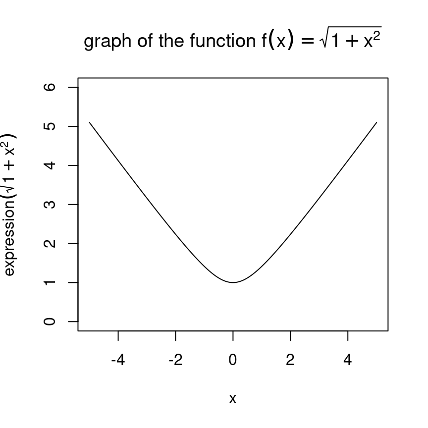
图 10.20: 批量生成函数图形
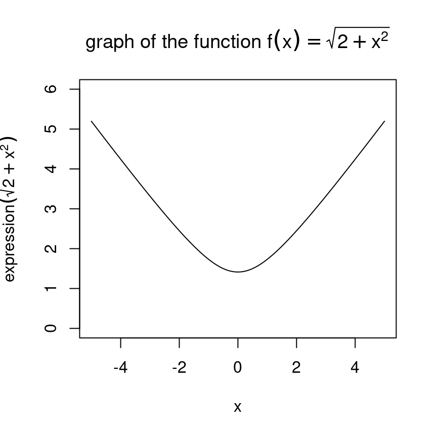
图 10.21: 批量生成函数图形
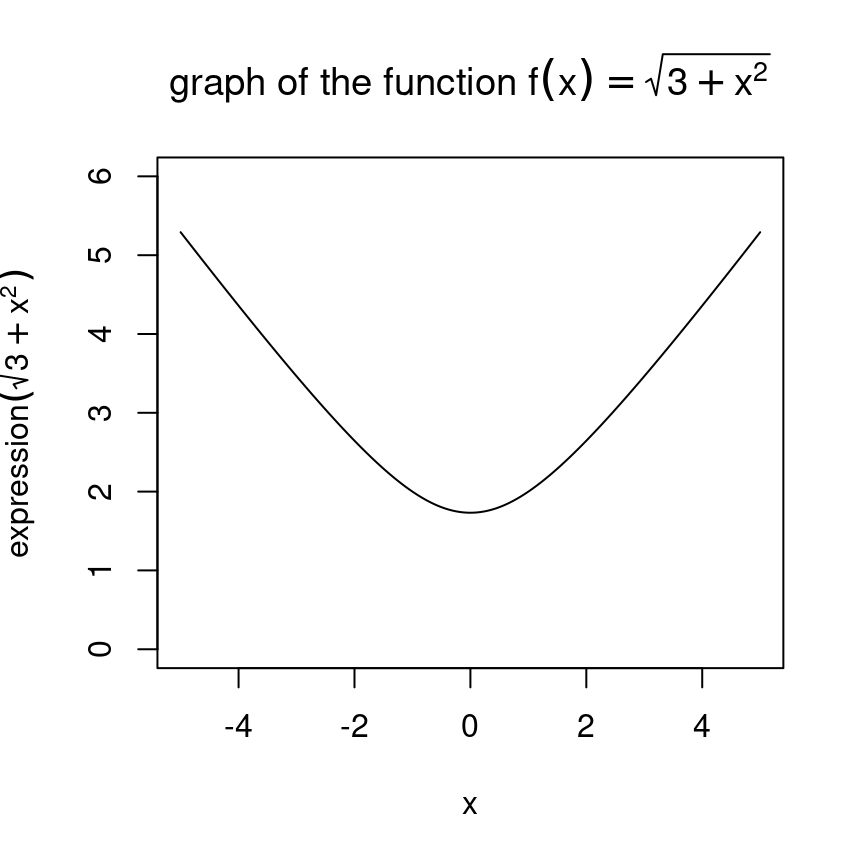
图 10.22: 批量生成函数图形
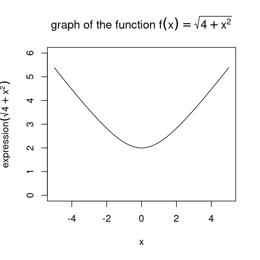
图 10.23: 批量生成函数图形
基础绘图函数,如 plot 标签 xlab 支持 Unicode 代码表示的希腊字母,常用字母表备查,公式环境下,也可以用在绘图中
| 希腊字母 | LaTeX 代码 | Unicode 代码 | 希腊字母 | LaTeX 代码 | Unicode 代码 |
|---|---|---|---|---|---|
| \(\alpha\) | \alpha |
\u03B1 |
\(\mu\) | \mu |
\u03BC |
| \(\beta\) | \beta |
\u03B2 |
\(\nu\) | \nu |
\u03BD |
| \(\gamma\) | \gamma |
\u03B3 |
\(\xi\) | \xi |
\u03BE |
| \(\delta\) | \delta |
\u03B4 |
\(\varphi\) | \varphi |
\u03C6 |
| \(\epsilon\) | \epsilon |
\u03B5 |
\(\pi\) | \pi |
\u03C0 |
| \(\zeta\) | \zeta |
\u03B6 |
\(\rho\) | \rho |
\u03C1 |
| \(\eta\) | \eta |
\u03B7 |
\(\upsilon\) | \upsilon |
\u03C5 |
| \(\theta\) | \theta |
\u03B8 |
\(\phi\) | \phi |
\u03C6 |
| \(\iota\) | \iota |
\u03B9 |
\(\chi\) | \chi |
\u03C7 |
| \(\kappa\) | \kappa |
\u03BA |
\(\psi\) | \psi |
\u03C8 |
| \(\lambda\) | \lambda |
\u03BB |
\(\omega\) | \omega |
\u03C9 |
| \(\sigma\) | \sigma |
\u03C3 |
\(\tau\) | \tau |
\u03C4 |
| 上标数字 | LaTeX 代码 | Unicode 代码 | 下标数字 | LaTeX 代码 | Unicode 代码 |
|---|---|---|---|---|---|
| \({}^0\) | {}^0 |
\u2070 |
\({}_0\) | {}_0 |
\u2080 |
| \({}^1\) | {}^1 |
\u00B9 |
\({}_1\) | {}_1 |
\u2081 |
| \({}^2\) | {}^2 |
\u00B2 |
\({}_2\) | {}_2 |
\u2082 |
| \({}^3\) | {}^3 |
\u00B2 |
\({}_3\) | {}_3 |
\u2083 |
| \({}^4\) | {}^4 |
\u2074 |
\({}_4\) | {}_4 |
\u2084 |
| \({}^5\) | {}^5 |
\u2075 |
\({}_5\) | {}_5 |
\u2085 |
| \({}^6\) | {}^6 |
\u2076 |
\({}_6\) | {}_6 |
\u2086 |
| \({}^7\) | {}^7 |
\u2077 |
\({}_7\) | {}_7 |
\u2087 |
| \({}^8\) | {}^8 |
\u2078 |
\({}_8\) | {}_8 |
\u2088 |
| \({}^9\) | {}^9 |
\u2079 |
\({}_9\) | {}_9 |
\u2089 |
| \({}^n\) | {}^n |
\u207F |
\({}_n\) | {}_n |
- |
其它字母,请查看 Unicode 字母表
10.1.8 图例
x <- seq(-6, 6, length = 200)
y <- sin(x)
z <- cos(x)
plot(y ~ x,
  type = "l", lwd = 3,
  ylab = "", xlab = "angle", main = "Trigonometric functions"
)
abline(h = 0, lty = 3)
abline(v = 0, lty = 3)
lines(z ~ x, type = "l", lwd = 3, col = "red")
legend(-6, -1,
  yjust = 0,
  c("Sine", "Cosine"),
  lwd = 3, lty = 1, col = c(par("fg"), "red")
)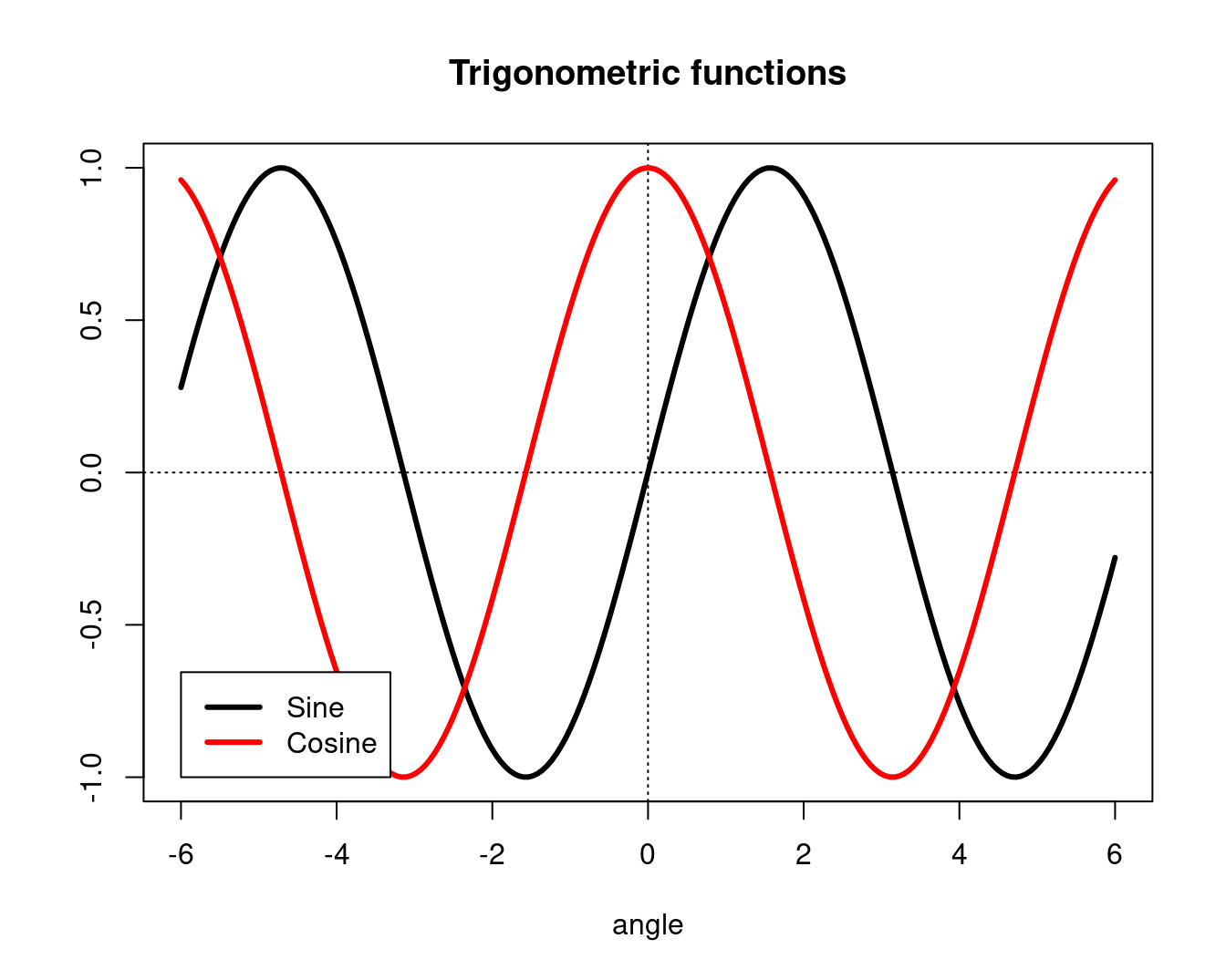
图 10.24: 三角函数添加图例
xmin <- par("usr")[1]
xmax <- par("usr")[2]
ymin <- par("usr")[3]
ymax <- par("usr")[4]

plot(y ~ x,
  type = "l", lwd = 3,
  ylab = "", xlab = "angle", main = "Trigonometric functions"
)
abline(h = 0, lty = 3)
abline(v = 0, lty = 3)
lines(z ~ x, type = "l", lwd = 3, col = "red")
legend("bottomleft",
  c("Sine", "Cosine"),
  lwd = 3, lty = 1, col = c(par("fg"), "red")
)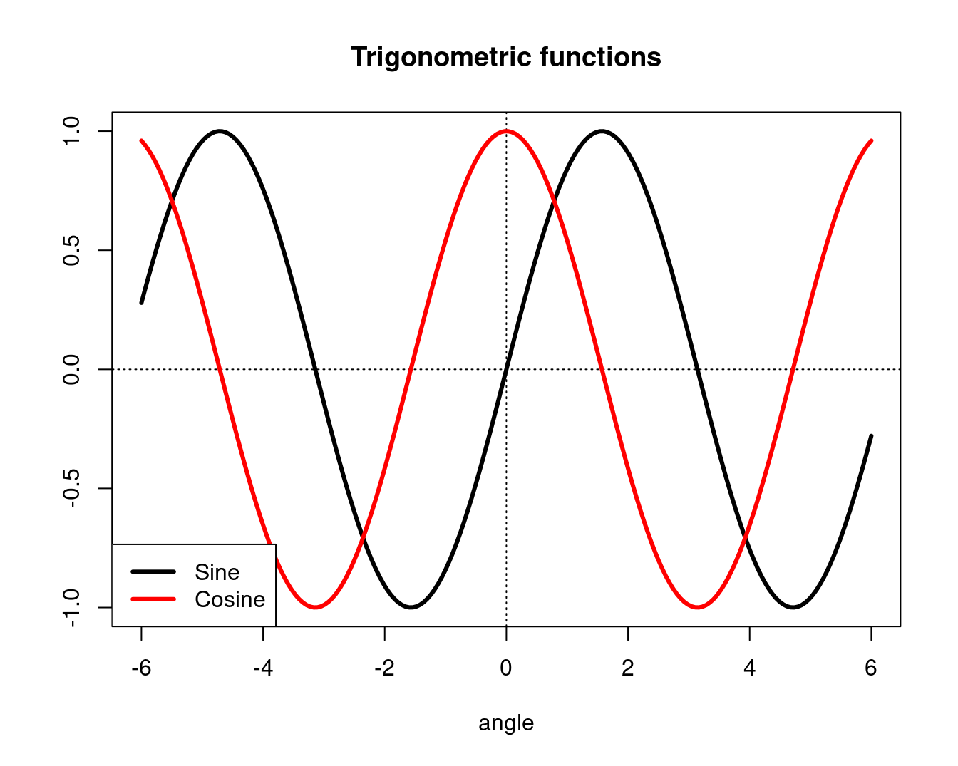
图 10.25: 设置图例的位置
plot(y ~ x,
  type = "l", lwd = 3,
  ylab = "", xlab = "angle", main = "Trigonometric functions"
)
abline(h = 0, lty = 3)
abline(v = 0, lty = 3)
lines(z ~ x, type = "l", lwd = 3, col = "red")
legend("bottomleft",
  c("Sine", "Cosine"),
  inset = c(.03, .03),
  lwd = 3, lty = 1, col = c(par("fg"), "red")
)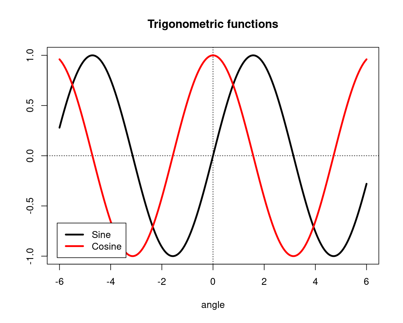
图 10.26: insert 函数微调图例位置
op <- par(no.readonly = TRUE)
plot(y ~ x,
  type = "l", lwd = 3,
  ylab = "", xlab = "angle", main = "Trigonometric functions"
)
abline(h = 0, lty = 3)
abline(v = 0, lty = 3)
lines(z ~ x, type = "l", lwd = 3, col = "red")
par(xpd = TRUE) # Do not clip to the drawing area 关键一行/允许出界
lambda <- .025
legend(par("usr")[1],
  (1 + lambda) * par("usr")[4] - lambda * par("usr")[3],
  c("Sine", "Cosine"),
  xjust = 0, yjust = 0,
  lwd = 3, lty = 1, col = c(par("fg"), "red")
)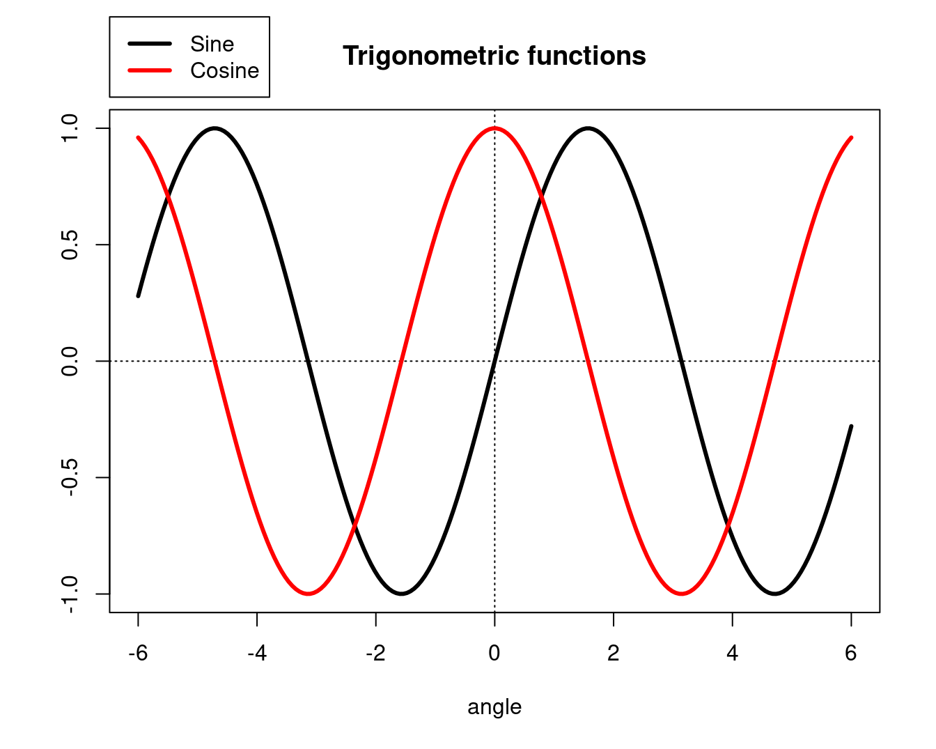
图 10.27: 将图例放在绘图区域外面
par(op)Hmisc 包的 labcurve 函数可以在曲线上放置名称,而不是遥远的图例上
10.1.9 边空
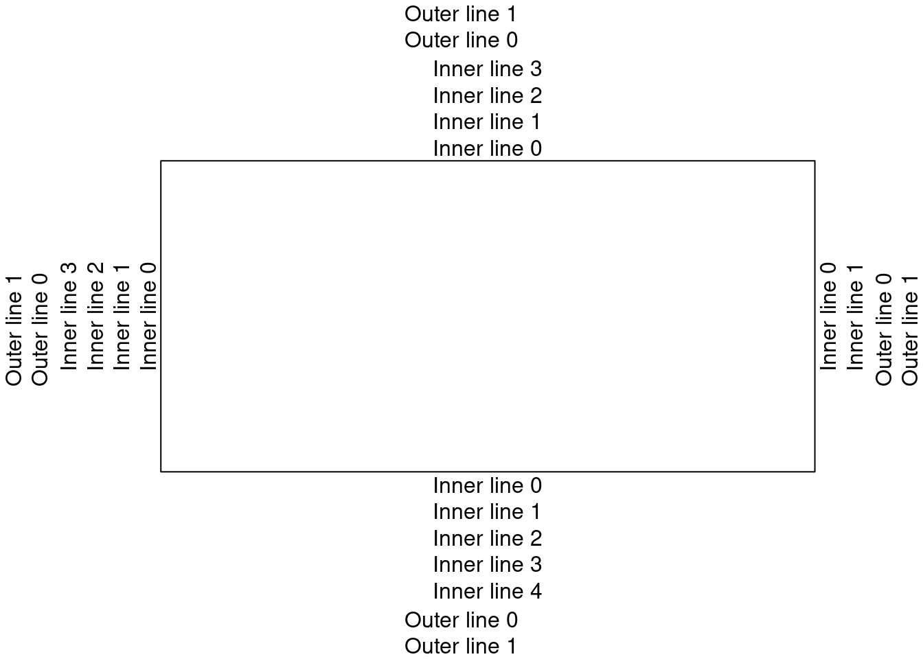
边空分为内边空和外边空


图 10.28: 边空
line 第一行
N <- 200
x <- runif(N, -4, 4)
y <- sin(x) + .5 * rnorm(N)
plot(x, y,
  xlab = "", ylab = "",
  main = paste(
    "The \"mtext\" function",
    paste(rep(" ", 60), collapse = "")
  )
)
for (i in seq(from = 0, to = 1, by = 1)) {
  mtext(paste("Line", i), 3, line = i)
}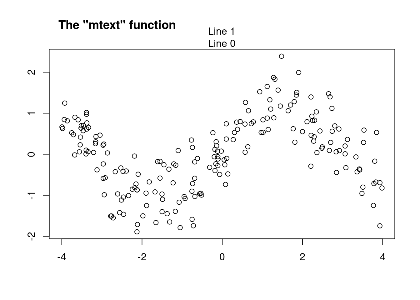
图 10.29: 外边空在图的边缘添加文字
par
# 多图排列/分屏 page 47
# 最常用的是 par mfrow mfcol分别按行/列放置图形
op <- par(
  mfrow = c(2, 2),
  oma = c(0, 0, 4, 0) # Outer margins
)
for (i in 1:4) {
  plot(runif(20), runif(20),
    main = paste("random plot (", i, ")", sep = "")
  )
}
par(op)
mtext("Four plots, without enough room for this title",
  side = 3, font = 2, cex = 1.5, col = "red"
) # 总/大标题放不下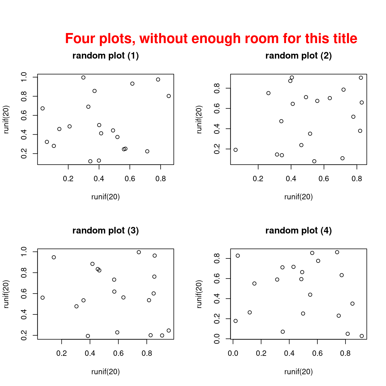
图 10.30: 多图排列共享一个大标题
par 的 oma 用来设置外边空的大小,默认情形下没有外边空的
par()$oma## [1] 0 0 0 0我们可以自己设置外边空
op <- par(
  mfrow = c(2, 2),
  oma = c(0, 0, 3, 0) # Outer margins
)
for (i in 1:4) {
  plot(runif(20), runif(20),
    main = paste("random plot (", i, ")", sep = "")
  )
}
par(op)
mtext("Four plots, with some room for this title",
  side = 3, line = 1.5, font = 1, cex = 1.5, col = "red"
)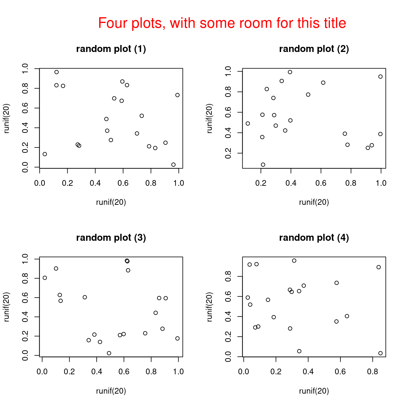
图 10.31: 设置外边空放置大标题
除了内边空还有外边空,内外边空用来放注释说明
op <- par(no.readonly = TRUE)
par(oma = c(2, 2, 2, 2))
plot(1, 1, type = "n", xlab = "", ylab = "", xaxt = "n", yaxt = "n")
for (side in 1:4) {
  inner <- round(par()$mar[side], 0) - 1
  for (line in 0:inner) {
    mtext(text = paste0("Inner line ", line), side = side, line = line)
  }
  outer <- round(par()$oma[side], 0) - 1
  for (line in 0:inner) {
    mtext(text = paste0("Outer line ", line), side = side, line = line, outer = TRUE)
  }
}
外边空可以用来放图例
set.seed(1234)
x <- runif(10)
y <- runif(10)
cols <- rep(hcl.colors(5), each = 2)
op <- par(oma = c(2, 2, 0, 4), mar = c(3, 3, 2, 0), mfrow = c(2, 2), pch = 16)
for (i in 1:4) {
  plot(x, y, col = cols, ylab = "", xlab = "")
}
mtext(text = "A common x-axis label", side = 1, line = 0, outer = TRUE)
mtext(text = "A common y-axis label", side = 2, line = 0, outer = TRUE)
legend(
  x = 1, y = 1.2, legend = LETTERS[1:5],
  col = unique(cols), pch = 16, bty = "n", xpd = NA
)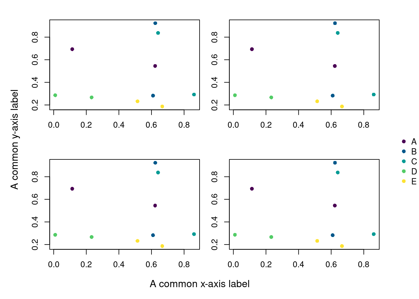
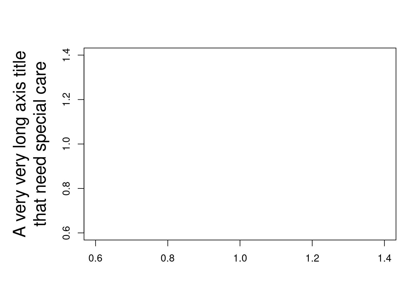
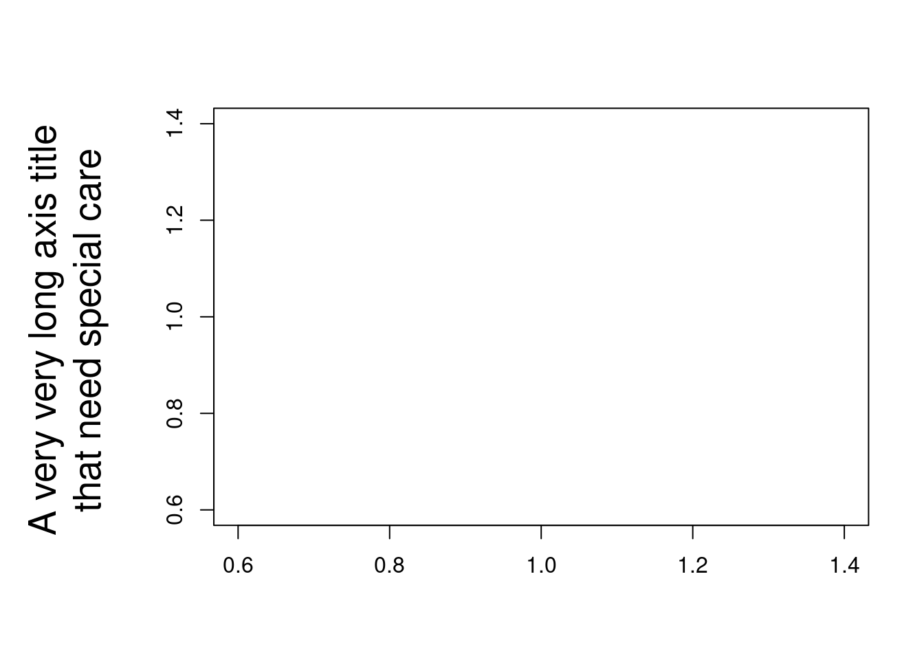
par(op)坐标轴标签 xlab 和 ylab 的内容很长的时候需要内边空
par(cex.lab = 1.7)
plot(1, 1,
  ylab = "A very very long axis title\nthat need special care",
  xlab = "", type = "n"
)

# 增加内边空的大小
par(mar = c(5, 7, 4, 2))
plot(1, 1,
  ylab = "A very very long axis title\nthat need special care",
  xlab = "", type = "n"
)
有时候,仅仅增加内边空还不够,坐标轴标签内容甚至可以出现在绘图区域外面,设置 outer = TRUE
par(oma = c(0, 4, 0, 0))
plot(1, 1, ylab = "", xlab = "", type = "n")
mtext(
  text = "A very very long axis title\nthat need special care",
  side = 2, line = 0, outer = TRUE, cex = 1.7
)
op <- par(
  mfrow = c(2, 2),
  oma = c(0, 0, 3, 0),
  mar = c(3, 3, 4, 1) + .1 # Margins
)
for (i in 1:4) {
  plot(runif(20), runif(20),
    xlab = "", ylab = "",
    main = paste("random plot (", i, ")", sep = "")
  )
}
par(op)
mtext("Title",
  side = 3, line = 1.5, font = 2, cex = 2, col = "red"
)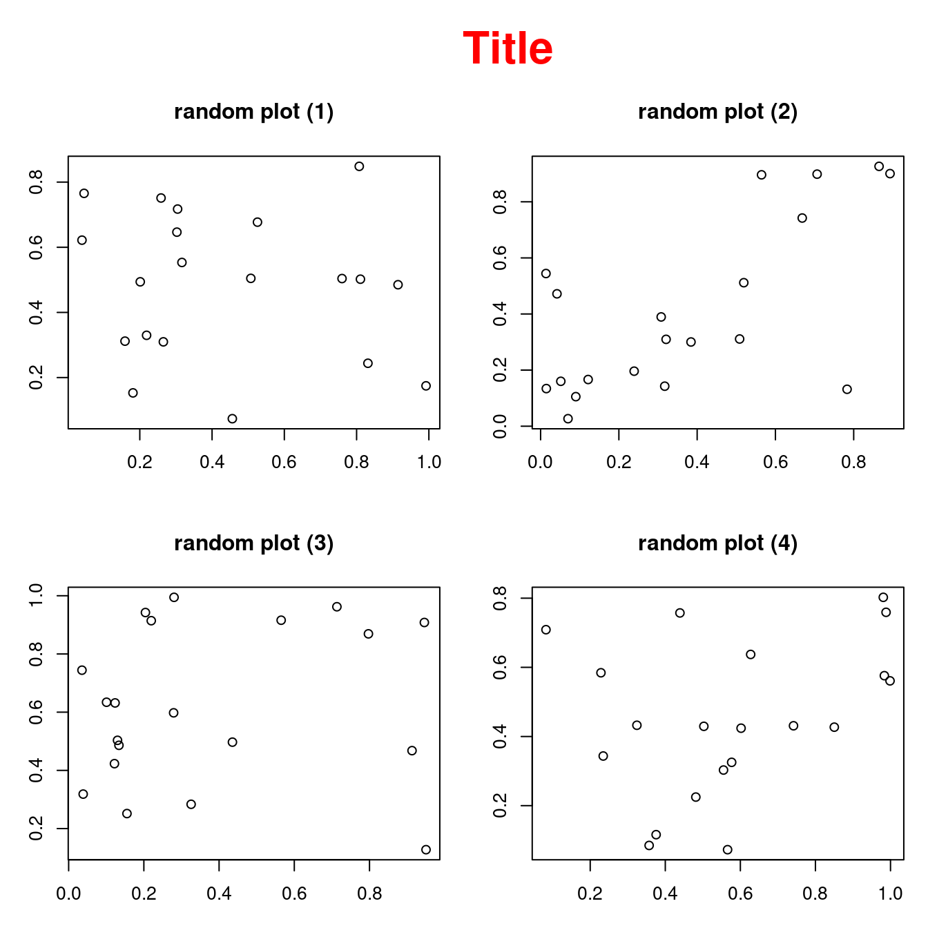
图 10.32: 设置每个子图的边空 mar
10.1.10 图层
覆盖图形 add = T or par(new=TRUE)
plot(runif(5), runif(5),
  xlim = c(0, 1), ylim = c(0, 1)
)
points(runif(5), runif(5),
  col = "#EA4335", pch = 16, cex = 3
)
lines(runif(5), runif(5), col = "red")
segments(runif(5), runif(5), runif(5), runif(5),
  col = "blue"
)
title(main = "Overlaying points, segments, lines...")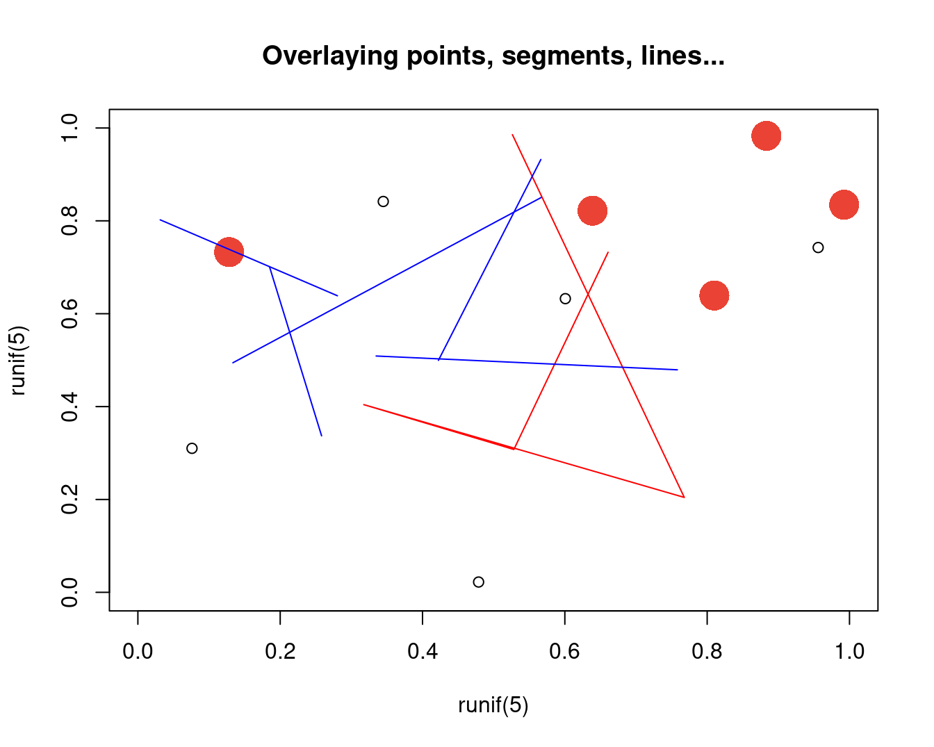
图 10.33: 添加图层
10.1.11 布局
layout 函数布局, 绘制复杂组合图形
op <- par(oma = c(0, 0, 3, 0))
layout(matrix(c(
  1, 1, 1,
  2, 3, 4,
  2, 3, 4
), nr = 3, byrow = TRUE))
hist(rnorm(n), col = "light blue")
hist(rnorm(n), col = "light blue")
hist(rnorm(n), col = "light blue")
hist(rnorm(n), col = "light blue")
mtext("The \"layout\" function",
  side = 3, outer = TRUE,
  font = 2, cex = 1.2
)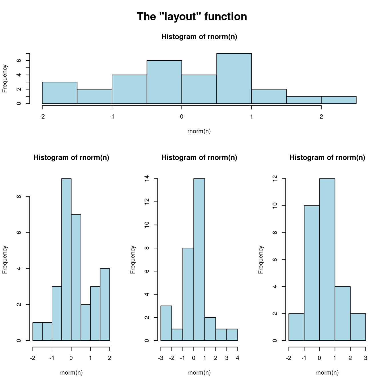
图 10.34: 更加复杂的组合图形
10.1.12 组合
par 之 fig 参数很神奇,使得多个图可以叠加在一起,它接受一个数值向量c(x1, x2, y1, y2) ,是图形设备显示区域中的绘图区域的(NDC, normalized device coordinates)坐标。
plot(1:12,
  type = "b", main = "'fg' : axes, ticks and box in gray",
  fg = gray(0.7), bty = "7", sub = R.version.string
)
par(fig = c(1, 6, 5, 10) / 10, new = T)
plot(6:10,
  type = "b", main = "",
  fg = gray(0.7), bty = "7", xlab = R.version.string
)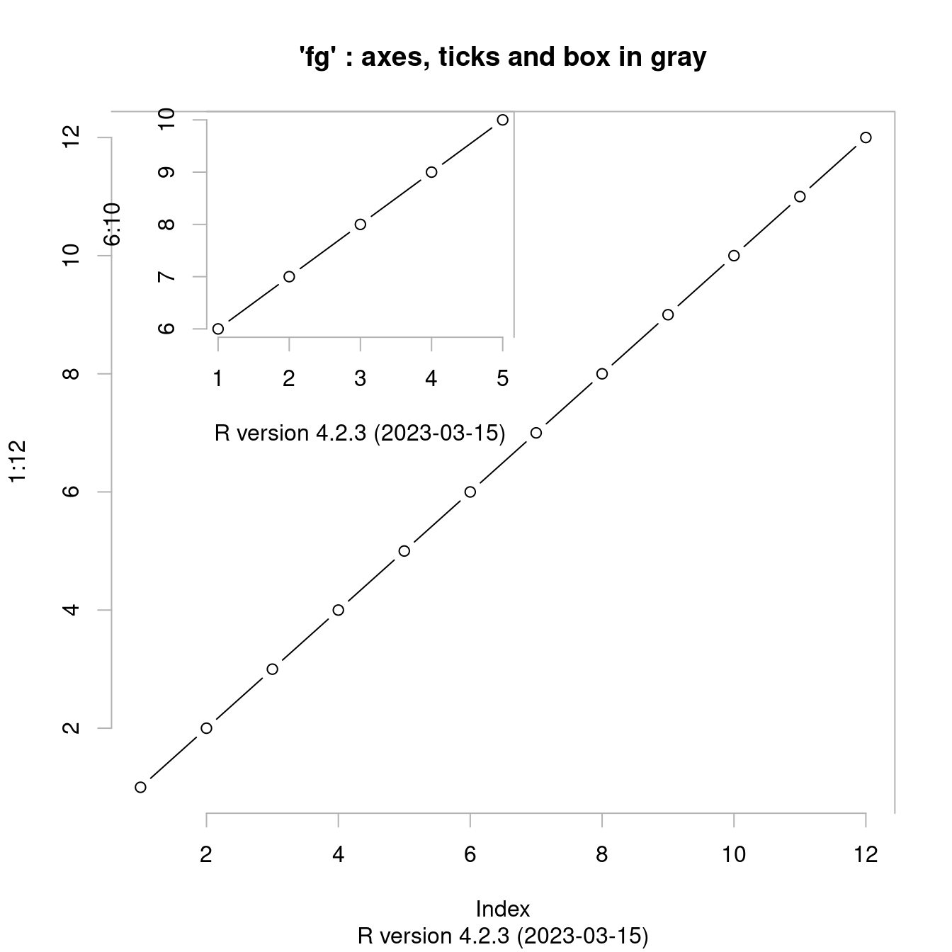
图 10.35: 多图叠加
fig 参数控制图形的位置,用来绘制组合图形
n <- 1000
x <- rt(n, df = 10)
hist(x,
  col = "light blue",
  probability = "TRUE", main = "",
  ylim = c(0, 1.2 * max(density(x)$y))
)
lines(density(x),
  col = "red",
  lwd = 3
)
op <- par(
  fig = c(.02, .4, .5, .98),
  new = TRUE
)
qqnorm(x,
  xlab = "", ylab = "", main = "",
  axes = FALSE
)
qqline(x, col = "red", lwd = 2)
box(lwd = 2)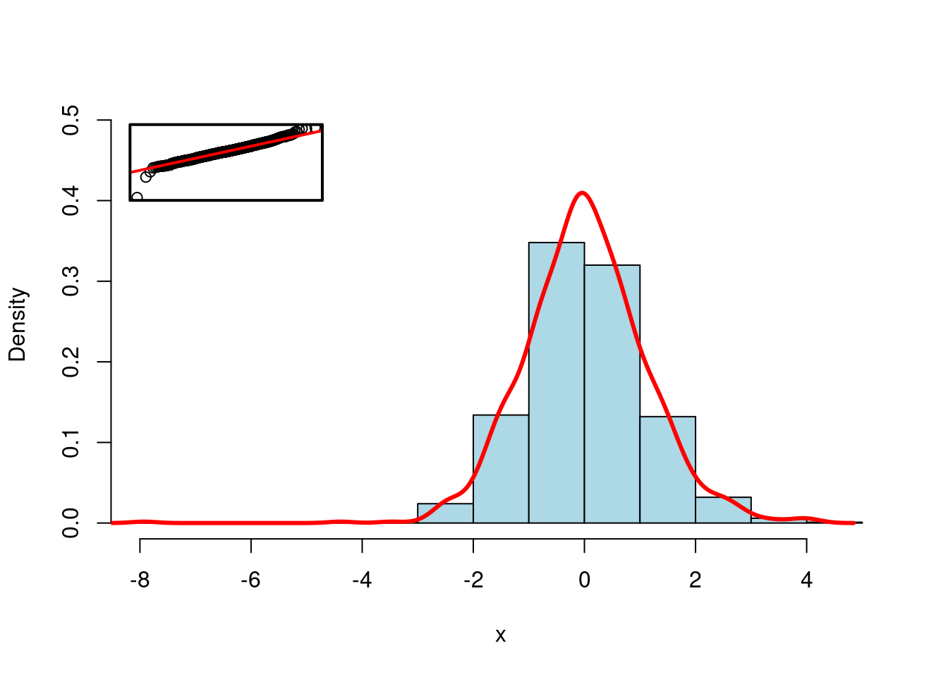
图 10.36: 组合图形
par(op)10.1.13 分屏
split.screen 分屏组合
random.plot <- function() {
  N <- 200
  f <- sample(
    list(
      rnorm,
      function(x) {
        rt(x, df = 2)
      },
      rlnorm,
      runif
    ),
    1
  ) [[1]]
  x <- f(N)
  hist(x, col = "lightblue", main = "", xlab = "", ylab = "", axes = F)
  axis(1)
}
op <- par(bg = "white", mar = c(2.5, 2, 1, 2))
split.screen(c(2, 1))
## [1] 1 2split.screen(c(1, 3), screen = 2)## [1] 3 4 5screen(1)
random.plot()
# screen(2); random.plot() # Screen 2 was split into three screens: 3, 4, 5
screen(3)
random.plot()
screen(4)
random.plot()
screen(5)
random.plot()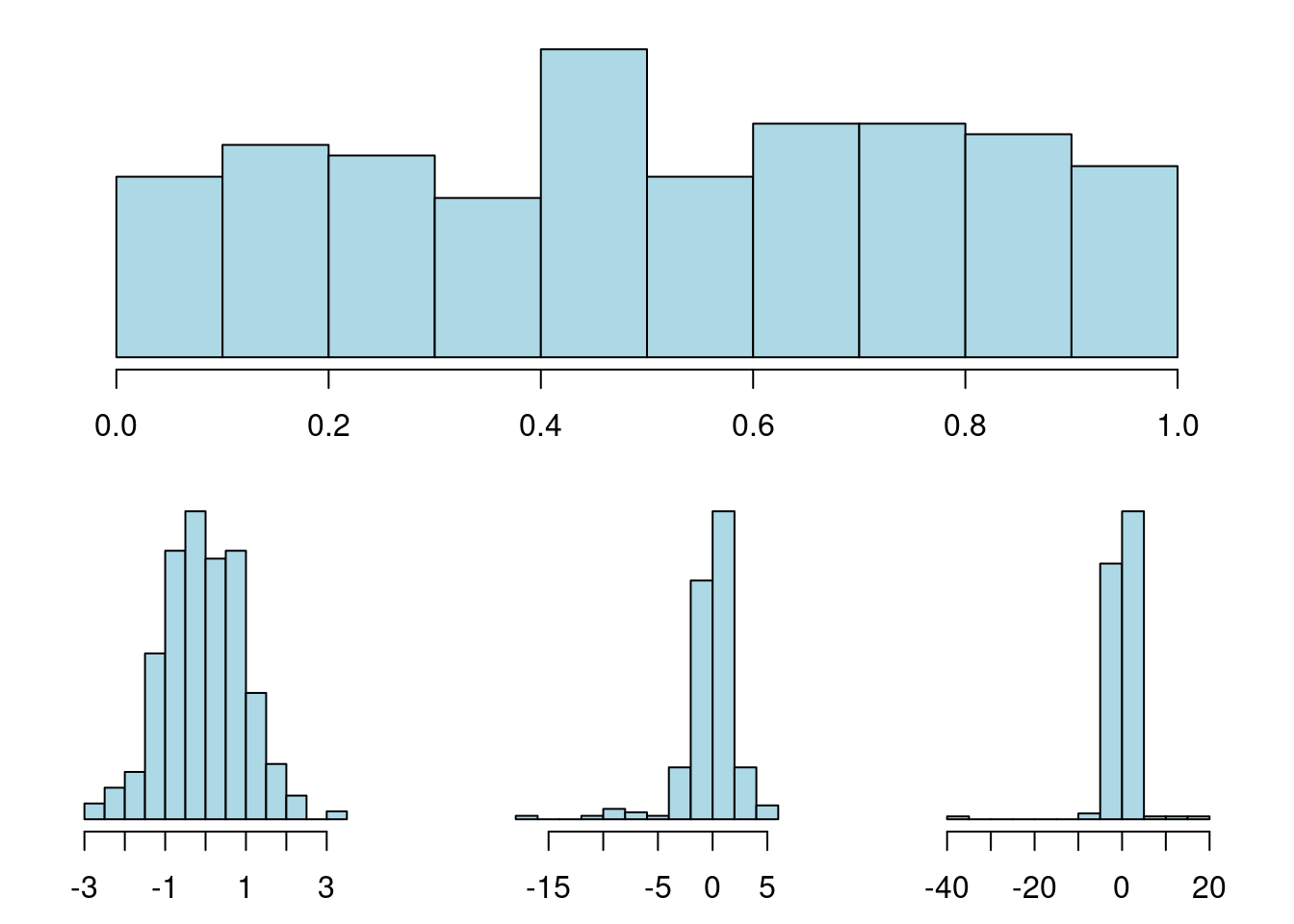
图 10.37: 分屏
close.screen(all = TRUE)
par(op)