Chapter 7 Polynomial Regression
7.1 The Assumption of Linearity
- So far, we have worked under the assumption that the relationships between predictors and the response are (first-order) linear.
- In reality, they are almost never exactly linear.
- However, as long as the relationships are approximately linear, linear models work fine.
- But what can we do when the relationships are clearly non-linear??
7.1.1 Example
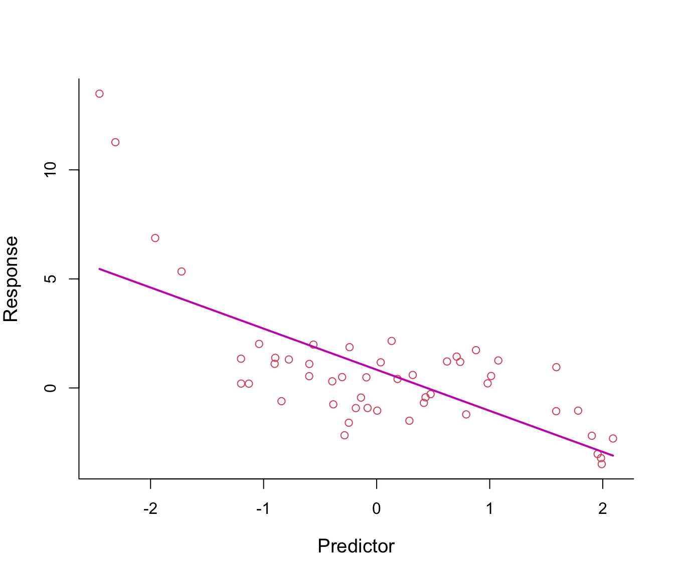
Figure 7.1: First-order polynomial regression line through non-linear data.
Figure 7.1 shows a fitted regression line from the model \(y = \beta_0 + \beta_1 x + \epsilon\): clearly not a good fit!
Why not add \(x^2\) in the equation in order to bend the straight line? See Figure 7.2.
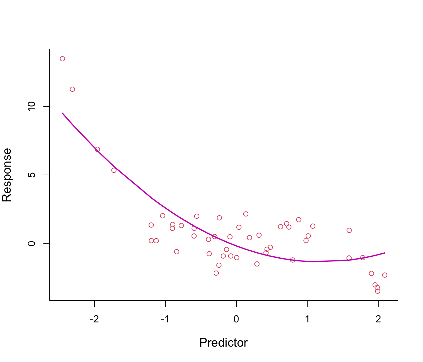
Figure 7.2: Second-order polynomial regression line through non-linear data.
The fitted regression line from the model \(y = \beta_0 + \beta_1 x + \beta_2 x^2 + \epsilon\) looks somehow better, especially on the left tail.
Why not make the line even more flexible by adding an \(x^3\)-term? see Figure 7.3.
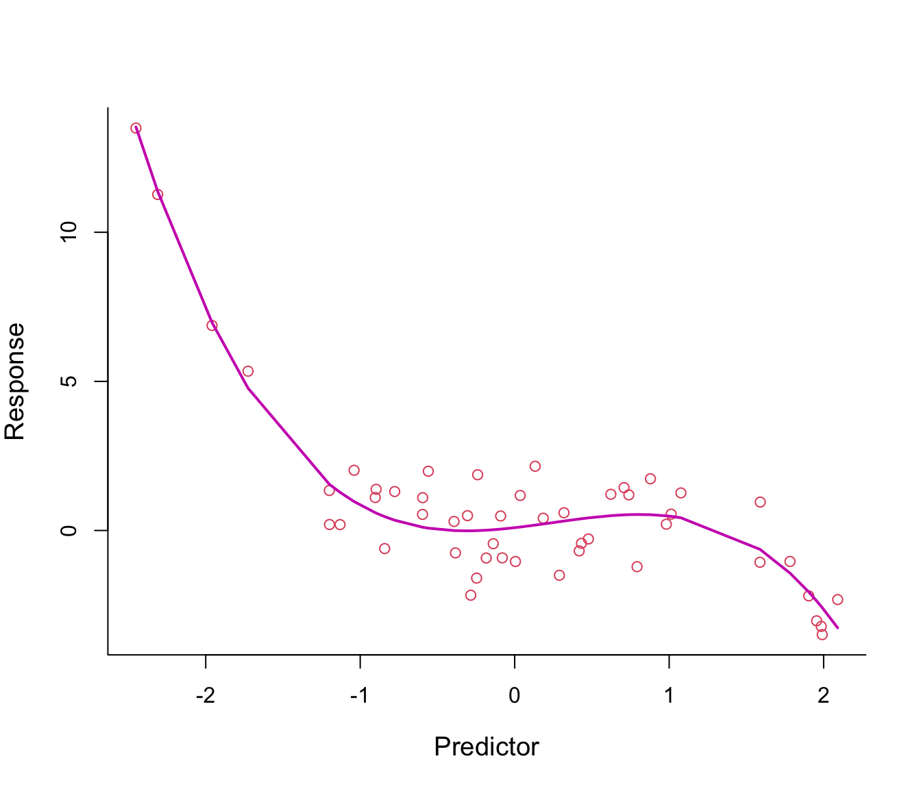
Figure 7.3: Third-order polynomial regression line through non-linear data.
The fitted regression line from model \(y = \beta_0 + \beta_1 x + \beta_2 x^2 + \beta_3 x^3 + \epsilon\) looks just right.
7.2 Polynomial Regression Models
- We have just implemented polynomial regression - as easy as that!
- In general, polynomial models are of the form \[ y = f(x) = \beta_0 + \beta_1 x + \beta_2 x^2 + \beta_3 x^3 + \ldots + \beta_d x^d + \epsilon, \] where \(d\) is called the degree of the polynomial.
- Notice how convenient this is: the non-linear relationship between \(y\) and \(x\) is captured by the polynomial terms but the models remain linear in the parameters/coefficients (the models are additive).
- This means we can use standard Least Squares for estimation!
- For example, previously we fitted a third-order polynomial, which can be also written as \[ y = \beta_0 + \beta_1 x_1 + \beta_2 x_2 + \beta_3 x_3 + \epsilon \] with the predictors simply being \(X_1 = X\), \(X_2 = X^2\) and \(X_3 = X^3\).
7.2.1 What degree \(d\) should I choose?
- What about \(d\) here - do we have a tuning-problem again?
- In this case no. In practice, values of \(d\) greater than 3 or 4 are rarely used.
- This is because if \(d\) is large the fitted curve becomes overly flexible and can take very strange shapes.
- We want the curve to pass through the data in a smooth way.
7.2.2 Example: Overfitting
We fit a polynomial of degree 3 to some training data. On the left of Figure 7.4, we compare the training data (red points) with their fitted values (that is, the model predictions at the training data inputs) joined up as a line. On the right, we compare some test data with their model predicted values (again, joined up as a line). We can see the learned curve fits relatively nicely on both the training data and the test data (it is very similar in both plots, noting that the fit is only plotted across the range of test points in the right-hand plot).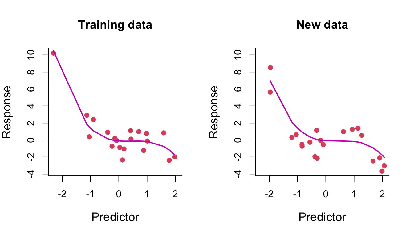
Figure 7.4: Degree-3 polynomial regression line through training and test data.
We then fit a polynomial of degree 14 to the same training data. On the left of Figure 7.5, we can see that the fitted curve tries to pass through every training data point. The result of this overfitting on prediction is clearly seen on the right.
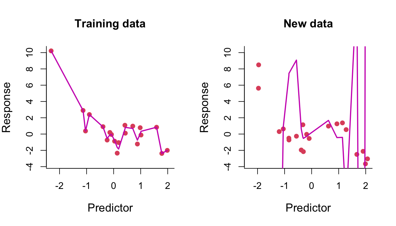
Figure 7.5: Degree-14 polynomial regression line through training and test data.
7.2.3 Example: Wage data
We consider the Wage dataset from library ISLR, which contains income and demographic information for males who reside in the central Atlantic region of the United States. In particular, each panel of Figure 7.6 is a plot of wage against age. We then see the results of plotting polynomial models \(\hat{f}(x)\) (solid lines) of age for wage of various degrees - 2, 3 and 4 respectively. We can see some slight differences between the models for this data.
The purpose of fitting any of these polynomial models is because we are interested in modelling wage as a function \(\hat{f}\) of the predictor age as best we can, this leading to an understanding of the relationship between age and wage. For example. in the left-hand panel we have a degree-2 polynomial fit \(\hat{f}\). This would allow us to estimate wage at a particular value for age, \(x_0\) say, as
\[
\hat{f}(x_0) = \hat{\beta}_0 + \hat{\beta}_1 x_0 + \hat{\beta}_2 x_0^2
\]
where \(\hat{\beta}_0, \hat{\beta}_1, \hat{\beta}_2\) are the least squares fitted coefficients.
Least squares also returns variance estimates for each of the fitted coefficients \(\hat{\beta}_0, \hat{\beta}_1, \hat{\beta}_2\), as well as the covariances between pairs of coefficient estimates. We can use these to estimate the point-wise standard error of the (mean) prediction \(\hat{f}(x_0)\).
The coloured points on either side of the solid-line fitted curve are therefore \(2\times\) standard error curves, that is they correspond to \(\hat{f}(x) \pm 2 \times \mathrm{SE}[\hat{f}(x)]\), where \(\mathrm{SE}[\hat{f}(x)]\) corresponds to the standard error on the mean prediction at \(x\). We plot twice the standard error because, for normally distributed error terms, this quantity corresponds to an approximate \(95\%\) confidence interval (in this case for the mean prediction at \(x\)).
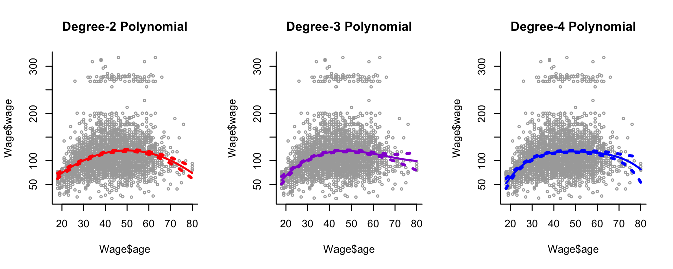
Figure 7.6: Plots of wage against age and the fits from three polynomial models.
7.2.4 Disadvantages
- The fitted curve from polynomial regression is obtained by global training. That is, we use the entire range of values of the predictor to fit the curve.
- This can be problematic: if we get new samples from a specific subregion of the predictor this might change the shape of the curve in other subregions!
- Ideally, we would like the curve to adapt locally within subregions which are relevant to the analysis.
- A first simple approach for resolving this is via step functions (see Chapter 8).
7.3 Interpretation or Prediction?
In Part I - Variable Selection -, and Part II - Shrinkage - of this course we took an interest in both the interpretation of the regression coefficients as well as making predictions at new data points.
In this part, Part III - Transformation - interpretation of regression ceofficients is not of interest. This was the case in this chapter since it is even somewhat hard to figure out what the coefficients of the polynomial models we have just looked at even mean.
Instead, in Part III (including this chapter) we are mainly interested in modelling the non-linear relationships in data by fitting smooth curves to the data, with the aim of using these curves for prediction purposes. In other words, we want a function \(\hat{f}\) which provides a good estimate \(\hat{f}(x)\) of the response given input predictors \(x\).
7.4 Practical Demonstration
In this section we will start with the analysis of the Boston dataset included in the R library MASS. This dataset consists of 506 samples. The response variable is median value of owner-occupied homes in Boston (medv). The dataset has 13 associated predictor variables.
7.4.1 Initial steps
We load library MASS (installing the package is not needed for MASS), check the help document for Boston, check for missing entries and use commands names() and head() to get a better picture of how this dataset looks like.
library(MASS)
help(Boston)
sum(is.na(Boston))
## [1] 0names(Boston)## [1] "crim" "zn" "indus" "chas" "nox" "rm" "age" "dis"
## [9] "rad" "tax" "ptratio" "black" "lstat" "medv"head(Boston)## crim zn indus chas nox rm age dis rad tax ptratio black lstat medv
## 1 0.00632 18 2.31 0 0.538 6.575 65.2 4.0900 1 296 15.3 396.90 4.98 24.0
## 2 0.02731 0 7.07 0 0.469 6.421 78.9 4.9671 2 242 17.8 396.90 9.14 21.6
## 3 0.02729 0 7.07 0 0.469 7.185 61.1 4.9671 2 242 17.8 392.83 4.03 34.7
## 4 0.03237 0 2.18 0 0.458 6.998 45.8 6.0622 3 222 18.7 394.63 2.94 33.4
## 5 0.06905 0 2.18 0 0.458 7.147 54.2 6.0622 3 222 18.7 396.90 5.33 36.2
## 6 0.02985 0 2.18 0 0.458 6.430 58.7 6.0622 3 222 18.7 394.12 5.21 28.7We will analyse medv with respect to the predictor lstat (percentage of lower status population).
head(cbind(Boston$medv, Boston$lstat))## [,1] [,2]
## [1,] 24.0 4.98
## [2,] 21.6 9.14
## [3,] 34.7 4.03
## [4,] 33.4 2.94
## [5,] 36.2 5.33
## [6,] 28.7 5.21For convenience we will just name the response y and the predictor x. We will also pre-define the labels for the x and y-axes that we will use repeatedly in figures throughout this practical.
y = Boston$medv
x = Boston$lstat
y.lab = 'Median Property Value'
x.lab = 'Lower Status (%)'
First, lets plot the two variables.
plot( x, y, cex.lab = 1.1, col="darkgrey", xlab = x.lab, ylab = y.lab,
      main = "", bty = 'l' )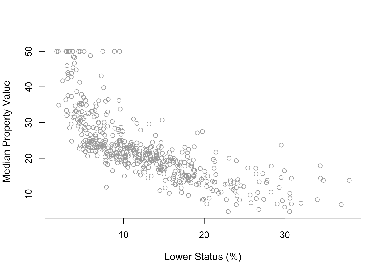
The plot suggests a non-linear relationship between medv and lstat.
7.4.2 Polynomial regression
Let us start by fitting to the data a degree-2 polynomial using the command lm() and summarising the results using summary().
poly2 = lm( y ~ x + I(x^2) )
summary( poly2 )
##
## Call:
## lm(formula = y ~ x + I(x^2))
##
## Residuals:
## Min 1Q Median 3Q Max
## -15.2834 -3.8313 -0.5295 2.3095 25.4148
##
## Coefficients:
## Estimate Std. Error t value Pr(>|t|)
## (Intercept) 42.862007 0.872084 49.15 <2e-16 ***
## x -2.332821 0.123803 -18.84 <2e-16 ***
## I(x^2) 0.043547 0.003745 11.63 <2e-16 ***
## ---
## Signif. codes: 0 '***' 0.001 '**' 0.01 '*' 0.05 '.' 0.1 ' ' 1
##
## Residual standard error: 5.524 on 503 degrees of freedom
## Multiple R-squared: 0.6407, Adjusted R-squared: 0.6393
## F-statistic: 448.5 on 2 and 503 DF, p-value: < 2.2e-16Important note: Above we see that we need to enclose x^2 within the envelope function I(). This is because x^2 is a function of x and when we use a function (any function) of a predictor in lm() we need to do that, otherwise we get wrong results! Besides that we see the usual output from summary().
The above syntax is not very convenient because we need to add manually further polynomial terms. For instance, for a 4-degree polynomial we would need to use lm(y ~ x + I(x^2)+ I(x^3)+ I(x^4)). Fortunately, we have the function poly() which makes things easier for us.
poly2 = lm(y ~ poly(x,  2,  raw = TRUE))
summary(poly2)
##
## Call:
## lm(formula = y ~ poly(x, 2, raw = TRUE))
##
## Residuals:
## Min 1Q Median 3Q Max
## -15.2834 -3.8313 -0.5295 2.3095 25.4148
##
## Coefficients:
## Estimate Std. Error t value Pr(>|t|)
## (Intercept) 42.862007 0.872084 49.15 <2e-16 ***
## poly(x, 2, raw = TRUE)1 -2.332821 0.123803 -18.84 <2e-16 ***
## poly(x, 2, raw = TRUE)2 0.043547 0.003745 11.63 <2e-16 ***
## ---
## Signif. codes: 0 '***' 0.001 '**' 0.01 '*' 0.05 '.' 0.1 ' ' 1
##
## Residual standard error: 5.524 on 503 degrees of freedom
## Multiple R-squared: 0.6407, Adjusted R-squared: 0.6393
## F-statistic: 448.5 on 2 and 503 DF, p-value: < 2.2e-16The argument raw = TRUE above is used in order to get the same coefficients as previously. If we do not use this argument the coefficients will differ because they will be calculated on a different (orthogonal) basis.
However, this is not important because as mentioned in lectures with polynomial regression we are almost never interested in the regression coefficients. In terms of fitting the curve poly(x, 2, raw = TRUE)) and poly(x, 2)) will give the same result!
Now, lets see how we can produce a plot similar to those shown in Section 7.2.3. A first important step is that we need to create an object, which we name sort.x, which has the sorted values of predictor x in a ascending order. Without sort.x we will not be able to produce the plots! Then, we need to use predict() with sort.x as input in order to proceed to the next steps.
sort.x = sort(x)
sort.x[1:10]     # the first 10 sorted values of x
## [1] 1.73 1.92 1.98 2.47 2.87 2.88 2.94 2.96 2.97 2.98pred2 = predict(poly2, newdata = list(x = sort.x), se = TRUE)
names(pred2)## [1] "fit" "se.fit" "df" "residual.scale"The object pred2 contains fit, which are the fitted values, and se.fit, which are the standard errors of the mean prediction, that we need in order to construct the approximate 95% confidence intervals (of the mean prediction).
With this information we can construct the confidence intervals using cbind(). Lets see how the first 10 fitted values and confidence intervals look like.
pred2$fit[1:10] # the first 10 fitted values of the curve## 1 2 3 4 5 6 7 8 9
## 38.95656 38.54352 38.41374 37.36561 36.52550 36.50468 36.37992 36.33840 36.31765
## 10
## 36.29691se.bands2 = cbind( pred2$fit - 2 * pred2$se.fit,
pred2$fit + 2 * pred2$se.fit )
se.bands2[1:10,] # the first 10 confidence intervals of the curve## [,1] [,2]
## 1 37.58243 40.33069
## 2 37.20668 39.88036
## 3 37.08853 39.73895
## 4 36.13278 38.59845
## 5 35.36453 37.68647
## 6 35.34546 37.66390
## 7 35.23118 37.52865
## 8 35.19314 37.48365
## 9 35.17413 37.46117
## 10 35.15513 37.43870Now that we have all that is needed we can finally produce the plot!
Final detail: Below we use lines() for pred2$fit because this is a vector, but for se.bands2, which is a matrix, we have to use matlines().
plot(x, y, cex.lab = 1.1, col="darkgrey", xlab = x.lab, ylab = y.lab,
     main = "Degree-2 polynomial", bty = 'l')
lines(sort.x, pred2$fit, lwd = 2, col = "red")
matlines(sort.x, se.bands2, lwd = 1.4, col = "red", lty = 3)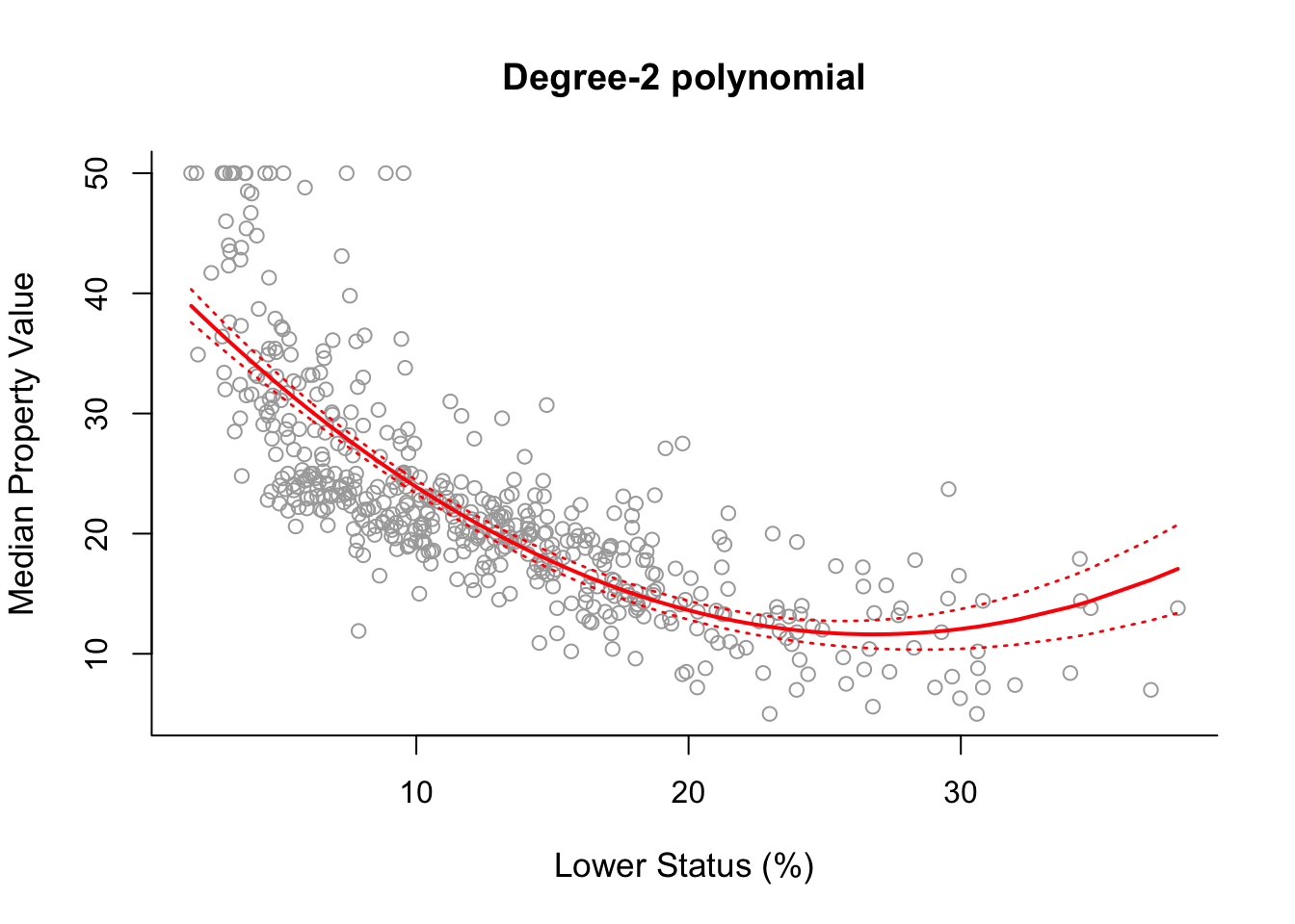
Having seen this procedure in detail once, plotting the fitted curves for polynomials of different degrees is straightforward. The code below produces a plot of degree-2 up to degree-5 polynomial fits.
poly3 = lm(y ~ poly(x,  3))
poly4 = lm(y ~ poly(x,  4))
poly5 = lm(y ~ poly(x, 5))

pred3 = predict(poly3, newdata = list(x = sort.x), se = TRUE)
pred4 = predict(poly4, newdata = list(x = sort.x), se = TRUE)
pred5 = predict(poly5, newdata = list(x = sort.x), se = TRUE)

se.bands3 = cbind(pred3$fit + 2*pred3$se.fit, pred3$fit-2*pred3$se.fit)
se.bands4 = cbind(pred4$fit + 2*pred4$se.fit, pred4$fit-2*pred4$se.fit)
se.bands5 = cbind(pred5$fit + 2*pred5$se.fit, pred5$fit-2*pred5$se.fit)


par(mfrow = c(2,2))
# Degree-2
plot(x, y, cex.lab = 1.1, col="darkgrey", xlab = x.lab, ylab = y.lab,
     main = "Degree-2 polynomial", bty = 'l')
lines(sort.x, pred2$fit, lwd = 2, col = "red")
matlines(sort.x, se.bands2, lwd = 2, col = "red", lty = 3)

# Degree-3
plot(x, y, cex.lab = 1.1, col="darkgrey", xlab = x.lab, ylab = y.lab,
     main = "Degree-3 polynomial", bty = 'l')
lines(sort.x, pred3$fit, lwd = 2, col = "darkviolet")
matlines(sort.x, se.bands3, lwd = 2, col = "darkviolet", lty = 3)

# Degree-4
plot(x, y, cex.lab = 1.1, col="darkgrey", xlab = x.lab, ylab = y.lab,
     main = "Degree-4 polynomial", bty = 'l')
lines(sort.x, pred4$fit, lwd = 2, col = "blue")
matlines(sort.x, se.bands4, lwd = 2, col = "blue", lty = 3)

# Degree-5
plot(x, y, cex.lab = 1.1, col="darkgrey", xlab = x.lab, ylab = y.lab,
     main = "Degree-5 polynomial", bty = 'l')
lines(sort.x, pred5$fit, lwd = 2, col = "black")
matlines(sort.x, se.bands5, lwd = 2, col = "black", lty = 3)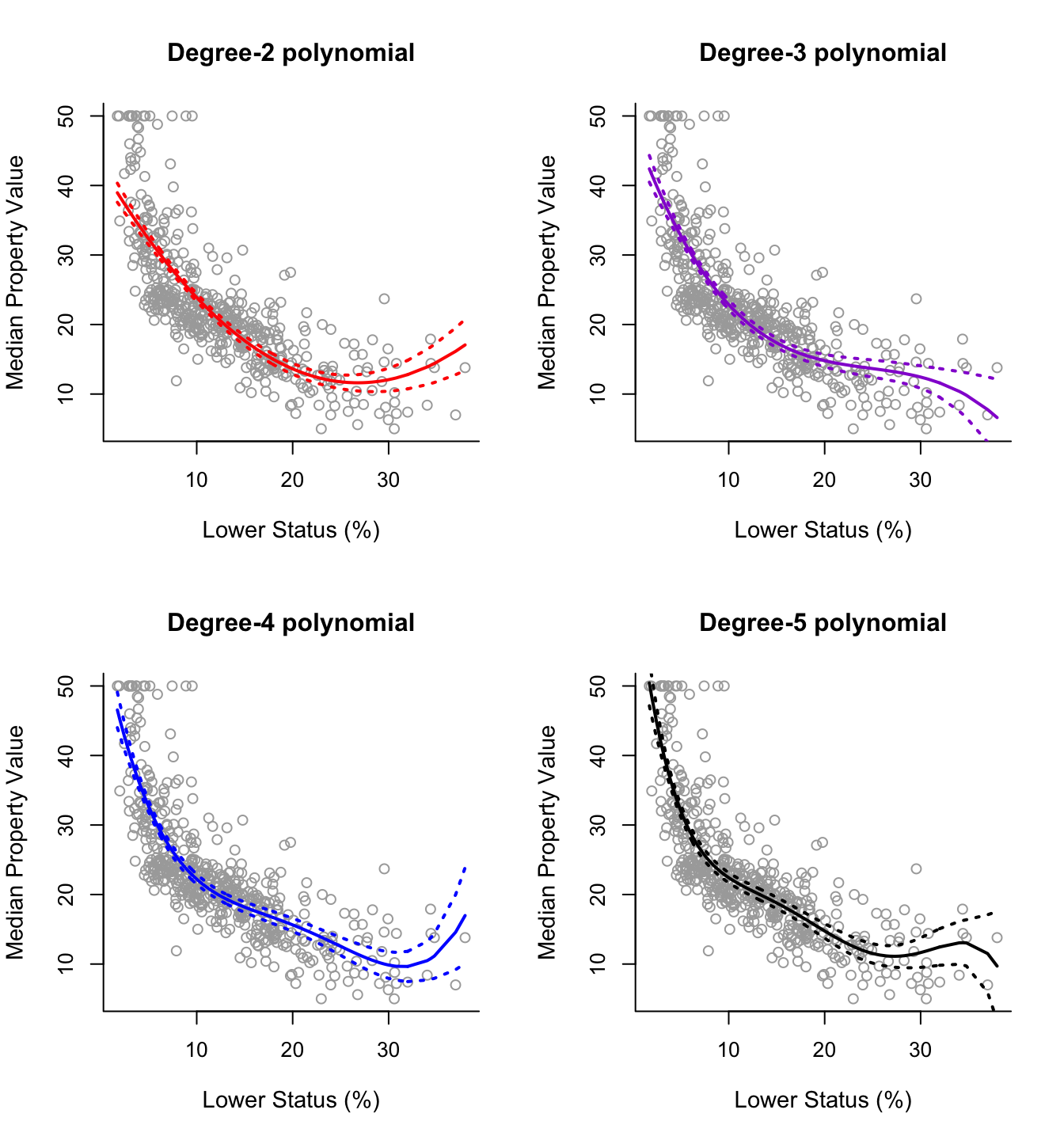
For this data it is not clear which curve fits better. All four curves look reasonable given the data that we have available. Without further indications, one may choose the degree-2 polynomial since it is simpler and seems to do about as well as the others.
However, if we want to base our decision on a more formal procedure, rather than on a subjective decision, one option is to use the classical statistical methodology of analysis-of-variance (ANOVA). Specifically, we will perform sequential comparisons based on the F-test, comparing first the linear model vs. the quadratic model (degree-2 polynomial), then the quadratic model vs. the cubic model (degree-3 polynomial) and so on. We therefore have to fit the simple linear model, and we also choose to fit the degree-6 polynomial to investigate the effects of an additional predictor as well. We can perform this analysis in RStudio using the command anova() as displayed below.
poly1 = lm(y ~ x)
poly6 = lm(y ~ poly(x, 6))
anova(poly1, poly2, poly3, poly4, poly5, poly6)
## Analysis of Variance Table
##
## Model 1: y ~ x
## Model 2: y ~ poly(x, 2, raw = TRUE)
## Model 3: y ~ poly(x, 3)
## Model 4: y ~ poly(x, 4)
## Model 5: y ~ poly(x, 5)
## Model 6: y ~ poly(x, 6)
## Res.Df RSS Df Sum of Sq F Pr(>F)
## 1 504 19472
## 2 503 15347 1 4125.1 151.8623 < 2.2e-16 ***
## 3 502 14616 1 731.8 26.9390 3.061e-07 ***
## 4 501 13968 1 647.8 23.8477 1.406e-06 ***
## 5 500 13597 1 370.7 13.6453 0.0002452 ***
## 6 499 13555 1 42.4 1.5596 0.2123125
## ---
## Signif. codes: 0 '***' 0.001 '**' 0.01 '*' 0.05 '.' 0.1 ' ' 1The hypothesis that is checked at each step is that the decrease in RSS is not significant. The hypothesis is rejected if the p-value (column Pr(>F)) is smaller than a given significance level (say 0.05). If the hypothesis is rejected then we move on to the next comparison. Based on this reasoning and the results above we would select the 5-degree polynomial.