Chapter 6 Principal Component Regression
6.1 Reminder
So far, we have focused on linear models of the form \[ y= \beta_0 + \beta_1x_1 + \beta_2x_2 + \ldots + \beta_p x_p +\epsilon \] and argued in favour of selecting sparser models which are simpler to interpret and also have better predictive performance in comparison to the model that includes all \(p\) predictors.
Specifically, we saw
- Model-search methods: discrete procedures which require full or partial enumeration of all possible models and select one best model.
- Coefficient shrinkage methods: continuous procedures which shrink the coefficients of the full model to zero (penalised regression).
Both approaches effectively reduce the dimensionality of the problem.
6.2 Dimension Reduction
- There is another alternative strategy to standard LS regression.
- It is quite different than subset selection and penalised regression.
- The idea is to reduce dimensionality before applying LS.
- Instead of utilizing the \(p\) original predictors, this approach utilises \(q\) transformed variables which are linear combinations of the original predictors, where \(q<p\).
Idea: Transform the predictor variables and then fit a Least Squares model using the transformed variables. The number of transformed variables is smaller than the number of predictors.
Mathematically:
- Define \(q < p\) linear transformations \(Z_k, k = 1,...,q\) of \(X_1,X_2,\ldots,X_p\) as
\[Z_k= \sum_{j =1}^{p}\phi_{jk}X_j,
\]
for some constants \(\phi_{1k}, \phi_{2k}, \ldots, \phi_{pk}\). - Fit a LS regression model of the form \[y_i = \theta_0 + \sum_{k =1}^q \theta_k z_{ik}, \, i = 1,\ldots, n. \]
We have dimension reduction: Instead of estimating \(p+1\) coefficients we estimate \(q+1\)!
Interestingly, with some re-ordering we get: \[ \sum_{k =1}^q \theta_k z_{ik} = \sum_{k =1}^q \theta_k \left( \sum_{j =1}^{p}\phi_{jk}x_{ij}\right) = \sum_{j =1}^{p} \left(\sum_{k =1}^q \theta_k \phi_{jk}\right)x_{ij} = \sum_{j =1}^p \beta_j x_{ij} \]
This means that \(\beta_j = \left(\sum_{k =1}^q \theta_k \phi_{jk}\right)\) and this is essentially a constraint
- So similarly to penalised regression the coefficients are constrained, but now the constraint is quite different.
- The constraint again increases bias but decreases the variance.
- This results in the same benefits we have previously seen for settings that are not “least-squares friendly”!
Question: How should we choose the \(\phi\)’s?
Well, we need to find transformations \(Z_k= \sum_{j =1}^{p}\phi_{jk}X_j\) which are meaningful. Trying to directly approach the problem with respect to the constants \(\phi_{1k}, \phi_{2k}, \ldots, \phi_{qk}\) is difficult.
It is easier to approach it with respect to the \(Z\) variables. Specifically, to consider what properties we would like the \(Z\)’s to have.
Desired properties:
- If the new variables \(Z\) are uncorrelated this would give a solution to the problem of multicollinearity.
- If the new variables \(Z\) capture most of the variability of the \(X\)’s, and assuming that this variability is predictive of the response, the \(Z\) variables will be reliable predictors of the response.
This is exactly what principal component regression (PCR) does!
6.3 Principal Component Analysis
PCR utilises Principal Component Analysis (PCA) of the data matrix \(X\).
PCA is a technique for reducing the dimension of an \(n \times p\) data matrix \(X\). The \(Z\)’s are called principal components. The first principal component \(Z_1\) of the data lies on the direction along which X varies the most. The second principal component \(Z_2\) lies on the direction with the second highest variability, and so forth.
In mathematical lingo, PCA performs a hierarchical orthogonal rotation of the axes according to the directions of variability. The \(\phi\)’s which perform this operation are called the principal components loadings. We use the following example to explain this further.
Technical note: If the predictors are not on the same scale, the columns of matrix \(X\) should be standardised before implementing PCA.
6.3.1 Example: Advertisement Data
The advertisement data contains data from 100 cities on the amount of advertisement spending. We are interested in the variable advertisement spending in thousands of dollars (ad), and population in tens of thousands of people (pop). These two variables are plotted against each other in Figure 6.17.
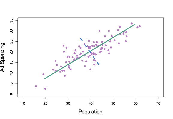
Figure 6.1: The population size and ad spending for 100 different cities are shown as purple circles. The green solid line indicates the first principal component, and the blue dashed line indicates the second principal component.
The solid green line represents the first principal component direction of the data. We can see by eye that this is the direction along which there is the greatest variability in the data. In other words, if we projected the 100 observations onto this line (as shown in the left-hand panel of Figure 6.2), then the resulting projected observations would have the largest possible variance. Projecting the observations onto any other line would yield projected observations with lower variance. Projecting a point onto a line simply involves finding the location on the line which is closest to the point. The blue line in Figure 6.1 represents the second principal component line - that with highest variance that is uncorrelated with \(Z_1\).
Perhaps a more intuitive interpretation for PCA is that the first principal component vector defines the line that is as close as possible to the data. For instance, in Figure 6.1, the first principal component line minimises the sum of the squared perpendicular distances between each point and the line. These distances are plotted as dashed line segments in the left-hand panel of Figure 6.2, in which the crosses represent the projection of each point onto the first principal component line. The first principal component has been chosen so that the projected observations are as close as possible to the original observations.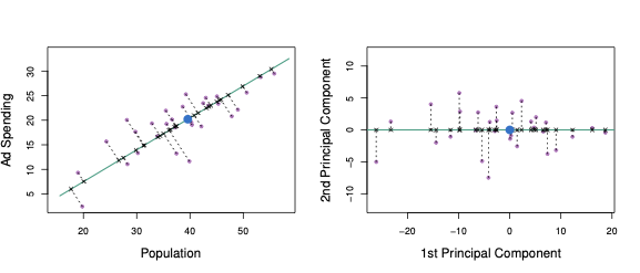
Figure 6.2: A subset of the advertising data. The mean population and advertising budgets are indicated with a blue circle. Left: The first principal component direction is shown in green. It is the dimension along which the data \(X\) vary the most, and it also defines the line that is closest to all \(n\) observations. The distances from each observation to the principal component are represented using the black dashed line segments. The blue dot represents the mean. Right: The left-hand panel has been rotated so that the first principal component direction coincides with the \(x\)-axis.
In the right-hand panel of Figure 6.2, the left-hand panel has been rotated so that the first principal component direction coincides with the \(x\)-axis. The first principal component score for the \(i\)th observation is the distance in the \(x\)-direction of the \(i\)th cross from zero.
Plots of the first principal component scores against the two variables are shown in Figure 6.3. We can see that the first principal component effectively explains both advertisement spending and population.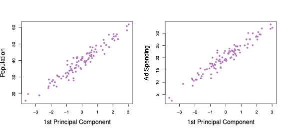
Figure 6.3: First Principal Component scores against each of the two variables population and advertisement spending.
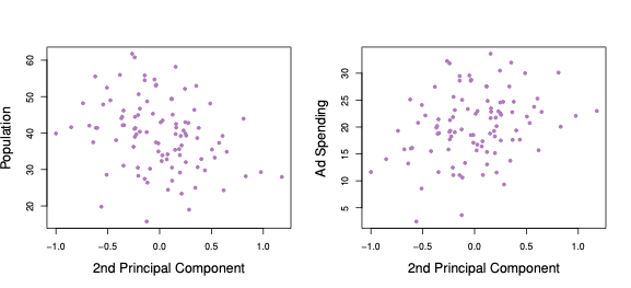
Figure 6.4: Second Principal Component scores against each of the two variables population and advertisement spending.
6.4 Principal Component Regression
Principal Component Regression (PCR) involves constructing the first \(q\) principal components \(Z_1,...,Z_q\), and then using these components as the predictors in a linear regression model that is fit using least squares.
The key idea is that often a small number of principal components suffice to explain most of the variability of the data, as well as the relationship with the response. In other words, we assume that the directions in which \(X_1,...,X_p\) show the most variation are the directions that are associated with Y. This assumption is not guaranteed, but it is often reasonable enough to give good results.
6.4.1 Example: Advertisement Data
In the advertising data, the first principal component explains most of the variance in both population and advertisement spending, so a principal component regression that uses this single variable to predict some response of interest, such as sales, will likely perform well.
6.4.2 How Many Components?
- Once again we have a tuning problem.
- In ridge and lasso the tuning parameter (\(\lambda\)) was continuous - in PCR the tuning parameter is the number of components (\(q\)), which is discrete.
- Some methods calculate the total variance of X explained as we add further components. When the incremental increase is negligible, we stop. One such popular method is the scree plot (see the practical demonstration extension).
- Alternatively, we can use (yes, you guessed it…) cross-validation!
6.4.3 What about Interpretability?
- One drawback of PCR is that it lacks interpretability, because the estimates \(\hat{\theta}_k\) for \(k = 1,\ldots, q\) are the coefficients of the principal components, which have no meaningful interpretation.
- Well, that is partially true, but there is one thing we can do: once we fit LS on the transformed variables we can use the constraint in order to obtain the corresponding estimates of the original predictors \[ \hat{\beta}_j = \sum_{k =1}^q \hat{\theta}_k \phi_{jk}, \] for \(j = 1,\ldots, p\)
- However, for \(q < p\) these will not correspond to the LS estimates of the full model. In fact, the PCR estimates get shrunk in a discrete step-wise fashion as \(q\) decreases (this is why PCR is still a shrinkage method).
6.4.4 PCR - a Summary
Advantages:
- Similar to ridge and lasso, it can result in improved predictive performance in comparison to Least Squares by resolving problems caused by multicollinearity and/or large \(p\).
- It is a simple two-step procedure which first reduces dimensionality from \(p+1\) to \(q+1\) and then utilizes LS.
Disadvantages:
- It does not perform feature selection.
- The issue of interpretability.
- It relies on the assumption that the directions in which the predictors show the most variation are the directions which are predictive of the response. This is not always the case. Sometimes, it is the last principal components which are associated with the response! Another dimension reduction method, Partial Least Squares, is more effective in such settings, but we do not have time in this course to cover this approach.
Final Comments:
- In general, PCR will tend to do well in cases when the first few principal components are sufficient to capture most of the variation in the predictors as well as the relationship with the response.
- We note that even though PCR provides a simple way to perform regression using \(q<p\) predictors, it is not a feature selection method. This is because each of the \(q\) principal components used in the regression is a linear combination of all \(p\) of the original features.
- In general, dimension-reduction based regression methods are not very popular nowadays, mainly due to the fact that they do not offer any significant advantage over penalised regression methods.
- However, PCA is a very important tool in unsupervised learning where it is used extensively in a variety of applications!
6.5 Practical Demonstration
For PCR, we will make use of the package pls, so we have to install this before first use by executing install.packages('pls'). The main command is called pcr(). The argument scale=TRUE standardises the columns of the predictor matrix, while argument validation = 'CV' picks the optimal number of principal components via cross-validation. The command summary() provides information on CV error and variance explained (RMSEP - Root Mean Squared Error (of Prediction)). Note that adjCV is an adjusted estimate of CV error accounting for bias. Under TRAINING, we can see the proportion of the variance of training data explained by the \(q\) largest PCs, \(q=1,...,p\).
library(pls) # for performing PCR##
## Attaching package: 'pls'## The following object is masked from 'package:stats':
##
## loadingslibrary(ISLR) # for Hitters dataset
set.seed(1)
pcr.fit = pcr( Salary ~ ., data = Hitters, scale = TRUE, validation = "CV" )
summary(pcr.fit)## Data: X dimension: 263 19
## Y dimension: 263 1
## Fit method: svdpc
## Number of components considered: 19
##
## VALIDATION: RMSEP
## Cross-validated using 10 random segments.
## (Intercept) 1 comps 2 comps 3 comps 4 comps 5 comps 6 comps 7 comps
## CV 452 352.5 351.6 352.3 350.7 346.1 345.5 345.4
## adjCV 452 352.1 351.2 351.8 350.1 345.5 344.6 344.5
## 8 comps 9 comps 10 comps 11 comps 12 comps 13 comps 14 comps 15 comps
## CV 348.5 350.4 353.2 354.5 357.5 360.3 352.4 354.3
## adjCV 347.5 349.3 351.8 353.0 355.8 358.5 350.2 352.3
## 16 comps 17 comps 18 comps 19 comps
## CV 345.6 346.7 346.6 349.4
## adjCV 343.6 344.5 344.3 346.9
##
## TRAINING: % variance explained
## 1 comps 2 comps 3 comps 4 comps 5 comps 6 comps 7 comps 8 comps 9 comps
## X 38.31 60.16 70.84 79.03 84.29 88.63 92.26 94.96 96.28
## Salary 40.63 41.58 42.17 43.22 44.90 46.48 46.69 46.75 46.86
## 10 comps 11 comps 12 comps 13 comps 14 comps 15 comps 16 comps 17 comps
## X 97.26 97.98 98.65 99.15 99.47 99.75 99.89 99.97
## Salary 47.76 47.82 47.85 48.10 50.40 50.55 53.01 53.85
## 18 comps 19 comps
## X 99.99 100.00
## Salary 54.61 54.61We can use the command validationplot() to plot the validation error. The argument val.type = 'MSEP' specifies to select Mean Squared Error (of Prediction), other options are Root Mean Squared Error (of Prediction), RMSEP and \(R^2\); type ?validationplot for help.
validationplot( pcr.fit, val.type = 'MSEP' )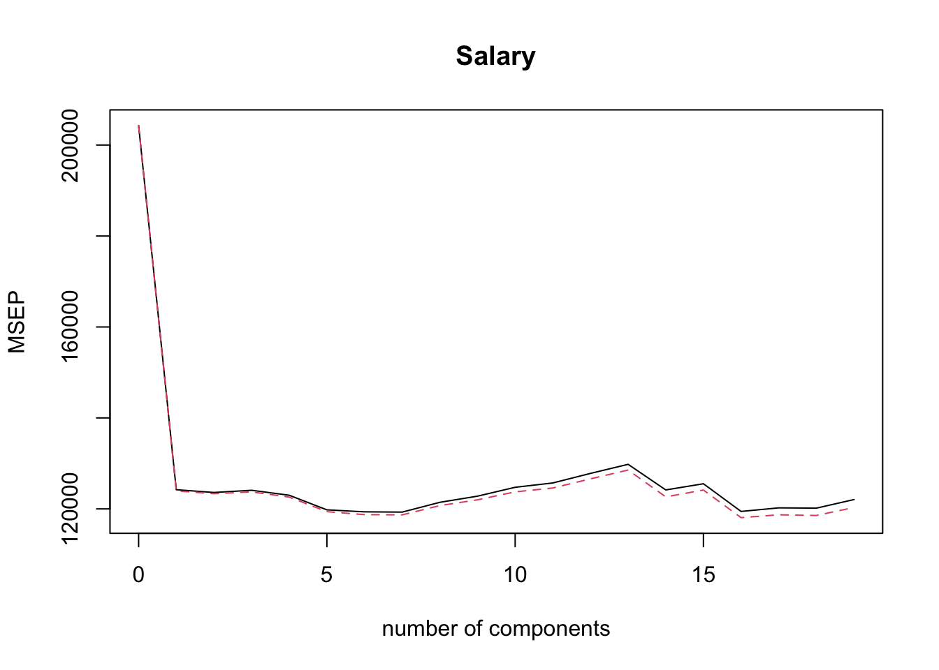
From the plot above it is not obvious which PCR model minimises the CV error. We would like to extract this information automatically, but it turns out that is not so easy with pcr()! One way to do this is via the code below (try to understand what it does!).
min.pcr = which.min( MSEP( pcr.fit )$val[1,1, ] ) - 1
min.pcr
## 7 comps
## 7So, it is the model with 7 principal components that minimises CV. Now that we know which model it is we can find the corresponding estimates in terms of the original \(\hat{\beta}\)’s using the command coef() we have used before. Also we can generate predictions via predict() (below the first 6 predictions are displayed).
coef(pcr.fit, ncomp = min.pcr)## , , 7 comps
##
## Salary
## AtBat 27.005477
## Hits 28.531195
## HmRun 4.031036
## Runs 29.464202
## RBI 18.974255
## Walks 47.658639
## Years 24.125975
## CAtBat 30.831690
## CHits 32.111585
## CHmRun 21.811584
## CRuns 34.054133
## CRBI 28.901388
## CWalks 37.990794
## LeagueN 9.021954
## DivisionW -66.069150
## PutOuts 74.483241
## Assists -3.654576
## Errors -6.004836
## NewLeagueN 11.401041head( predict( pcr.fit, ncomp = min.pcr ) )## , , 7 comps
##
## Salary
## -Alan Ashby 568.7940
## -Alvin Davis 670.3840
## -Andre Dawson 921.6077
## -Andres Galarraga 495.8124
## -Alfredo Griffin 560.3198
## -Al Newman 135.5378Extension: Regularisation Paths for PCR
What about regularisation paths with pcr()? This is again tricky because there is no built-in command. The below piece of code can be used to produce regularisation paths. The regression coefficients from all models using 1 up to 19 principal components are stored in pcr.fit$coefficients, but this is an object of class list which is not very convenient to work with. Therefore, we create a matrix called coef.mat which has 19 rows and 19 columns. We then store the coefficients in pcr.fit$coefficients to the columns of coef.mat, starting from the model that has 1 principal component, using a for loop. We then use plot() to plot the path of the first row of coef.mat, followed by a for a for loop calling the command lines() to superimpose the paths of the rest of the rows of coef.mat.
coef.mat = matrix(NA, 19, 19)
for(i in 1:19){
  coef.mat[,i] = pcr.fit$coefficients[,,i]
}

plot(coef.mat[1,], type = 'l', ylab = 'Coefficients',
     xlab = 'Number of components', ylim = c(min(coef.mat), max(coef.mat)))
for(i in 2:19){
  lines(coef.mat[i,], col = i)
}

abline(v = min.pcr, lty = 3)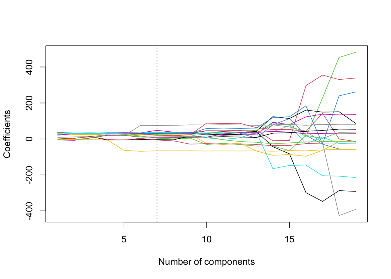
We can see from the plot the somewhat strange way in which PCR regularises the coefficients.
Extension: Scree plots
Finally, consider here that we used the in-built CV within the function pcr to select the number of coefficients. We can, however, use the visual aid of a scree plot to help us decide on the appropriate number of principal components. This amounts to plotting as a bar chart the cumulative proportion of variance attributed to the first \(q\) principal components, such as was shown in the X row of the % variance explained matrix when we called summary(pcr.fit). This information is a little difficult to extract from the summary object, however, so we construct the scree plot manually as shown below (try to understand what is happening):
PVE <- rep(NA,19)
for(i in 1:19){ PVE[i]<- sum(pcr.fit$Xvar[1:i])/pcr.fit$Xtotvar }
barplot( PVE, names.arg = 1:19, main = "scree plot",
xlab = "number of PCs",
ylab = "proportion of variance explained" )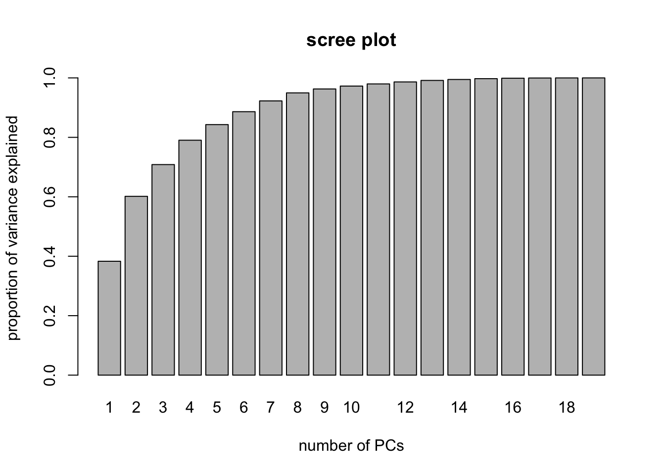 We may, for example, decide that we need the number of principal components required to explain 95% of the variance in the predictors. In this case, we could look at the scree plot and the output from
 summary(pcr.fit) to elicit that we need to select the first 9 principal components in order to explain 95% of the variance in X.