5.1 Bar charts (side-by-side; stacked)
For this section, the data introduced in Sect. 3.1 are used.
- Use the jamvoi menu: select Analyses> Frequencies> Independent samples (\(\chi^2\) test of association).
- Add the variables.
Add the variables to the rows and columns (in this case, the
RowsisDietand theColumnsisB12). - Click on the right-pointing arrow next to the Plots option from the bottom of the left-side screen.
- In the Plots section, select
Bar Plot; then select Bar Type (either aSide by sidebar chart, or aStackedbar chart).
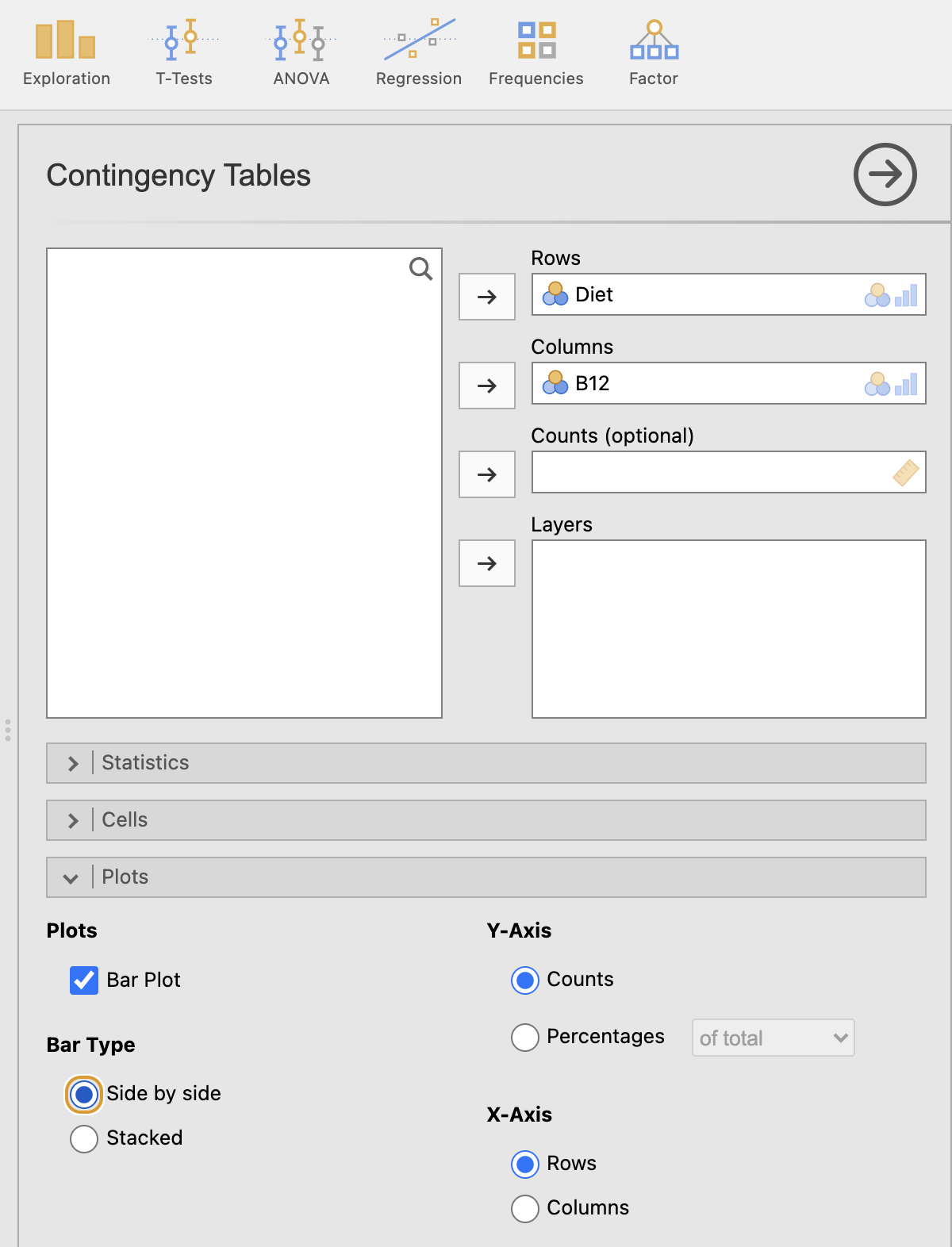
FIGURE 5.1: Adding the variables to create a side-by-side bar chart in jamovi
- You can change the vertical axis to represent either counts or percentages by your selection under Y-Axis.
- You can change which variables is on the horizontal axis by your selection under X-Axis.
There are plenty of options, so feel free to experiment.
A useful one is to use for the Y-Axis is
Percentageswith thewithin rowsoption.
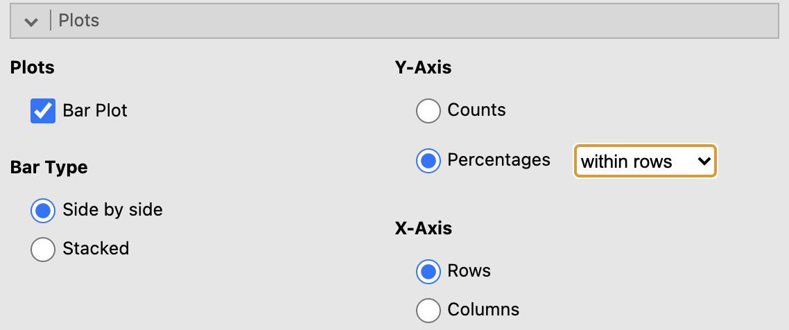
FIGURE 5.2: Adding the variables to create a side-by-side bar chart in jamovi
- You will have your graph in the Output window.