1.2 Statistical Power
Type II error rates (\(\beta\)) vary inversely with the power of the study (1 - \(\beta\)). Statistical power is an increasing function of a) sample size, b) effect size, and c) significance level. The positive association with significance level means there is a trade-off between Type I and Type II error rates. A small \(\alpha\) sets a high bar for rejecting H0, but you run the risk of failing to appreciate a real difference. On the other hand, a small \(\alpha\) sets a low bar for rejecting H0, but you run the risk of mistaking a random difference as real.
The 1 - \(\beta\) statistical power threshold is usually set at .80, similar to the \(\alpha\) = .05 level of significance threshold convention. Given a real effect, a study with a statistical power of .80 will only find a positive test result 80% of the time. There may be such a thing as too much power, however. With a large enough sample size, even trivial effect sizes may yield a positive test result. You need to consider both sides of this coin.
A power analysis is frequently used to determine the sample size required to detect a threshold effect size given an \(\alpha\) level of significance criteria. A power analysis expresses the relationship among four components. If you know any three, it can return the fourth. The components are i) power (1 - \(\beta\)), ii) sample size (n), iii) significance (\(\alpha\)), and iv) expected effect size (Cohen’s d = \((\bar{x} - \mu_0)/\sigma\)).
Suppose you set power at .80, significance level at .05, and n = 30, like in the IQ example. What effect size will this design detect?
(pwr <- pwr::pwr.t.test(
  n = 50,
  sig.level = .05,
  power = 0.80,
  type = "one.sample",
  alternative = "greater"
))
##
## One-sample t test power calculation
##
## n = 50
## d = 0.3566064
## sig.level = 0.05
## power = 0.8
## alternative = greaterAn effect size of d = 0.357 will fall in the \(\alpha\) = .05 region with probability 1 - \(\beta\) = .80 if the sample size is n = 50. Multiply d = 0.357 by \(\sigma\) = 15 to convert to the IQ units, 5.3.
n2 <- 50
mu_2 <- mu_0 + pwr$d * sigma
iq_range <- seq(90, 120, .01)

tmp <- data.frame(
  iq = iq_range,
  H0 = dnorm(iq_range, mean = mu_0,  sd = sigma / sqrt(n2)),
  H1 = dnorm(iq_range, mean = mu_2, sd = sigma / sqrt(n2))
)

alpha_x <- qnorm(.95, mu_0, sigma / sqrt(n2))
alpha_y <- dnorm(alpha_x, mean = mu_0, sd = sigma / sqrt(n2))

tmp %>%
  pivot_longer(cols = c(H0, H1), values_to = "density") %>%
  mutate(alpha_beta = if_else((name == "H0" & iq >= alpha_x) |
                                (name == "H1" & iq <= alpha_x & iq > mu_0),
                              density, NA_real_)) %>%
  ggplot(aes(x = iq, color = name, fill = name)) +
  geom_line(aes(y = density), size = 1) +
  geom_area(aes(y = alpha_beta), alpha = .4, show.legend = FALSE) +
  geom_vline(xintercept = mu_0, linetype = 2, size = 1, color = "lightgoldenrod") +
  geom_vline(xintercept = mu_2, linetype = 2, size = .5, color = "steelblue") +
  geom_vline(xintercept = qnorm(.95, mu_0, sigma / sqrt(50)),
             linetype = 2, size = .5, color = "gray80") +
  scale_color_manual(values = c("H0" = "lightgoldenrod", "H1" = "lightsteelblue")) +
  scale_fill_manual(values = c("H0" = "lightgoldenrod", "H1" = "lightsteelblue")) +
  annotate("text", x = x_bar - 4, y = .0075, label = "beta", parse = TRUE,
           color = "steelblue") +
  annotate("text", x = x_bar - 1, y = .0075, label = "alpha", parse = TRUE,
           color = "darkgoldenrod") +
  theme_light() +
  theme(panel.grid = element_blank(), legend.position = "top") +
  labs(
    title = glue("n = {n2} tightens the distributions."),
    fill = NULL, color = NULL, x = "IQ"
  ) +
  scale_x_continuous(breaks = c(90, 100, round(qnorm(.95, mu_0, sigma / sqrt(50)), 1), round(mu_2, 1), 110, 120))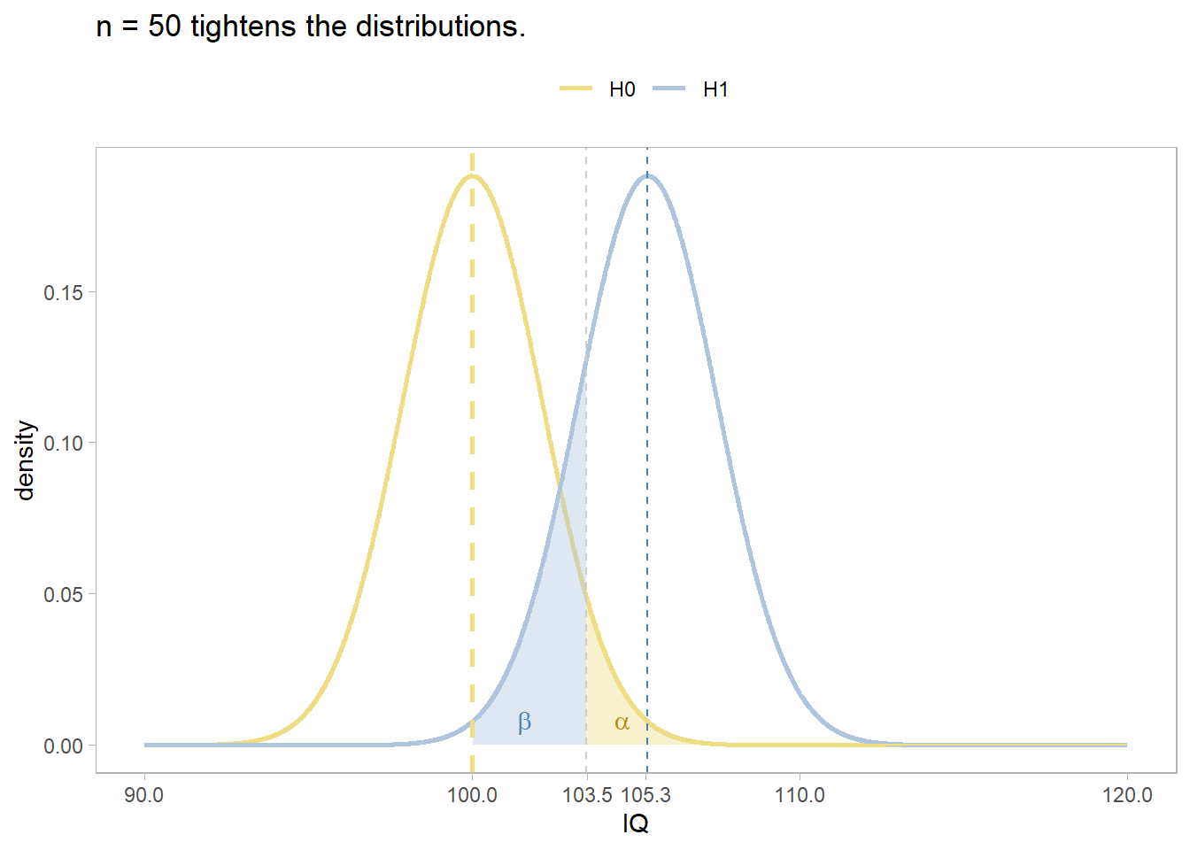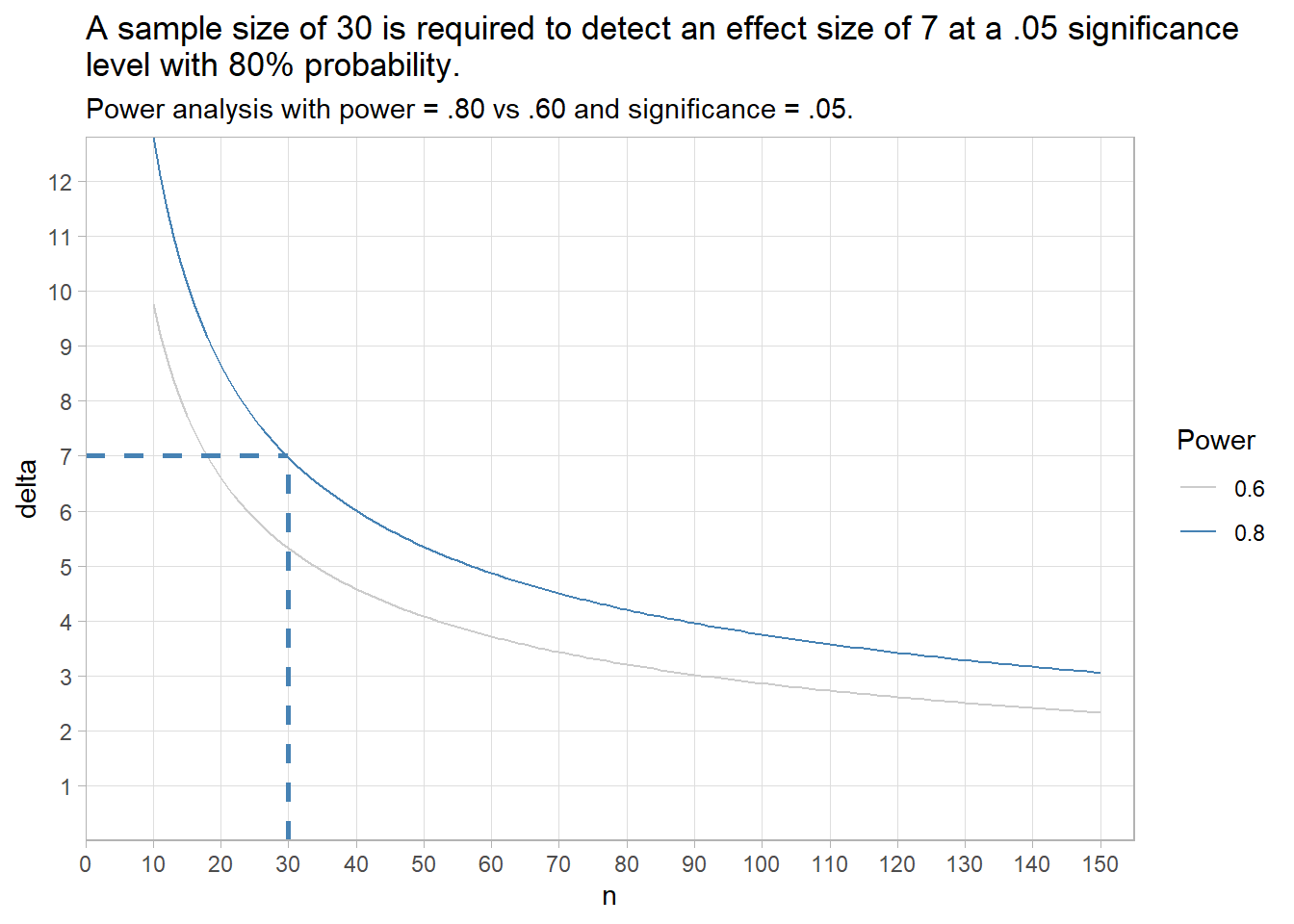
plot_iq <- function(M0, M1, S, n) {
  iq_range <- seq(90, 120, .01)

  data.frame(
    iq = iq_range,
    H0 = dnorm(iq_range, mean = M0,  sd = S / sqrt(n)),
    H1 = dnorm(iq_range, mean = M1, sd = S / sqrt(n))
  ) %>%
    pivot_longer(cols = c(H0, H1), values_to = "density") %>%
    ggplot(aes(x = iq, color = name)) +
    geom_line(aes(y = density), size = 1)
}

plot_iq(M0 = mu_0, M1 = mu_0 + pwr$d * sigma, S = sigma, n = 30)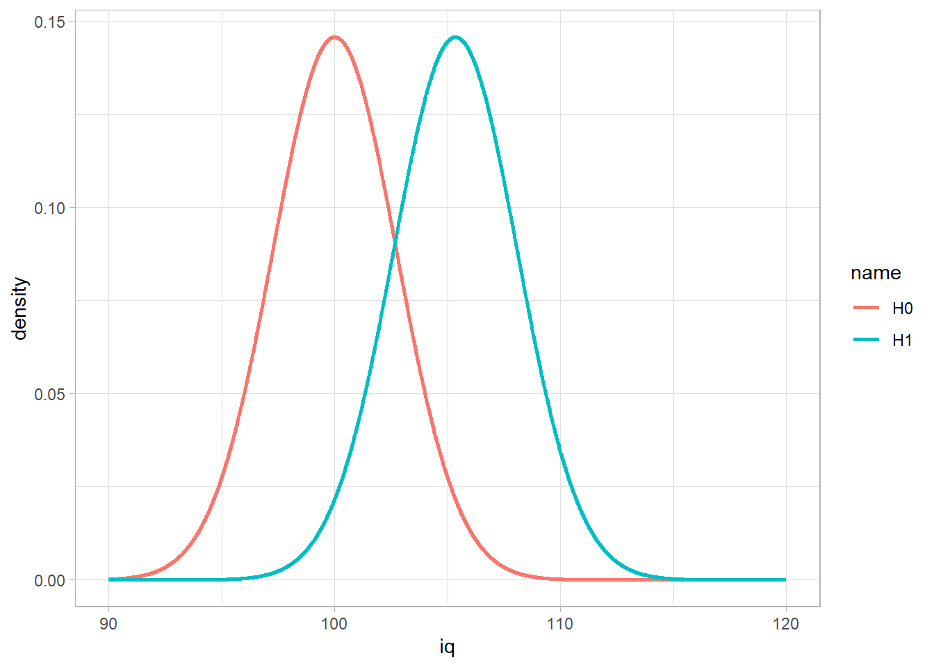
You can use the power test to see the relationship between sample size and effect size. Let’s do that with the IQ example. Note: the y-axis multiplies Cohen’s d by \(\sigma\) to get the effect size in original units.
data.frame(n = rep(10:150, 2),
           power = c(rep(.80, 141), rep(.60, 141))) %>%
  mutate(d = map2_dbl(n, power, ~ pwr.t.test(n = .x,
                                     sig.level = .05,
                                     power = .y,
                                     type = "one.sample",
                                     alternative = "greater") %>% pluck("d")),
         delta = d * sigma
  ) %>%
  ggplot(aes(x = n, y = delta, group = as.factor(power), color = as.factor(power))) +
  geom_line() +
  annotate("segment", x = 30, xend = 30, y = 0, yend = 7, linetype = 2, size = 1, color = "steelblue") +
  annotate("segment", x = 0, xend = 30, y = 7, yend = 7, linetype = 2, size = 1, color = "steelblue") +
  scale_y_continuous(limits = c(0, NA), breaks = 1:100, expand = c(0, 0)) +
  scale_x_continuous(limits = c(0, 155), breaks = seq(0, 150, 10), expand = c(0, 0)) +
  scale_color_manual(values = c("0.6" = "gray80", "0.8" = "steelblue")) +
  theme_light() +
  theme(panel.grid.minor = element_blank(), legend.position = "right") +
  labs(title = paste("A sample size of 30 is required to detect an effect size",
                     "of 7 at a .05 significance \nlevel with 80% probability."),
       subtitle = "Power analysis with power = .80 vs .60 and significance = .05.",
       color = "Power")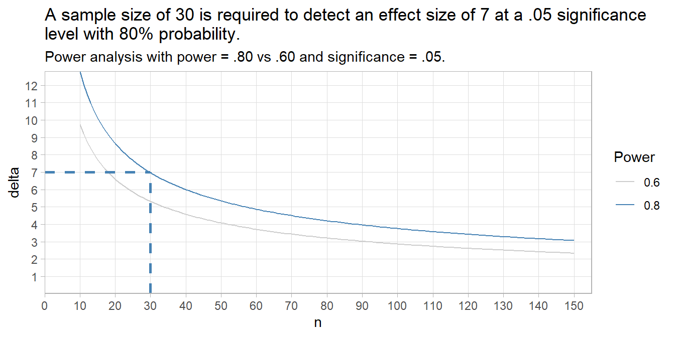
The plot shows a sample size of 30 is required to detect an effect size of 7 at a .05 significance level with 80% probability. If an effect size of 5 is important, then if you need a sample size of at least 58 (always round up).
pwr::pwr.t.test(
  d = 5 / sigma,
  sig.level = .05,
  power = 0.80,
  type = "one.sample",
  alternative = "greater"
)
##
## One-sample t test power calculation
##
## n = 57.02048
## d = 0.3333333
## sig.level = 0.05
## power = 0.8
## alternative = greatercritical_value <- qnorm(.95, mu_0, sigma / sqrt(n))
tibble(
iq = seq(90, 120, .01),
H0 = dnorm(iq, mean = mu_0, sd = sigma / sqrt(n)),
actual = dnorm(iq_range, mean = mu, sd = sigma / sqrt(n))
) %>%
pivot_longer(cols = c(H0, actual), values_to = "density") %>%
mutate(area = if_else(
(name == "H0" & iq >= critical_value) |
(name == "actual" & iq <= critical_value & iq > mu_0),
density, NA_real_)
) %>%
ggplot(aes(x = iq)) +
geom_line(aes(y = density, color = name), size = 1) +
geom_area(aes(y = area, fill = name), alpha = .4, show.legend = FALSE) +
geom_vline(xintercept = mu_0, linetype = 2, size = 1, color = "lightgoldenrod") +
geom_vline(xintercept = mu, linetype = 2, size = 1, color = "lightsteelblue") +
scale_color_manual(values = c("H0" = "lightgoldenrod", "actual" = "lightsteelblue")) +
scale_fill_manual(values = c("H0" = "lightgoldenrod", "actual" = "lightsteelblue")) +
annotate("text", x = x_bar - 4, y = .0075, label = "beta", parse = TRUE, color = "steelblue") +
annotate("text", x = x_bar - .5, y = .0075, label = "alpha", parse = TRUE, color = "darkgoldenrod") +
theme(panel.grid = element_blank(), legend.position = "top") +
labs(
title = glue("X-bar = {scales::number(x_bar, accuracy = .1)} is ",
"outside the .05 significance level of H0 value, {mu_0}."),
fill = NULL, color = NULL, x = "IQ"
) +
scale_x_continuous(breaks = c(90, 100, 105.6, 110, 120))