4.3 Introducing data visualisation in R
Data visualisation is such an important topic there are many books and blogs devoted to this topic. One general, i.e., not specific to R, book that is continuing to be developed is (Dougherty and Ilyankou 2020). Entertaining examples of poor visualisations abound, but include this blog on junk charts and a simple journalistic piece by Carson MacPherson-Krutsky on “Three Questions To Ask Yourself Next Time You See a Graph, Chart or Map”.
In R there are multiple ways to do the same thing, especially with visualisation. Base R comes has a good deal of built-in functionality for charts and graphs. Then on top of this there are many R packages that extend this functionality of which {ggplot2} authored by Hadley Wickham is by far the most popular and powerful. Although this is more complex I recommend it.
4.3.1 Visualisation using ggplot2
Until now we have used the plot facilities within Base R, however as just indicated, there is an extremely powerful graphics package {ggplot2} which is very widely used. It offers a number of advantages:
- ggplot provides a great deal of flexibility
- it enables us to add complexity and detail incrementally
- it is based on Leland Wilkinson’s landmark book The Grammar of Graphics (hence “gg”) so rigorous and complete
- the default colours and other aesthetics are nice (usually!)
- you can easily produce production quality graphics
- you can save plots (or the beginnings of a plot) as objects
- as the programmer you have complete control
- multivariate exploration is simplified through faceting and use of colouring
- multiple themes are provided for aesthetics which helps produce a consistent style of output for longer or more complex reports
The downside is that ggplot can be a little more complex, but I believe it is well worth persevering with.
To start with you need to install the {ggplot2} package which is actually part of {tidyverse} as
install.package("tidyverse"). Do this once. Then every new R session load the package from your R library into memory, so if you just want ggplot2 then library(ggplot2) will do.
The package is very well-documented on the tidyverse website and for the impatient there is a cheatsheet(pdf).
As a simple example, let’s say we want to visualise the distribution of the arrest rate for murder in the US using the built-in data set USArrests. As an alternative to the boxplot we can use a kernel density estimator. For a technical explanation see (Schucany 2004) and a rather nice visualisation from (Conlen 2020). I’ve chosen to superimpose this on a histogram which can be helpful when the sample is small so we can see the relationship between the actual observations and the smoothed kernel density. In order to make the y-axis meaningful it’s necessary to show the histogram as a probability rather than a count so that the density plot can be properly superimposed.
In Base R this can be achieved in the following code.
# Density plot and histogram of murder arrests using Base R
hist(USArrests$Murder,
     probability = T,      # use probability rather than count for y-axis
     main = "Histogram and density plot of murder arrests by US state",
     xlab = "Arrests per 100,000 population")
lines(density(USArrests$Murder), col="blue", lwd=2)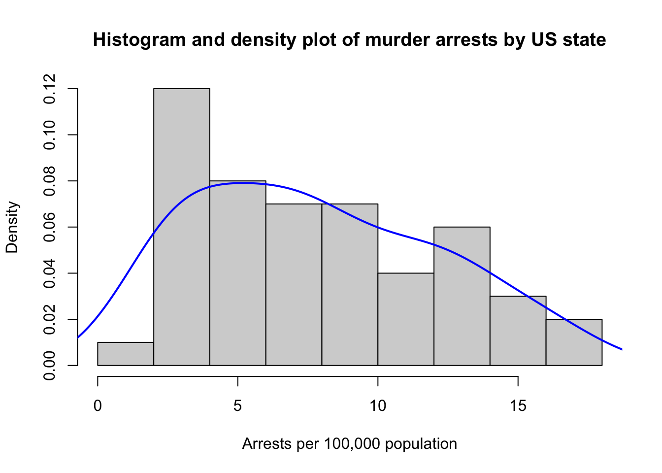
Alternatively we can use {ggplot2}. Notice how we store the output in a new R object that we have created my.plot. This can be manipulated like any other data object. Notice also the structure where the + operator is used to compose the different ggplot2 functions, e.g., geom_density() and ggtitle() into a single plot.
# Using ggplot
my.plot <- ggplot(USArrests, aes(x=Murder)) +
# Histogram with scaled density instead of count on y-axis
           geom_histogram(aes(y=..density..),
                          binwidth=1,
                          colour="black",
                          fill="grey") +
# Overlay with transparent blue density plot
           geom_density(alpha=.2, fill="blue") +
           ggtitle("Histogram and density plot of murder arrests by US state") +
           labs(x="Arrests per 100,000 population")
# Output my.plot
my.plot
## Warning: The dot-dot notation (`..density..`) was deprecated in ggplot2 3.4.0.
## ℹ Please use `after_stat(density)` instead.
## This warning is displayed once every 8 hours.
## Call `lifecycle::last_lifecycle_warnings()` to see where this warning was
## generated.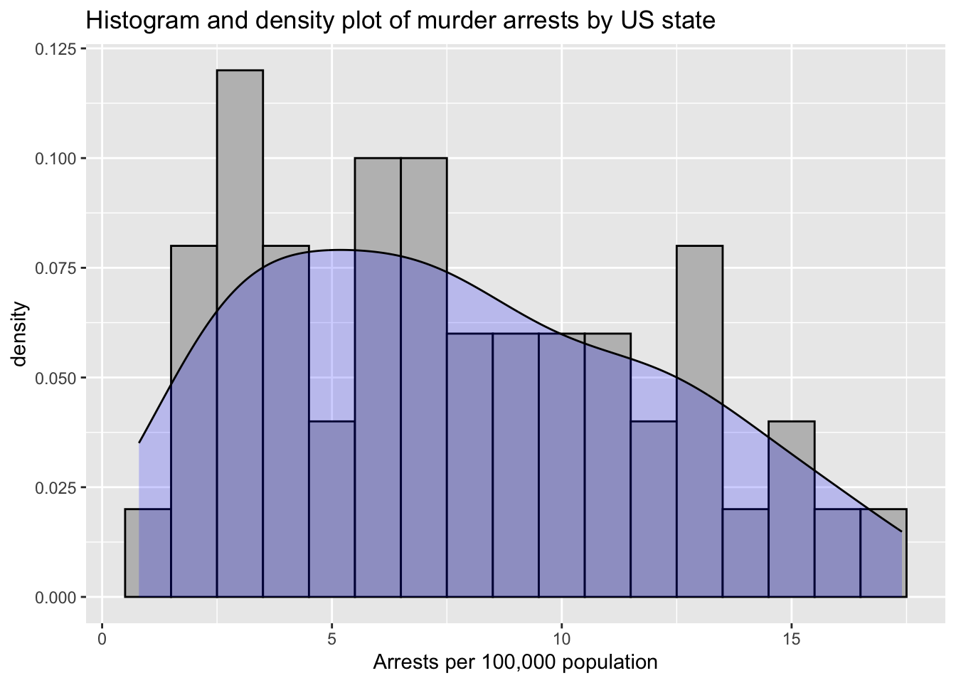
Another important part of EDA is to show how variables co-vary. Below is a plot also taken from the USArrests data set that shows the relationship between murder arrest rate and proportion of the population that is urbanised by state. Then the chart is enriched by also adding assault arrest rates (by colouring the points from blue (low) to red (high)). For some background on producing scatterplots, adding regression lines and then confidence intervals and smoothers see (Neitmann 2021).
ggplot(data = USArrests, aes(x=UrbanPop, y=Murder, colour=Assault)) +
      geom_point(shape = 1, size = 2) +
      scale_colour_gradient(low = "blue", high = "red") +
      stat_smooth(method="lm", se=TRUE) +
      ggtitle("Urban population by US State vs Murder Arrests (1973)") +
      xlab("Urban population percentage") +
      ylab("Arrests per 100,000")
## `geom_smooth()` using formula = 'y ~ x'## Warning: The following aesthetics were dropped during statistical transformation:
## colour.
## ℹ This can happen when ggplot fails to infer the correct grouping structure in
## the data.
## ℹ Did you forget to specify a `group` aesthetic or to convert a numerical
## variable into a factor?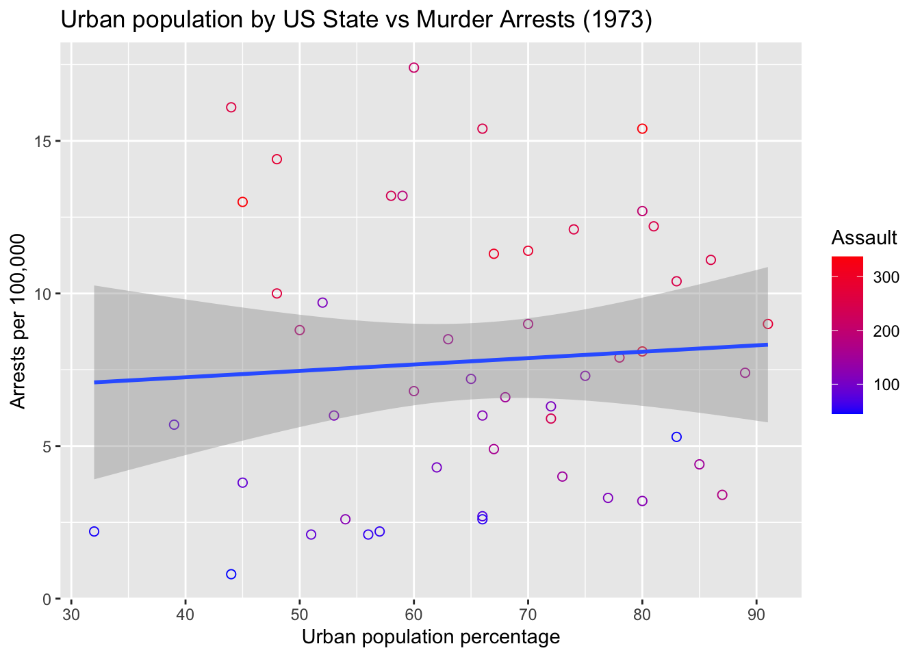
From this plot we see a very weak relationship (if any) between murder arrest rate and the percentage urban population. However, it does seem that assault and murder arrests are associated. By adding more dimensions and also the uncertainty (in terms of confidence intervals) of relationships, we can provide the data analyst with a richer picture. Deciding what to include and what graphics to provide is a skill and to some extent goes with experience.
4.3.2 Visualising model fit
Although potentially at a later stage, another benefit of visualising your data lies in checking a model and its fit to the data.
Andrew Gelman’s blog (2020) highlighted the following example. A recently published paper (Islam et al. 2020) in the BMJ used regression discontinuity modelling to estimate the effect of social distancing.
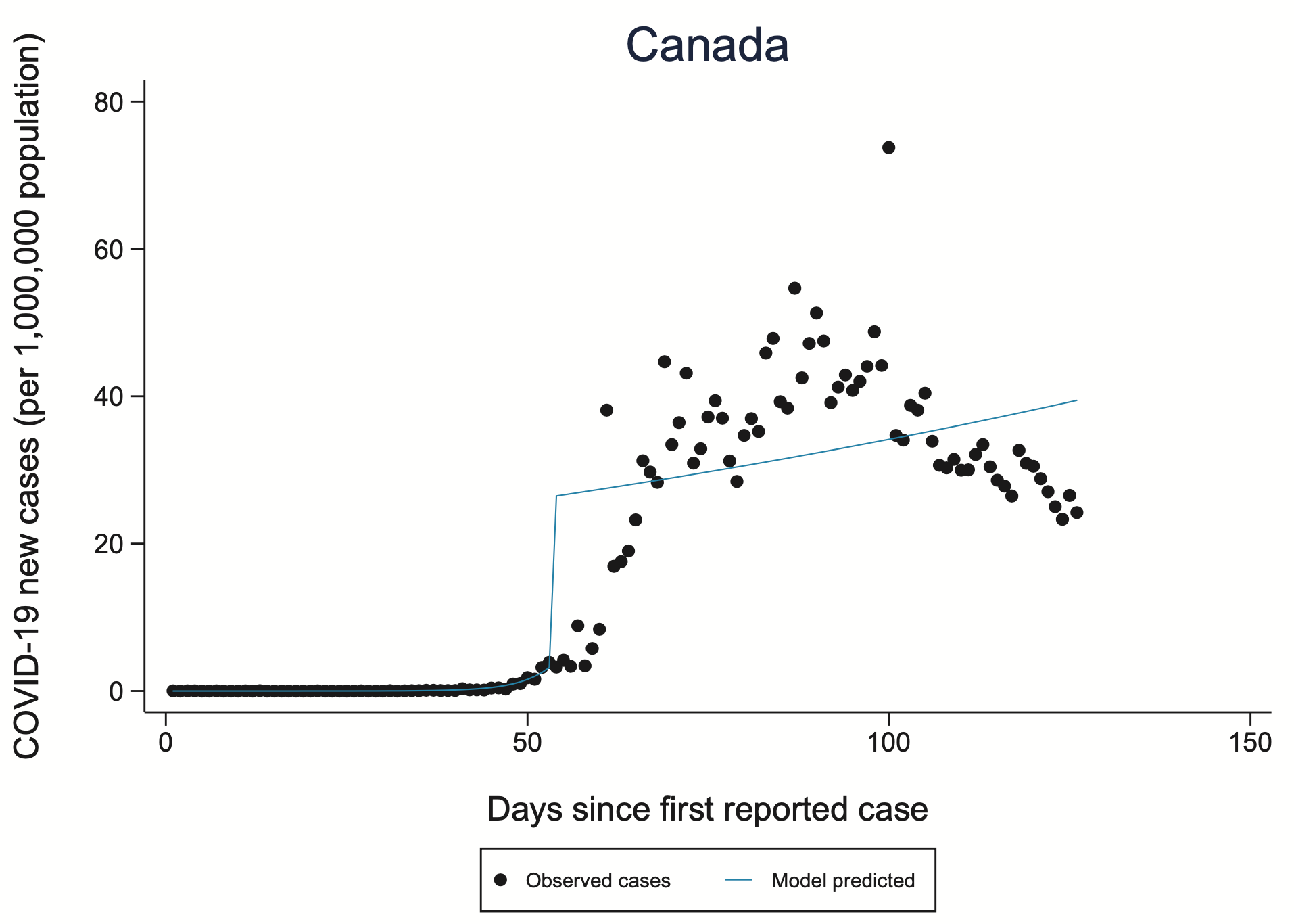
However, even a quick glance at the model fit, as denoted by the blue line suggests quite poor fit. It is not obvious that the Covid-19 infection rate is anything like linear and the discontinuity in the model leading to two lines and relationships appears highly arbitrary even if it equates to the introduction of new public health measures such as social distancing. By visualising the model and its fit such problems and underlying questions become immediately apparent.
Lessons from this discontinuity modelling example include:
- The chart of Canada is buried deep in the appendix of the article, and the fit is better for many other countries
- The authors are expert epidemiologists
- We should not be intimidated by the Schneidelgrüber Hyper-transverse spline method33 or more seriously by technically dense methods and techniques
- Often a good starting point is to look; it can help us spot problems
References
For a start there is no such method (well to the best of my knowledge)!↩︎